MLB Pitch Characteristics
Ryan Loutos; 455135; ryanloutos@wustl.edu
Mitchell Black; 455428; mitchell.black@wustl.edu
GitHub RepositoryBackground and Motivation
Project Objectives
- What MLB pitchers throw similarly to me?
- Of those MLB pitchers, who has the most effective offspeed pitches?
- Of those MLB pitchers, what do those offspeed pitches look like? How do they move?
- Where do these pitchers throw their offspeed pitches? Low, high, left, right?
- What counts do these pitchers throw these pitches in?
Data
Data Processing
Visualization Design
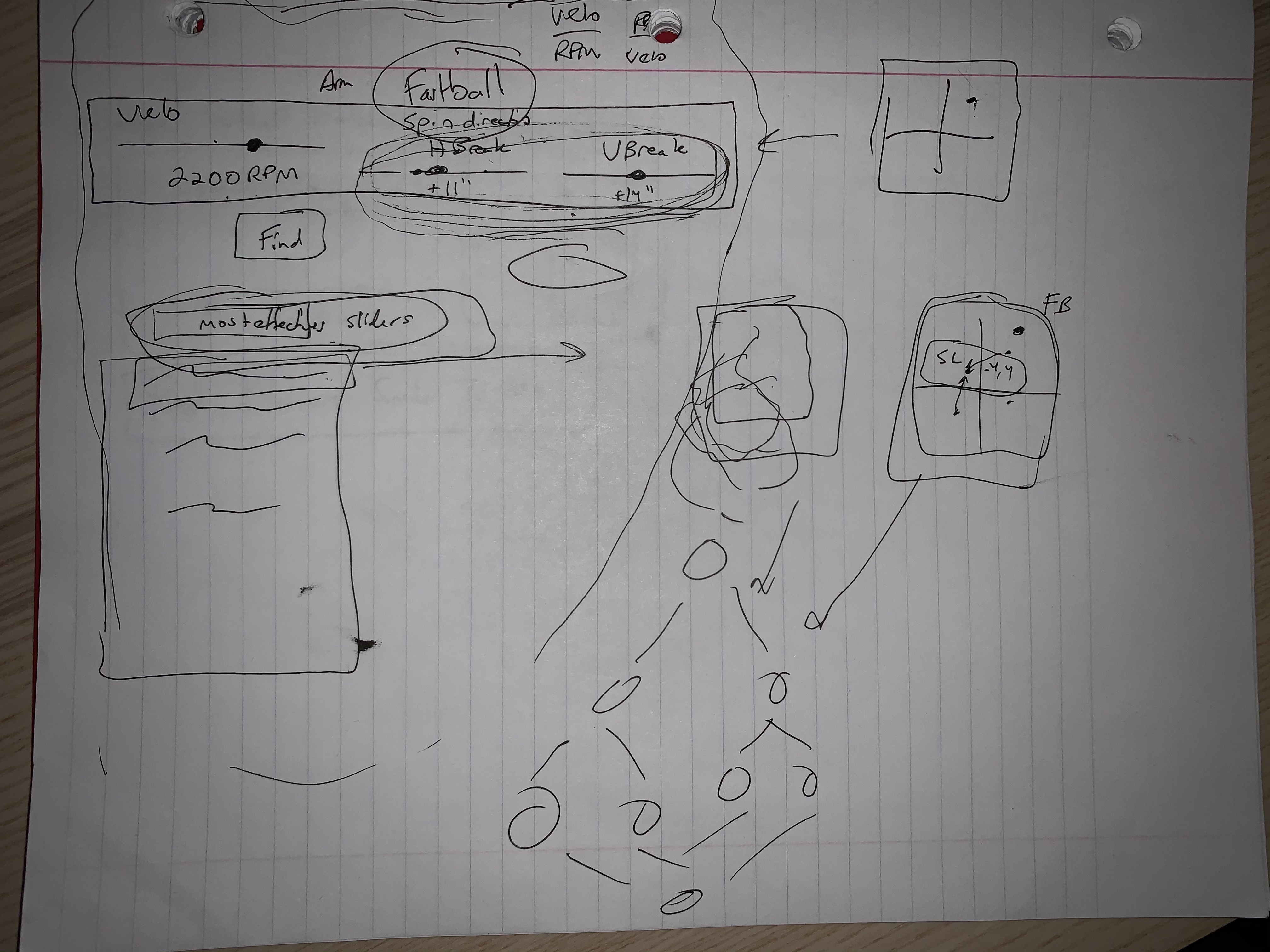
This is our first graphic design iteration. It is a pretty rough sketch of what information we will eventually want to show. Included are an input box, a similar player selection box, and some rough sketches of diagram types, which are more clear later.
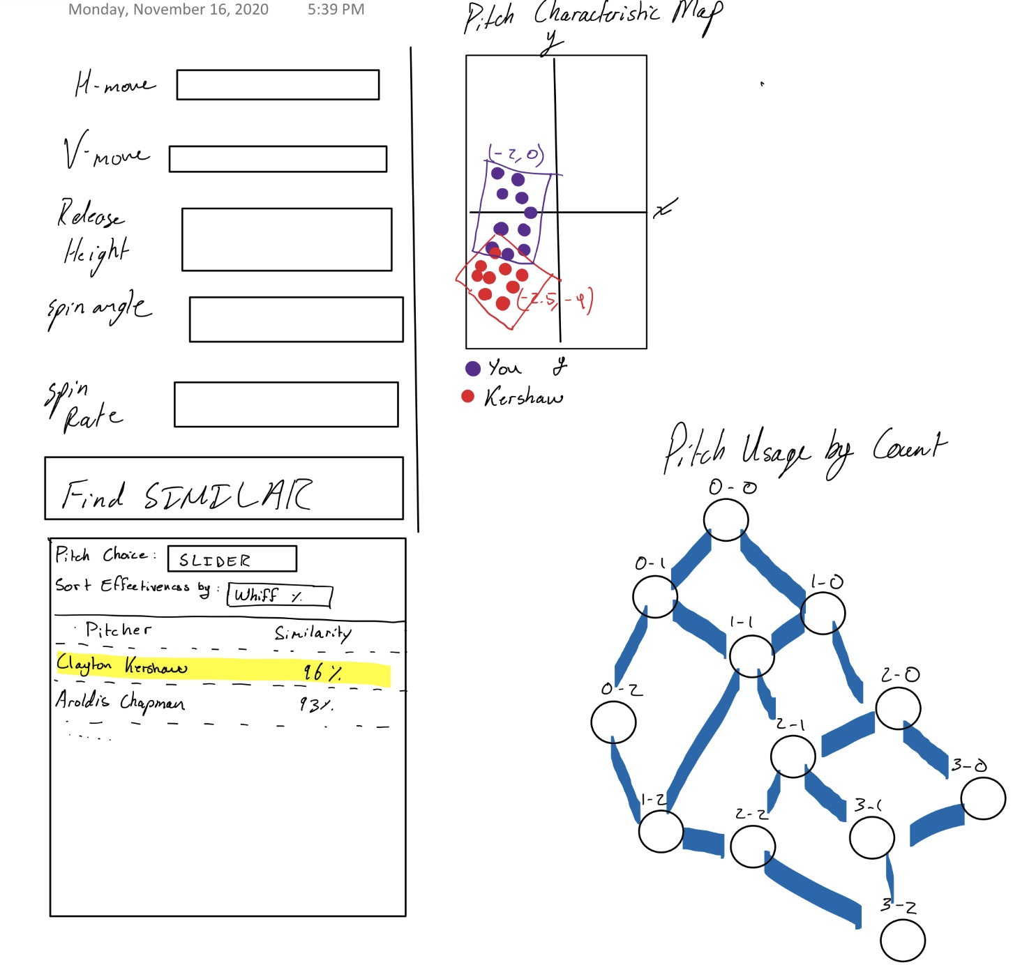
Our second graphic design iteration attempts at clearly defining the elemnts though of in design 1. It includes an input box of defined characteristics and a player selection based on various similarity metrics. The diagrams are a combined heat map and spray comparison between you and an mlb pitcher. There is also trickle down chart for pitch usage in different situation.
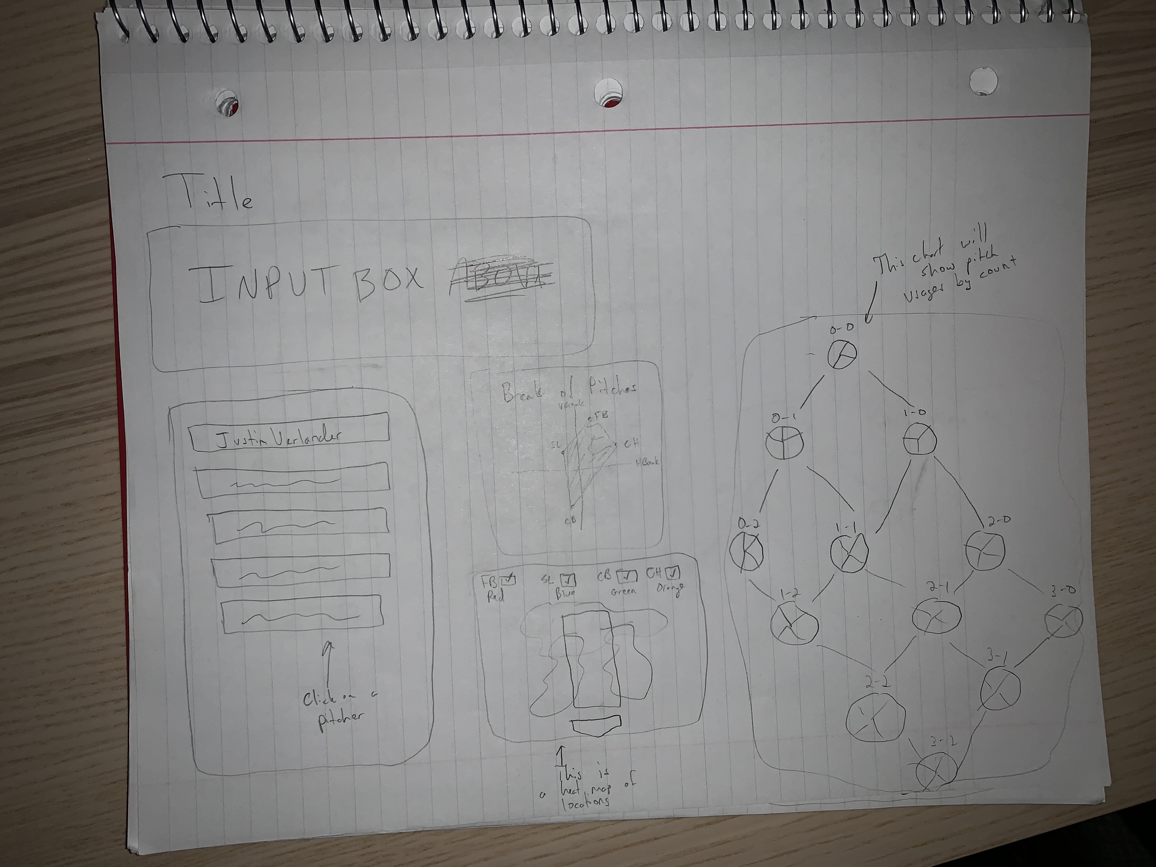
This is a half improvement on the last itertion. It separates the heat map and spray charts. They are both easier to undersatnd and achieve their goals in a more accurate manner.
This is our third graphic design iteration. It changes the combined spray into a 3d pitch characteristic diagram. This is too advanced for our tools and the time frame allotted. It also is too complicated for a user to understand possibly. We believe that we can display the same information in a simpler fashion that is also more effective.
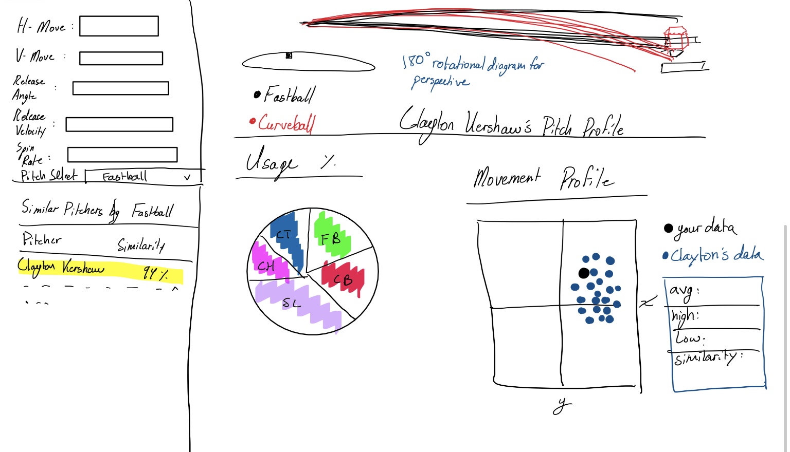
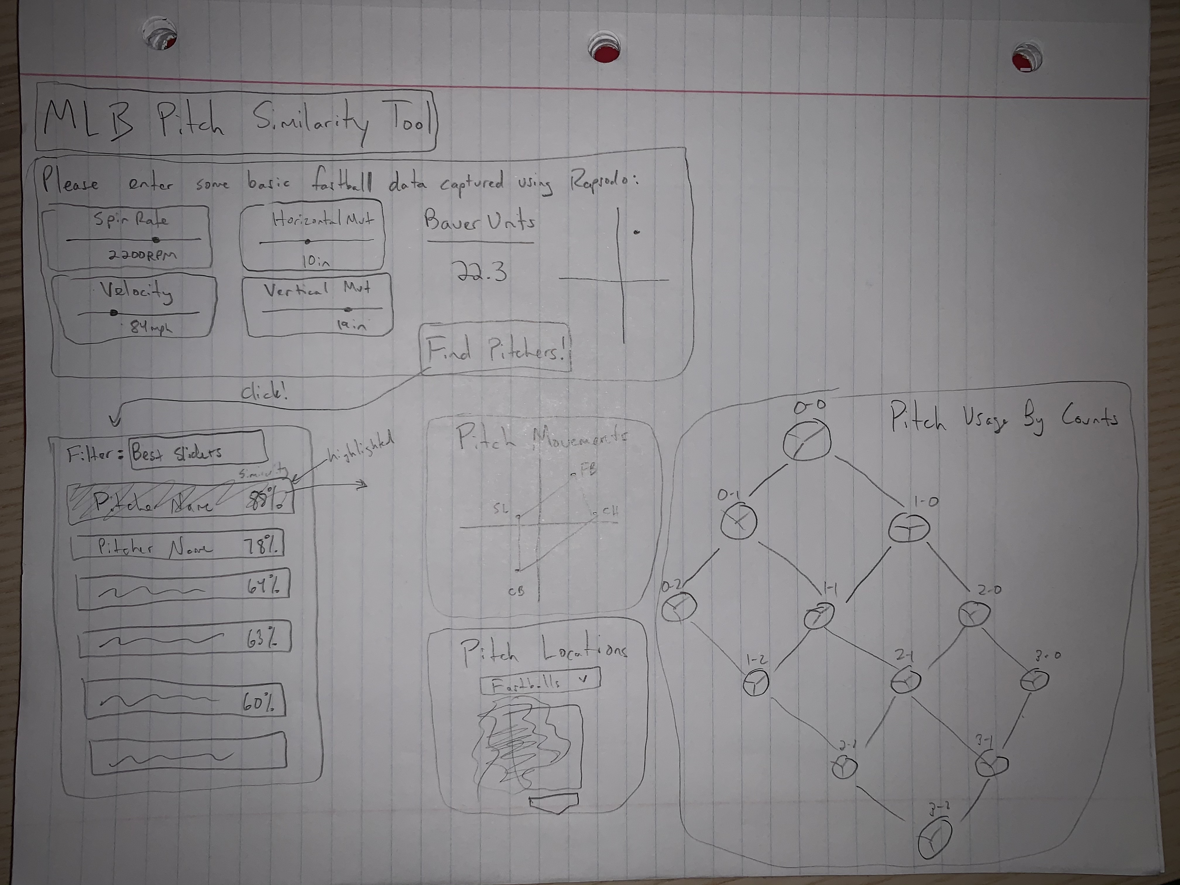
This is our final graphic design iteration. It combines elements from all of the above iterations. From the vetted input characteristics, to the similarity metrics calculations it is simpler and more comprehensive for the user. We chose the heatmap and trickle down charts because they demonstrate how the best of the best utilize their tools in a simple manner. The pitch usage by count is important as well because it defines the trends necessary to succeed no matter the competition level.
Must-Have Features
- Input box for Fastball H-Break and V-Break
- MLB effectiveness by several categories (ERA, batting average against, whiff rate, ...)
- MLB Pitcher pitch specific heatmap
- MLB Pitcher pitch specific V-Break and H-Break
- MLB Pitcher pitch usage by count trickle down
Optional Features
- Any other cool dynamic visualizations we think of along the way
- Pitch similarity (we don't really know how to calculate this at the moment)
- Add more fastball inputs to make the similarity lookup more accurate (have to research data more)
Project Schedule
Week 1 (by 11/23/20)
- Have data completely parsed and organized in JSON form
- Basic HTML file started with some compenents built
- Any other milestone 1 requirements
Week 2 (by 11/30/20)
- Have the input box fully functional, user friendly, and clean
- Have the list of pitchers that are similar be functional, styled, clean
- Maybe have started to build other visualizations but nothing done here
Week 3 (by 12/7/20)
- Have the similarity value done for each pitcher
- Have the visualizations close to done but maybe missing one or two minor features
Week 4 (by 12/14/20)
- Ideally we tidy up anything that needs to be
- Add other aspects of the website like process book, how to use, etc
Week 5 (by 12/21/20)
- At this point we want to be done with our visualization (family/winter break reasons)
- Take in all peer reviews and adjust designs accordingly