MLB Pitch Characteristics
Ryan Loutos; 455135; ryanloutos@wustl.edu
Mitchell Black; 455428; mitchell.black@wustl.edu
GitHub RepositoryOverview and Motivation
Project Questions
- What MLB pitchers throw similarly to me?
- Of those MLB pitchers, who has the most effective offspeed pitches?
- Of those MLB pitchers, what do those offspeed pitches look like? How do they move?
- Where do these pitchers throw their offspeed pitches? Low, high, left, right?
- What counts do these pitchers throw these pitches in?
Data
Data Analysis
Design Evolution
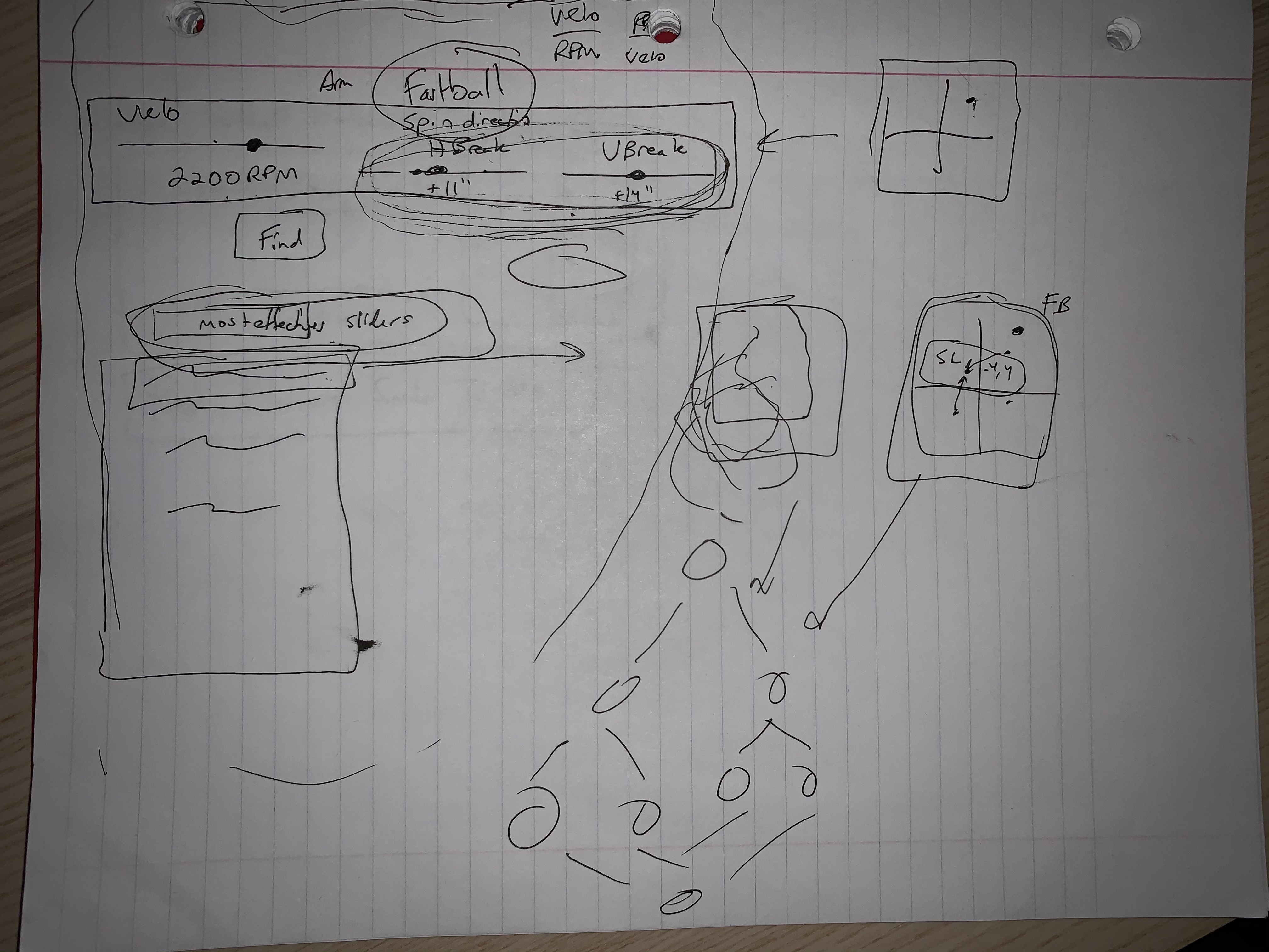
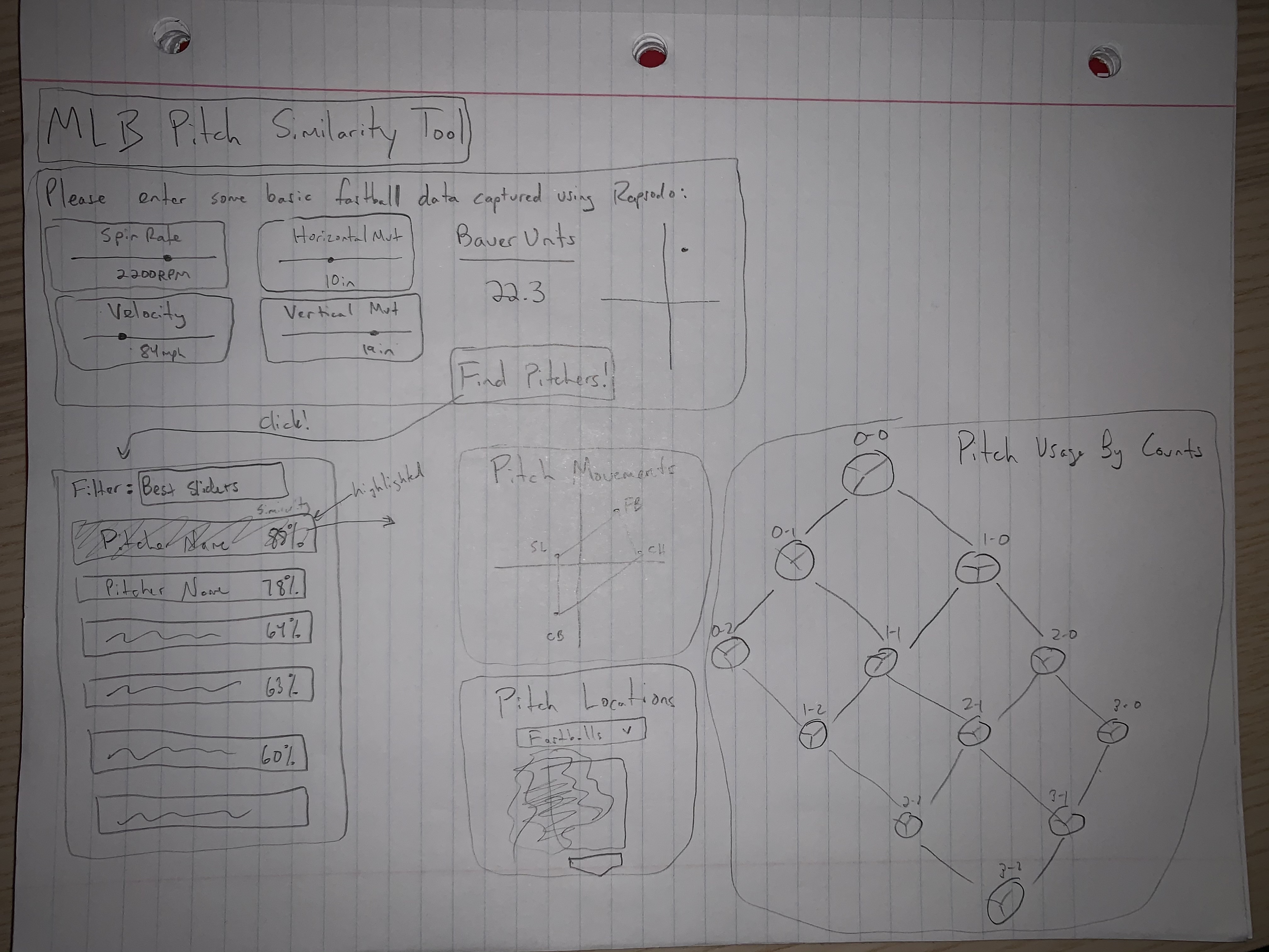
This is our first graphic design iteration. It is a pretty rough sketch of what information we will eventually want to show. Included are an input box, a similar player selection box, and some rough sketches of diagram types, which are more clear later.
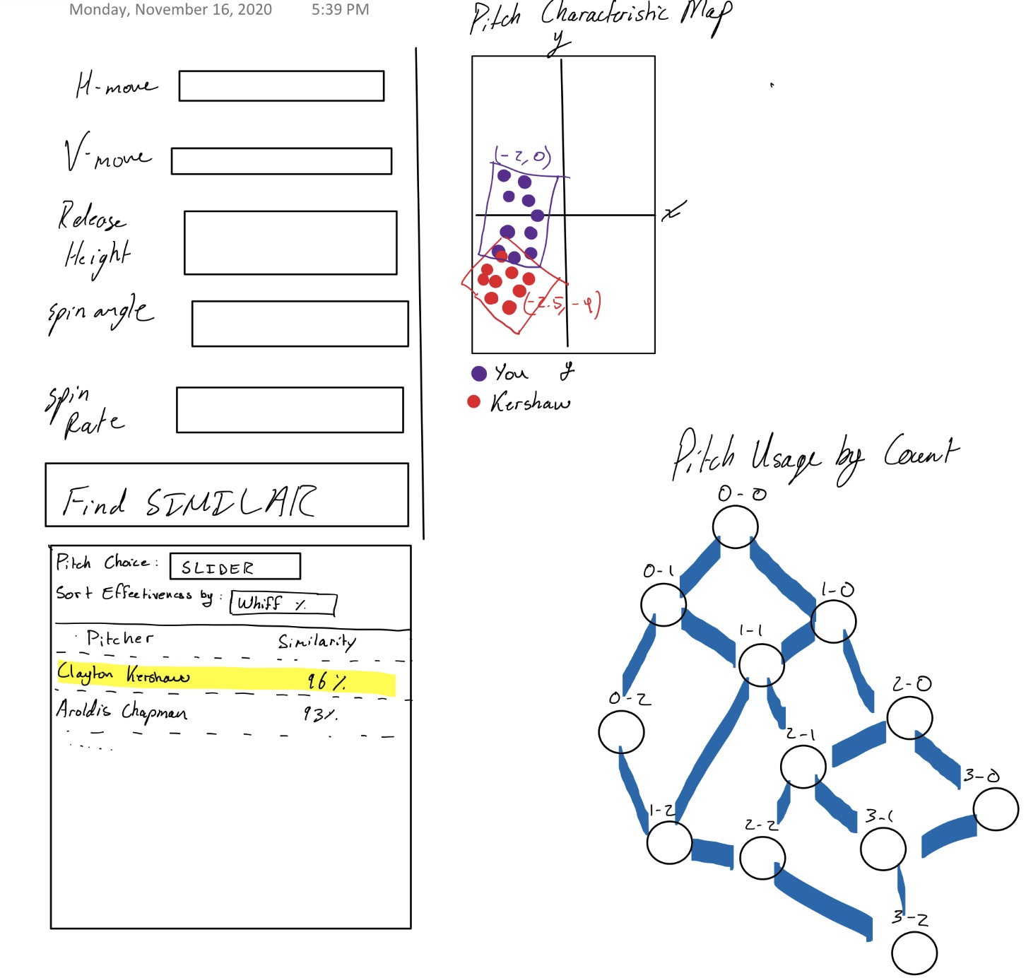
Our second graphic design iteration attempts at clearly defining the elemnts though of in design 1. It includes an input box of defined characteristics and a player selection based on various similarity metrics. The diagrams are a combined heat map and spray comparison between you and an mlb pitcher. There is also trickle down chart for pitch usage in different situation.
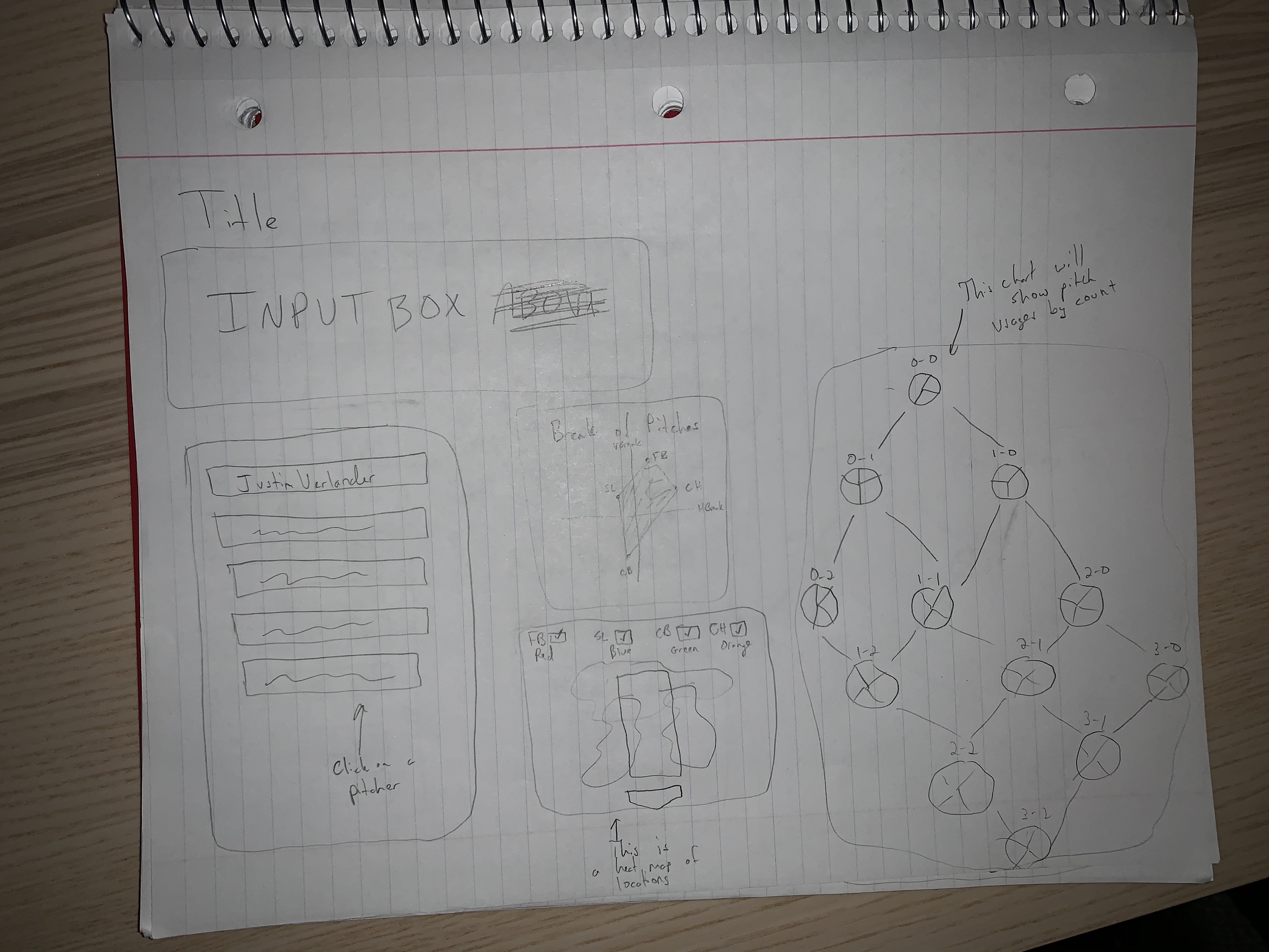
This is a half improvement on the last itertion. It separates the heat map and spray charts. They are both easier to undersatnd and achieve their goals in a more accurate manner.
This is our third graphic design iteration. It changes the combined spray into a 3d pitch characteristic diagram. This is too advanced for our tools and the time frame allotted. It also is too complicated for a user to understand possibly. We believe that we can display the same information in a simpler fashion that is also more effective.
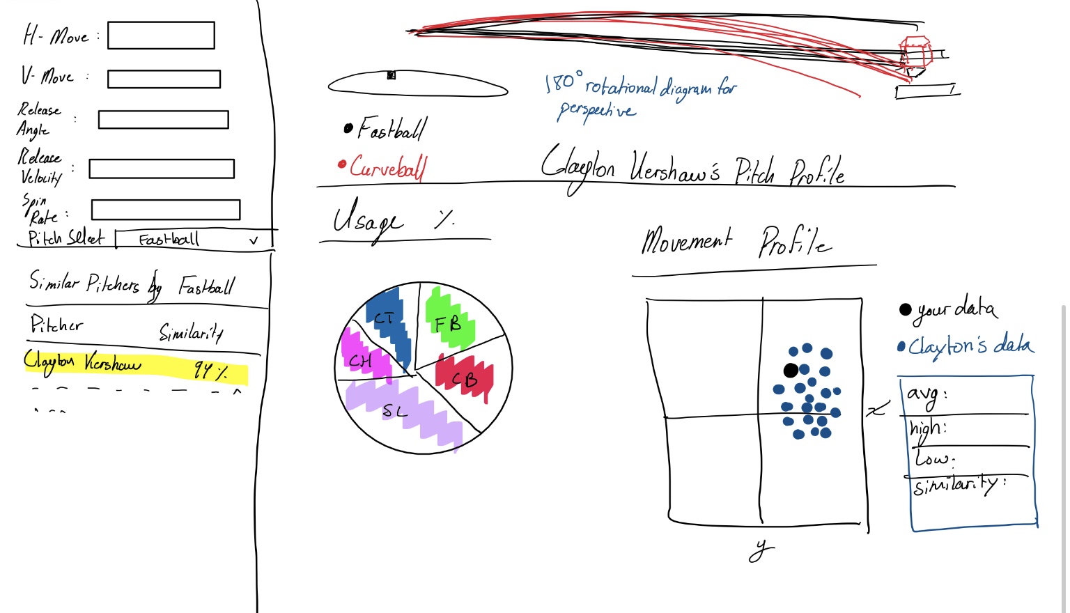
This is our final graphic design iteration. It combines elements from all of the above iterations. From the vetted input characteristics, to the similarity metrics calculations it is simpler and more comprehensive for the user. We chose the heatmap and trickle down charts because they demonstrate how the best of the best utilize their tools in a simple manner. The pitch usage by count is important as well because it defines the trends necessary to succeed no matter the competition level.
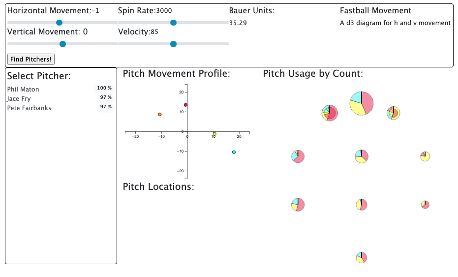
The designs completed for milestone 1 focus mainly on a proof of concept. Our data analysis section is so intense that it dominated the time we would have used to refine the visualizations. What we managed to accomplish in this milestone is a demonstration of the data entry, user selection, and information distinction.
The data entry section was designed to limit user input to only necessary items, and to remove as much possibility of error as possible. Our player selection window thus populates based on similarity threshold which is at the moment rudimentary. However it does show that our concept is feasible.
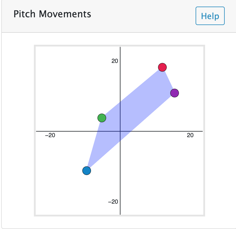
The actual visualizations are the movement profile display and the pitch usage display. The movement profile display attempts to show the range of tools with which this pitcher can be effective. Our goals for refining this are to include tooltips for precise information, as well as a polygon connectecting all of the points from the outside. The tooltip will display the information more precisely, and the polygon will further portray the range of weapons available.
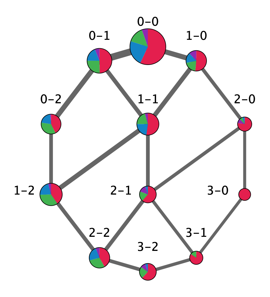
The pitch usage chart attempts to show how MLB pitchers best usee their discussed weapons at different times. The colors represent different pitches, and the sizes of the pie-charts represent the frequency that the pitcher is in this situation. Our next iteration on this chart will have tooltips for the percentages of each pie chart, edge weights between nodes showing connections between counts, labels above different scenarios.
In addition to these updates, we will need to display a global legend, as well as possibly some of the raw data which is best understood simply on its own.
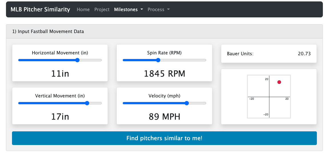
Our designs in milestone 2 attempted to polish our charts, as well increase their accessability to both baseball savy users, as well as those who are less experienced.
The first improvement we completed to improve accessability is to bump the style of the whole page up a notch. Starting with the data entry window. Each of the sliders is labeled correctly including units. There is also a graphical representation along the right to help display what the infomation entered, as well as allow a separates entry method if the user is more compfortable with spacial data. We also changed the entry button to be friendlier.
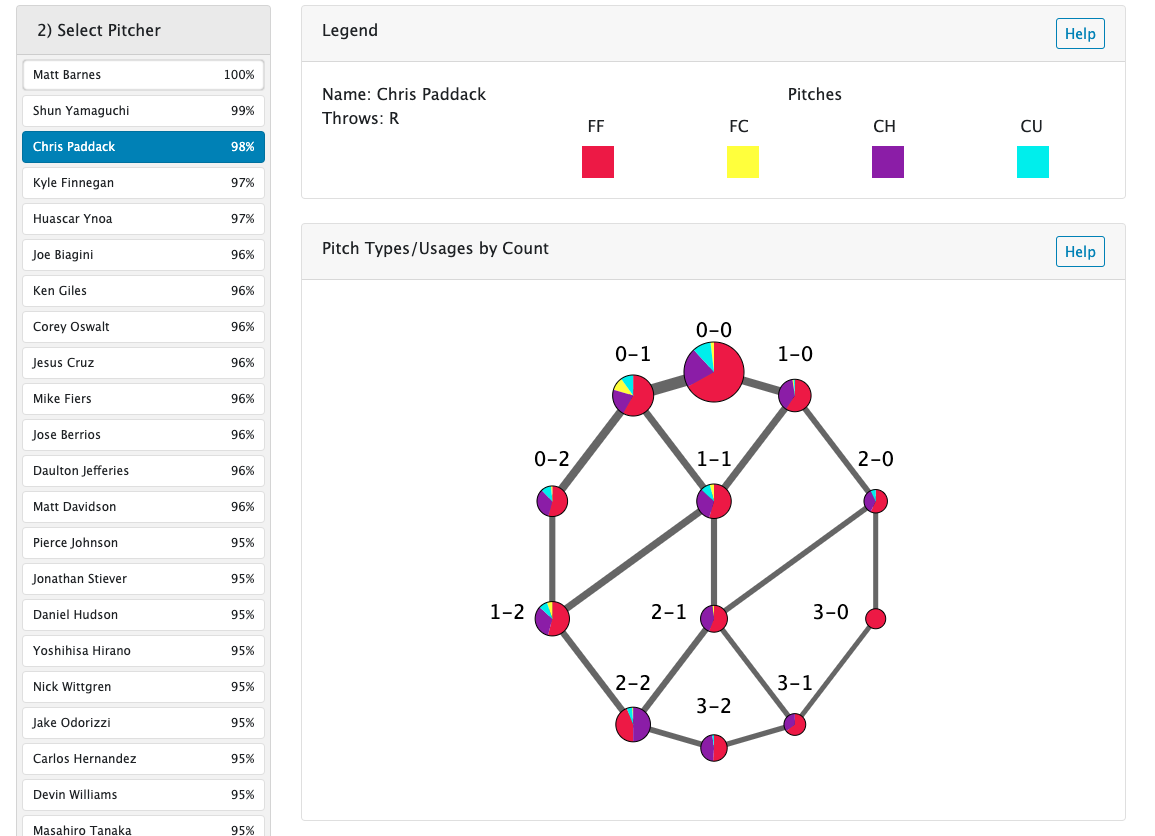
The select pitcher chart still displays a pitcher's name, as well as a similarity metric to the user calculated using percent differences among a number of stats. It now includes context highlighting though, as well as a label at the top to try to connect the process of selecting data to examine.
Within the data window, we have our first iteration of a legend to increase user accessability. It includes the pitcher's name, which hand they throw with, as well as a list of the pitches the pitcher throws, along with their encoded color. These colors are used everywhere else in the demonstration. We are considdereing adding some more information here, as well as giving the user the option to select their own, friendlier colors in the case they are color blind, or wish for a different scheme.
Moving to the visualizations, up top is our "plinko" chart. This one is a challenge at the moment, as it encodes a large amount of data. Ensuring that the user understands what is being desplayed to the extent that we intend is an ongoing struggle. To assist this, we added connecting edges between related pie charts (at bat counts), tooltips explaining the values in the charts, labels for each of the counts, and a helper popup window if the user desires.
The pitch movement chart now moves dynamically with each selected pitcher. It too has a helper window to assist with the comprehension of the infomation. The highlighted area between the dots was added to show the user the scope of pitches, speeds and movements that are available to the elite players of the game.
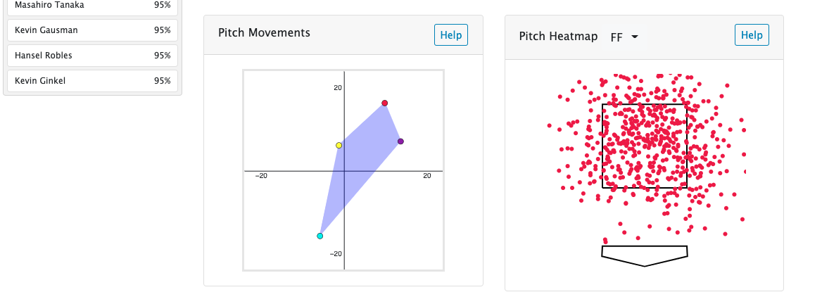
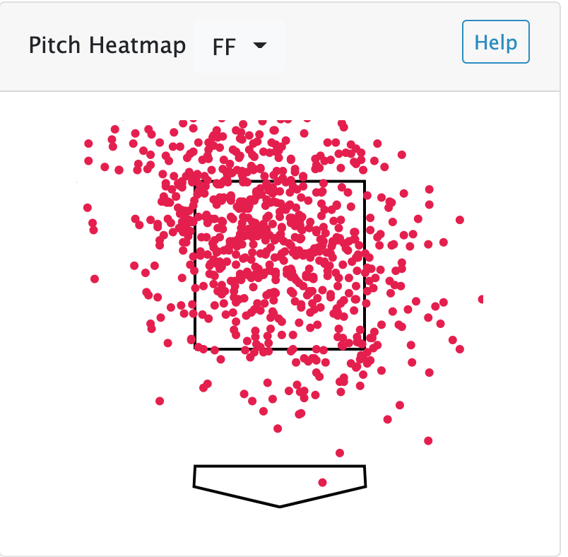
The pitch locations chart shows every pitch that was thrown for that pitcher separated by pitch type. This allows the user to see where the similar pitchers throw their pitches, and give insight into how they can help improve their game.
We only made a few changes for the final submission.
The first change was added in response to us not answering a question we were planning on: Of the pitchers that are most similar to me, who has the best X pitch of that group? This filter allows the user to order the similar pitchers by a pitch type if they so please.
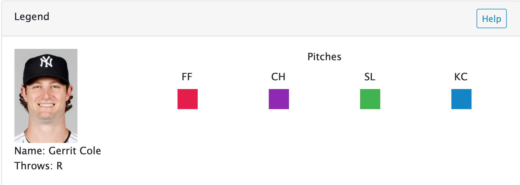
The second change was just adding all 700 pitchers' pictures (we scraped them). This added a nice little touch and helped put a face to the data.
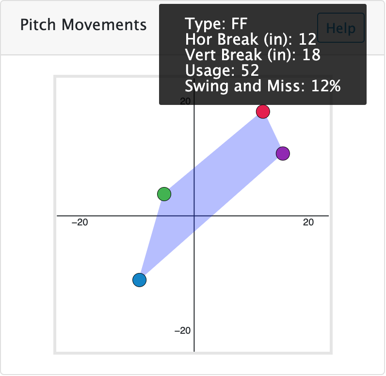
The last update we made was adding tooltips to the movement chart to give some detailed data on the specific pitch. This makes the visualization a bit more interactive and gives the user more details.
Implementation
This section will go over the visualizations created for the project and the thought process behind them.
Plinko
The idea behind this chart was to offer an all-encompassing chart to paint a picture of the pitches the pitcher throws, the counts he throws them in, and much more. It has a nice flow to it (from top to bottom) as pitches are thrown in the at bat. You can really see some tendencies from relative sizes of objects within the chart.
Pitch Movement
This chart is a great way to visualize pitches relative to one another, and the web adds a nice touch to see how much space the pitcher's arsenal can cover. It's nice to have the information encoding in tooltips, so you can associate data with a visual that makes sense.
Pitch Heatmap
This last chart was a nice way to see where a pitcher tends to throw certain pitches. We thought about doing a heatmap with boxes or hexagons, but felt that the circles showing the exact locations provided all the information we needed, as well as gave the user a sense of how frequently that pitch was thrown (more dots = more pitches).
Evaluation
What did you learn about the data by doing your visualizations?
To be honest, both of us know a lot about this stuff already, so the project was more focused on implementation more than anything. We definitely took away some things related to our own pitches and ways they can be improved....but we are both stats and data nerds so we didn't "learn" anything about the data necessarily.
How did you answer your questions?
We answered our questions by letting the user interact with different pitchers that are similar to them. If we could do the work up front by providing the similar pitchers, we let the user explore them and how they get the job done so they can compare and contrast what will likely work for them.
How well does your visualization work, and how could you further improve it?
We think it checks all of the boxes for what we wanted to accomplish. It's fairly simple to use, especially for our audience. We think it could be improved with some more visualizations potentially that highlight or focus on specific data.