CSE 457 Final Project Process Book | The SVGs
Hacking the NYT Best Sellers List
Visualization
GitHub Repository Demo
Isabella Blair - i.blair@wustl.edu - 485714
Kyerra Norton - k.n.norton@wustl.edu - 489940
Sylvie Lee - sylvie@wustl.edu - 473527
Overview and Motivation
We all enjoy reading, and we were aware that some books are bulk bought in pre-sale so that they would rank in the NYT Best Sellers list once they were officially released. We wanted to track which books have potentially been ranked this way, as well as analyze the publishers that are suspected of doing this the most and what genres have the most books that are suspected to be fraudulently ranked. Additionally, we want to show how rankings for books that have been on the best seller list for multiple weeks have changed over time as well as the history of the list and its categories.
Related Work
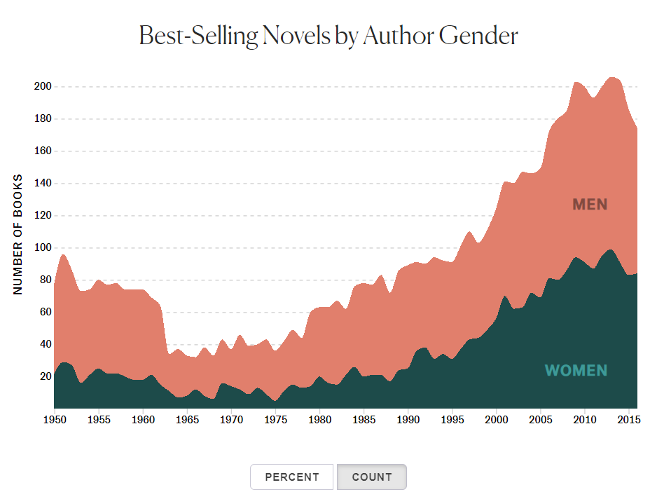
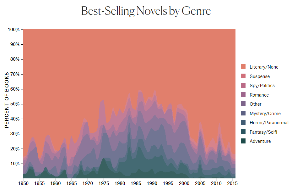
We have taken a lot of inspiration from these two visualizations from The Pudding by Rosie Cima. These use the same API that we used, the NYT Developer's Books API, and analyze bias in the data by gender. We would like to implement an area chart similar to these for one of our visualizations.
We were also inspired by these graphs from studios 2, 5, and 6. We liked the idea of interactive bar charts and again the idea of a stacked area chart.
Questions
These are the main questions we would like to answer with our visualizations. Our questions have mostly stayed the same, though we have come to the realization that there is not a particularly reliable source of data detailing book sales from bookstores, independent sellers, etc. to compare to the reported sales which could be fraudulent. We have decided to make visualizations that allow the user to come .
Data
Our main source of data has been from the NYT Developers Books API. In order to extract data using calls to this API, which has a limit on the amount of requests that can be made per certain amounts of time, we used a Python script, dates.py, which requests the data for certain lists and then writes it to a JSON file. There is no genre parameter. We are considering using the Google Books API to cross reference titles and append a genre parameter to our NYT data. We are also having to extract specific data such as titles and number of weeks on the NYT best sellers list from multiple different files in order to gain relevant and useful data for our visualizations.
Exploratory Data Analysis
This Towards Data Science article by Kailey Smith contains some visualizations that helped us get our bearings when confronted with such a massive amount of data.
These are not interactive, and do not contain all of the views that we plan to implement. However, they were a good tool to see what sort of results we could expect to see if our data extraction was successful.
Much of our initial analysis was not in the form of visualizations, but rather just filtering through raw data and seeing what information we could access through the API. There are limits to how many requests can be made to the API through a given API key, so gathering data for this project was
a long process. The 'daggers', or the markers that the New York Times uses to denote a book they believe may have been fraudulently placed on the list, are beneath multiple layers of data and can be hard to access.
Design Evolution
Initial Sketches
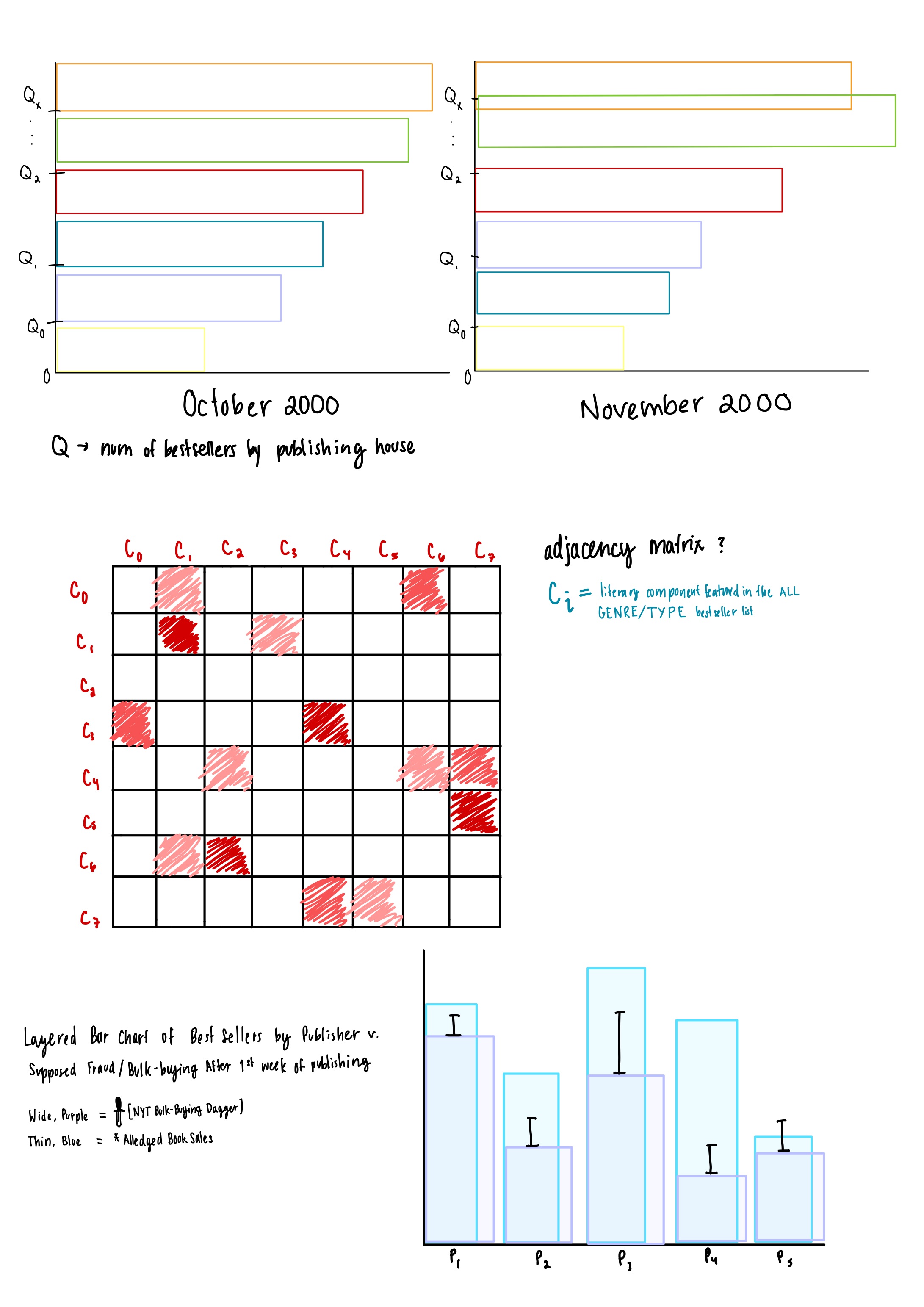
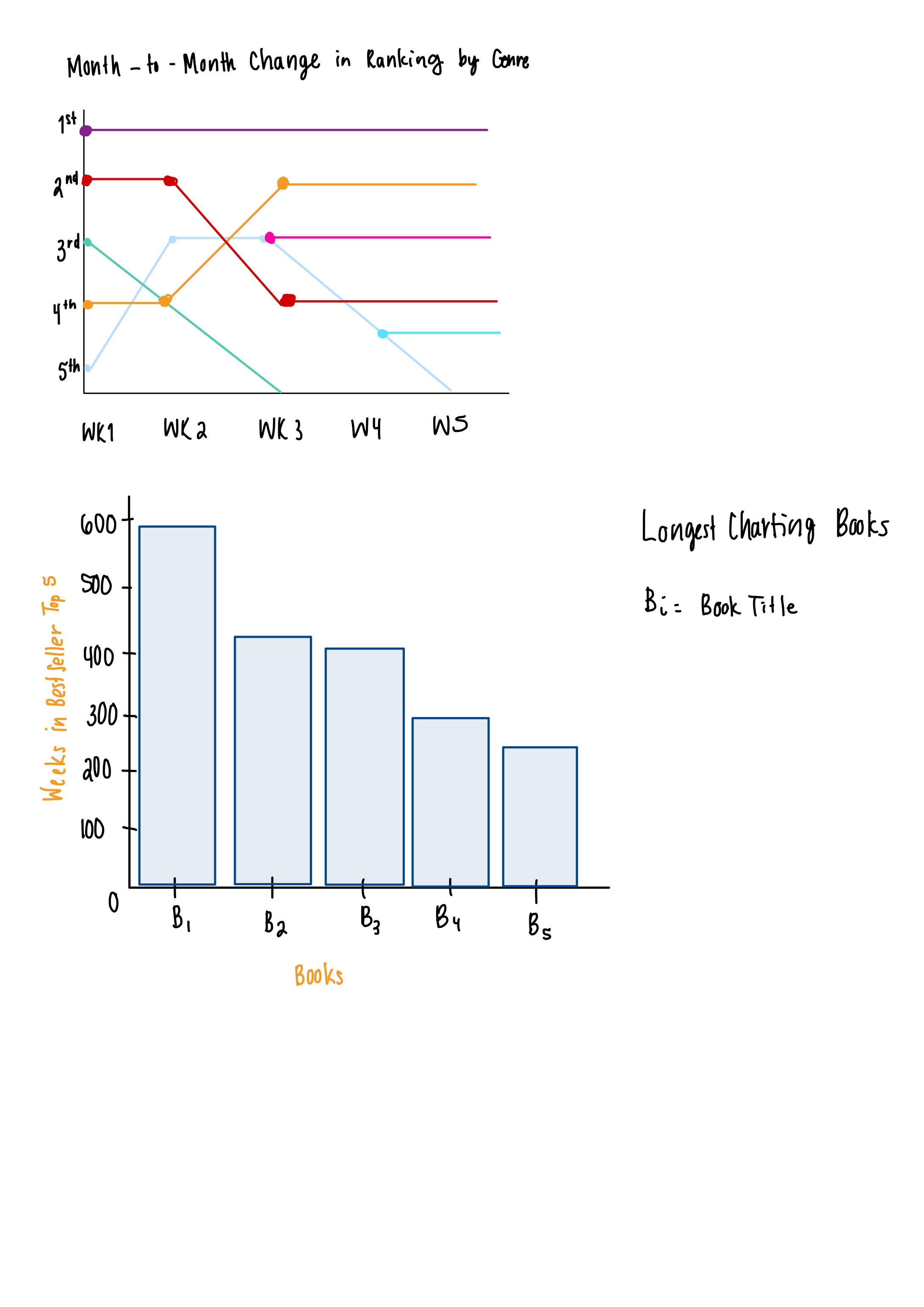
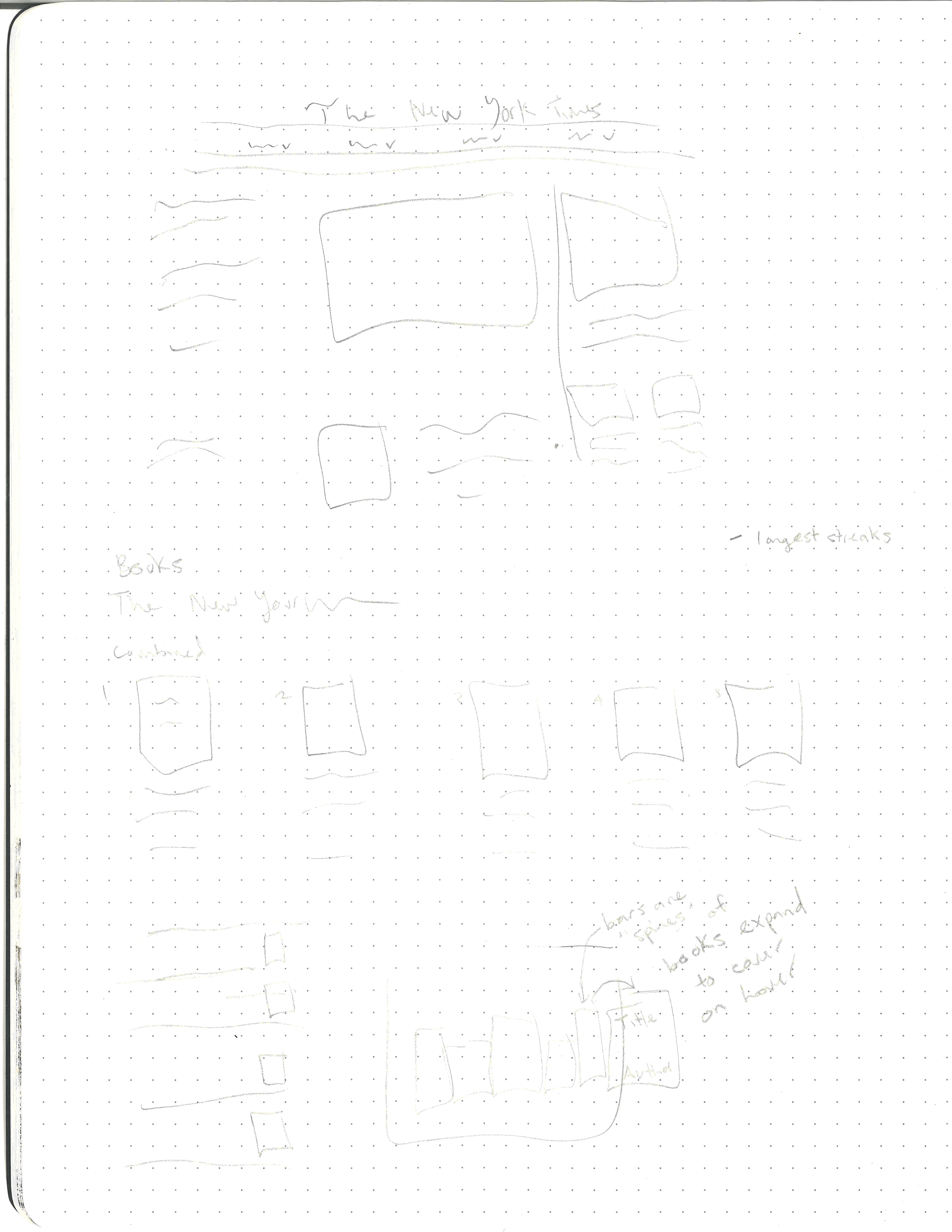
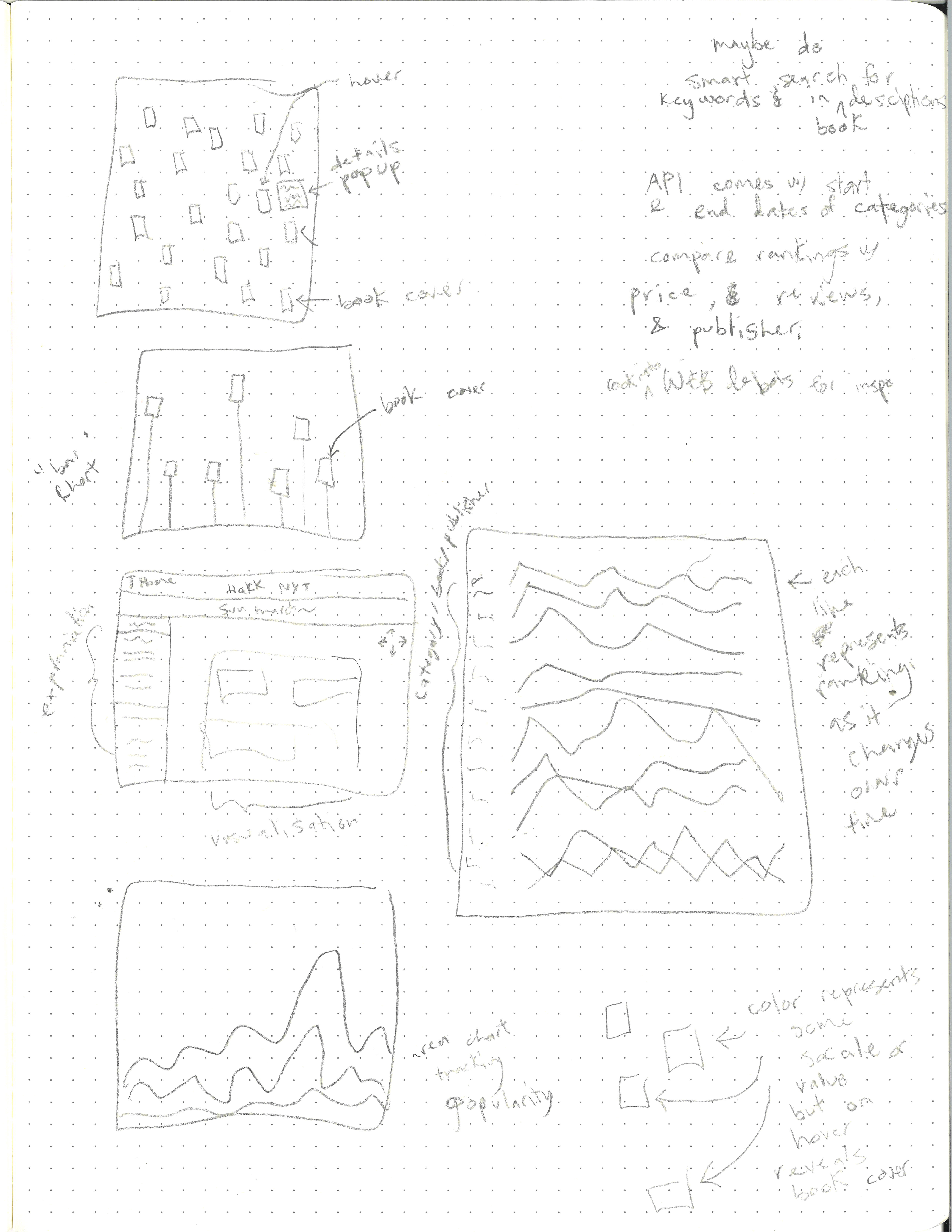
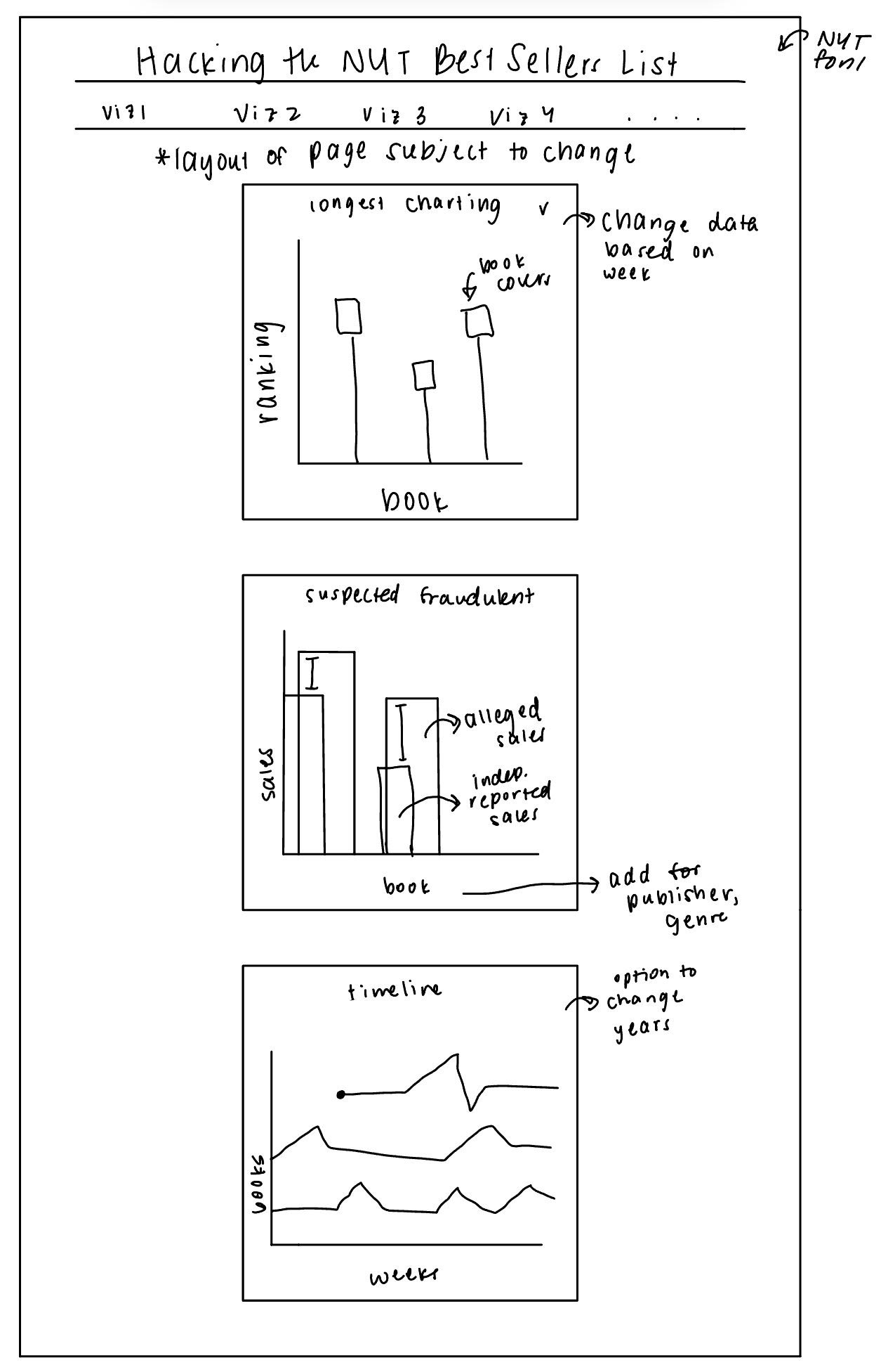
In our initial sketches, we were mainly just brainstorming different ways that we could effectively present our data. You can see that we thought of various different visualization types, layouts, and encodings. One thing that remained throughout all of our sketches was a bar char to show the longest charting books as well as some sort of timeline.
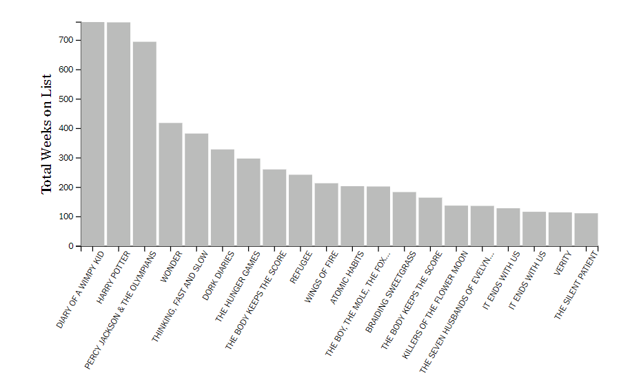
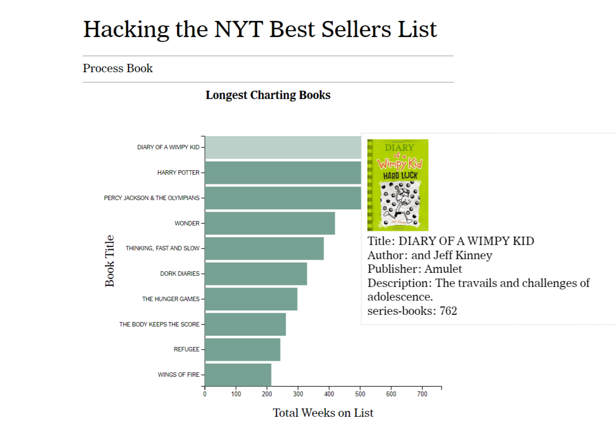
Above is the first iteration of our bar graph showing the longest charting books. In response to feedback from user testing, we flipped the axes of the graph to make the book titles easier to read and improved the content provided in the tooltip. Below is the final version of this graph showing the tooltip when the user hovers over the top bar.
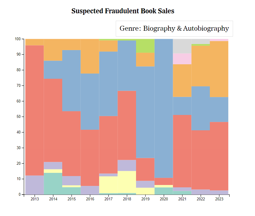
We considered many different options for presenting the genres of suspiciously placed books. Our initial idea was to create a stacked area chart, but ultimately it seemed unneccessarily complex. We chose to implement a stacked bar chart showing what percent of the total suspected books in a year each genre took up. It is much easier to visualize which genre is taking up most of the space per year this way since the blocks of color each represent a genre. The final result is shown below.
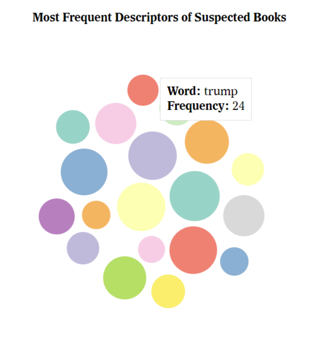
Following the theme of finding trends in suspiciously ranked books, we came up with the idea to look at the descriptions of the suspicious books relatively late in the process of creating this website. We chose to implement a bubble chart for this, as it is easy to tell which words are used more frequently based on the size of the associated bubble. We believe this visualization is useful because it allows the user to analyze potential trends in the descriptions of suspicous books.
Implementation
Longest Charting Books Visualization
We have implemented a bar chart to show the longest charting books on the NYT Best Sellers list. Whenever the user hovers over a bar, a tooltip appears that gives relevant information about the associated book such as the cover, author, and publisher. Additionally, hovering over a bar changes the color of the bar to make it easier to identify which information the user is targeting. This is intended to answer the first questions that people might have when they think about the NYT Best Sellers list, such as "which book has charted on the list for the longest period of time?" or "how many weeks has the longest charting book been on the list?"
Suspected Fraudulent Book Sales
In this stacked bar graph, we analyze the genres which make up the suspected fraudulent book sales per year. When the user hovers over a section of the graph, it shows what genre that section represents. This is intended to provide users with the opportunity to analyze potential trends in genres that are more likely to have books which are suspected to be fraudulently placed on the list.
Most Frequent Descriptors of Suspected Books
This bubble chart takes the descriptions of the books which are suspected to have been fraudulently placed on the NYT Best Sellers list and shows the top 20 most used terms excluding stop words such as "a" or "and." When the user hovers over a bubble, a tooltip with the word and the frequency it appeared in the descriptions pops up. This is intended to convey to the user common themes that occur in the descriptions of suspiciously placed books. For instance, many of the words have political connotations.
Evaluation
We have so far learned what the longest charting books on the NYT Best Sellers list are. This visualization could be improved through the use of color and other views to show the longest charting books based on publisher or by genre.
We have also learned that most of the books which have been suspected to be fraudulently placed on the Best Sellers list are categorized as being in the "Biography & Autobiography" genre as well as the "Political Science" genre. The Suspected Fraudulent Book Sales visualization might be improved by ensuring the contrast between colors is heightened so that more people are able to differentiate them. It also might be helpful to explain what the 'Other' category means.
Our Most Frequent Descriptors of Suspected Books visualization suggests that many of the suspicious books are political in nature given that the most frequently used words have political connotations. This visualization might be improved by having the words themselves in the bubbles rather than in the tooltip, but we decided against implementing this because it has the potential to look clunky and confusing. The color palette of this visualization could also be made more inclusive.
Overall, we have mostly answered the questions we initially asked. We have provided information about the genres and descriptions of suspiciously placed books, as well as general information about the list that users might wish to know.
User Study
Users will use Kyerra's laptop to perform the tasks.
Session 1: Think-aloud Method
Session 2: Specific Tasks
Session 3: Feedback/Critique
The main criticism we received was about our longest charting books bar chart. Users explained that it would be easier to read the book titles if we flipped the axes (see design evolution) and that the tooltip could be more descriptive. Overall, users seemed to understand that the website was NYT themed and what information the visualizations provided.