Elon Pan 502865
Matthew Martin 464197
With soccer being one of the biggest sports in the world, data is constantly being taken of certain leagues and players. While much of this data is publicly available, there isn't a central area to explore and visualize these statistics. At best, perusing csvs or tables are the only current ways of exploring most of these statistics. Many news articles or outlets create great visualizations for the purpose of proving their point but are never interactive or provide the viewer to explore beyond the topic they are addressing. The purpose of our project is to give the viewer a way to explore a number of aggregated statistics for players in a few of different visualizations. This would give our viewers a new lens into their favorite players in the top 5 leagues in Europe and the space to explore it.
A lot of inspiration came from different articles in the Athletic that would have great visualizations provided in their stories. Reading them I would see a number of radar charts and scatter plots looking at specific players or team performance. Seeing these visualizations would always spark interest in seeing the same visualization for different players or leagues to see how they compare. Also, working with all the different types of visualizations through the semester inspired us to build our own ways to visualize sports statistics. For example, the bubble chart is the only bubble chart I have seen to view player comparisons in soccer.
The main questions we tried to answer were:
Through our analysis, the main shift in our questions was how to allow users that don't already know about the sport to be able to explore the data rather easily.
The source of our data is located in these two links:
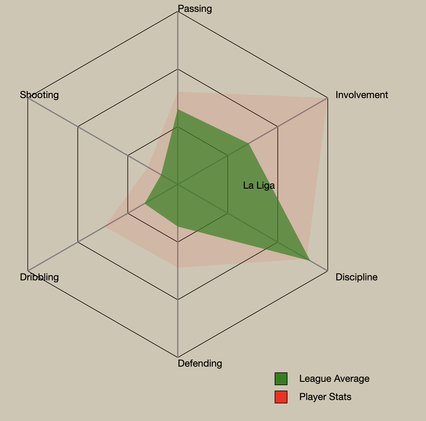
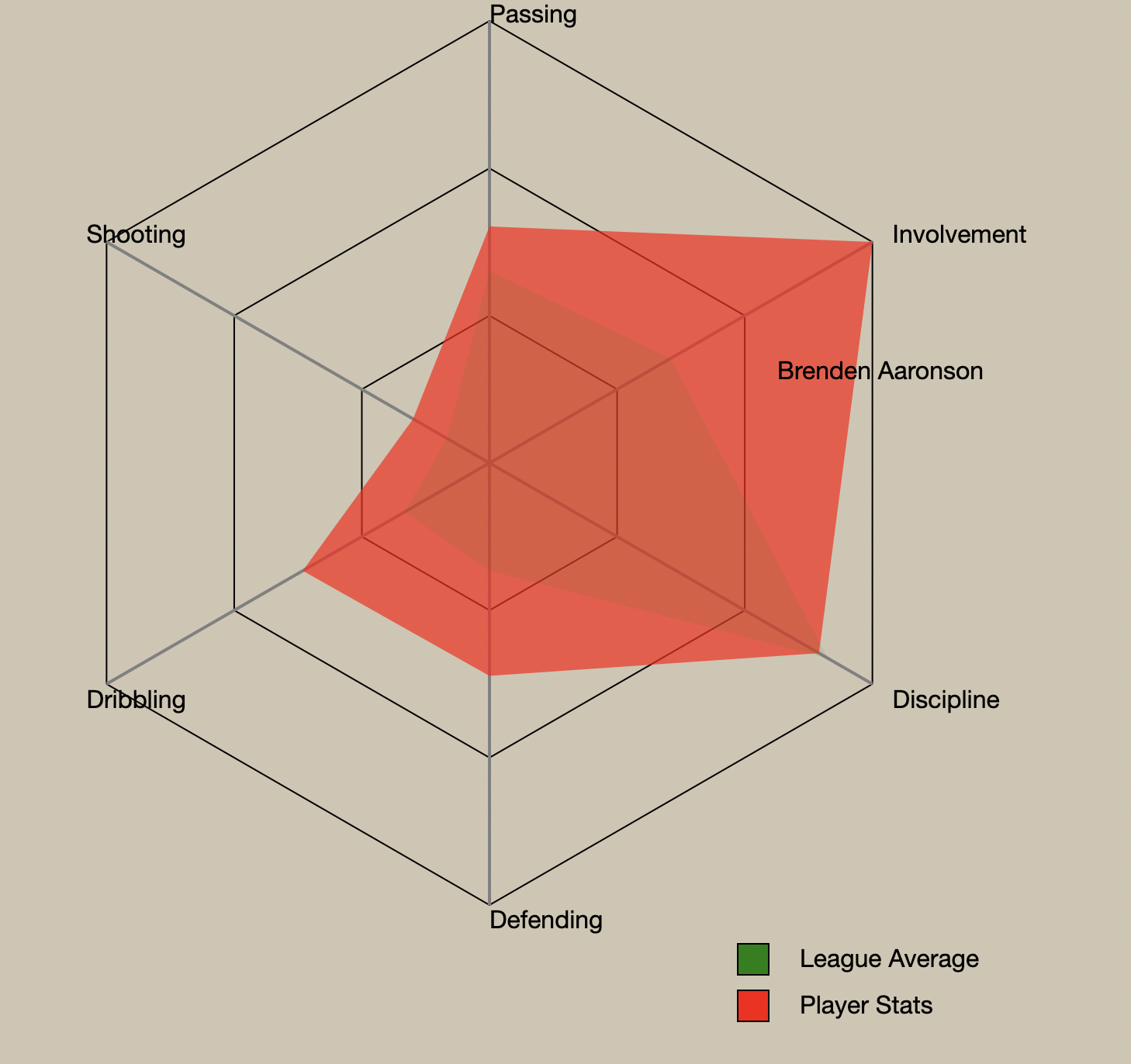
The data we used was taken from these two csvs above. We cleaned and manipulated it to create a few different csv and json files for use in our visualizations. All of our stats used in our visualizations (Passing, Dribbling, Shooting, etc) were all created in python by combining a bunch of the raw stats into specific equations to create scores. These scores were then normalized between 0 and 100.
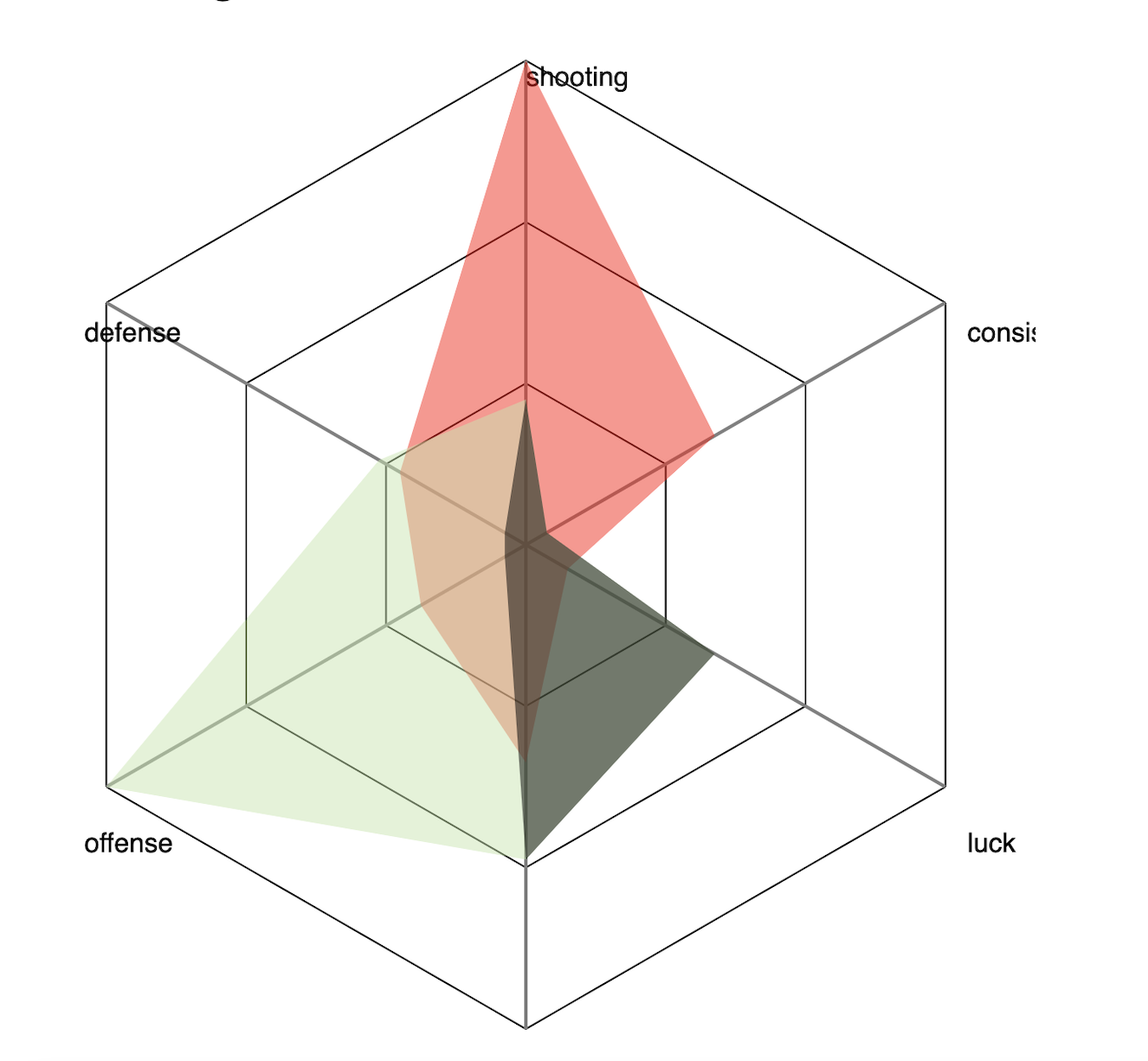
To first look through our data, we sorted and looked through different filters in python to understand the differences in our aggregated stats and just the sheer amount of data we were dealing with. Then we started with our radar chart since we knew that was going to be the core chart of our project. That is shown below. Knowing that this would be a great way to make comparisons between the 6 different stats each player had, we kept it and the design to use in comparisons.
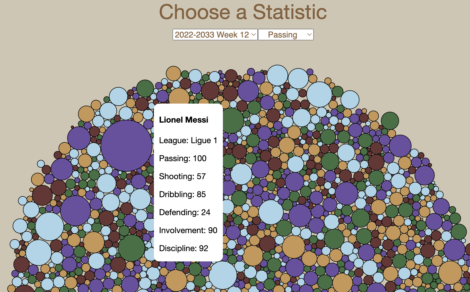
But with the radar chart, we were limited to only having a certain number of players at a certain time or else the chart got too convoluted. This inspired the bubble chart as we tried to create a way to view all of the players in a single visualization. The player comparison tab with the radar chart and bar chart looking at an individuals stats now works well with the new bubble chart that looks over the entire dataset.
The main two visualizations we considered from the beginning were the radar chart and a scatter plot. The radar chart ended up working very well for comparing multiple entities of data to see the overlap and differences for specific statistics. Especially with some hover styling, the radar chart is able to covey a lot with a good balance of data ink. As for the scatter plot, our dataset was too similar and also too large to able to use it effectively. Our main deviation from our proposal and the solution to this problem was creating a bubble chart. After doing assignments and studios with the force layout, we decided to create a bubble chart because we saw how great of a comparison tool it was and how good it was at viewing large datasets. The bubble chart also lets the viewer to explore the dataset based on different filters which the scatter plot also wouldn't have provided. Alongside both the bubble chart and the radar chart, we added a number of bar charts to display the statistics of separate entities in the data. As most people are very familiar with bar charts and it shows comparison between values well, we added one to show player values in the player comparison tab and a number of others to show the values of leagues averages in the statistical info tab.
The three interactive visualizations we created are the radar chart, the bubble chart, and the bar charts. For the radar chart, it is comparing the values of the selected player and league. To select a player a dropdown is used and to select a league the buttons of the league icons above the chart are used. The radar chart changes based on what values of each of these are chosen. The selected player then updates information about the player below and the selected league is outlined when picked. On the radar chart, a hover is used to identify which entity of data you're looking at (the player or the league average) and specifically which player or league.
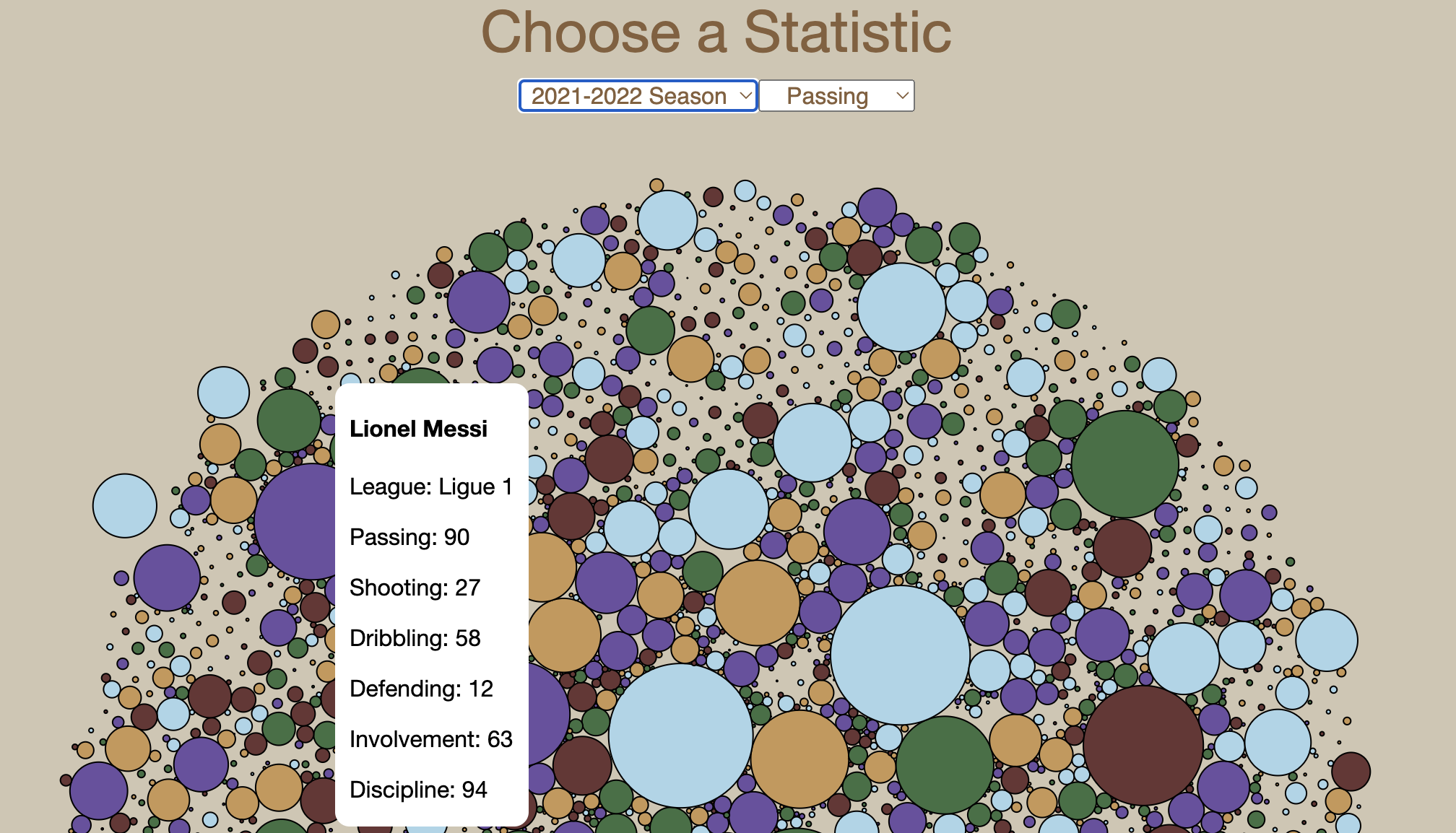
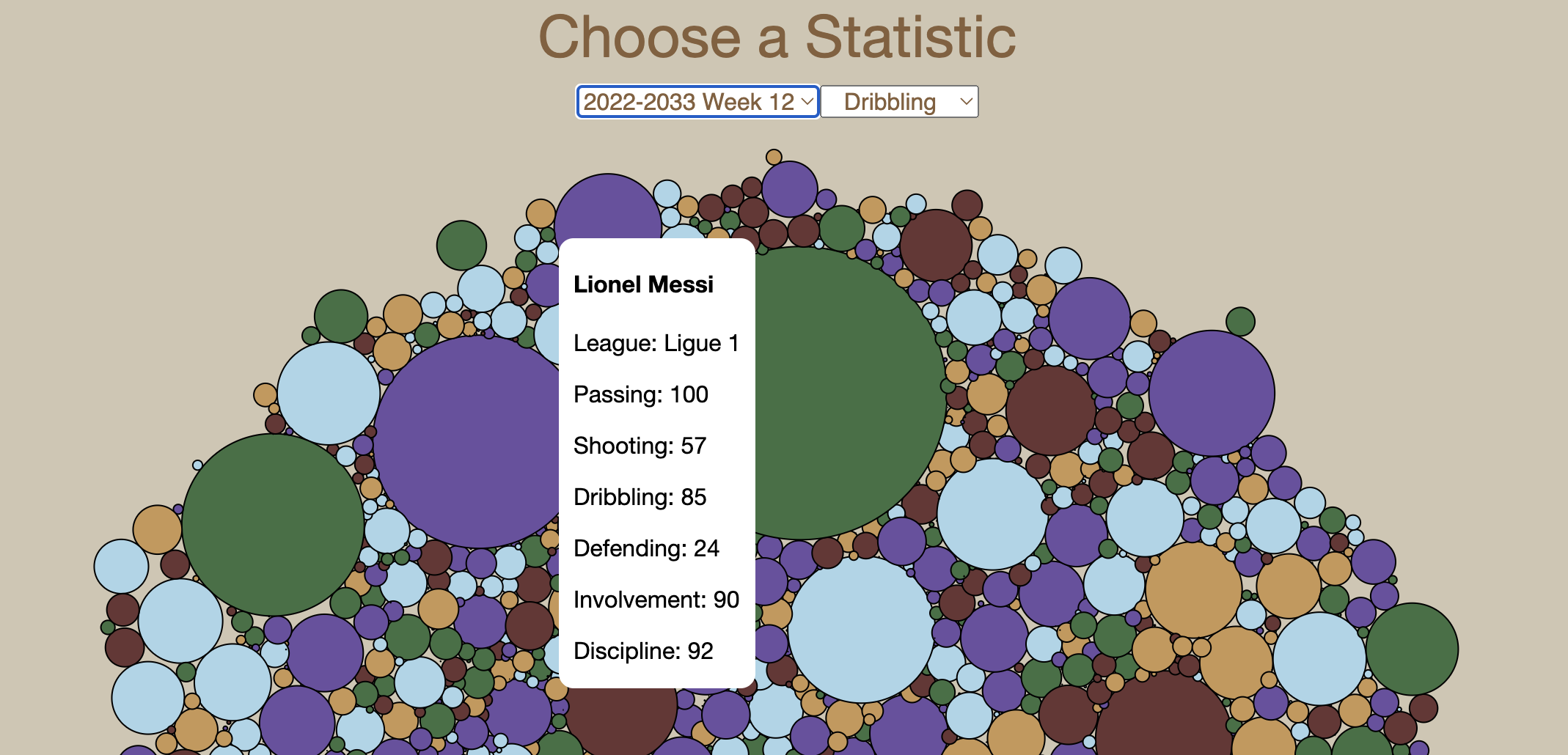
For the bubble chart, each bubble is a single player, the size of the bubble is related to the selected stat chosen, and the color of each depends on what league the player is in. The two dropdowns above it are for selecting the time period the stats are from and the statistic you want to look at. Changing the selection updates the chart to portray the correct data. When you hover over a bubble, a tool tip pops up with the players name, league, and aggregated stats.
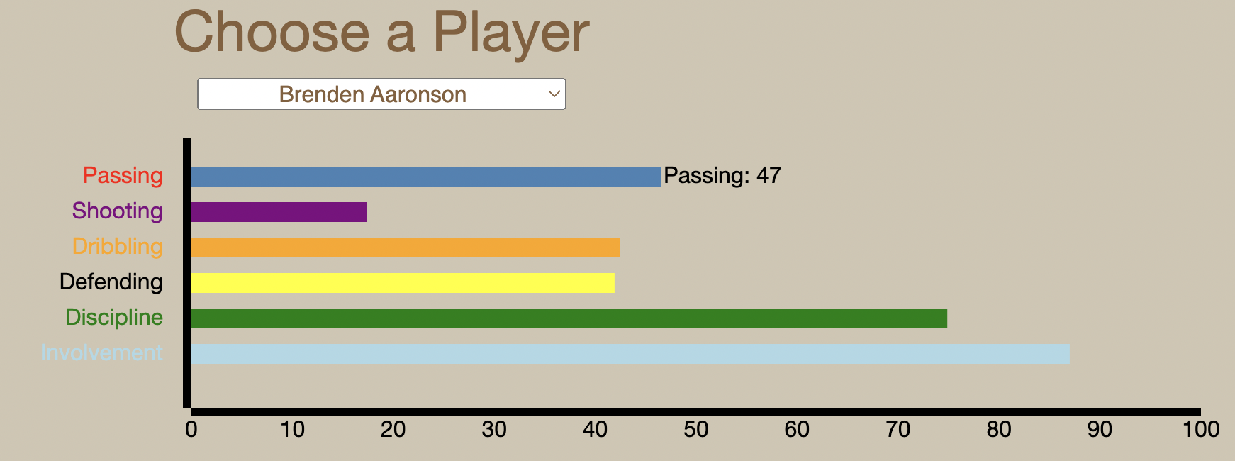
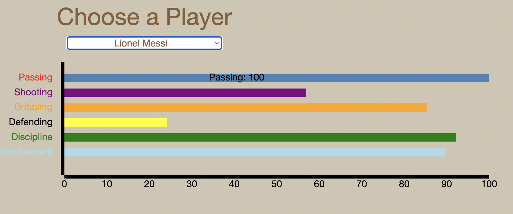
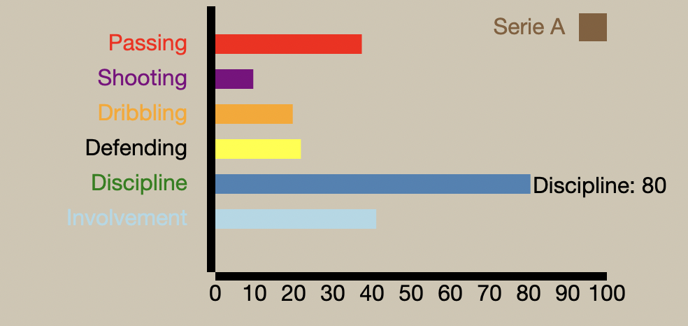
As for the bar charts, there are two different areas with bar charts: the player comparison tab and the statistical info tab. In the player comparison tab, the bar chart's values update with the player selected from the dropdown menu. Each bar can be hovered over to see the specific value of each. This hover is the same for all the bar charts in the statistical info tab. All the bar charts in the statistical info tab have static values.
From our data visualizations, we truly understood how large our original dataset was and how many players in these leagues no one really hears about. We learned that most of the top players that are always getting press such as Lionel Messi, Kylian Mbappe, and Eerling Haaland are all backed by the aggregated statistics. We also found a number of players who are backed by the stats and are not very well known in the soccer world. Before the World Cup, Sofiane Boufal and Azzedine Ounahi were not known to the world and ranked very high in the dribbling statistic. We were surprised to see these two being such large bubbles when creating the bubble chart. During the world cup, both shined for the Moroccan national team helping their team get to the semi-finals. From this, we saw how effective using the bubble chart was to spot hidden talent. While we are not saying that every player with high scores is a great player as some of these stats must be contextualized, we do see how this method could help identify players to watch. We also learned from our league averages that while the difficulty in leagues may vary, the averages of stay relatively similar meaning no league is significantly more pronounced in any statistic. While some leagues have reputations for certain styles of play, player data tends to average out. Our visualizations work well as they helped answer our questions that pertain to the data. To improve them, we believe that a greater amount of filtering options for users could help them identify different patterns and trends more easily. We also think that more user feedback on the styling and use of our visualizations could help us improve on making the website more user friendly.