Process Book
Christopher Patrick, c.r.patrick@wustl.edu, 488360
Ruiwei Xiao, ruiwei@wustl.edu, 500959
Climate change is a global phenomenon that will affect every single
human in every country across the Earth; thus, it is an issue every
country must address. However, we suspect that climate change might
disproportionately effect countries around the world. We will be
evaluating this through CO2 emissions, which has been proven to be a
contributing factor to climate change, the ND-Gain Country Index, a
score of "vulnerability to climate change and other global challenges"
created by University of Notre Dame. To supplement this, we also want
to observe which countries have been doing their due dilligence in
combating climate change by taking a look at their climate policy
efforts and investment in renewable energy.
Wealthy nations like the United States tend to be major contributors
to the causes of climate change, so we want to explore whether it will
be impacted by the effects of climate change as much countries that
have contributed relatively little. We hope this will bring more
attention to the disparities of this global phenomenon and encourage
people to think complexly about the role each country can and should
play in the effort to combat climate change.
We got inspiration from this large scale study of carbon emissions from each country: https://ourworldindata.org/co2-emissions This study takes a look at a lot of different aspects of CO2 emissions and how much each region of the world has contributing to it. It presents a lot of useful tools for comparison between different countries and how data has changed over time, so we took some inspiration from the way they presented their information and the way they led the user through the data with question prompts.
There was quite a bit of data cleaning, that mostly involved restructing the datasets so they could be read into D3 as a csv, handling a few missing values, and changing columns to the right datatypes.
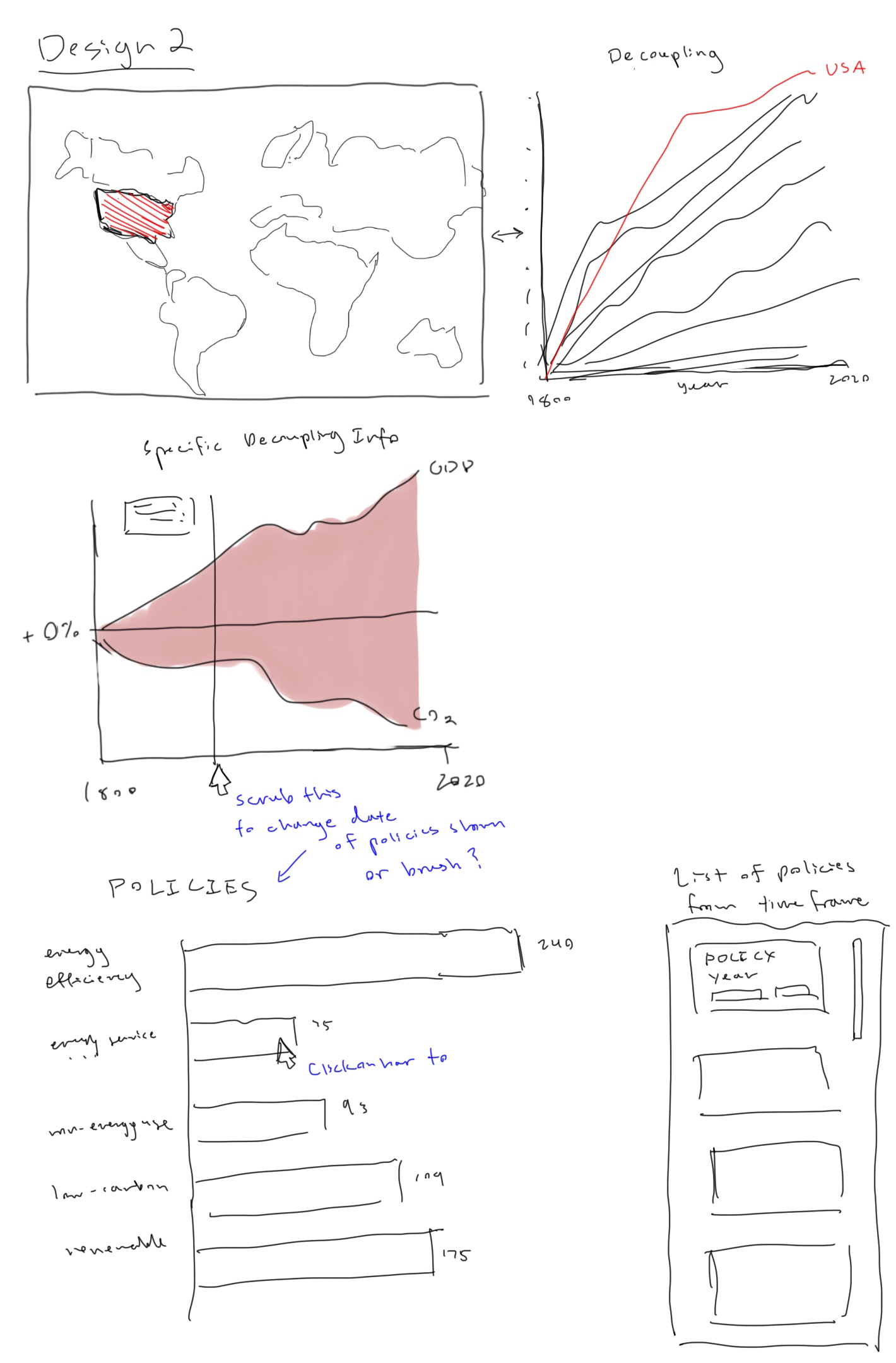
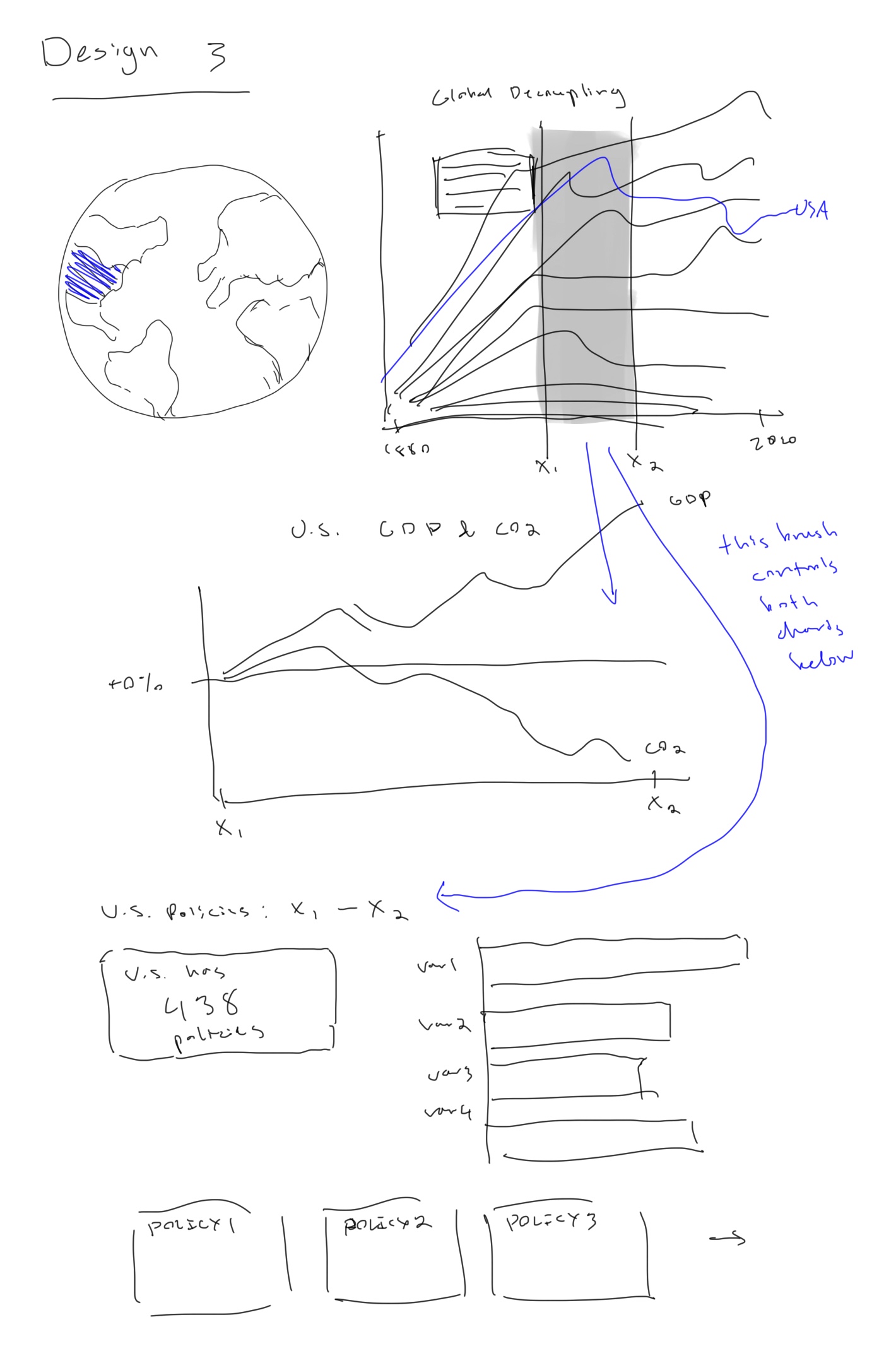
Because our data involves all countries around the world, we knew we wanted to include a map or globe of some sort as an entry point and navigation tool for the user to select a country they may be interested in.
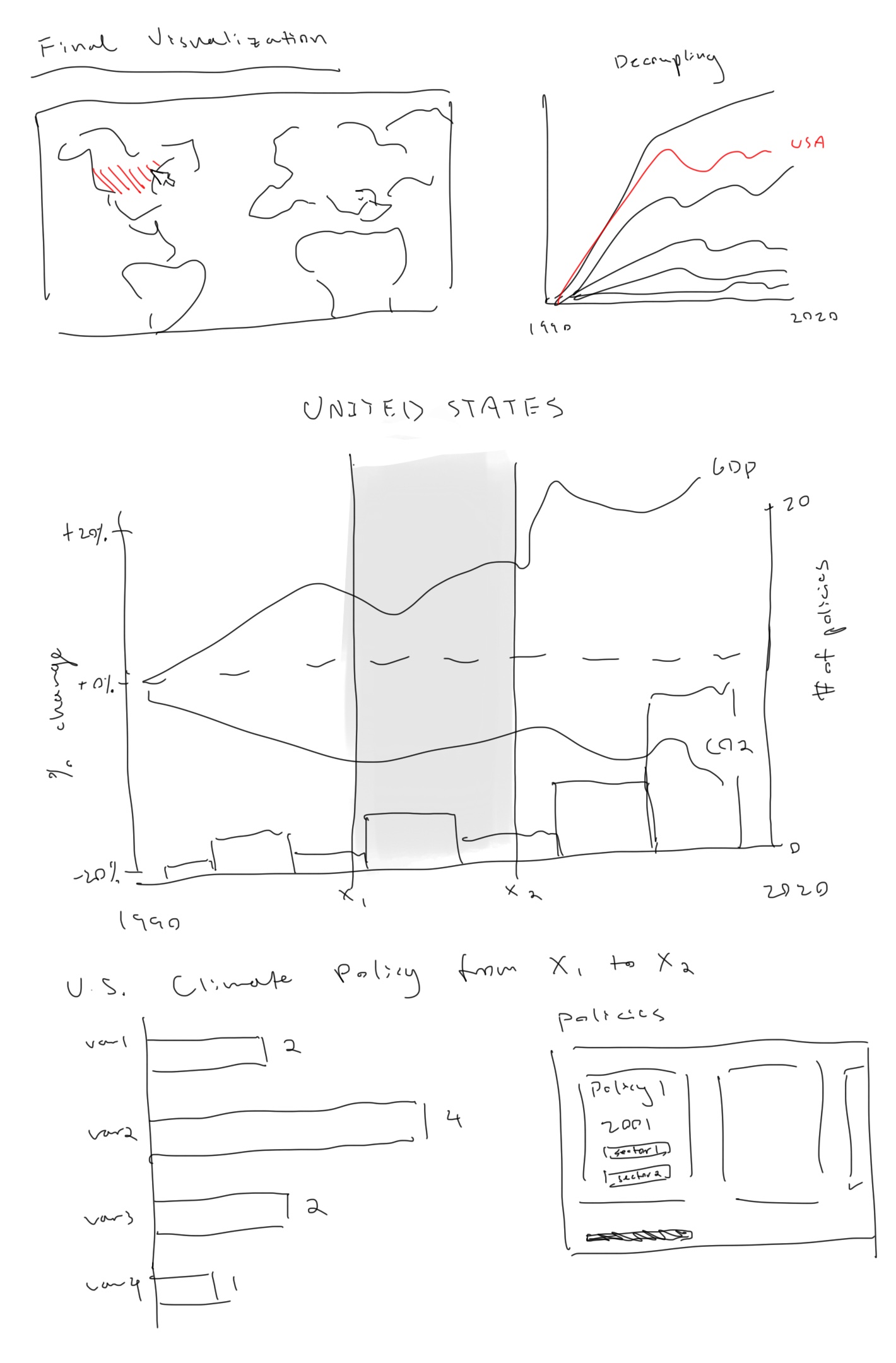
Because our CO2 data changes over time, we initially decided on a line chart, as this would be the easiest way to show information that changes over time.
We wanted to display our policy data as a histogram/bar chart, showing the number of climate policies that were created each year.
These initial sketches explore some different iterations of ways to present our data. We decided on a final design with a map andline graph of all countries decoupling data as an entry point, and then a detailed view of CO2 and GDP trends over time along with the number of climate policies that were created each year. The user can then scrub over the timeline to see the specific breakdown of policies created within that time period.
This mock-up addresses a change in layout so the user can see changes in the graphs more easily (rather than having to scroll up and down when they want to change the data). The open panel on the right will display the specific data, while the left with act as the "control panel," where users can select a country on the map and see where it stands in its decoupling compared to other countries.
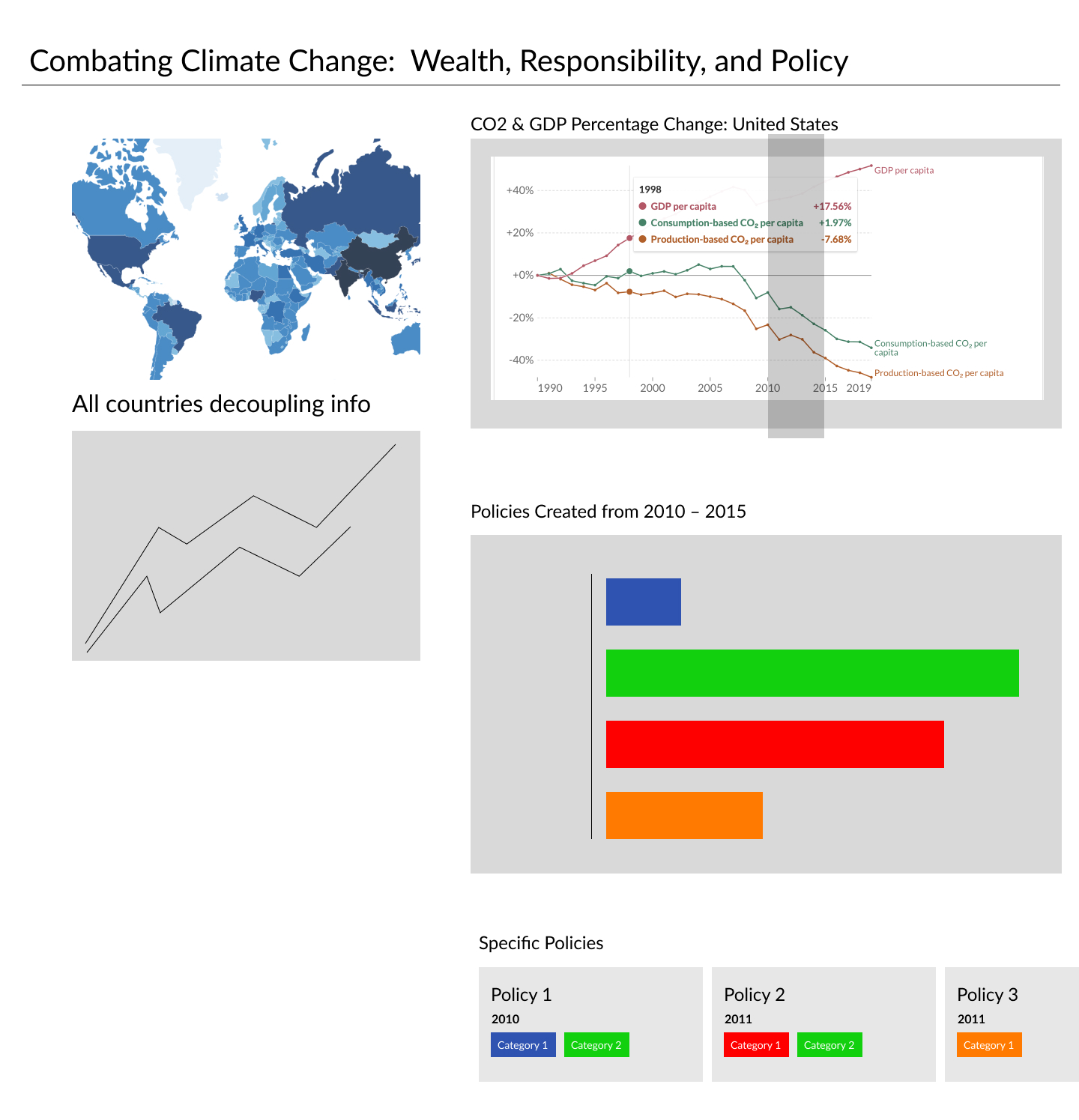
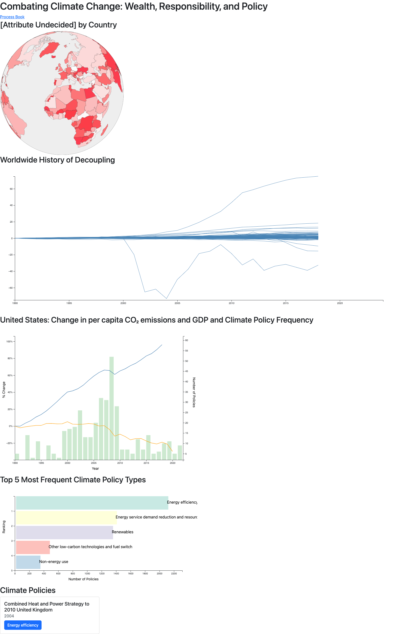
However, it is following this implementation that we decided to pivot the aim of our project because we wanted to answer new questions and found our original goal hard to implement in a clear and understandable way for users. In our Milestone 1 prototype, we were addressing these questions:
During our exploration, we decided we wanted to explore more specifically as to how certain countries would be affected by climate change, as we noticed more wealthy and developed nations were able to decouple, while developing nations were much less capable of decoupling, and this made us consider how there might be disparities in how climate change affects different nations around the world. We adjusted our questions to target the questions:
After getting some feedback on our designs, we realized it might be hard to understand our main graphs and the data it was trying to express. Our country-specific graph was also not showing correlation between our information very well, so with our new questions, we decided to redo our visualizations to tell a story more coherent.
The goal of our main visualizations - as it was from the beginning - is to show that there are some countries that should be taking more responsibility than they are now. At first, we tried comparing ND-gain (a vulnerability index) data to co2 emissions, but this was difficult to understand. We instead decided to show responsibility by comparing co2 emissions as a percentage of total emissions and world population percentages. This is shown below by darker countries having a greater co2% to population% ratio. Furthermore, we have a scatter plot that allows that user to more easily target countries by ratio value.
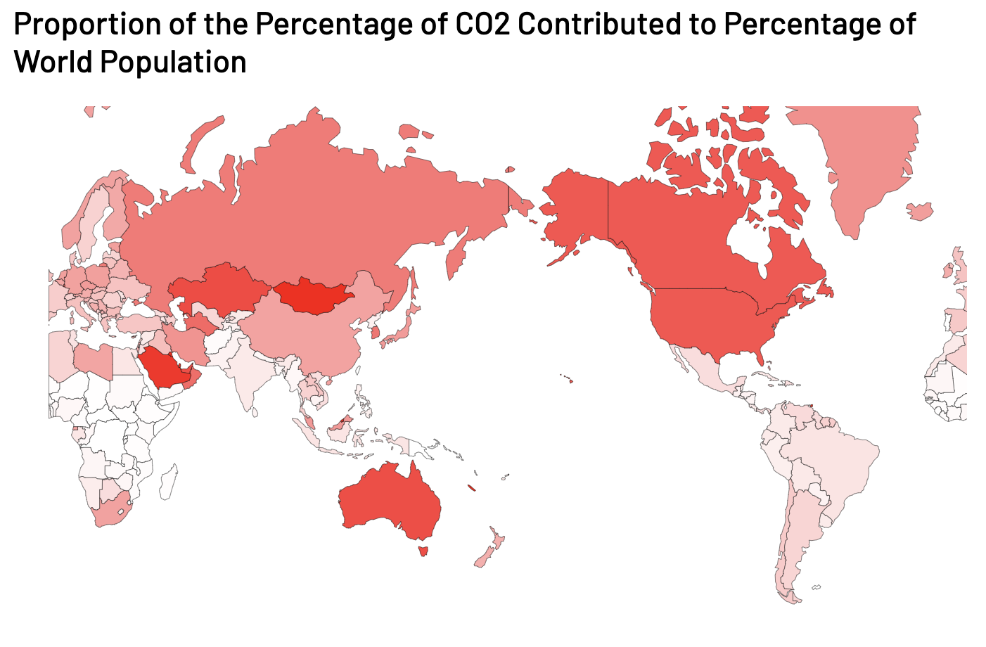
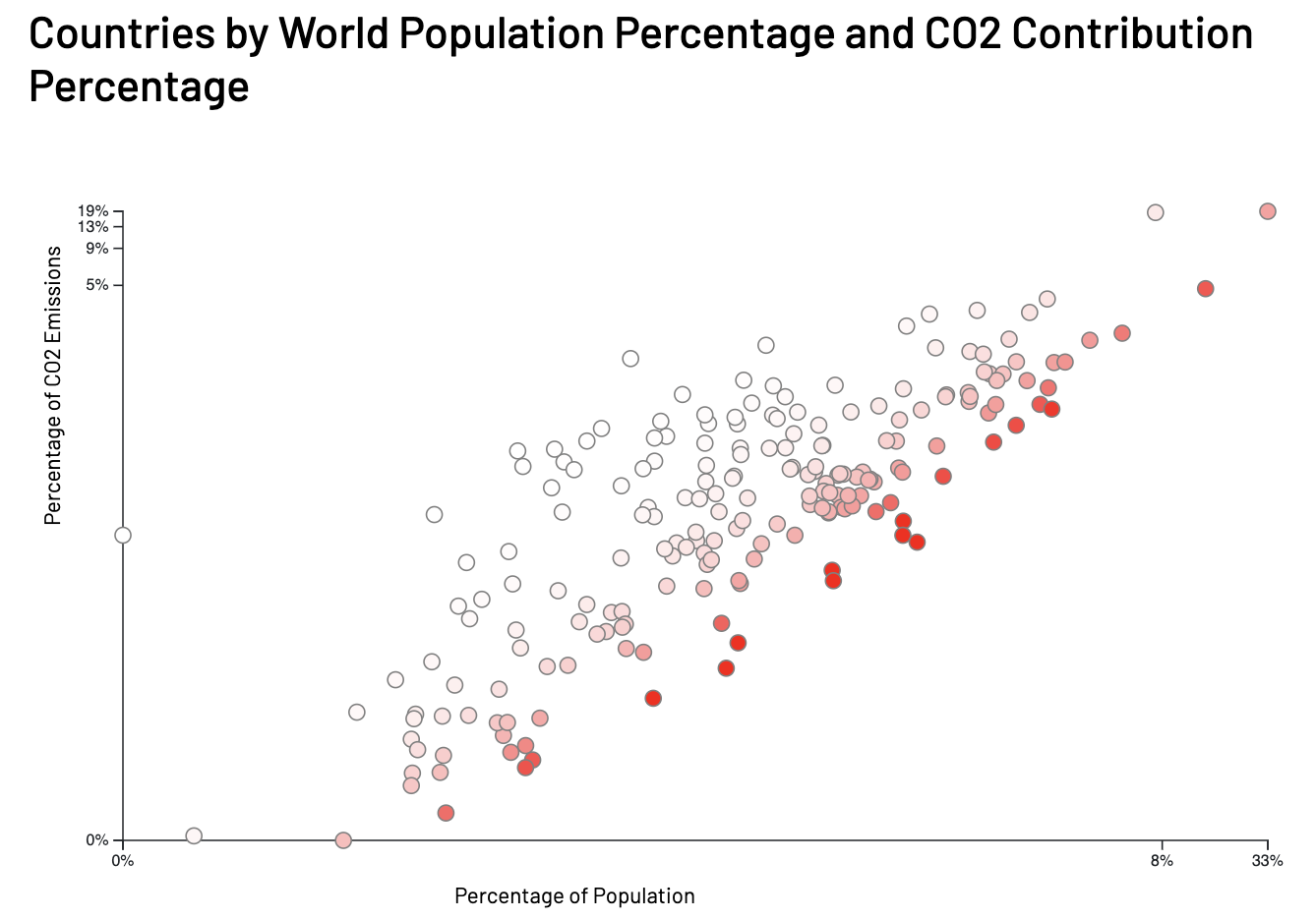
One thing that changed from our previous iteration is the inclusion of renewable energy data over time. Our goal is to point out countries that need to take more responsibility, and answering the question "is this country heading in the correct direction" helps complete the narrative.
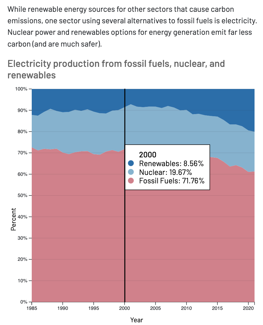
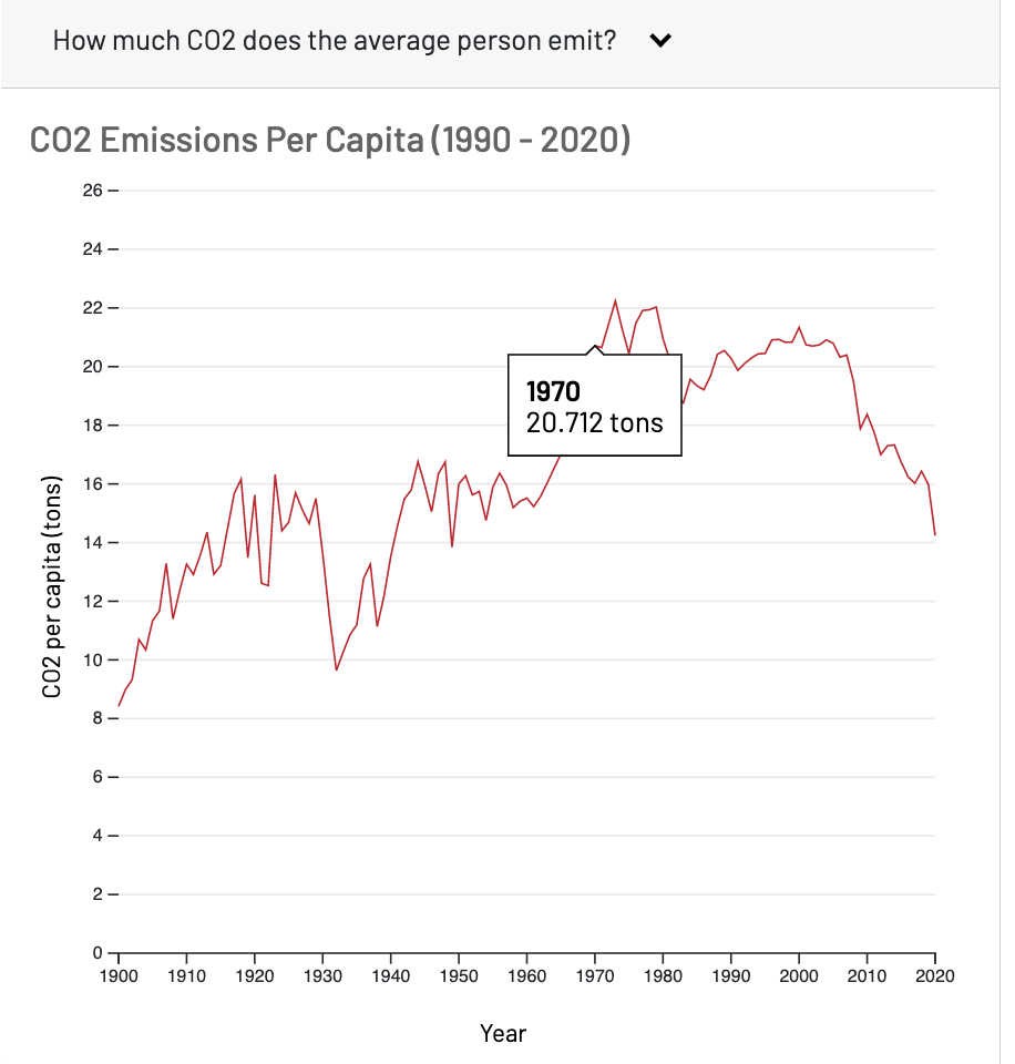
Additionally, we believe that simply giving presenting the co2 data over time allows the user more perspective than they would have if they were only to see the map which is only a snapshot in time. We are no longer pursing the decoupling concept from milestone 1, so we are presenting the co2 data in a chart by itself. Similar to the renewable energy visualization, we want to allow our viewer to see if the country is heading in a positive or negative direction.
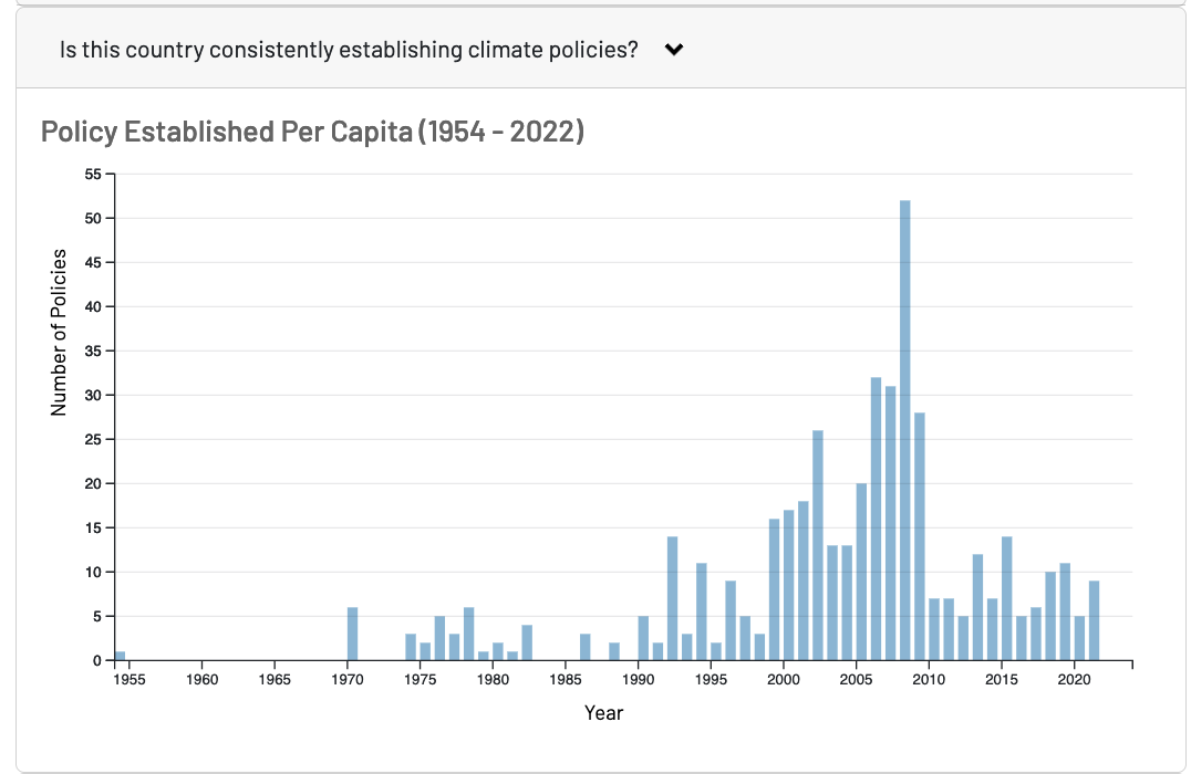
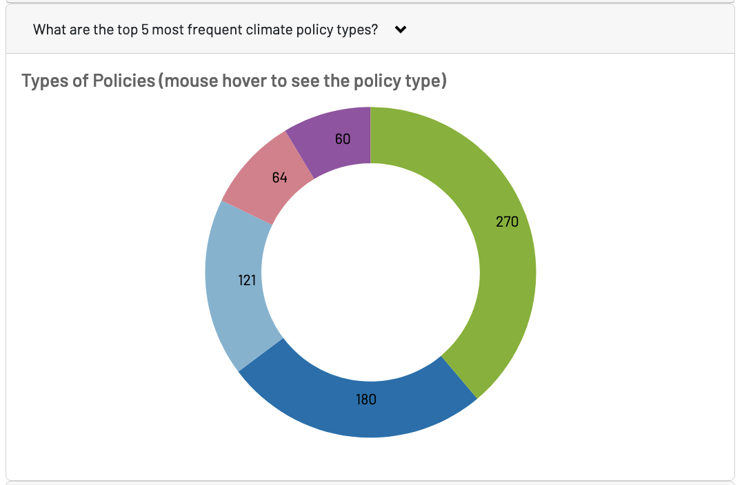
Finally, we decided to continue on our path of visualizing policy creation over time. Policy is not the only factor that contributes to emission changes, but it plays a big role. We give the viewer the chance to see if a country is consistently creating policies so that the user can speculate whether the country is putting in sufficient effort to benefit their situation. Below, you can also see a chart with the breakdown of policy types. This is so that users can be aware of the specific actions actions a country is taking.
We are happy that our message has become more refined and comprehensible since milestone 1. We look forward to to in-person evaluations to see which of the visualizations users pay attention to the most. With this, we hope to further narrow down our message to explore a narrative that our classmates are most interested in.
Bostock, M. (2021, October 20). Line chart, Tooltip. Observable. Retrieved November 30, 2022, from https://observablehq.com/@d3/line-with-tooltip
Moxy, L. (2018, October 3). Create a D3 line chart animation. Medium. Retrieved November 30, 2022, from https://medium.com/@louisemoxy/create-a-d3-line-chart-animation-336f1cb7dd61
https://observablehq.com/@d3/normalized-stacked-area-chart
Dragging: Retrieved November 21, 2022, from https://observablehq.com/@michael-keith/draggable-globe-in-d3
Gradient legend: Retrieved November 28, 2022, from https://stackoverflow.com/questions/39023154/how-to-make-a-color-gradient-bar-using-d3js