Group Members
Alex DiChristofano a.dichristofano@wustl.edu 450420
Eden Tibebu etibebu@wustl.edu 472813
Overview and Motivation
St. Louis has a history of racial discrimination tied to geography, with historically marginalized-majority areas of the city significantly underserved in comparison to whiter areas. Our goal is to investigate how historical discrimination practices and current geographic disparities connect to Citizen's Service Bureau (311) requests within the city, over a period of time from 2014 to present-day. This is a growing research topic and while there is a lot of data to constitute a future research goal, our first step is to process and visualize all of this data in its original state.
Related Work
Recently published research (linked below) has made progress in estimating underreporting in public 311 data, which can be difficult since you don't know if an issue exists if it was not reported in the first place.
Equity in Resident Crowdsourcing: Measuring Under-reporting without Ground Truth DataProject Objectives
- What does the geographic distribution of 311 requests in St. Louis look like over time?
- While some other major cities already have visualizations of this data, there does not exist a visualization of this data for St. Louis.
- How do these request patterns line up with other geographic phenomena, such as racial distributions, income inequality, or historic practices such as redlining?
- As with many geographic patterns in St. Louis, there may be trends which are concerning and threaten to perpetuate historical disparities but are not yet discovered.
- New Questions to Consider:
- Has there been an increase in 311 usages over the years and any changes in types/patterns of reporting?
Data
Our data is collected from the publicly available Citizens' Service Bureau (CSB) Service Requests (311) Dataset. Source: CSB Service Requests (311) Dataset
Pre-Processing:
Looking at the amount of data recorded before 2014 (2009 -2013), we assume the system was progressively being
put
into use (either the 311 hotline or the data recording of the hotline).
Specifically, before 2013, there was barely any data recorded, and during 2013, there was significantly more
data recorded, but about 10MB less than subsequent years (~25 vs ~35). Thus, for the sake of this project,
we
focus on data from 2014 onwards.
We also got geofence data for the various St. Louis geographies that we wanted to map, such as zip code,
census
tract, block group, and block. We decided to use block groups, of which there are 314 in St. Louis City.
Each 311 request has a coordinate in Missouri State Plane East Geometry, and we convert this to the CRS we
are
going to use in d3. We then perform a spatial join with the block groups, finding the block group in which
each
point resides.
Next we aggregate the counts of 311 calls by complaint type and by year for each block group.
In order to calculate the mean time to the close of a call, or request for service, we first have to clean the data.
Out of almost one million calls, 818 had a closure time that was ealier that the inititiation of the request.
While we considered these valid calls for the counts, we did not include them in the mean time to call closure.
Additionally, there appeared to be some outlier calls with extremely long times to closure.
Since it appeared that different categories of calls typically had different lengths to closure, we identified these outliers category by category.
We identified which calls were outlier calls by detecting which calls were above the third quartile by more than six interquartile ranges, and set the time to closure of these calls to the max for the category of call type with the outliers excluded.
Finally, we average call time to closure by block group, category, and year.
We merge this data at the block-group level with racial demographic data from the 2020 United States Census, and with poverty level data from the 2020 5-year American Community Survey.
The data on racial demographics includes the race and ethnicity of every individual residing in the block group, while the data on poverty level includes information about all adults living in the block group and whether they live above or below the povery threshold.
Exploratory Data Analysis:
What visualizations did you use to look at your data initially? What insights did you gain? How did these insights inform your design? We initially looked at visualizations for 311 data from other cities. The link below is a 311 data visualization for the city of New York.
Look Up Service Requests · NYC311We were inspired by this visualization to implement a feature to filter the data by year. This would allow for our users to engage with and find specific data they wanted more easily. We also found that point data (especially for large datasets) made the visualizations much slower and laggy.
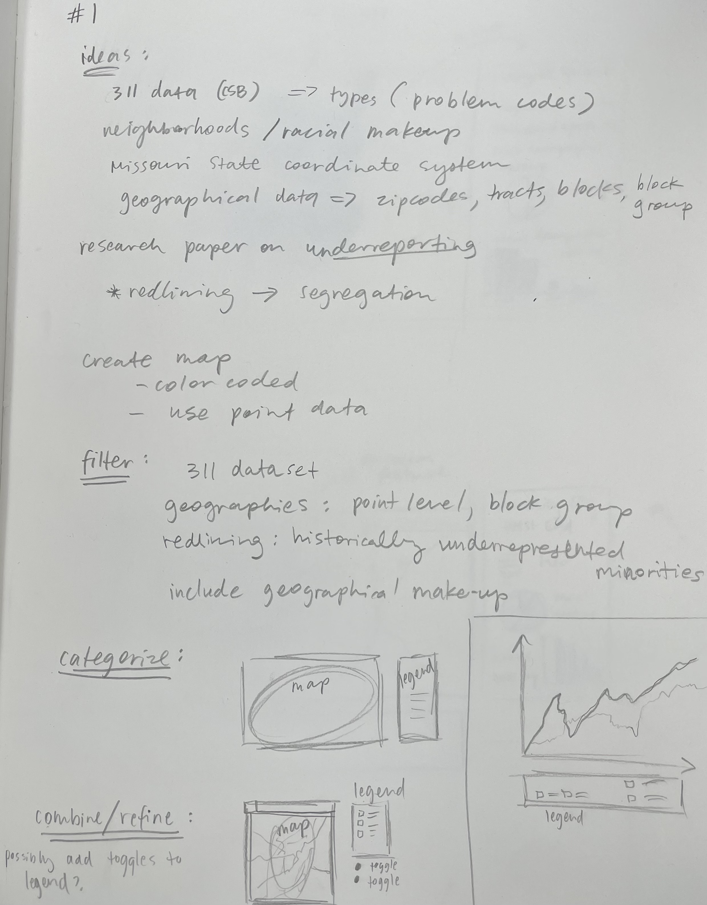
Design Evolution
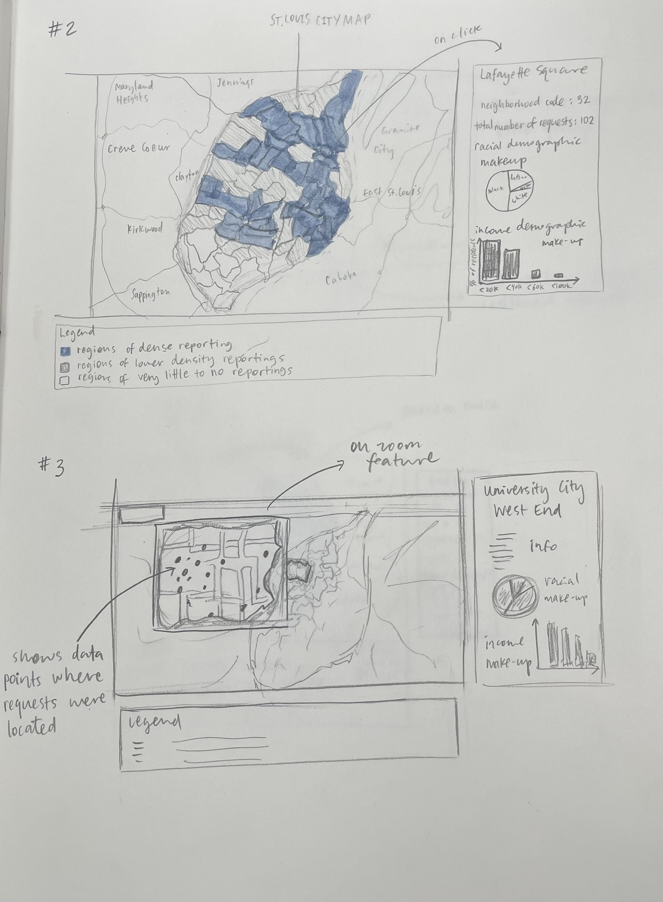
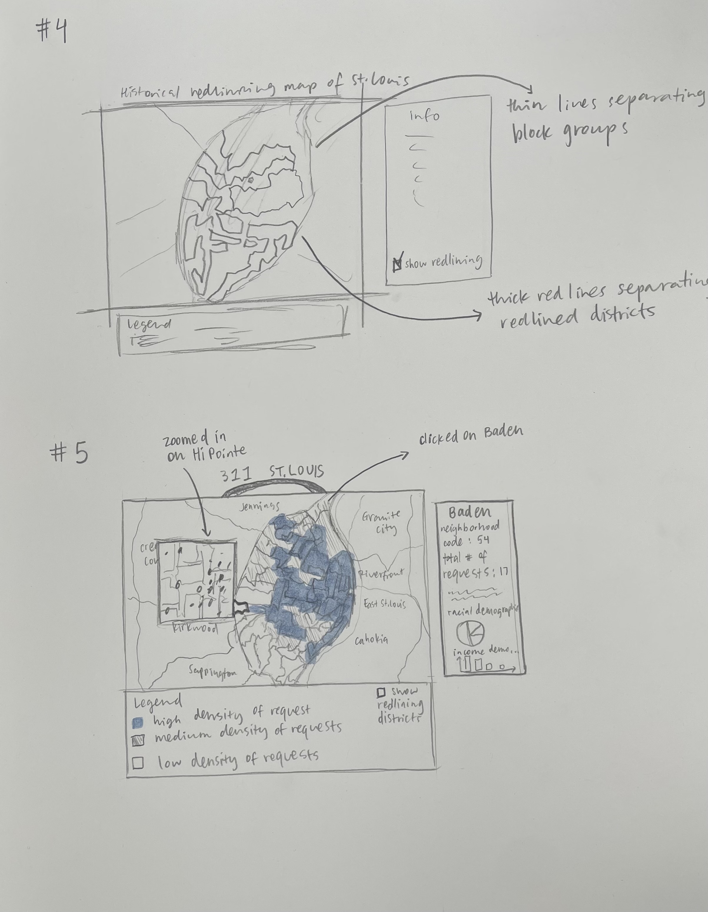
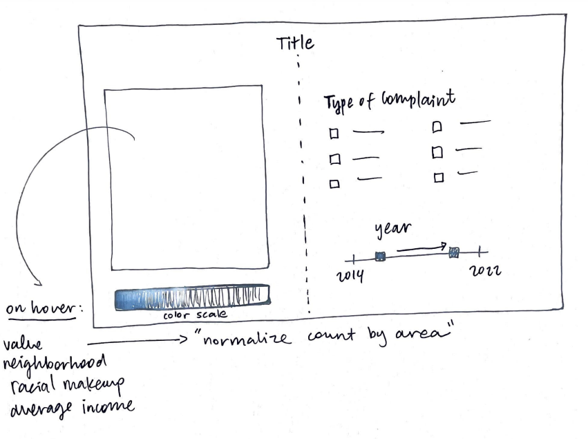
We need to have 1) a map of St. Louis city that is responsive to window size (can be upon refresh), as well as 2) overlaid service request data that is selectable by time and type of request. For a must-have feature, it should be aggregated at the block- group level, as this will produce a heatmap, which should be a pretty interpretable way to try and detect trends. In our proposal we said we wanted to have service requests indicated by points laid on top of the map. This also could include adding other geofences of interest, such as integrating a map of historic redlining practices in St. Louis. We ultimately decided against this.
Implementation
Milestone I
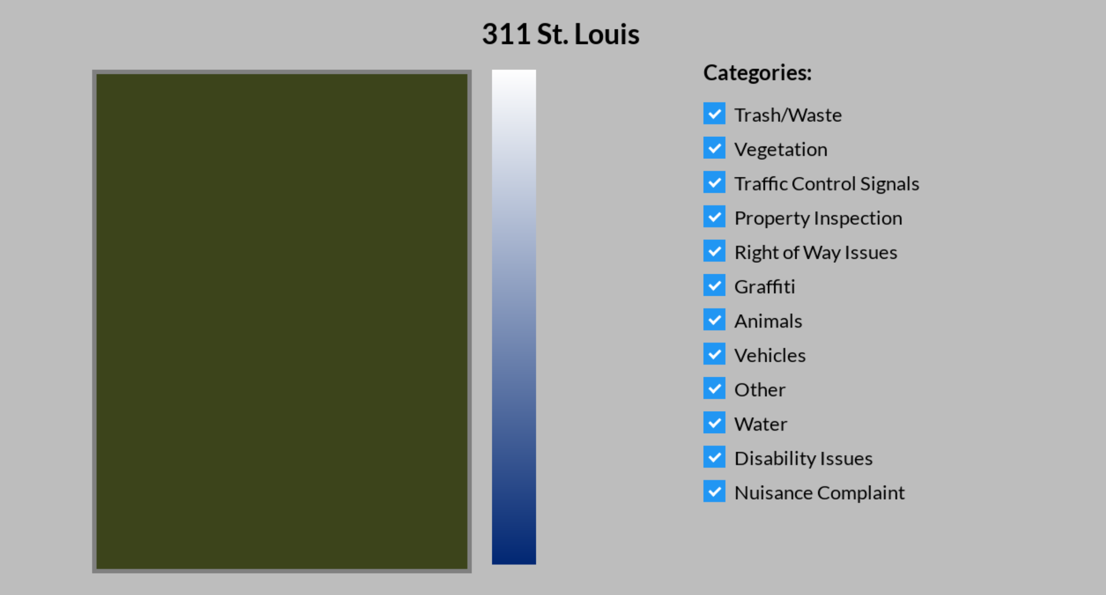
Our initial plan was to use leaflet.js as our mapping library to create our map of St. Louis. Ultimately, we came to the conclusion that we would not be able to customize the leaflet map enough to fit our needs, one being the use of block groups. We underestimated that implementing the block groups in map would be the most challenging part of the project as it took us a lot more time to get the preprocessed python code to work with our d3 code. We then decided to tackle its implementation first, by layering maps on top of each other. We did this by first making the regions map (including the states MO and IL), then layering the map of the city of St. Louis, and finally layering the map of the block groups on top of that. The image below shows the output of this process in python.

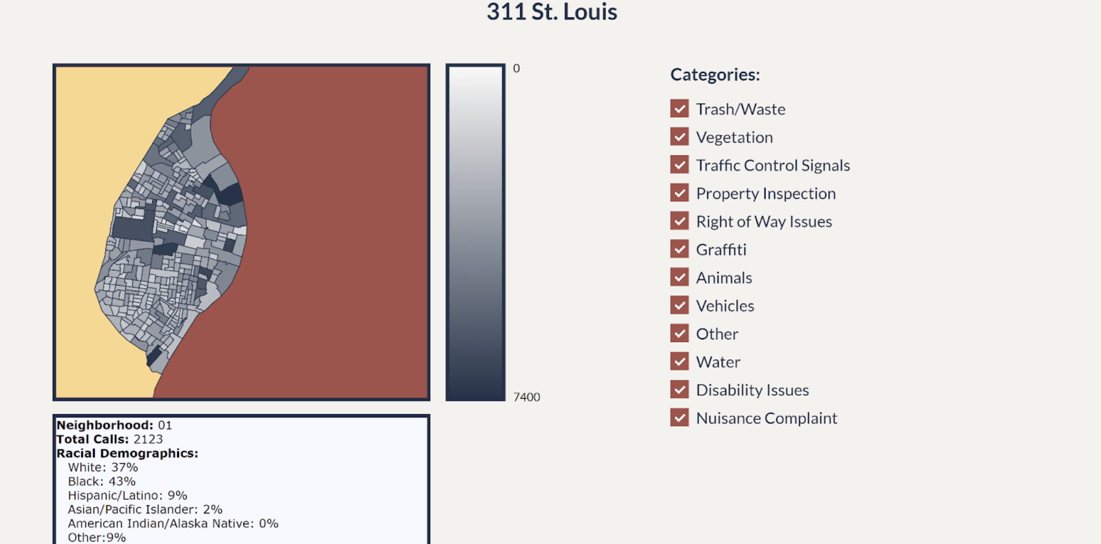
Next we added a color scale to map colors to the number of 311 calls collected over a period of 8 years (2014-2022). We also created a legend to add context to the map. Another feature we added was the use of checkboxes to filter the categories or types of calls made. This allowed for the user to choose to represent a specific type of call on the map over all available years. That way, the user could interpret the information as they observed it through the interactiveness of the feature. The image below shows a screenshot of the main page.
Milestone II
Based on feedback from our milestone one submission, we implemented the following changes:
We changed the color scale to show a more significant difference between higher and lower number of calls. We also changed the color scheme of the site to fit our theme (we used St. Louis City colors) and to make the site more appealing for users. We felt it was important to add more context to the map, so we created a tooltip that displays relevant information on hover. At the time, the tooltip showed the neighborhood ID, total calls, and racial demographics of the chose block group. The image below shows the changes we implemented.
Final Iteration
For the final version of our project site, we took into account the feedback we received from the professor
as well as the results from our
user studies. We implemented the following changes:
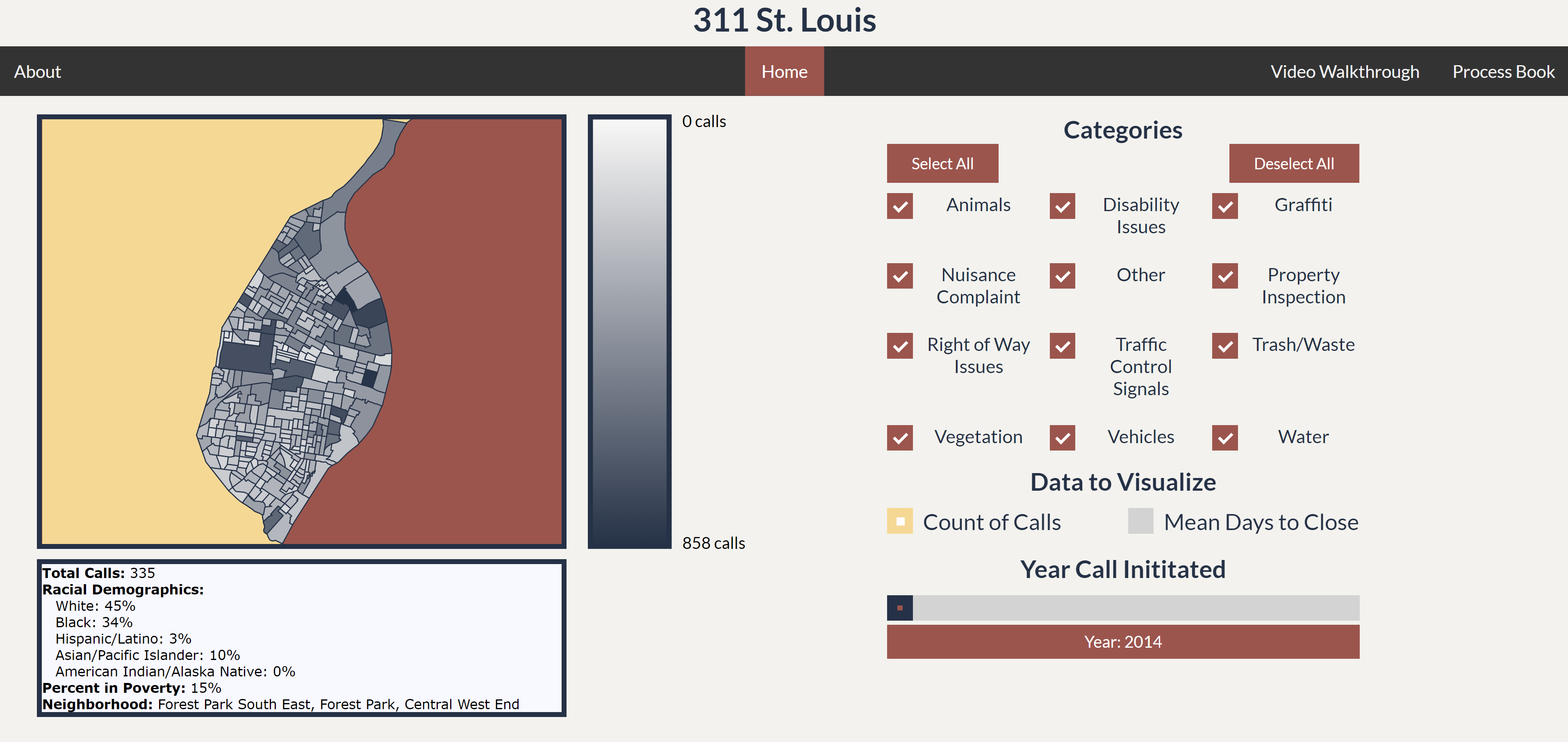
We were told that having the categories be in alphabetical order would make it easier for the user to
find specific categories they wanted,
so we ordered them alphabetically and separated them into 3 columns instead of having all of them in one. We
also added a Select All and Deselect all
button to make it easier for the users to select all categories at once (instead of having to click each
checkbox one by one). We also implemented
a year chart slider to filter the data through the years. Throughout our building process, we had to make
sure that our site could filter by categories
and years at the same time without clashing or overriding each other. We also had to find a way to make sure
the site had an initial data filtered state,
which we decided would be year: 2014 and all categories selected.
One thing we felt was important from the beginning of the project, was that we wanted to show not
only the racial makeup of the individual block groups,
but also the income disparities. So we implement a new tooltip where we added the percentage of residents
below the poverty line.
We also got feedback from other students who said the neighborhood IDs were confusing, so we found a dataset
from the census that included the names
of the neighborhoods in the block groups and added that to the tooltip. Finally, to answer our initial
question on how long does it take for
each call to be close/resolved, we added radio buttons to toggle between showing the number of calls on the
map and the average days it takes for
a call to be close/resolved. This now allowed for the users to go between the two types of data to compare
and contrast them as well as the see
and visualized trends between specific neighborhoods, the racial/income makeup of the neighborhoods, as well
as the number of calls and average days
for resolution.
We also thought it would be helpful to create a tutorial for the site, which we added to our about page.
The image below shows all the changes we implemented.
Evaluation
User-Studies
Evaluation 1
Session 1: Think-aloud method
Assuming that the map is of St. Louis the city The scale tells me how many calls there have been in a certain area If deselect the boxes there will be less calls What is this place - it's so triangular (It seems that the categories are not clear what they really mean) If this is St. Louis, where's the arch? Confused by the counties of Missouri and the river Keeps trying to explore outside of the city WHERE'S THE ARCH???
Session 2: Ask the user to perform specific tasks
Which three block groups have the most calls across all categories?
Seemed relatively easy
How many calls for trash/waste are there in Forest Park?
Was semi confused but guessed right, but then was confused again
Are there more total calls for trash/waste + water or vegetation + right of way issues?
The way this question is worded it is impossible to answer because we don't have total counts
One district might have more calls, but can't tell whether there are actually more calls
Which colors do you like the best?
Dark green can give off water vibes, lighter green gives off more tree/forest/land vibes
Session 3: Feedback/Critique
What if you can tell me I am Illinois now?
Would have been nice to know where forest park was, put landmarks in
like the checkmarks
could move map and legend down to align with the checkmarks
Session 4: Debrief
Evaluation 2
Session 1: Think-aloud method
Instinct is to click on a region, but nothing happens
I see that there are values, they seem to work on the color scale
Not really sure what the values mean, assuming that more calls are darker and fewer calls are lighter
I am going to uncheck all of them because I want to see a specific one
I am not very familiar with St. Louis, they were using different types of categories to find their way around the city.
It's interesting that there is this one region that has a very high number of property inspections, it would be nice to have more information so I can look it up later
Doesn't know what some of the categories mean
Not realizing that the scale is changing
Session 2: Ask the user to perform specific tasks
Which three block groups have the most calls across all categories?
Needed to go back and check all categories
Don't know the names of the groups
How many calls for trash/waste are there in Forest Park?
I feel like the biggest one is forest park, confused about whether it is that or wash u and why the size isn't the same
Are there more total calls for trash/waste + water or vegetation + right of way issues?
feel like I see more dark regions for vegetation + right of way issues
noticed that the scale was changing
Which colors do you like the best?
blue from alex first with green from alex second
Session 3: Feedback/Critique
Need select all and clear all
Could improve order in which categories are listed, alphabetical probably best
Want it to show up on hover, want it to stay on click
overall pretty intuitive to use, definitely not focused on the actual numbers at all, focused more on the gradients are shown on the geographic space
display count of category and description on hover
What did you learn about the data by using your visualizations? How did you answer your questions? How well does your visualization work, and how could you improve it?Reflection
Through our visualization, we learned many things about the data. For one, we saw a correlation between the number of calls and the income levels (for the majority of cases, the higher the number of calls, the higher the poverty rate). We also found some interesting datapoints that we don't have explanations for that we'd like to examine in the future (ex. Why does Tower Grove have so many calls about Grafitti?). Our visualization answered our questions: "What does the geographic distribution of 311 requests in St. Louis look like over time?" and "How do these request patterns line up with other geographic phenomena, such as racial distributions and income inequality?". This is because we can clearly see trends in the data distribution of our map and can compare the racial demographics and income levels along side the number of calls/average days to resolution and observe patterns. In the future, we'd like to add more data filtering features as well as line graphs to show linear trends in addition to our map.