Milestone 1 Process Book
Main Page Milestone 2Basic Info
- Title: Team Todd
- Russell Scharf, rscharf@wustl.edu
- Marissa Kalkar, mkalkar@wustl.edu
- Bo Anderson, boanderson@wustl.edu
- Repo link: https://github.com/csex57/cancer
Overview and Motivation
Cancer, a diverse class of diseases, is typically characterized by uncontrollable cell growth. This simplification is often misleading, as in reality the disease is extremely complex and is responsible for nearly a sixth of deaths worldwide (Bray). Roughly 1 in 2 men and 1 in 3 women will themselves develop cancer over the course of their lives, and it goes without saying that nearly everyone in the world will be touched by cancer in some capacity throughout their lifetime.
Despite its massive prevalence and enormous research effort, the age adjusted mortality* rate for cancer patients has remained stagnant since 1930 (Azra Raza). This means that in over 90 years, the life expectancy of cancer patients has remained largely unchanged. Despite frequent news of “breakthroughs in treatment” and “game changing discoveries”, the cancer treatment complex composed of clinicians, researchers, and pharmaceutical companies remains largely stumped in combatting and curing cancer. Massive amounts of funding and resources are allocated towards cancer research each year but the return on investment remains unfathomably low.
*age adjusted mortality: controls for the effects of differences in population age distributions
Related Work
Azra Raza is an oncologist and professor of medicine at Columbia Univesity. Several of her works, including her book titled The First Cell, have inspired our team to pursue this project. While extremely optimistic about the future of the war against cancer, Raza is frusterated with how little progress has been made over the years.
The notion that progress is low is surprising given the amount of resources invested into cancer research and drug development each year. Our team wanted to visualize cancer diagnosis and mortality rates to observe whether or not Raza's frustration is justified.
Questions
Questions: What questions are you trying to answer? How did these questions evolve throughout the project? What new questions did you consider in the course of your analysis? The following questions are answered for each type of cancer:
- Who is affected the most by the cancer in the US by state and demographic?
- What is the survival rate for type of cancer?
- What are the trends of cancer rates throughout the years?
- What stage is the type of cancer usually caught?
- What are the different treatment options for this type of cancer?
- What are the survival rates for each treatment option?
Data
Acquiring and parsing data has proven to be an extremely large part of making this project successful.The Centers for Disease Control and Prevention (CDC) have set up databases that “researchers can access and analyze high-quality population-based cancer incidence data on the entire United States population. De-identified cancer incidence data are available to researchers for free in public use databases.” (CDC). The data available to the public include cancer incidence and population data for all 50 states, the District of Columbia, and Puerto Rico, providing information on more than 31 million cancer cases.
The databases include data by demographic characteristics (for example, age, sex, and race) and tumor characteristics (for example, year of diagnosis, primary tumor site, histology, behavior, and stage at diagnosis) (United States Cancer Statistics). The current data comes from the 2020 National Program of Cancer Registries (NPCR) and Surveillance, Epidemiology, and End Results (SEER) program submissions, which include cancer cases diagnosed from January 1, 2001 through December 31, 2018. The data is accessible through the SEERStat software.
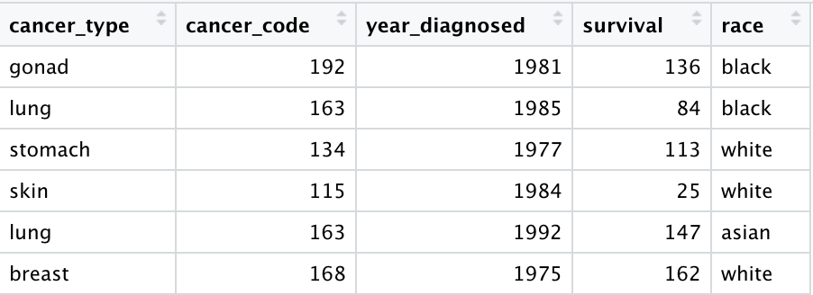
Our team has been approved to access the data and download the SEERStat software required to do so. The data we have downloaded thus far consists of over 5 million individual cases of cancer, each with over 200 variables that describe each case (age, race, cancer site, treatment, etc.). Many of the variables that we will be using need some adjusting from the raw data. For example, the type of cancer that each patient had is in the form of a code. A table online gives the conversion from each code to a specific cancer type. We used R to efficiently translate each code into its corresponding cancer type.
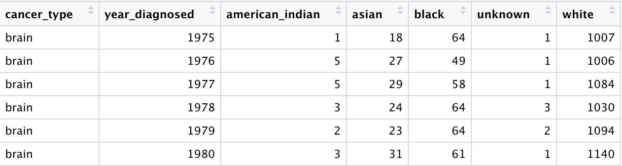
Feeding D3 a table of over 5 rows would be a flawed approach for what we are trying to achieve. This would lead to extremely slow runtimes and would ultimately get in the way of the information we are trying to convey to the users of our visualizations. To that end, we used R to do a lot of the computationally-intensive data processing. For example, our visualization allows for users to look at the proportion of new diagnoses that occurred in different racial groups for a cancer and year of their choice. To lighten the workload of JavaScript, almost all of the computation necessary to display this data is already done. The 5 million rows of individual cancer cases were condensed to a file that contains only the information needed to create the visualization itself.
Exploratory Data Analysis
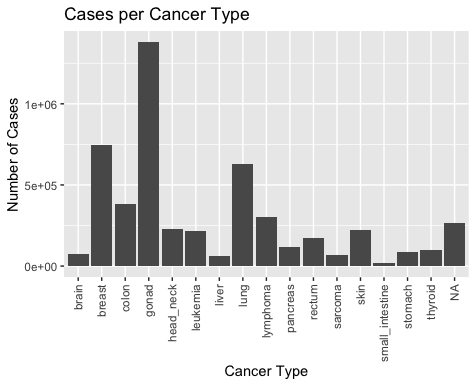
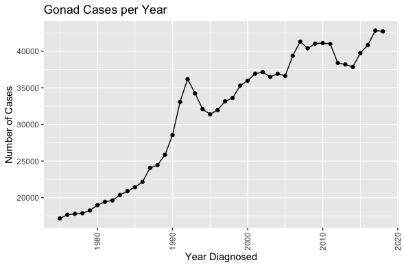
It was important to get a sense of what our data looked like before deciding on which visualizations to pursue. The four plots below were helpful in deciding what made sense to pursue, and issues to be aware of.
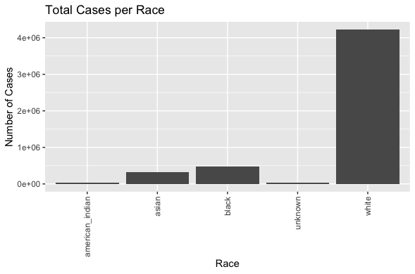
Specifically, it is important to note the large number of gonad cancer cases and relatively small number of small intestine cancer cases, as well as the rising number of diagnosed cases per year. While this would suggest that cancer cases are rising overall in the United States, there are other possible explanations to consider, such as improved reporting from doctors, or improved cancer detection techniques.
The plot in the bottom left shows that white people represent the majority of reported cancer cases. This too can be interpreted to mean many different things, but it is definitely interesting to note.
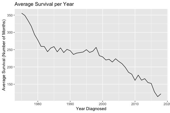
Lastly, the plot in the bottom right showing survival over time is the most surprising. It would have been more reassuring to see survival rates increasing over time, but we are actually seeing just the opposite.
Overall, these initial plots reassure our team of our goal and we believe the visualizations in the proposal will be valuable and informative.
Design Evolution
Design Evolution: What are the different visualizations you considered? Justify the design decisions you made using the perceptual and design principles you learned in the course. Did you deviate from your proposal?
Throughout the course of our preliminary research, it was our goal to create a centralized, informative webpage that holds a lot of information in one condensed, organized area.
In order to achieve this, we placed an interactive human body at the center to indicate the main navigation hub. The human body will cause all of its surroundings to change, providing
a visually-pleasing transition into the next cancer-type data set.
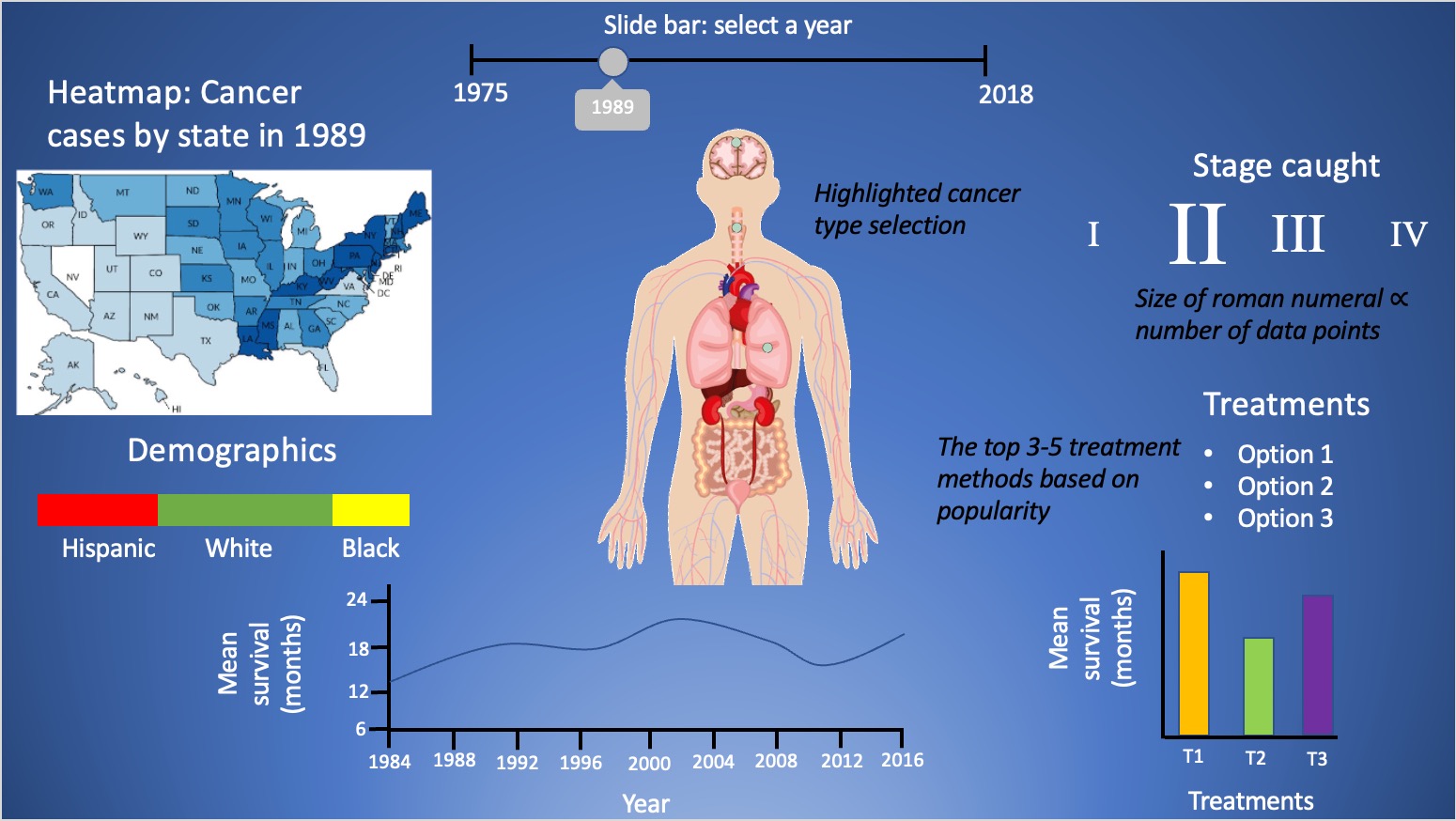
After the obtaining the data set as described earlier, we gained a better sense of the information we could use, leading us to want to provide a decent amount of information. The only way to achieve
this is to avoid repeating/common elements to display the data; the graphs should all be unique and eye-catching in their own way. Below is the original design made from PowerPoint slides:
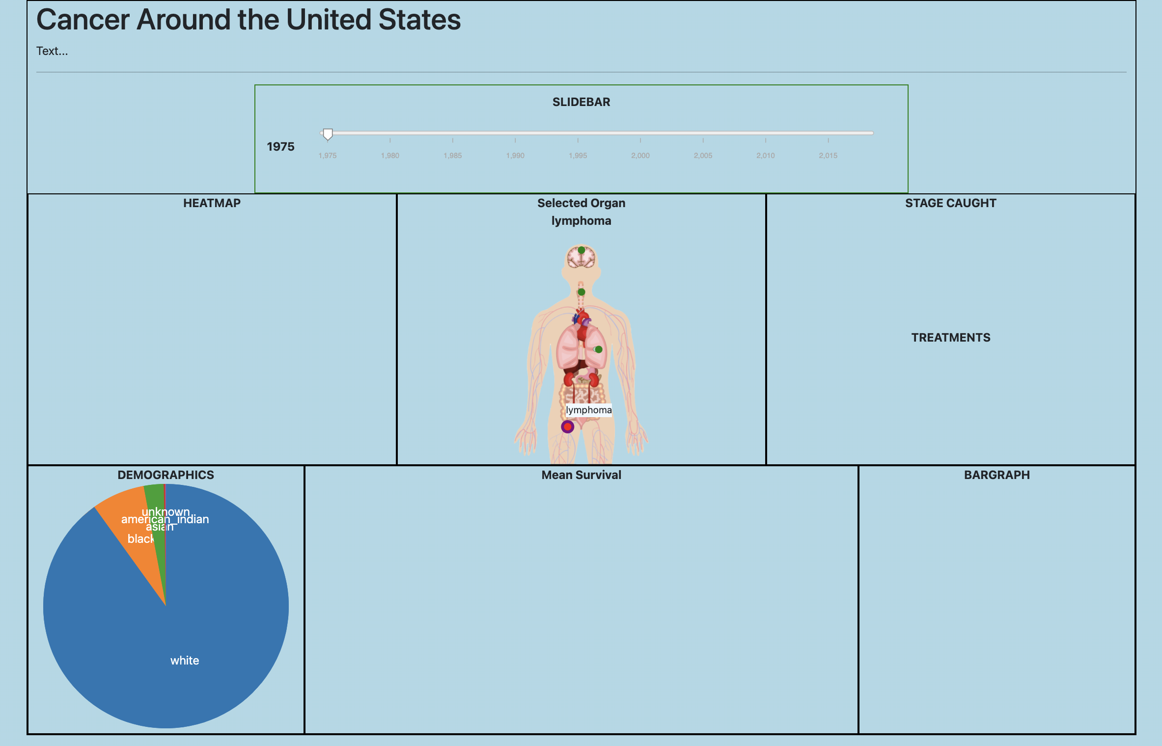
After turning in our project proposal, we stuck to our script closely as well as implementing them as sketched out, upon which we can clean-up certain areas later. As can be observed below with the current implementation, we have included many features introduced previously in this class including:
- D3 Event Handling
- jQuery
- SVG Charts
Current Version of Webpage:
Implementation - To Be Continued
Implementation: Describe the intent and functionality of the interactive visualizations you implemented. Provide clear and well-referenced images showing the critical design and interaction elements.
Evaluation - To Be Continued
Evaluation: What did you learn about the data by using your visualizations? How did you answer your questions? How well does your visualization work, and how could you further improve it?