Basic Info
Project Title: NBA Playoff Visualization
Jonathan Decavel-Bueff, d.jonathan@wustl.edu, 470716
Nicolas Giordana, nicolas.giordano@wustl.edu, 475410
Background and Motivation
As avid NBA basketball fans, we found it difficult to view previous NBA playoff performances in a visually appealing manner. The purpose of this project is to be able to show a timeline of historical NBA data in a way that doesn't overwhelm the user. A bracket-like visualization will be intuitive for the user. From there, they can select a certain game in the playoffs to see more in-depth information on the game, such as individual series matchup performance. The goal of this project is to provide a centralized place for NBA fans to view historical NBA playoff games without convoluting the visualization by just showing what is truly important.
Project Objectives
Questions
When analyzing the performance of two teams, is there a certain statistic that proves to be more important in deciding the outcome of a game and/or series than others. For example, a popular theory in today's league is that games are won with 3-pointers. Another very popular theory that you may have heard is that "defense wins games" or "defense is offense". Our visualization will help users answer which is actually true by being able to visualize how well a winning team's player performed when it comes to shooting 3-pointers or when it comes to getting rebounds. Since 2010, have 3-pointers become increasingly more valuable in determining the outcome of a matchup? Additionally, our visualization will help users determine if the outcome of a matchup determined by how well a team performs as a collective unit or if 2 or 3 very strong players can carry the rest of their team to victory.
The benefits of this project will unveil to the user age-old questions regarding team performance as well as individual player performance. NBA games tend to display unnecessary information to the viewers that don't tend to add much constructive information for the viewer. Our visualization will include only what is important. All of this information will also be unbiased.
Data
We will be downloading our data in the form of CSV files from: https://www.basketball-reference.com/leagues/NBA_2020.html#all_all_playoffs
Data Processing
We will not need to do any scaling or data wrangling. The information we found presents the data in usable ways and our visualizations will not require scaling or any data wrangling that goes farther than filtering and finding specific games and specific players. We will just need to download and centralize our data. We plan to extract the following information for each year:
- Winner of the championship
- Winner of each games
- Indiviudal performances of players
- Extra: Location coordinate of shots taken for each game by each player
We will be using Python to implement data processing.
Visualization Design Evolution
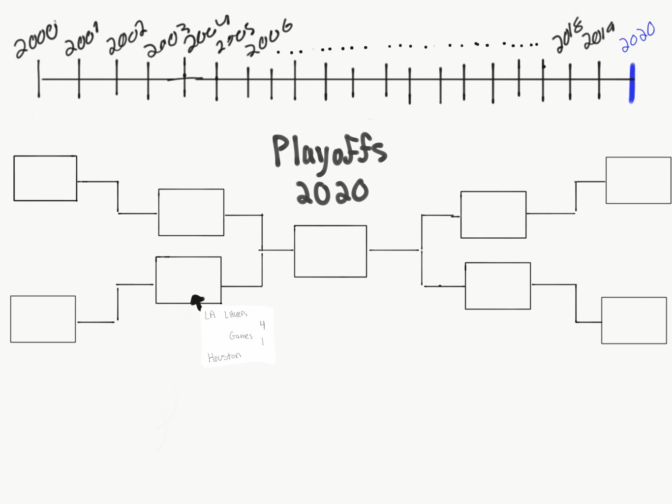
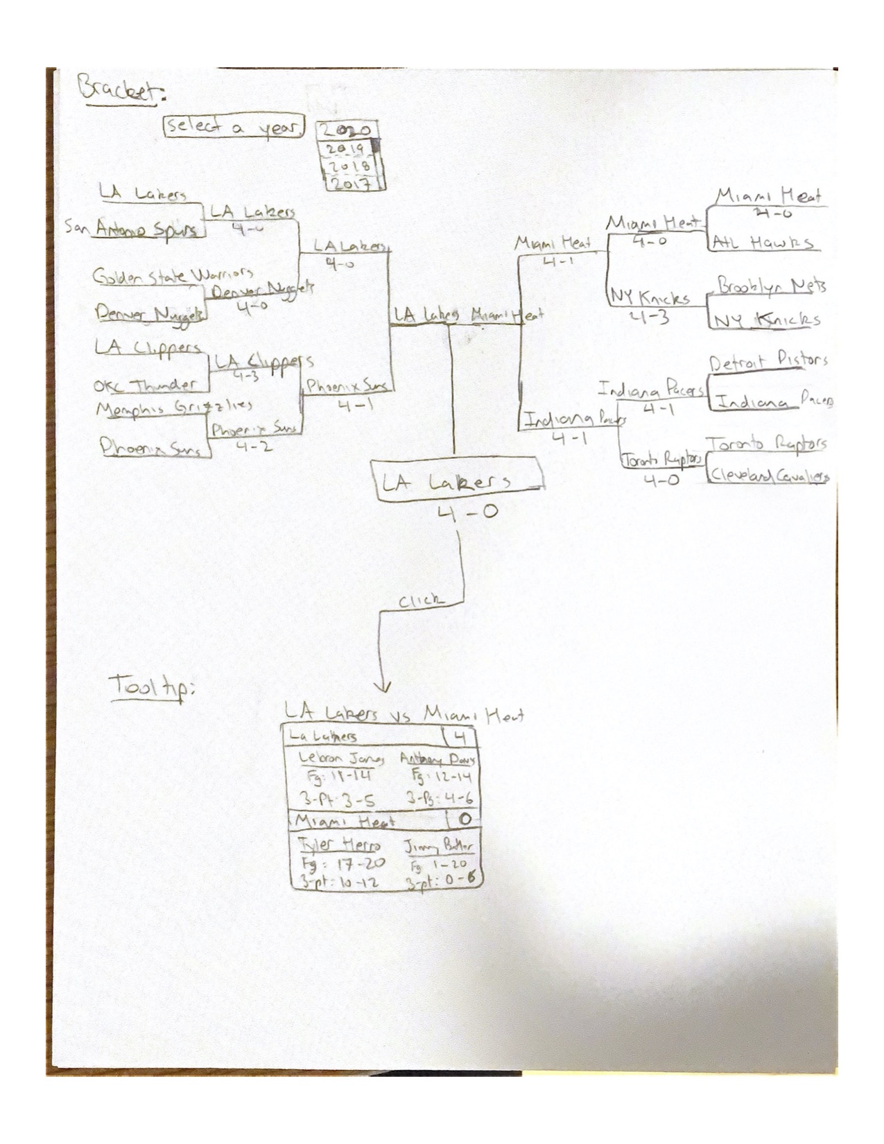
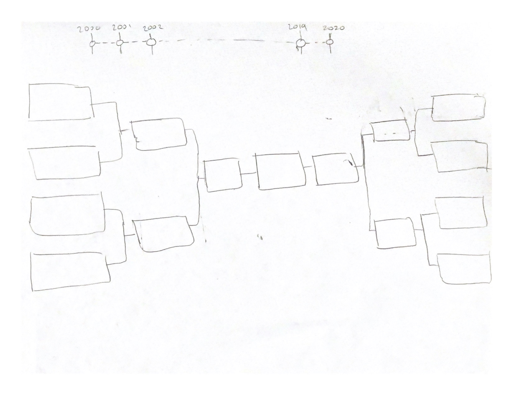
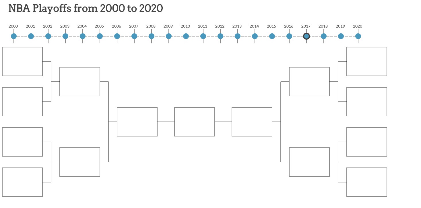
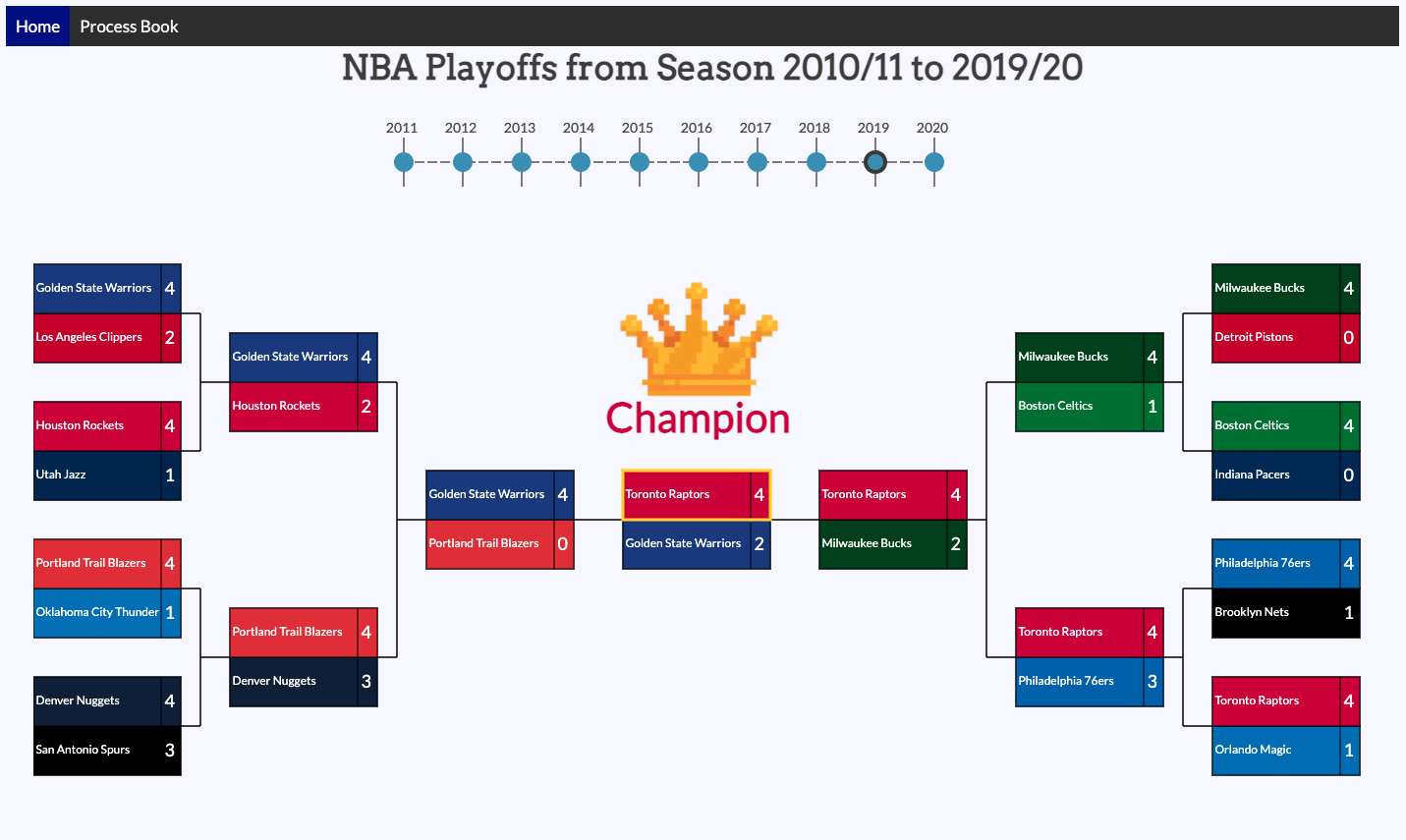
We will display a timeline showing the years for which we have playoff data that we will be providing visualiations for. When a year is selected, we will display the corresponding year's playoff games onto a bracket layout using d3. The winner and score of each game should be displayed and obvious to the user. When a game in the bracket is selected, another visualization should display showing key stats for all the players. Statistics will include key stats such as FT % or 3-pt %. We will highlight the most impactful players of the match as well as show the average performance of each team.
Bracket and Tooltip
Extra Visualization
Refined Visualization
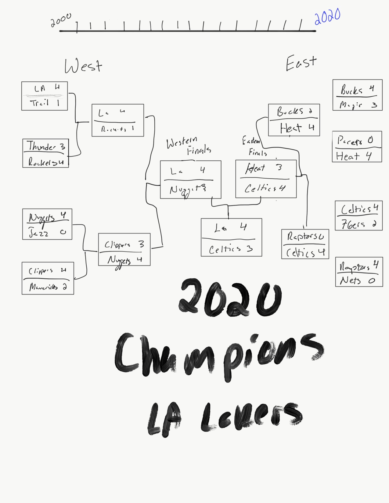
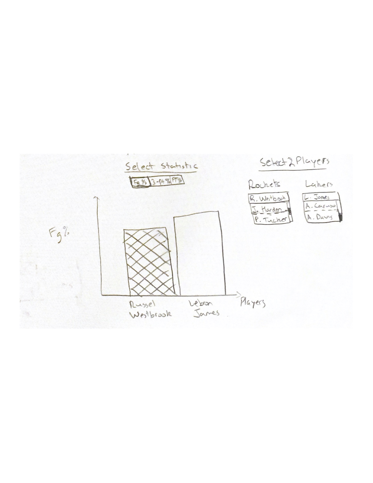
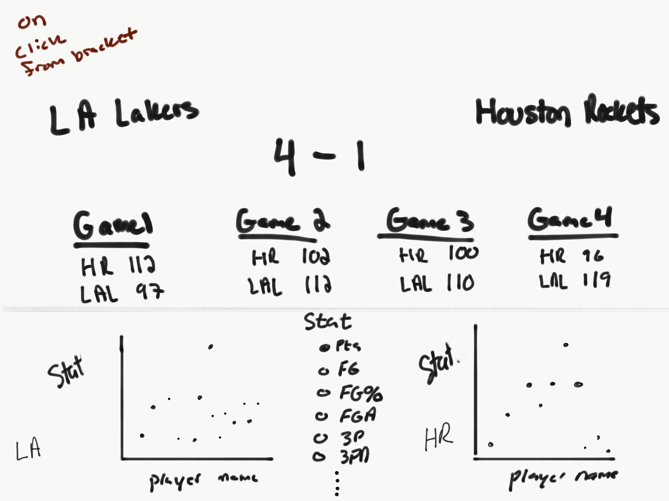
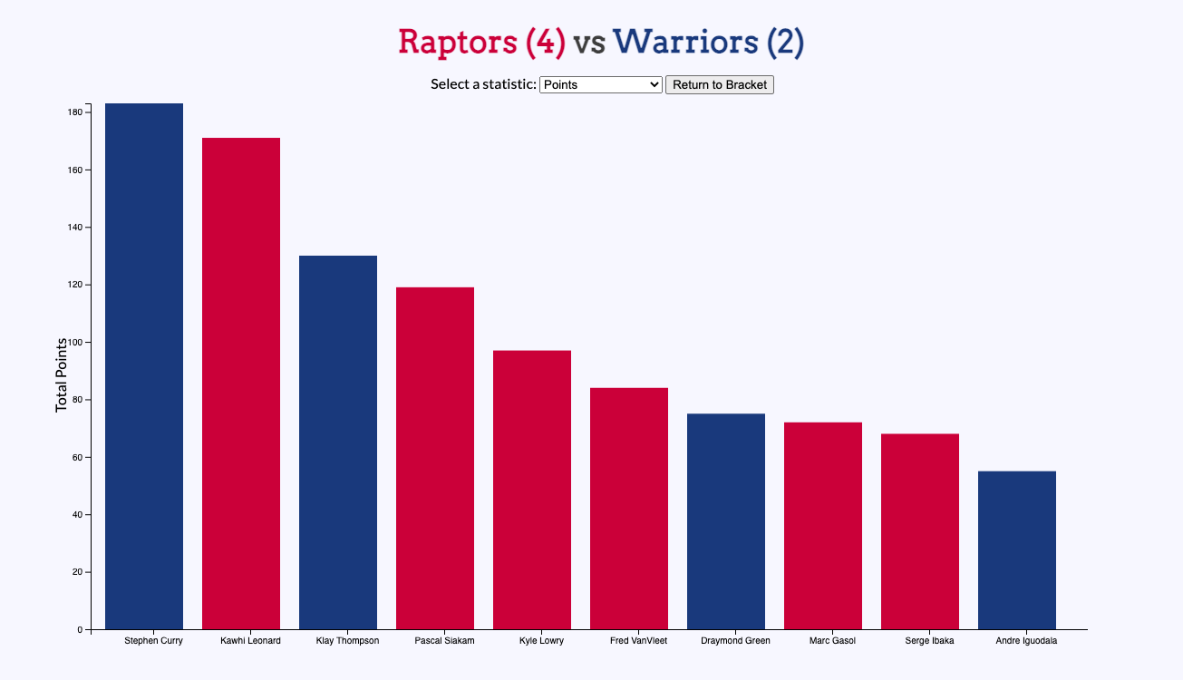
From our drafts, we liked the timeline aspect because it gave a greater sense that the information is chronological than the dropdown select menu. In regards to the bracket, we will incorporate a mix of the two bracket drafts. We will implement boxes for each matchup. In each box, we will include the two teams with a number next to organization name that represents the number of games won by that team in the 7-game series. Lastly, when a game is selected, rather than showing a tooltip that pops up, we think it will be best to create a bar graph where the user can select a player from each team and compare a certain stat.
Visualization Update
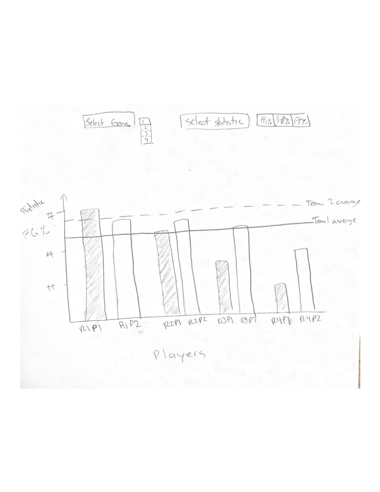
UPDATE: After speaking with the professors, we've updated our visualization. As you can see below, our timeline will include circles that are clickable. The lines we previously had did not indicate to the user that you can click them. Our bar graph originally was just to compare two players that the user can select. Upon review, this did not give a good indicator for answering our questions. Instead, the user can select which statistic to compare. We will give a rank for each player on their corresponding team based on the statistic chosen. Then, we will compare each player's statistic by rank. For example, if we rank the players based on FG % for each team, the player with the best FG % on team 1 gets compared to the player with the best FG % on team 2. In the additional visualization below, the "R1P1" on the x-axis of the bargraph refers to the highest ranked player from team 1 and "R2P2" refers to the highest ranked player from team 2. We will also show the average performance of each team as a baseline. This will allows us to answer our question regarding if a team is carried by one strong player or if a team's win is due to the average performance of the players on a team.
Visual Encoding Reasoning
For displaying our timeline, we want to be able to show the chronological ordering of the years, which is better presented with a broken up linesegment, such as we did with the electoral college visualization, than with a dropdown select menu. The bracket form is intuitive for showing results for a tournament-like situation. Since the NBA playoffs is essentially a tournament, a bracket layout will be easy to digest for the user. Information such as which teams are playing and who won should be easy to view with a bracket. Lastly, using a bar graph rather than a tooltip will allow for easy user interaction to compare key statistics for all the players on both teams. We will be able to highlight the most impactful players visually by ranking the players by their performance for each game. Bar graphs are good comparison tool for numerical metrics.
Must-Have Features
- Timeline to select from for each year in our dataset
- Bracket for each playoff series showing losers and winners and the result of the 7-series matchups
- A bargraph to display key stat performances of players from both teams
Optional Features
- A court mapping of shots taken for each game. This visualization will display whether or not that shot went in.
Milestone 1:
For milestone 1, we've begun our data collection process and finsihed implementing the bracket chart whihc we will later fill with data corresponding to the year selected. We hope to fill the rectangles with the two colors of the teams in the matchup as well as reflect their score.
Milestone 2:
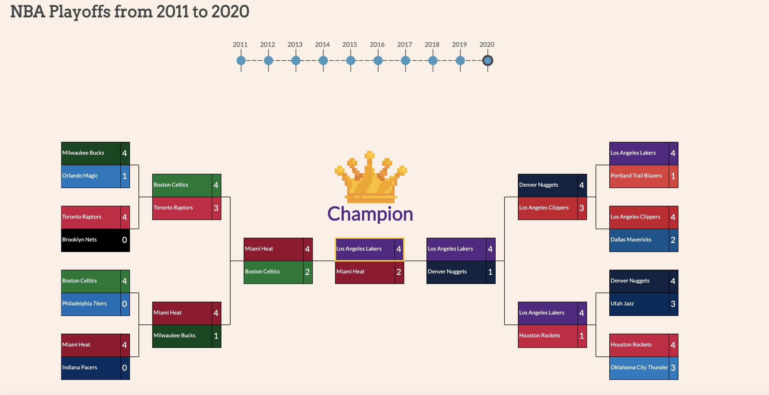
For this milestone, we added data to our bracket chart and finished implementing our bargraph visualization. Additionally, we added colors representing a team's primary colors. We also changed our views a little bit from the original plan for the project in how we would display the data.
- One thing we wished to do was compare two players between different teams for a game. What we do now is show the top 10 from either team for a specific statistic for that specific split. A split is refering to the set of games for a certain section of playoffs. For example the finals split for 19-20 was a 6 game long split.
- Another thing was the implementation to choosing stats. We originally were thinking of the use of radio buttons to select which stat we would look at for the players. We ended up changing this and going with a drop down selection form.
- Lastly we decided to only do from the 10-11 season to the 19-20 season because of how data acquisition was. To get the data we had to by hand create and save each csv file because where we were gathering the data from only gave the text form of a csv and not a downloadable. So it would've taken 600 times to get all the data for 00-01 to 19-20 instead we just did it 300 times.
Final Updates:
We have realized that our project is now aimed towards the problems of which teams attended the Playoffs in any given year of the past decade by showing a braket style representation. With this, we also answer the problems of how the top players of each team performed in that split of the Playoffs. This allows fans access to look at a split between two teams and see who's team or player performed better in actuality. It also will help fans see why their team seemed to struggle in a specific split. For example, looking at the Western Conference Finals between the Spurs and the Thunder, we can see that the Spurs had an overall more well rounded team where as the Thunder did not and as a result the Spurs went on to the Finals. In addition, our visualiation helps basketball fans pick up one what actually may determine the outcome of the game. We provide a list of relevant statistics, which users can select to visualize how team's performed relative to that statistic. By doing so, basketball fans can determine what statistics had the greatest impact in a game: 3-points made, rebounds, field goal percentage, etc. This will help answer many underlying questions basketball fans may have regarding changes in how the game has evolved over the years. For example, a popular theory is that the league now revolves around making 3-point shots, so will we see a greater number of 3-points attempt from 2010 to 2020? Alternatively, many believe that defenses wins games. So, will the team at has the most rebounds most likely win a match up? Is the outcome of any specific series more determined by the number of 3-points made rather than field goal percentage, rebounds, or assists?
In response to our milestone 2 feedback and user studies, we have implemented the following changes:
- Added title and score of which two teams are being compared to the barchart at the bottom of the page. This will help users know what teams are being compared and what the score was without having to scroll back up to the bracket.
- Added the functionality of when a specific split is chosen, the webpage will drag down and display the barchart automatically for the user. Additionally, we've added a button in the bargraph to send the user back up to the bracket chart.
- Added a cursor hover over the games in the bracket to make it obvious that someone can actually click on these games and see more information.
- Fixed positioning of teams in bracket. West is now on the west and East is now on East. Also fixed some inaccuracies in our data that caused our bracket to misrepresent certain year playoff matchups.
- Added some more centering of items.
Project Screencast
Project Analysis
The visualization aims to answer multiple things that the user can inspect. The two questions that we will inspect now are whether the league has turned into a shooters league, meaning that 3-pointers have become increasingly common for victorious teams over the years, and whether a team was carried by a few strong performing players. For the first one, we look at 4 matchups that went to 5 games over the decade and assess the 3-points attempted. If you take a look at the 2012 Heat vs Thunder game, you see only a few players took more than 20 attempts, with the most being in the low 30s. In the 2014 Spurs vs Heat game, there are slightly more players taking 3-point shots, wiht more commmon occurences being around 20-26. However, in the Warriors vs Cavaliers game of 2017, we see that most players are taking at least 30 3-point attempts, with two players taking 40 or more. Lastly, in the 2020 heat vs bucks game, we see a player taking 51 3-point attempts. In all of these visualizations, the team that one was the team that took the most 3-point attempts. Additionally, we see a trend over the years where teams are taking more 3-point attempts. This data complements the idea that the league values 3-point shots much more than they used to in the past. Another common theory is that the 2016 Cavaliers were solely carried by Lebron James. However, inspecting the match statistics, we see that Kyrie Irving of the Cavaliers scored the second highest amount of points among all the players in the 7-game series between the Cavaliers and the Warriors. Additionally, Tristan Thompson of the Cavaliers had the second highest amount of rebounds among all the players. While Lebron James lead these categories, this shows that he was helped heavily by his teammates, contrary to popular belief. These are just two examples where our visualization can come in handy to answer basketball questions.
Project Schedule
- Week of 11/16: Final project proposal to be submitted. We will begin data scraping/acquisition and setup source control using Github. Additionally, we will have the timeline visualizations completed and interactable.
- Week of 11/23: Milestone 1 to be finished. We should have a working visualization prototype for the timeline chart and the playoff bracket that reflects dummy data. This dummy data will be empty, but it will be the same length as what we will eventually be using. This means that that all we should have is an array of length 15, because that is the number of matchups in the playoffs. The data will not be connected yet. This bracket should also be created once a year is selected. The produced bracket should be connected with squares and lines that are symmetric and visually appealing. Data should not be shown yet. The following milestone will include the implementation of these data structures with real data. We should not have any console errors.
- Week of 11/30: Our bracket should load with corresponding data for that year. The prototype for the bargrpah should be complete and we should have started implementing real data with all our visualizations. The bargraph showing more in-depth player statistics for a selected game should be completed the following week. Visually, styling will not be emphasized until later on this week, before milestone 2 is due.
- Week of 12/07: Milestone 2 to be completed 12/07. This should include our visualizations fully implemented with the data that was acquired from our source. Styling should be intuitive for the user. For example, this could mean that the winners of a game should be displayed in green rather than red. The winner of the series is clearily visible among the other games/teams in the bracket. The bargraph should be easy to digest. There should not be any confusion as to what team do players belong to.
- Week of 12/14: Final project presented to the class. This week will consist of prepping what we will say and display.
- Week of 12/21: Working on extra features. Here, we will try to implement our visualization that maps out the shots taken on a court for each team. This visualization will display whether or not that shot went in.
- Week of 12/28: This week will be designated to finalizing the project and fixing any bugs our website may have. We will be finalizing our process books, project screencast, and peer assessment.
- Week of 01/04: Final project to be submitted on 01/06.