Process Book
Overview and Motivation
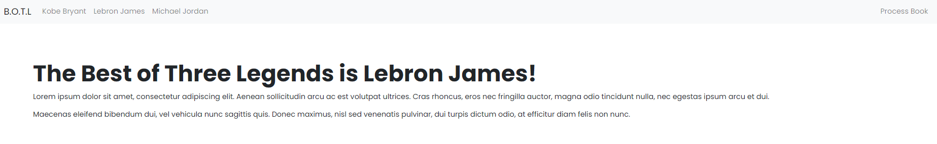
- One of the reasons why the NBA is an exciting sport is because of the statistics the players produce day in and day out. As NBA fans, we thought it would be a great idea to visualize these numbers in meaningful ways. One of the biggest topics that NBA analysts and fans discuss is “Who is the Greatest Of All Time NBA player?” The top three players that are in the legendary category are Kobe Bryant, Lebron James, and Michael Jordan. We are motivated to create visualizations to compare these three players.
Related Work
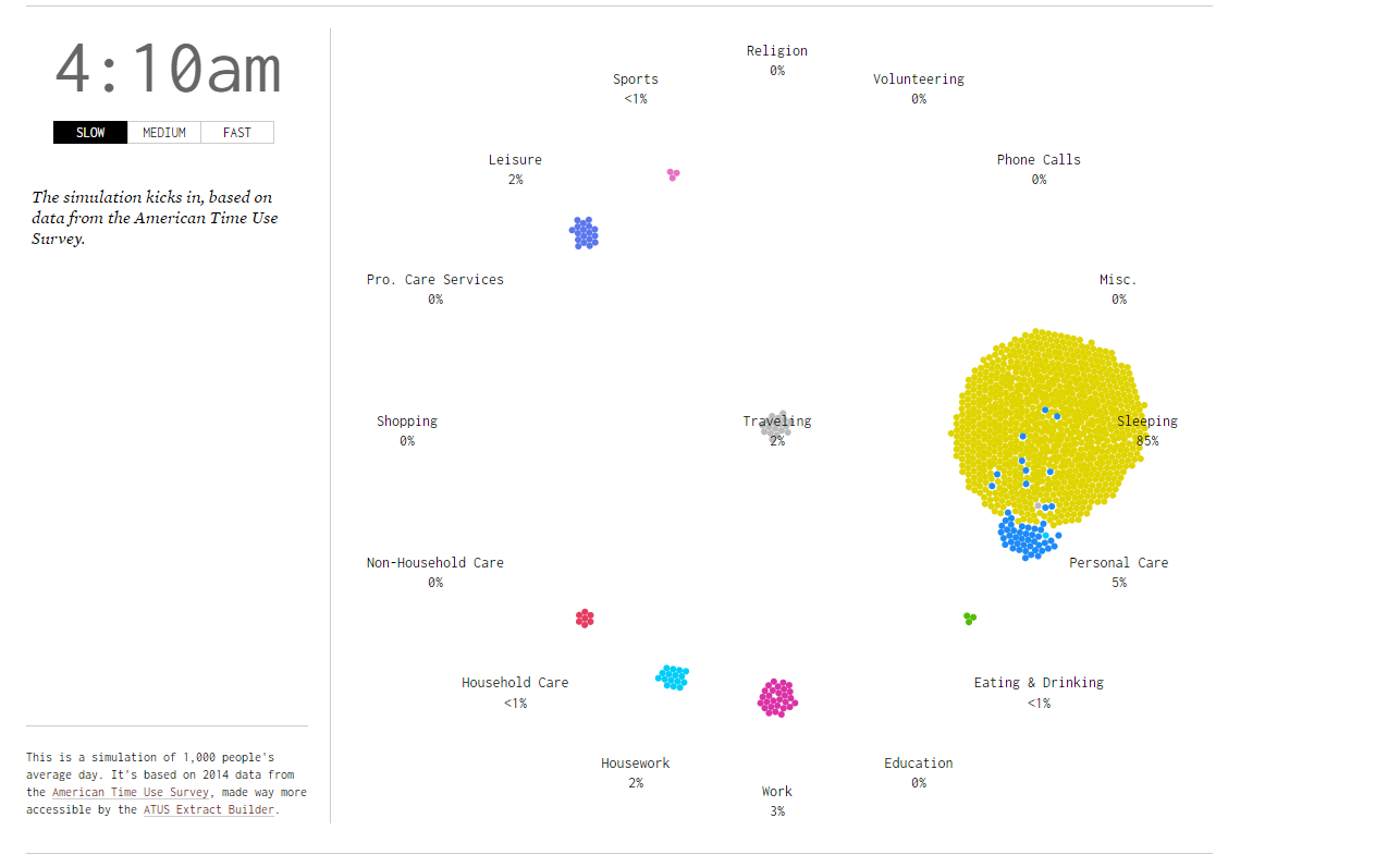
This day in the life simulation by Nathan Yau, on flowing data, helped inspire our visualization.
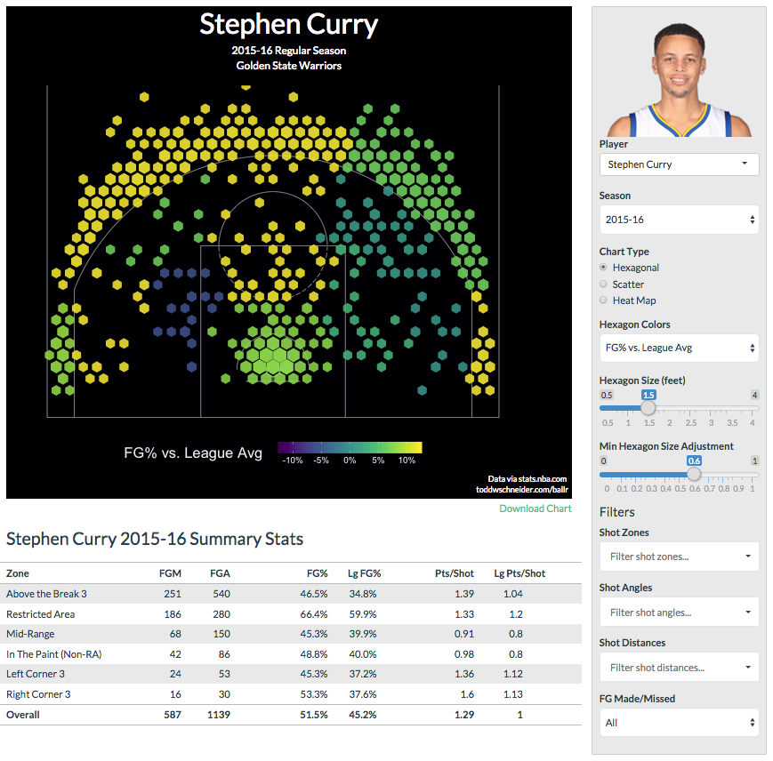
This Curry court visualization helped inspire one of the features we've not implemeneted yet but hope to include in our final project. It is an example on this NBA data tool's github.
Questions
- We compare key basketball metrics between Kobe, Jordan, and Lebron for all of the years they played in the NBA.
-
Users can analyze data through our visualizations to “answer” the
question “Who is the Best of the Three Legends?”
-
Examples of questions we answer:
- At 22 yrs old, who averages more Field Goals?
- At 31, who averages the most assists?
- At 24, who had a higher free throw percentage?
- At # (any year they played), who's a better defender?
- Right now, we compare Free Throw Attempts, Free Throw %, Free Throws, Field Goals, Assists, Blocks, Defensive Rebound %.
-
Examples of questions we answer:
- Users can learn more about each player’s biography.
- Users can learn more about each player’s performances through visualizing the statistics.
- Benefit: Users can have data-driven comparisons of these players.
Data
We got our data from kaggle
Our dataset has stats for every game each of these 3 players have played (-Lebron because he is still in the NBA).
We used Python to convert this game data for each player into age data, by averaging all of the stats that a player played for each year of their life that they played in the NBA.
For example, after processing, we have a row of data for Lebron that contains his stats from when he was 18 years old playing in the NBA.
Exploratory Data Analysis
We looked at this set of visualizations created by Xavier Vivancos García because he uses the same dataset.
We were worried that these players would perform too similarly in a variety of the metrics.
Xaviers visualizations show that they perform significantly different in some metrics (ex: triple doubles) and similar in others (ex: total points).
This easied our concerns about all of the data being too similar. However, our current visualization isn't granular enought to compare relatively similar values.
We will address this shortcoming in the future via a user interaction. Potentially, hover or click, to see more indepth analysis (ex: maybe a chart or just the numbers)
Design Evolution
We sketched a few alternative designs that would help us choose the best version for our project.
The following is some sketches that we have.
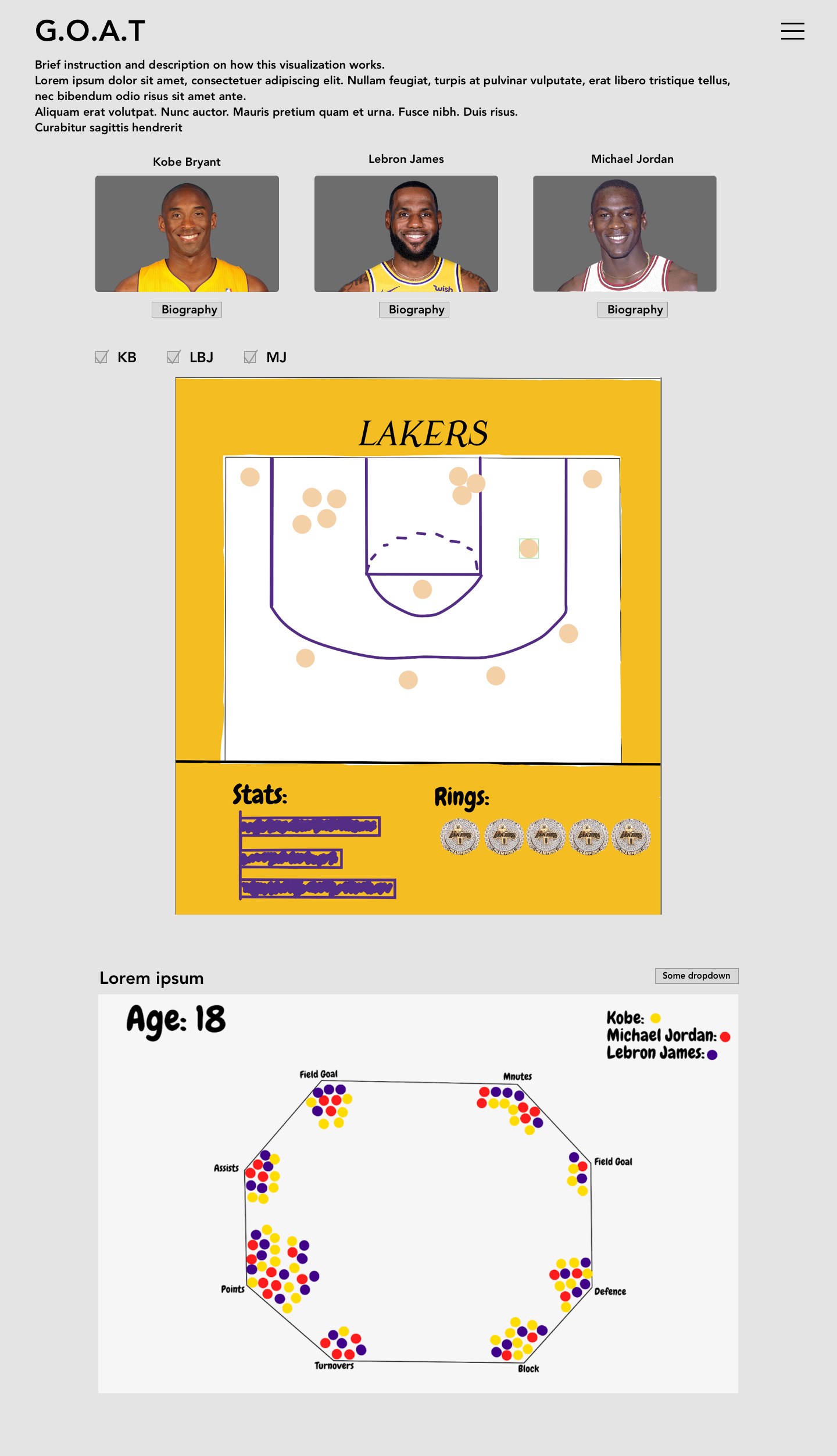
Final main page design sketch
After hours of sketches and combining multiple designs through talking with the team members, we have decided to go with a final main page design something along this line. Our main idea is to focus on a few visualizations but make them more meaningful and interactive rather than having a lot of static data visualizations.
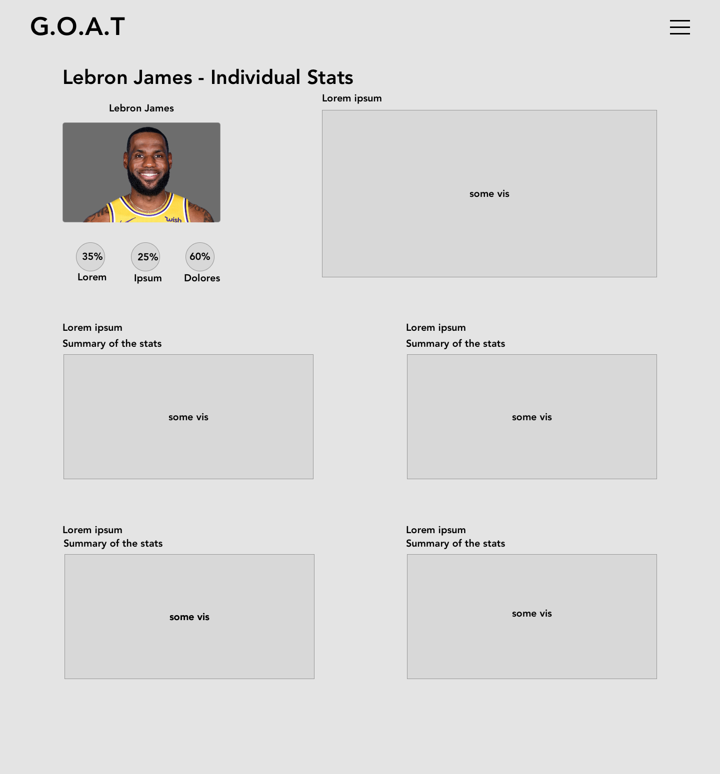
Main Page 1
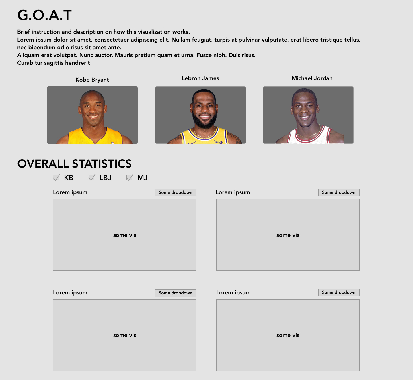
The idea for this is to mainly highlight stats of each player. This way users can focus on one and only legend without overwhelming them with three of them at the same time. Of course, the user can also have the ability to compare all three players at the same time but this is the design that demonstrates focus.
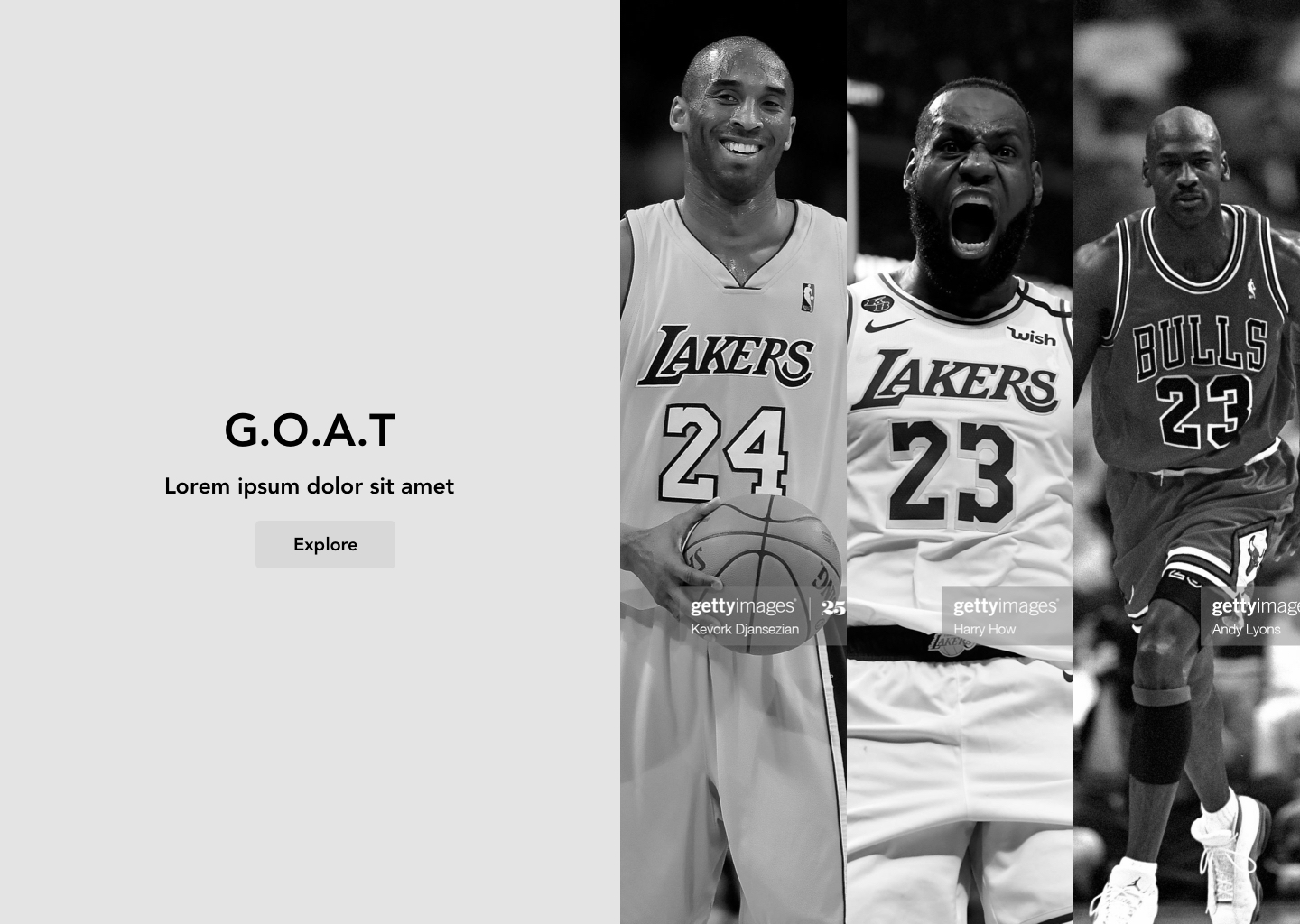
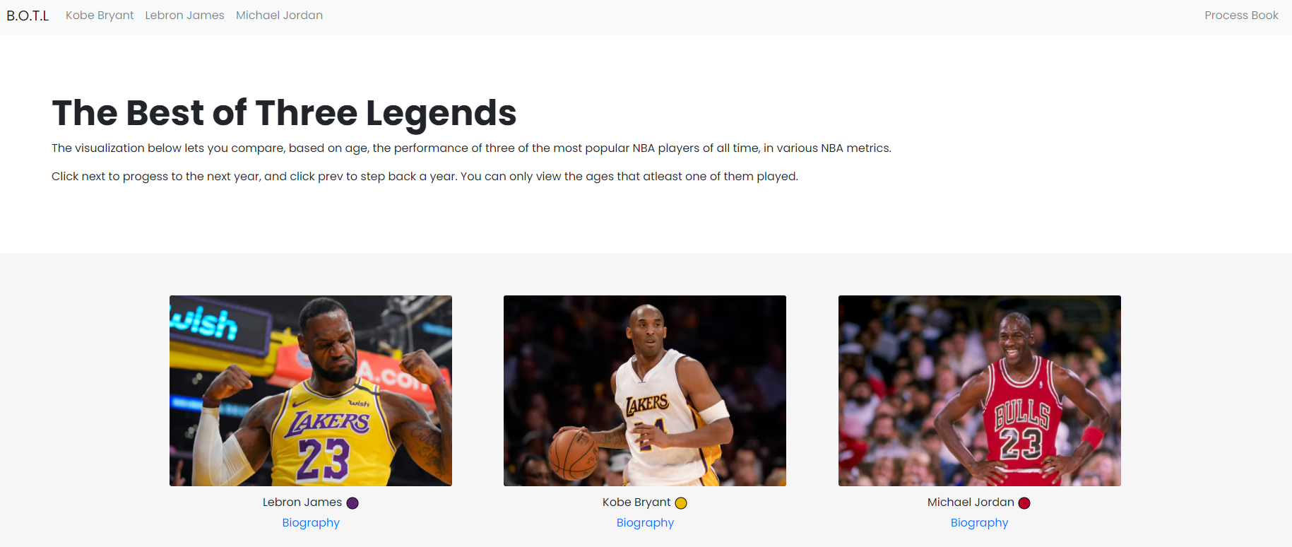
Landing page
The landing page is very simple. It highlights big images of the players with their respective teams that they last played or currently in. The high quality images with players showing emotions are very powerful. A true NBA fan will feel their energy. The landing page also loads the data in the background as well.
Main Page 2
This main page focus on all three players at the same time with a couple of visualization charts to demonstrate every players' unique statistics. However, we did not go with this route because we decided not to use too many visualization charts.
Story telling page 1
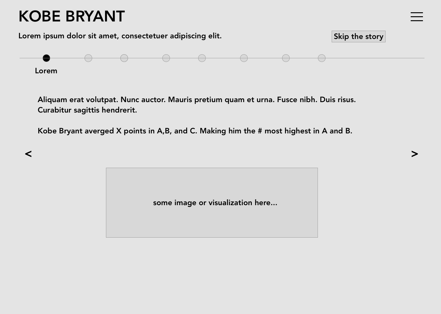
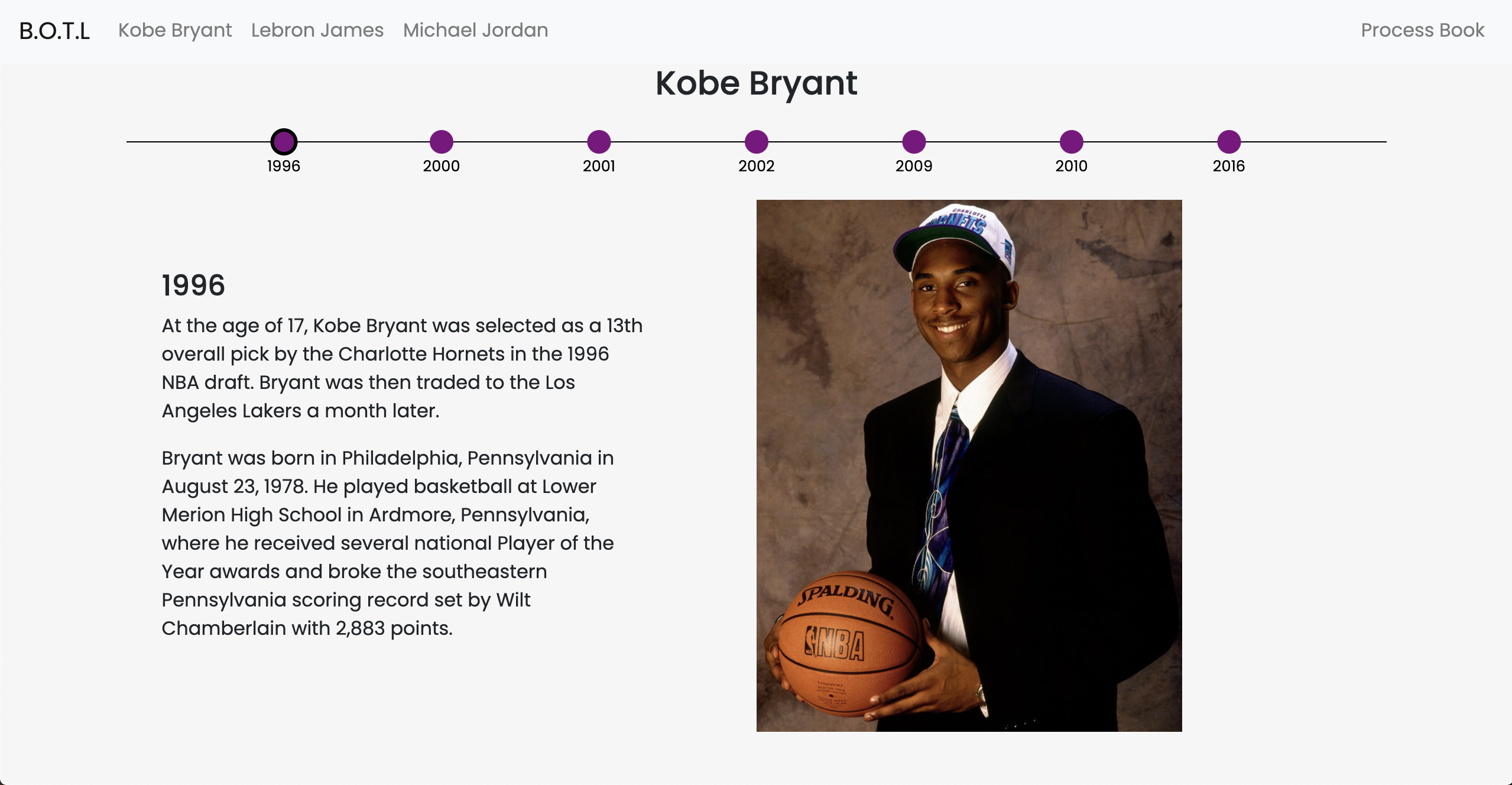
Design: Click on a specific player, get brought to a background informational timeline page that is more text based than data based. Justification: Users come to our website to learn more about these 3 players. Giving a detailed timeline of their lives will help the users understand what made these players great and educate them on the backgrounds of these legends. Data is better with context. That is what we will provide with this section.
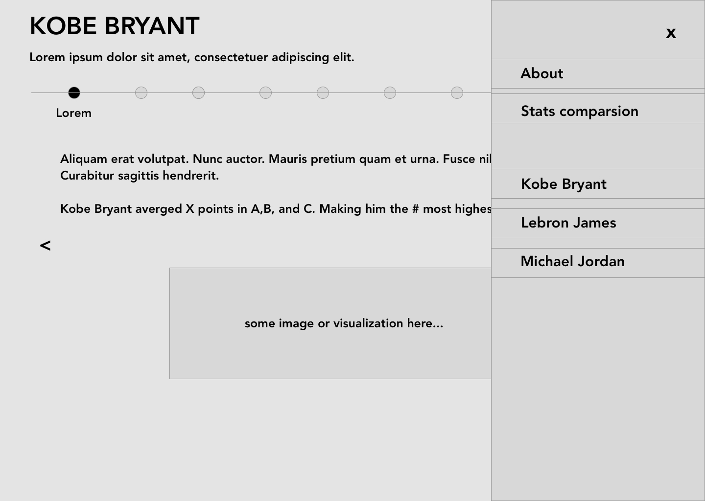
Story telling page with Hamburger
This design illustrates the hamburger menu.
Individual visualization 1
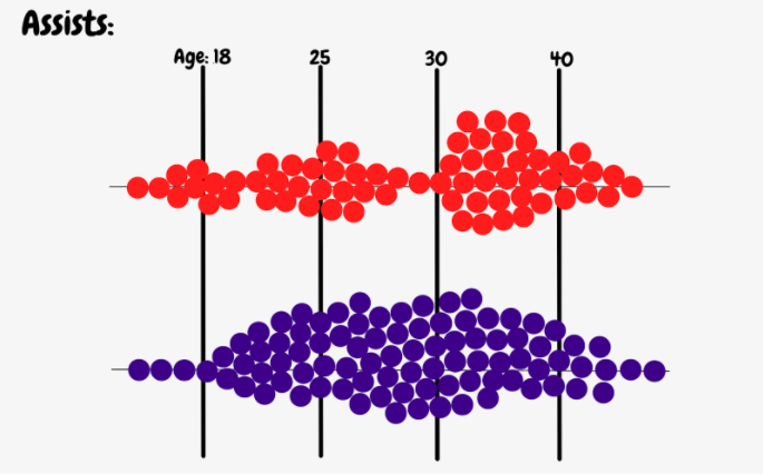
In this bubble chart visualization our main goal is to show how consistent a player is. When choosing a stat such as ‘Assists,’ a bubble graph will show how well or poorly they performed over time. In the visualization example, we can see that player blue is more consistent than player red.
Individual visualization 2
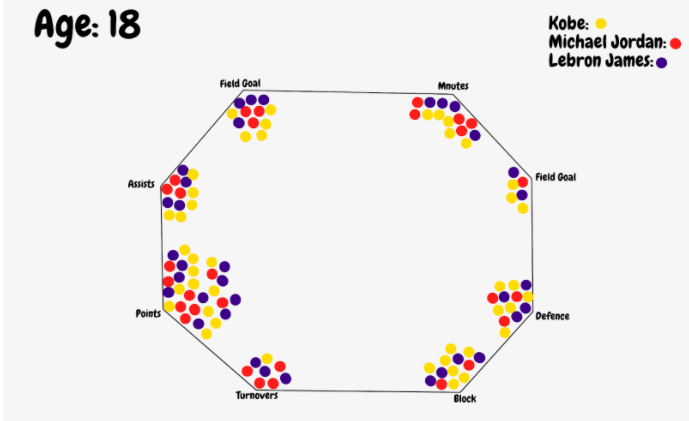
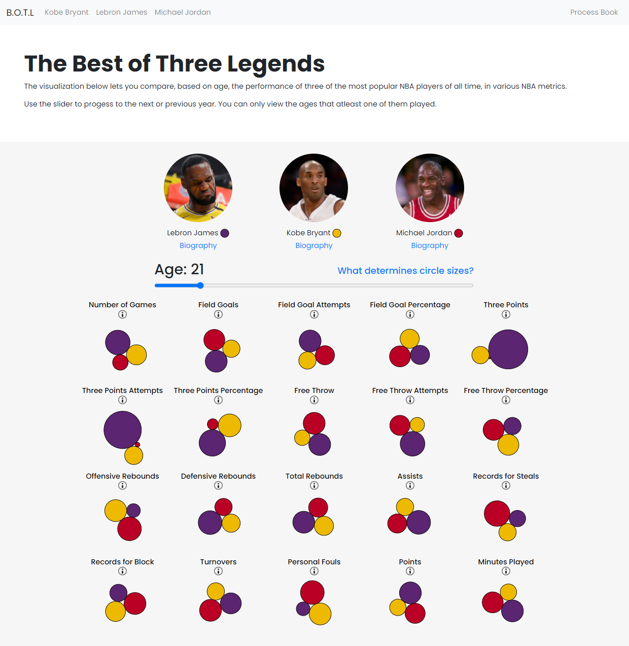
In this octagon visualization we will show each player’s stats in an interactive way. At the top, the age would be changing over time, and the circles moving depending on how each player’s stats changes. This visualization shows each player in one screen helping users to compare them all at once.
Implementation
Milestone 1

Above is the landing page, where (eventually) users click on the image of a player to nav to their player bio.
Clicking explore navigates you to the main (vis) page.
Above is the top half of the main page. The text explains the visualization.
You can click on Biography below each player's image to be routed to their player bio.
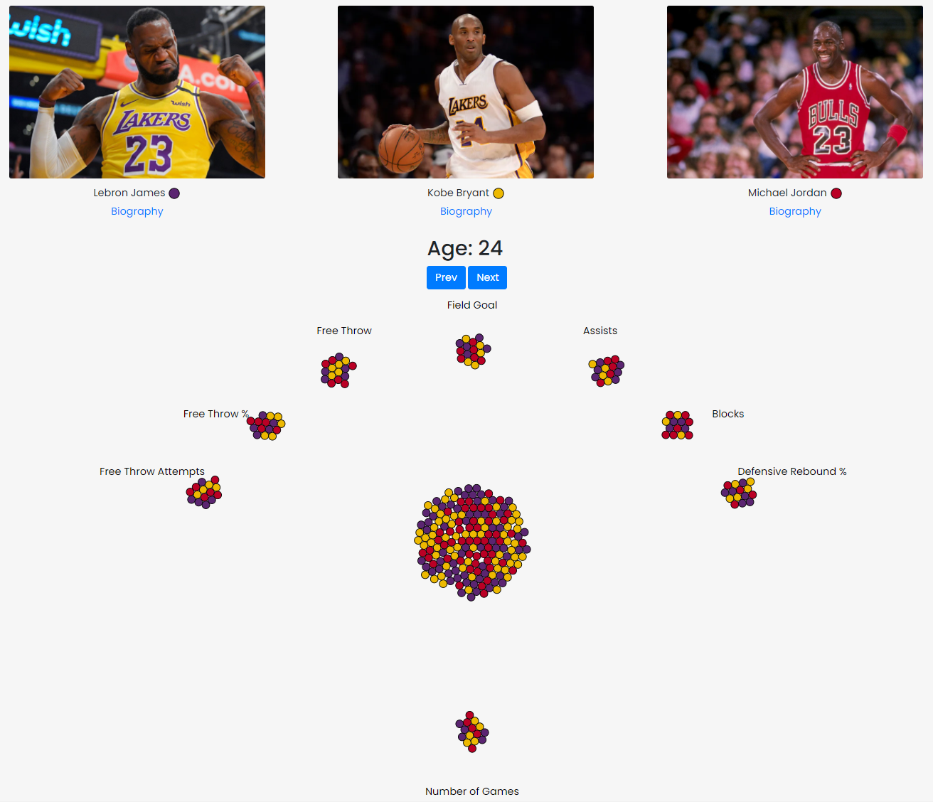
This is the main visualization.
You can click next, to progress to the next year (age: 25). Likewise, you can click prev to go to Age: 23.
This visualization shows the average relative performance between these players when they played in the NBA, when they were the selected age.
Above is the placeholder player bio. Each player has a unique page.
Milestone 2
For milestone 2, we made these changes to our visualization:
- We reduced the size of the padding in the banner and also the size of the images. We still want to make so that users don't need to scrow down to see the visualization.
- We added a slider to move through the years.
- We changed the shape of our visualization. Now we have each section positioned in rows and columns instead of an octagon shape.
- We added an explanation model. When the user hovers over the 'attention' icon, users can see more information about the category.
- We added a tooltip for each circle where users can see the real data.
- We changed the way we update the visualization. Instead of loading a new visualization every time the year chages, we are now updating the data in the same visualization and animating the size of the circles.
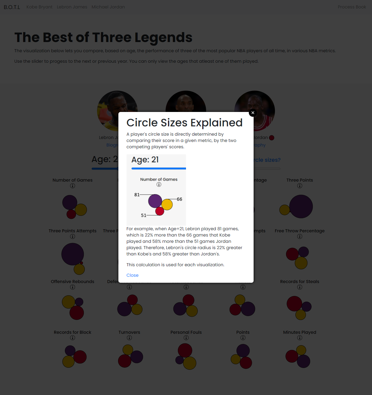
- We added an Circle Size Explanation modal that explains how we calculate the radius for each node.
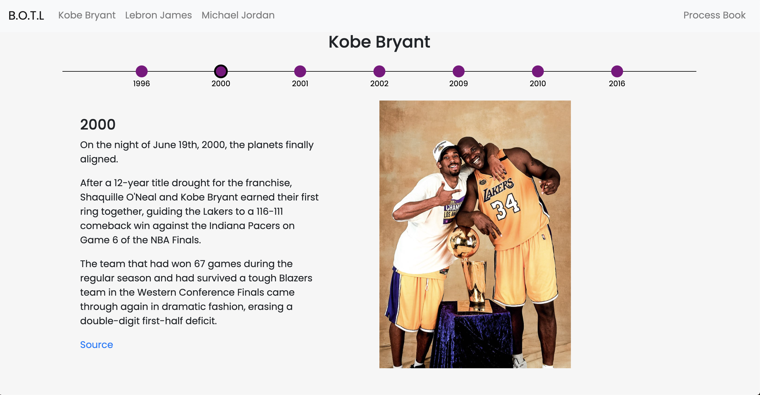
- We made progress on our player bio section. Bio section includes a timeline-style that highlights each player's milestones. These three players are well-known for their championships and the unbelievable stats that they produce when the team needed the most. We plan to highlight some of their notable statistics using simple static visualization charts. For now, we have some basic information about their milestones.
Evaluation
We learned that at the same ages, these players performed similarly in a lot of metrics.
We also learned that these 3 elite players were strong in different areas. For example, MJ isn't the strongest 3 point shooter.
We answered our questions about how these players stack up (in various metrics) at different ages.
Our current visualization now has a level granularity that allows users to see the value of small differences between the players.
The visual size of each node lets users quickly compare the players in each metric, and then the user can hover to see the exact number the circle is representing.
Things we want to add to further improve our visualization:
- Next iteration, we will change our colors to colorblind safe colors.
- When the age-year only has specific players competiting, like age=40 only has MJ, grey out the images for the non competing players.
- Ability to enable and disable a player in the visualizations by clicking on their image.
- We haven't acquired the data yet, but if we can find it and the time required, we want to create a spatial basketball court visualization for these three players.
- Dual handled slider that allows you to average the performance between the ages. Ex: put the slider on the far left and far right to average their career stats.
- Implement animations for player stories and if we have time, make it more interactive. We would also like to add more visualizations into the stories.