Team Gender Gap
Jeff Che, jche@wustl.edu, ID: 464957
Raeka Attari, raeka.attari@wustl.edu, ID: 455207
Shruthi Ramalingam, s.ramalingam@wustl.edu, ID: 457856
Background and Motivation
We want to explore the global impact of gender disparities by comparing metrics across countries and across time. We chose this topic because although we talk about gender inequalities and statistics very frequently in relation to the United States in the form of wage gaps, job opportunities, medical care, etc, we don’t frequently discuss the global scale and impact of these disparities. We thought it would be a very meaningful project to visualize some of the prominent global data related to gender so we can see its implications beyond the scope of what we already know and beyond our scope of just the United States. We want to educate our audience and challenge their preconceived notions of stereotypes across countries. We want to allow the audience to see how these inequalities have changed overtime and allow them to see if/how conditions are improving across the world. Additionally, we thought it would be a key point of interest if we were able to elucidate some of the reasons for this stratification, if possible. We want to mostly focus on the key points of disparity to really be able to create a provocate visualization that will engage the audience and help them understand the different areas of focus, but we would also like to provide some context for why those areas have such disparities. This will be something that we would like to get into if we have time and something we will consider exploring further after our first prototype round.
Project Objectives
We would like to visualize the inequalities in gender across the globe
and how these differences vary from country to country. We would like
to allow users to hover over countries to view more detailed
information on a specific country, as well as allow them to compare
statistics across countries. We would like to include statistics from many
different areas including health, education, and economic opportunities.
Some statistics we are considering comparing across genders are: survival
rates from 15-60 years of age, probability of survival to age 5,
expected years of school, firms with female/male participation in ownership,
and number of self employed women. Lastly as mentioned above we would like to
allow users to compare these values across countries and time, so they are able
to see long-term trends.
Some questions we would like to answer with a global emphasis across
regions are:
1) What are the differences in literacy rates between males and
females?
2) What are the differences in completion of secondary education?
3) What is the percentage of females in the total labor force of a
country?
4) What is poverty headcount ratio at national poverty lines? (% of
females)
5) What are some healthcare differences between countries for females?
6) How does the percent of elected female officials vary across regions?
7) How does women exposed to communicable and non-communicable diseases vary
across regions?
8) How does the percent of women immunizationed vary across countries?
Data
We are collecting our data from the World Bank’s Gender Statistics database. This database contains the recent gender statistics that spans topics such as education, health, access to financial opportunities, and decision-making/agency.
Data Processing
We expect to parse a significant amount of data as our dataset is
extremely large. Because we want our visualizations to be interactive
to allow our users to choose specific metrics to view, we need to
acquire data overtime, across countries, and in different sectors as
discussed above. We believe that these quantities will be quite large. We
also want to keep our visualizations very dynamic and interactive so we want
to maximize the utility of the data that we are bringing in to populate
the visualizations. We plan to spend a significant amount of time ensuring
that our data is cleaned-up and easy to analyze. All of our data will be
in the form of a large CSV file.
Some of the data cleanup for this project will include parsing only
certain years in the timeline, as for certain years there isn't enough
data or there is no data at all. So our parsing will have to account
for just skipping those metrics.
Visualization Designs
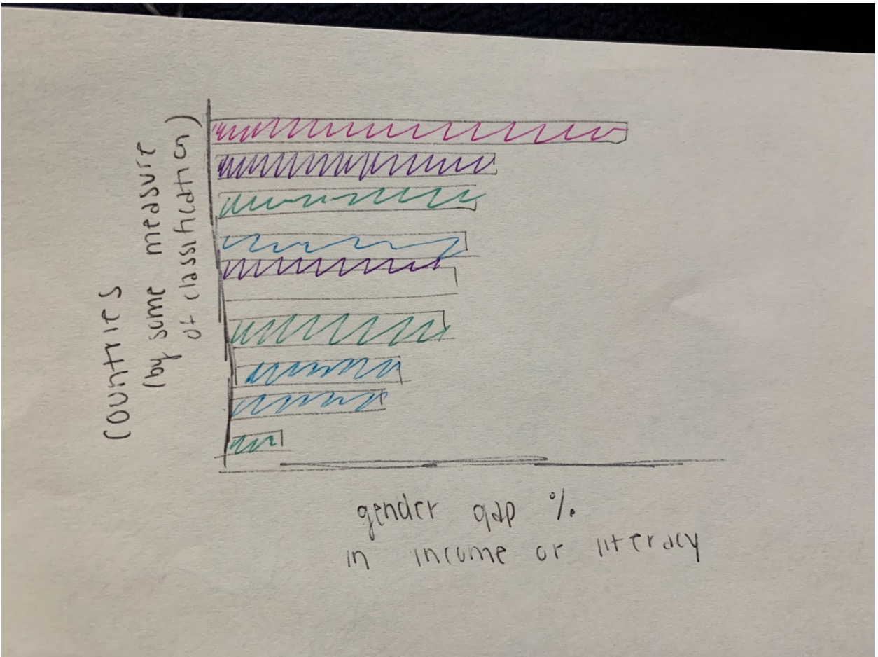
Bar chart idea to compare gender gap difference between countries (or anything else). Could also be a stacked bar or split bar chart.
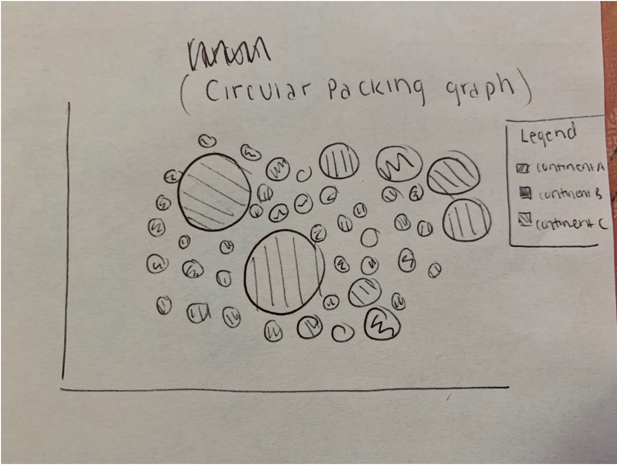
Circular packing graph with charge that corresponds to how close countries are to each other in terms of literacy rates, wage gaps, etc. So the closer the countries are to each other, the more similar they are. The charge could also represent another metric.
More comparison designs.
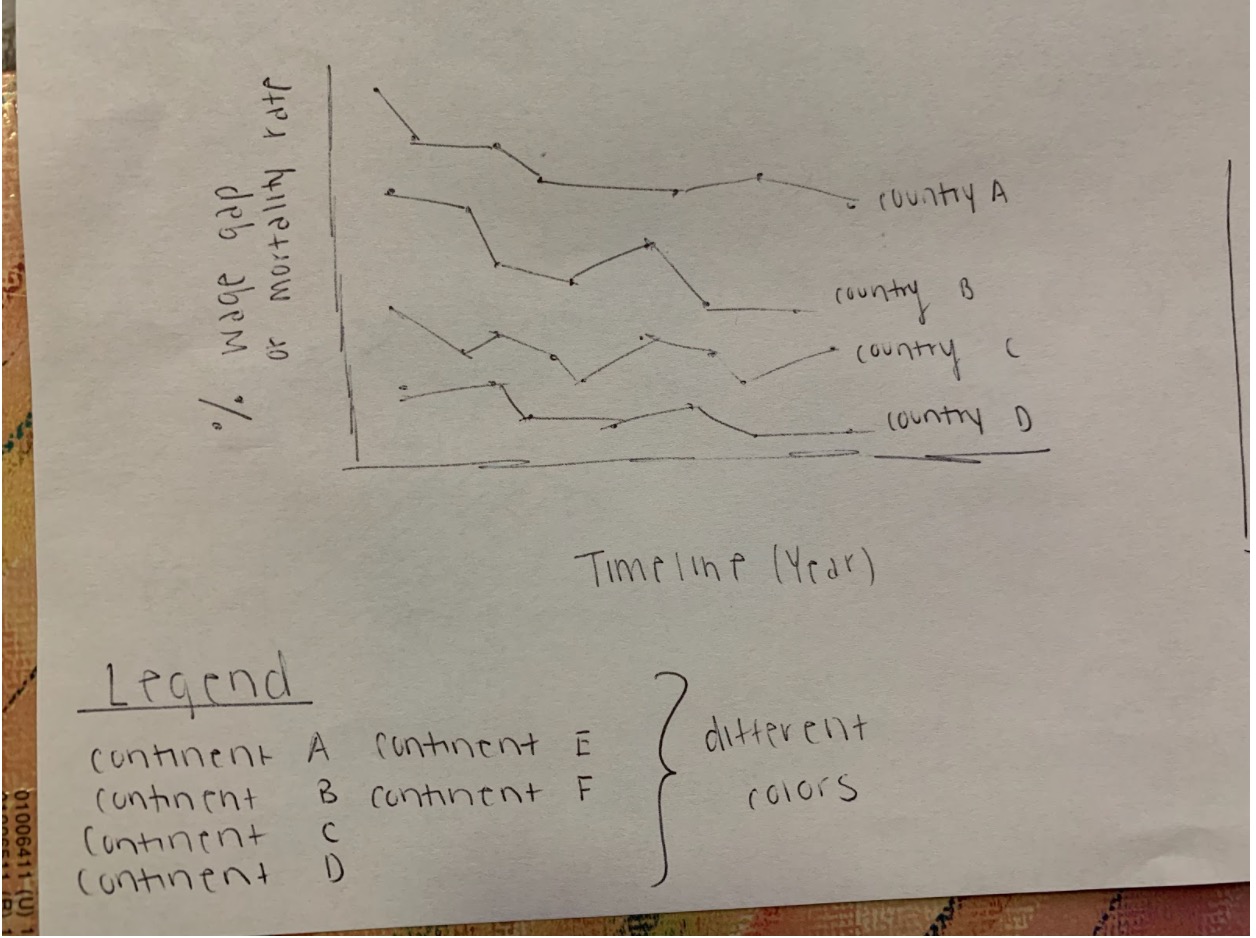
Stacked line chart. Could also be a stacked area line chart, intended to show change over time for several (selected) countries.
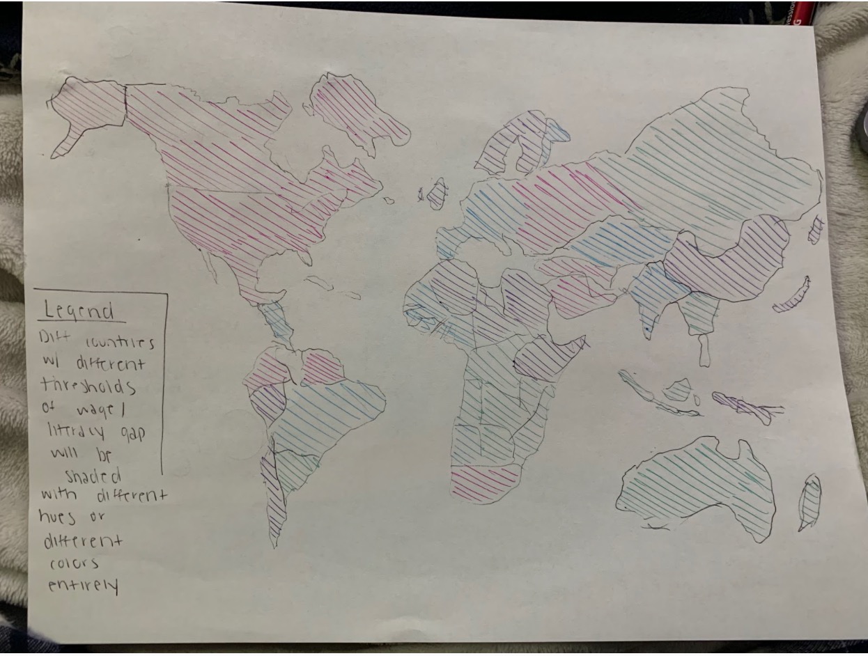
Map of the world that serves as a point of reference for country selection or to also show some statistic (heat-map style). This would be our landing page. The other visualizations will show up after a selection is made from a menu or dropdown.
We would like our final design to include the circular packing chart, line (stacked area) chart, and the map. We will incoporate each design in its own page and try to display insight into a specific comparison/problem. We will also use bar charts to show some additional comparisons for when they might be handy.
Must Haves
Because the majority of our data will be comparisons, either across countries, time, or genders we plan to use bar charts, line charts, and scatter plots as we believe that these will best display the disparities. When comparing across countries we plan to mainly use a scatter-plot or line chart. And when only comparing across genders we plan to mainly use bar-charts. However we believe these decisions may change once we begin analyzing the data. We also plan to have a map from which users can select the country they would like to view in more detail. These graphs and maps may also contain tool tips and hovers that will allow for a more engaging experience for the user. They will be able to hover over the visualizations and get some more detail on the data behind these visualizations and be able to see the actual numbers if they would like to.
Optional Features
Some optional features that would be nice to have would be user interactive features. These features include additional tool-tips and other hovering features so that users can get more details about a specific data-point. We are also considering adding a brush feature so that users can zoom in on a specific time frame. We have also discussed having a stacked line chart as a method for users to compare countries over time.
Schedule
- Week 1 (11/8): Finish project proposal, parse dataset (All of us) and data wrangling. (Jeff)
- Week 2 (11/15): Set up first two visualizations, work on setting up the bar chart and the line chart with the data. The entire dataset does not need to be utilized just yet. (Shruthi, Raeka)
- Week 3 (11/22): Create hover/tool-tips, set up world map and make sure that the entire dataset we were planning on using is utilized by this point. (All of us)
- Week 4 (11/29): Add the finishing touches to all of our visualizations, make sure all the data is utilized, make sure the hover/tool-tips are working correctly, and that the visualizations are appealing, thorough, interactive, and portray a clear picture and communicate our project goal. (All of us)
- Week 5 (12/6): Everything should be complete for Milestone 2 by this point. We begin practicing the presentation for 12/14 and create slides as well as put together how we will explain our visualizations. (All of us)
- Week 6 (12/13): Everything should be done by this point for the final presentation on 12/14. (All of us)
Milestone 1
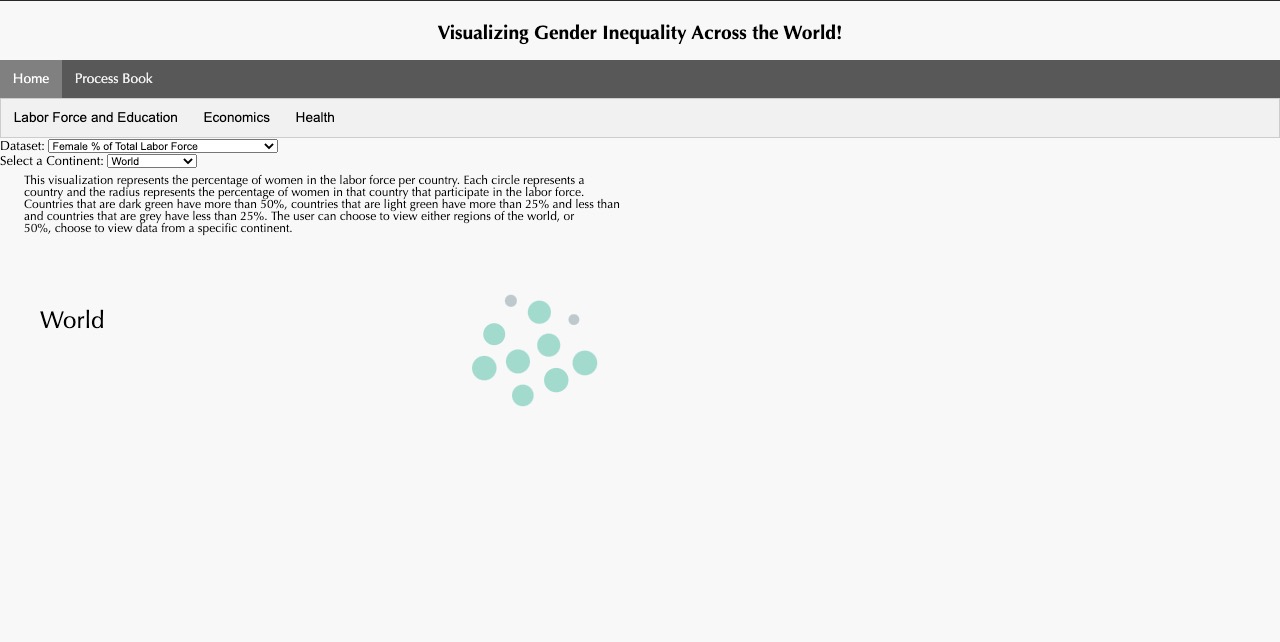
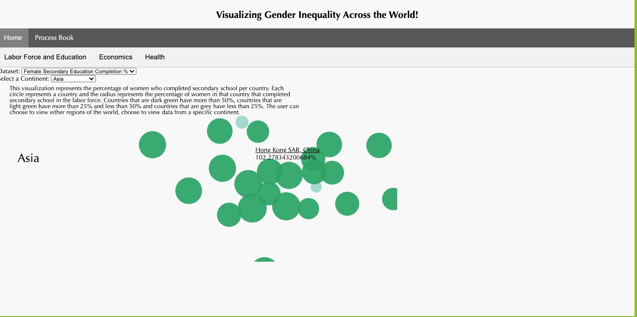
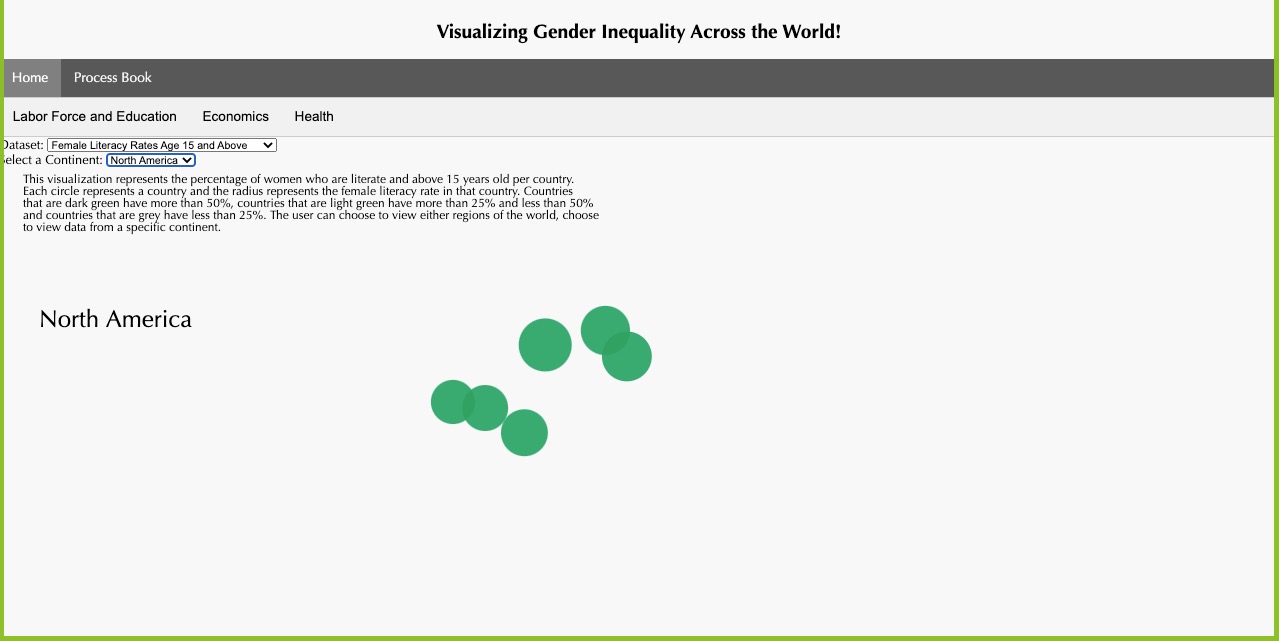
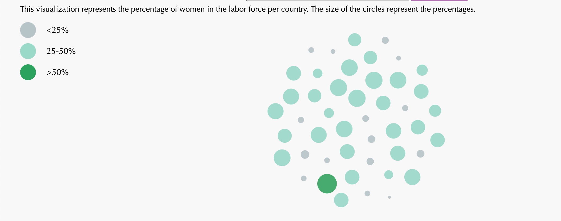
We have implemented a circular packing chart to demonstrate the relative comparisons/sizes of literacy rates, completion of secondary education, and percentage of total labor force amongst different countries which are grouped by regions. Users can select from a dropdown menu which allows them to view a particular region and they can also change the metric for gender inequality that they would like to view. The sizes of the circles correlate to the percentages of females while viewing these metrics and the colors represent the threshold for the percentages. There is also a toolip function which allows users to hover over countries to get more data about them.
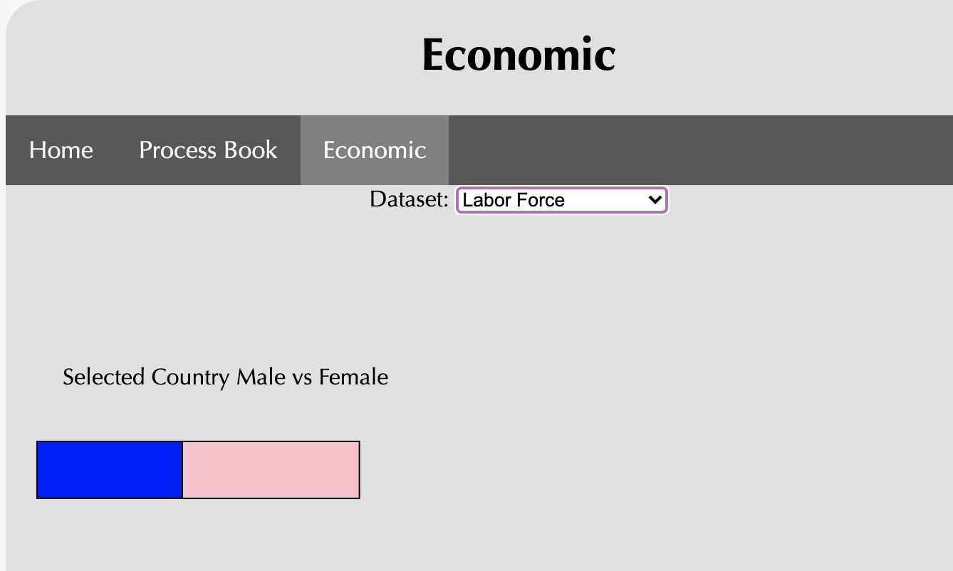
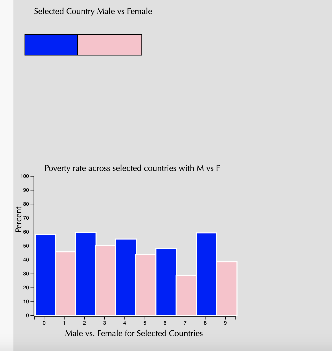
We have implemented a bar chart that demonstrates the difference, for now, between just a few countries. We will first have a tool that will allow us to see the difference between males and females in terms of poverty rates in a particular country, and we will have a drop down menu to help pick that. And then below that, we will have a comparison stacked bar chart that will show the differences in poverty rates amongst different countries. There are two bars for each country, one that represents the male statistics, and the other that represents the female statistics. The x axis reprsents the country, so it is an ordinal scale that just displays the names of the countries. And the y axis represents the percentage of the rates between males and females. The difference in height for the bar charts will demonstrate the difference in poverty statistics between males and females in different countries.
We have a third tab which will demonstrate the health disparities between genders across the globe. We have parsed the data and have acquired it, but are still working with how best to represent the data. The best way, we believe, is by implementing a map structure and then having a hover tool/tool tip that will allow the user to see the statistics of disparity in healthcare, especially women's health. In this way, the users can see a map of the globe with different hues of colors to represent the local differences between countries of different regions and you will be able to compare countries of any region to each other. In this milestone, we focused more on wrangling and doing data cleanup, so for the next iteration, we will be sure to finish our third visualization and cleanup the first two to make sure it looks better. Our main goal was to make sure we had all of our data for this milestone and that we could access that data properly so we would have an easier time creating the visualizations and having a smoother time with the views.
Milestone 2
Overview
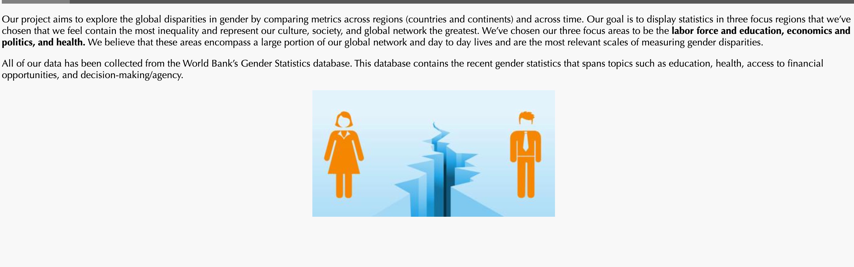
Our project aims to explore the global disparities in gender by comparing metrics across regions (countries and continents) and across time. Our goal is to display statistics in three focus regions that we’ve chosen that we feel contain the most inequality and represent our culture, society, and global network the greatest. We’ve chosen our three focus areas to be the labor force and education, economics, and health. We believe that these areas encompass a large portion of our global network and day to day lives and are the most relevant scales of measuring gender disparities.
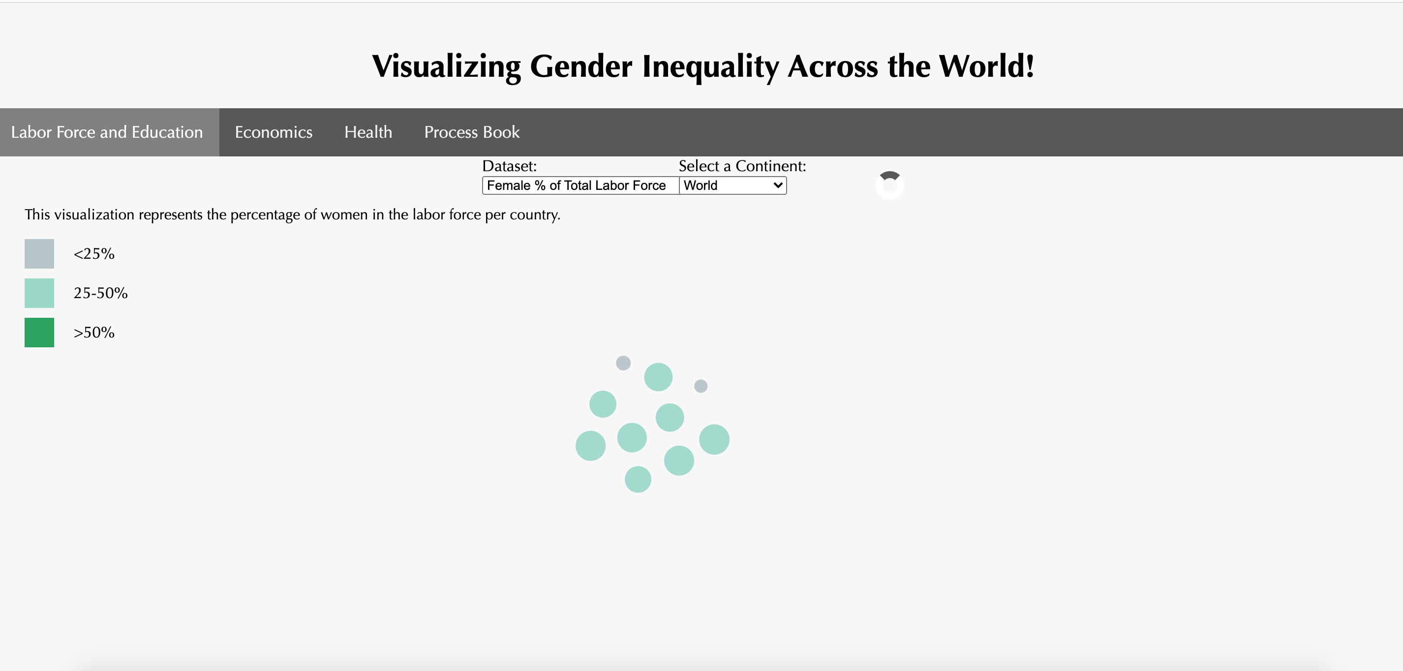
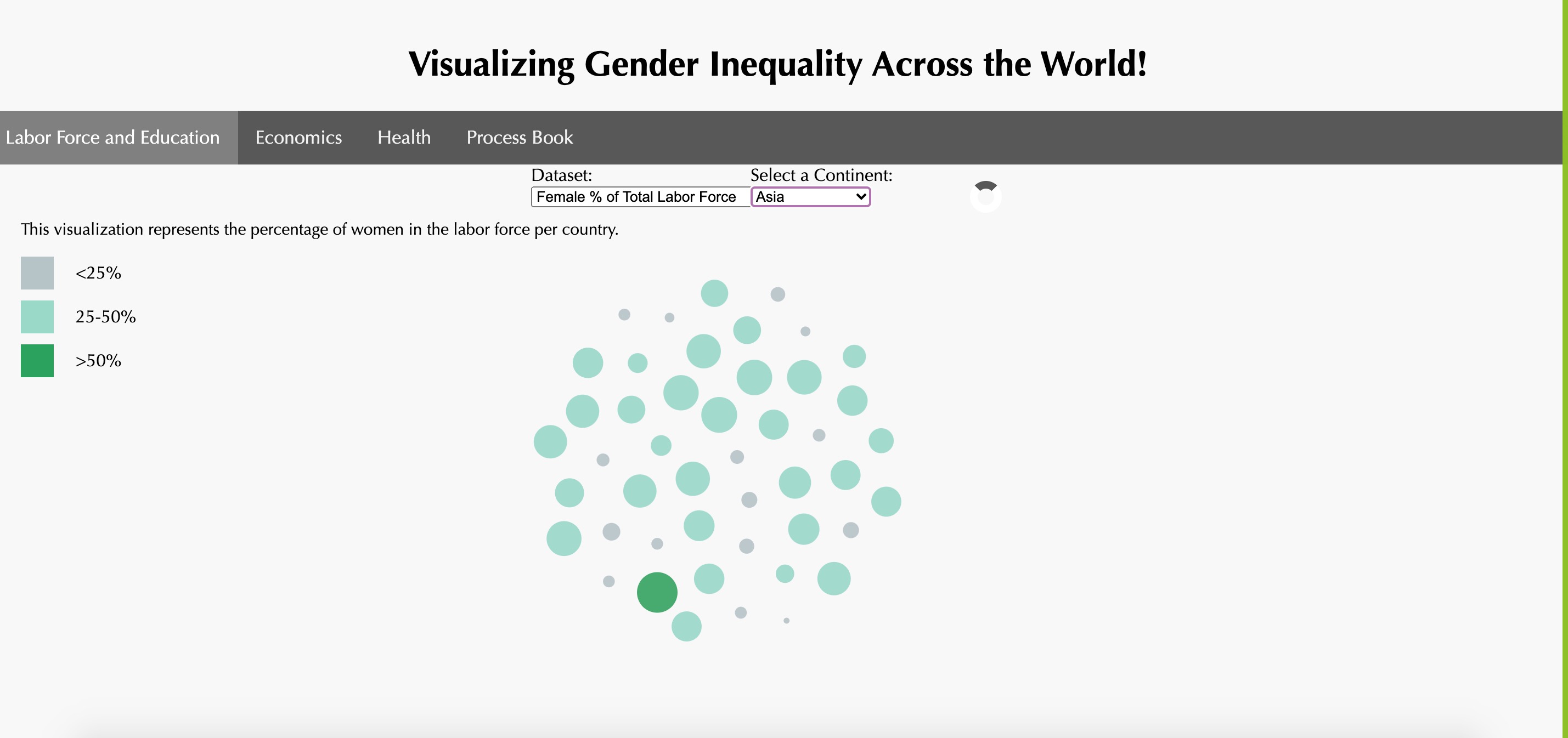
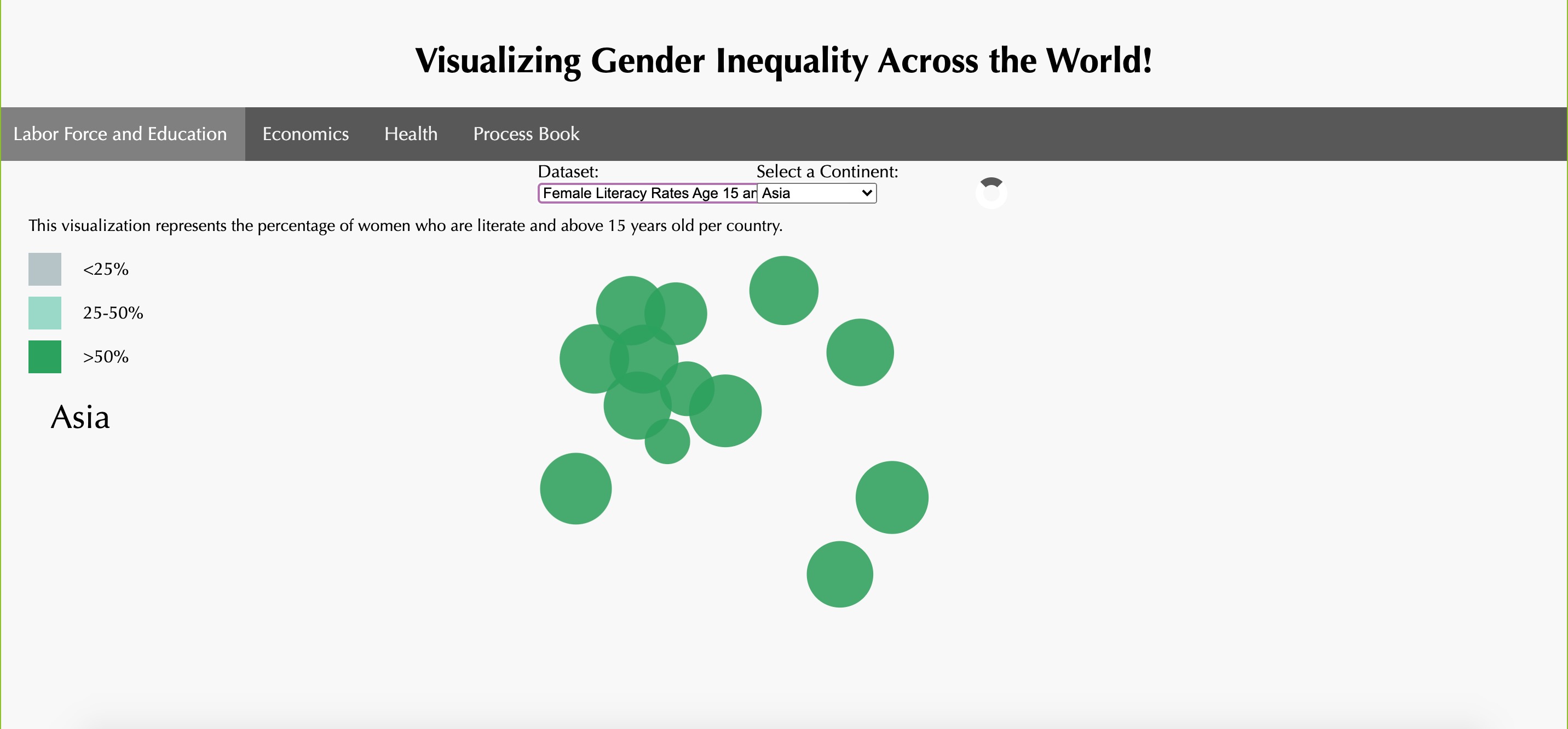
We have implemented a circular packing chart to demonstrate the relative comparisons/sizes of literacy rates, completion of secondary education, and percentage of total labor force amongst different countries which are grouped by regions. Users can select from a dropdown menu which allows them to view a particular region and they can also change the metric for gender inequality that they would like to view. The sizes of the circles correlate to the percentages of females while viewing these metrics and the colors represent the threshold for the percentages. There is also a toolip function which allows users to hover over countries to get more data about them.
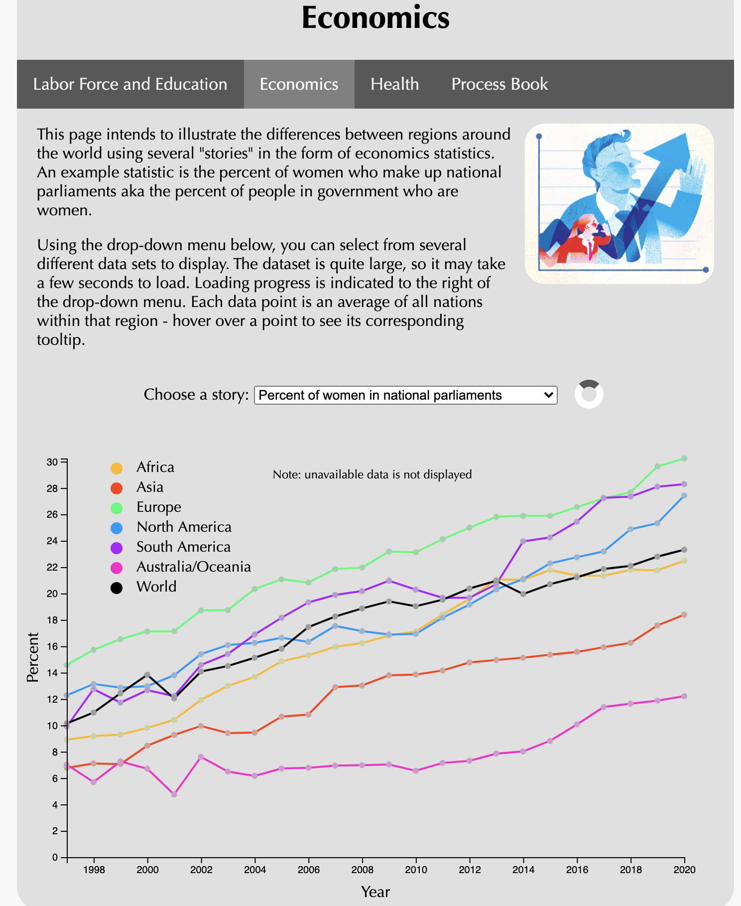
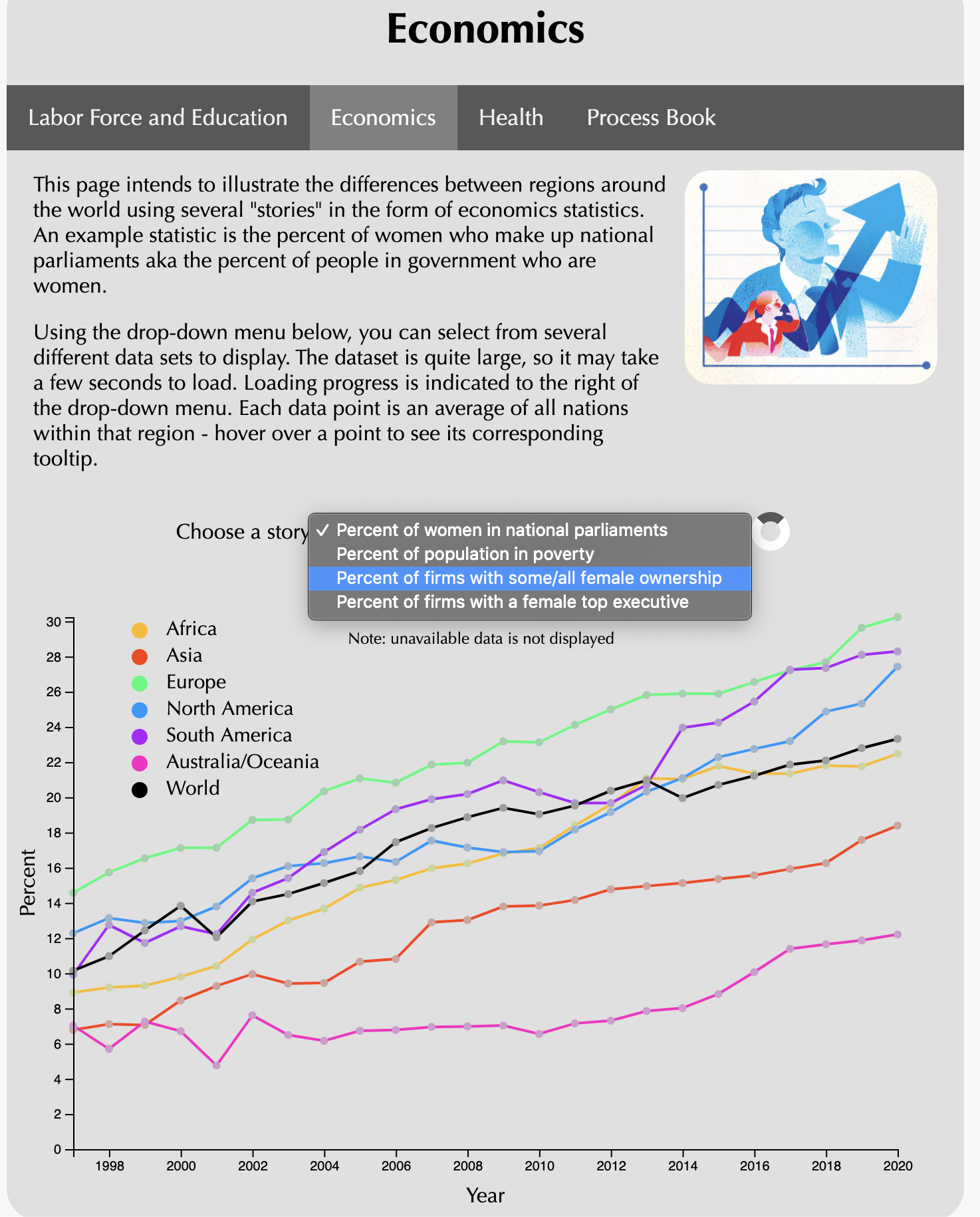
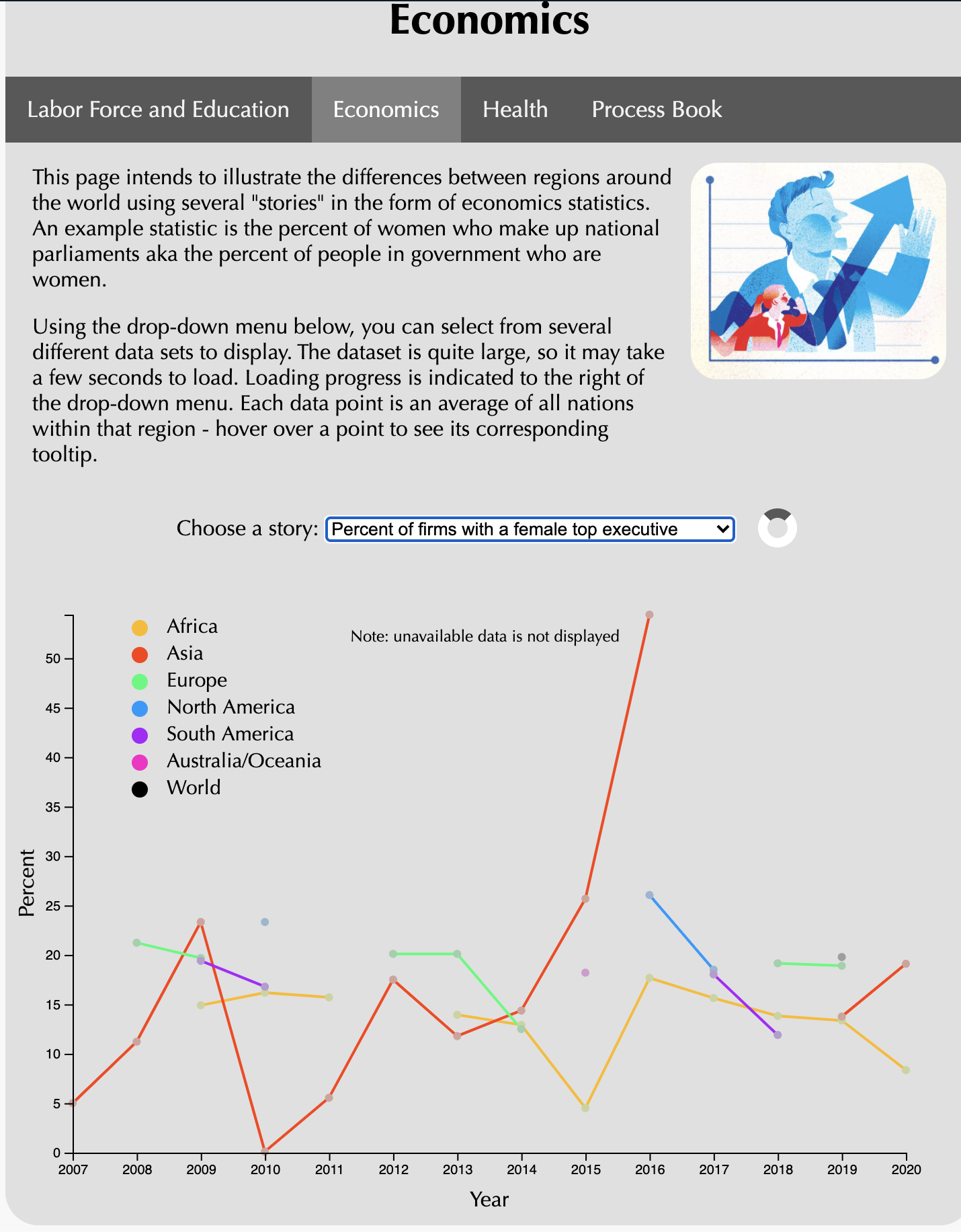
We have implemented a stacked line chart visualization that allows the users to have the perspective of seeing the different gender inequality statistics of different regions throughout the years. The stacked line chart allows for a comparison between different regions side by side, so the rates of different gender inequality variables are seen in reference to other regions. There is also the option of being able to see the statistics change throughout the years so the user is able to see the trend of these gender statistics throughout the years. The statistics in question are women in national parliaments and the poverty rate of females in relation to the overall poverty rate. Additionally, there is also a tool tip that the user can utilize upon hovering over the line charts, and the tool tip displays the region, the corresponding data (percentage) and the year for which the section of the tool tip was hovered over.
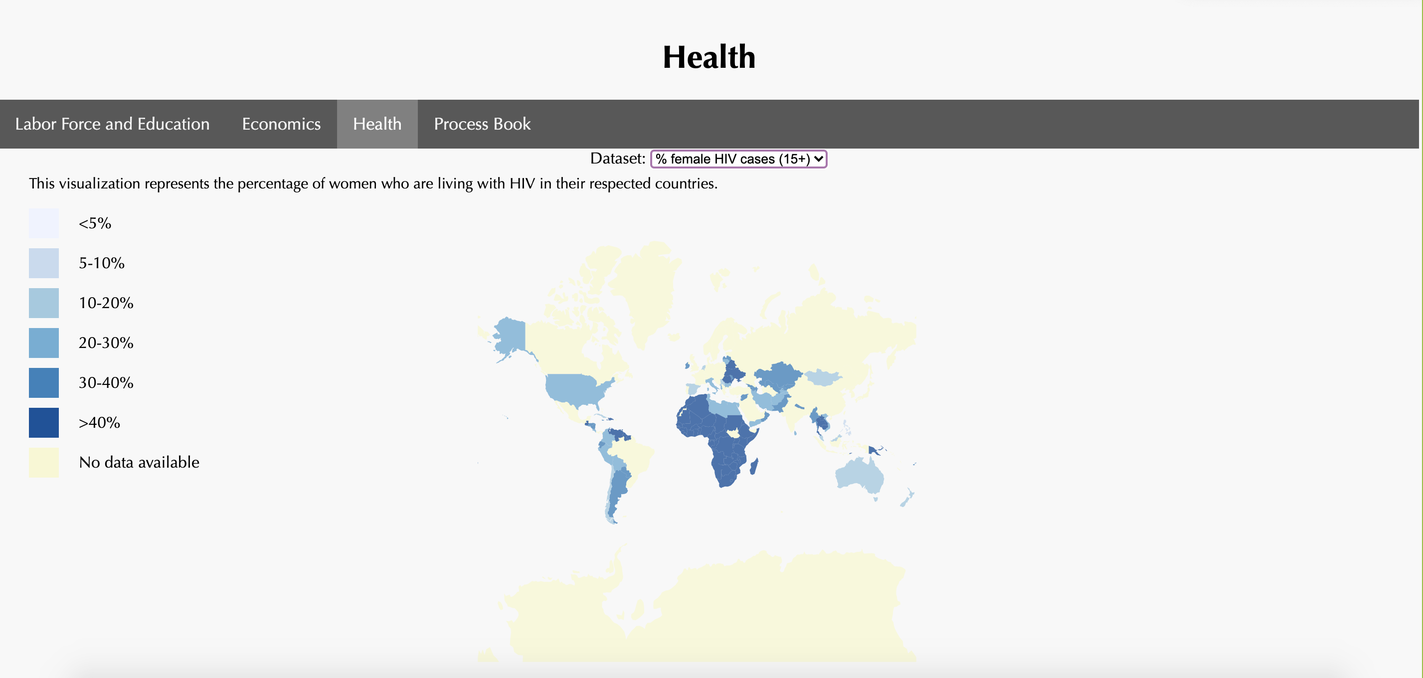
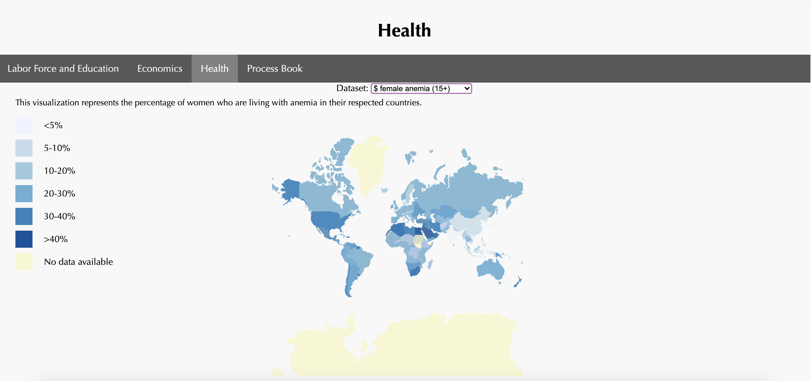
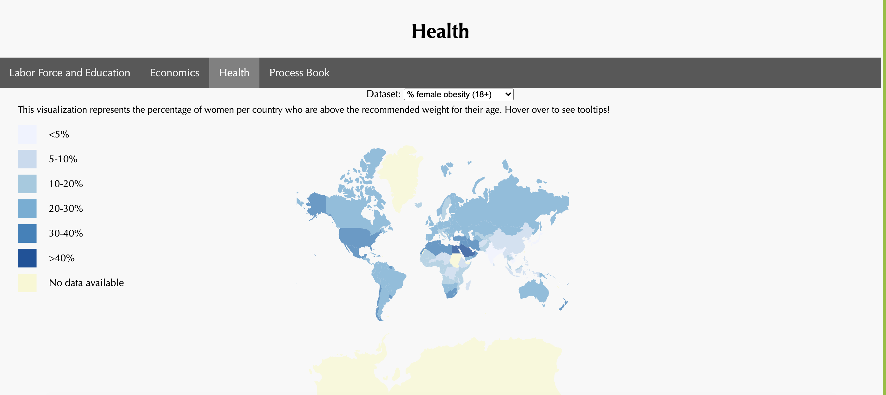
We have implemented a global map visualization that allows the users to have a unique perspective of seeing global statistics. The statistics in question for this visualization fall under the health category in terms of gender inequality and include female obesity, female anemia rates, and female HIV statistics. The user is able to view this entire map at a high level view and see the differences in these statistics for all of these values through different shading. We have included a color legend that depicts to the user what the differences in color represent, with darker colors largely representing higher percentages and lighter colors representing smaller percentage values. The views also include a tool tip upon hover over the counties, as the user is also able to see the individual country name and its associated percentage value. The map is used for a high level overview to see the various gender inequality differences amongst different countries and the tool tips are used for a more low level view of discerning individual statistics for corresponding countries.
User Study Feedback Fixes
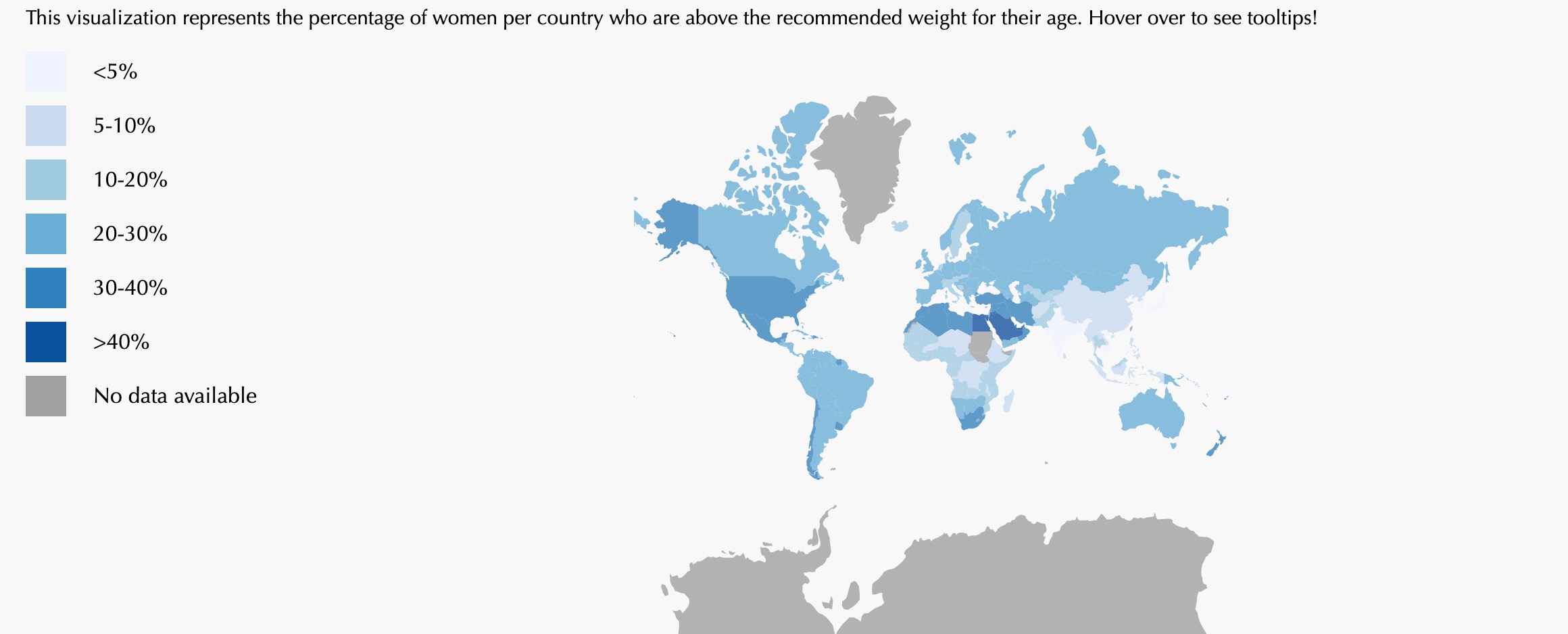
We wanted to change the color of our No Data section in our health tab for the choropleth graph. We wanted to keep the color scale ordinal and consistent and make sure that we would have a clear graph with a color scheme that was easy to identify and distinguish. Since we have different sections of percentages and a scale that divides up those percentages, we would like the color scheme to also correlate to those minute differences. In this way, the user will see a clear color gradient that will then be easy to correspond to the percentages for the particular statistical variable that they are viewing.
We got feedback from our user tests that gave us some direction and insight into how to make our site even more user friendly and how to make our visualizations clearer and more nuanced in conveying our information. Certain comments that we got were about making our three focus regions clearer in our home page. We want to make sure that when the user first finds the site, they can see exactly what we are trying to convey and how we are dividing up our information into segments for better information processing. We would like to highlight those three focus regions and bold them to make them as clear as possible for the user to understand how we are dividing up our comparisons and how these segments will come together to tell our story of gender inequality across the globe.
Additionally, we also got comments to change the squares on our legend in the circular packing chart to circles so it would be clearer to visualize for the users. Having a consistency in the shape of the visualization as well as in the legend depicting the information for that visualization is really important in the sense that we would like the users to have as clean and user friendly of a visualization as possible and so that the message that we are trying to convey does not become diminished.
We also wanted our loading symbols to disappear when they were done loading on the page instead of staying, so the user has an accurate representation of when they should expect information to be loaded on the page.
Resources
- 11/19/2020, Yan Holtz, d3 graph gallery, circular packing: https://www.d3-graph-gallery.com/graph/circularpacking_template.html
- 11/19/2020, Yan Holtz, d3 graph gallery, circular packing: https://www.d3-graph-gallery.com/graph/circularpacking_drag.html
- 12/4/2020, d3noob, bl.ocks, paths/lines: https://bl.ocks.org/d3noob/4db972df5d7efc7d611255d1cc6f3c4f
- 12/5/2020, Shubham Singh, geeks for geeks, Tick formatting: https://www.geeksforgeeks.org/d3-js-axis-tickformat-function/
- 12/6/2020, Mitch Lamers, codepen, Loading indicator: https://codepen.io/mitchlamers/pen/YNaqmV
- 12/6/2020, Yan Holtz, d3 graph gallery, Chloropleth hover: https://www.d3-graph-gallery.com/graph/choropleth_hover_effect.html