CSE 457 Final Project - Process Book
Vihar Desu | vihar.desu@wustl.edu | 443845Nick Murray | nicholasmurray@wustl.edu | 441567
Return
Exploring global clothing trends through 27,000 Instagram photos
With improvements in computer vision models and billions of photo uploads to social media platforms like Instagram, a new form of culture and fashion analysis is possible.
In this visualization, we want to demonstrate and explore a few techniques to analyze the trough of great image data available on Instagram to explore clothing preferences in various major cities.
Overview & Motivation
Our motivation for this data visualization project is in part an experiment and in part a venture into trend analysis that influences millions of people’s clothing decisions everyday.
Fashion trends are influenced by culture in a unique way that allows people to express their identities and connect with others in their communities. We want to take advantage of image data that enable us to quantitate fashion and style trends on both temporal and geographical scales.
Here, we present a framework for visual discovery at scale, analyzing clothing and fashion across millions of images of people around the world and spanning several years. We hope this project inspires further conversations about this form of analysis
Questions
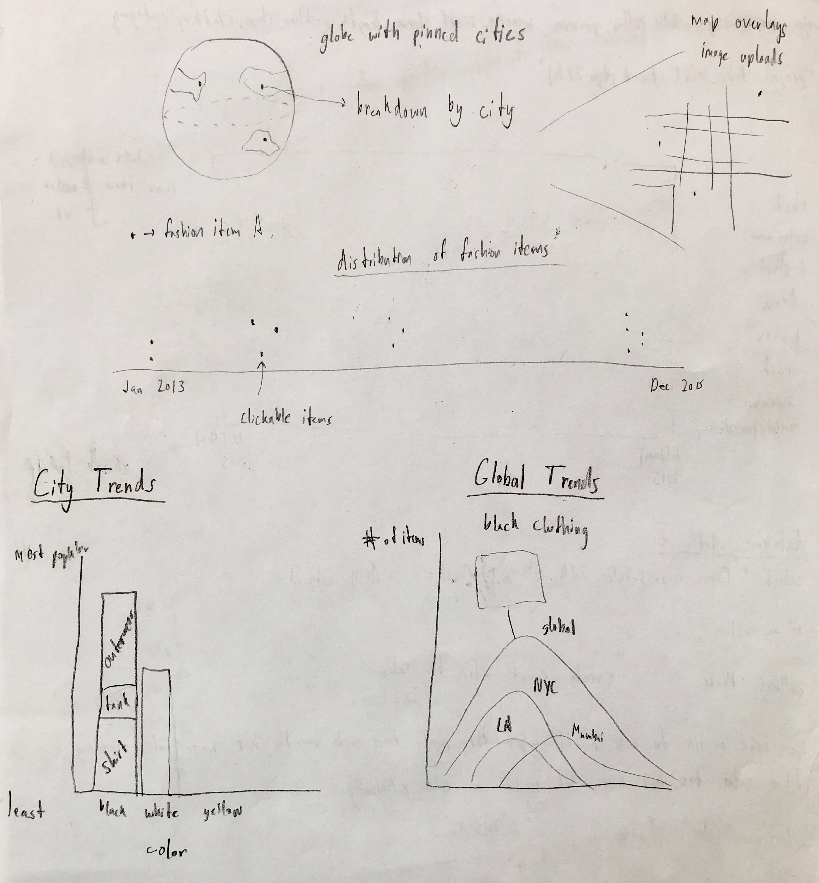
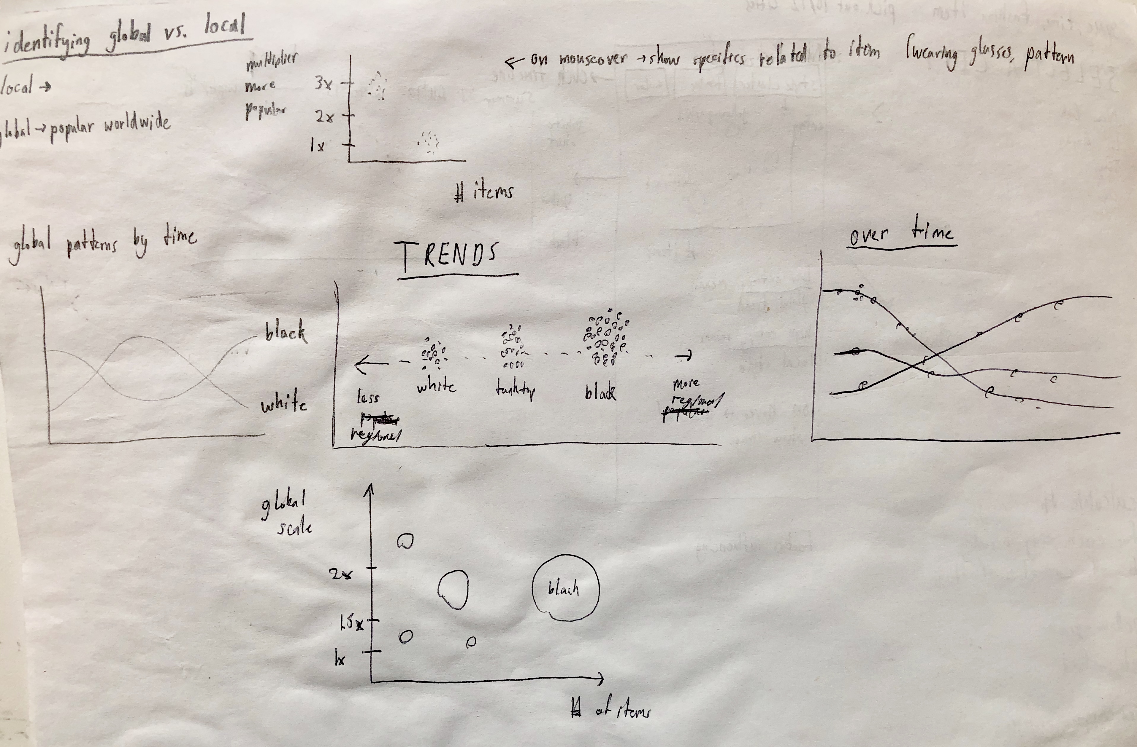
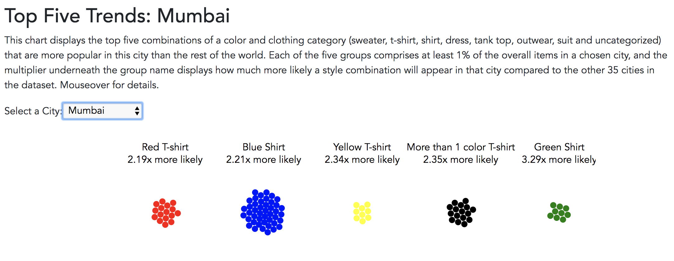
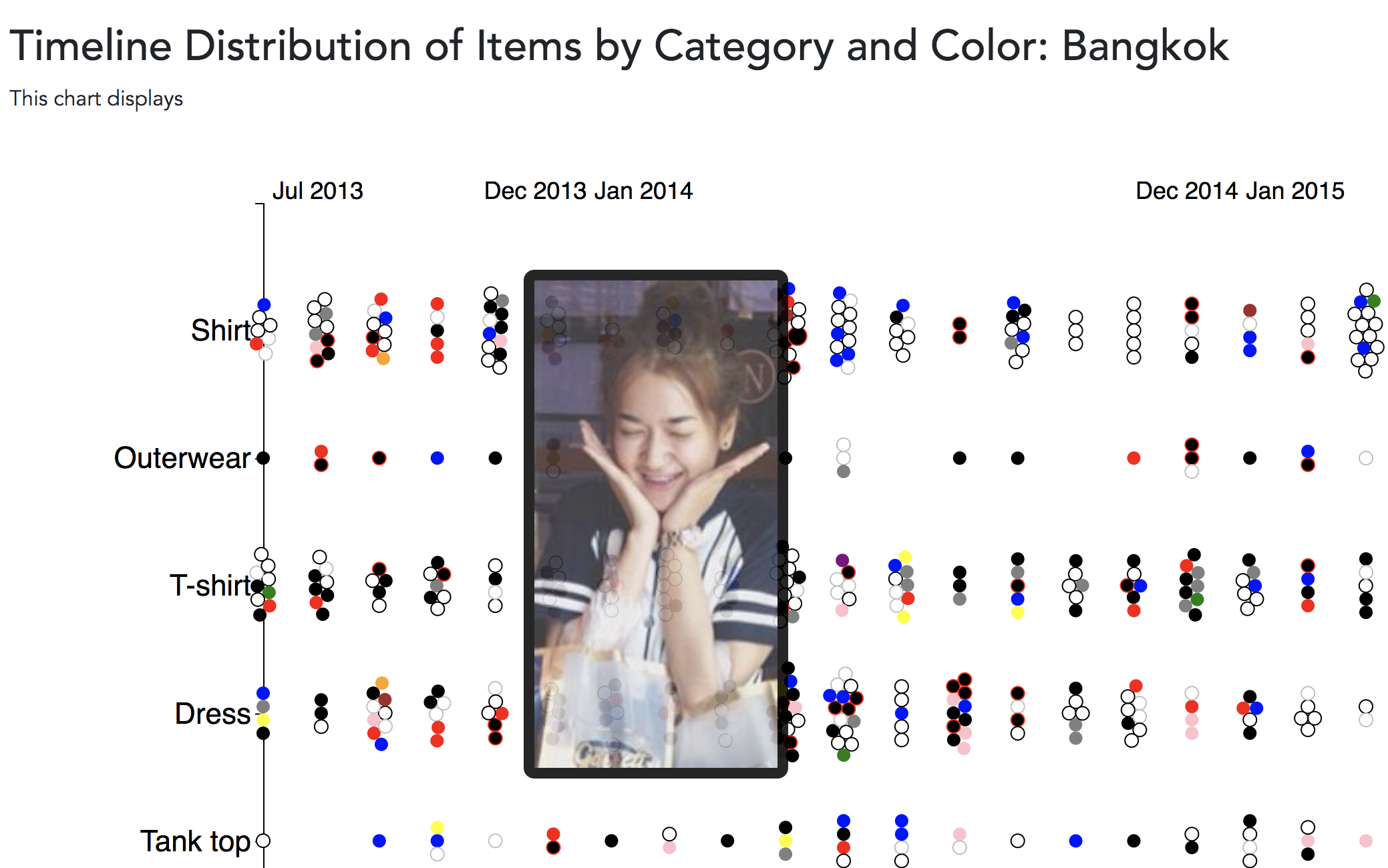
Can we identify fashion patterns by observing clothing trends across cities and time?
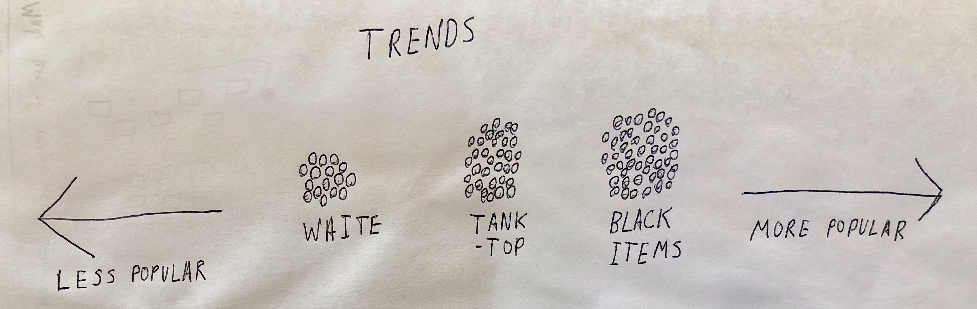
One of the key leading indicators for our project was clothing item distribution. We wanted to be able to identify whether certain patterns occur; for example, were are a lot people wearing black in a city like New York on Fridays? Do more people tend to wear white and light colors during warmer temperatures?
Can we illustrate direction? Where are fashion trends going?
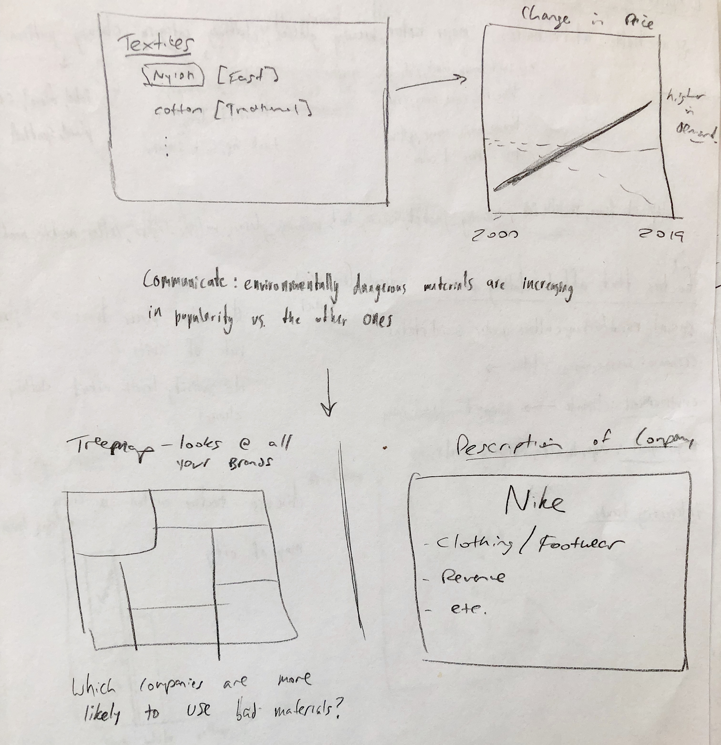
Although future fashion may be considered unpredictable, historically fashion trends have experienced longitudinal patterns. We want to uncover such fashion patterns and potentially key into certain fashion trends so that we can identify the effect that these trends have had on environmental impact. The example below demonstrates a fashion trend in women’s swimsuits, and we can draw intuition about the particular impact that these trends may potentially have.
Our project has evolved a little bit since we first started. We explore various ways to visualize our data, and at each iteration, we found ourselves finding better techniques to present the data. Originally, we were interested in demonstrating the environmental impact of the clothing industry. We were interested in answering questions like: Are there certain trends that are worse than others for the environment? Do certain city and company pairs influence fast fashion more than others? Is there a way to visualize how this influence spreads on gegraphic and temporal scales?
Data
Our data primarily came from the following two sources:
StreetStyle: Found Here.
Pitchbook: Subscription Only.
Our data capture, cleaning and processing can summarized as so:
We fed our data into an SQL database, where we ran queries for specific visualizations.
In order to capture the likelihood of a trend, we calculated the percentage of each combination in the total dataset, and compared it to individual city percentages.
We set a minimum limit of 1% of all of a city's pictures in order to consider it a trend.
Each instagram image contained the following categorical, boolean and continuous values: Id, url, created_time, city_id,month_id, lat, long, x1, y1, x2, y2, width, height, clothing_pattern, major_color, wearing_necktie, collar_presence, wearing_scarf, sleeve_length, neckline_shape, clothing_category, wearing_jacket, wearing_hat, wearing_glasses, multiple_layers
In addition, we also created an Amazon s3 bucket to store all the images downloaded from the original dataset.
The s3 bucket is, https://s3.amazonaws.com/streetstyle27k , and you need an image's specific key to view it.
Exploratory Data Analysis
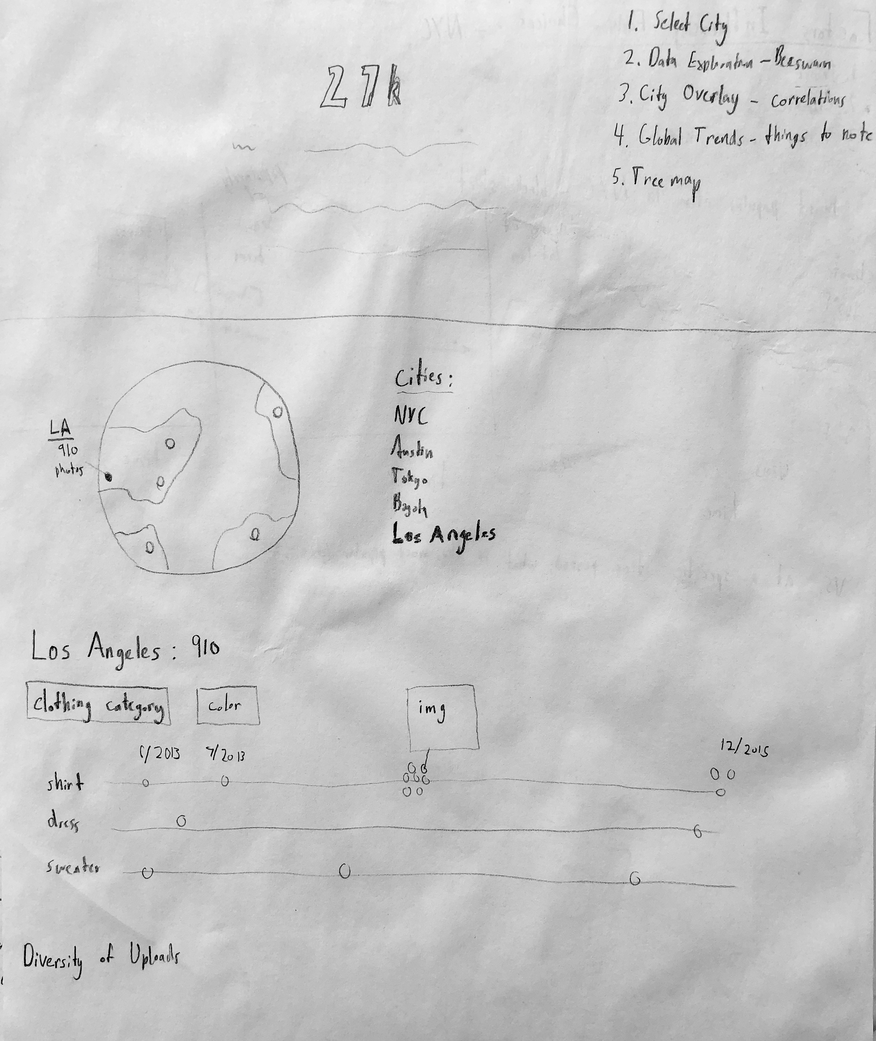
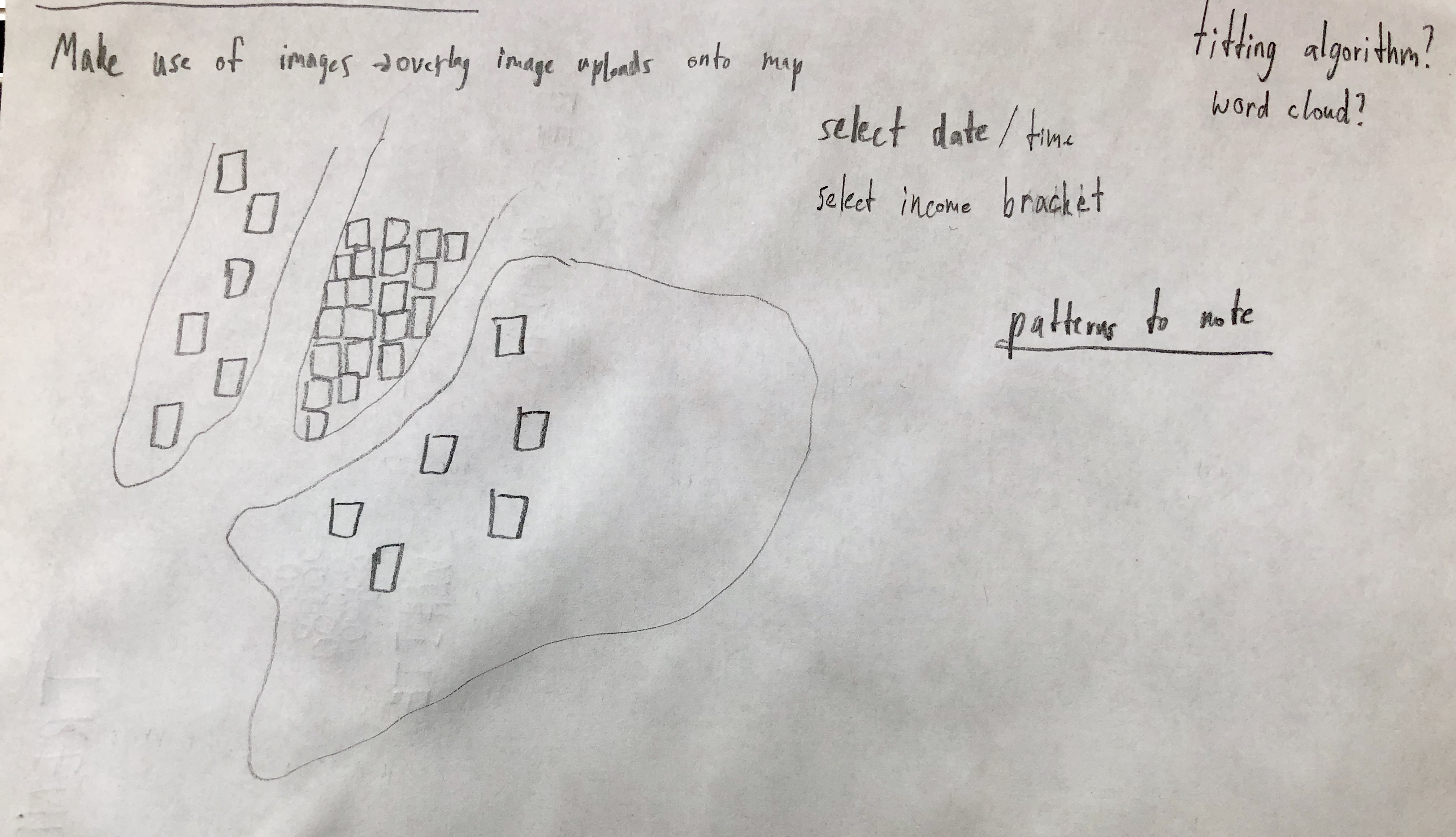
We had experimented with a lot variants with our initial visualization designs. Our core theme centered around visualizing cities and having an exploratory interactive component as demonstrated below. We ultimately stuck with this idea.
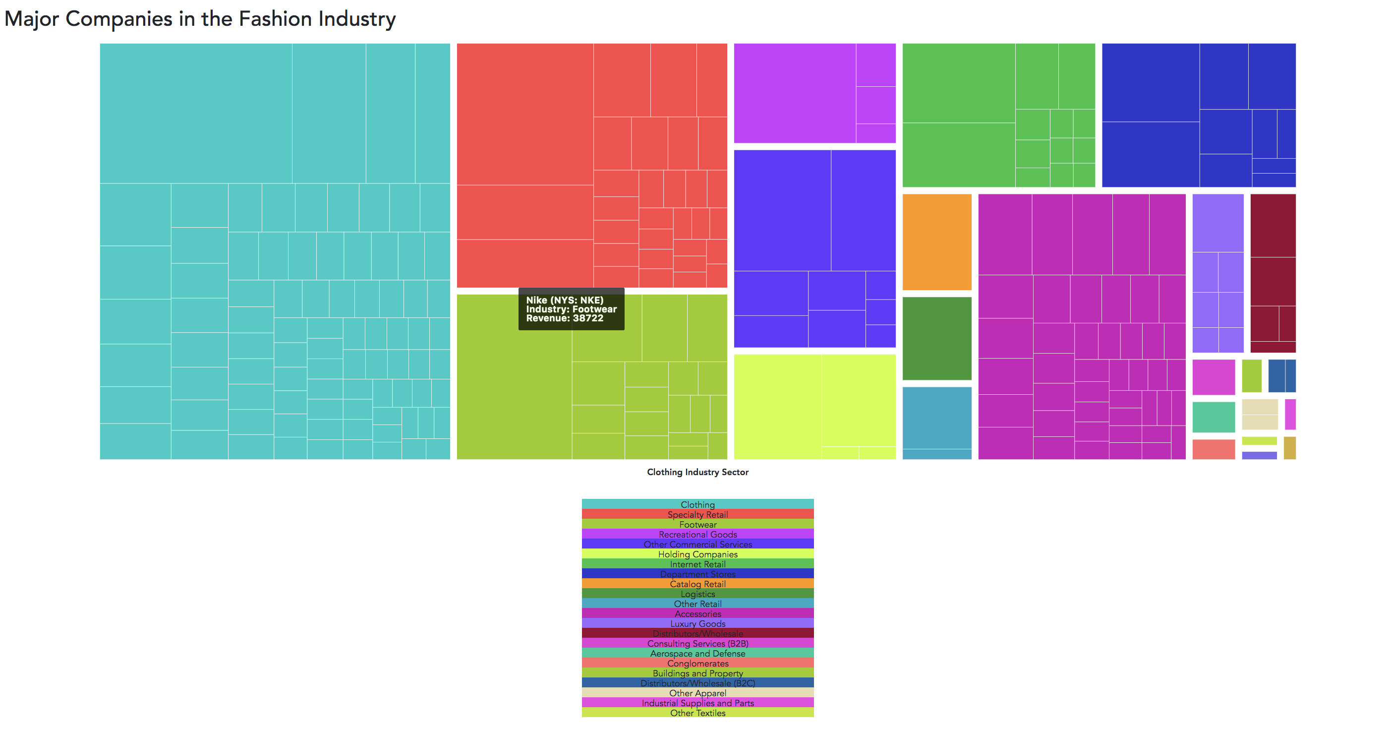
Additionally, we experimented with styles like representing fashiong companies through their clothing categories (footwear vs. athleisure etc.). We played with treemap implementations, interactive bar graphs and line charts and linear trend analyses like below.
Design Evolution
Ultimately, the beeswarm was chosen as the distribution for the clothing categories so users could easily compare data points, and then they could see individual images.
Users are then able to navigate a host of different visualizations linked to the beeswarm to gain perspectives about trend distributions more visually. We believe that experiencing size differences visually and time-based trends linearly were most effective in communicating the data.
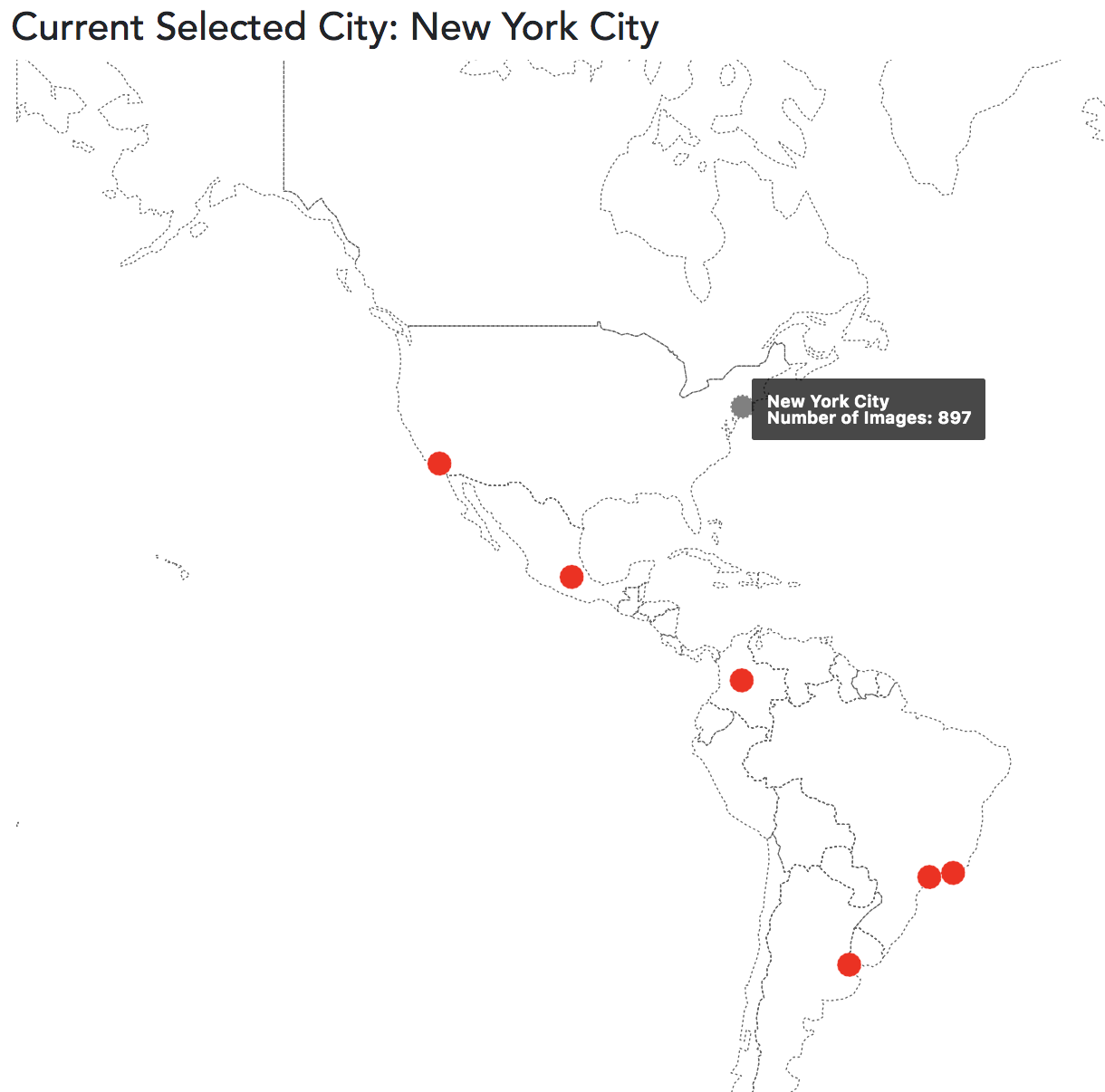
An additional instrument we wanted to use was Leaflet's interactive maps. We felt that they effectively helped capture one of our main visualizations: a geographic city-display with our Instagram data overlayed directly on top of it (fitted to the longitude and lattitude that the images were posted in. We felt this added an effective density dimension to our visualization.
Implementation & Final Design
Our final representation sought to capture the image data in the most honest way possible while still providing an intuitive format for organic exploration of the content. Our first visualization provides a starting point for the exploration where users can select a city on map to start exploring trends.
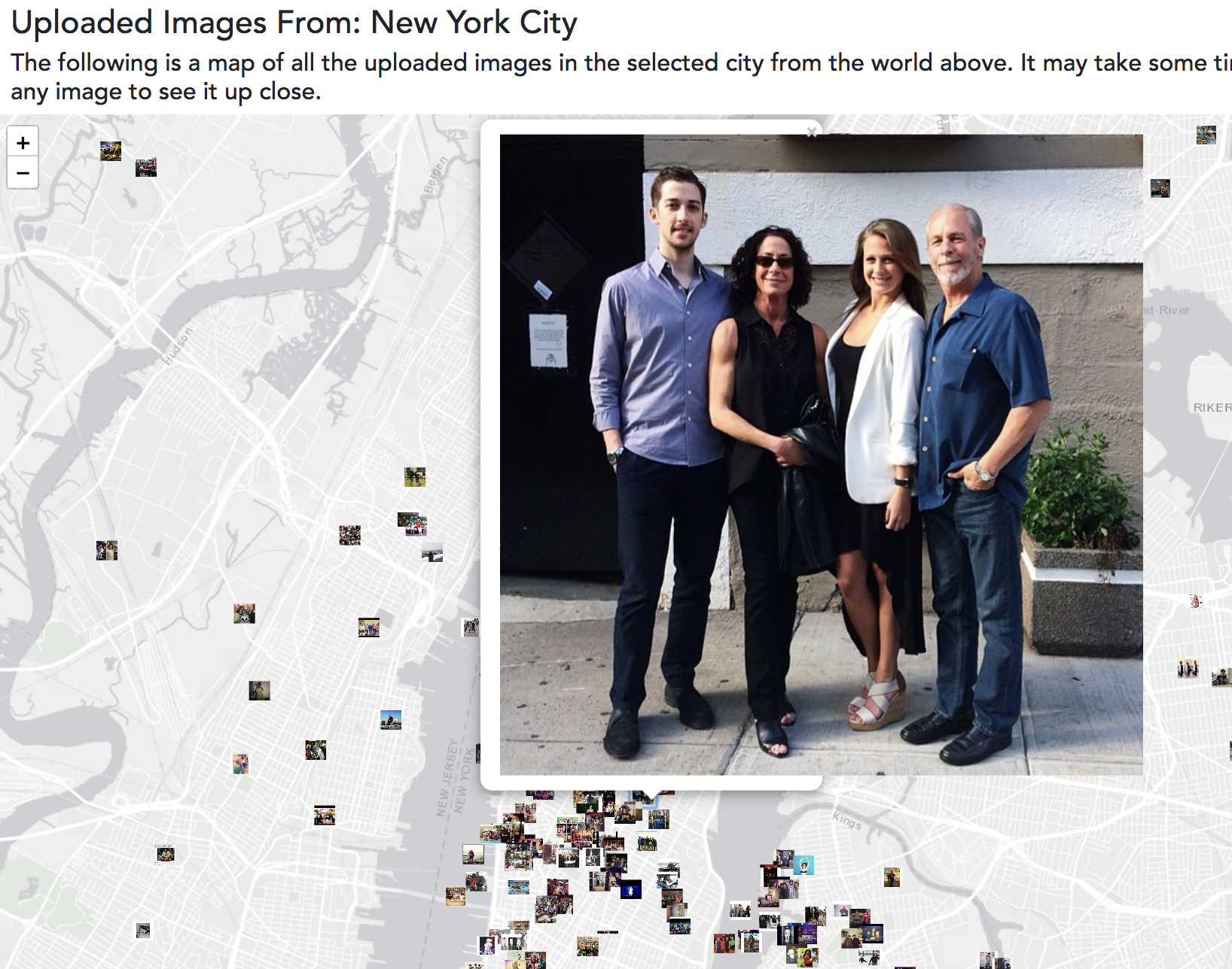
We nudge the user to pay attention to a few key comparisons among styles. We give users access to those images in varieties of accessible formats rather than baraging them with random images.
We also allow users to explore relative sizes of their favorite fashion brands, prodiving them with a visual breakdown of the fashion industry by subsector.
Evaluation
Our major takeaway point from our iterative design process was that honest communication of data is more powerful than rigorous back-end analysis. We toyed with more sophisticated pre-processing techniques and played with non-intuitive representations of our data. We ultimately realized that a major advantage of data visualization is that it helps communicate complicated information in accessible ways.
We carried this philosophy through our final implementation, and it was one of the most beneficial shifts of thinking for our project. We sought to be clean and clear; however, we didn't want to compromised the quality of our analyses.
In the future, I think this approach for our design thinking can go in a lot of different directions. On one hand, we can foster more creativity on data-joining. In other words, we want to find unique ways to combine independent data sets to provide layers of depth not available in individual feature-spaces. Additionally, we want to think about human intuitive design in a more critical way; we think that prioritizing how a user engages with a visualization leads them to certain conclusions. This form of nudging we think will be a really important design approach.