Process Book for The New Workforce
Contributors:
Rome Diaz-Rivero - romina@wustl.edu - 476327
Jason Li - j.m.li@wustl.edu - 486661
Background and Motivation:
At the turn of the decade of the 2020s, the job market in the United States entered an era of volatility, starting with
a historic layoff during the height of the Covid-19 Pandemic that the labor market has yet to recover from. (1)
With the introduction and proliferation of AI brought even more anxiety and uncertainty among Americans relating to job security. (2)
With the advancement of AI, many have felt threatened by possibly being laid off due to their occupation being able to be accomplished by more efficient AI,
which, as it grows closer to and may exceed human performance, may appear more desirable than human workers to employers.
With our project, we will analyze the rising interest in AI through search engine usage versus the numbers of layoffs in cities worldwide. Then we will see just how much AI
popularity correlates to bigger layoffs, or if they correlate at all.
Project Objectives
Our objectives are:
- Show the popularity of AI in search and use since at least 2019
- Analyze trends in layoffs from 2020 to present in various geographic locations.
- Map trends in both datasets, comparing and contrasting the trends of the popularity of AI and job security
in order to discern whether a tangible relation exists between the two.
Data:
For our search data, google provides its own analysis of search trends, which users can easily specify and obtain specific data relating to
the search term over a desired time range. Google gives the user the ability to download large quantities of data relating to searches
and can be filtered by region and date for further specificity.
For information about job layoffs, we turned to the machine learning and data science dataset website, Kaggle. We found publicly available dataset that provided ample
information about job layoffs from 2020 to 2024, with features including the specific number of workers laid off, the region (by city), and even the relevant industry of the layoffs.
Data Processing:
Both the datasets are in .csv format, so processing covnerting them into json files
where each row corresponds to a sub-json object shouldn't cause any compilations.
However, one issue is that while Google's dataset is unwaveringly consistent, the
Kaggle dataset requires a significant amount of filtering, as occasionally
required columns such as "number of workers laid off" in the csv are not filled
in some rows, resulting in rows that are unusable for analysis and presentation, requiring us to reduce the size
of the dataset. Once the data has been converted into json objects, we can use
JavaScript's d3 library to present the data in visualizations. For more diversity and insight,
Google's dataset will come from data for multiple AI-related search terms, such as "machine learning" or "chatbot".
Google's datasets will be combined to create an analysis of the overall interest tred in artificial intelligence.
Visualization Drafts:
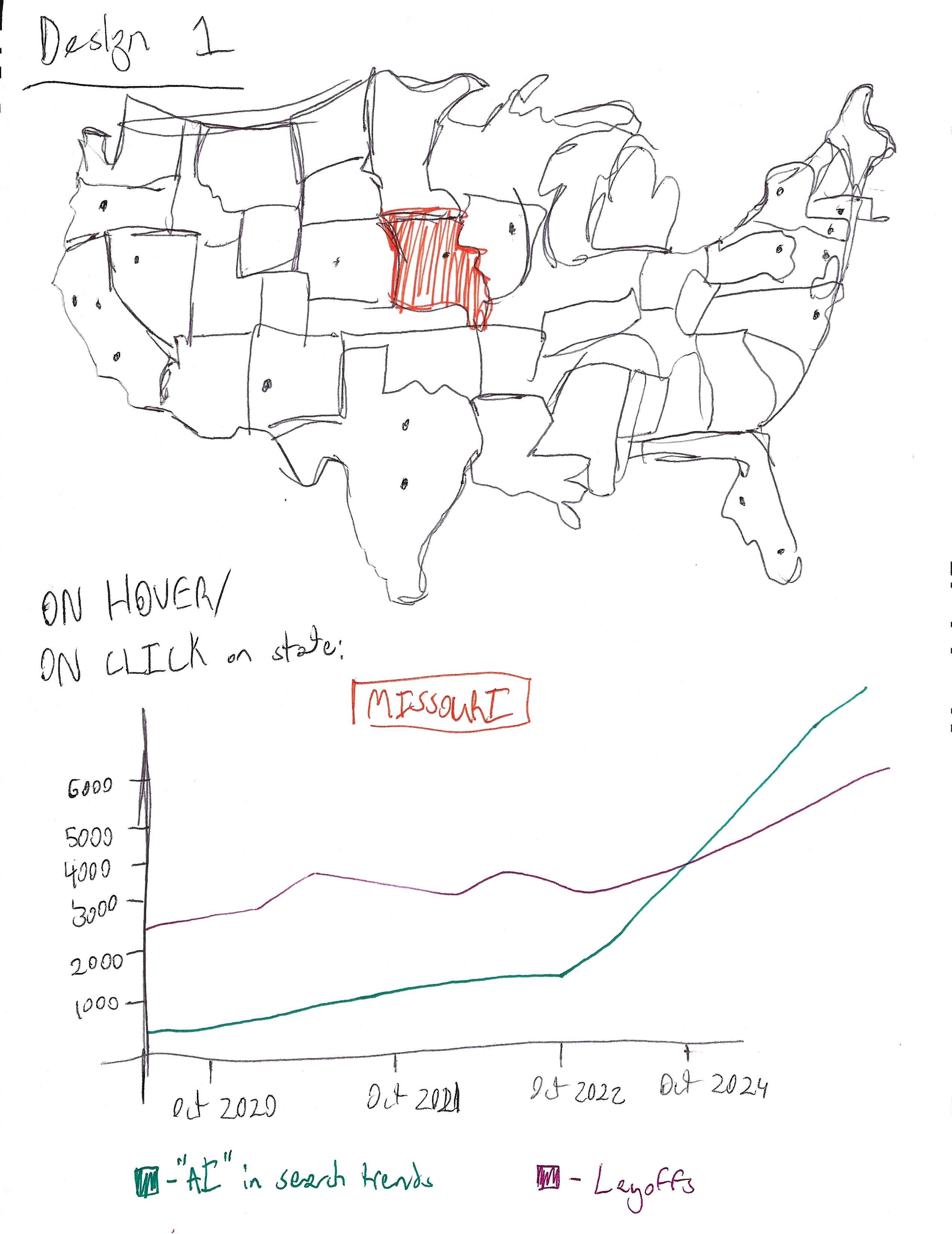
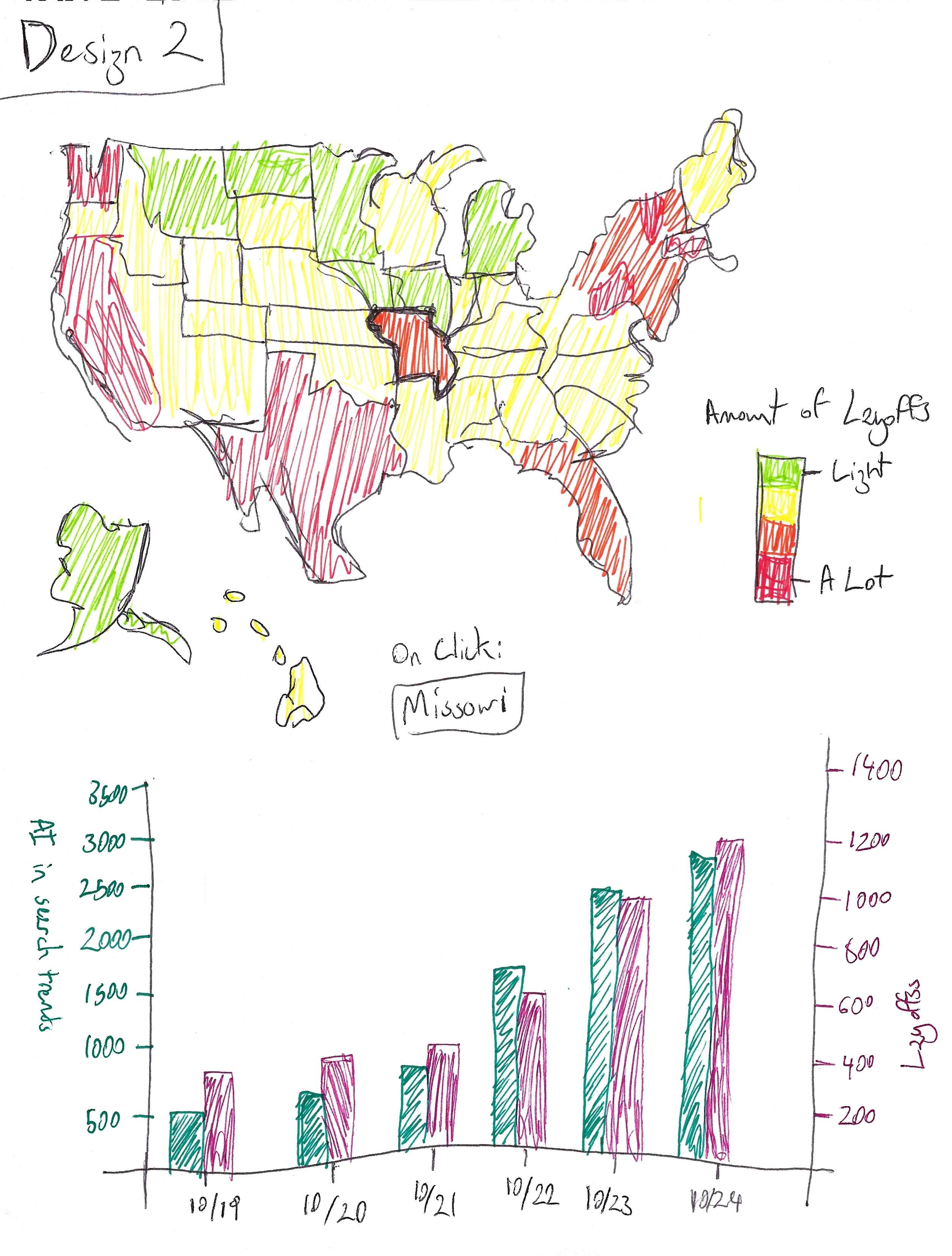
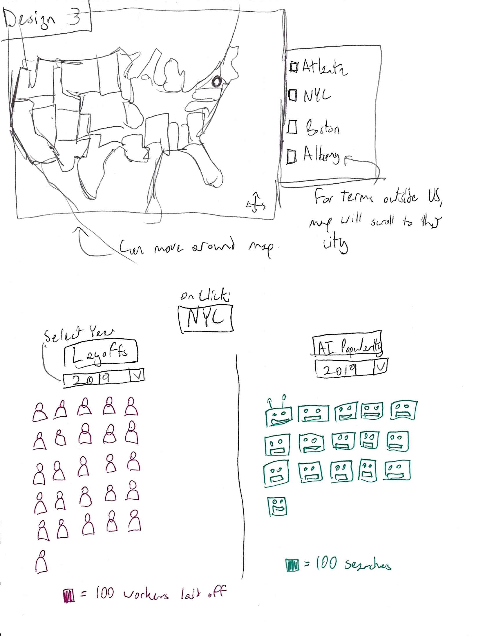
Three sketch designs, where we played around with line graphs vs. bar graphs vs. icon arrays.


 Final Design Draft


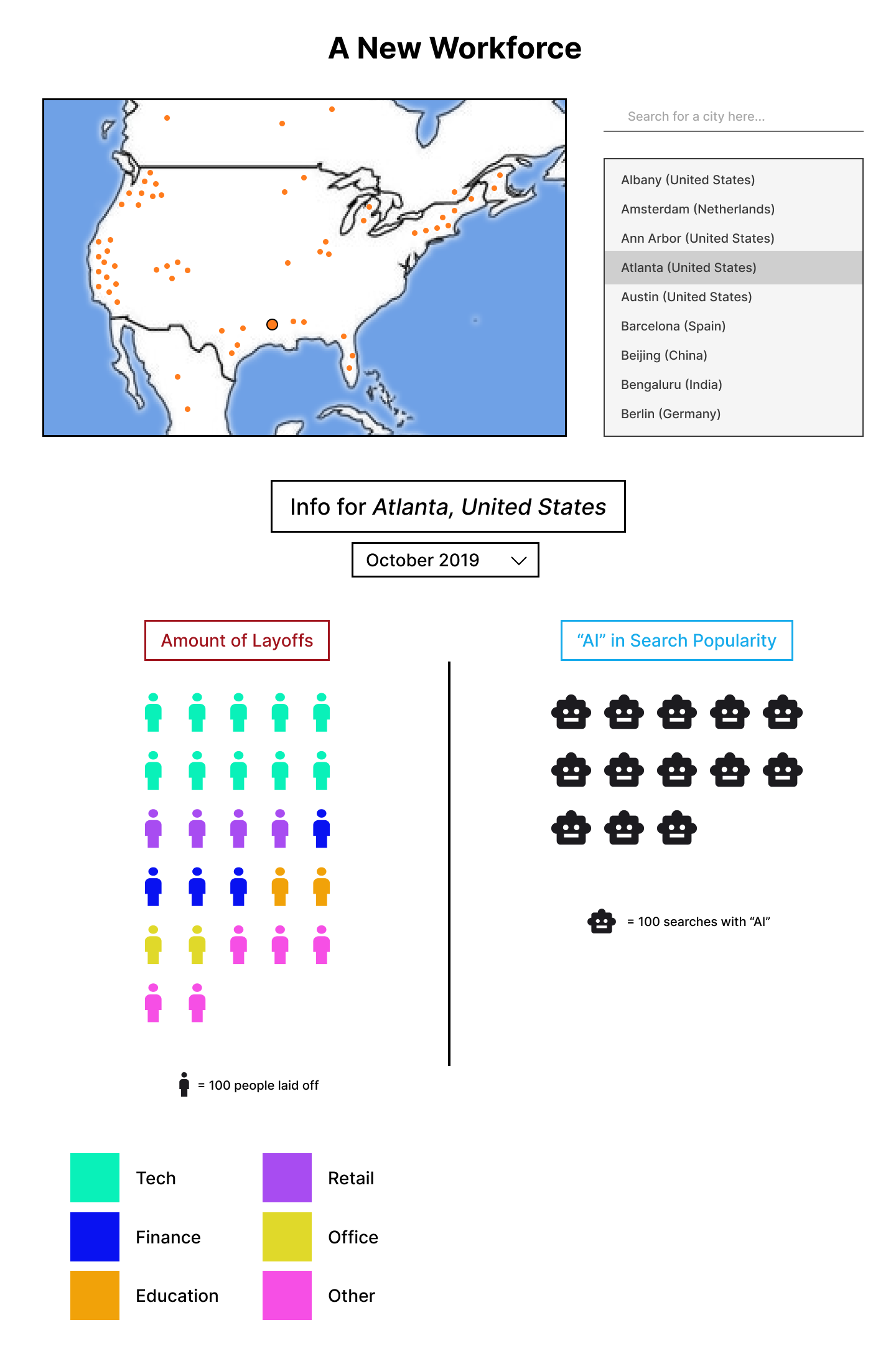
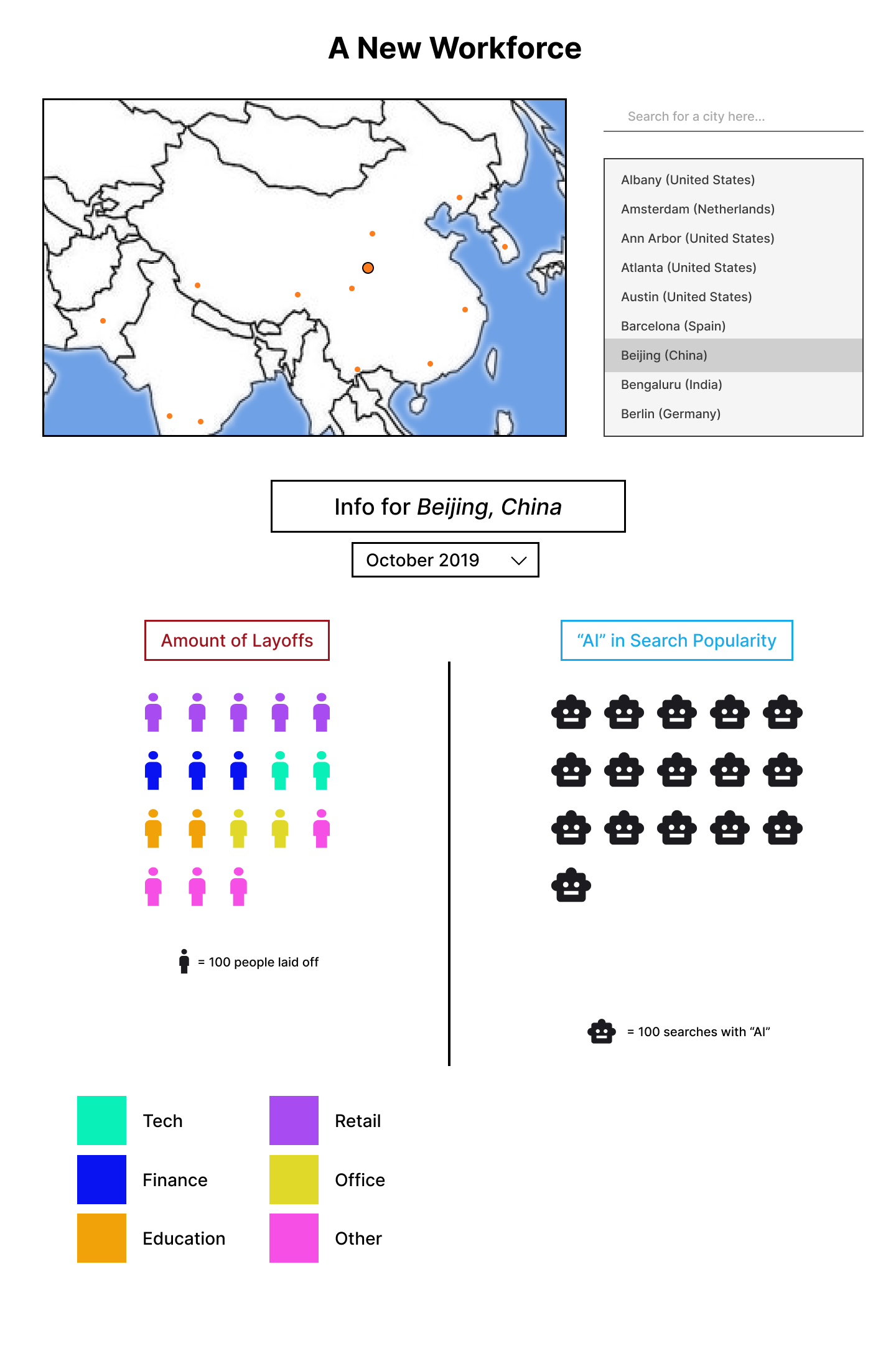
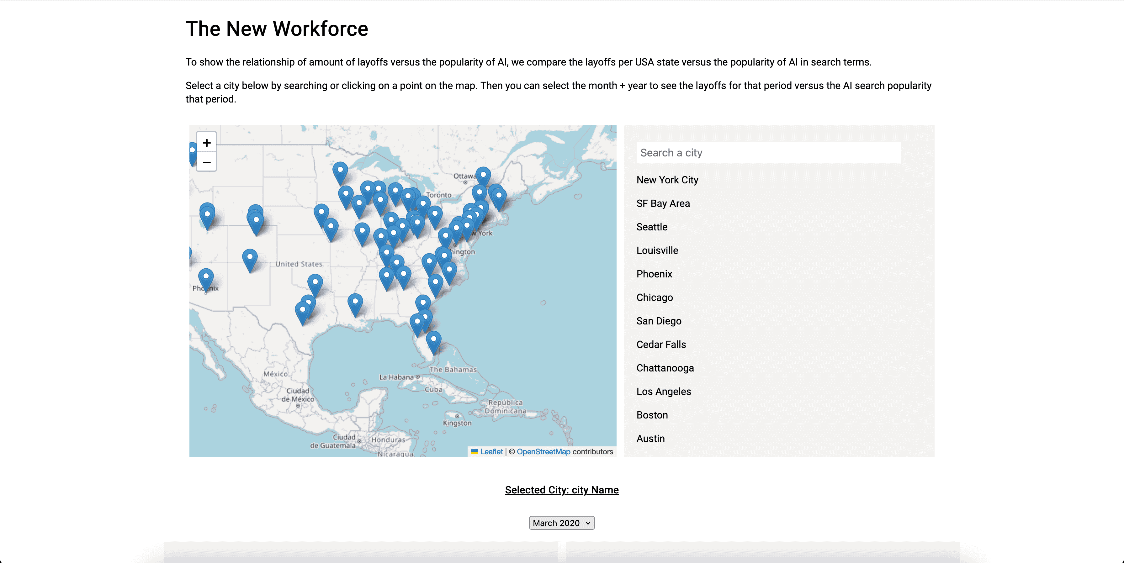
For the final design, we decided besides the obvious map and city selection, to display the
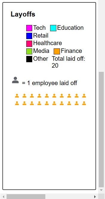
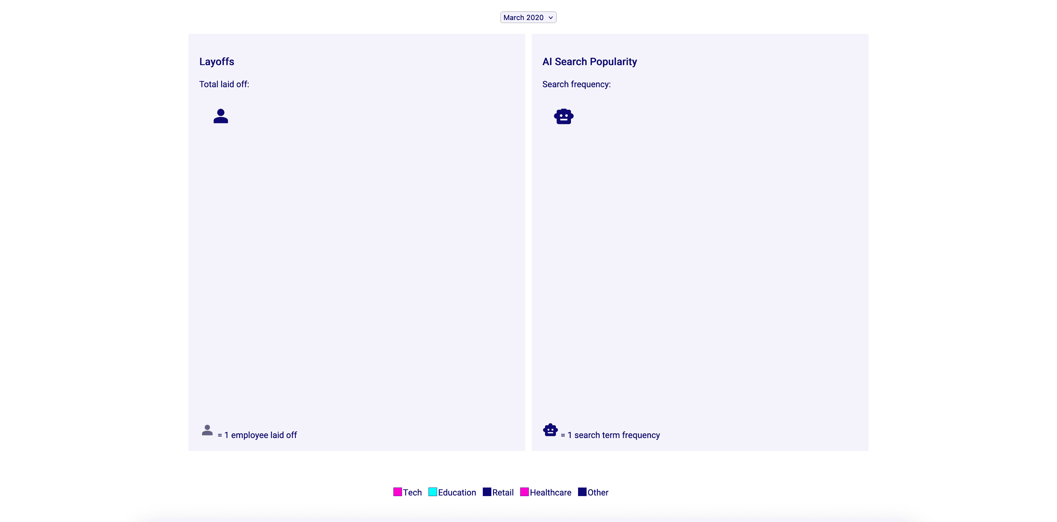
results for each city with icon arrays. The layoffs amount will be represented by people icons,
while AI popularity is shown per robot icon. After the user selects a city from a circle on the map,
on the bottom will come up the results for that selected city. The user can select a month/year
range from the selection menu above, then the results return two icon arrays— the layoffs and
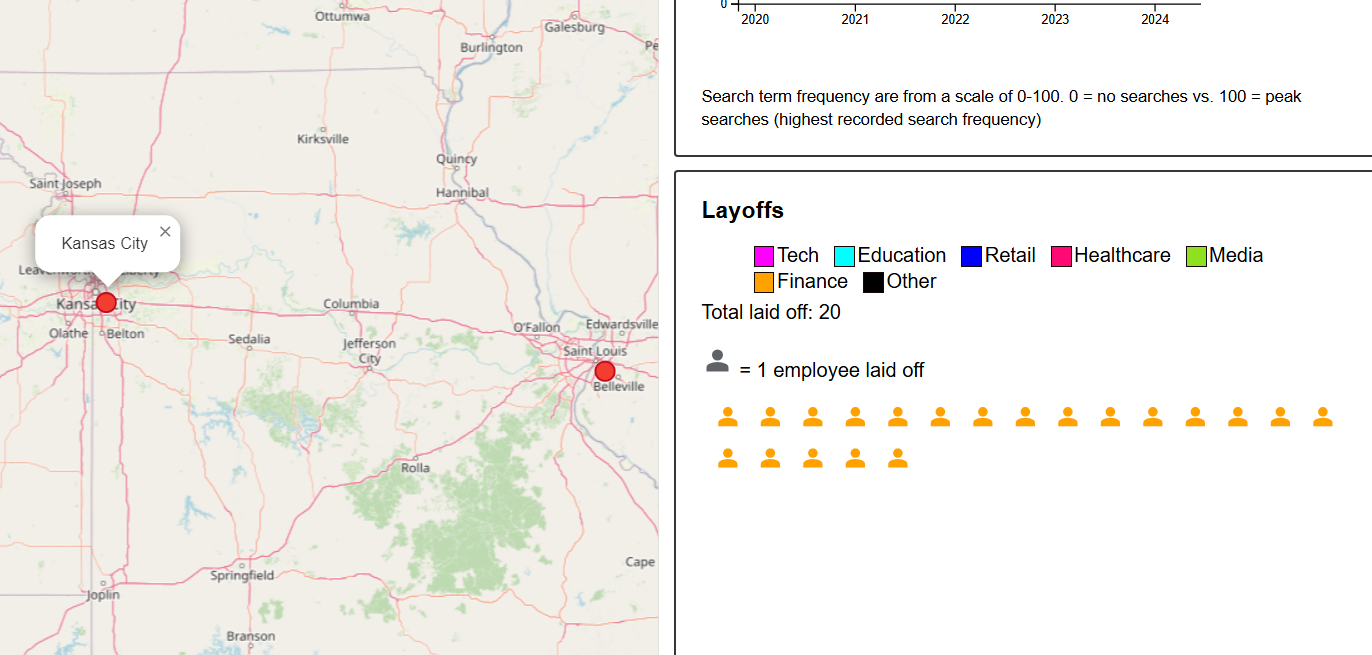
AI search popularity. There will also be a use of color for the laid-off people to show what
field their job was in (tech, retail, education, etc.).
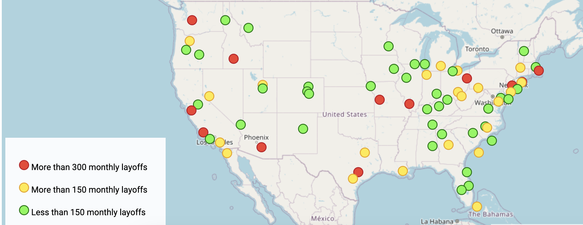
The map and dots on it will allow users to drag and easily select a city of interest. If the user
has a specific city in mind, they can also type it in the search bar on the right, and find it on
the list below it. We chose the icon arrays since we though the visual interest of person vs.
robot would be more interesting for our topic. It also allows to show different values per icon
instead of dealing with one scale on the y-axis like with bar charts or line graphs. For example,
one person icon can mean per 100 people, while 1 robot icon can mean per 300 searches with "AI".
This can be more easily differentiated with icon arrays and their lengends/keys, while one axis
can't handle that difference in scale.
Milestones
Milestone #1


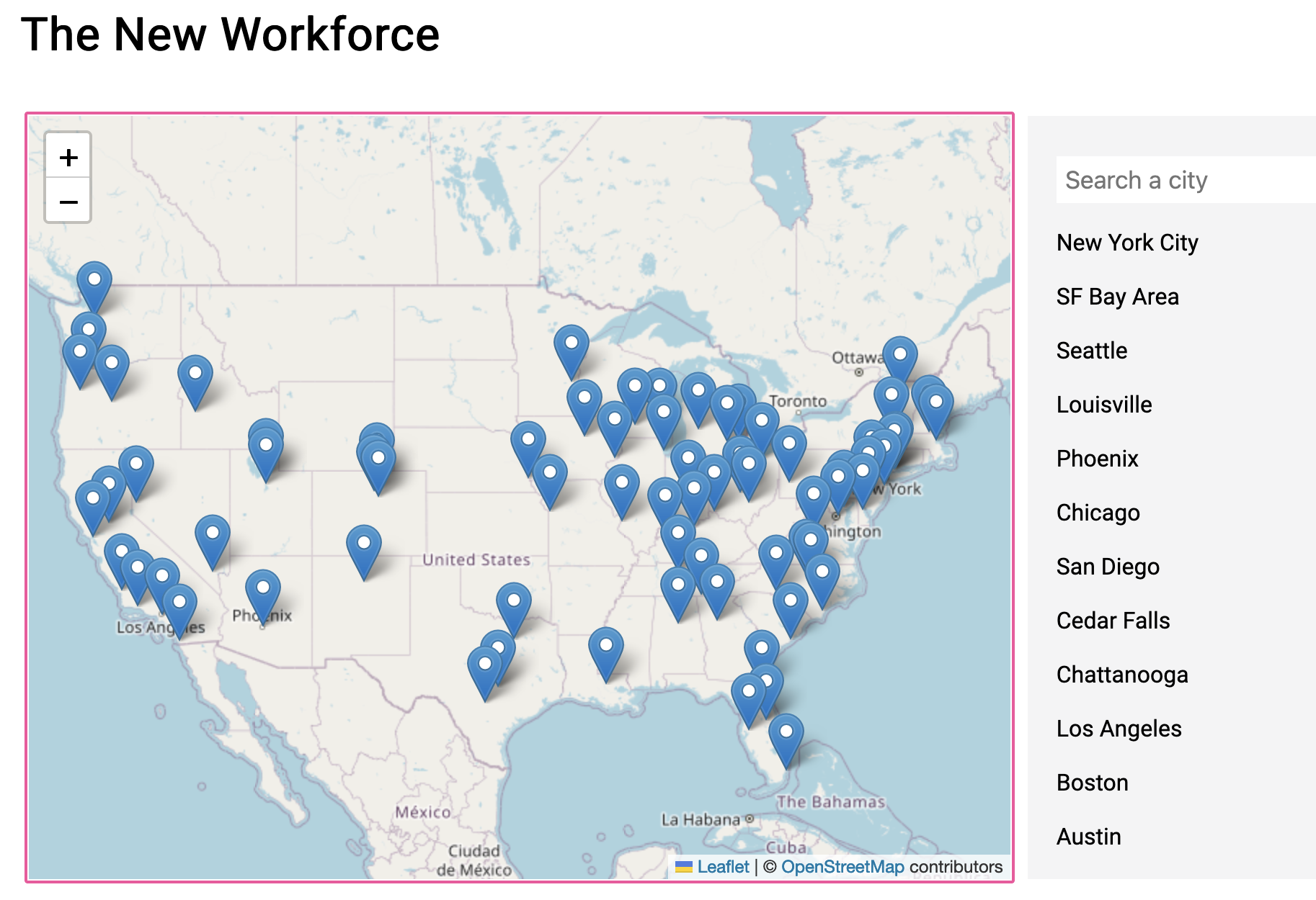
We added our data for each location the data is from in our layoffs data in our map. So marker
represents that. We also started on the search bar function to find a certain location.

We also started on figuring out how icon arrays work, but we didn't connect them to the data
yet nor were able to color coordinate them.
Milestone #2


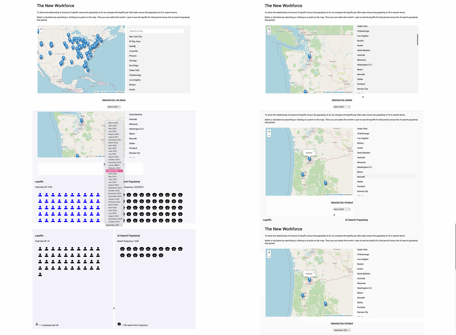
We were able to get the search working for selecting cities. Upon clicking, it calls information from layoffs and AI search term data.
The data is displayed at the bottom of the page, where each icon of a person or robot is an indicitative representation of the data in both areas for a given time.
There are two avenues to reach the layoff/AI: clicking on a city in the search results, or a marker on the map.

We were also able to color coordinate the layoff data to indicate the specific field a subset of employees worked
in, allowing for more insight into the types of jobs undergoing layoffs. However, we should work on expanding the specificities of job categories since a lot of the data ends
up falling "Other".
Revisions (12/16/2024)

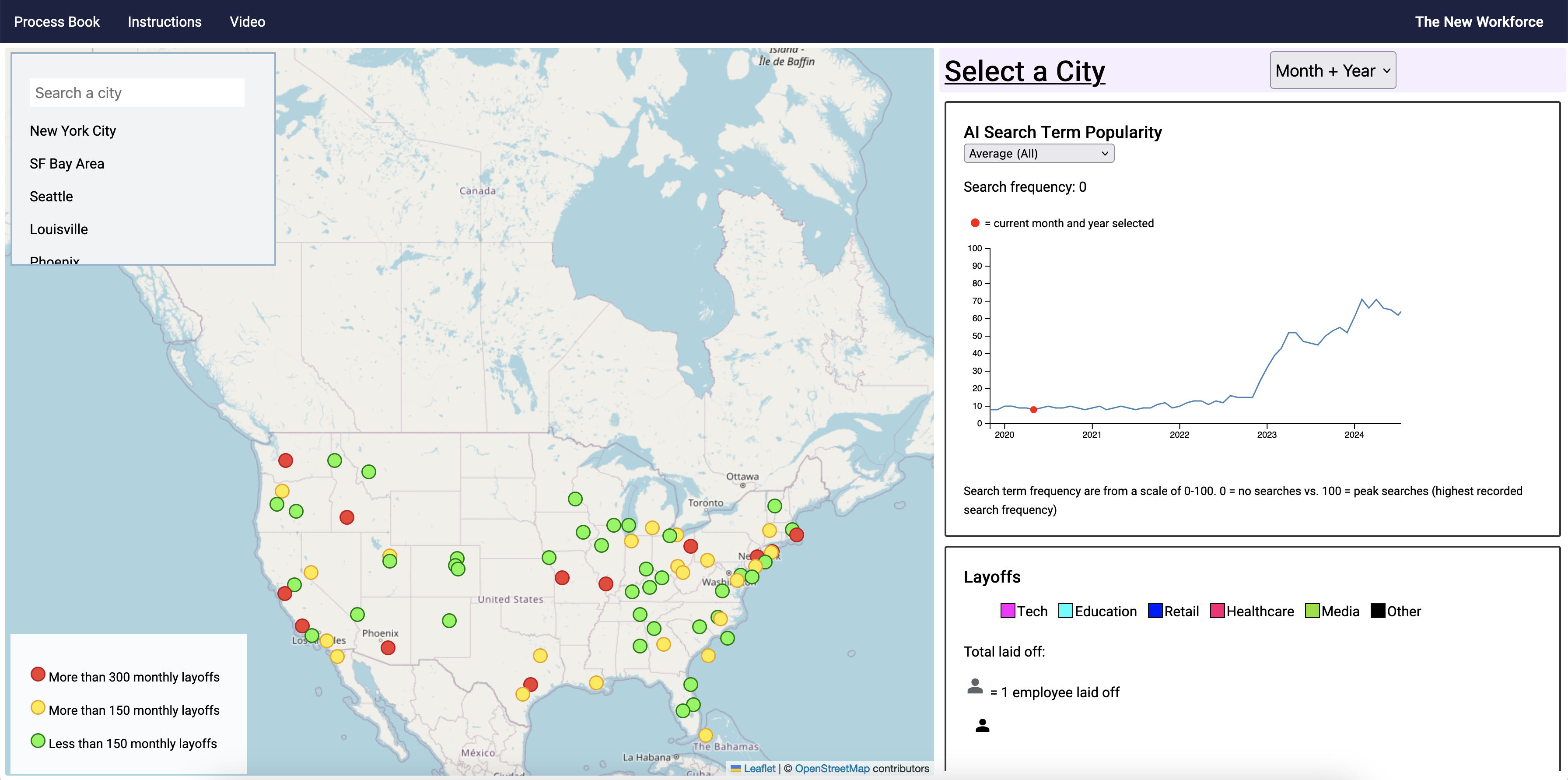
We changed the layout to be horizontal on the wider desktop screen since users were frustrated
with having to scroll constantly to see the visualizations.

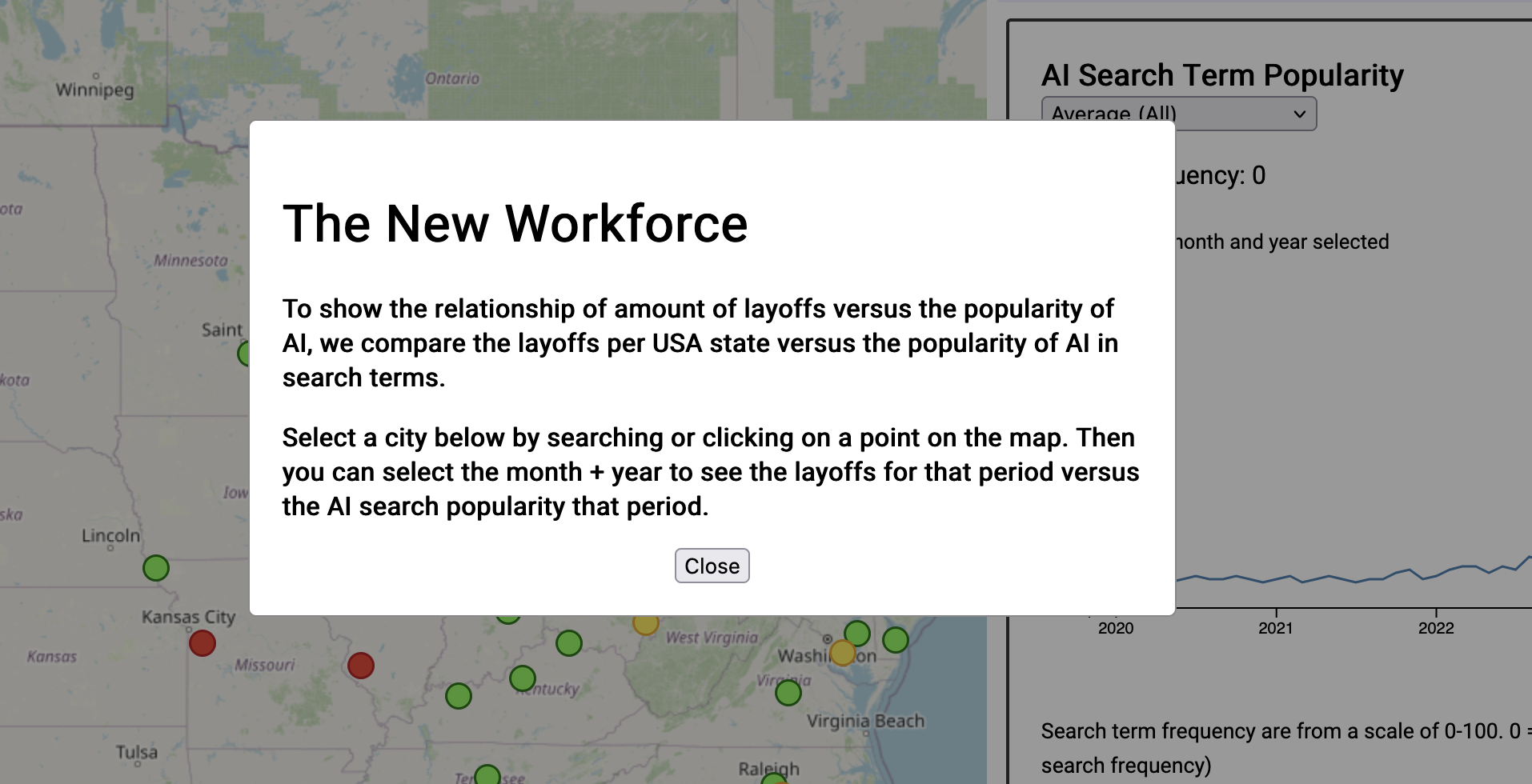
To save space, we also added a popup (similar to other projects) explaining the purpose and how
to use the site. Users can access it by clicking on "Instructions" on the nav bar.

Icons on the map are color coded based on how many layoffs have happened in that city since 2019.

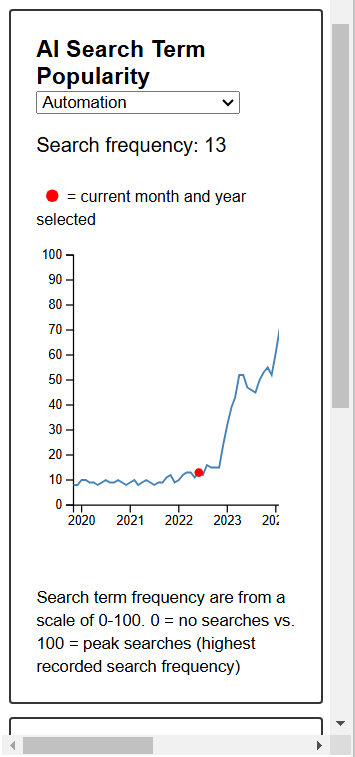
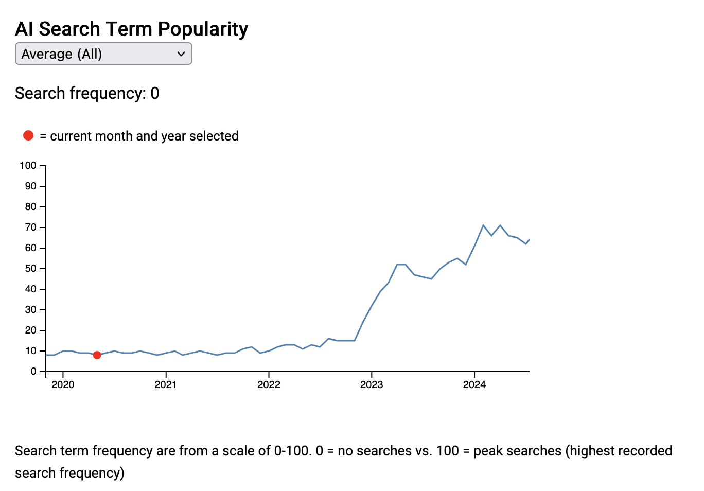
We changed the icon array on the AI search terms to a line chart since that made more sense and
it was easier to tell what changes happened over time.
We also added an additional "Finance" category to job layoff types.

Additionally, we modified the charts to shrink and grow with the size of the browser window.
