St.Louis is notorious for its drastic differences in its neighborhoods. Considering this, we have decided to
visualize just how drastically different these neighborhoods are by measuring safety. Concentration of crime and
safety is a major issue, because these resources need to be spread out.
By using the Dataset that shows crimes in St. Louis by neighborhood, our solution is to keep a count and specify
categories of crimes that occur in specific neighborhoods.
This matters because it can reveal more questions as to why these crime patterns occur and reveal the proximity
of dangerous neighborhoods to safer neighborhoods.
Project Objectives:
Primary Question:
What type of crimes happen in what neighborhoods the most?
Are there hotspots for crime in St. Louis?
How do crime rates change over time?
Learn and Accomplish:
From answering our primary question, we hope to learn if there is any correlation between the different
neighborhoods and crime rates. From mapping out all the crime happening in St. Louis, we want to be able to show
people which neighborhoods in St. Louis are considered safe and what is not.
Benefits:
Let people know which neighborhood is safe.
Able to see if there are crime hotspots for a certain type of crime to warn people not to go near that
area.
Be able to see if the crime rates have decreased or increased over time.
Visualization Design:
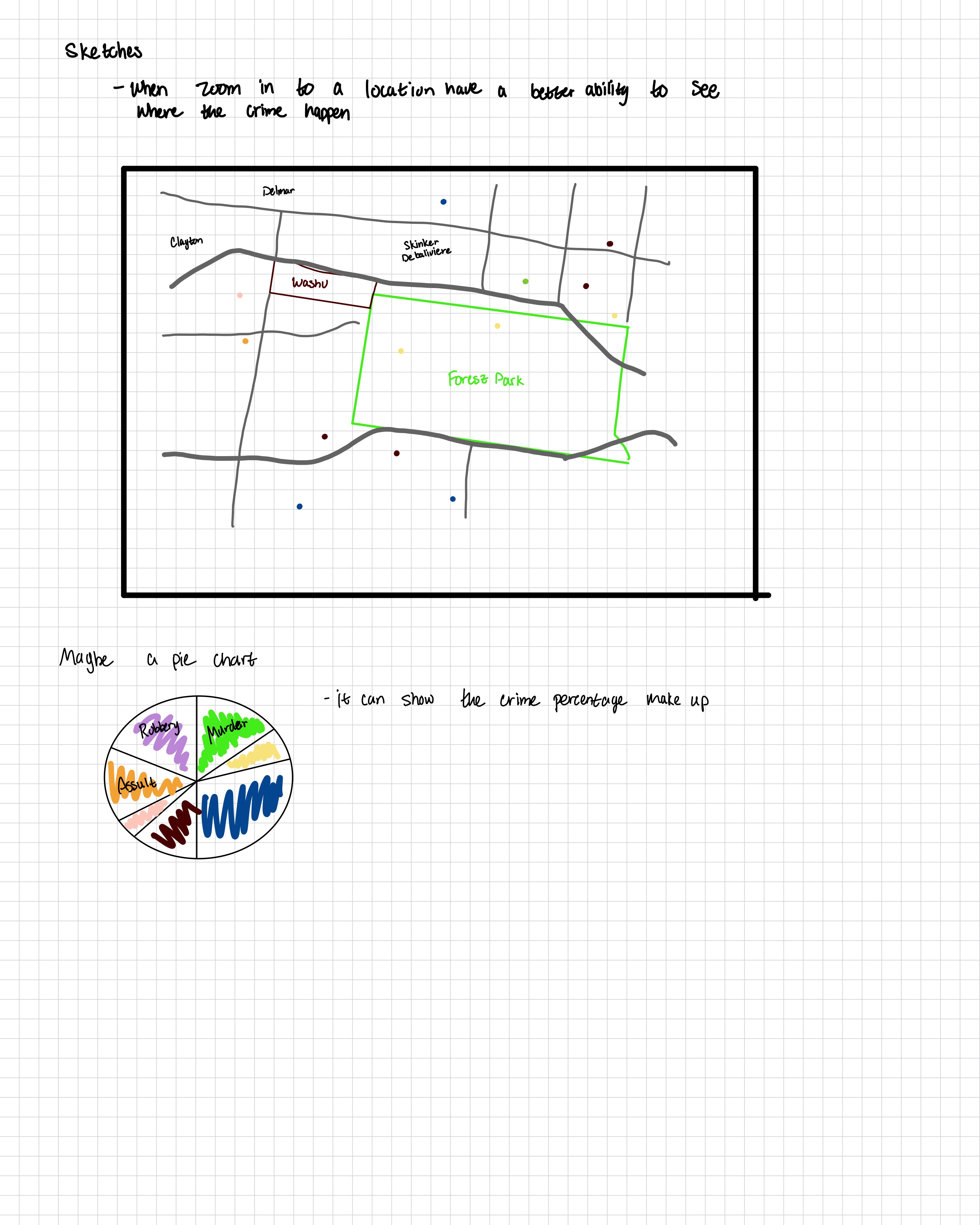
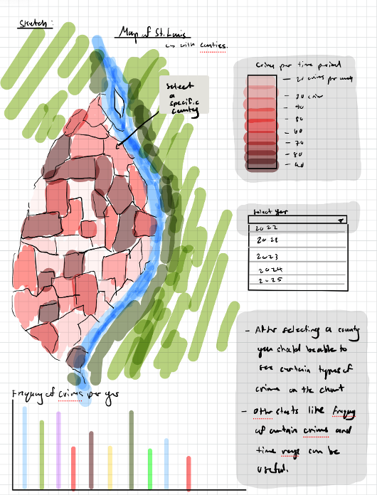
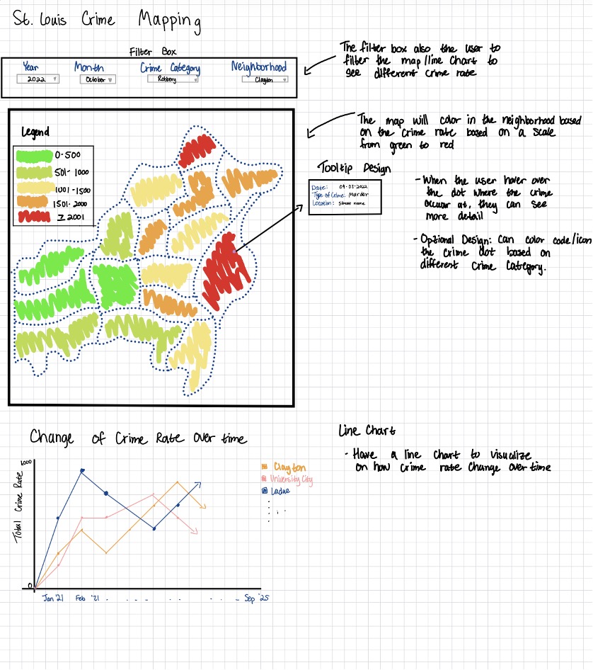
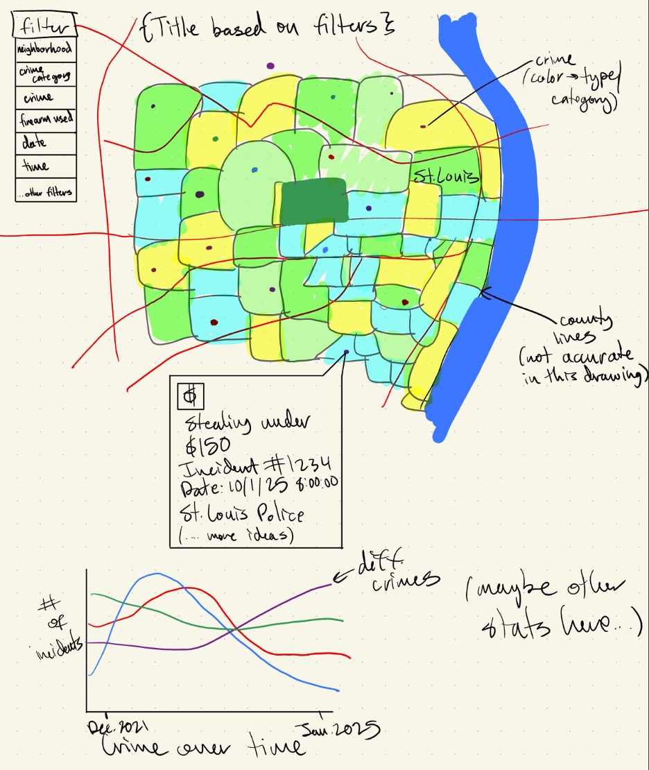
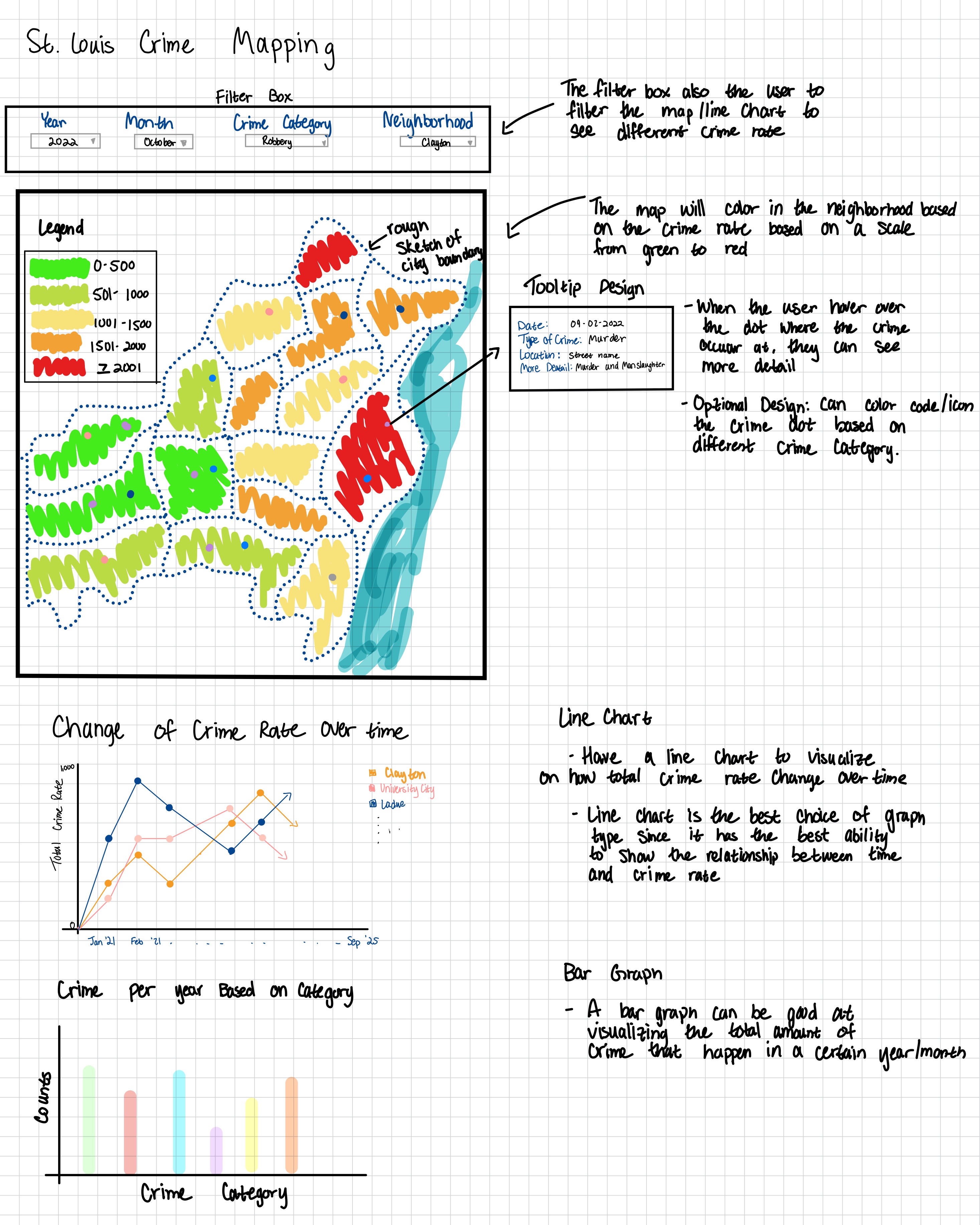
Sketches
Design #1
Design #2
Design #3
Final Design:
We ended up choosing this design as our final design because the filter box with the different drop-down options
is the most user-friendly. The user can easily use the interface and apply the filter they want.
The color scale used on the map, from green to red, is a more straightforward connection the user can make for
determining which neighborhood is safe/unsafe.
In addition to the line graph and bar graph that are on the final design, more variations of the graphs can be
done. For example, if we want to focus on a certain neighborhood, Clayton, we can also do a line graph to see
how the amount of different types of crime changes over time.
Must Have Features:
Be able to show the location where the crime happened (dot on the map based on longitude and latitude).
There is a map.
We must at least use the data in the new format (2021-2025).
Tooltip: when hovering over the crime dot, show more details about the crime.
Have a line graph and a bar graph to visualize the data.
Have a stylesheet to organize our custom styles.
Optional Features:
Having two maps side by side so the user can compare crime rates side by side. (Example: Sep 2025 BURGLARY
vs Sep 2024 BURGLARY)
The crime dot can be color/icon coded based on the crime category.
The map title can be changed based on what filter is being applied.
Data:
We got our data from the St. Louis Metropolitan website, where it has the National Incident Based Reporting
System (NIBRS) statistics of crime happening in St. Louis.
We’ll be using Jupyter notebooks + Python to clean and process the data and extract more metrics that we could
visualize.
There is data from 2008 - 2025. The format changes starting Jan. 2021, so we will have to analyze the
differences between the formats and determine if we want to visualize both and how to handle them.
There may be some typos and NA values in the data, so we will have to clean it.
Some crimes may be reported years after they happened - we will have to handle that and ensure every crime is
counted.
We have to take into account administrative adjustments (may change the type of crime, ex., assault ->
homicide).
Take into account the x and y coordinate format.
Do further investigation into what some of the values mean.
Project Schedule:
Date
Deadline
Notes
What to Accomplish
10/27 - 10/2
10/27
Project Proposal
Project Proposal. Start working on data wrangling.
Finish data wrangling. Get a working prototype (map and plot crimes on it).
11/10 - 11/16
11/10 Milestone 1
Jasmine: exam 11/12 Soleyana: exam 11/12
Add all the different features we want.
11/17 - 11/23
Making sure everything is interactive.
11/24 - 11/30
11/24 Milestone 2
Alina: won’t be in class 11/25
12/1 - 12/8
12/8 Project Due
Jasmine: in STL Alina: exam 12/4
Do final touches, make sure edge cases are handled.
Milestone 1:
Milestone 1 Design:
What was done:
Data Processing
We were initially going to use the csv files and process them into Geojson files, but we ended up
finding
a pre-processed Geojson version from STL county's open government
website.
I took that file and added split the "occurred" field into dayOccurred, monthOccurred, and
yearOccurred fields using a
Jupyter notebook with Python to be able to filter by those values in JavaScript.
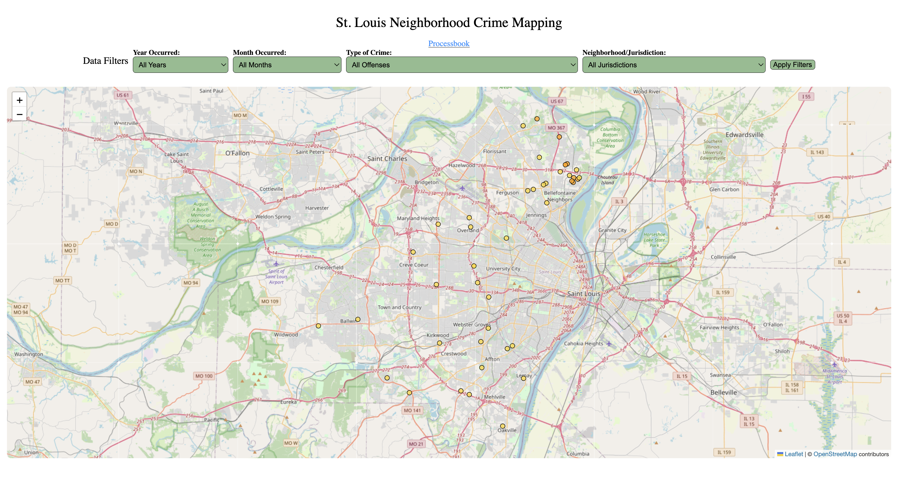
Data Mapping
For the first milestone we were able to map all the crimes we have in our current data set. We color
coded the crimes dot by offense category.
We also added a tooltip so the user can obtain more information about the crime which includes the
date,
location, and a more detailed description about the crime.
Problem that we faced:
Mention in the Data Processing section, we found a pre-processed Geojson file, but that file ended up
being over 260MB in size.
We were not able to load it into our map. The temporary solution we came up with was to just extracting
36 data points from the Geojson file
and then loading them into our map. So we can see if our mapping functions are working correctly. For
the next milestone, we will have to decided that we are going
to do proportional stratified sampling where we will extract a fixed percentage from each stratum, which
is per year, per month, and per neighborhood.
Milestone 2:
Milestone 2 Design:
What was done:
Data Processing
Refined the data further by removing unecessary variables, keeping the essential data
Standardized naming conventions to camel case
Filtered for crimes commited from 2021 - 2025 (there were some reported crimes that happened before
2021)
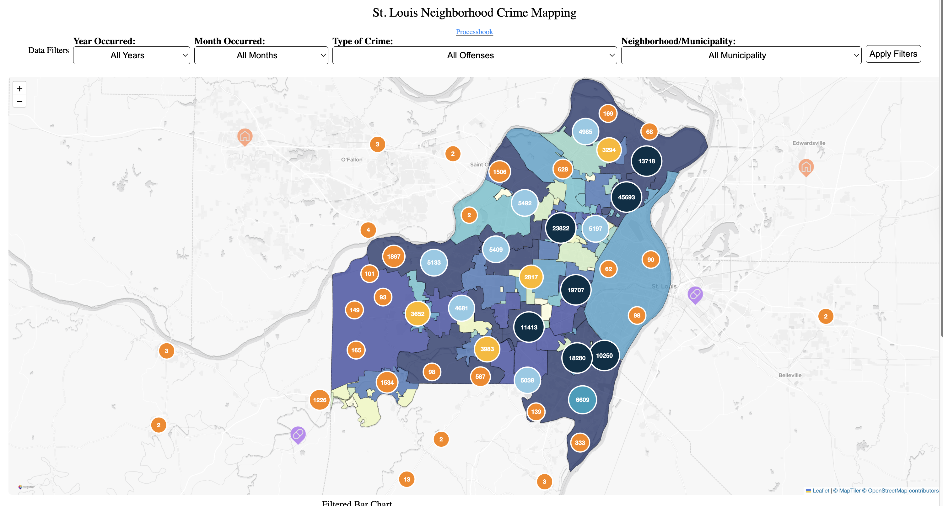
Data Mapping
Added choropleth layer
Draw the municipality polygons from the Geojson file gotten from this website.
Shaded each municipality based on the number of crimes occurring within each municipality's
boundaries on a color scale from yellow to blue. Our original design was going to use a
scale from green to red, but after considering
colorblindness, we changed the scale to yellow to blue.
Added Marker Clustering
Crimes happening in the same location will be grouped together to illustrate where the crime
hotspots are.
Implementing marker clustering also helped with the problem we faced in Milestone 1 where we
were not able to load the Geojson file into our map.
Added Custom map icons
Custom map icons for each offense category.
Changed Based Map Theme
Changed the base map theme to a light theme so that the map is easier to read.
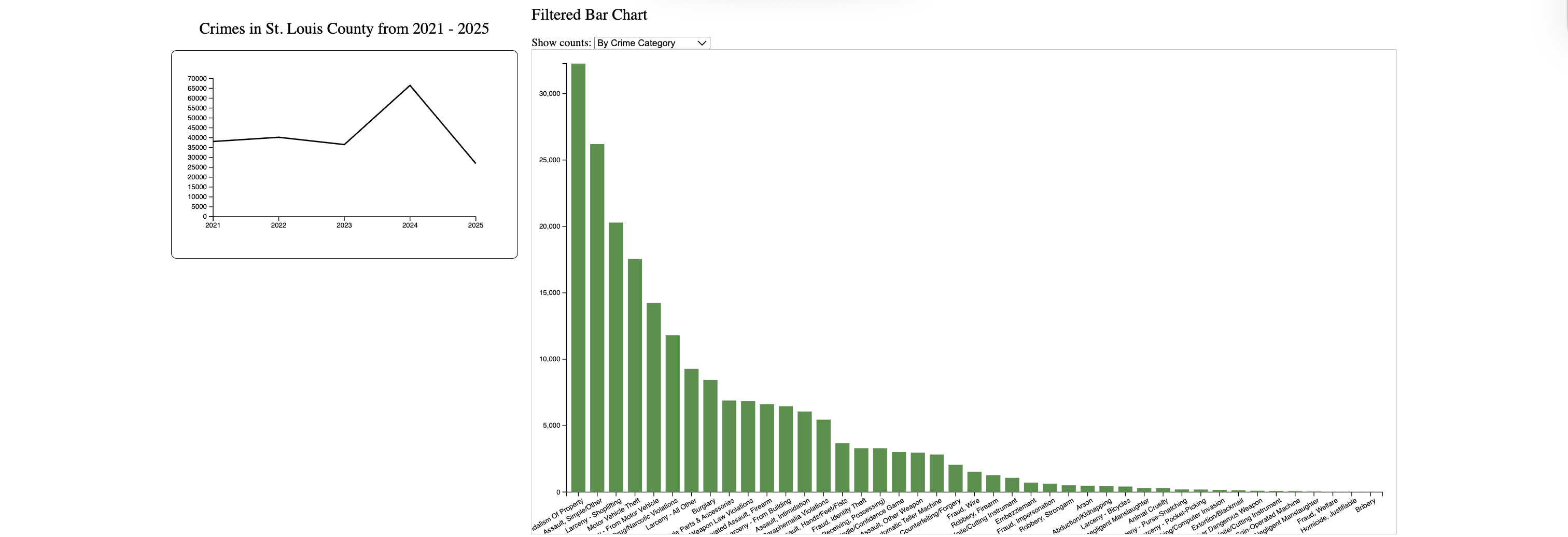
Line Graph
Added line graph to visualize crime over time according to filters selected for the map
Can handle different filters dynamically
Ensured use of colorblind-friendly palette for line
Line colored according to category of crime or all crimes
Added animation to the line and axes
Bar Chart
Added barchart to reflect filtered data already reflected in the map.
After the filters are applied, user can further toggle data to show bar graphs by county, month, and crime.
Graph updates as map updates
Graph filters work reflecting accurate values for pre filtered data
Bars move smoothly as filters are applied
Colorblind friendly bars added
Problem that we faced:
Had to play around a bit to represent data right on axes of line graph
Figuring out how to handle data dynamically for line graph
User Study Plan
Session 1: Think-Aloud
Participants freely explore the visualization while verbalizing their thoughts. We observe how they interpret
markers, clusters, colors, and filters, and note any confusion during initial use.
Session 2: Task-Based Evaluation
Participants complete short, specific tasks to test usability and accuracy. Example tasks include these:
Identify which jurisdiction has the most crimes this year.
Filter for violent crimes and find where they are most common.
Compare crime levels between two neighborhoods.
Use filters to find all property crimes in a given month.
As they are doing the tasks, we will observe for any confusion.
Session 3: Feedback / Critique
Participants give open feedback about clarity, color choices, filter usability, and overall experience. We will
ask them what felt intuitive, what was confusing, and what features they would improve or add.
Session 4: Debrief
We briefly explain the goal of the visualization, answer any remaining questions, and gather any other comments
they have.
User Study Feedback
Liked the map animations while zooming in and out - felt playful
Add a legend to the map
Make the filters automatic rather than pressing a button
Add tooltips to the graphs
Would like option to turn choropleth layer on and off
Add loading bar - users confused if it works or not
The questions that we tried to answer throughout the project were:
What type of crimes happen in what neighborhoods the most?
Are there hotspots for crime in St. Louis?
How do crime rates change over time?
We believe that the questions we tried to answer did not change much over time as we worked on the project. Yet
we did consider
other questions as we look deeper into the data we have. When we were doing data processing, we noticed that it
has
columns for when the crime happened and when it was reported.
We noticed that many crimes happened in the 2000s but weren't reported until recent years, and of those
crimes, many of them were assault crimes. At that time, we were thinking of doing a question like
Do certain types of crimes (such as assaults) have longer reporting delays?. But due to the scope and focus
of our project, we decided not to pursue this question further, at least not in this project.
Exploratory Data Analysis:
We explored some of the exisiting maps for crime in St. Louis and looked at what inspiration we would take
to improve our own visualization. We liked how some maps had jurisdiction boundaries, but we thought we could improve them
by adding a choropleth layers and supporting graphs to give more insight than seeing a lot of points of the graph.
We also looked at some features that were common throughout them, such as legends, filters, and different icons for crime categories.
Design Evolution
At the beginning of the project, we considered different kinds of visualization to show crime intensity. We were
considering between
a heat map or a choropleth map. After consideration, we went with a choropleth map because it made it easier to
see which neighborhoods have the most crime.
A choropleth map takes in consideration real geographic boundaries, use a clear sequential color scale, and
supports direct
comparison between regions. Heat maps looked visually appealing, but they created smooth gradients that were
harder to interpret and could suggest density in areas without actual crime data. This change helped align our
visualization with perceptual design principles and better answer our research questions.
At the beginning of the project, we had planned to potentially just have the map and the line graph to visualize
our data, but we realized
that we needed a bar chart to visualize the crime frequency in different categories other than the selected
filters.
Implementation
Map
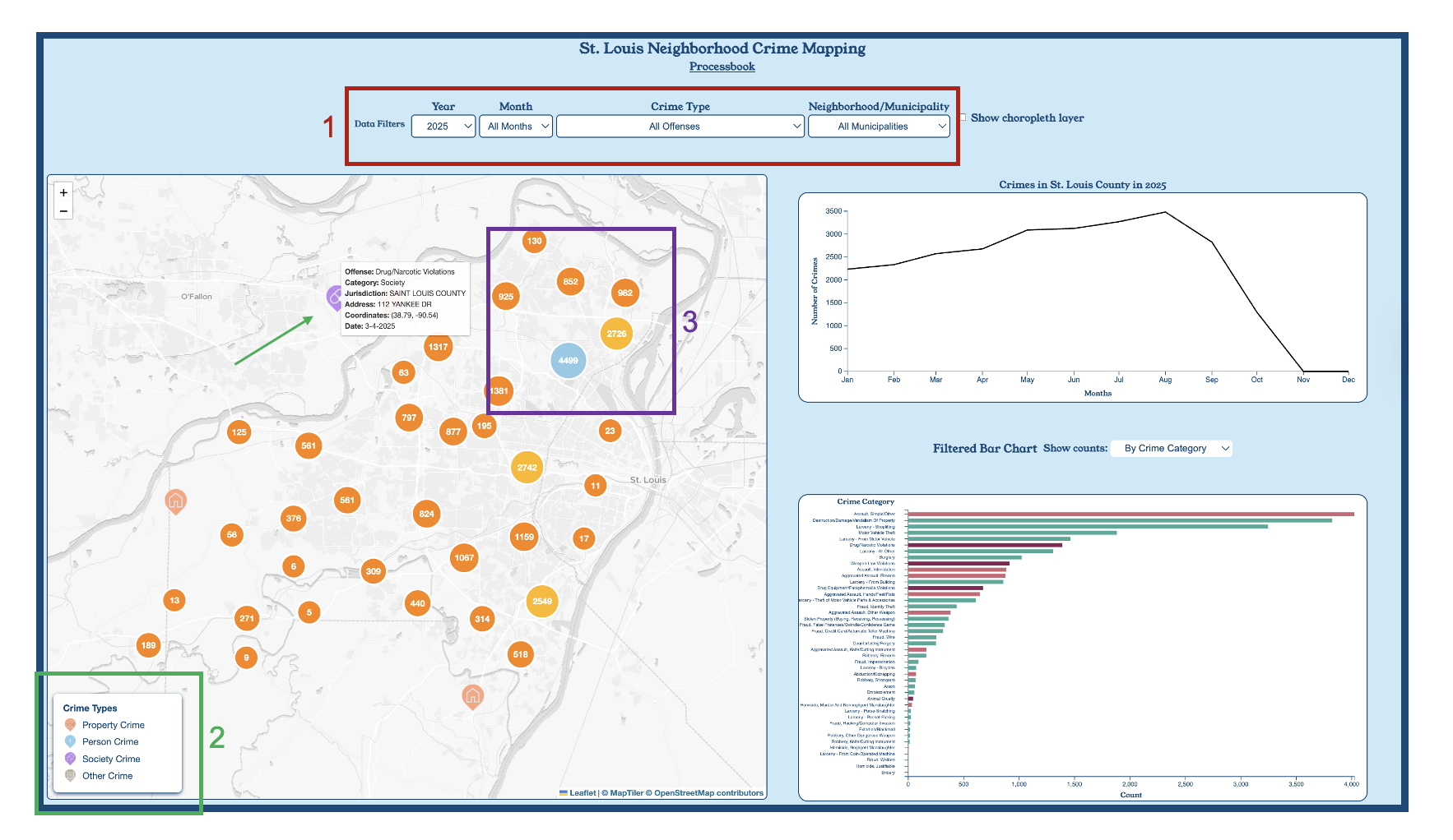
1. Filter Controls
Users can filter the data by year, month, crime type, and neighborhood/municipality.
This helps narrow down the results and focus on specific time periods or types of crime, improving
exploratory analysis.
2. Icon Legend and Tooltips
The legend shows the icons used for each crime category:
Property, Person, Society, and Other.
When a user hovers over any crime point, a tooltip displays additional information including the offense
name,
location, and the date the incident occurred. This provides immediate context without navigating away
from the map.
3. Clustered Crime Points
Crime incidents are clustered to reveal density patterns and hotspots.
As the user zooms in and out, the clustering dynamically updates, making it easy to distinguish between
isolated incidents
and areas with high crime concentration.
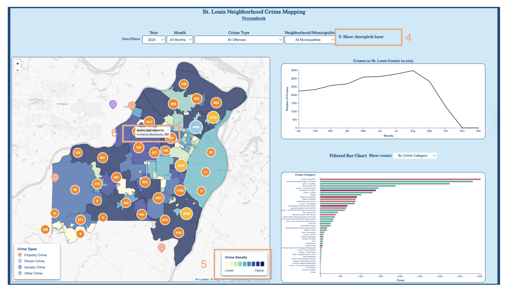
4. Choropleth Toggle
Selecting the checkbox enables the choropleth layer. This visualization aggregates crime counts by
municipality,
helping users quickly see which regions experience the highest number of crimes.
5. Sequential Color Scale
The choropleth uses a yellow–to–blue color scale to represent low–to–high crime
density.
The corresponding legend explains the meaning of the color gradient and guides user interpretation.
6. Municipality Hover Interaction
Hovering over a municipality displays a tooltip showing the total number of crimes in
that region.
This allows users to get summary statistics directly on the map without clicking or switching views.
Line Graph
The line graph automatically adjusts to the map filters and the current map zoom.
Hover over points to seem exact counts for that data point.
Click on the legend toggle to see the legend for crime categories.
Bar Chart
To use the bar chart, firt select desired filters through the map.
After selcting feature, now select from the drop down menu to explore this filtered data by
jurisdiction, crime type and month.
Hover over the bars to show data counts of each filtered bar chart.
Evaluation
Map
Through creating and interacting with the map visualization, I learned several new things about St.
Louis and the crime dataset.
Before mapping the municipality boundaries, I did not know that St. Louis has unincorporated areas.
After researching further, I learned that these are regions not part of a specific city and are
governed directly by the county.
When applying different filters, I noticed that many of the unincorporated areas consistently showed
higher crime counts.
Another interesting observation was that some crime points are mapped outside of St. Louis region,
including locations in Montana and Texas. Upon deeper examination, I realized these were all fraud
related crimes, which helped explain why they were mapped outside of the city.
Using clustering also helped identify crime hotspots. In several areas, multiple incidents occurred
at the exact same location and were often the same type of crime. Like I zoom in to a grocery shop
and the majority of crimes there were all burglarious. The map effectively answered the question “Are
there hotspots for crime in St. Louis?” because the clusters clearly showed that a large number
of crimes occur in the northern part of the city.
Overall, the map works decently, but there is room for improvement. One major challenge is the
performance of the map. The data takes a long time to load, especially when all the filters change
to “All.” Since Milestone 2, I have made some changes, so it is faster than before; however, the
loading time is still not ideal. For future improvement, I would like to focus on improving the
performance, especially when loading and filtering large datasets.
Line Graph
While developing the graph, I learned how to handle the time data dynamically and use different
scales depending on the filters.
By showing crime over time, be it by year, month, or day, the line graph helped us identify trends
and seasonal patterns in crime rates,
such as the spike in overall crime in 2024.
The line graph could be further improved by adding more specific filters, such as by multiple
jurisdictions or crime categories so it is easier to compare and contrast trends between different
areas or types of crime.
Bar Chart
The development of the bar graph was done so that users could further investigate possible patterns
within the line chart and map.
The bar chart allowed me to grow my skills in understanding scale types, scyncing with other
visualizations, and creating clean implementations.
The bar chart is able to help user view patterns by jurisdiction, month, and crime type, to reveal
patterns that show up within St. Louis County's crime data.
The bar graph could be enhanced by allowing for more filters based on the data set. Allowing people
to further group counties by broader regions or by including population data, to further draw a
picture of St. Louis's history of gentrification.