Visualization Sketches
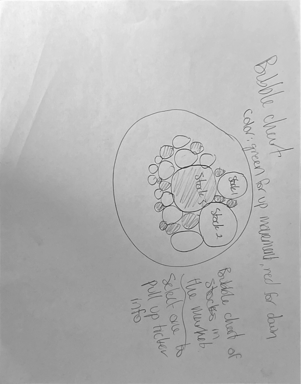
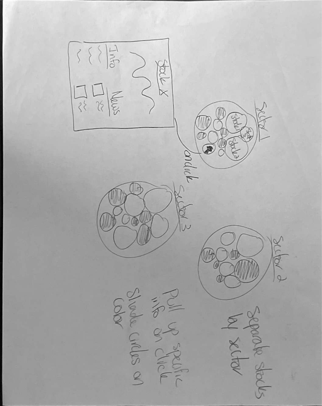
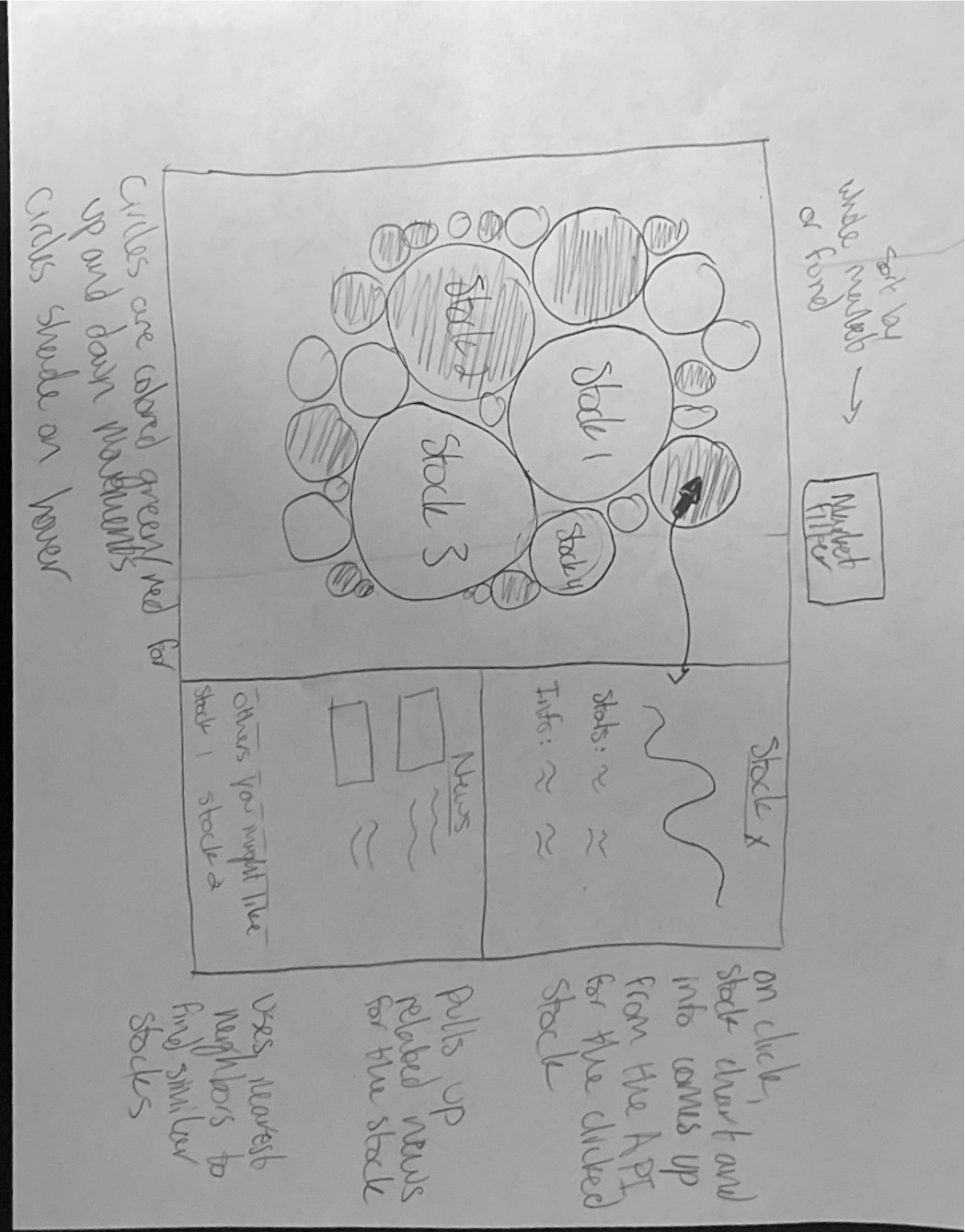

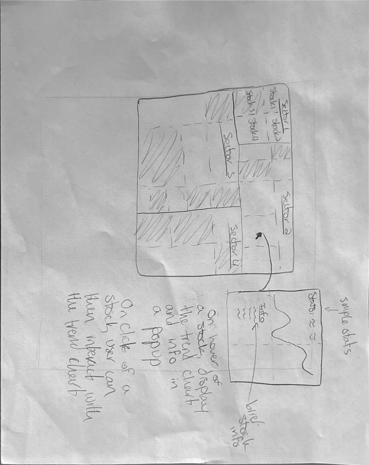
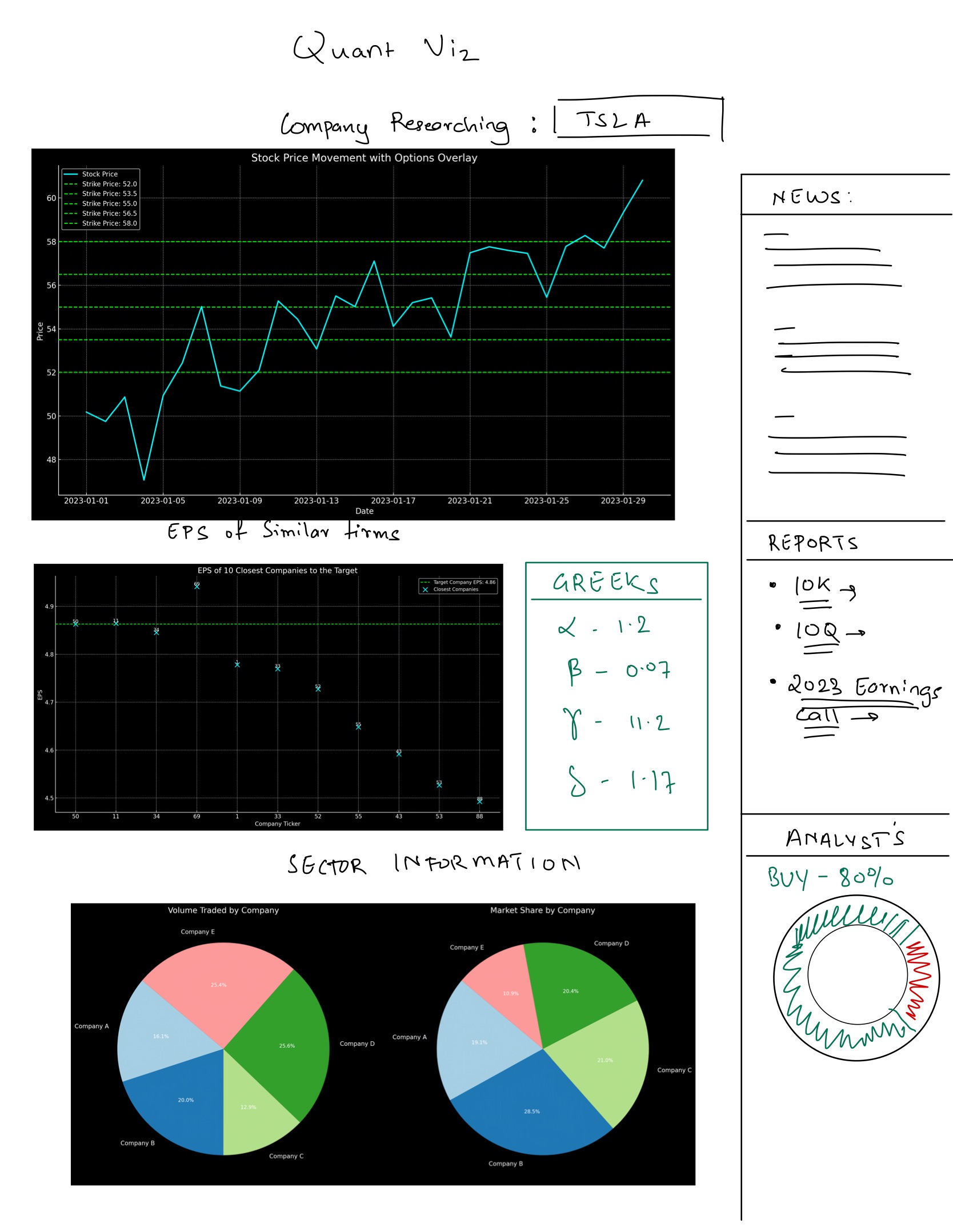
Traditional stock charts, predominantly those on platforms like finviz.com, have been criticized for their cluttered, complex, and seemingly outdated nature. They often rely on technical analysis methodologies that have faced skepticism and are considered by some as pseudoscientific. On the contrary, the contemporary financial landscape has welcomed the rise of sophisticated financial, news, and alternative data sources such as polygon.io and quiverquant. These platforms offer invaluable insights into the US equity market, presenting data that can be streamlined into intuitive and thorough analysis.
Our team is inspired by the idea of reimagining stock chart visualizations. We aim to meld these contemporary data sources, offering actionable insights in a more user-friendly format. Our goal is to cater to the emerging generation of investors, including those with a rudimentary understanding of the financial world, such as recent college graduates. By presenting data in an intuitive and insightful manner, we hope to bridge the gap between complex financial data and its practical application.
Our objectives for this project are manifold:
Primary Data Sources:
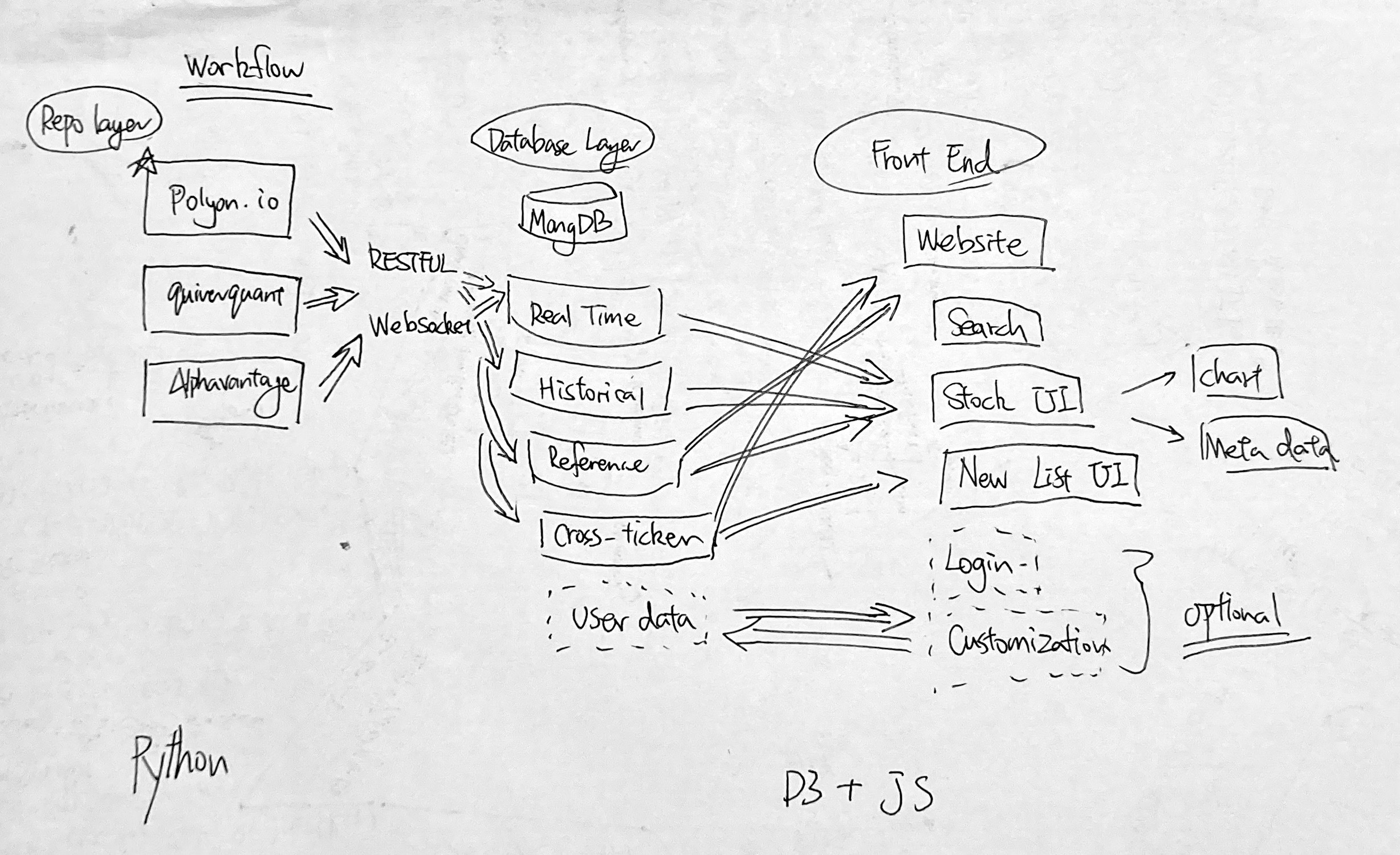
Data Collection and Integration: Data will be consistently fetched via API integrations with the aforementioned sources and subsequently stored in our MongoDB database. Given the diverse nature of these data sources and the requisite need for real-time processing, substantial data cleanup and processing will be anticipated. Key metrics like option pressure data and short-term call/put trading volume will be derived. The Python backend will shoulder the responsibilities of data collection, sanitization, processing, and final storage in MongoDB.
In our exploration of stock data utilizing Quiver Quant and Yahoo Finance, we initially immersed ourselves in a vast array of available data and charting options. However, we quickly realized that the charts presented an overwhelming amount of information, potentially leading to confusion, particularly for novice users. This observation emphasized the need for simplification without compromising the depth of insights.
To streamline complexity, we opted for a minimalist approach. We found that condensing the wealth of data into a single trend line while providing multiple options for charting proved most effective and straightforward. This approach allowed users to focus on the primary trend while offering flexibility to explore additional data points or indicators based on their preferences.
By consolidating information into a single trend line with customizable features, our goal was to offer simplicity without sacrificing depth of analysis, ensuring accessibility for users of varying expertise levels.
Must-Have Features:
Optional Features:
PROPOSAL (DUE Oct 30):
Repository initialization, preliminary design sketches, and API integrations.
MILESTONE 1 (DUE Nov 13):
PRESENTATION (DUE Dec 5):


Our first milestone for the Insightful Stock Charting project includes a series of option charts that are crafted to depict bearish and bullish price movements effectively. The red lines indicate bearish trends, while the green lines represent bullish trends, providing an intuitive understanding of market sentiment at a glance.
Our charts are designed with a dark background to ensure that the colors of the price movements are distinctly visible to enhance the user's focus on the data. This choice is deliberate to minimize visual strain and improve the contrast ratio, which is particularly beneficial for extended periods of analysis.
Each chart represents different time frames—1 week, 1 month, 1 year, and 5 years—offering users a comprehensive view of market trends over varying periods. This temporal flexibility allows for a detailed analysis tailored to the investment knowledge of the user.
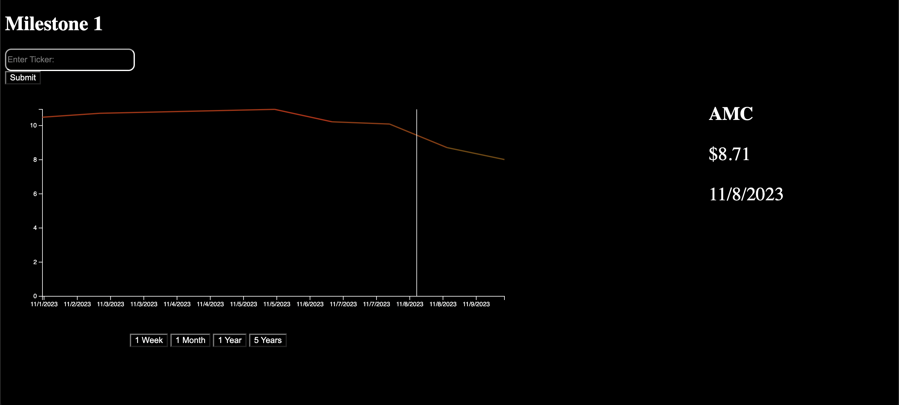
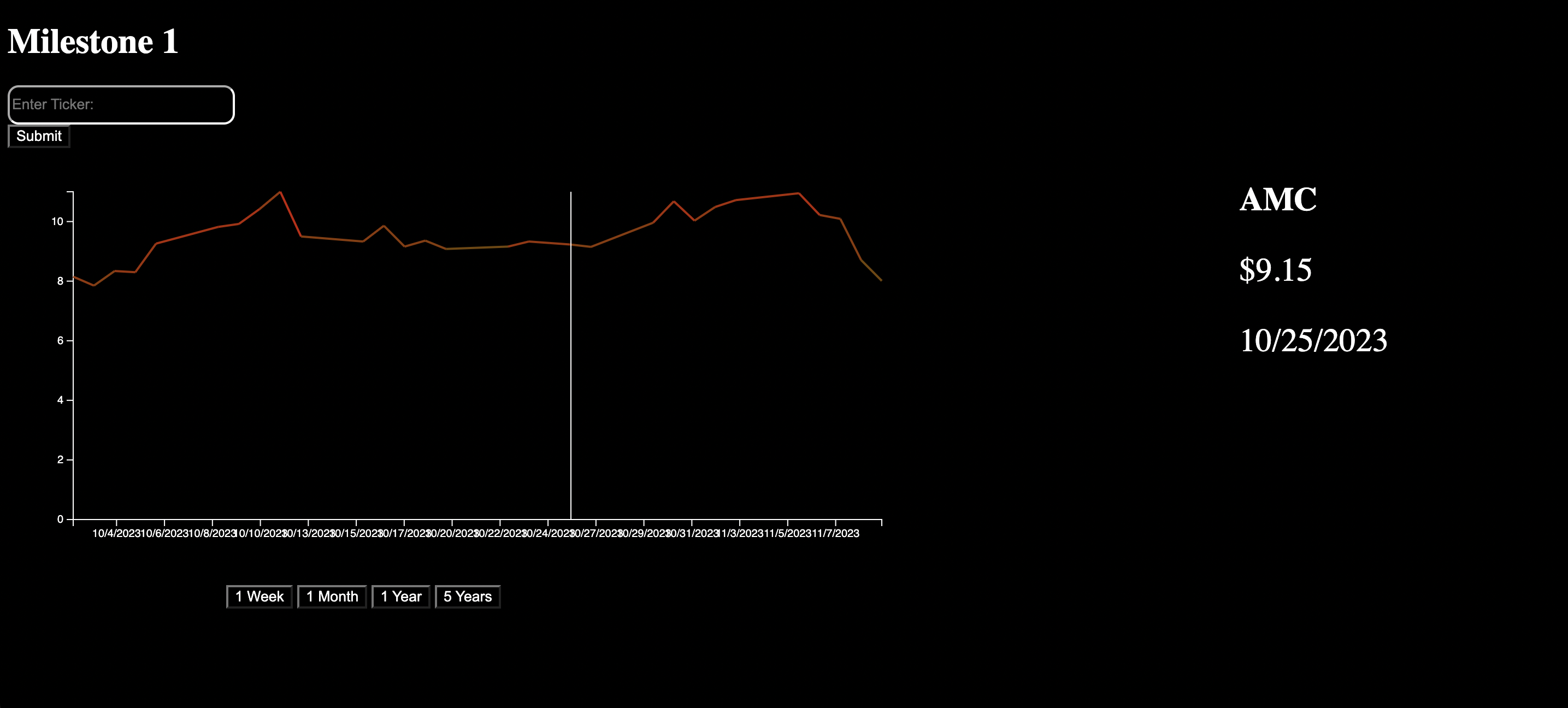
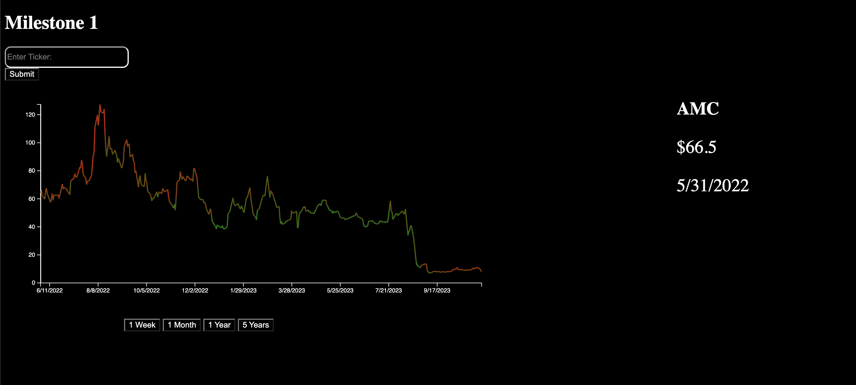
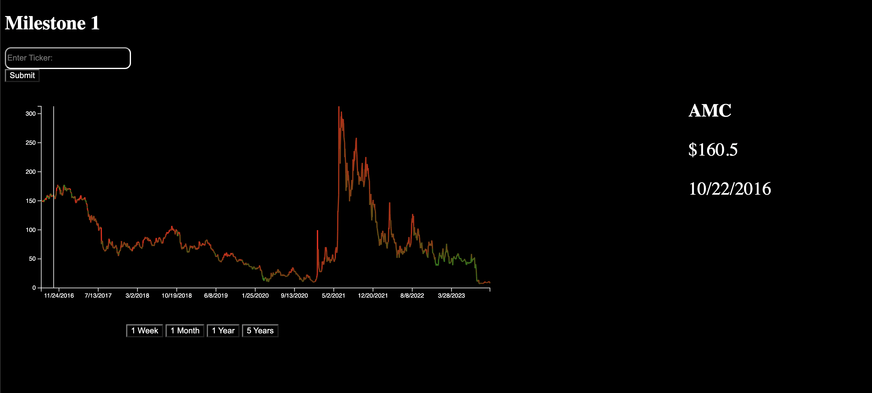
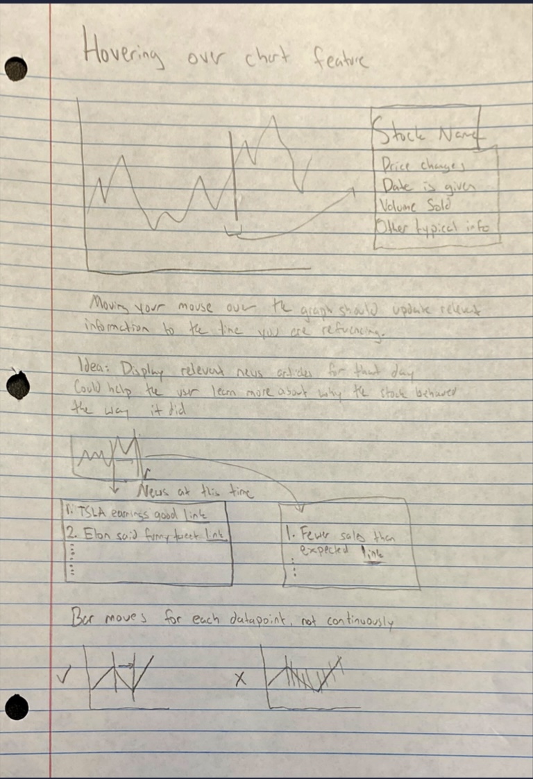
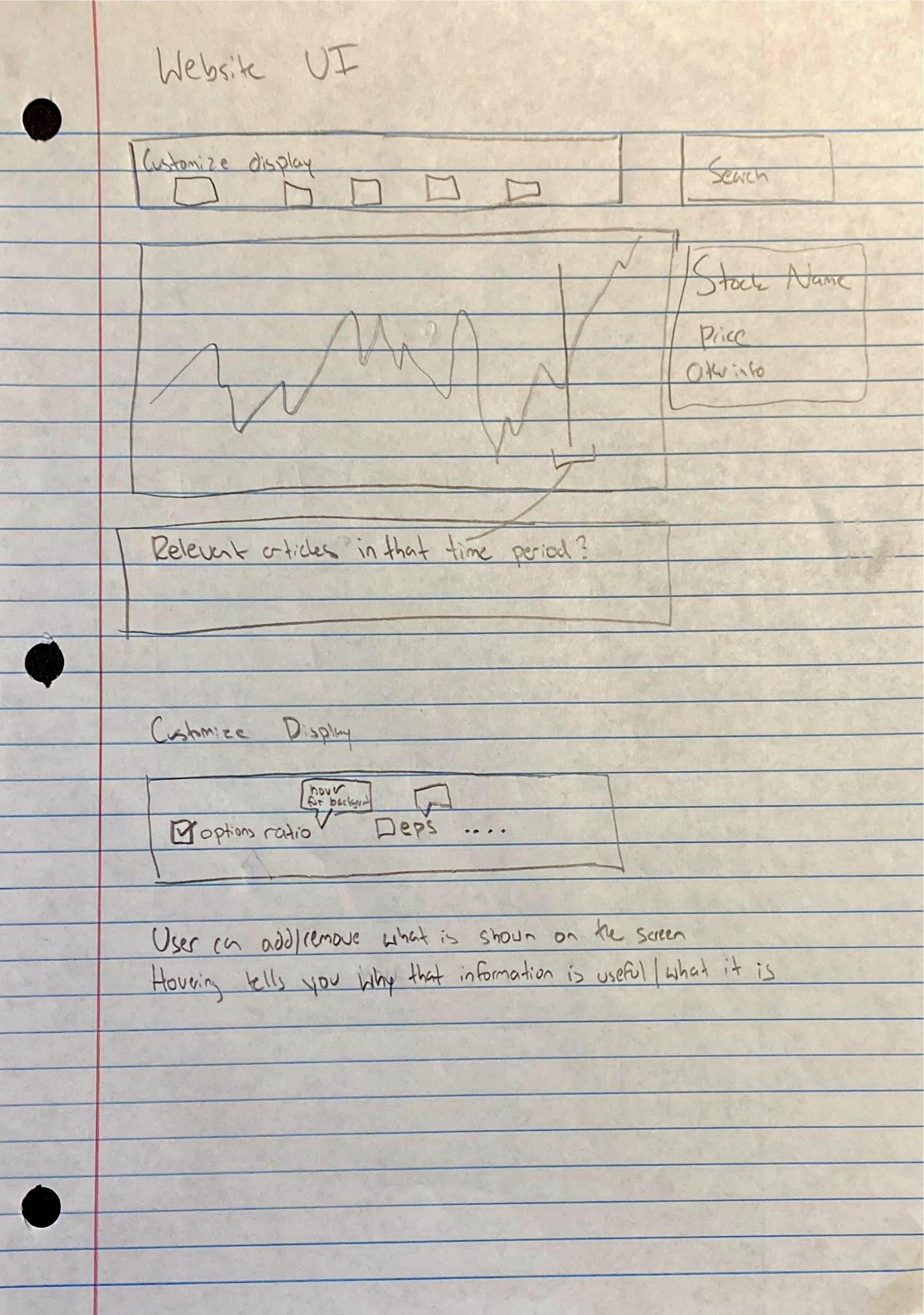
This interface is intentionally minimalist, placing the emphasis on the data itself. Hovering over a section of the chart displays a tooltip that provides additional details, including the date, price, and option pressure. This feature is particularly useful for users who wish to gain a deeper understanding of the data. Searching for a specific stock ticker will eventually call our mongodb database and return company-specific data, news, and other related information.
We added a time selector below each chart that enables a more interactive exploration of stock performance. By allowing users to switch between different time frames, they can gain a multi-dimensional understanding of stock behavior, which is crucial for making informed investment decisions.
The design and functionality of these charts are representative of our project's goal of providing investors with a clear, concise, and interactive tool for stock market analysis. The Insightful Stock Charting project strives to empower its users by offering a platform that is both informative and user-friendly.
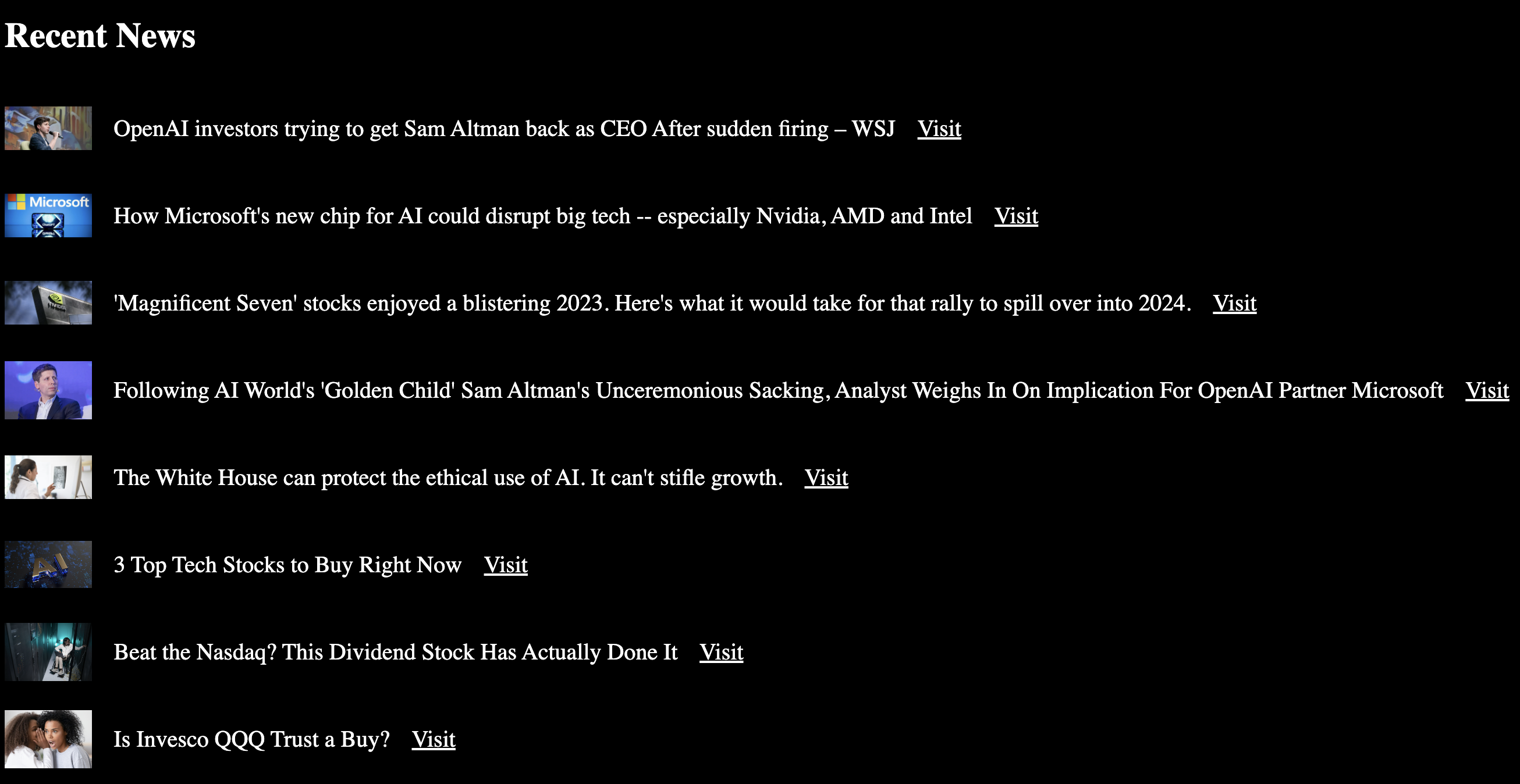 When a stock ticker is searched for, we find and display the 10 most recent news articles related to that stock. This helps our users stay informed about a company's current events.
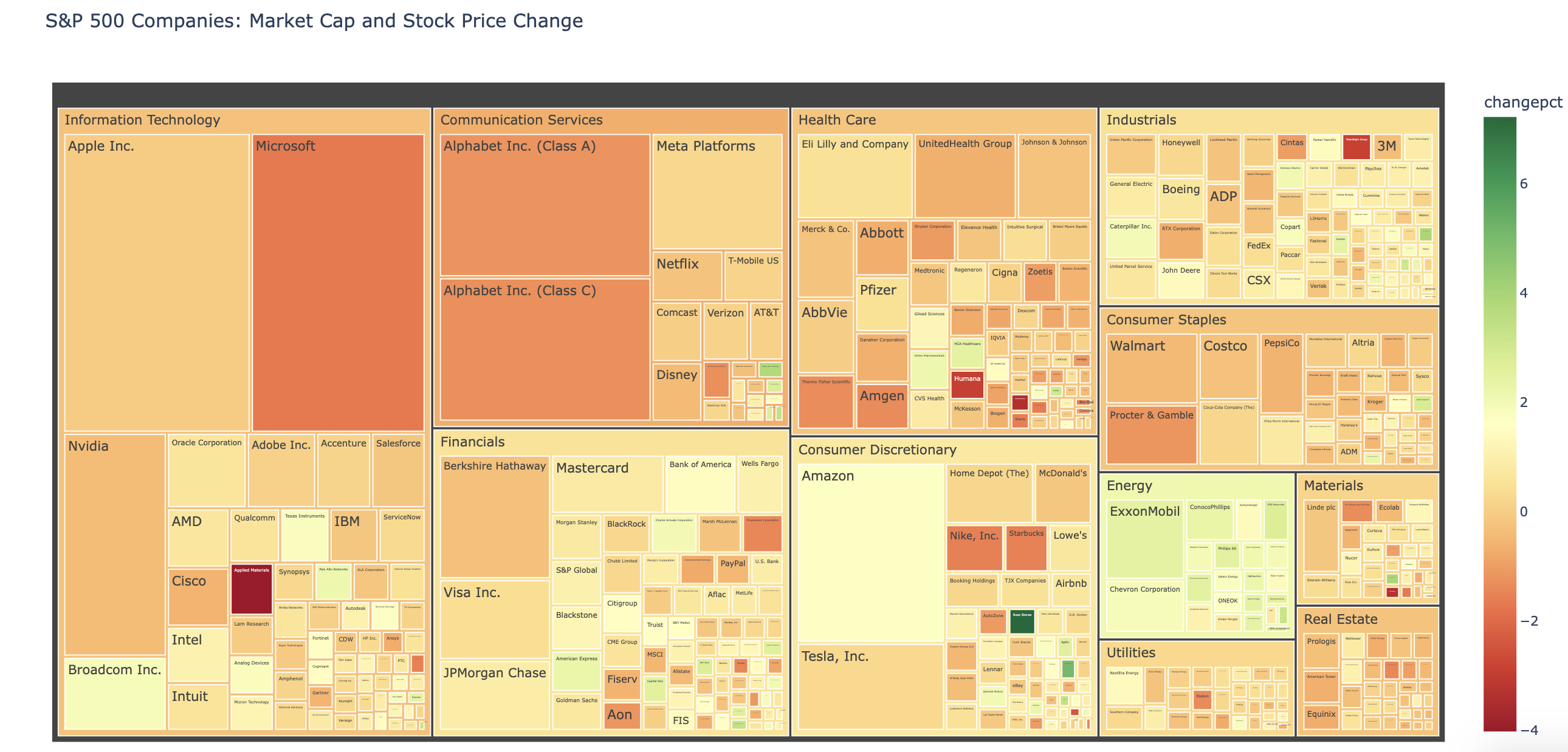
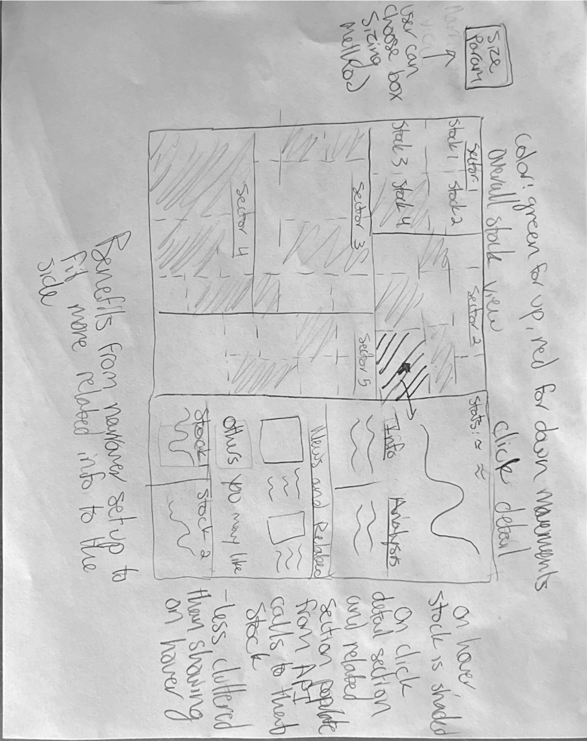
Our tree chart is crafted with intentionality, where minimalism in design converges with maximalism in data depth. The interface foregrounds the data, allowing the market dynamics of the S&P 500 to speak for themselves. Each block in the tree chart corresponds to an individual stock, scaled to represent its market capitalization within the index. This scaling is intuitive, providing a visual shorthand for the stock's relative size and influence in the market.
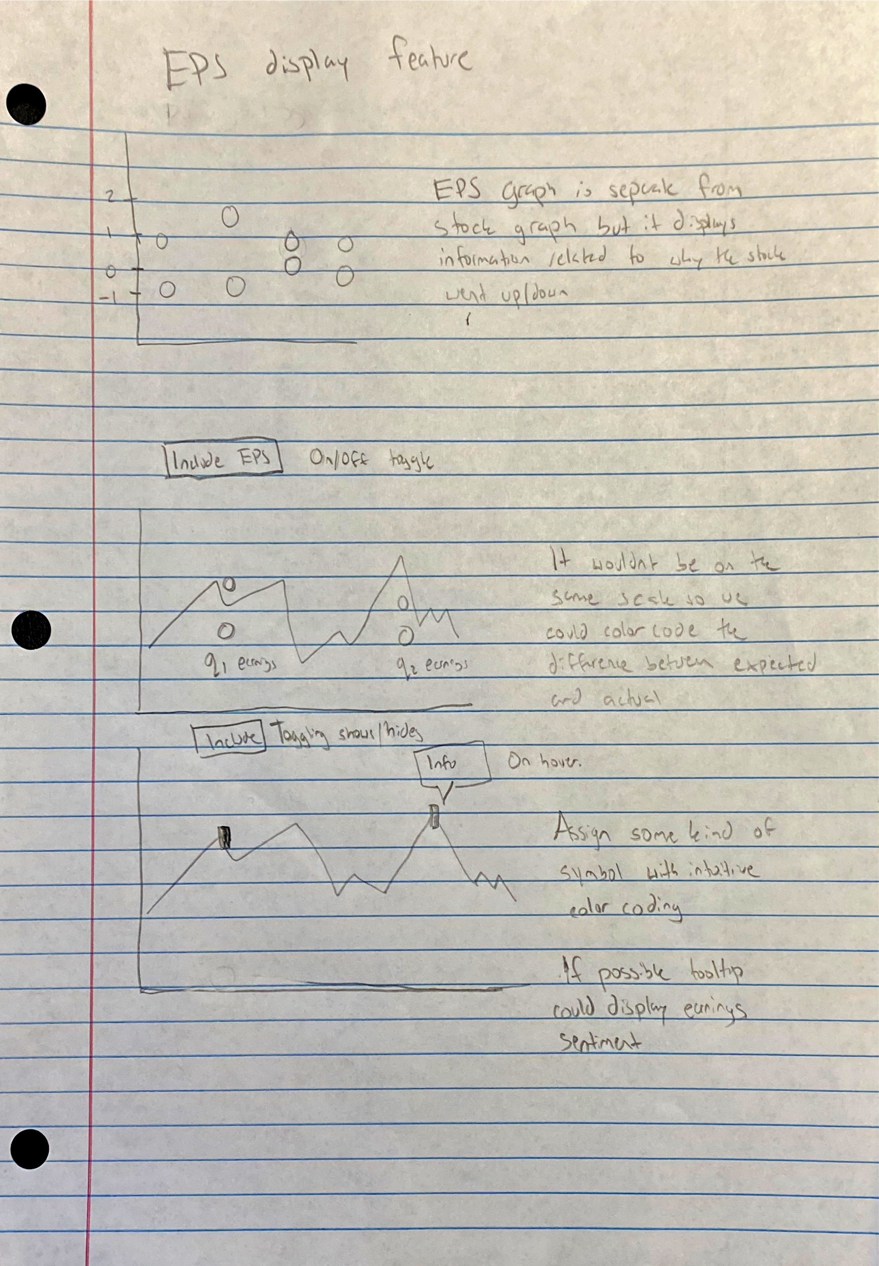
Interactivity is woven into the fabric of the chart. A user's hover unveils a tooltip—a detailed vignette of financial data that includes the latest stock price, the percentage change within the selected timeframe, and the market cap. The additional layer of option pressure data is pivotal, offering insight into market sentiment and potential future movements.
The chart goes beyond static displays, beckoning users to engage with the data. This includes not just numbers but narratives, with up-to-date news and analytics painting a full picture of a company's stock story.
Complementing the chart is a time selector, a feature that invites users to witness the stock performance across various temporal landscapes—daily, monthly, semi-annually, and annually. This control transforms the chart into a time machine, revealing the arc of stock narratives over different chapters of time. The color-coding is the final touch in this interactive canvas, where shades shift to reflect stock price changes—green for growth, red for decline—offering a quick visual cue to the market's heartbeat.
The design and functionality of our tree chart are emblematic of the Insightful Stock Charting project's philosophy—to elucidate the stock market through a clear, concise, and interactive lens. We are committed to stripping away the complexity of the financial markets, providing a platform where usability meets utility. Our project's ambition is encapsulated in this visualization: to equip investors with an informative, user-friendly tool that elevates their market analysis and decision-making.
Objective: The purpose of this user study is to evaluate the usability and effectiveness of our stock visualization tool through structured 5-minute user surveys. The study aims to gather user feedback to identify areas for improvement and assess the clarity of displayed information.
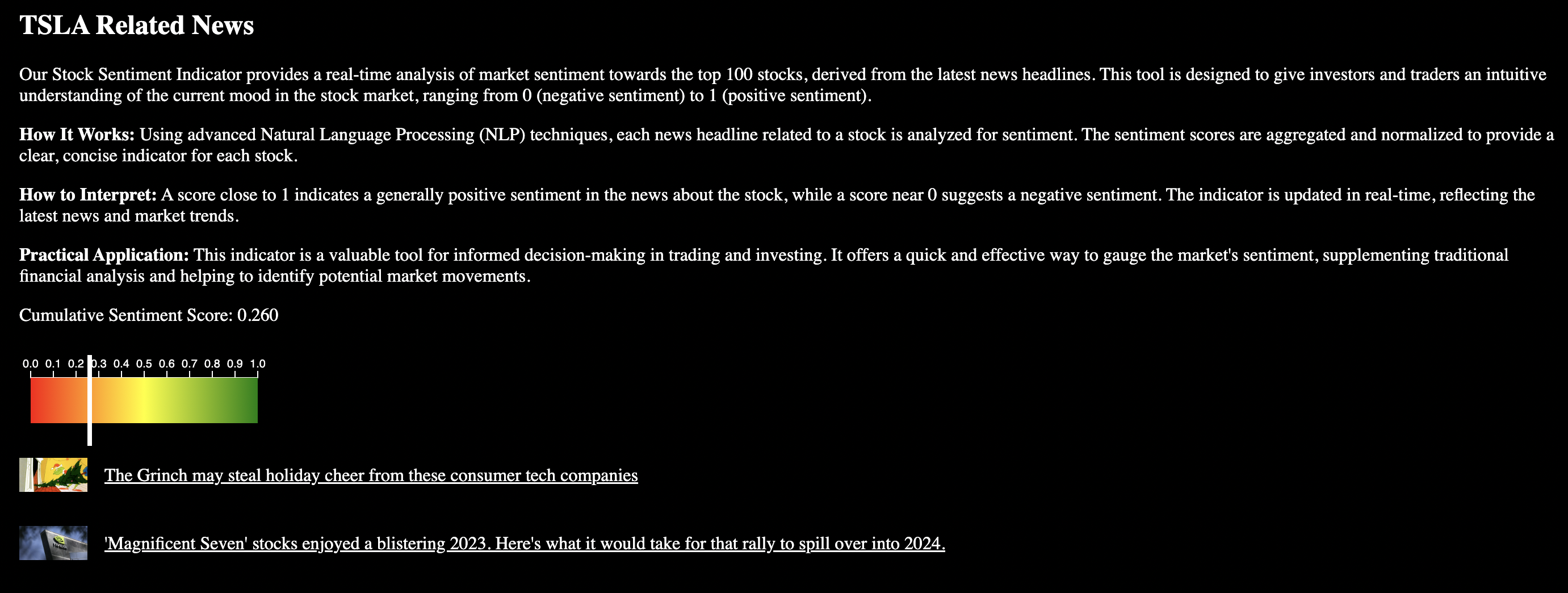
Our Stock Sentiment Indicator harnesses sophisticated Natural Language Processing (NLP) methodologies to present a dynamic real-time analysis of market sentiment concerning the top 100 stocks, as derived from the most recent news headlines. Tailored for both investors and traders, this tool offers an insightful glimpse into the prevailing mood of the stock market, portrayed on a scale ranging from 0 (indicative of negative sentiment) to 1 (reflecting positive sentiment).
Employing advanced NLP algorithms, each stock-related news headline undergoes meticulous sentiment analysis. These sentiment scores are then harmonized and standardized, resulting in a concise and comprehensive indicator for each stock.
A score nearing 1 signifies an overall positive sentiment within the stock-related news, while a score closer to 0 implies a prevailing negative sentiment. Continuously updated in real-time, this indicator stays abreast of the latest news and market trends.
Serving as a valuable asset in trading and investment decision-making, this indicator provides a rapid and effective means to gauge market sentiment. It serves as a complementary tool to traditional financial analysis, facilitating the identification of potential market dynamics and aiding in strategic decision-making processes.
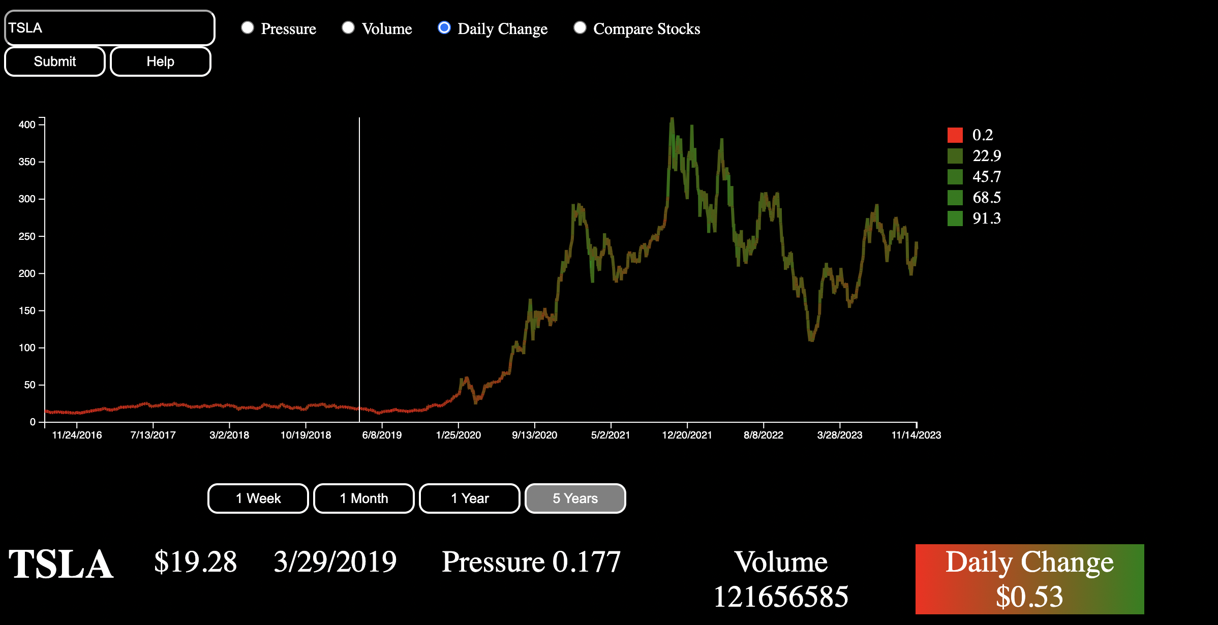
Looking at the visualizations unveiled critical insights into stock data while adapting to evolving objectives over the course of the project. Initially, the visuals elucidated the stock's overall trends, showcasing distinct patterns like bullish or bearish movements. They effectively correlate trading volume with price shifts and provide insights from key technical indicators, accurately explaining the stock's performance indicators.
Furthermore, the visualization gauged market sentiment by aligning news events with stock performance, showing a potential correlation between news sentiment and stock movements. Historical analysis unveiled the stock's current performance against past data, revealing recurring patterns and behaviors.
As our focus shifted towards stock comparison and user-friendly representation, the visualizations evolved to cater to novice comprehension and actionable insights. They can now compare stocks with industry peers and included features for novices' easy interpretation. However, to enhance usability, tooltips and more user-friendly guides could be incorporated. The visualizations effectively guide investment decisions but could benefit from additional improvements in simplification and accessibility for users with varying expertise levels. Refinements in interface clarity and information representation could amplify the visualization's effectiveness further. The visualization could also do a better job of summarizing insights for the user.