brainstorm
Team Members: Jeffrey Wang, Kristen Wang
Emails: jeffrey.w@wustl.edu, kristen.w@wustl.edu
UIDs: 497952, 498148
GitHub Page Link: https://csex57.github.io/nyc-water/
Having spent years living in NYC, both of us are well aware of the poor water quality in the metropolitan area. However, with billionaires and the super-rich living just across town, we question to what extent socio-economic status affects access to cleaner, safer water.
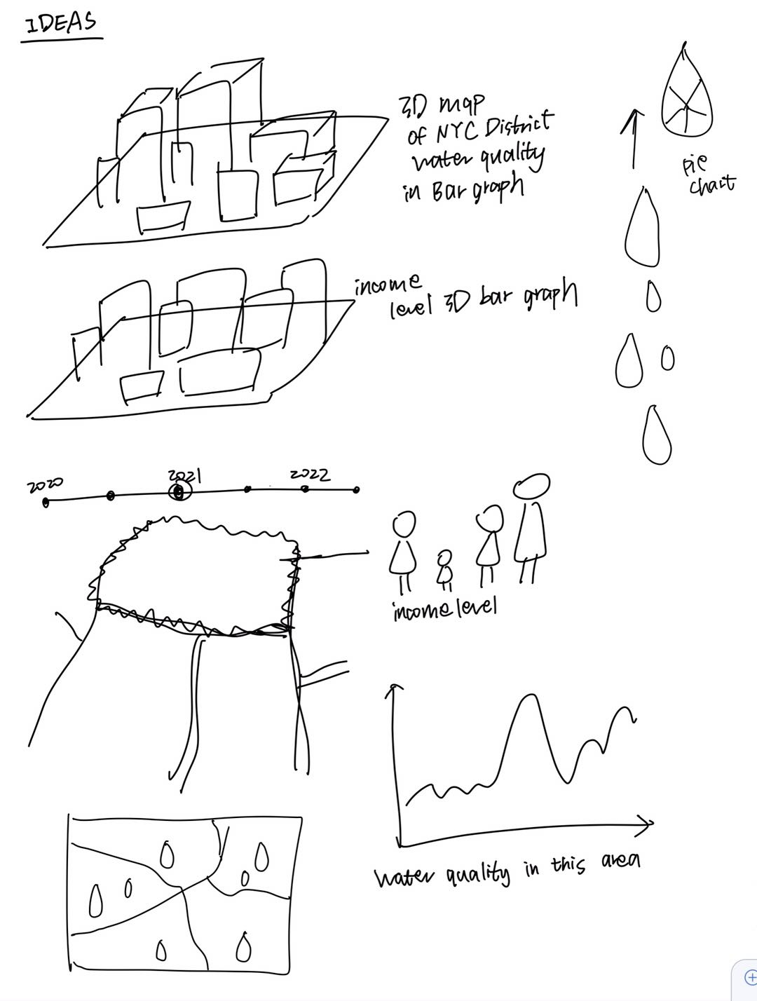
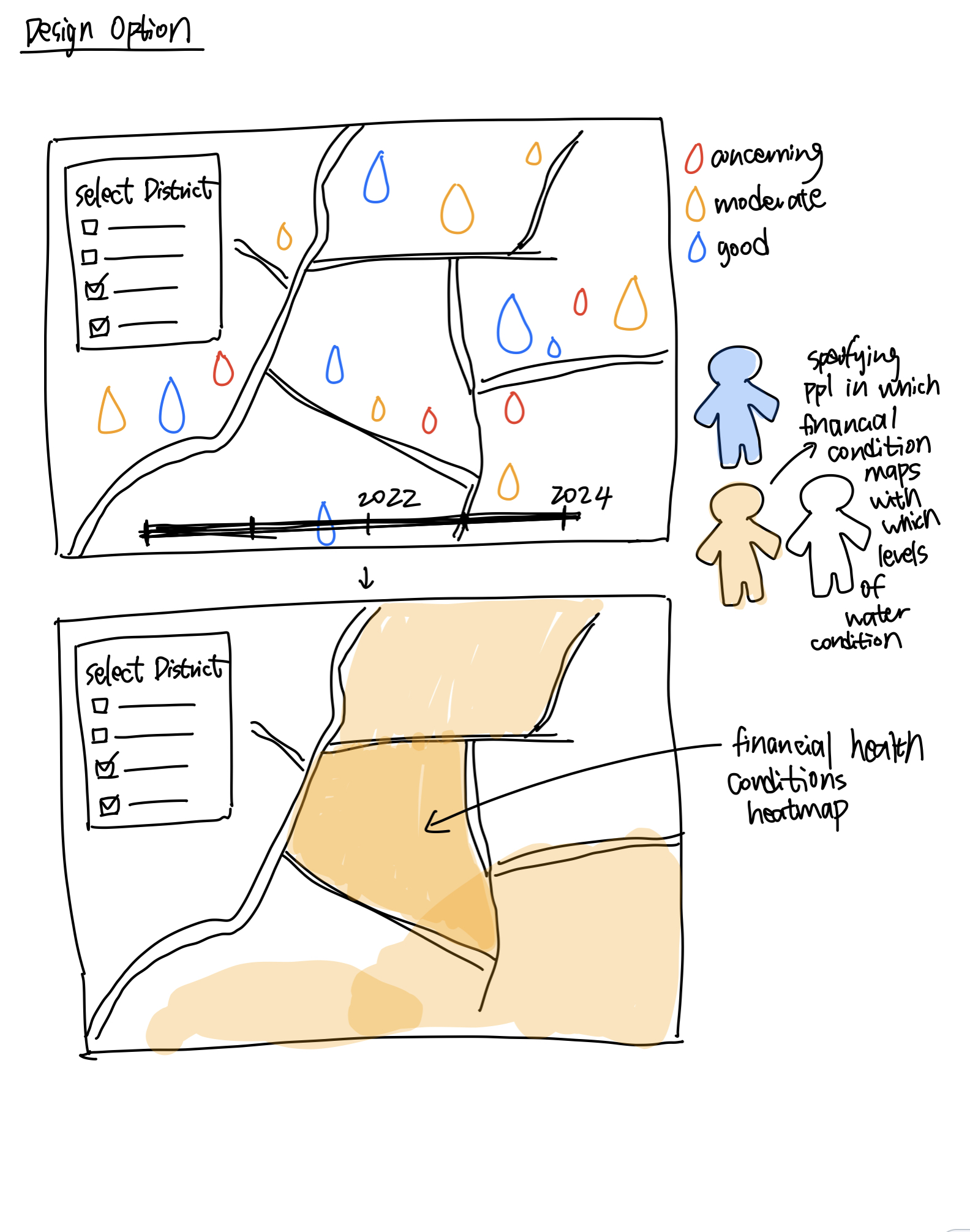
This project aims to explore the impact of socio-economic disparities on water quality in the hyper-dense neighborhoods of NYC. Our goal is to visualize the differences in water quality across neighborhoods with varying levels of financial health. We aim to create an interactive visualization that enables viewers to compare water quality metrics and socio-economic data side-by-side.
The expected benefits of this visualization are:
We will be collecting data from NYC Open Data. Specifically, we plan to explore these datasets as potential data sources:
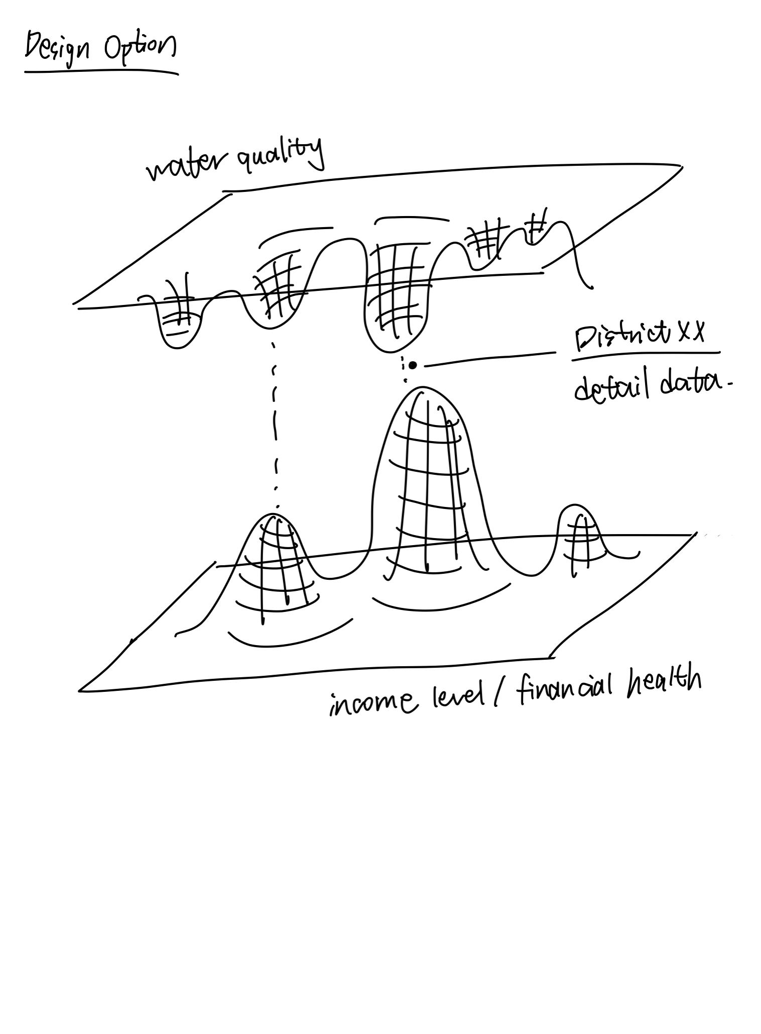
We plan to use two datasets as two separate layers while using the geographic location as the control/connecting factor. The first layer would be the self-reported water quality based on location and the second layer would be the financial health based on the location of the neighborhood in NYC.
Due to the size of the dataset (49 columns in the original table), we will be filtering data that we need. There are a significant number of columns specifying lab name, inspection company, and irrelevant details around water quality such as ladder access. Therefore, we decided to filter out these columns and only focus on the fields below for now:
The dataset is not real-time updated but will update every few days. Key fields include:
This dataset doesn’t provide the exact latitude and longitude for location, but does provide these columns that we can use to find the neighborhood’s location. We probably need to query Google Maps to extract the exact latitude and longitude based on them:
These columns provide numerical values to measure the financial health of a neighborhood, which can be used to construct a heatmap:
These columns can provide us with additional info about a neighborhood’s racial distribution for further insights:

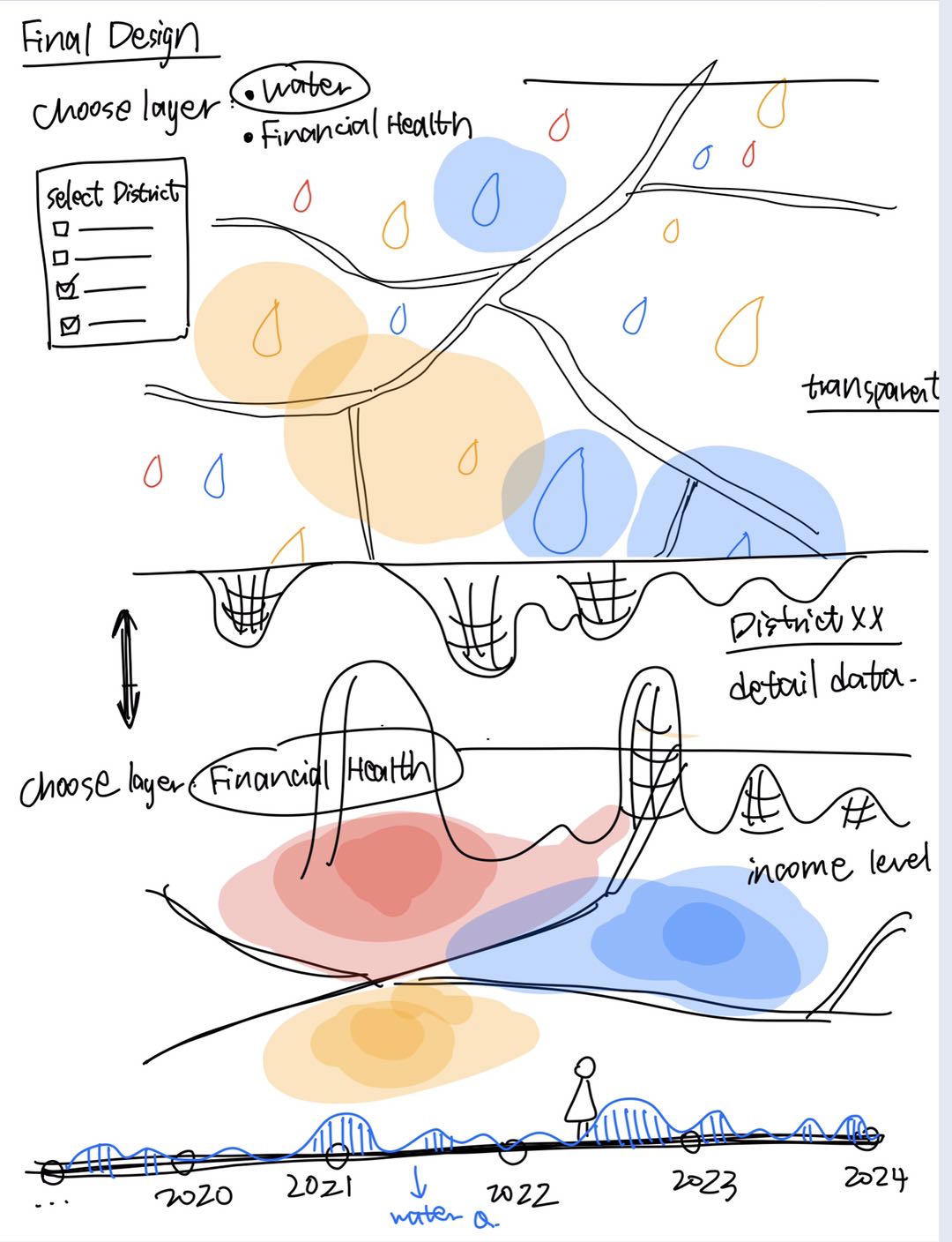
We have 7 weeks before the final project is due. So we will divide up the timeline into 3 sprints evenly, each sprint lasting 2 weeks, with 1 week reserved for any delays.
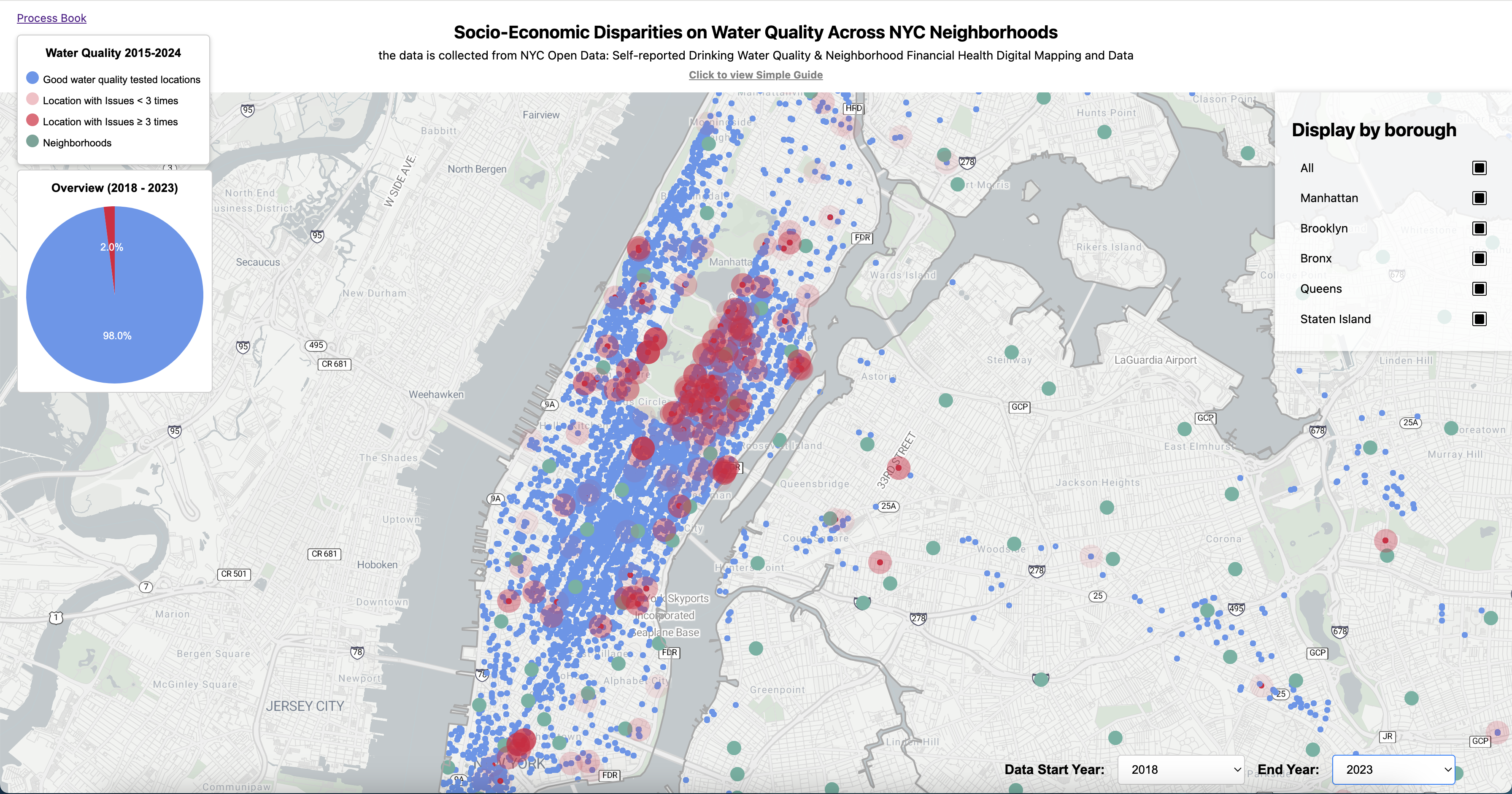
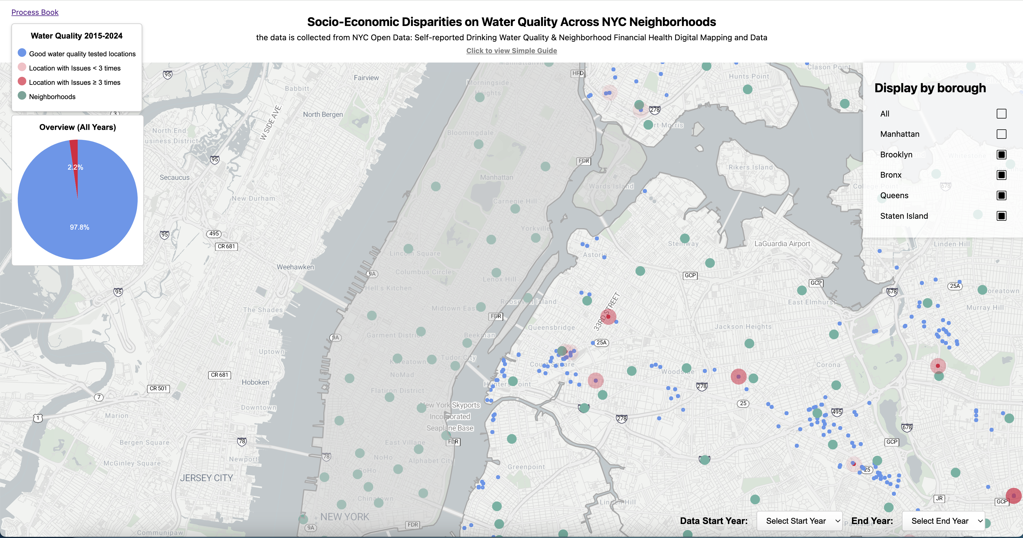
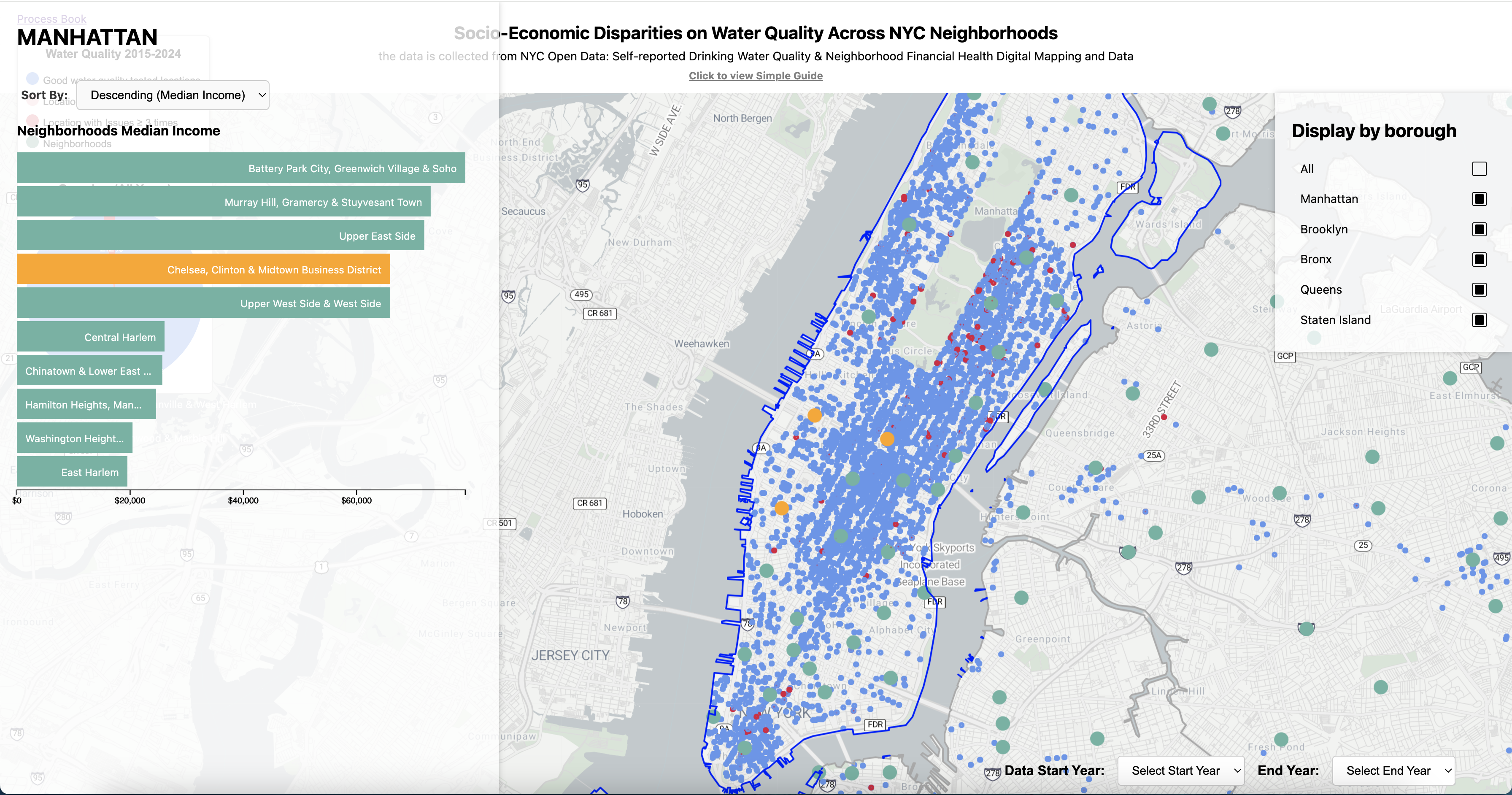
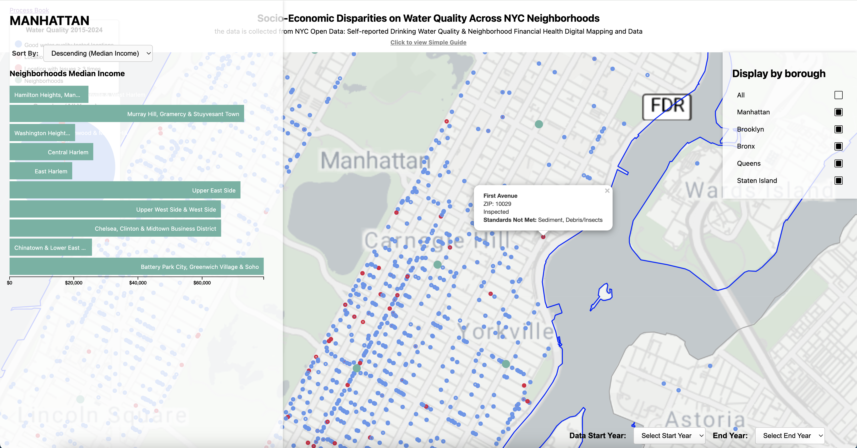
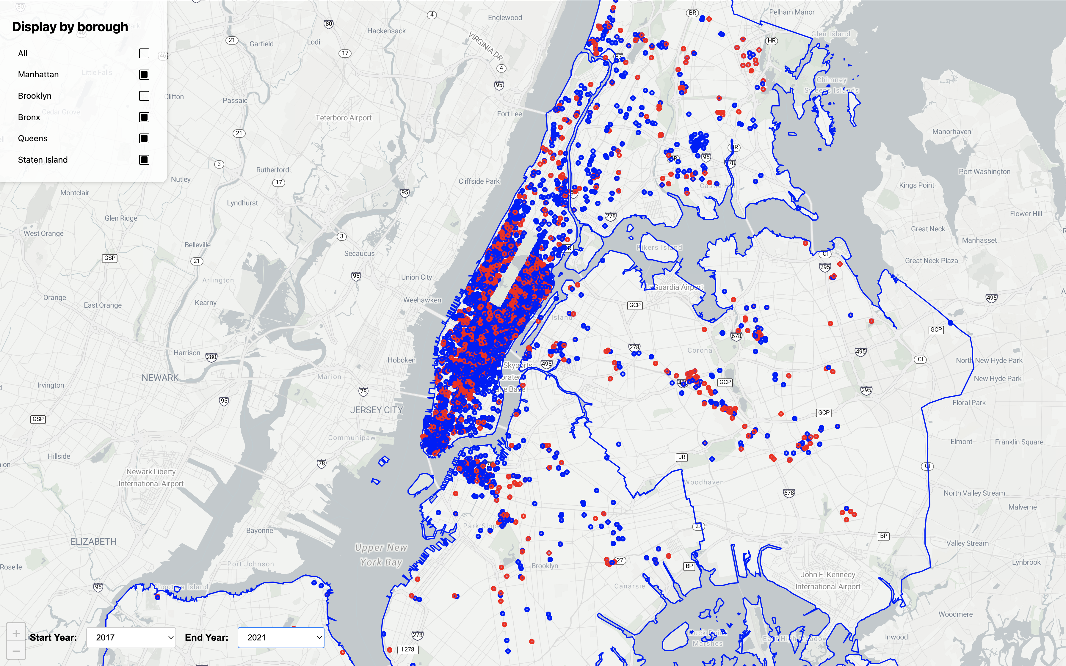
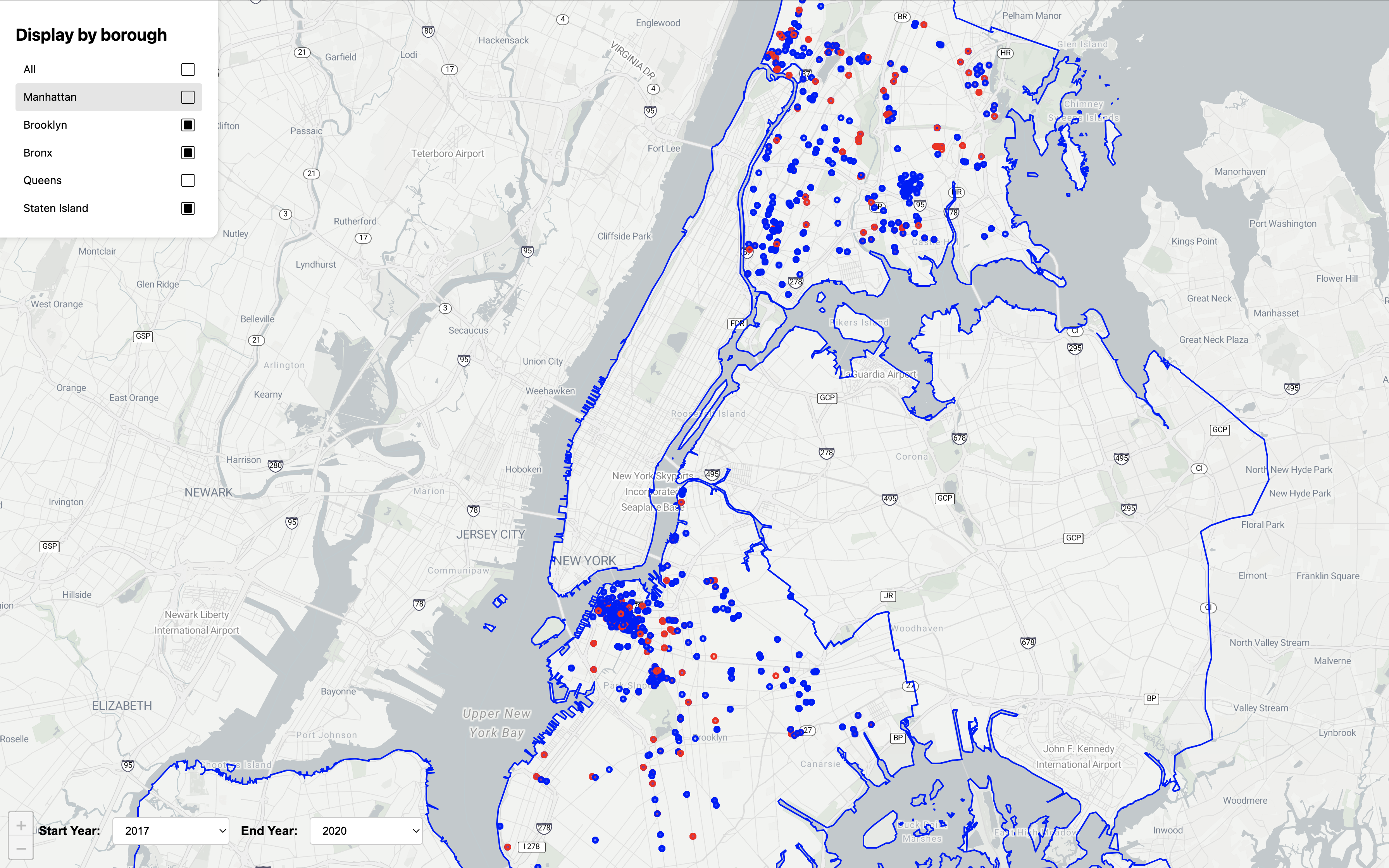
For this milestone, our focus is on visualizing water quality on the map. We first filtered our dataset to retain only water quality inspection data directly relevant to our objectives, plotting inspected locations on the NYC map. We added a timeline for the user to select the start and end year of the water quality visualization that they would like to see. In the future this timeline will be a more user friendly slide bar instead of an option panel. To enhance user interaction, we added a control panel allowing users to filter NYC regions, offering a broad overview of area-specific water quality. We use red and blue markers to indicate concerning versus satisfactory water quality, respectively. Although the dataset includes a MEET_STANDARDS parameter that theoretically flags water quality issues, we found it inconsistent, with a 'Y' value for only about 30% of the records. As a result, we decided to rely on specific inspection result columns to assess water quality conditions.

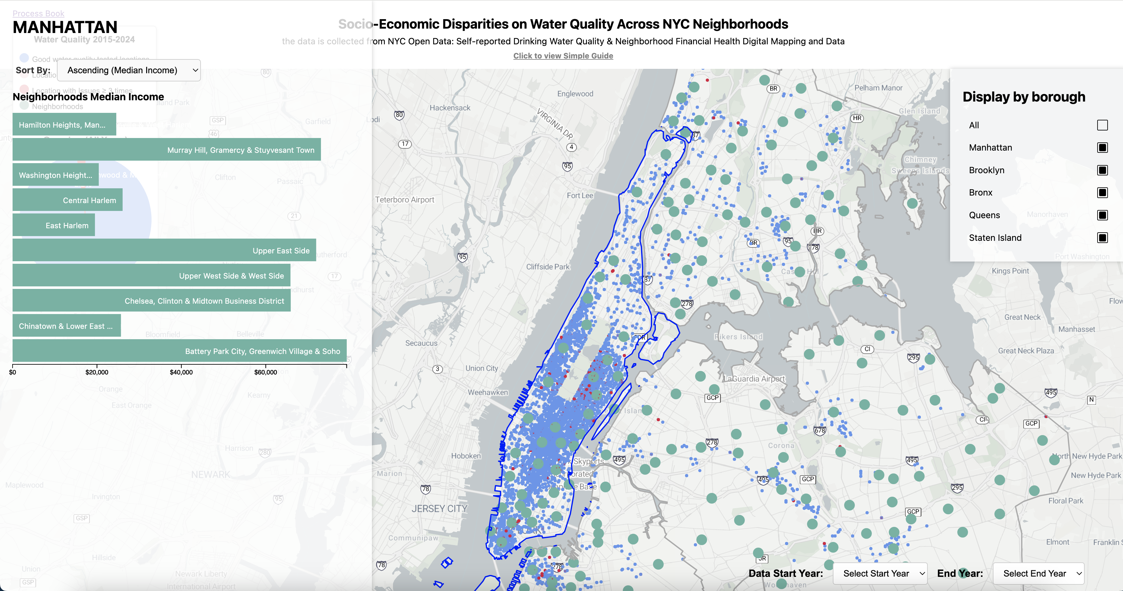
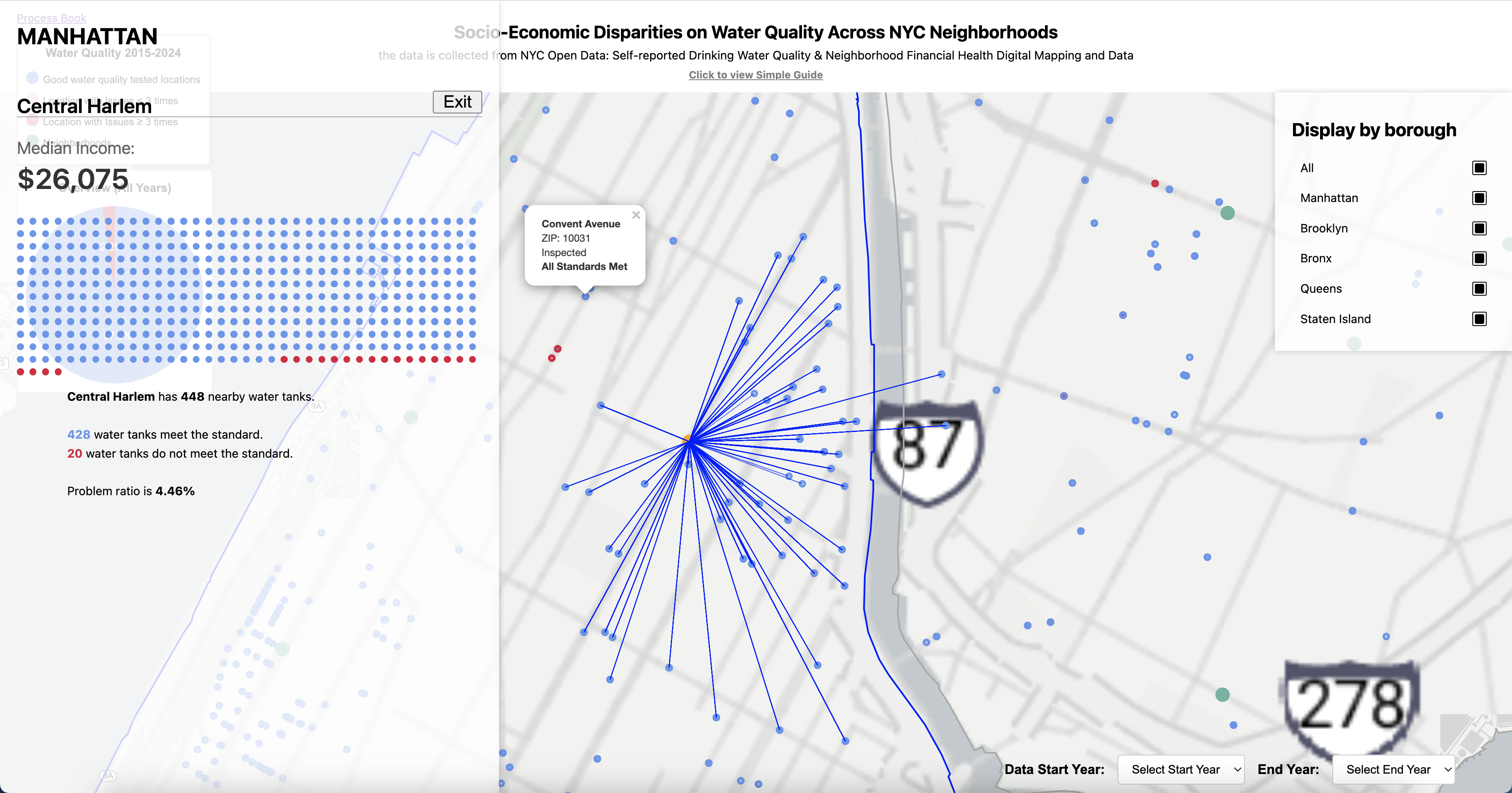
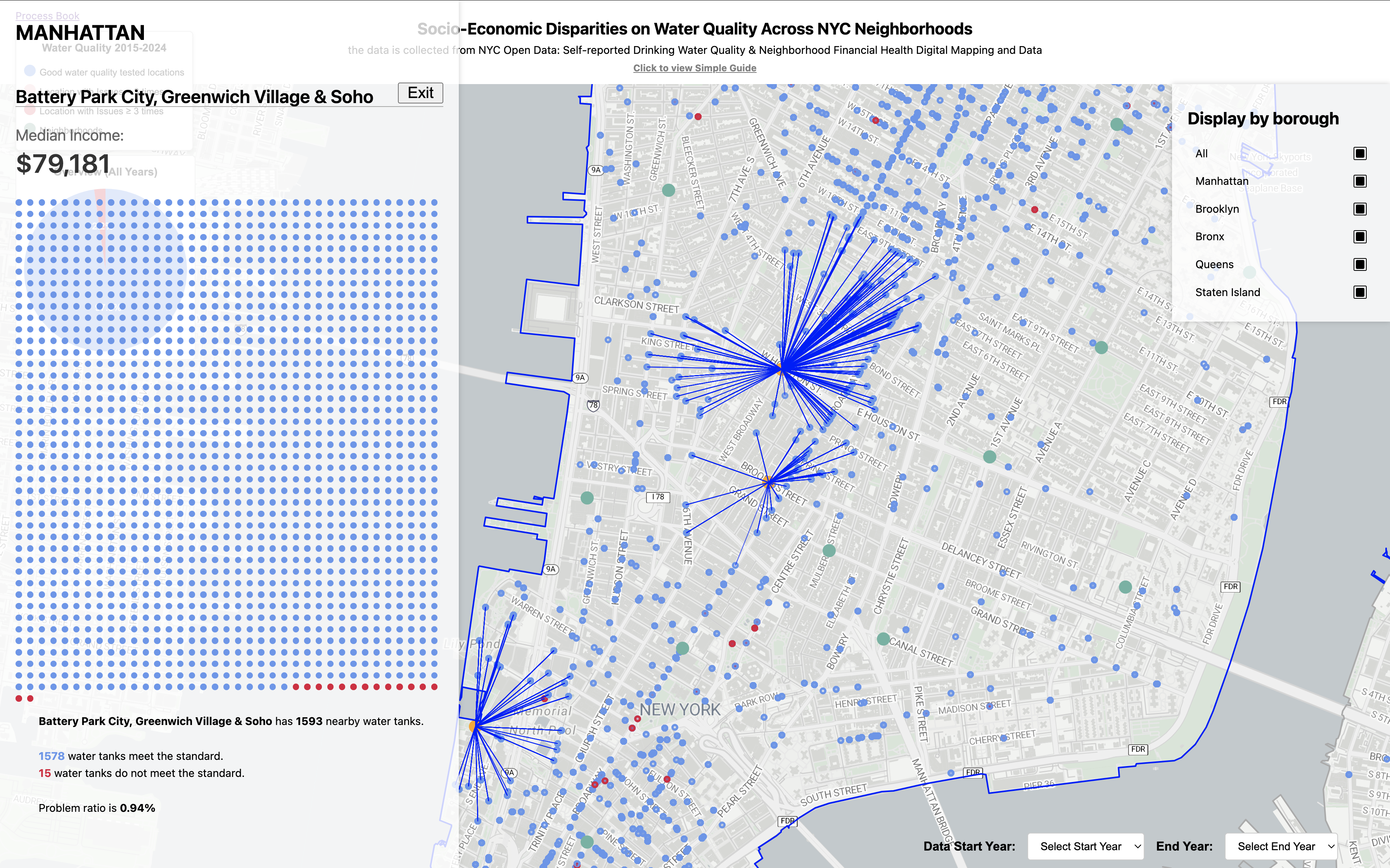
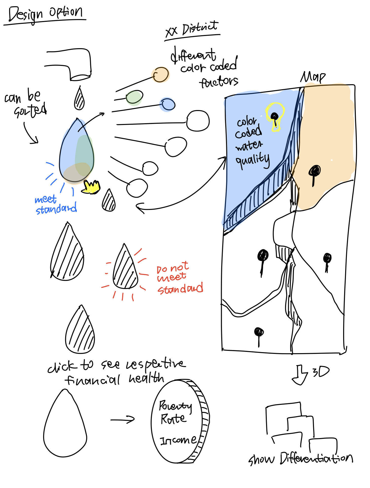
For this milestone, our focus shifted to including more data analysis strategies such as bar graphs. First, in order to get a more general sense of accumulating water quality through out the years and the general region, we added a transparent radius around each point where the water quality does not meet standard, which cannot be seen through simple solid dots. Second, we added a hovering and highlight feature so that the user can select to see and sort the finance data (median income) for each specific district inside each area. The dots representing the location will also be shown as the same highlight color on the map to create an intuitive interaction. Third, the user can interact with the bar chart by clicking on a specific bar, which reveals additional details about the corresponding neighborhood. This detail view provides the exact median income of the selected neighborhood and the number of water tanks in that neighborhood that have issues, such as not meeting water standards utilizing the representation of red and blue dots. This informative approach gives more useful information in addition to our visualization.
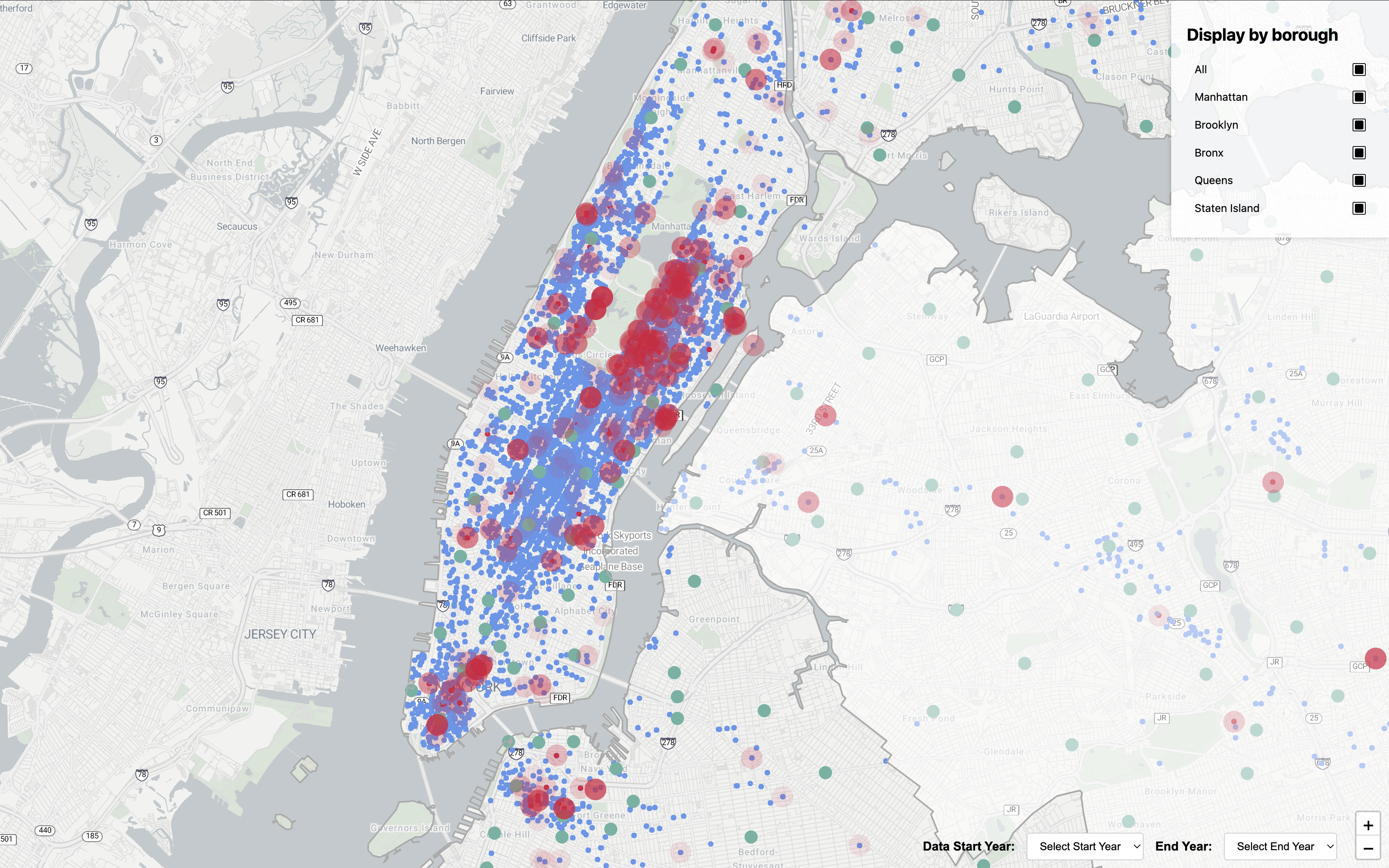
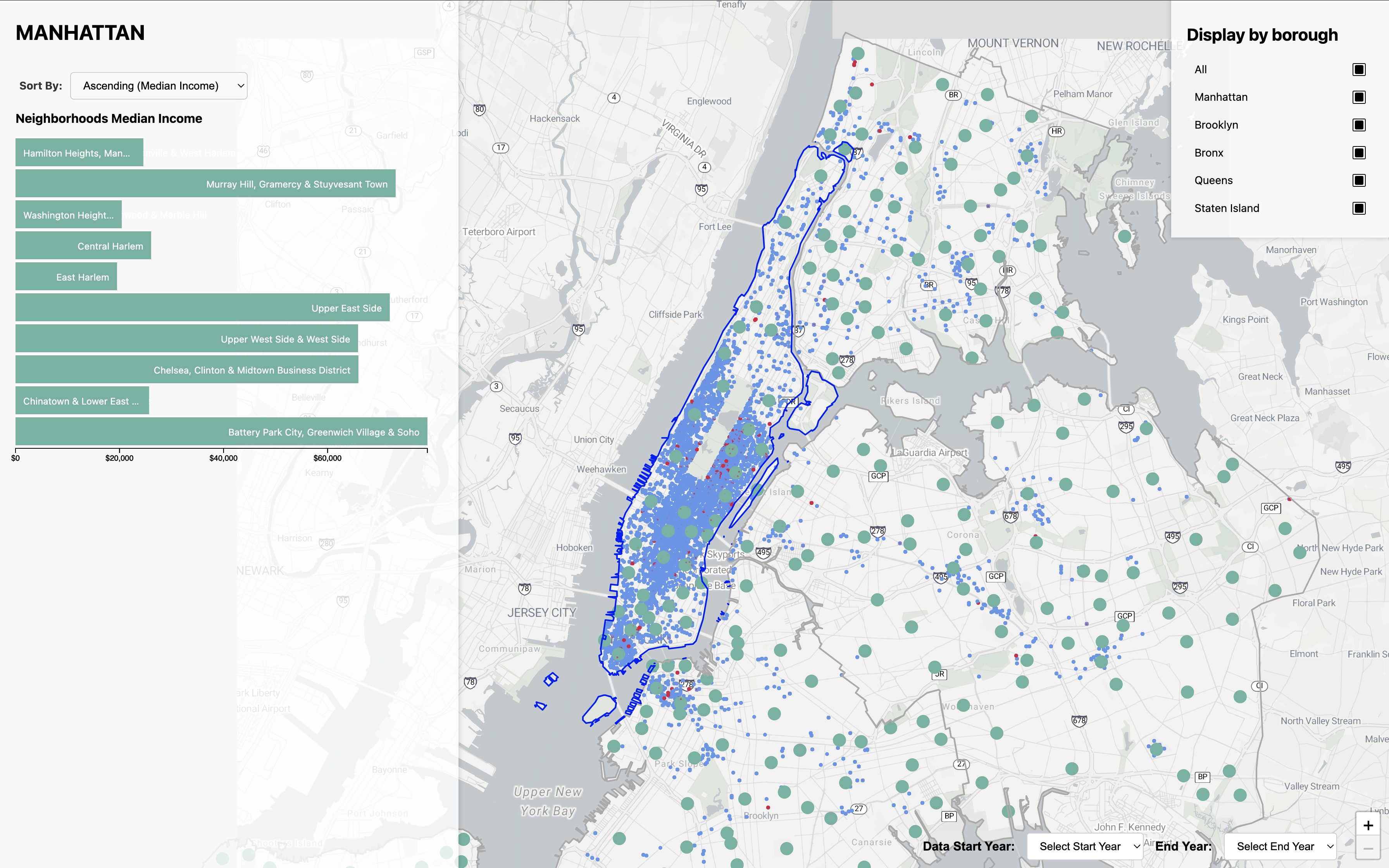
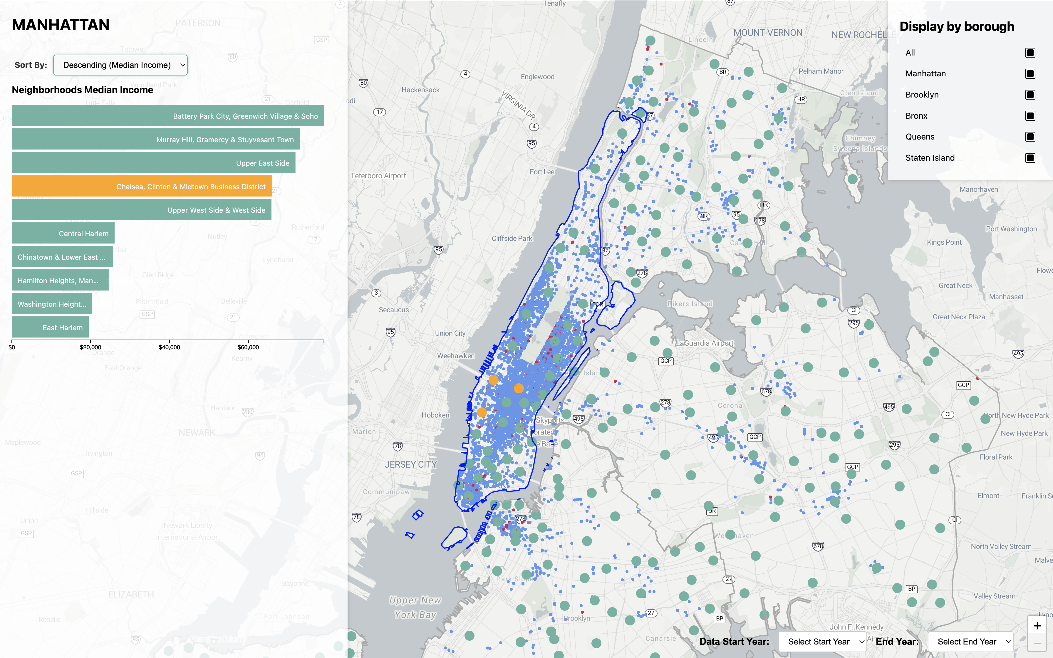
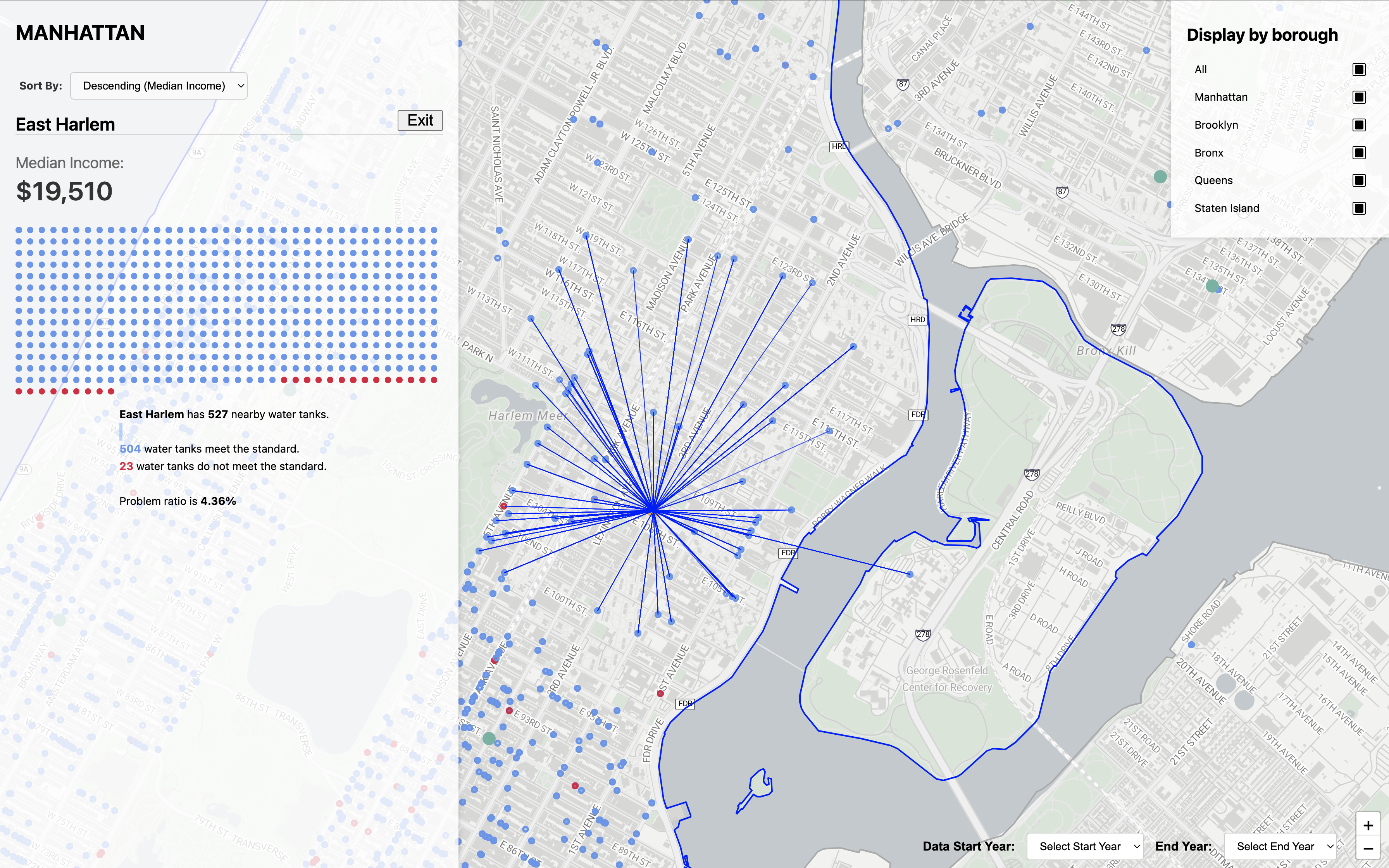
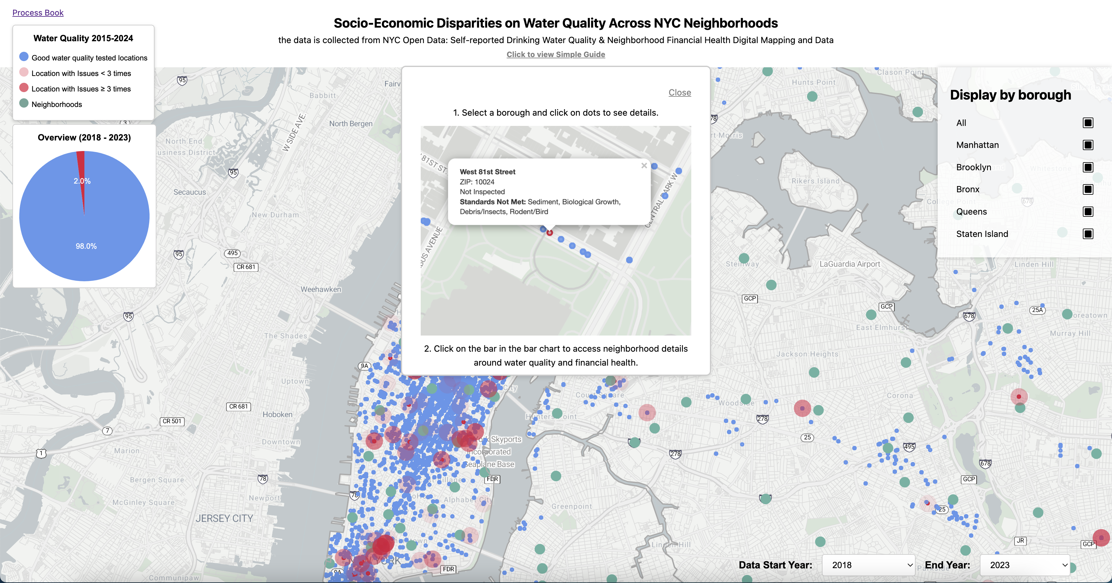
After we received the feedback from Milestone 2 that our visualization was lack of necessary guidance for our features and indication of different forms of representation such as the lines in the neighborhood and the dots on the homepage, we addressed these issues in this revision. We also added a overview representation of the percentage of disqualified water tanks for the selected year on the home page for the user to have a more general sense.
Project highlight
Analysis
After the presentation, we received valuable feedback regarding our findings in the relationship between water quality and the status of the financial health of the neighborhoods that we should consider the population in the neighborhood. Sadly, we did not have the data for the population in our existing dataset and we will incorporate that in the future.
