Mental health in the workplace has become a central issue in the tech industry, where long hours, distributed teams, and high expectations are common. In this project, we build an interactive web-based dashboard that combines the
OSMI Mental Health in Tech Survey (2014) with CDC PLACES 2024 depression and obesity data to explore how workplace support and regional context shape mental health outcomes.
Our final website consists of six coordinated visualizations, all implemented in D3.js v7, that allow users to move smoothly between:
(1) national depression patterns,
(2) state-level physical vs mental health trends,
(3) workplace experiences from the OSMI survey,
and (4) individual-level stories embedded in the data.
The goal is not just to show where depression rates are high, but to ask: how does the tech workplace help or hurt people living with mental health conditions, and how does this vary across the U.S.?
2. Background and Motivation
The OSMI survey has become a widely cited source for understanding mental health in tech. It captures how employees experience stigma, support, and practical barriers when they consider seeking treatment. At the same time, the CDC’s PLACES dataset reveals how depression and other health indicators vary geographically across the U.S.
Our motivation was to bring these two perspectives together:
From OSMI: what do tech workers say about treatment, interference with work, and workplace support?
From CDC PLACES: what does the broader mental-health landscape look like in their states and counties?
By pairing workplace-level experiences with regional health patterns, we hoped to identify:
States where tech workers are more likely to seek treatment.
Gaps between high depression prevalence and low workplace support.
Places where physical and mental health burdens seem to move together.
Ultimately, we want the visualizations to help employers, policymakers, and researchers better understand where support is working and where it is clearly not enough.
3. Project Objectives
The main questions we focused on are:
How does mental health treatment and support vary across U.S. states for tech workers?
What is the relationship between obesity (a physical health indicator) and depression (a mental health indicator) at the state level?
How do specific workplace factors—such as benefits, anonymity, and leave policies—relate to treatment seeking and work interference?
Which states appear to have stronger or weaker support systems for mental health in tech workplaces?
How do individual experiences (treatment, stigma, support) differ across states and demographic groups?
Across all of these, our broader objective is to use visualization to make hidden patterns visible and to give users a flexible way to explore the data rather than just reading a static report.
4. Task Abstraction
We thought about our design using classic visualization task categories: who is using the system, what are they trying to see, and why they are looking.
4.1 Users
Curious viewers / classmates: Want an intuitive overview of mental health in tech across the U.S.
Employers / HR professionals: Want to compare their region to others and understand where workplace support may be lacking.
Researchers / students: Want more detailed, drill-down views (e.g., state vs county, individual-level patterns).
4.2 Data and Tasks
High-level tasks:
Overview: See national patterns of depression across states and counties.
Zoom and filter: Focus on one region or state and explore its detailed patterns.
Relate: Compare obesity vs depression, or support vs work interference.
Explore individual variation: See how different respondents’ experiences line up across many dimensions.
Rank and sort: Identify states with the highest or lowest support or treatment rates.
Why these tasks matter:
These tasks support typical questions like “Is my state doing better or worse than others?”, “Do states with higher obesity also tend to have higher depression?”, and “What workplace factors tend to show up when people say mental health interferes with their work?”.
5. Data
We use three main data sources.
5.1 OSMI Mental Health in Tech Survey (2014)
The OSMI dataset includes roughly 778 U.S. respondents working in tech. For each respondent, we have:
Demographics: age, gender, state, self-employment, tech company status.
Mental health indicators: treatment history, whether mental health interferes with work, family history.
Workplace support: benefits, mental health care options, wellness programs, encouragement to seek help.
Policies and culture: anonymity protection, ease of taking mental-health leave, perceived consequences, comfort discussing with coworkers/supervisors, mental vs physical health parity, observed consequences for others.
5.2 CDC PLACES 2024 — Depression and Obesity
State-level: depression and obesity prevalence for adults.
County-level: depression prevalence for all U.S. counties.
These variables give us the broader mental health and physical health context for each state where OSMI respondents live.
5.3 Supporting Geospatial Data
us-states.geojson for state outlines.
counties-10m.json (TopoJSON) for county boundaries.
6. Data Processing
The raw datasets were not ready to visualize directly, so we spent a significant amount of time on cleaning and preprocessing.
Filtering to U.S. respondents: We removed non-U.S. entries and standardized state names to two-letter codes where needed.
Normalizing categorical labels: We cleaned up inconsistent text like “Don’t know”, “Not sure”, etc., and harmonized Yes/No fields across the survey.
Gender normalization: We condensed many free-text gender entries into a smaller set of categories (Male, Female, Non-binary/Other) for aggregation while being mindful of sensitivity.
Ordinal encoding: We converted ordered responses such as work interference (Never, Rarely, Sometimes, Often) into numeric scales to compute averages and build comparisons.
State-level aggregation: For each state, we computed:
Proportion of respondents who have received treatment.
Distribution of work interference categories.
Share of respondents working at tech companies.
Share of respondents reporting access to benefits and support.
Merging with CDC data: We joined OSMI state-level aggregates with CDC state depression and obesity rates. For the choropleth, we also linked state and county codes to the GeoJSON/TopoJSON files.
Derived indicators: In some cases, we combined multiple survey questions into more interpretable indicators (for example, grouping several support-related questions into a “support profile” for the radar chart).
The final processed data flows into six separate D3 visualizations, all loaded from data/ and wired up through:
js/choropleth.js
js/scatter.js
js/workInterference.js
js/radar.js
js/stateDashboard.js
js/parallel.js
7. Visualization Design
Our final site integrates six main views. Below we describe the intent, design choices, and example screenshots for each one.
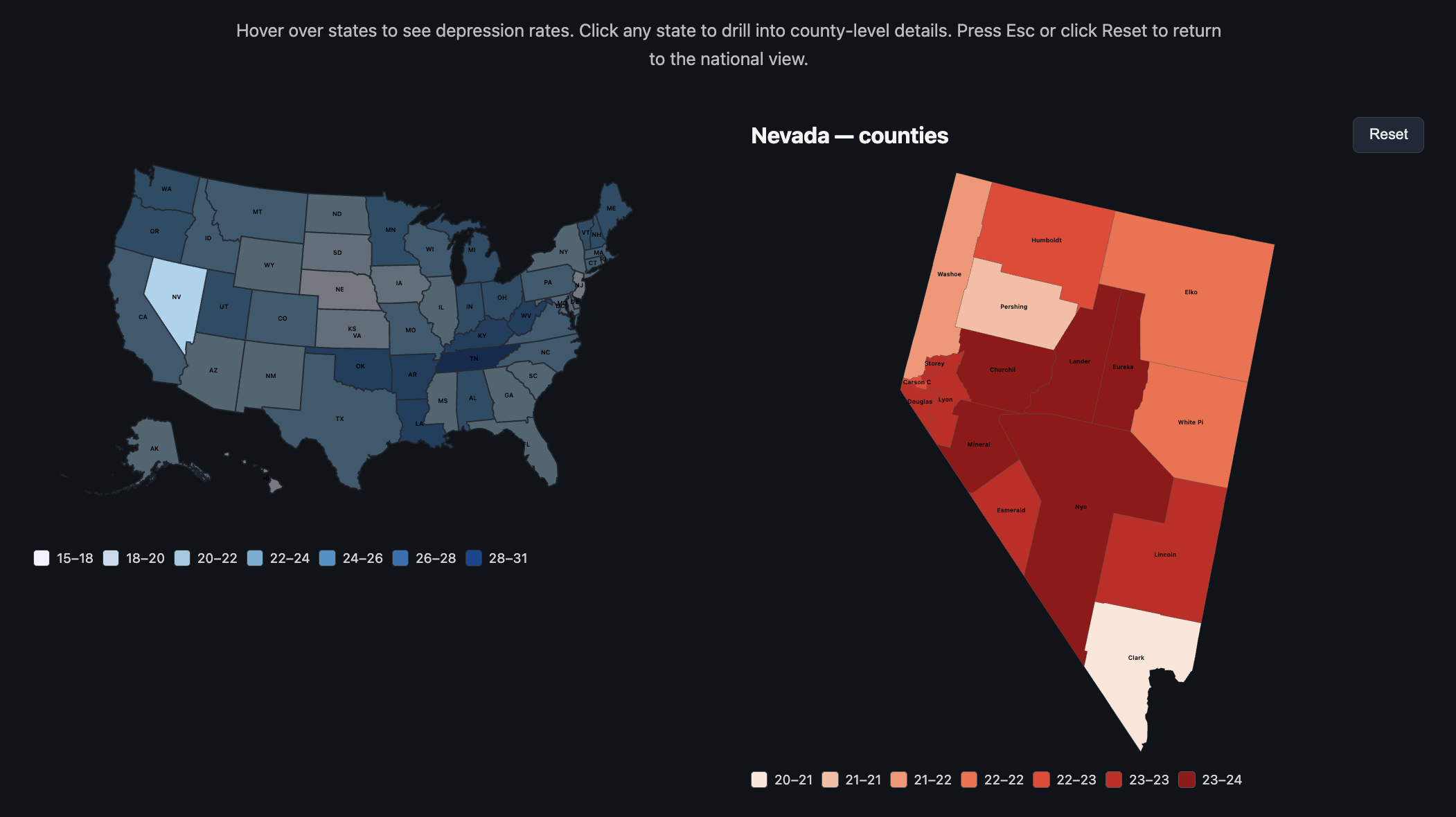
7.1 U.S. Depression Choropleth + County Drill-Down
Figure 1. Choropleth showing depression rates by state with drill-down into county-level depression patterns.
This view uses a state-level choropleth as the starting point. Each state is color-coded by depression prevalence. Hovering reveals a tooltip with the state name and exact rate. Clicking on a state smoothly transitions into a state-specific Albers projection that reveals county-level depression rates.
A reset button and the Escape key both take users back to the national view. We used a white background and a fairly restrained color palette so that the color scale remains readable for small states and the overall map feels clean.
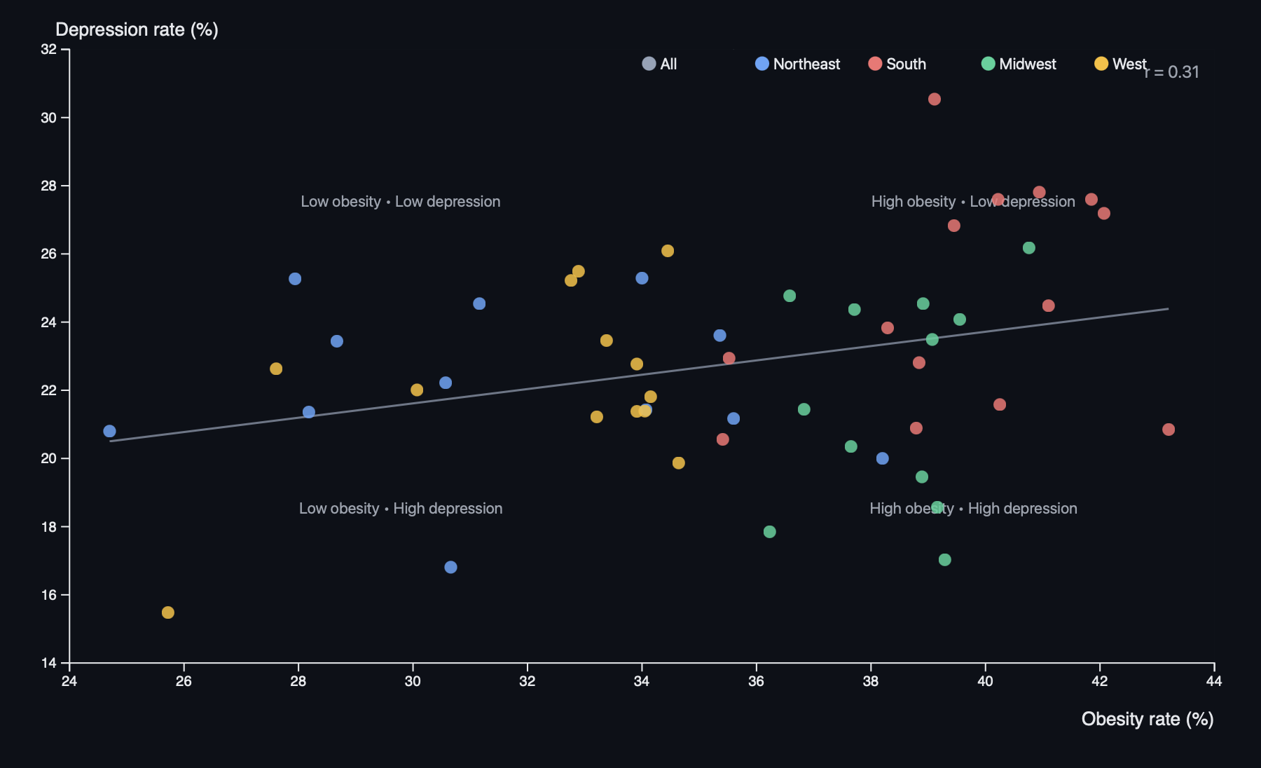
7.2 State Obesity vs Depression Scatter Plot
Figure 2. Scatter plot comparing obesity and depression rates by state, with regional colors and a fitted trend line.
This scatter plot shows each state as a dot, with:
X-axis: obesity rate (%)
Y-axis: depression rate (%)
Color: region (Northeast, South, Midwest, West)
We add a regression line and display a correlation coefficient to summarize the overall relationship. Median reference lines divide the chart into quadrants, making it easier to spot states that are high/low on both variables.
An interactive legend lets users highlight or isolate regions, and hover tooltips show the exact values for each state. The scatter plot uses a slightly darker background and clear axis labels to keep the points visually distinct.
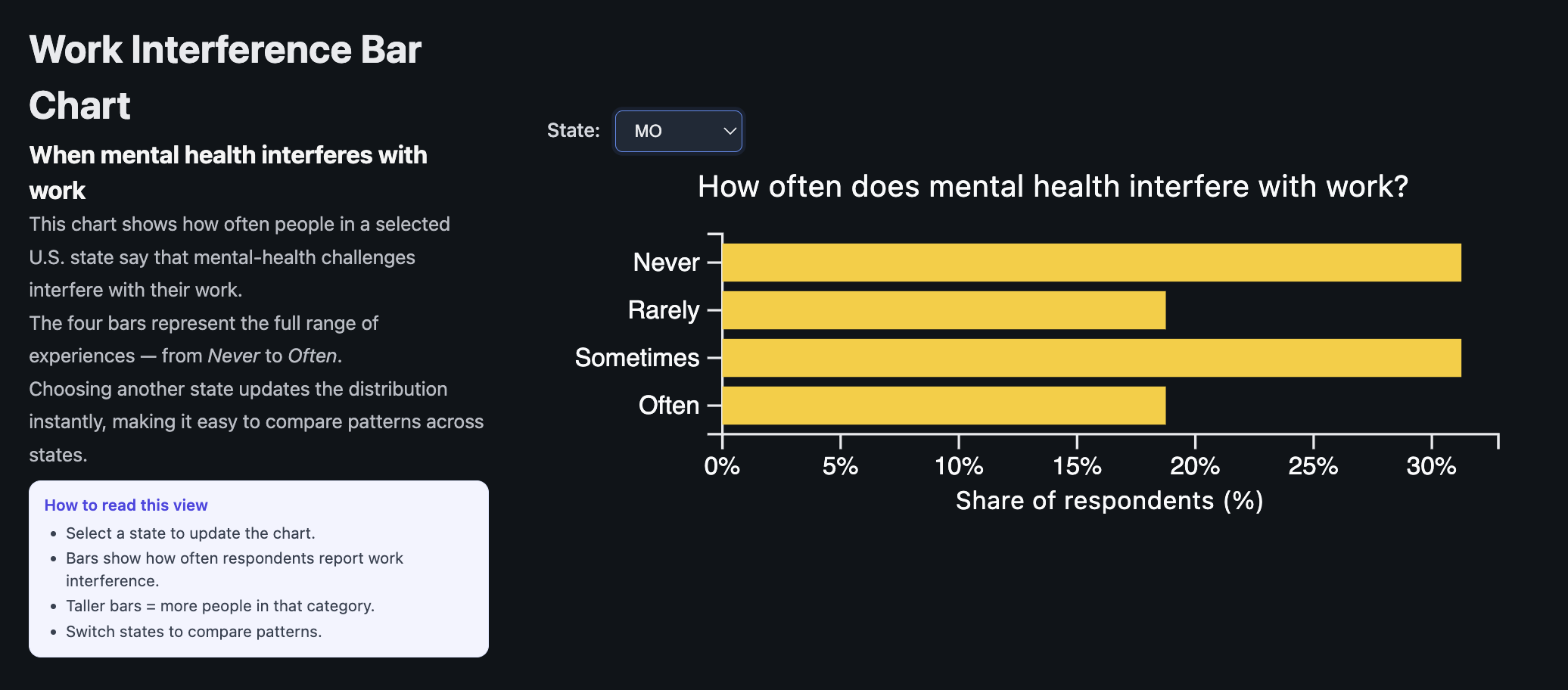
7.3 Work Interference Bar Chart (State-Level)
Figure 3. Horizontal bar chart showing how often mental health interferes with work for respondents in a selected state.
This visualization focuses directly on how respondents feel mental health impacts their work. A dropdown allows users to pick a state. For that state, we show the percentage of respondents in four categories:
Never
Rarely
Sometimes
Often
Animated transitions make changes across states feel smooth and help the user track the movement of bars. A small hint box explains how to read the chart (“taller bars toward Sometimes/Often generally indicate higher work impact in this state”).
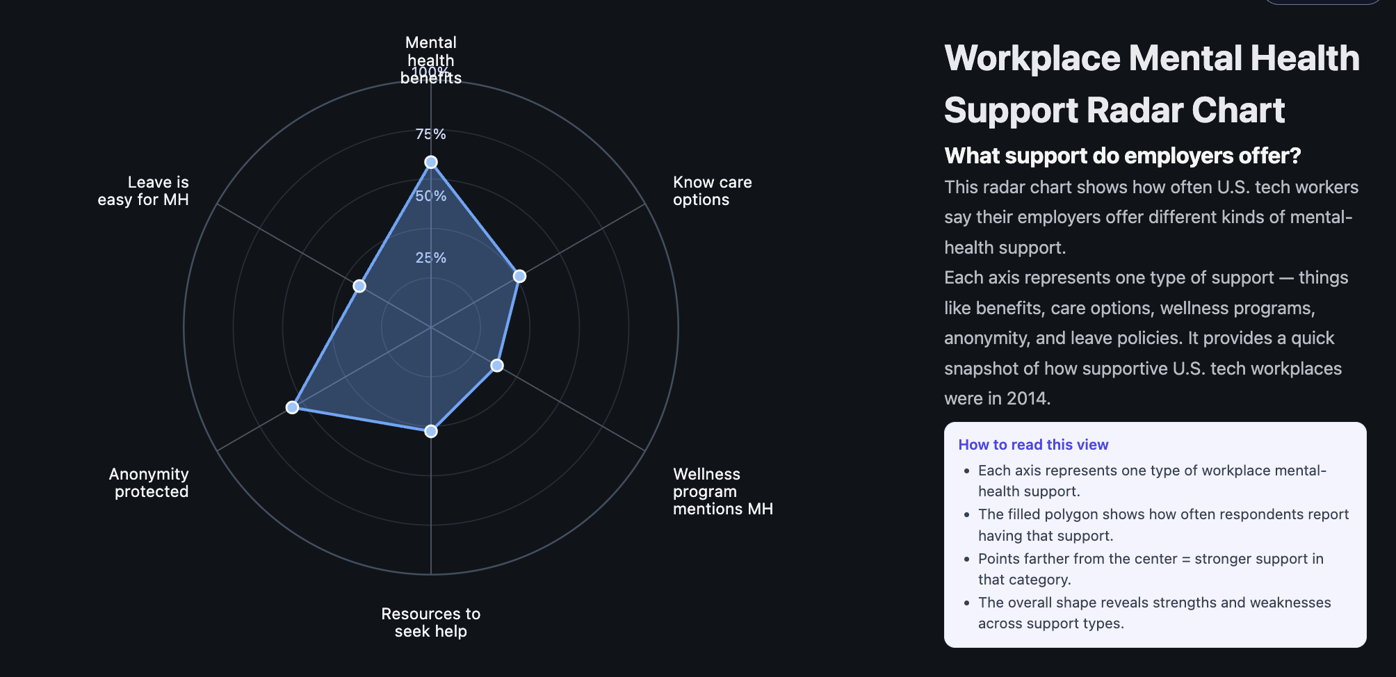
7.4 Radar Chart: Workplace Support Profile (National)
Figure 4. Radar chart summarizing key workplace mental health support dimensions at the national level.
The radar chart summarizes several workplace support dimensions using aggregated OSMI data:
Mental health benefits available
Clear care options
Wellness programs
Encouragement to seek help
Anonymity protection
Ease of taking mental-health leave
The polygon shape visually highlights which areas are relatively strong versus weak. For example, benefits may be relatively common, while anonymity and ease of leave lag behind. Hover tooltips show exact percentages on each axis. We used a darker background and subtle grid lines to keep the polygon readable.
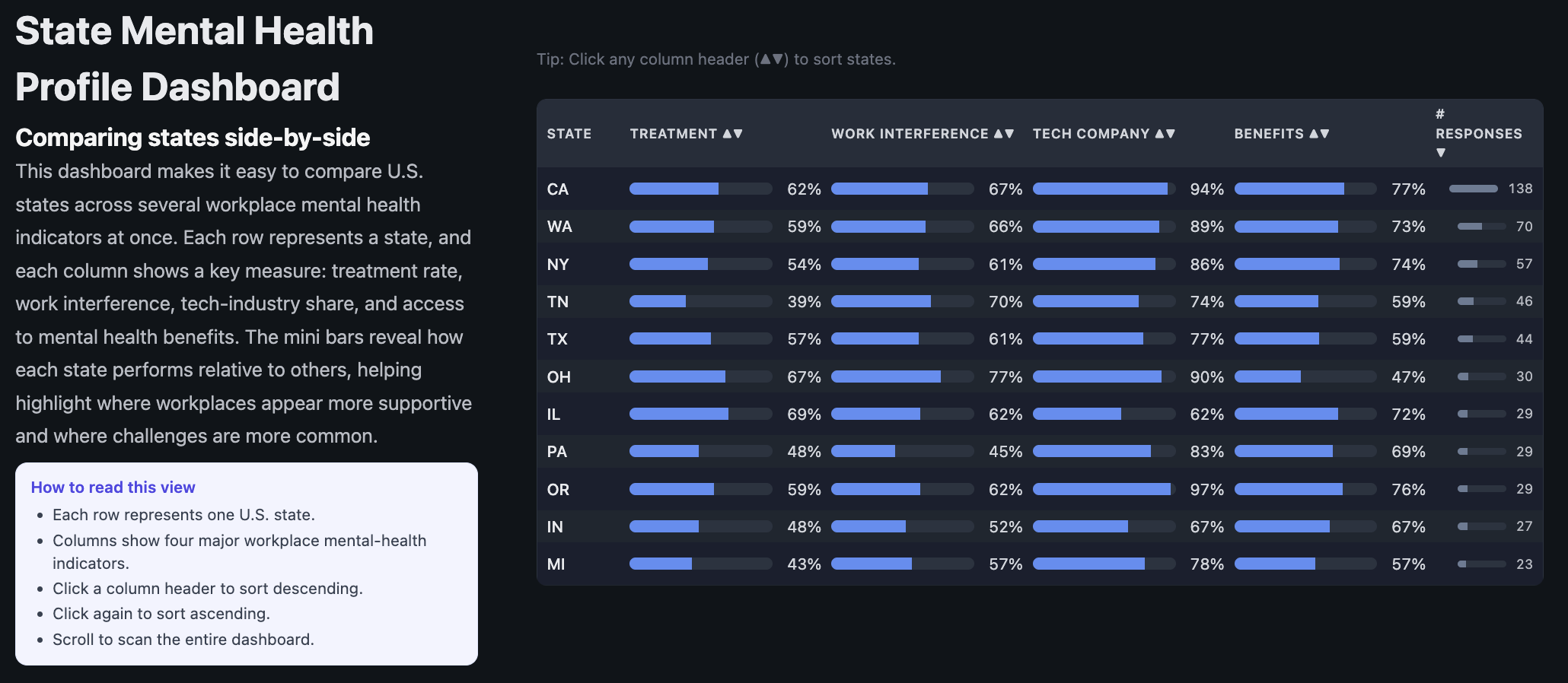
7.5 State Mental Health Dashboard (Sortable Table)
Figure 5. Sortable dashboard comparing states across key workplace mental health indicators.
This dashboard condenses several state-level OSMI indicators into a single table. For each state, we display:
Estimated treatment rate
Work interference rate
Tech company share among respondents
Benefits rate (access to mental health benefits)
Number of OSMI respondents
Users can click any column header to sort the table by that metric (ascending or descending). Small ▲/▼ arrows make the sort state visible. This view is meant to support “which states are highest/lowest?” tasks and makes it easy to spot standout states.
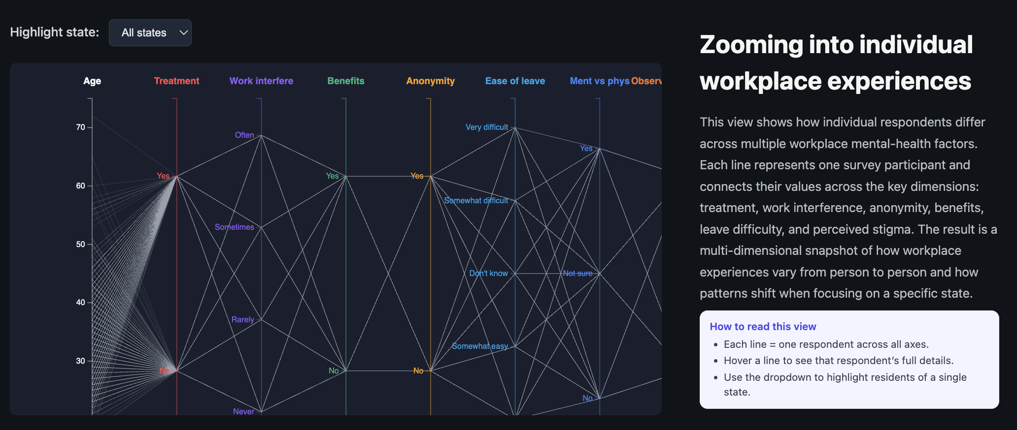
7.6 Parallel Coordinates: Individual Experiences
Figure 6. Parallel coordinates plot showing how individual respondents line up across multiple mental health and workplace dimensions.
The parallel coordinates plot is our way of showing that behind every state-level statistic are individual stories. Each line corresponds to one respondent. Axes include:
Age
Treatment status
Work interference
Benefits access
Anonymity protection
Ease of leave
Mental vs physical health parity
Observed consequences for others
A dropdown lets users highlight respondents from a particular state. Lines from that state are drawn in a stronger color, while others fade into the background. Hovering reveals tooltip details for individual lines. This view is more complex, so we include an “How to read this view” instruction panel directly below the heading.
8. Visualization Evaluation
Overall, we feel the six views complement each other and support a range of tasks from overview to detailed exploration. Here we summarize what works well and what could be improved.
8.1 What Worked Well
Choropleth + drill-down: This view is effective for quickly spotting high-depression regions and then zooming into specific states. The reset button and transitions make the interaction easy to learn.
Scatter plot: The combination of regional coloring, regression line, and quadrant layout helps users quickly understand the relationship between obesity and depression. The legend filtering feels natural.
State dashboard: Sorting by different columns makes it very easy to answer ranking questions, like “Which states have the highest treatment rate?” or “Where is work interference particularly high?”
Parallel coordinates: Once users read the instructions, this view does a good job of showing how messy and varied individual experiences are, which balances the simpler aggregate views.
8.2 Limitations and Trade-Offs
Cognitive load: The parallel coordinates view is powerful but can be visually overwhelming, especially before filtering. We mitigate this with fading and tooltips, but it still requires patience from the user.
Sample size: Some states have relatively few OSMI respondents. For those states, percentages can look “noisy.” We do not display confidence intervals, so this is something users need to keep in mind.
Aggregation choices: For the radar chart and state dashboard, we had to make decisions about how to aggregate multiple survey questions. Different choices might lead to slightly different interpretations.
Static linking between views: Our visualizations share data and concepts but are not tightly Linked (e.g., hovering over a state in the map does not automatically highlight it in the dashboard). Stronger brushing-and-linking would be a nice upgrade but was out of scope given time.
9. Milestones and Schedule
9.1 Milestone 1
In the first milestone, we focused on data access, cleaning, and getting basic versions of our core visualizations running.
Confirmed usage of the OSMI 2014 dataset and downloaded the full CDC PLACES 2024 depression and obesity data.
Standardized key fields (states, Yes/No encodings, work interference categories).
Implemented a basic U.S. choropleth with hover tooltips.
Prototyped a simple scatter plot and a basic state-level bar chart for work interference.
Drafted an initial project plan and clarified which visualizations were “must-have” and which were “nice-to-have.”
9.2 Milestone 2
By Milestone 2, we aimed to have all of our core visualizations implemented and wired up with cleaner interactions.
Interactive choropleth map: Completed state-level and county-level drill-down, reset behavior, and projections.
Work interference chart: Built the dropdown-based state selector and animated transitions.
Radar chart: Implemented the national support profile with tooltips and animation on load.
State dashboard: Finished the sortable table with clear indicators of sorting direction.
Parallel coordinates: Implemented multi-axis layout, state highlighting, fading, and tooltips.
UX refinements: Added consistent styling, “how to read this view” text, and cleaned up layout in index.html and css/style.css.
9.3 Final Week
Polished visual hierarchies (font sizes, spacing, and colors) across the website.
Debugged edge cases for states with small sample sizes or missing values.
Prepared presentation slides and rehearsed a narrative that ties the visualizations together.
Completed and revised this process book to document both technical and design decisions.
10. Reflection
Working on this project taught us as much about data limitations and design trade-offs as it did about the actual topic of mental health in tech.
On the technical side, we got comfortable juggling multiple datasets and feeding them into coordinated D3 visualizations. Handling GeoJSON/TopoJSON, projections, and drill-down interactions felt challenging at first, but seeing the county-level map animate into place was very satisfying.
On the design side, we repeatedly had to scale back complexity to keep things understandable. For example, we originally considered even more derived indicators and compound scores but realized that simpler, clearly labeled metrics did a better job of communicating the story. The parallel coordinates view was a good reminder that powerful visualizations need guardrails, such as instructions and filtering, to be usable.
Content-wise, it was sobering to see how many respondents reported that mental health “Sometimes” or “Often” interferes with their work, and how many felt unsure about their benefits or worried about consequences. At the same time, we saw that support is not uniformly bad everywhere—some states and workplaces clearly do better.
11. Future Work
If we had more time, there are several directions we would like to explore:
Stronger linking between views: When a user clicks a state on the map, we could automatically highlight that state in the scatter plot, filter the work interference chart, and scroll the dashboard.
Time dimension: Incorporate newer OSMI survey waves or more recent mental health data where possible to show trends over time.
Uncertainty and reliability: Visualize confidence intervals or sample sizes more explicitly, especially for states with few respondents.
Interaction design: Add search and bookmarking (e.g., let users “pin” a state or a respondent profile they want to compare across views).
Qualitative context: Pair the quantitative charts with quotes or summarized themes from open-ended OSMI responses (if available and appropriate).
12. References
Open Sourcing Mental Illness (OSMI). “Mental Health in Tech Survey, 2014.” https://osmihelp.org/
Centers for Disease Control and Prevention (CDC). “PLACES: Local Data for Better Health, 2024 Release.” https://www.cdc.gov/places/
U.S. Census and related geospatial shapefiles/TopoJSON resources for states and counties.