We are graduating soon and the issue of where to live is an important question. It will be one of the first really long-term and potentially permanent choices we will have and will significantly affect the next stages of our lives so it would be incredibly useful to leverage data and visualizations to inform our decision.
We were inspired by Niche a website that has a similar service of comparing colleges and Neighborhoods. Our project is more visual and map-based.
We were also inspired to use a map by the Chicago bikes leaflet studio.
The data for this project is collected from the 2022 American Community Survey from the US Census and the 2019 Uniformed Crime Report from the FBI. The data was broken down by Metro Statistical Area (MSA), which measure metropolitan areas across the US. The data was used to create indices to compare cities/MSAs. Below is a list and decsription of the data and index it informed.
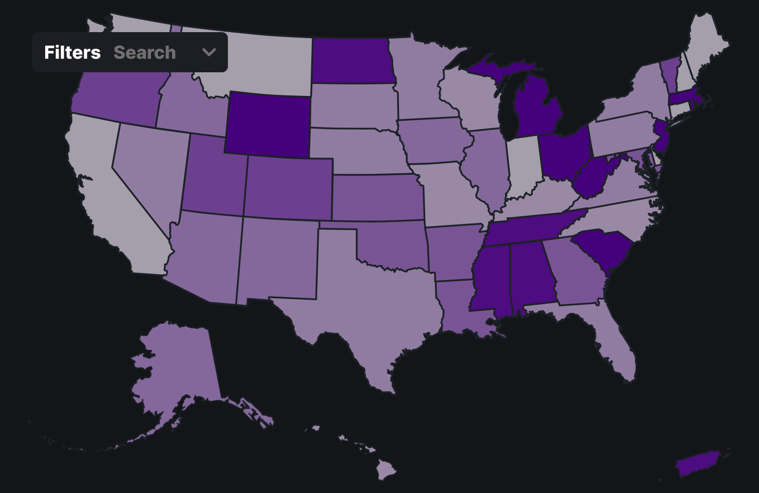
Initially we started by deciding what factors were important to us to visualize and explore. We decided that income, cost of living and crimes were most important. We then explored the Census data for more sources we could include to help improve the search. There we decided to add ages and education and worklife. Also by exploring the census data we found the Metropolitan Statistical Area convention that we used to group the different geographic areas. This was convient as it was fairly granular and standard across a series of sources. We also considered non-census data from the department of agriculture (such as about farmers markets) and from private sources (about housing costs). However, often that data was not broken by MSA or had a lot of missing data or the Census had a good substitute. In our Exploratory stage we considered having state-based maps, as you can see below; however, we found this to not be germane or as informative as a user would likely want. Therefore, we ended up with a just MSA map.
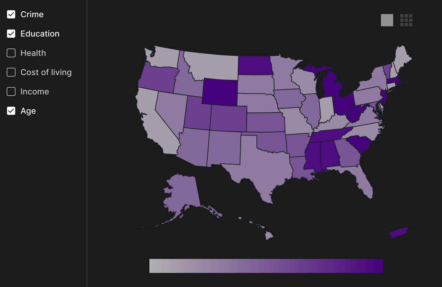
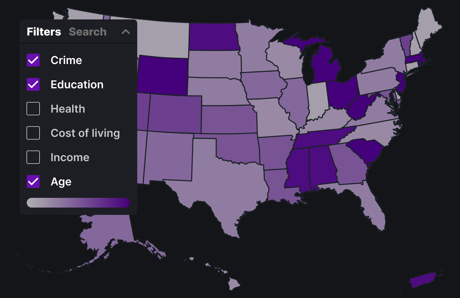
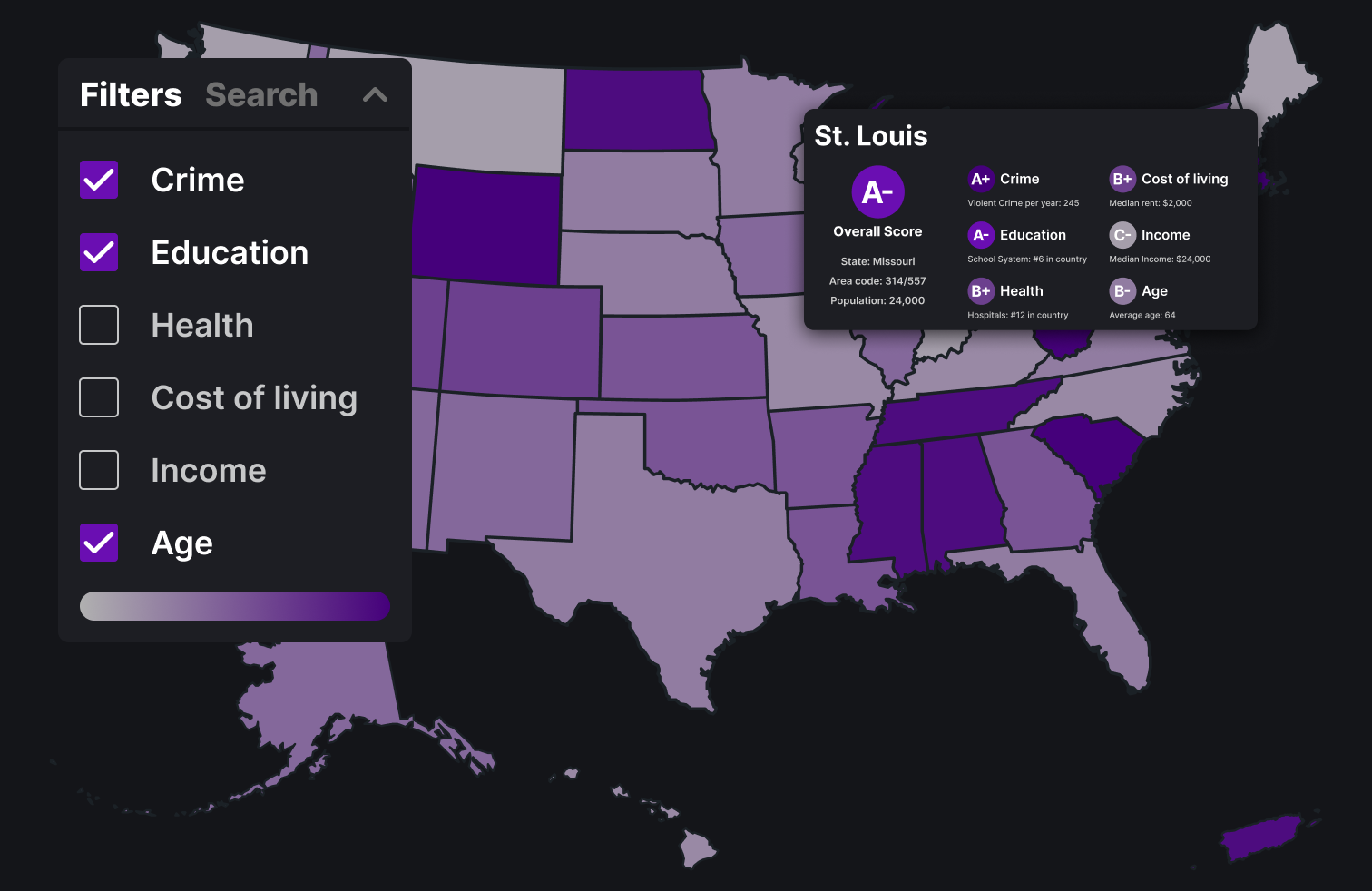
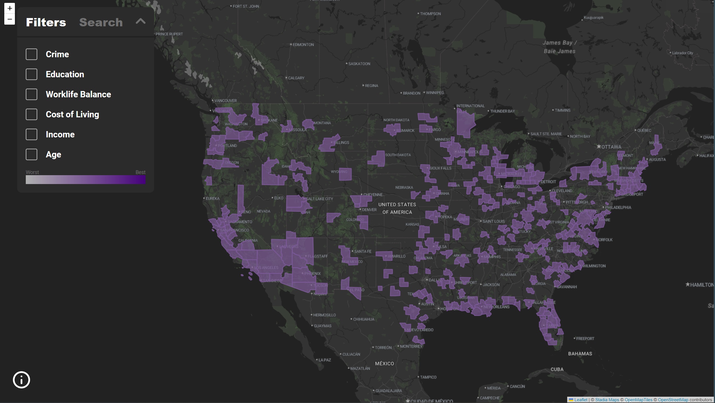
This design has a very simple layout with checkboxes along the top of the map view for the different categories and a side bar for search
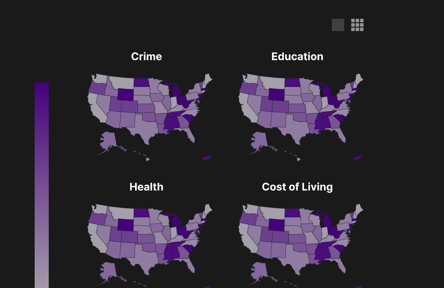
This version features the option to switch between a grid view and combined view of the maps so you can compare the maps across categories
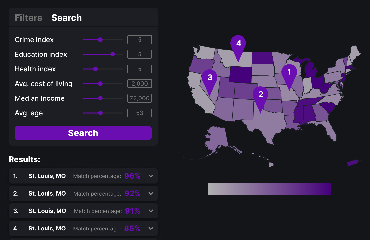
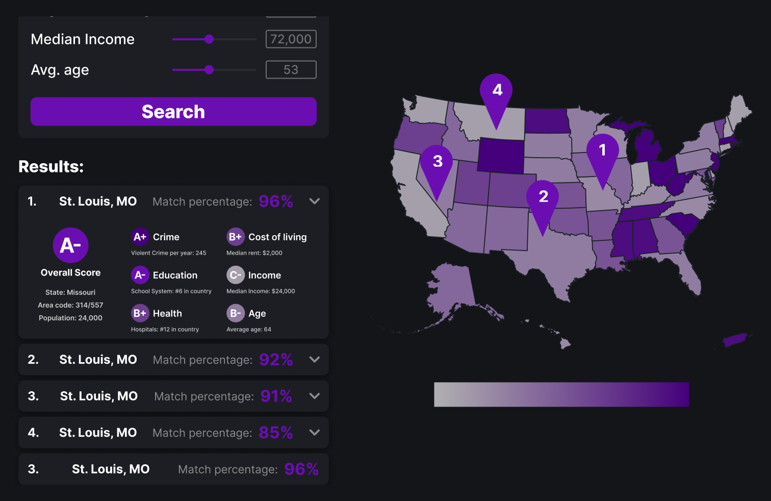
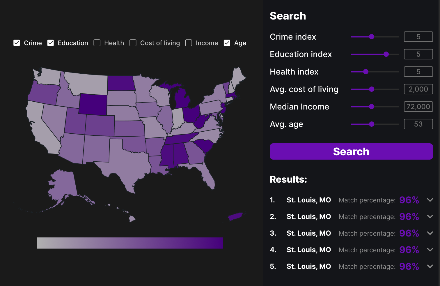
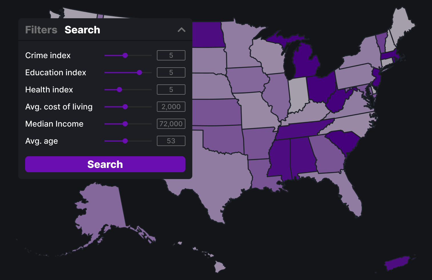
This version feature a side bar on the left that can be used for both search and filtering depending on which mode is selected. Filters are easily checked on or off and users can use sliders to control their search and see results listed below.
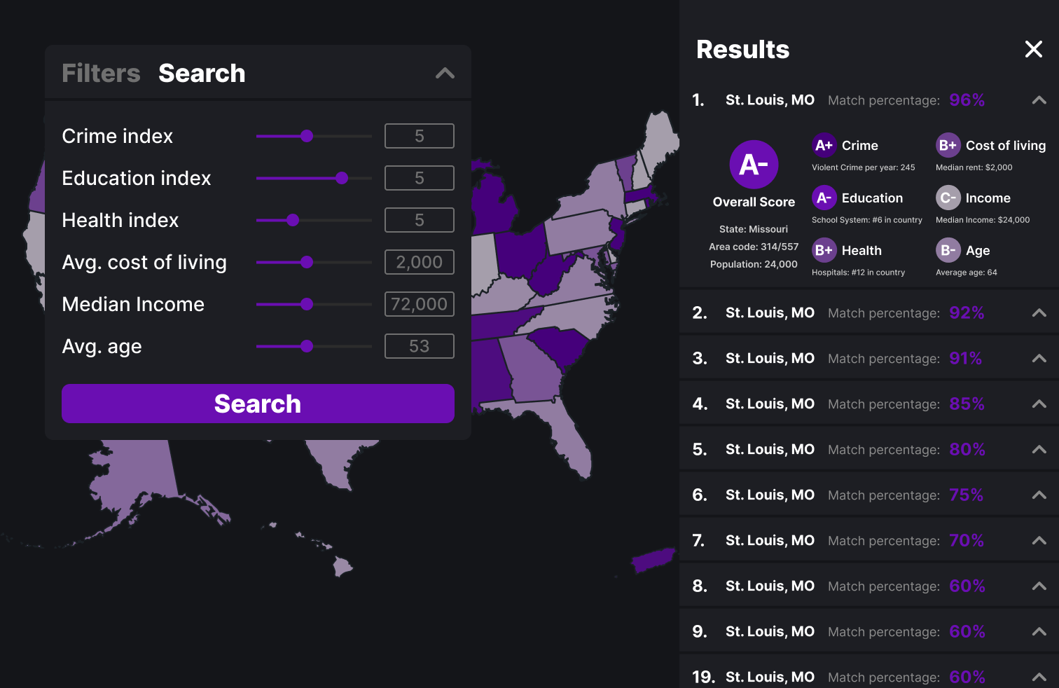
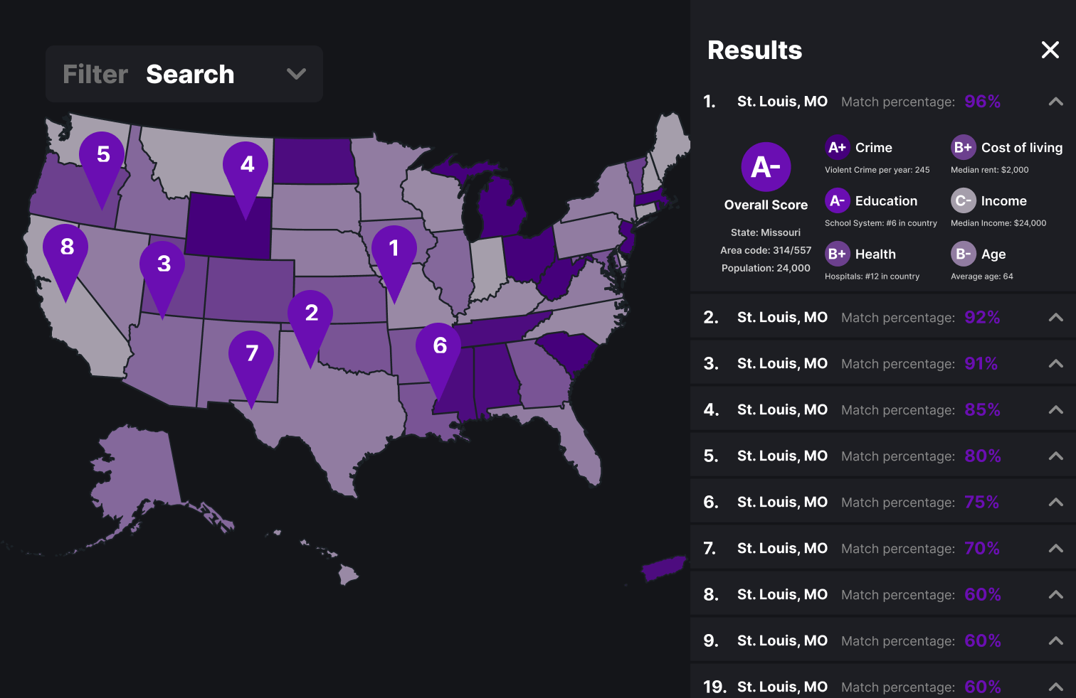
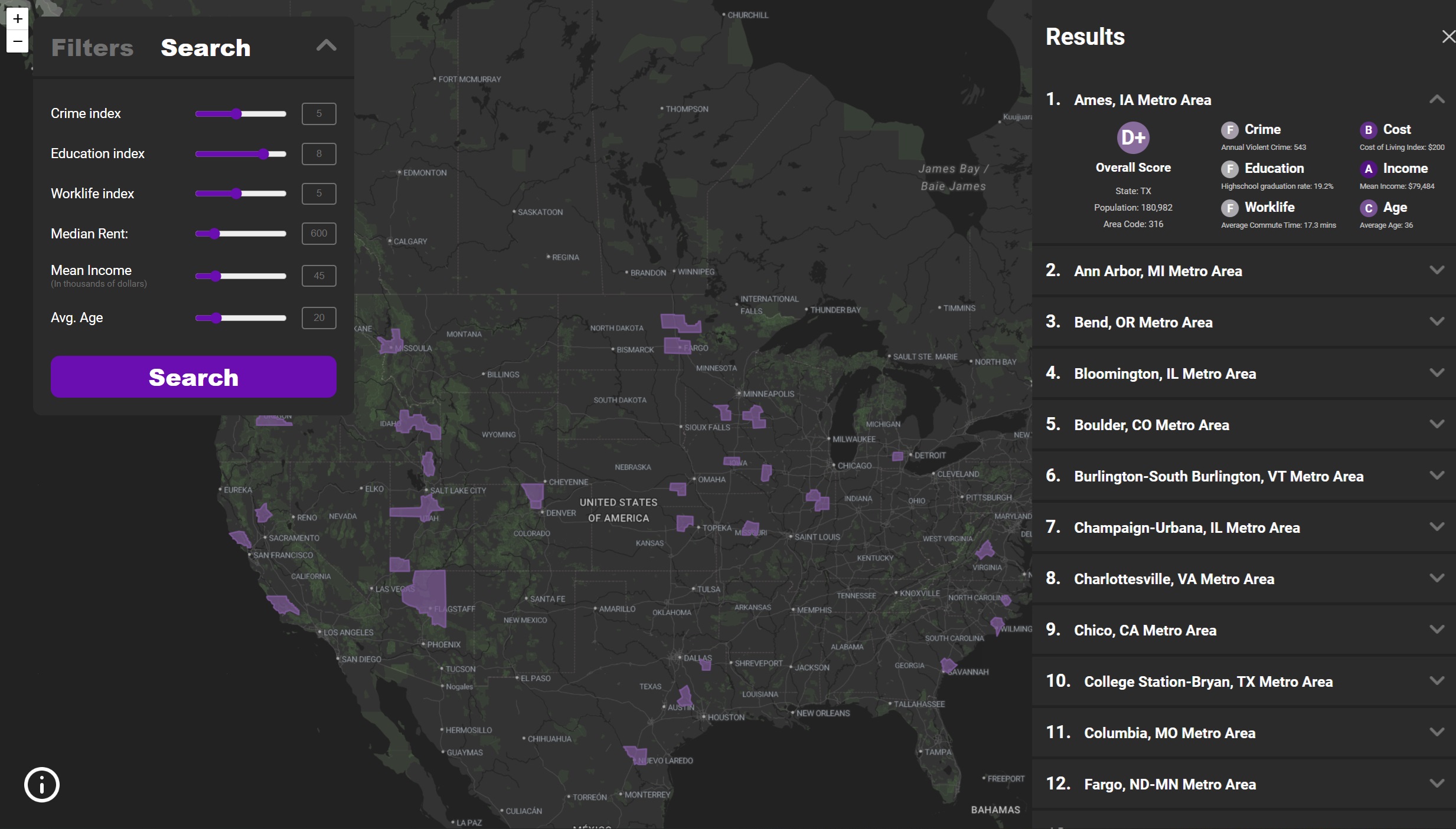
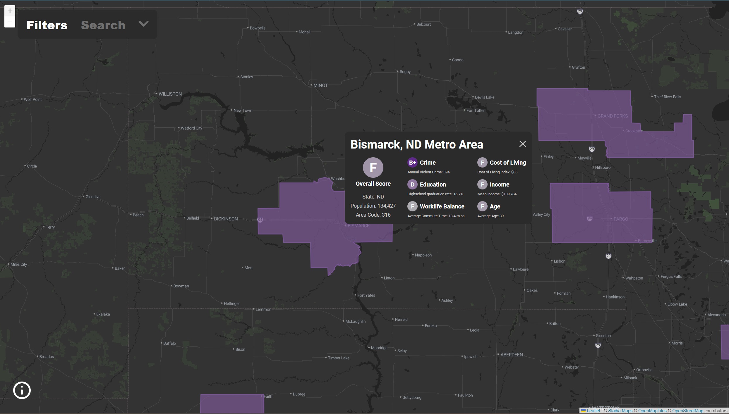
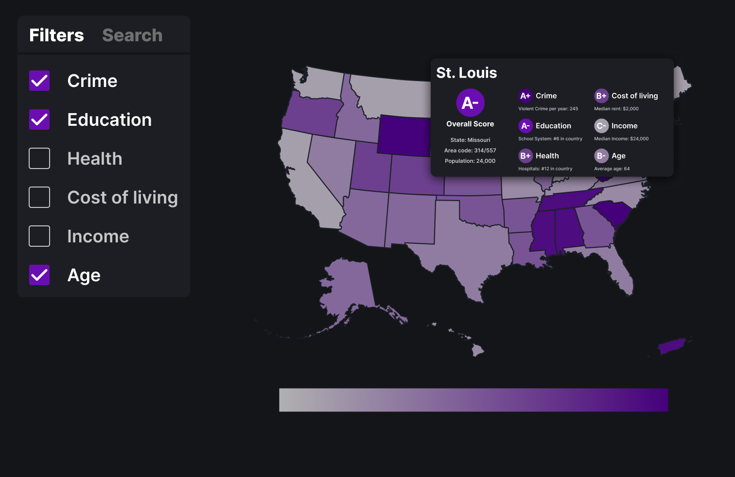
Above is the final design with all the MSAs. The three main visualizations are with the filters, the search function and the report card.
Once we had gotten the tabluar data about Rent, Income, Crimes etc. from the Census and FBI we processed it with Python to create Dataframes with properties and MSA. Then we took a Shapefile of all the MSAs and converted it to a geojson (Shapefiles are typically used in mapping software in Geographic Information Systems, to convert to geojson we used ArcGIS). Then we merged the dataframes with the geojson in a geopandas geodataframe. As well we separated some auxiliary data that is displayed on the report card but not used for the filters. The remaining data in the geopandas dataframe was exported to geojson; below is a further explanation of the underlying geojson and json.
In order to speed up load times we have two underlying sources of data:
Below is a rough sketch of the GeoJSON:
        {
            "type": "FeatureCollection",
            "crs": {
              "type": "name",
              "properties": { "name": "urn:ogc:def:crs:EPSG::4269" }
            },
            "features": [
              {
                "type": "Feature",
                "properties": {
                    "Key": "Abilene, TX Metro Area",
                    "Mean Income Rank": 142.0,
                    "AgeRank": 169.0,
                    "Education Rank": 168.0,
                    "Overall CoL Rank": 159.0,
                    "Worklife Rank": 29.0,
                    "Crime Rank": 89.0 }
                },
                "geometry": {"yada yada ..."
              },
              ... // next MSA
            ]
          }
Then a second json is the auxiliary data json. This data contains other data about the MSA that is not the
ranks but is on the report card.
Below is an example of the data:
        {
            "Key": "Walla Walla, WA Metro Area",
            "State": "WA",
            "Total Pop": 61890.0,
            "MeanIncome": "86,907",
            "High school graduate (includes equivalency)": 0.1440458879,
            "Renter Cost Of Living Rank": 116.5,
            "Owner Cost Of Living Rank": 122.0,
            "Mean travel time to work (minutes)": 17.9,
            "Violent crime": 145.0,
            "Area Codes": 316
          }
The map implementation is done with d3, leaflet and jquery. Most of the map data visualization and handling is done with the WorldMap object (see object definition in map.js). Data is loaded in main with the loadData function and then passed to a function that instantiates the WorldMap object. The search function is also in main, it works by taking the user input and filters the MSAs out that do not meet the criteria and then updates the WorldMap object. card.js handles the report card. sidebar.js and modal.js handle the javascript for the filters and search areas (though the function of filtering is in main.js)
We learned a lot about the differences in metro areas around the country. It was really interesting to see the wide variety of differences in cities and what met expectations and what did not. For example the oldest cities are in Arizona and florida (to states known for people retiring there). As well some of the highest income MSAs were in Conneticut, California and DC. But overall it was interesting to just explore the map and see different cities and regions of the US and how myriad their factors were. Our visualization is fairly successful, it was nice to share it with some people we know and after our presentation one person said they were going to use it. The biggest improvements would be maybe more search funcationality and more data/more granular data. The MSA areas while fairly small relative to other stats are still pretty big areas. Though in the end we definitely answered our questions well with the visualization.