Earth is among the billions of planets in this massive universe, where we are living and are not alone. There also exist uncountable numbers of dynamic “travelers” in the vast universe - the meteorites. Whether it's a fortune or not, our home, earth, will meet thousands of them a day, but only few of them will successfully land on the ground. Records will be taken each time a new “visitor” lands here, and the analysis of those “visitors” potentially reveals what fortune contained or how much damage it results when landing, or even a greater mystery waiting for us.
We are enchanted by those outlanders, and fascinated by the great fortune encompassed within. So that we plan to count meteorites that came in the 20 and 21 century, and visualize those meteorites by forming material category, mass category and landing position. It's really interesting that we can get our hands on such a rich and vivid domain, and with our best effort to present the insights behind the data to tell a bigger story about the universe.
- Users can choose to show the data of a certain year.
- A rotatable globe that shows all the meteorites as points.
- Users can see the mass type distribution of meteorites.
- Users can see the material type distribution of meteorites.
We are inspired by studio 7 in which we learn to implement orthographic projection. We believe that a rotatable Earth is more than appropriate for the visualization of meteorites.
We tried to find ways to make meteorites information over a period of time appear to the user. For example, How many meteorites are fallen in Asia/Africa/America in 1975? What are the types of meteorites that have fallen in 1999?
Throughout the project, we have more questions. What kind of chart should we choose to fit in the data? How can we manipulate the data so that it can fit the chart?
There are some new questions come up during the analysis. What kind of interactivity should we set up for the user? How to link between charts? How do we design the UI?
As we mentioned before, the dataset we are using is from The Meteoritical Society, and it contains information on all of the known meteorite landings. In order to be able to draw our charts more smoothly, we performed data-preprocessing on the dataset.
To be more specific, the original dataset is divided into three separate datasets, the first one contains all of the original information plus the Area each meteorite belongs (The Seven Continents), the second dataset contains information about number of meteorites that landed per year on each continent from 1900 to 2013, while the last dataset contains the information about each meteorite's name, weight, area, and the weight range in which the meteorite is located.
After exploring the dataset, we found a fun fact which is that the number of meteorites that landed on earch in recent years is much more than those in the 20th centery, at first what we thought was that in recent decades the environment around the Earth has become worse than before, and more meteorites have fallen to the Earth. But then on of our teammates said the environment around may not changed a lot, it's the technologies of ours improved very quickly that we are now able to detect more meteorites than ever before, hence the reason for the increasing number of meteorite discoveries each year may be due to the fact that many fallen meteorites have gone undetected before.
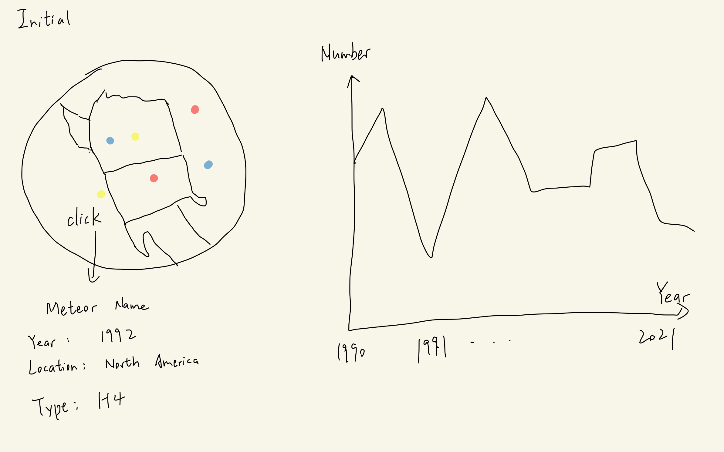
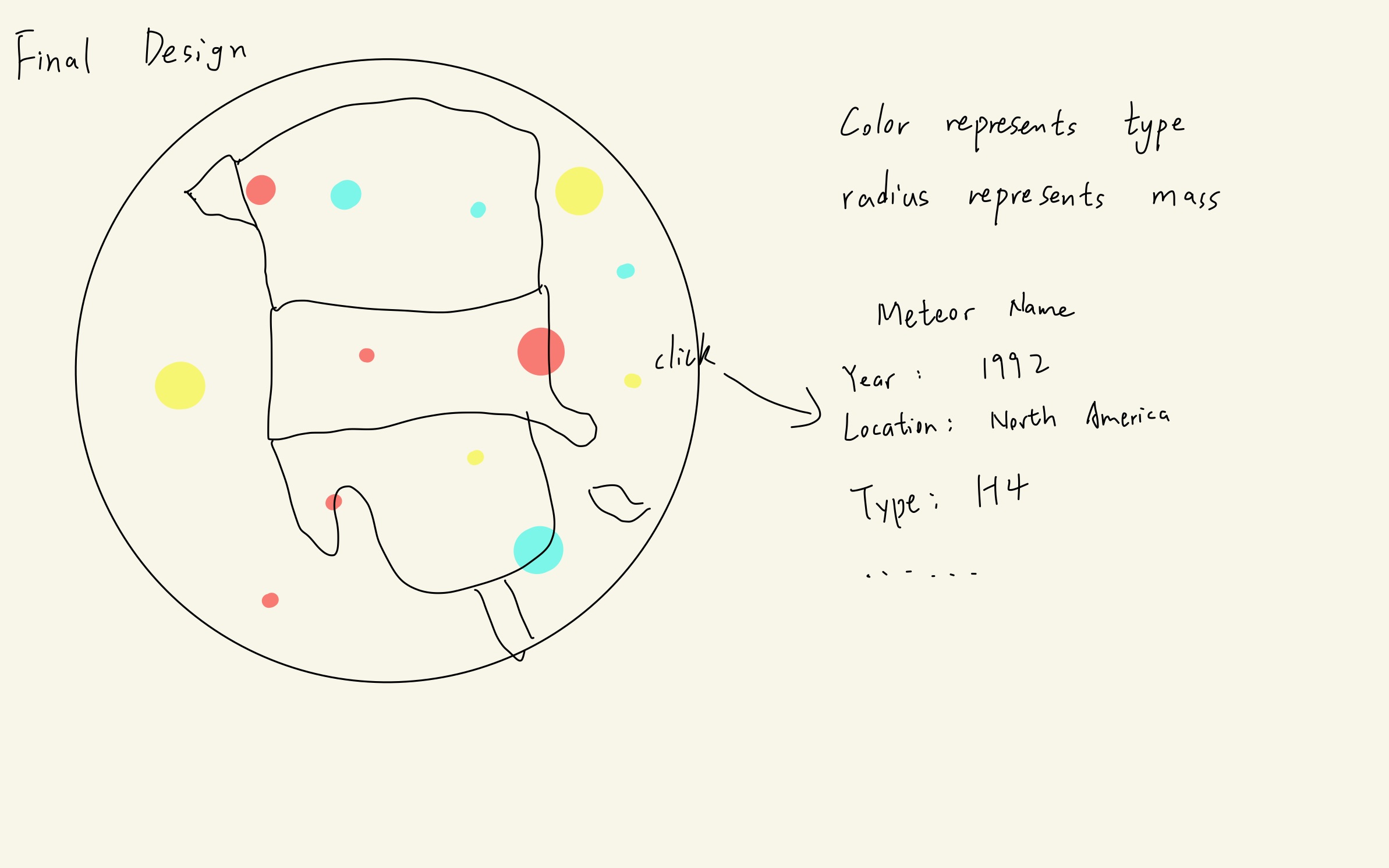
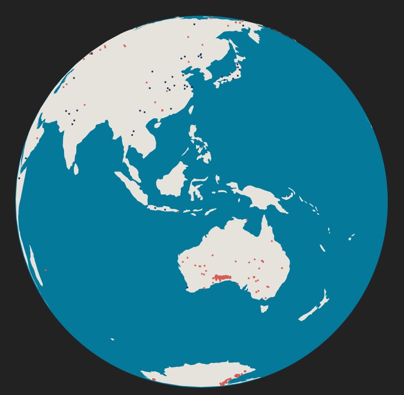
First of all, we want to show all the meteorites on the world map. There should be an orthographic projection earth and it should be at least interactable, like supports the rotation, that would be better if it could be zoomed. The meteorites should be drawed on the earth.
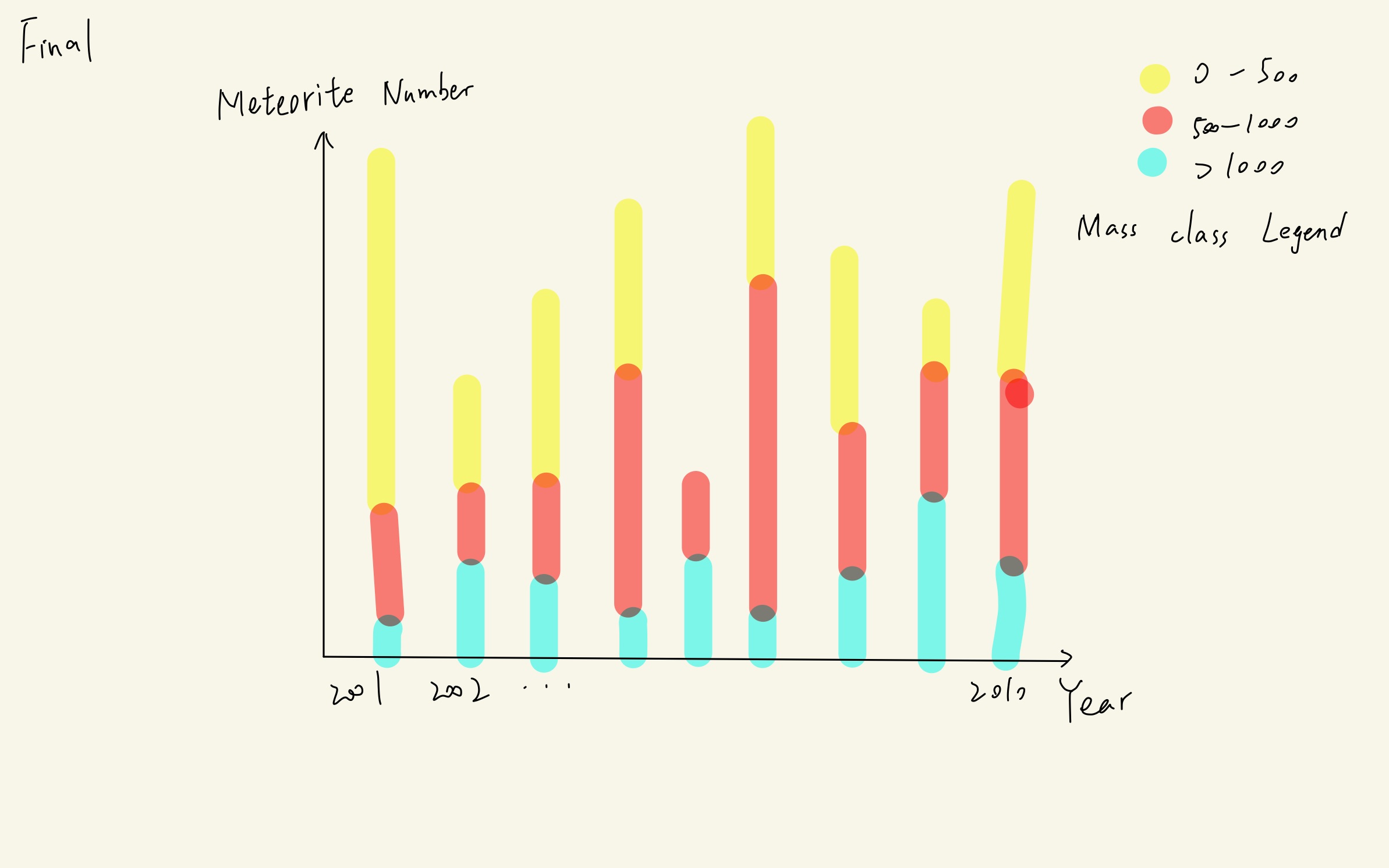
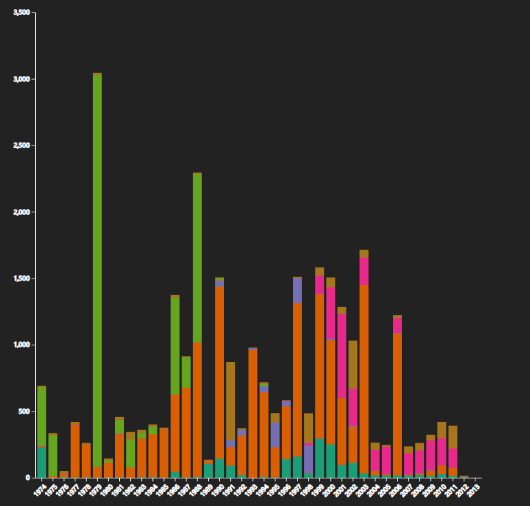
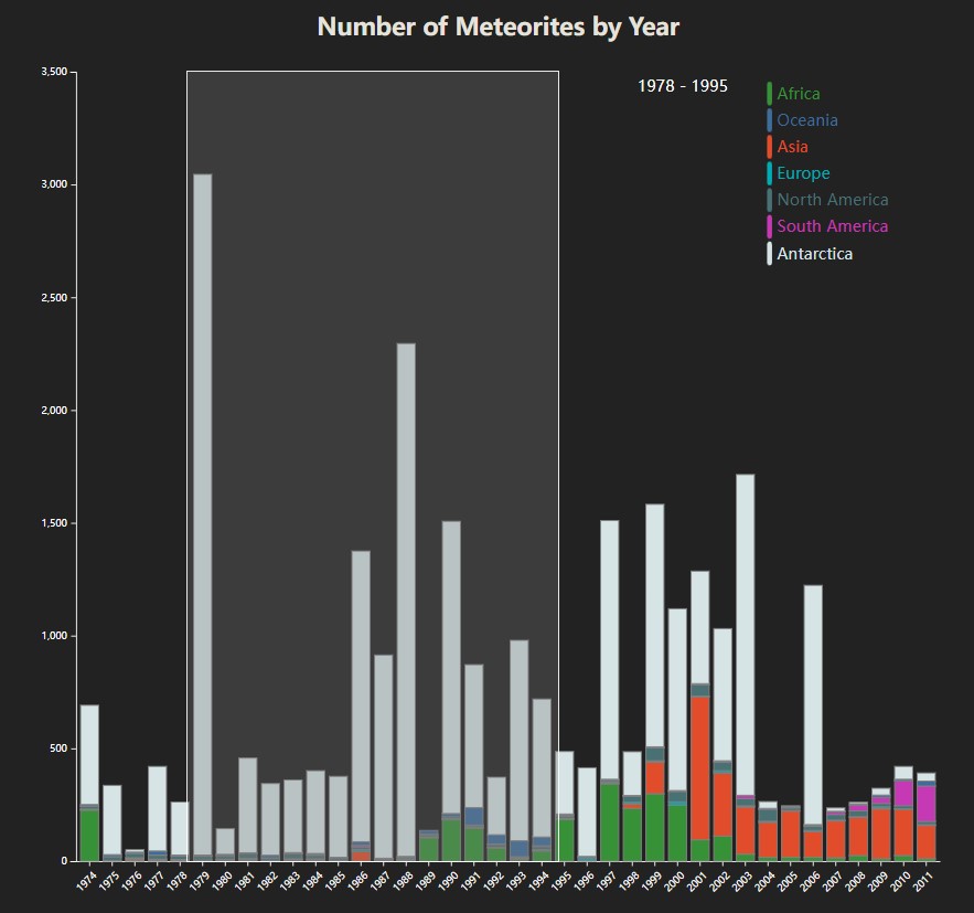
Secondly, there should be a chart showing the number of meteorites by year to provide context. We first consider line chart. However, the distribution of fall locations cannot be seen in the line chart. Therefore, We use stacked bar chart. If the reader click a bar, data of that year will be shown and all other charts will update their visualization. We choose a bar chart because it's very suitable for showing a general overview by time. We enable a brush on this chart to let users select the year range. The data of world chart and the sunburst chart will change according to the year range.
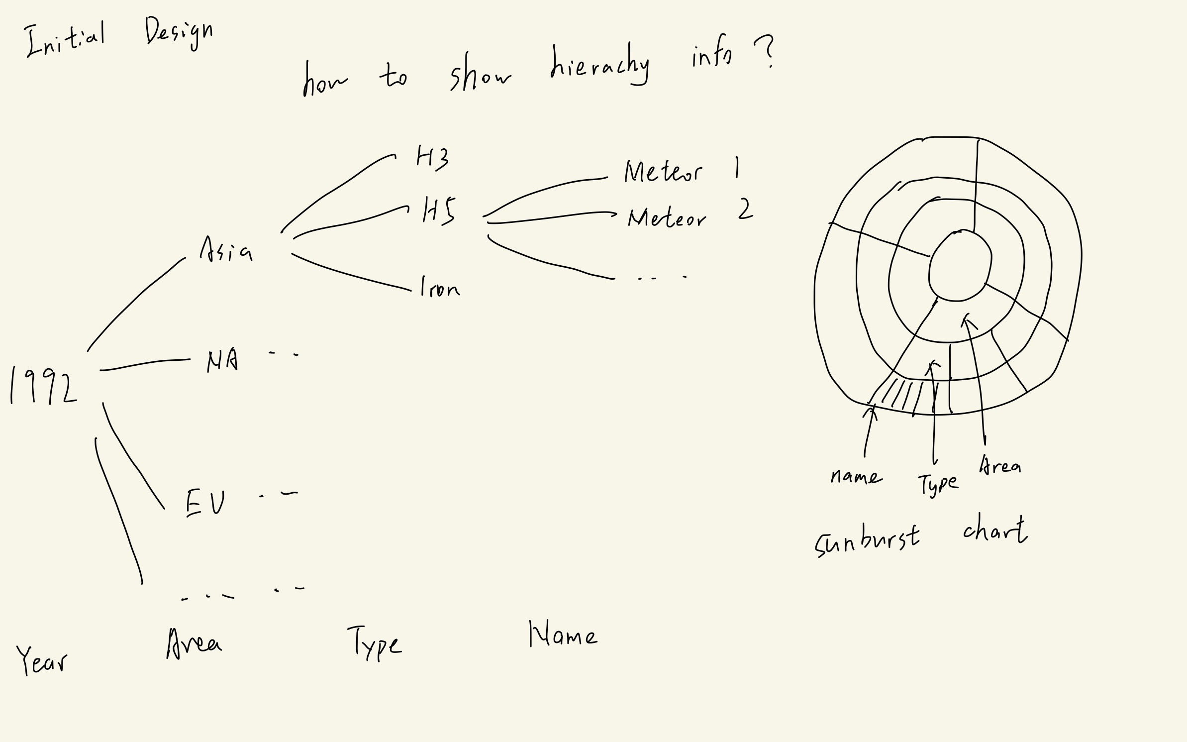
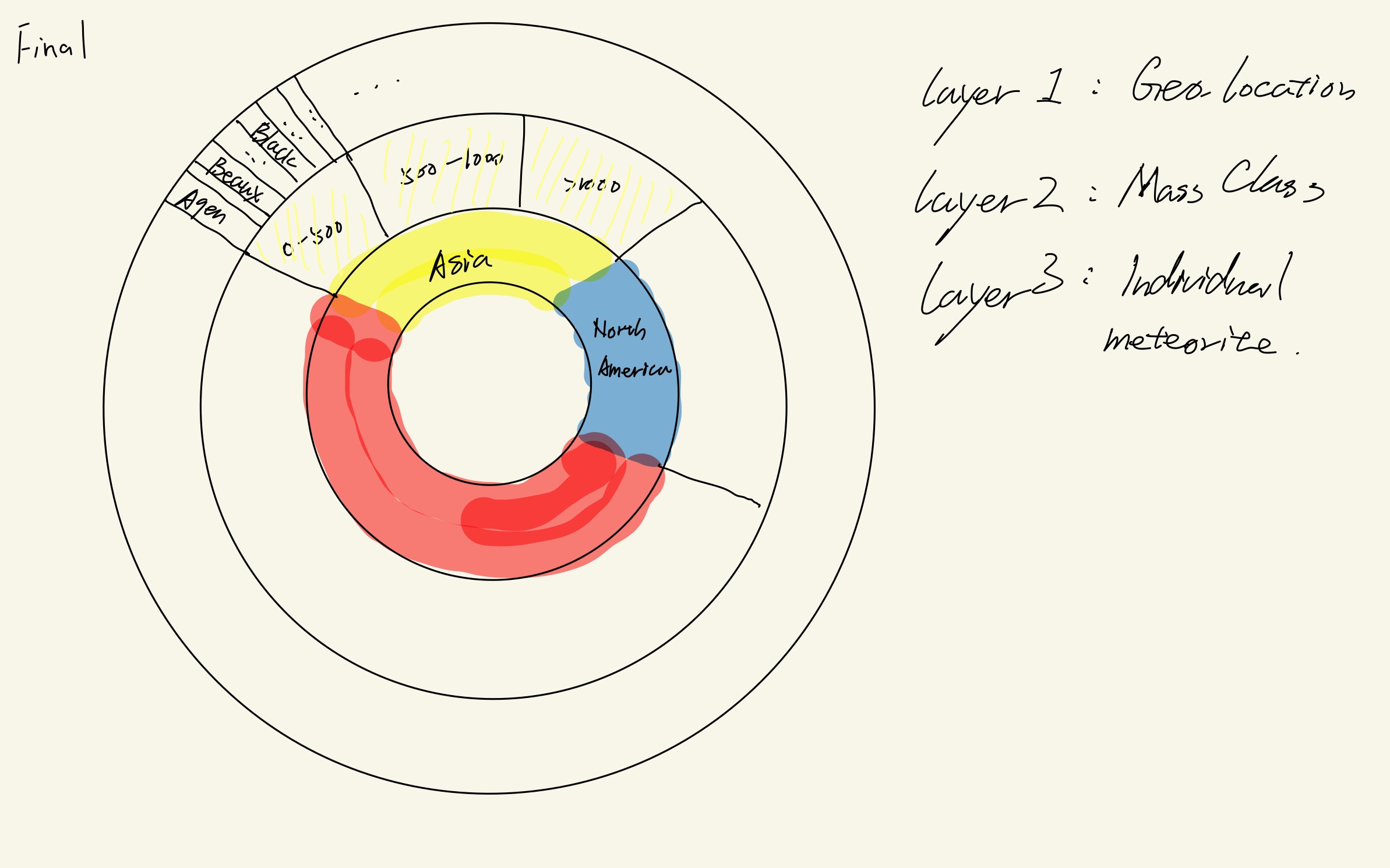
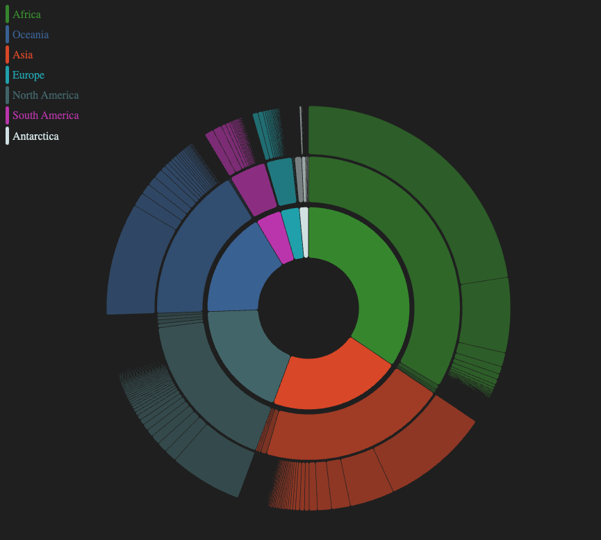
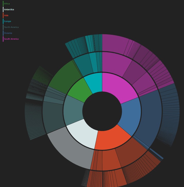
Thirdly, we use a sunburst chart. In this chart we will first divide all the meteorites by indistinguished continents, then different mass class to subordinate single meteorites. A sunburst visualization is eligible for such hierarchical data.
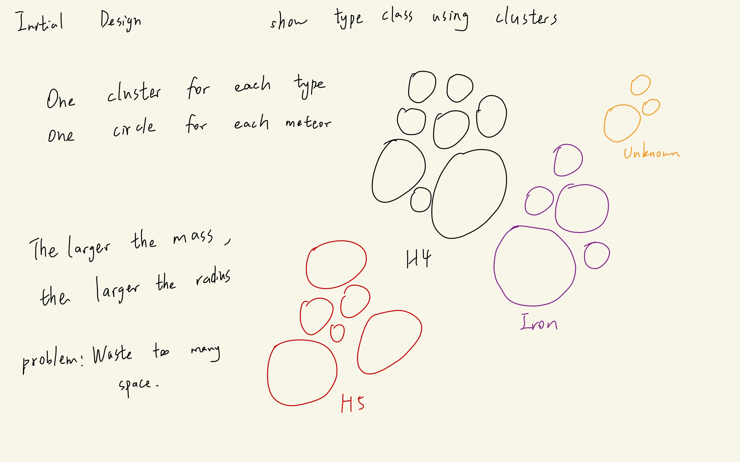
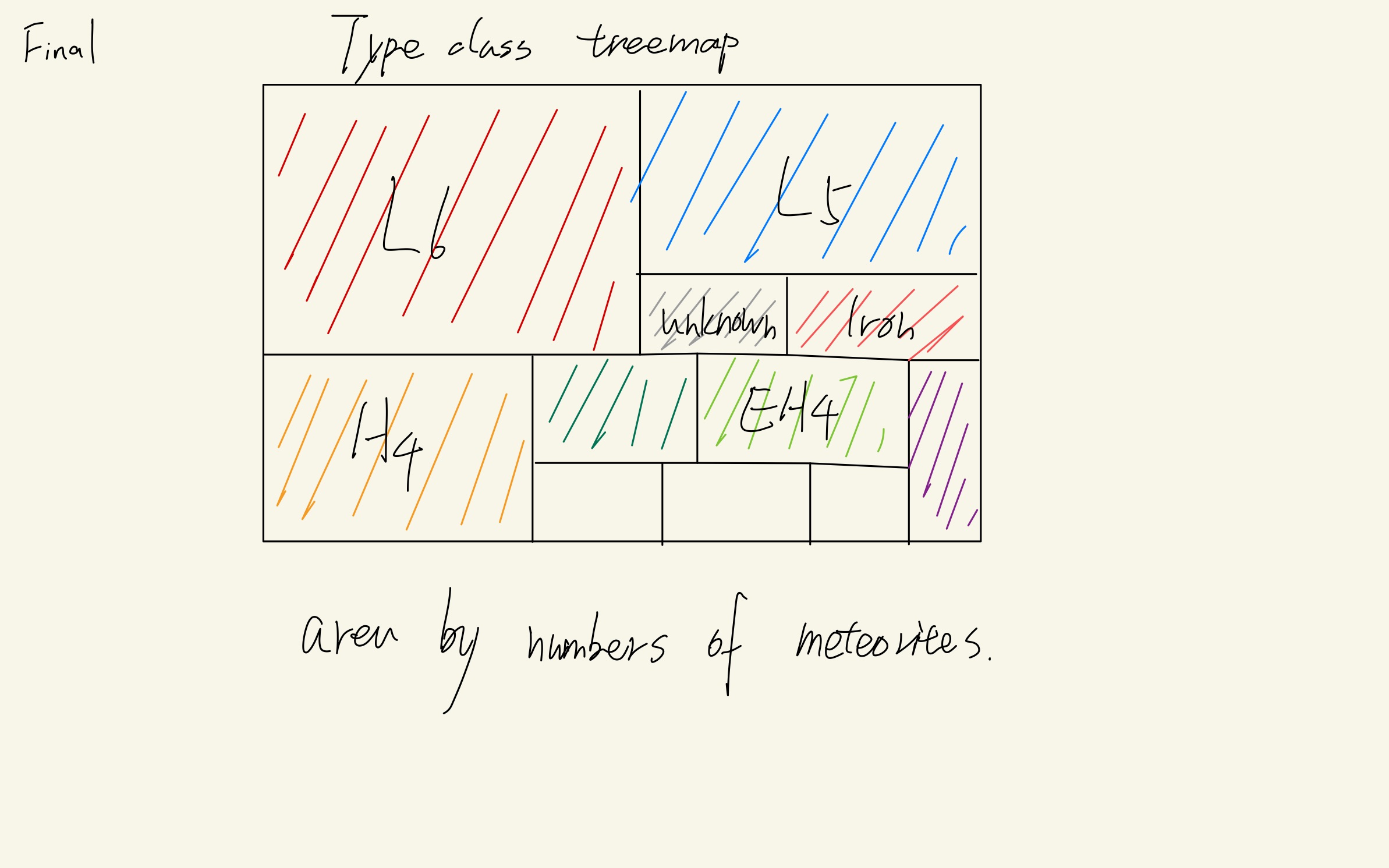
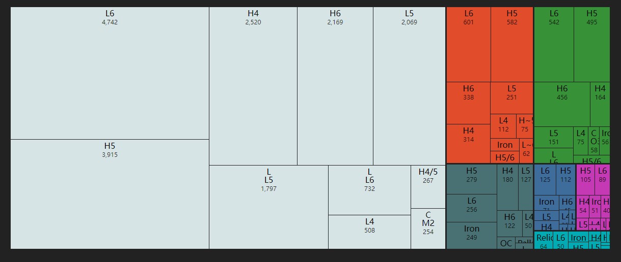
Finally, we want to show the 'material type' of meteorites by area. We first consider circle-packing diagram (one circle for one meteor). However, this kind of visualization wastes too much space. Moreover, when there are a lot of meteorites, it is hard for readers to recognize them. We also find that we don't need to show all the meteors in the chart, we only need to give the readers the distribution of meteor types. Finally, we decide to use treemap which is better for showing proportion.
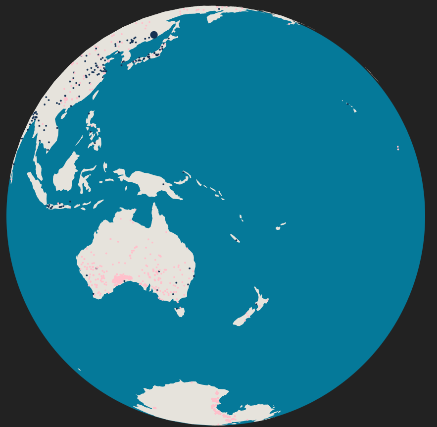
We have finished the rotatable and zoomable globe. Now we can show all the meteorites geographically on the globe. User can rotate and zoom the globe. The data on this chart will change according the brush on the stacked bar chart.
We have also implemented the stacked bar chart. User can see the location distribution of meteorites by year from this chart. We have also implemented a brush for selecting year range.
Additionally, we successfully draw the sunburst which describe the relationship between landing area and mass distribution of meteorites. User can inspect the landing area from color and corresponding area of the donut to get an instinct feeling towards mass distribution. User could get a hint on what the arc means by viewing the tooltip once they hovering the mouse over. Besides, we provide auxiliary bar charts for specify the amount relationship between different Mass Class in two dimentions -- total mass and count.
Finally, there is a treemap showing the material type distribution of meteorites of all the time. When the mouse hovers over an area, information of this part will be shown.
In this visualization, we successfully processed the raw data and extract the information we want. Users can easily know a lot from our charts. Not only can they know the distribution of the number of meteorites, but they can also see directly where the meteorites are located on Earth. I believe our visualizations can be of great benefit to astronomical scientists and enthusiasts.
Our website works generally well, but can be further improved in many areas. One obvious disadvantage is that due to the large number of meteorites, the page will lag when the year span in the election is large. If we can make the page work smoothly even when a large number of years are selected, users will have a better experience.