Process Book
Basic Info
Title: Flight Delay Visualization
Jay Won, jaywon@wustl.edu, 486025
Phillip Kim, k.phillip@wustl.edu, 490801
Video Demo
View the Link Here, or at: https://youtu.be/oawPuQl5iys
Overview and Motivation
Travelling is costly, both in time and money. It's even worse when yout trip plans are delayed or even worse, cancelled. We want our visualization to give insight onto flight data and help travelers learn more about which airlines to take so that they can be a more informed traveller, and maybe even experience less cancellations and delays when they travel. Letting the user look at data from different airports can help travellers look at personalized data from their region.
Related Work
We took a lot of inspiration from Assignment 2, specifically being able to select a specific year and updating the visualizations accordingly. For our visualization, we have something similar, where the user can select a specfic month from the year 2021 to look at flight data from. This idea was extended to the greater goal of personalization. This was really important because we wanted the user to be able to look at data that was relevant to them. This was why we wanted to user to have input to the data that they view, such as in the map (being able to look at the airport that the user uses, or the month that they travel from). We also referred to past studios to create our visualizations. The studio on working with GeoJSON helped in creating our map visualization that allows the user to click on a certain airport.
Questions
With the data we are using, we wanted to answer the following question: Which airlines have the most delays or cancellations across their flights? We want our visualization to help travelers compare different airlines so that they can find a flight with the least amount of delay.
Later, we also found ourselves answering the question of: "What statistic measurements give the most insights into the data?" We had to answer this because we realized that the data could be read in many different ways, depending if we used an average, max, minimum, median, etc. to display the data. This consideration had a profound effect on how we ultimately wrangled the data.
Data
We will be using a dataset called Flight Status Prediction we found on Kaggle. There are several data files across several years that show data on flight status. The link to the data is:
DatasetInitially, we planned to use all of the data across the years available, from 2018 to 2022, but after loading in the data, we realized the dataset was enormous. Because loading in the data for a single year takes quite a long time, we decided to use data solely from the year 2021. The dataset we used also provided smaller datasets split by month, which we used to speed up the data loading process when running our visualization. We used Git Large File Storage (https://git-lfs.github.com/) to store the data in GitHub.
The raw flight data has the corresponding airlines for each entry as a code, and so we had to process the data to convert this code to the actual airline name. The data has an Airlines.csv file that contains the code and the corresponding name, which we used to help convert this data.
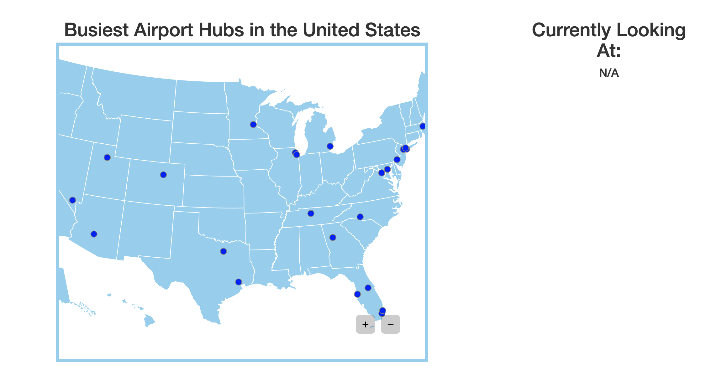
Because we want users to select a specific airport to look at the flight data, we found a list of the top 28 largest airport hubs in the US (https://en.wikipedia.org/wiki/List_of_the_busiest_airports_in_the_United_States) and created an airports.json file so that users can select an airport.
Exploratory Data Analysis
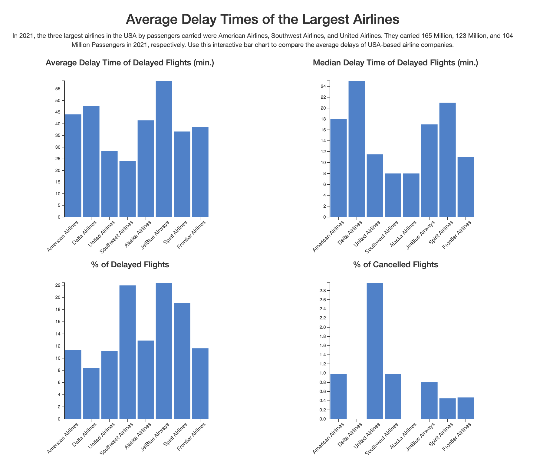
To allow users to look at a specific airport for flight delay data, we chose to include a map visualization, where users can click on a circle to select a specific airport. Since we also want to compare different airlines and their flight delay statistics, we decided bar charts would be the best way to visualize this, specifically looking at the mean data over all flights. However, we soon realized that while a lot of flights get delayed, there were lots of flights that did not get delayed, which outweighed the delay times, therefore skewing the averages towards zero. After seeing this, we made the change to only look at the average delays for the flights that actually did get delayed. This gave a much clearer insight into the average delay times of flights.
Design Evolution
We mostly considered using maps and bar charts to visualize our data, which didn't deviate from our initial proposal. However, we made a lot of more subtle changes that improved the clarity of the design. For the map visualization, we included points of the biggest airport hubs in the US for the user to click on. Since a user may not know the names of all of these airport hubs, we decided that adding a hover box that displayed the name of a given airport was helpful to add. Here is what our final design proposal looked like:
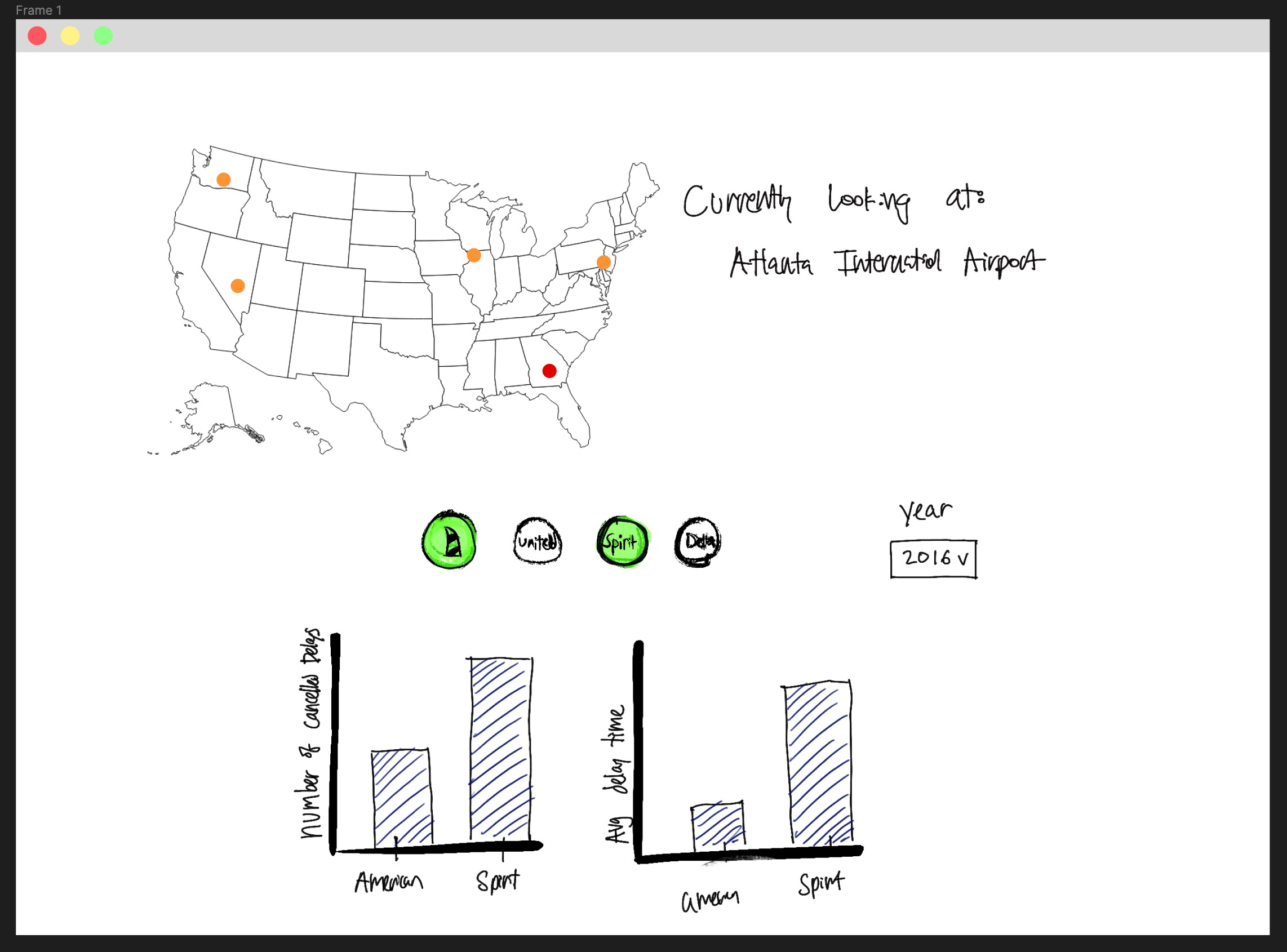
We made some changes in our bar charts as we progressed in our project. Initially, we were planning on having two bar charts side by side, one showing the
average delay of flights based on airline and another showing the % of cancelled flights based on airlines. We planned to have two dropdown menues where users
could select two airlines to compare. Once the user updated these two menues, the bar charts would show the data for the two airlines they selected. We later improved
this dropdown menu design for ease of use of the user.
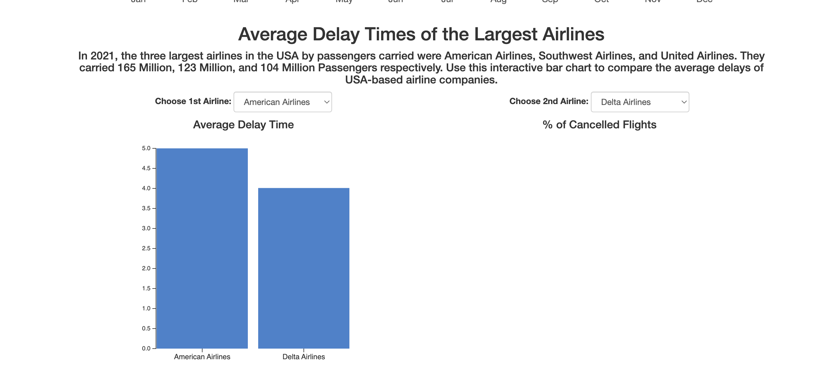
After getting user feedback, we made some changes to our bar charts. Taking into account what is important to a given traveller, we chose to narrow down the number of airlines to 8 because these are the airlines that are flown the most. Initially, we thought that the dropdown menus would be an easy way to allow the user to choose the airlines they want to compare, but since we only have 8, it makes the most sense to display them all at once. We discovered that having these dropdown menues just create an unnecessary extra step for the user. In addition, we decided to add bar charts that give more insight from our data, such as the median delay of flights and % of delayed flights. Here is an example of an improved bar chart:

Finally, we ended up with our final bar chart design by adding colors to the bar charts. To increase readability and associate each bar to it's respective airlines, we used the exact hex value of each airline's primary color, so that the user could make that instant association with the airline without having to look too closely at the airlines' label on the x-coordinate of the bar chart.
User testing and Design Iterations
Through engaging in routine user testing, we came away with some valuable insights with our design. One of the most significant improvements to the data was that it could be useful to make the data for all of the airlines visible at once, especially since we wanted to only look at a certain amount of airlines (such as the top 8 busiest airlines). 8 airlines can comfortably be shown on one graph, and it would enable to user to be able to compare multiple airlines at once, as well as see the 'bigger picture' in the sense of seeing more general trends among the airlines as a whole.
We also got feedback for our intial bar chart designs. We intitially only showed data for the average delay of flights and % of cancelled flights, but we realized that the average delay of flights for example could be limited. The average doesn't show how many flights have been delayed, or if certain flights skew the data heavily, and so we chose to also include bar charts for the median delay time and % of delayed flights.
Finally, we got feedback on the overall appearance of our visualization. We initially had the map above the bar charts, but we realized that made the purpose of our visualization less clear. Since we want travellers to use our website to learn more about flight delays, we chose to move the bar charts above the map so it could be highlighted more in our visualization.
Implementation
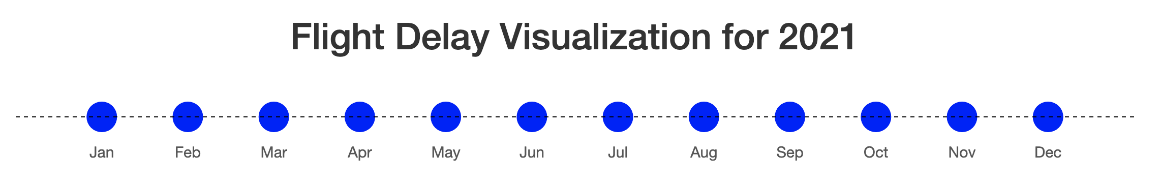
The user can select a specific month to look at flight data from. After selecting an airport, the bar chart visualizations will adjust to look at data from that month and airport. We decided this would be useful to add because flight delays may vary depending on the time of year (due to holidays or different seasons). Having this visualization would allow users to select on the time of year they are most likely to travel in.
In the map visualization, we included points for the largest airport hubs in the US that users can click on. We added a zoom feature in order to help users click on different airports since some of these airports are in close proximity to one another. Also, whenever a user hovers over an airport, they can see the name of it, and if they click on an airport, it will update the "Currently Looking At: " section next to the map along with updating the bar charts.
For the bar charts, we have four different charts that compare different pieces of data among airlines. These bar charts will update whenever a user selected a different airport they want to look at. Here is our final design:
Evaluation
Our visualization does well in answering the questions we had at the start, but there could be further improvements. For example, we picked a huge dataset that compromised the runtime performace of our visualization. Everytime we load one of the datasets, it takes a few seconds to load and update our website. One way we could improve the runtime is to take only a subset of our data to use and load in our visualization (possibly by taking a random sample). Improving this lag in our visualization would definitely make the overall use of our visualization better for the user.