Process Book
for The USA Runs On Fast Food | Helen Ye, Sally Lee, Claire Pan
Overview and Motivation
When starting this final project, we were struggling with trying to find a data set that
all three of us were interested in. We spend a long time searching the Kaggle website and
finally found something that we all bonded over: fast food. However, we each had our own
favorite fast food restaurants, and we were interested in seeing how the regions we were
from affected our tastes (Claire is from the Midwest, while Sally and Helen are from the
West Coast). We decided to investigate fast food restaurants in the USA to see the fast
food differences in each city and state.
Related Work
Assignment 2, the studio that worked with GeoJSON, and the most recent studio on interactive
maps all worked to inspire our final project. With Assignment 2, we saw that we could display
a bunch of different statistics in fun ways, and combined with the GeoJSON map of the USA, we
could accurately display the United States in a visualization. Finally, with the interactive
maps studio, we learned about leaflet, which aided a lot in one screen of our design.
Questions
What are the most popular fast food restaurants in each state?
Which fast food restaurants are universally loved by all 50 states?
Which parts of the USA have the most fast food restaurants?
How does the fast food industry differ based on location in the USA?
Answering these questions will help people trying to enter the fast food industry to see which type of restaurants are popular in different parts of the USA.
Additionally, our visualization will help those who are traveling and wish to see which fast food restaurants are present at their destinations.
All in all, our project will help educate people on how much we consume fast food and how much fast food is present in our lives.
Data
Our source of data is
this data set
from Kaggle. We downloaded the data set and sorted the fast food restaurants into a JSON object.
The object consists of an array that contains 50 objects. Each object has two attributes: a name
(which is the state name), and an array of objects (which is an array of the restaurants in that
state). We can use this sorted JSON to count up the number of each restaurant in each state and
display helpful visualizations that convey the breadth of fast food restaurants.
Exploratory Data Analysis
We initially liked the layout of the Assignment 2 Electoral Map and the bars above that showed
different information about each election. However, we realized that it might take a bit more
time to implement, so we just stuck with our map and bar charts for now.
Design Evolution
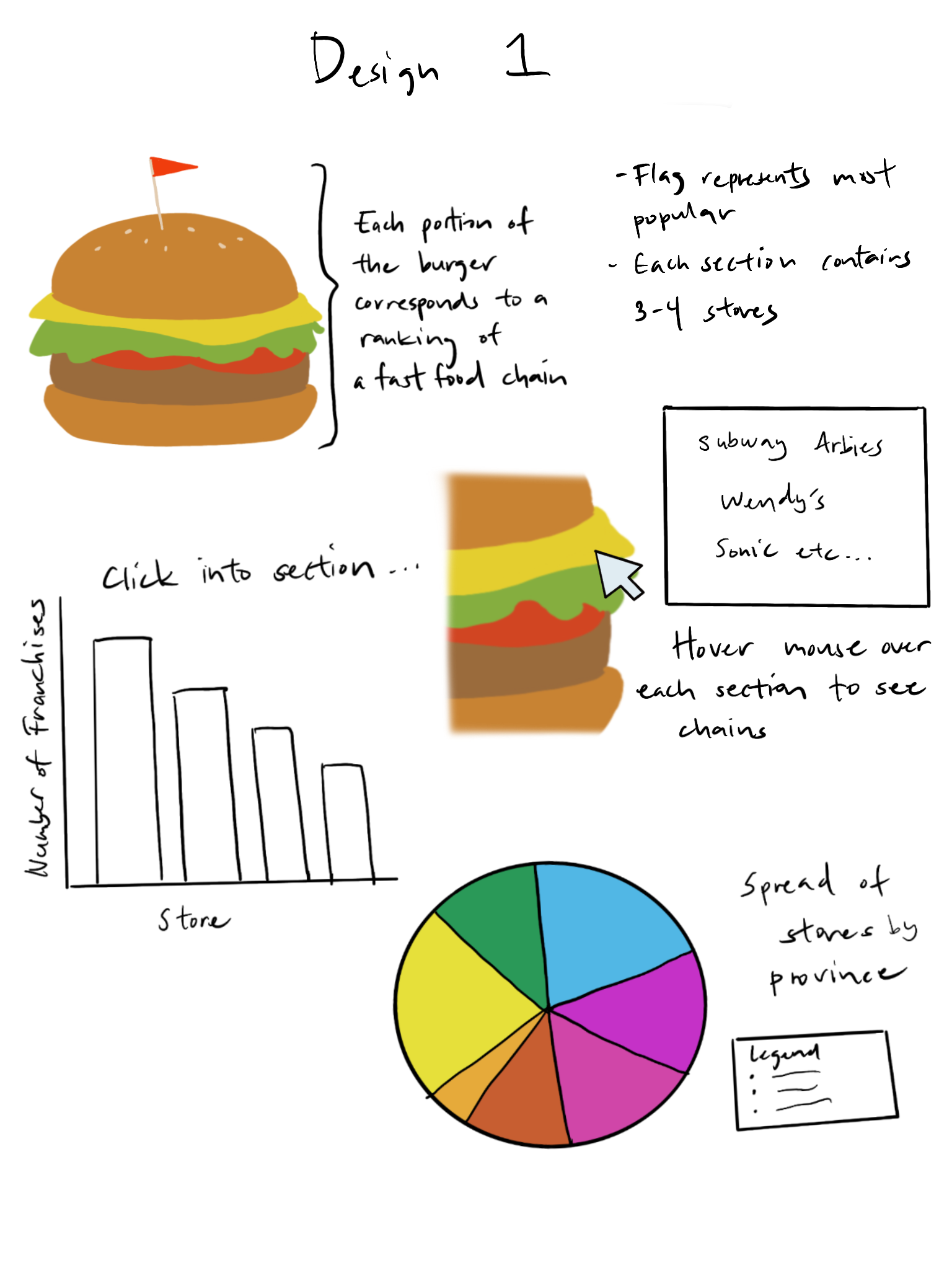
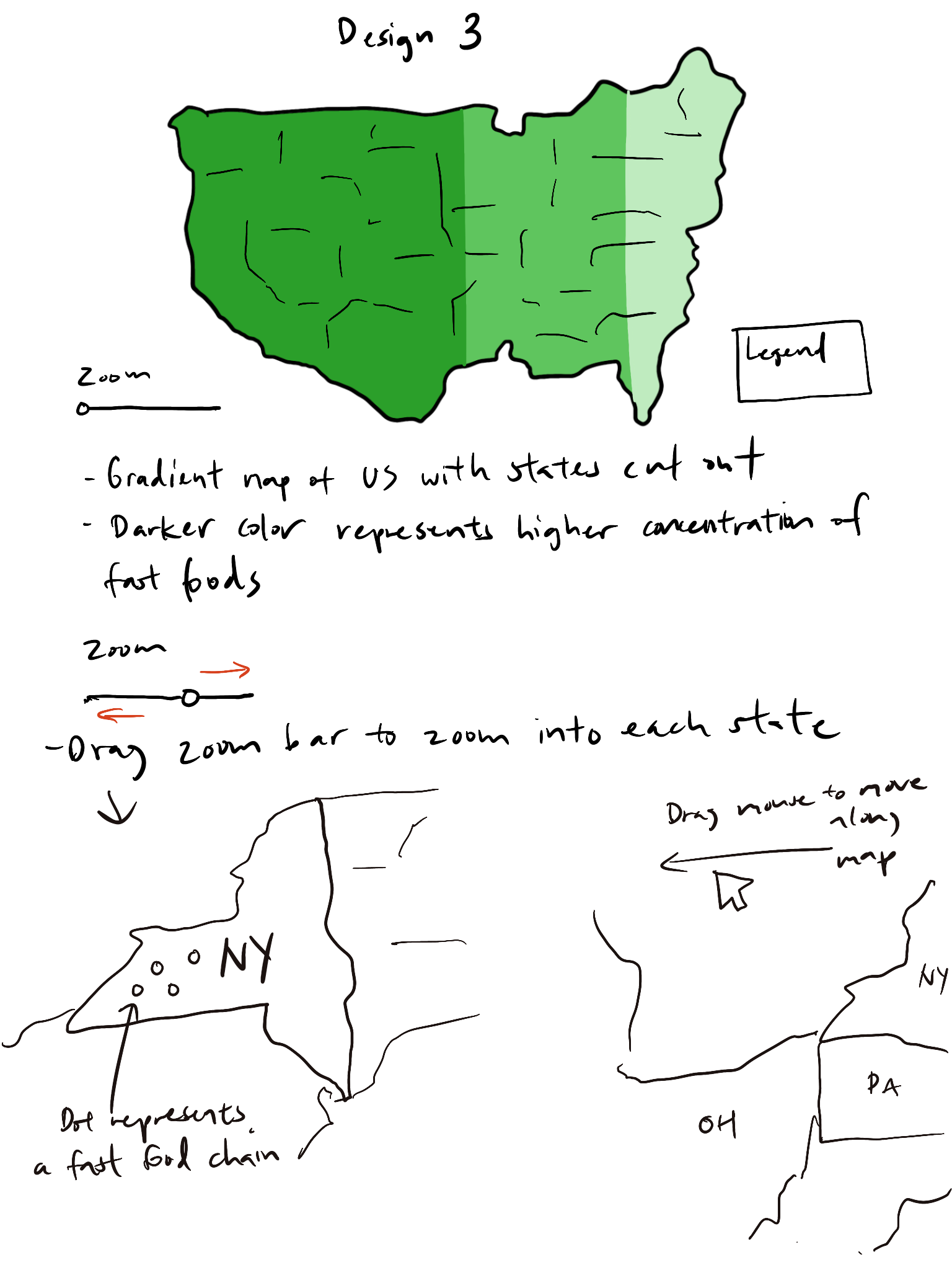
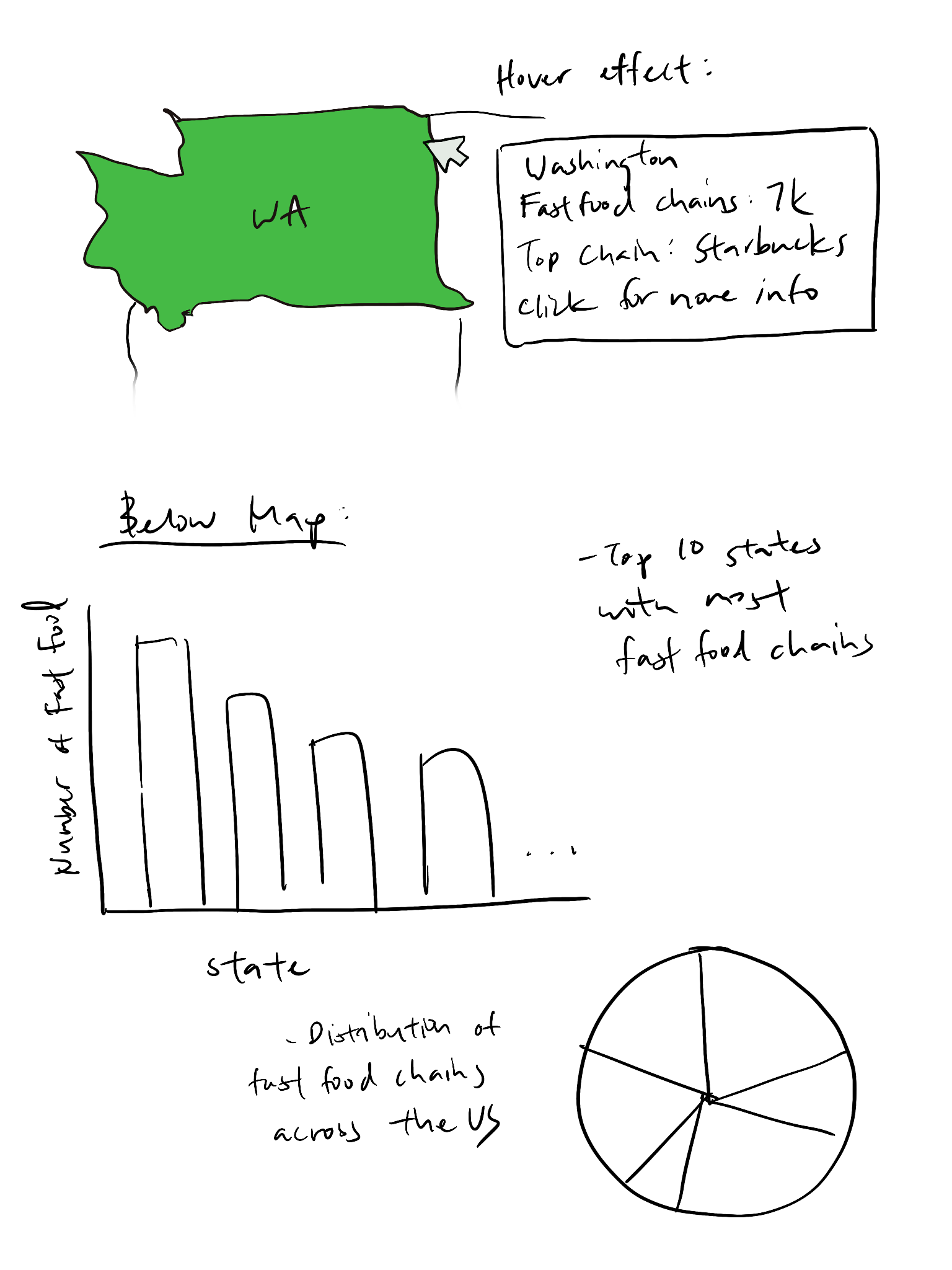
We originally had a few designs for our visualization. One was a hamburger with each topping being a fast
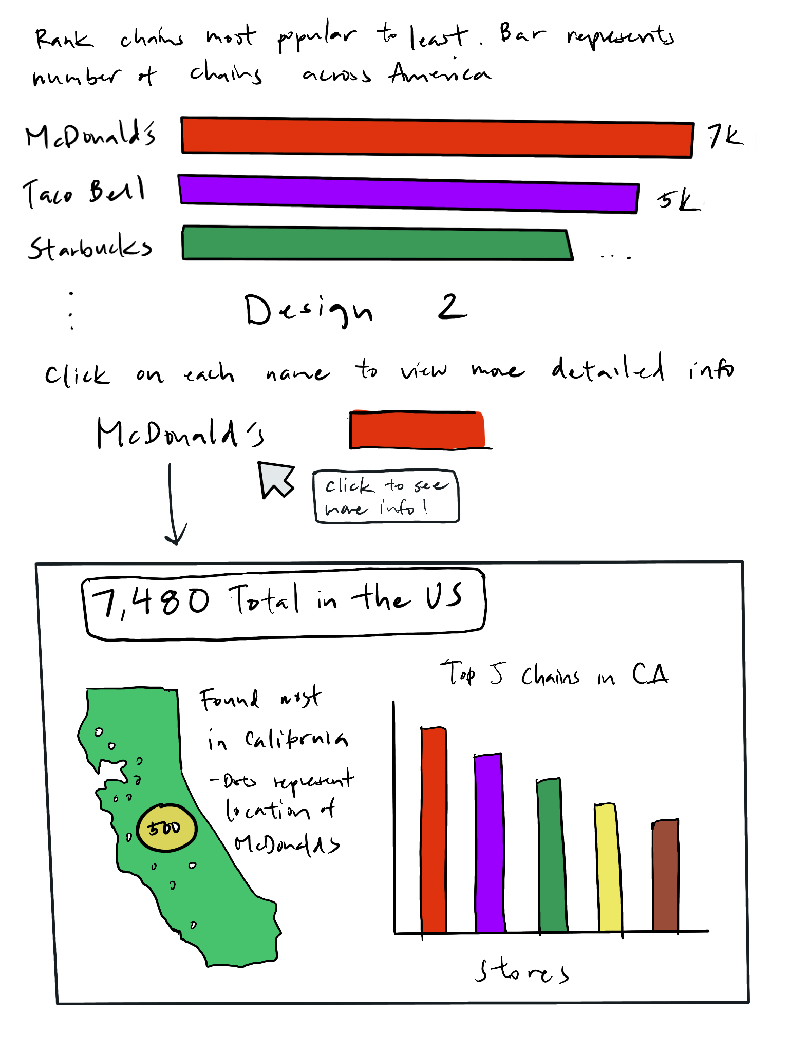
food chain, but we thought that was too abstract to be done. Another one was a horizontal bar chart that had
all the different popular fast food chains in the US, and clicking on a bar would allow you to see more
statistics about the restaurant. However, we thought this idea was a little too simple. Our third design was
the most similar to our final design, which was a map of the USA that you could zoom and drag around to navigate
around the different states. We liked the interactive map, but we didn't know if the zoom and drag movements
would be too complicated for users to figure out. Below are the three designs and the final design that we
decided on.
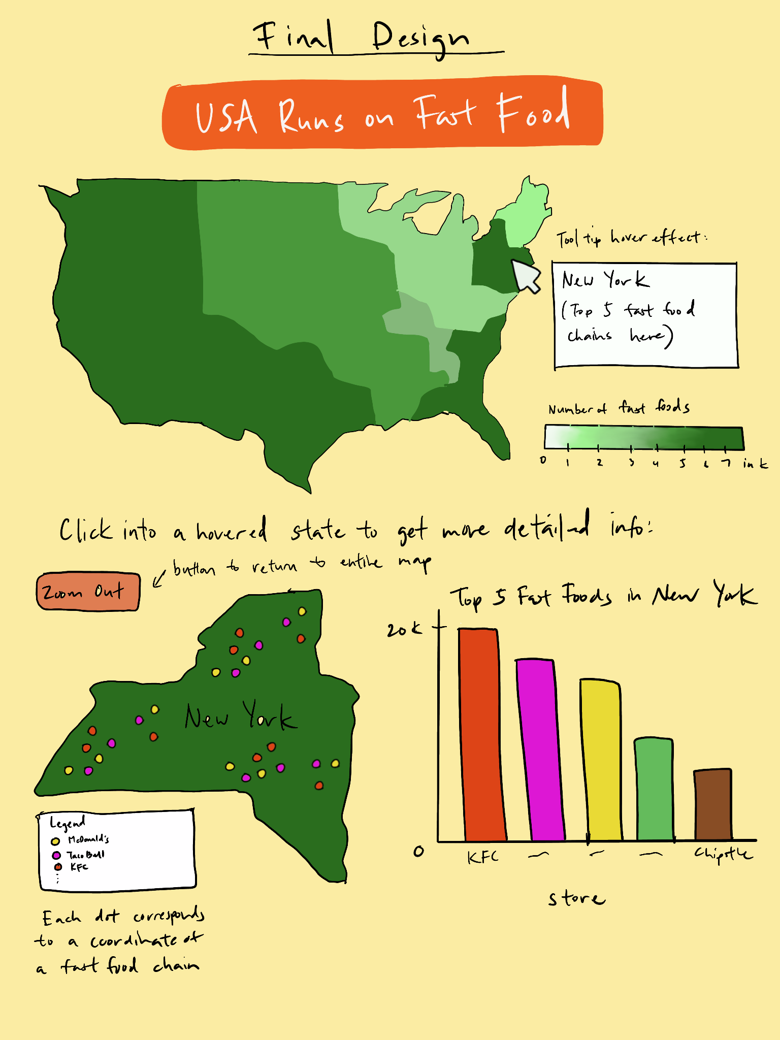
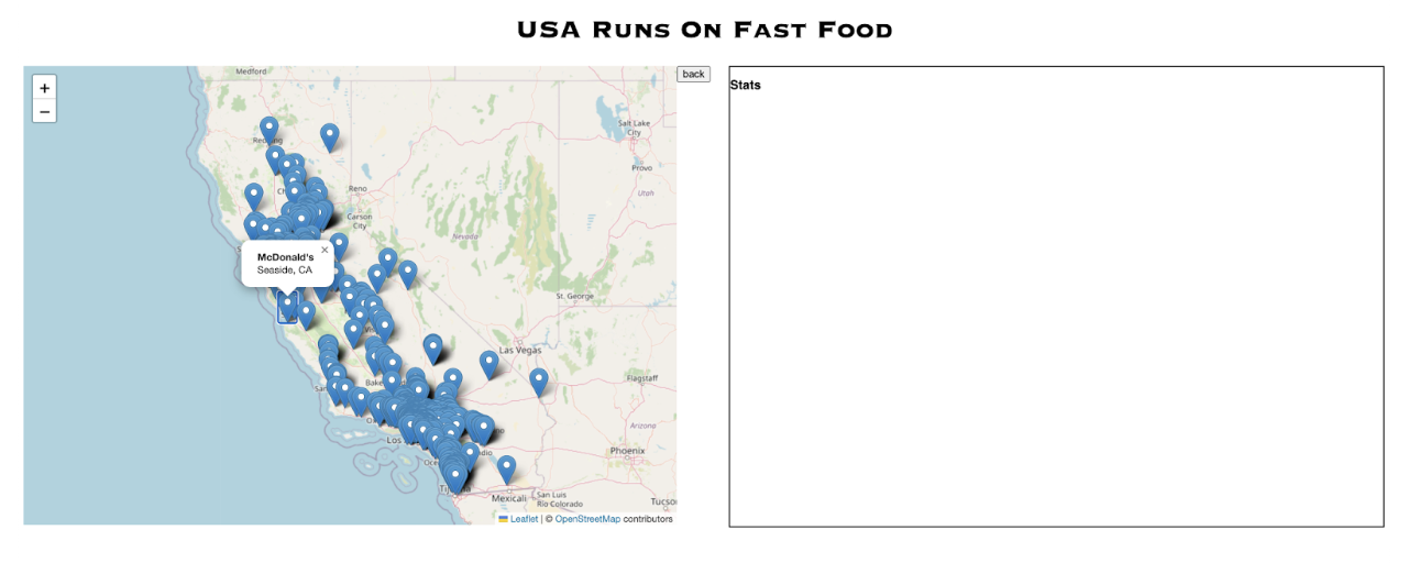
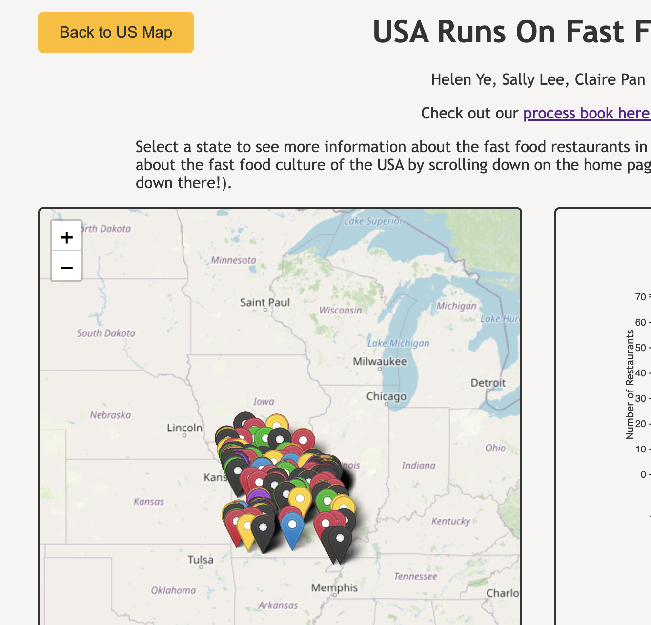
Following are some changes we made from our proposal's final design. Instead of drawing dots to represent each
restaurant once the user clicks on a state, we chose to use Leaflet markers after learning about
them from studio 10 since they already have nice aesthetics and popup labels. Instead of placing
the map of the selected state on top of the statistics box where the bar graph (top 10 fast food
chains of that state) will later be displayed, we chose to place them side by side so the user
can see both components at once instead of scrolling multiple times to make comparisons.
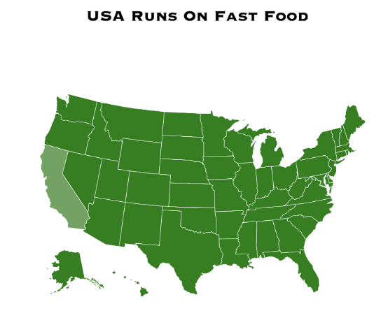
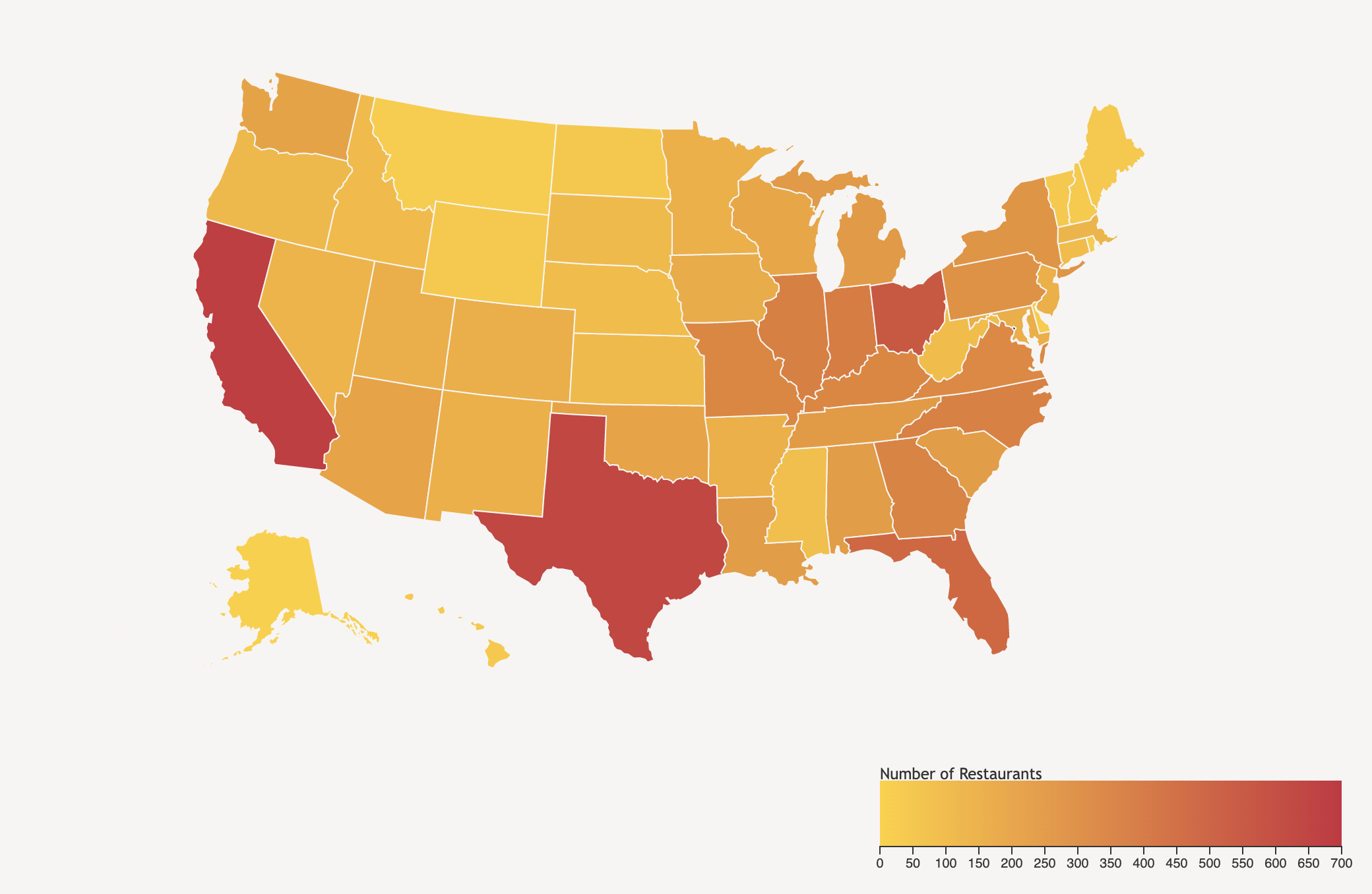
Milestone 2: We decided to include a color scale in our US Map home page so that viewers can see the
density of fast food restaurants in the USA by state. Additionally, we started including some CSS
styling so that the web page feels more cohesive. We also implemented different colored markers that
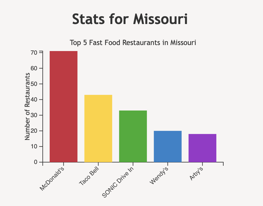
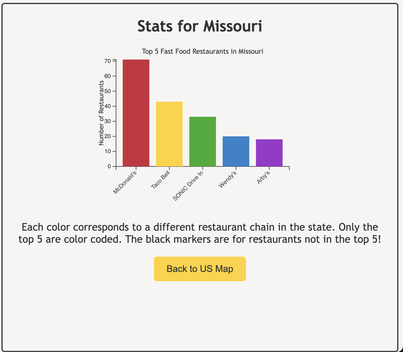
represent different kinds of fast food restaurants in the state. Our bar graph changed from the top 10
fast food restaurants in the state to the top 5 restaurants in the state, and we hope to add a hover
feature for both the home page US map and the bar graph in the zoomed in state mode.
User Studies: During user studies, we realized that we did not make it clear to the user that the data set
we used wasn't actually ALL of the restaurants in the USA. This was discovered when a user tried to find a
McDonald's by in their hometown and couldn't find it. We resolved this by adding an explanation to the top
of our main page to explain how our data set was a sample of a much larger one. Additionally, we added some
zoom constraints so that users wouldn't feel inclined to try and find a specific restaurants. Another point was made when
a user said they didn't understand why the markers in the zoomed in state were different color, so we made
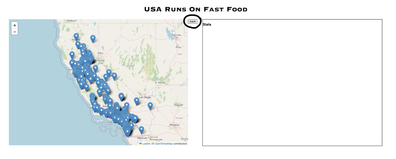
another note about that in the zoomed in state mode. One user also said that the back button for going back to the
US map was hard to find, so we moved it into the stats box for easier clicking. Alvitta also mentioned that navigation
would be easier if we moved the zoomed in state information to below the main map, but we were already in too deep
with the separate page thing, so we just moved the button:
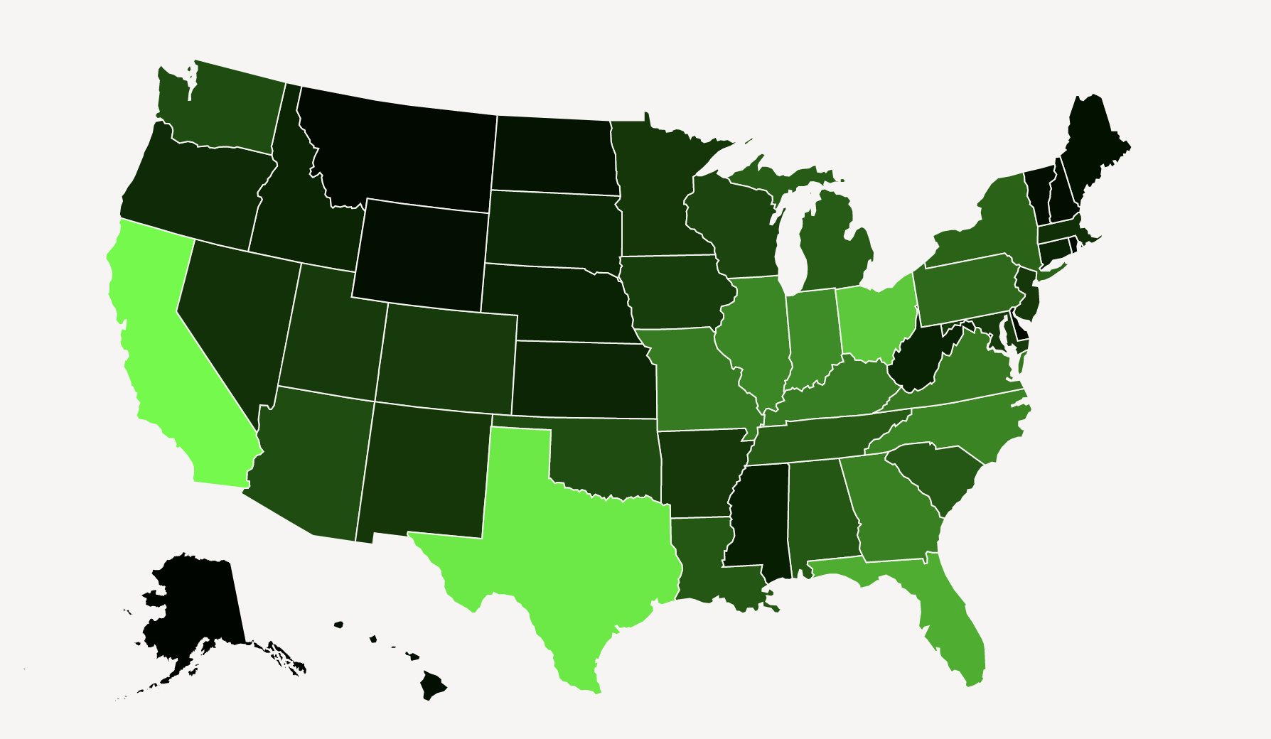
A super helpful piece of advice we received
was about our color map -- before, we were using math and calculating the RGB of each state, but then one
user showed us how to use D3's color scale (which we tried to do before, but had no luck with). Now, our
scale is a lovely yellow to red, with yellow representing less restaurants in the state and red representing
more restaurants in the state.
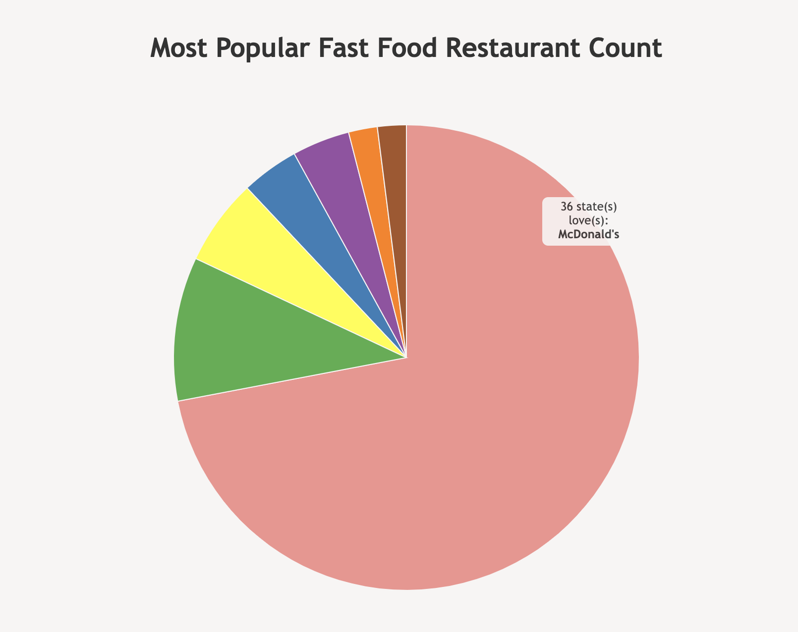
Finally, we received feedback from Alvitta that said that it was hard to determine which restaurant was the
most popular in the USA, so we made a pie chart that shows the popularity of each restaurant.
Evaluation
It confirmed some of our guesses: states with more densely packed markers, which indicates fast food restaurants,
coincidentally are more well known and densely populated states. To answer our question on which fast food chain
restaurant is most popular in each state, we are going to include a bar graph of the top 10 fast food chains, but
we think coloring the markers to represent each chain could make the trend visibly noticeable.
As of now (Milestone 2), we have implemented the different colored markers for each fast food chain. This has allowed
us to see the different chains in the state more clearly and see the more popular types of fast food restaurants by state.
Hovering over each state shows us that the most frequent fast food chain in most US states is McDonald's.
From user evaluations, we realized that since our data set was a sample of a larger data set, it was hard to gauge the actual
popularity of a fast food restaurant chain in a state. We were considering combining our data set with another one for
each states' population to get the density of fast food restaurants per person, but we didn't know how to combine the two data sets.