


Everyone loves to psychoanalyze themselves these days with people posting and sharing their Spotify Wrapped playlists the minute they come out. Music has always been a way for people to understand themselves. Many people use listening and creation as a means to connect with others based on shared experiences through audio art. Everyone is involved in the music space, but listeners rarely observe listening patterns.
Use the nav bar to check out the pie chart, bar chart, and keyboard visualizations to see and share trends about your music tastes! We hope you enjoy learning about your music!
Project Title: Explorify
Created By: Hannah Chen (hannahchen@wustl.edu), Sheng Guo (g.sheng@wustl.edu), Jebron Perkins (j.c.perkins@wustl.edu)
Github link
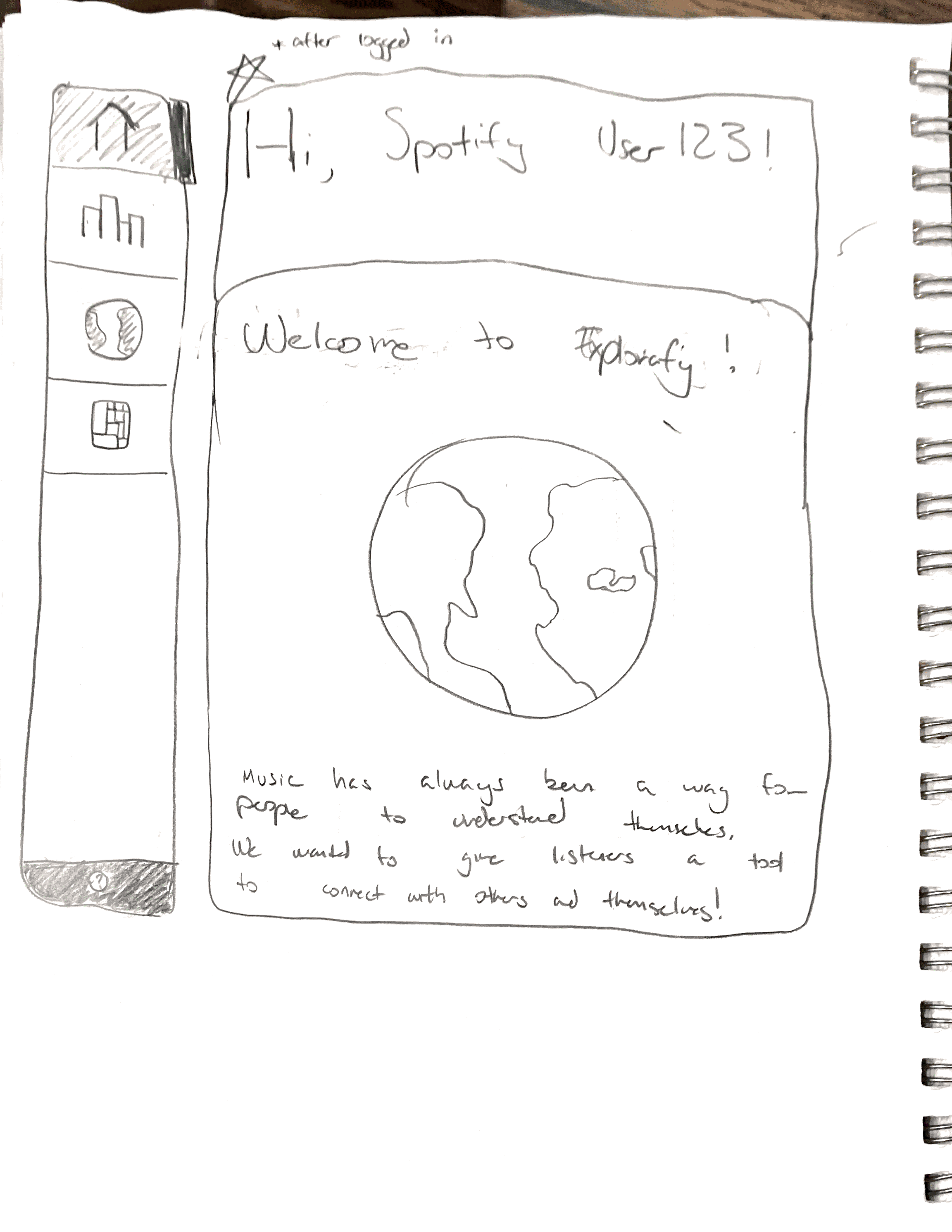
Welcome to Explorify! Here in CSE457, we create engaging, innovative illustrations so music lovers like you can learn more about your taste! Music has always been a way for people to understand themselves. Many people use listening and creation as a means to connect with others based on shared experiences through audio art. As musicians and listeners ourselves, we hope to create the wondrous feeling when you first listen to a song you resonate with. This time, that feeling comes from seeing a reflection of your music taste!
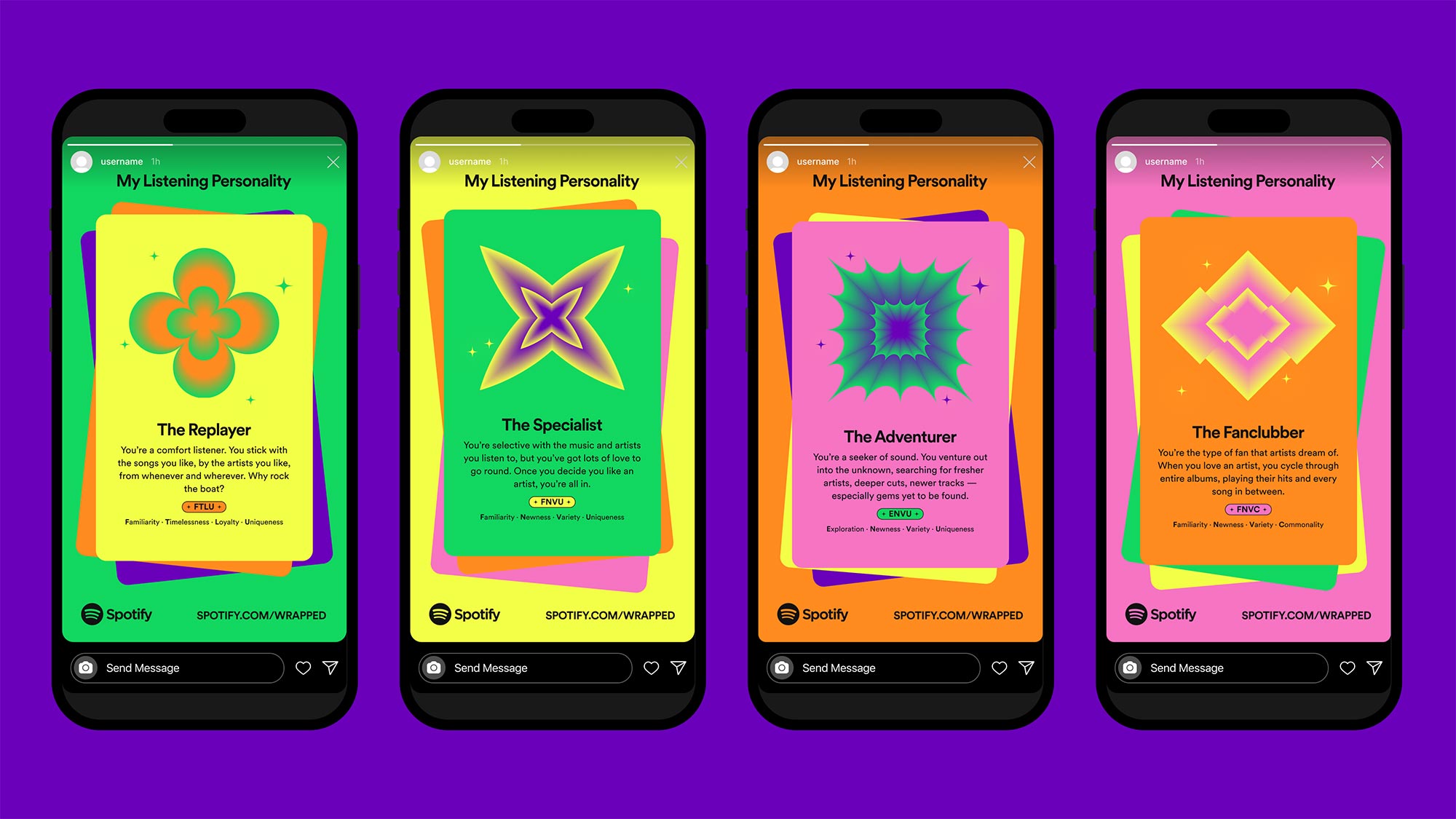
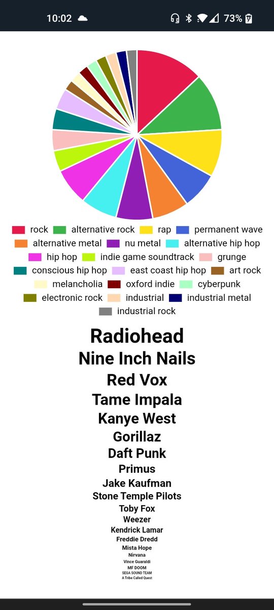
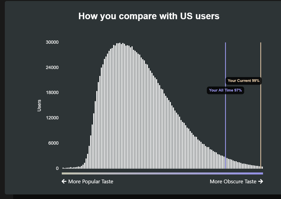
Spotify's unique success in the music industry can be attributed to embracing the social side of music. Here at Explorify, we believe that music's social aspect is what creates communities, strengthens relationship between listener and creator, and at the core of the interaction with art. Each December, Spotify releases Spotify Wrapped, or a "deep dive into the music and podcasts that defined your year". The release typically sets off a frenzy over social media, with friends and strangers commenting on each others' Wrapped posts. We took inspiration from Wrapped, and other similar Spotify plug-ins, from Spotify Pie to Obscurify. Each offers a different way to visualize our friends' music tastes. They have been a way to connect listeners across the planet, and we wanted to give that same feeling of community and connection through Explorify. Websites from left to right: Spotify Wrapped, Spotify Pie, Obscurify.
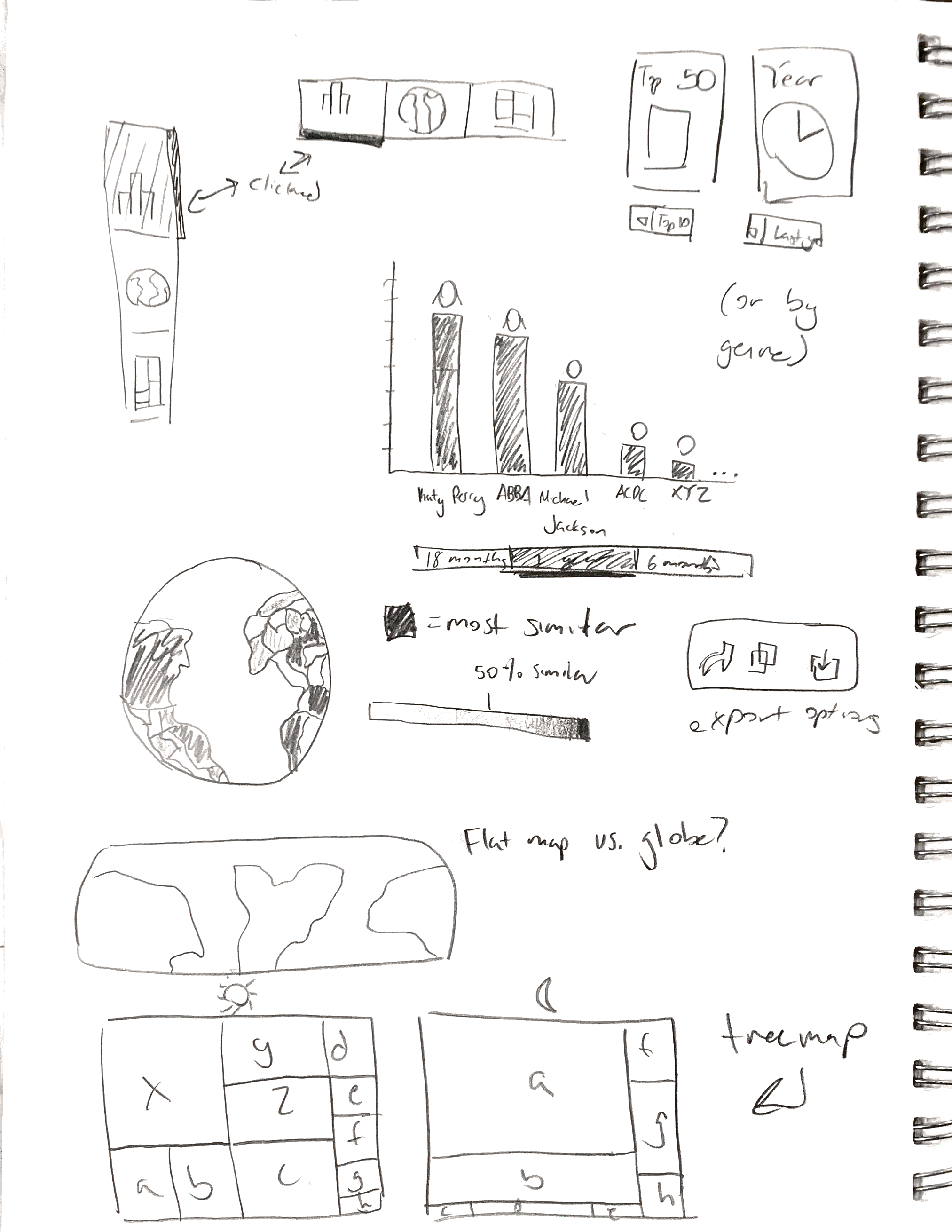
The tools mentioned in "Related Work" give listeners another outlet to connect with their music tastes. In creating Explorify, we wanted to explore: How can we visualize music tastes to help listeners understand themselves and get to know their friends better? Our application depends on the unique collection of visualizations to distinguish itself from similar products. Creating functioning, accessible, and interactive visualizations became the most important (and time consuming) part of the project. Questions we considered during the course of our analysis that guided our main exploratory question were:
Our website uses data collected from Spotify's Web API. We fetch a user's top 50 tracks and top 50 artists upon login if they choose to connect their Spotify account, then we fetch audio features and audio analysis for those top 50 tracks. In order to request from the Spotify API, we must first go through a client-side authorization process. Once we recieve the Authorization Key we set it in the local storage. This allows us to make our api calls to endpoints. Once we get the JSON results of our calls we set them into the local storage so that they can be used in the visualizatons across the project. The audio features provides us information such as acousticness, danceability, energy, etc. that we use to depict a user's general mood or vibe of music they listen to. Audio analysis provides musical data such as what key a song is in which we use as another measure of a person's music taste. By showing the frequency of keys, a user can tell if they have many in C or G major they likely have a lot of pop songs in their top 50. Spotify connects genres to artists and not individual tracks, so we use an indiviudal's top 50 artists to fetch and display the variety of genres they listen to. We use the compiled list from the api call to the user's top artists to make a call to get data for each artists.
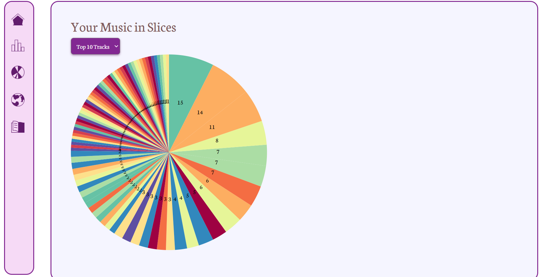
Since the Spotify API provides an organized structure of their data and in json format, there was not much cleaning required. The majority of work required was filtering data to the necessary portions and passing them in specific formats to create the d3 visualizations. For the bar chart of song characteristics, we took averages of each characterstic for all 50 songs and passed that as an array to create the bars. For the pie chart of genres, we had 50 lists of comma-separated genres that we created a dictionary of unique genres and how many times they appeared to create the pie chart. For the piano keyboard, we created a dictionary of keys 0-11 representing the musical notes C through B. If a song in the top 50 had a key (was not -1) we added it to the dictionary to create the bars above the piano keys.
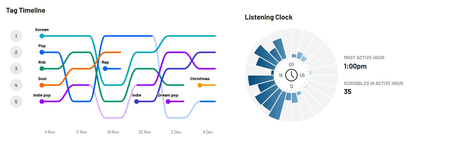
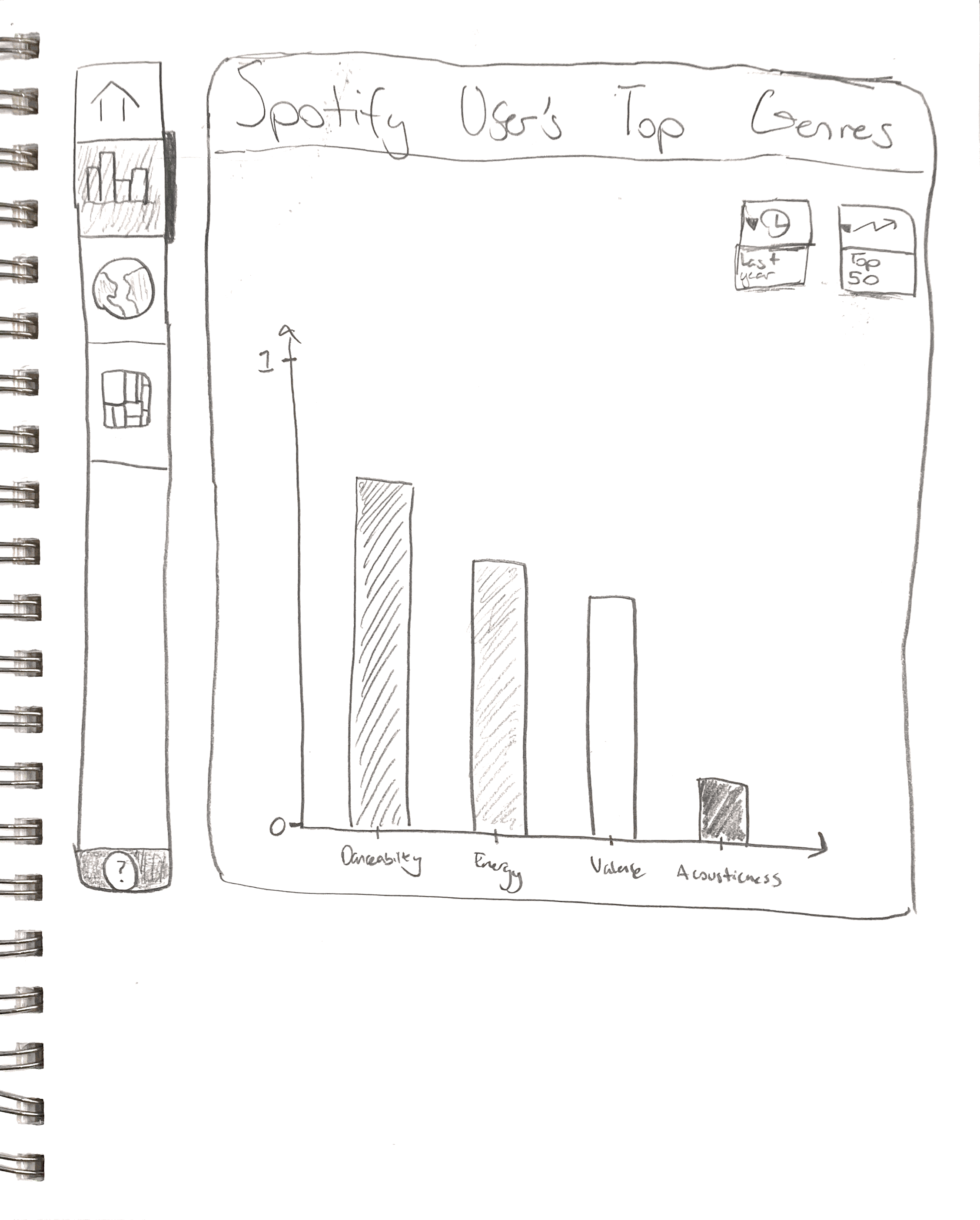
We wanted to create an experience with visualizations users are comfortable interpreting. For instance, if a user spends over a minute interpreting what a visualization type means, they might as well have left the app. Clarity of information is most important to us, so we wanted to have a bar chart, treemap, and world map, each with the option to change the data based off the user's top 50 or top 10 tracks. We admire LastFM's visualizations for how they are able to clearly communicate unique information. The listening clock takes the circular shape of the clock and molds it into a bar chart. The tag timeline takes brings elements of a line chart into top genres. We are drawn to LastFM's ability to combine familiar concepts with new information.
From our exploration of the Spotify API, we saw the most analysis data for tracks. We know many of the other sites that use Spotify data like to use the same track audio features of "energy", "danceability", etc. so we also wanted to include those familiar points in our site. We also wanted to work with genres data which we found under artist data. Lastly, as we played around we realized there was a lot of musical data that prompted us to think about visualizations of music.
In this first iteration of our final project, we wanted to make sure we were able to retrieve data and create a working visualization prototype. We pulled test datasets through the Spotify API and parsed through the JSON data returned to create arrays that we will use for our charts. In addition to our bar chart, we decided to replace the treemap with a pie chart. Treemaps work great to show larger numbers of genres and to display different kinds of attributes with color, shading, etc. Within the scope of our project, a pie chart can select a listener's top genres and compare them with more clarity.
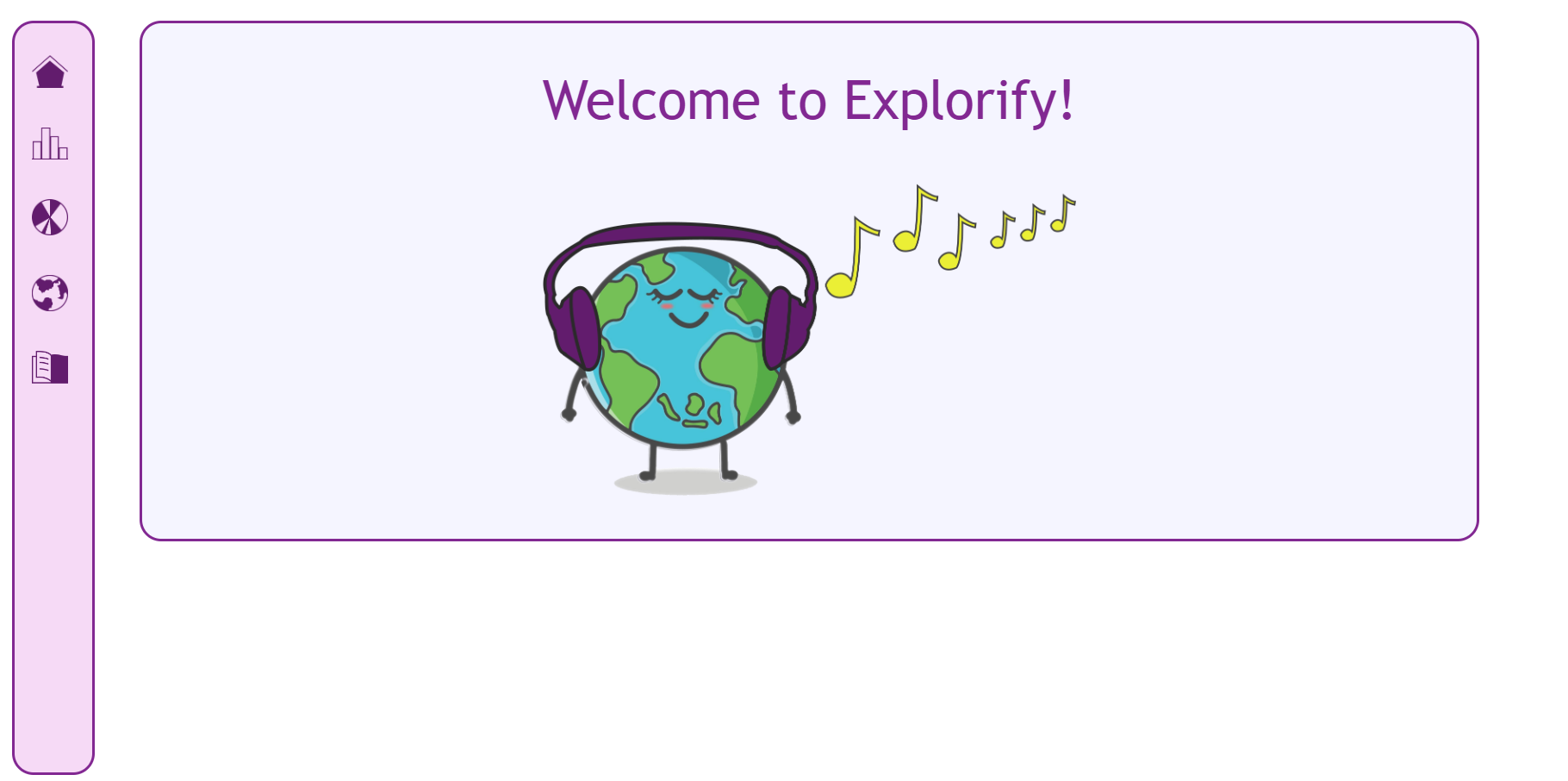
In the second iteration, we wanted to fine tune our visualizations, and refine the interactive elements of the application. It is important to note that we were unable to finish the visualizations using the Spotify API data, so the graphs are still using locally submitted data. However, we were able to get two visualizations running. Additionally, the hover function on the nav bar now features a cleaner, drop shadow. To remain consistent, hovering over the dropdown also increases the size of the drop shadow. The home screen was switched to a simple graphic, as we wanted to communicate the funky, playful tone of our project.
In this next section, we justify the decisions to include certain visualizations over others. To see more details on our design decisions, please skip to the "Implementation" section.
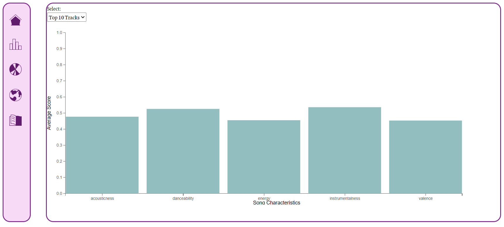
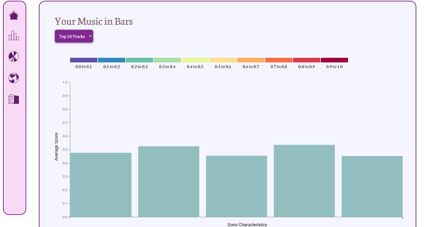
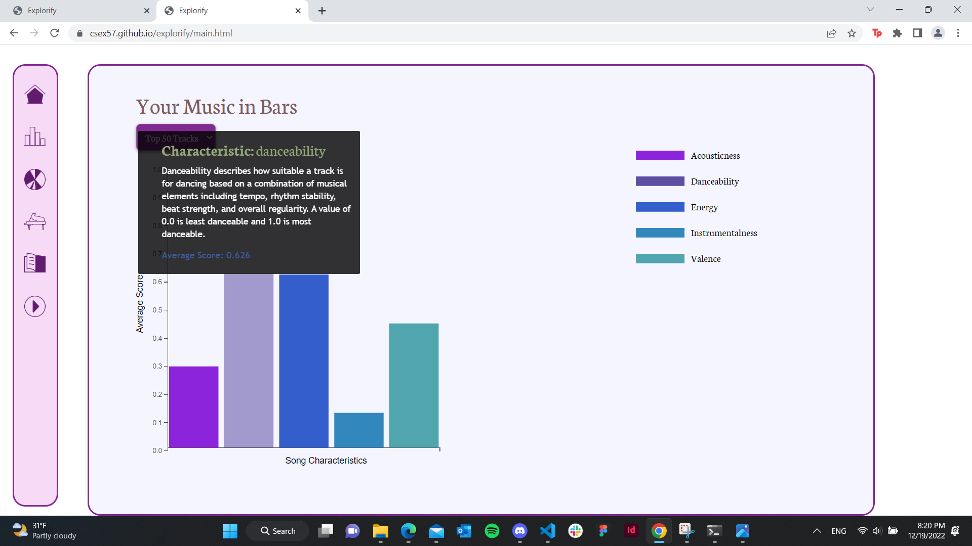
We implemented a bar chart with five measures of music style: acousticness, danceability, energy, instrumentalness, and valence. After receiving feedback during the presentation and user testing, we added a hover feature that displays a description of what the categories mean and the user's exact score for each.
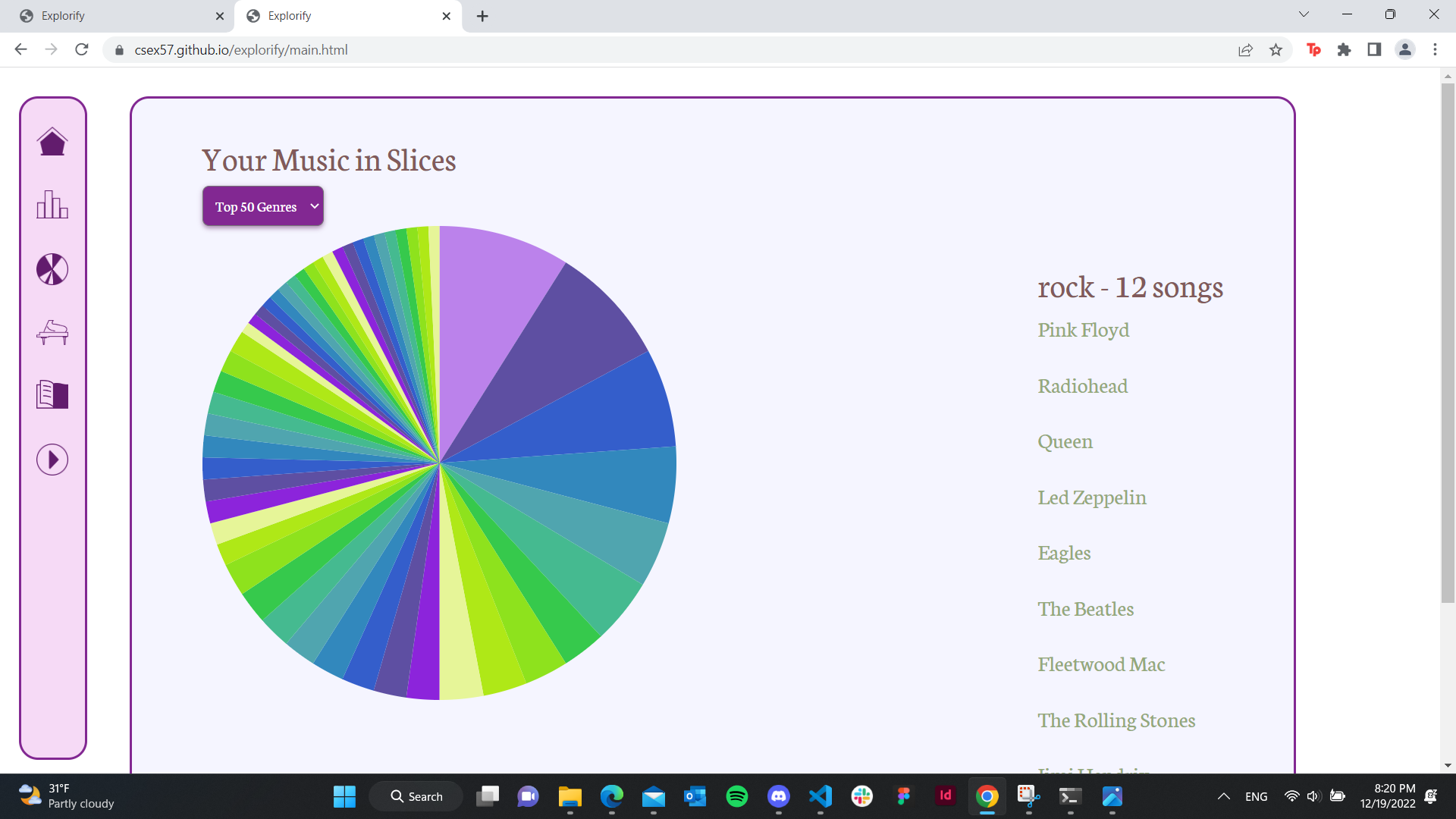
Our second visualization is a pie chart of the listener's favorite genres and the genre's corresponding artists. During user feedback, our classmates reported that the colors were distracting, the numbers on each slice were difficult to read, and the pie chart did not take up enough space. To address those issues, we changed the color scale, removed the number from each slice and listed the artists belonging to each genre on the right side, and increased the size of the pie chart, respectively.
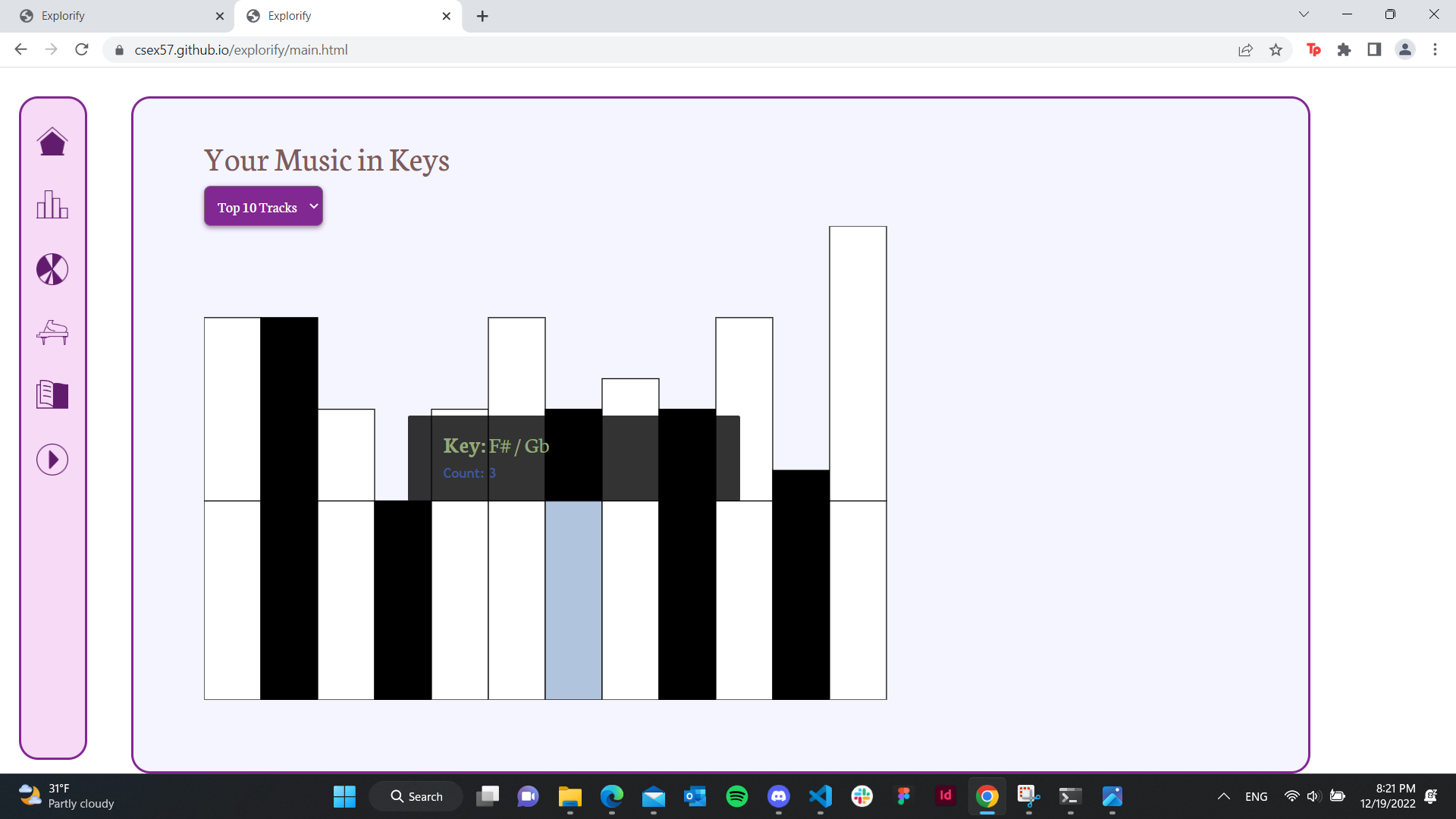
The key-chart integrates the user's listening habits into a bar chart. As mentioned before, we were looking to provide unique insights using commonly-used visualizations. This visualization would likely be most interesting to frequent music listeners. Additionally, all of our visualizations are tied together with an interactive nav bar with customized icons and hover functionality.
Our visualizations of Spotify user music tastes work as desired for the features we designed and
implemented which are:
Must-Have
We successfully processed the data from Spotify and allow users to see real-time personalized data. Users have multiple ways to think about their music taste or patterns of listening and can compare with friends. We added the ability to hover for all three visualizations to provide greater detail if a user desires more information. From our own accounts we found some interesting discoveries about our own habits we didn't expect. For example, from the piano visualization we saw less of the most common pop song keys than we thought. The pie chart also showed the large variety of genres Spotify classifies artists into which was impressive.
With more time, we would consider adding more categories to the bar chart of song characteristics. We could also potentially filter the genres from the Spotify API and group them more broadly to reduce the number of slices in the pie chart. Other features we considered implementing were: a visual depiction of the top 50 songs or artists, a dropdown or option to filter between the time range of the data (within past 1 month, 3 months, 1 year) or the number of top artists/songs (10 vs 50). If we added the depiction of individual songs, we also thought about finding a way to play a song on the piano visualization.