| # | name | studentID | |
|---|---|---|---|
| 1 | Bailong Li | bailong@wustl.edu | 501615 |
| 2 | Zhuomin Li | l.zhuomin@wustl.edu | 502313 |
| 3 | Jinyang Liu | jinyang.l@wustl.edu | 502412 |
Here is the GitHub repository link: https://github.com/csex57/nycapartments
We will identify the most profitable area (zip code) to invest for a real estate company that has a niche in purchasing properties to rent out short-term or long-term as part of their business model specifically within New York City.
We got data from Airbnb and Zillow
https://www.zillow.com/research/data/
http://insideairbnb.com/get-the-data.html
We did a data cleaning for both datasets. We got the house price from Zillow data and got the expected profit from Airbnb data. Since the data may have missing values or at a different timeline, we did a data quality check and fix the problem if they have. Data quality includes 7 dimensions: conformity, uniqueness, consistency, accuracy, completeness, relevance, and timeliness. We used skim and some data visualizations to check and show the completeness of raw data. we also checked the data quality of the 7 key variables that we are going to use to build our profit model. To be specifics, uniqueness, accuracy, and completeness can be quantified specifically. The other 4 data quality dimensions are checked by checking the data structure, analyzing the summary statistics of skim, and eyeballing the data. We particularly focus on checking the data quality on 6 key variables: weekly_price, monthly_price, zip code, price, predict_2019, and id.
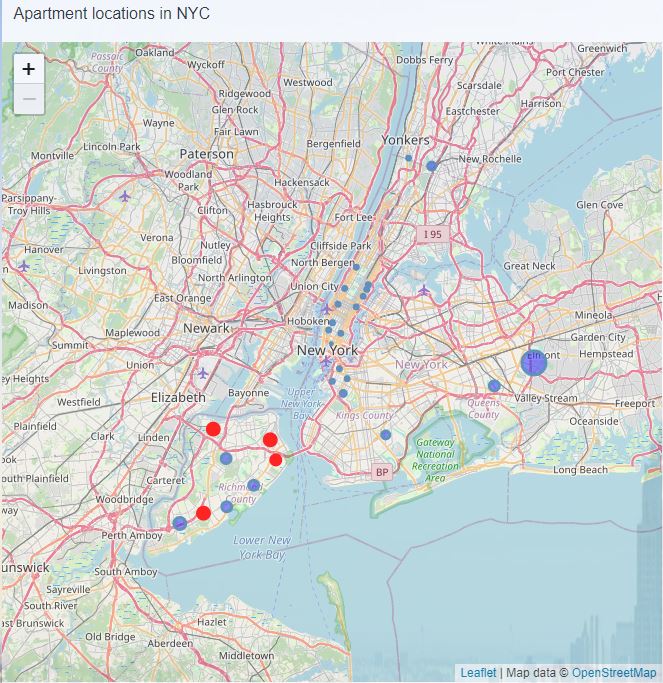
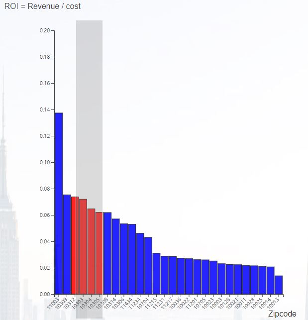
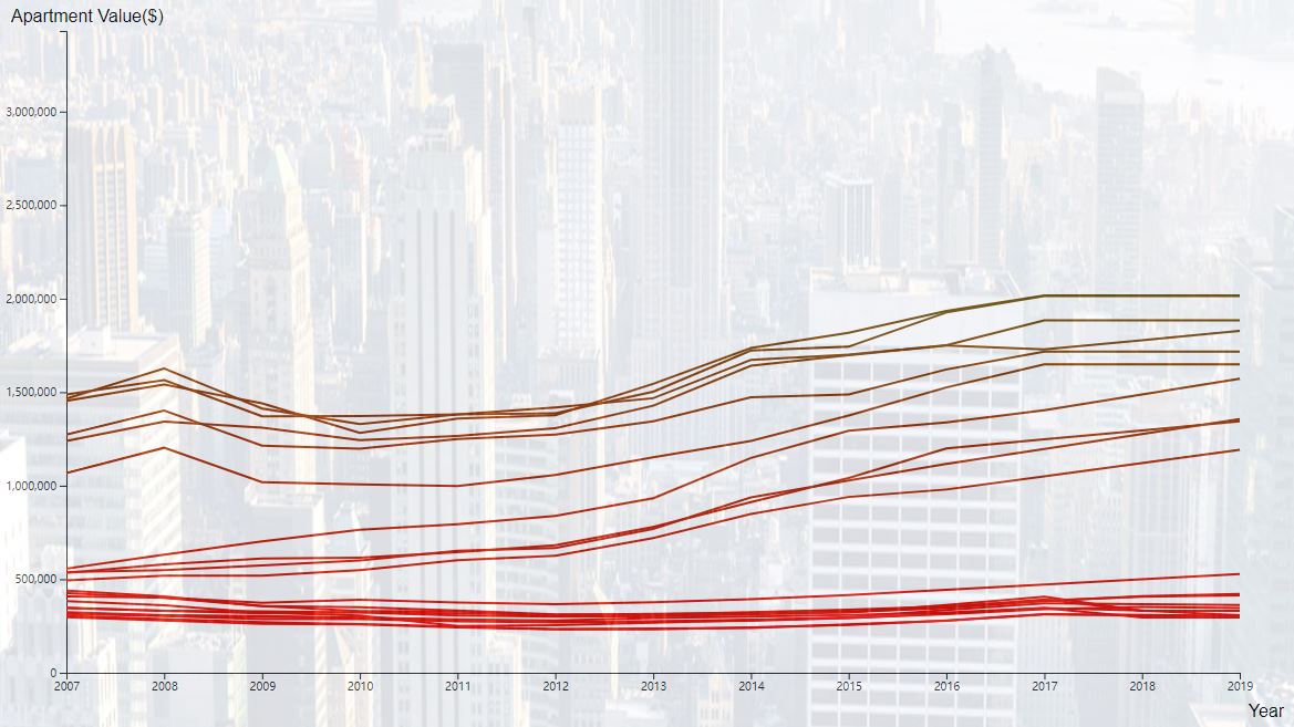
In this project, we think a map chart for the geographical location of NYC apartments, a bar chart for ROI evaluation and a line chart for apartment value forecasting.
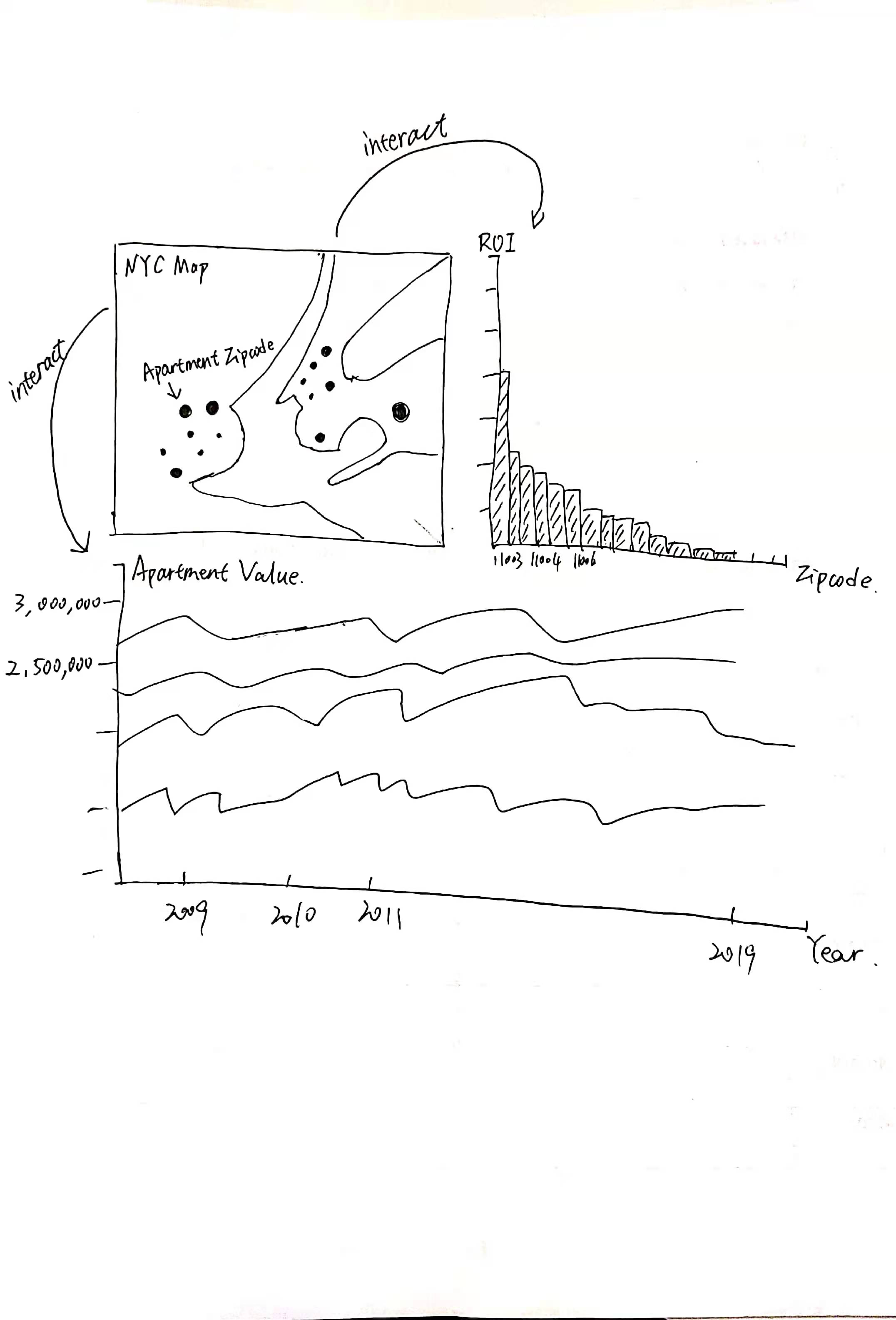
The points shown in the map represent the geographic location of zipcode in our data, and its radius size is the value of the average daily earnings. The blue dots represent the initialized area, the red dots represent the selected area, you can use mouse to hover over the dot to get more information.
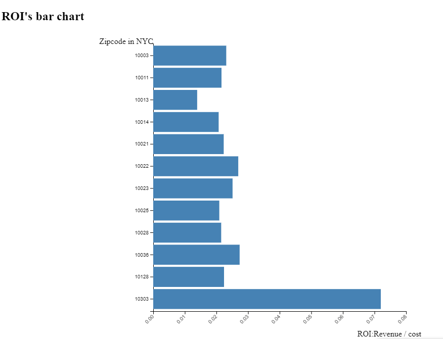
The x-axis in the top right bar chart is the zipcode for the region, and the y-axis is the return on investment (ROI value), calculated by the following formula: ROI = Revenue / cost Where Revenue is annual cash flow, we assume 365 days per year, Occupancy rate: 75%, then the formula for calculating Revenue is as follows: Revenue = price * days * Occupancy rate.
The x-axis of the line chart below is the specific year and the y-axis is the value of the apartment in dollars. The transition of the line color from red to green represents the value from small to large.
In this model, we only considered rent and tenancy term until now. House price itself is also worth considering. Covid will definitely bring unknown changes to the house price in the future, it may rise rapidly.
In this model, we only show the daily rent in those charts, weekly rental and monthly rental are the next thing we want to visualize. Since people rent apartments weekly or monthly, there must be some discount. It is also worth considering.
In this model, we assume occupancy rate are all 75%. It means people will live in their apartment about 250 days a year. What’s next, we can re-estimate the occupancy rate by counting the renter satisfaction index .
As we know payback period (break-even years) is the time that the initial investment can be covered. Smaller payback periods indicate better investment opportunities. In this model, we conclude that the best short-term rental (daily rental) opportunities are 11003, 10309, 10312.
We think that we answered our goals well. Property data was collected in Zillow and Airbnb for each zipcode in the New York area from 2007-2017, and property investments were selected by calculating return on investment (ROI) and viewing area home value curves. Among them, the larger the ROI, the more likely the investor is to make a profit. Based on our data processing and visualization, you can easily find out that the area with the highest ROI is in 11003, which will be the best area for you to invest in if you can only buy one property. If several areas have the same ROI value, the home value curve is used to determine which has a greater impact on the costs and benefits. On the other hand, we can make a choice by looking at the regional house value curve. With the data we collected earlier, we used Tableau to make a forecast. Investors can view the Revenue by growth rate. We did not make a forecast for home values after 2020 because of the uncertainty of home values caused by Covid-19.
The design of our visualization is excellent and all the charts work well. Some of our classmates think they are really useful. It would be better if we put more instructions and background information by each visualization to help people understand it faster.