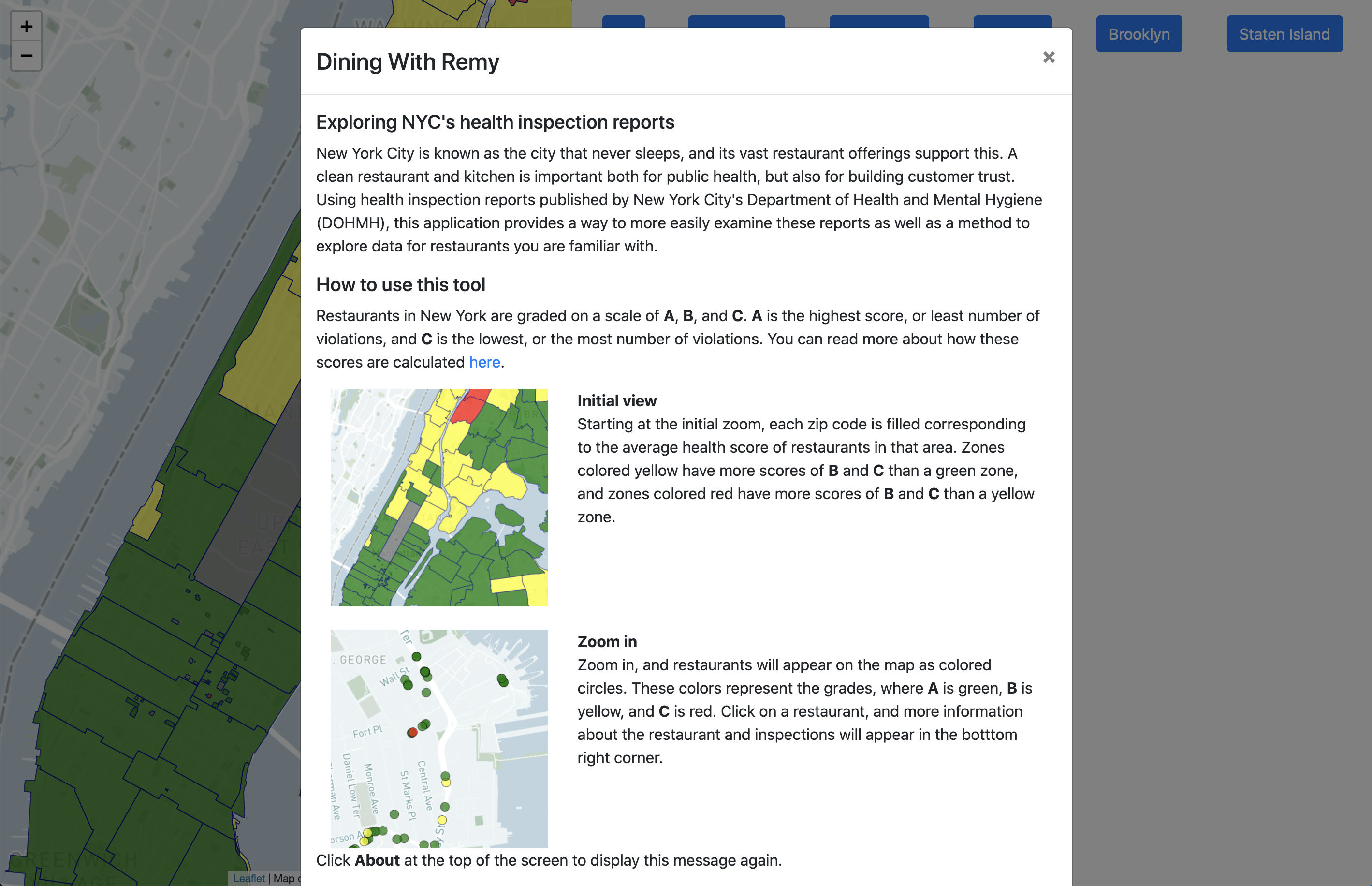
Overview and Motivation
Project Information
Title: Dining with Remy: What is the nastiest restaurant in NYC?
Group Members:
- Hannah Anderson, hannahanderson@wustl.edu, 464841
- Nathan Springman, nspringman@wustl.edu, 464394
Repository Link: Click Here
Background and Motivation
New York City is known as the city that never sleeps, and its vast restaurant offerings support this. Many WashU students like us visit or get jobs in NYC and going out to eat is a big part of socializing. However, with so many restaurants to choose from, it's important to choose one where you can feel comfortable with the food you're eating.
When you go out to eat, you don’t want rats in the kitchen. A clean restaurant is important both for public health, but also for building customer trust. Our visualization would serve as a tool for both tourists and locals to find a restaurant that meets their expectations of cleanliness. While our tool is marketed as ‘find the worst restaurant’ to make it more engaging and memorable, the ultimate goal is for a user to explore the dataset and find a restaurant in which they would be comfortable dining.
Related Work
Our project, in part, was inspired by reports that rat sightings in NYC restaurants are up during the pandemic. The New York Times covered this phemonenon this November, which you can read about here.
The name of the project, Dining with Remy, is a silly reference to Pixar's Ratatouille, in which a rat is the chef for a fancy restaurant.
Questions
Initial
Below is a table of our initial questions we wanted to answer with our visualization and the benefits that answering them can provide.
| # | Question | Benefit(s) |
|---|---|---|
| 1 | What are the most safe and unsafe places to eat in NYC? | Knowing a restaurant's food/building safety history can help lower one's risk of food poisoning or other health issues. |
| 2 | What are the most common health violations in NYC restaurants? Are they critical? | Even A-grade restaurants can be cited for violations, so contextualizing those violations as critical/noncritical and comparing them to how restaurants perform as a whole helps people realize how important/nonimportant different violations are. |
| 3 | Do certain boroughs or cuisine types experience more violations? Is there a specific type of violation they experience more of? | If one borough experiences more of a certain type of violation than others, we may be able to hypothesize about how its land/infrastructure may be causing a restaurant to deal with that violation. (e.g. If one borough of the city has more rat infestations than others, perhaps it has less alleyways to safely store food waste and is attracting rats.) The same goes for certain kinds of cuisines; We could hypothesize that rodents and bugs are more attracted to certain kinds of food. |
Data
Source & Access Method
We used the Department of Health and Mental Hygiene (DOHMH) New York City Restaurant Inspection Results dataset, which we accessed through NYC OpenData by downloading a CSV file.
For each restaurant, the dataset has up to 26 features; Not every entry has all of the features due to the unreliable nature of data entry from different inspectors. However, we will only be using entries that have the following features:
- CAMIS: A unique number identifier for a given restaurant.
- DBA: The name that the restaurant does business as. (The public name can change easily.)
- BORO: The borough the restaurant is located in.
- BUILDING: The building number of the restaurant.
- STREET: The street of the restaurant.
- ZIPCODE: The zipcode of the restaurant.
- PHONE: The phone number of the restaurant.
- CUISINE DESCRIPTION: The type of food that the restaurant serves.
- INSPECTION DATE: The date of the last inspection.
- ACTION: The action associated with the inspection.
- VIOLATION CODE: The code of a restaurant's violation.
- VIOLATION DESCRIPTION: A description of what the violation code refers to.
- CRITICAL FLAG: Whether a violation was critical or not; Critical violations are most likely to contribute to food-borne illness.
- SCORE: The restaurant's inspection score.
- GRADE: The restaurant's inspection grade.
- LATITUDE: The restaurant's latitude.
- LONGITUDE: The restaurant's longitude.
Pre-Processing & Clean-Up
The original csv file is well-formatted, so we didn't have to do substantial clean-up; We just filtered the kind of data we're including and then modified some of the entries that weren't complete.
We pre-processed the data using Pandas, a Python-based data analysis tool, in Jupyter Notebook. We documented the detailed clean-up process in this notebook, which can be seen in our repository here. To summarize, we mainly did the following to the dataset:
- Removed incomplete/unreliable entries.
- Calculated grades for scored restaurants missing a grade based on the DOHMH grading system.
- Removed aspects of the dataset we weren't interested in.
Additional Processing and Data Segmentation
There are too many restaurants and entires in the dataset to display at once, so we segmented the data by zip code.
When zoomed out, we want there to be a heatmap divided by zip code. In data/zip_processing.ipynb, we import a geojson, sourced here, and calculate an average grade for all the restaurants in that area.
Once zoomed in, the code will bring in data for zip codes that are visible. These are generated in data/zipcodeSorting.ipynb. The original dataset has entires by individual violations, so in these files, we have manipulated the data to have the restaurant as an entry with an array of violations.
In addition to segmenting the data by zipcode, we also wanted to visualize trends for specific violation types, so we segmented by violation code. This data is generated in data/violationSummaryData.ipynb and accessed via data/vioSummaryData.json.
Exploratory Data Analysis
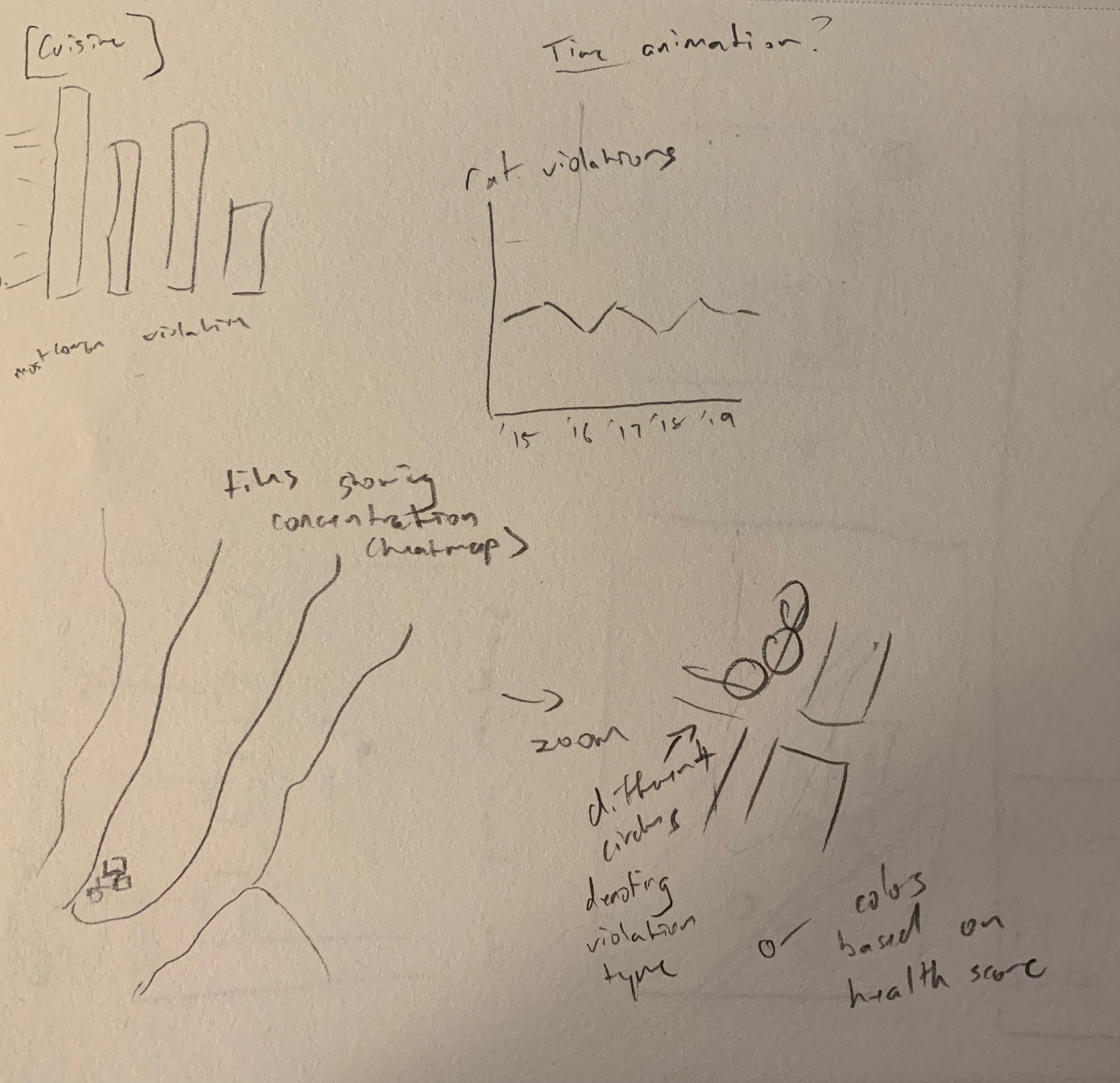
To explore the data at a high level, we used NYC Open Data's own visualization tool. This tool was helpful because it allowed us to examine/identify potential areas of interest for our visualization. As a disclaimer, the online visualization tool uses the entire dataset, whereas we cleaned the dataset for our final visualization; Thus, some of the trends we visualize might be slightly different from these visualizations. Below are some of the charts we looked at.
Inspections by Inspection Date
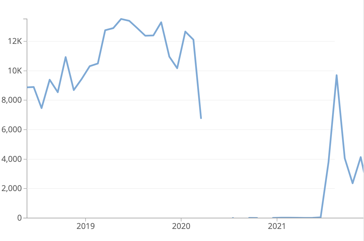
One chart we made on the tool that was interesting was the above "Inspections by Inspection Date" line chart which visualizes how inspection counts varied across time. (We filtered it to exclude values before 2015, since 1900 was used as a placeholder in the dataset for restaurants that hadn't been inspected yet, and the graph has been panned to focus on mid 2018 to nearly the present.)
This line chart is interesting because it shows the sheer impact that the COVID-19 pandemic had on restaurant health inspections in NYC. The pandemic hit the U.S., especially NYC, hard in March 2020, which is where the line graph abruptly stops. There is some inspection data from later in 2020 (less than 10 inspections), but things didn't start to pick back up until summer 2021. Summer in general seems to be a big time of year for these inspections, since the data peaks for each year in those months.
We decided not to visualize inspection date trends, but this graph definitely was notable because of the pandemic.
Violations by Violation Type
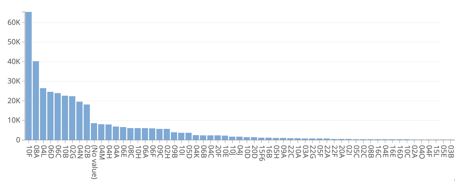
We also made a "Violations by Type" bar chart using the violation codes in the data to see if there were any high-level trends. (The screenshot above just shows the most common codes.)
10F was the most common violation code, which represents "Non-food contact surface improperly constructed. Unacceptable material used. Non-food contact surface or equipment improperly maintained and/or not properly sealed, raised, spaced or movable to allow accessibility for cleaning on all sides, above and underneath the unit." This is a non-critical violation, so not super concerning.
However, it is extremely concerning that the 3rd most common violation is 04L, which stands for "Evidence of mice or live mice present in facility's food and/or non-food areas." These restaurants are quite literally Dining with Remy!
This visualization across violation codes showed us that it would be cool to contextualize restaurant violations based on how common they are in some way for our visualization.
Violations by Cuisine Type
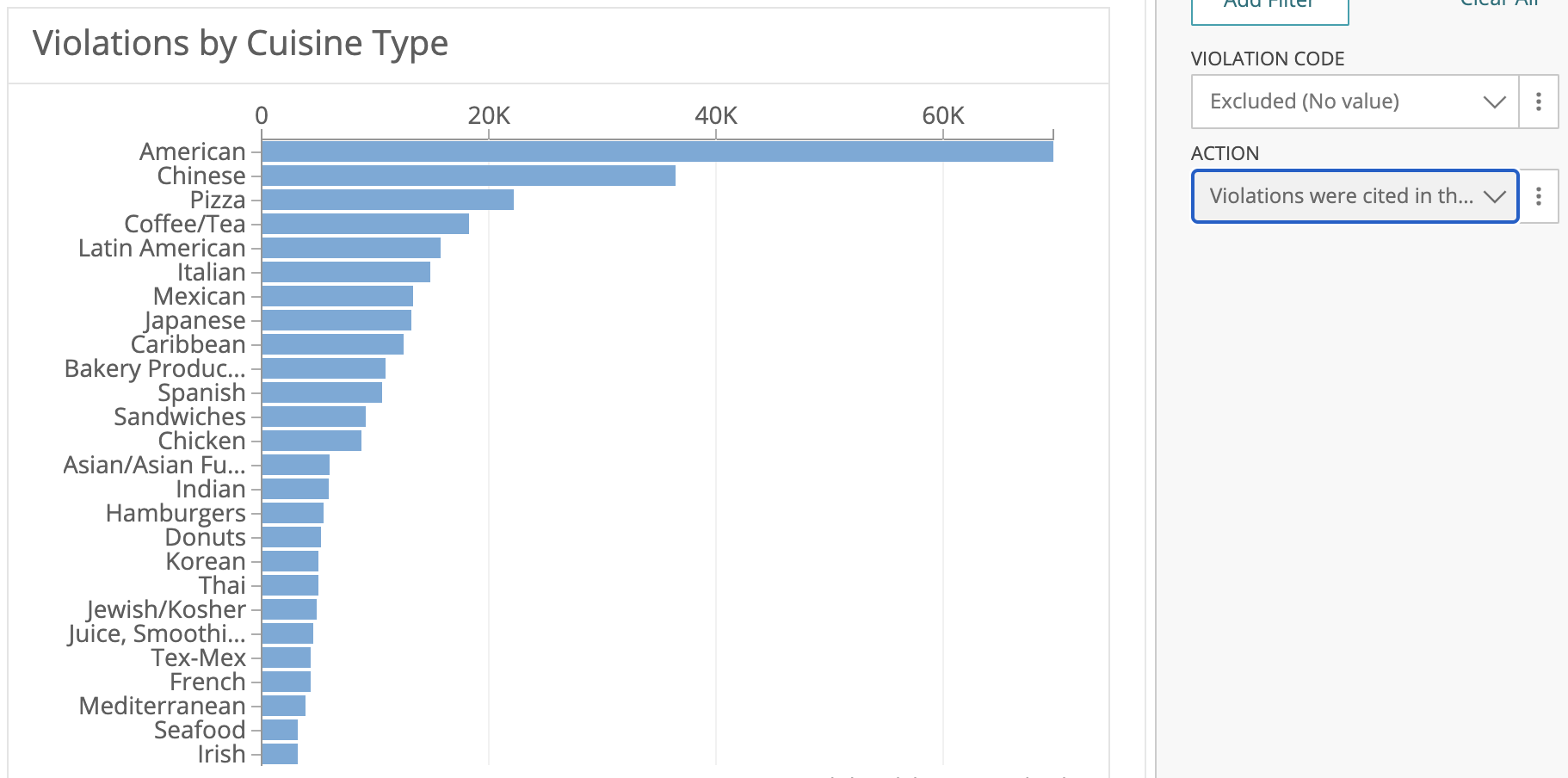
We also visualized violation frequency by cuisine type. (As the sidebar in the screenshot shows, we were filtering by restaurants that had a specific violation code listed and an action that indicated violations were recorded at the time of the inspection.)
As the chart shows, there are definitely differences across cuisines types regarding violation frequency. However, much of this is just based on the fact that those cuisine types have more restaurants to be inspected to begin with. (We also looked at a graph that showed the total # of inspections for each cuisine type, and it was almost identical.) The takeaway from this graph isn't that American, Chinese, and Pizza restaurants have more violations for a reason; rather, we would say the takeaway is that no matter the cuisine type, restaurant violations in general seem to be common.
Though this chart didn't really show anything interesting, we still wanted to examine cuisine type in our visualization and filter the data down more by zipcode and violation code to see if there are any insights there.
Design Evolution
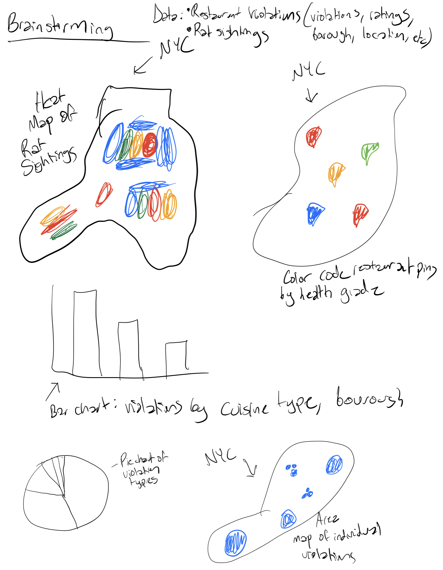
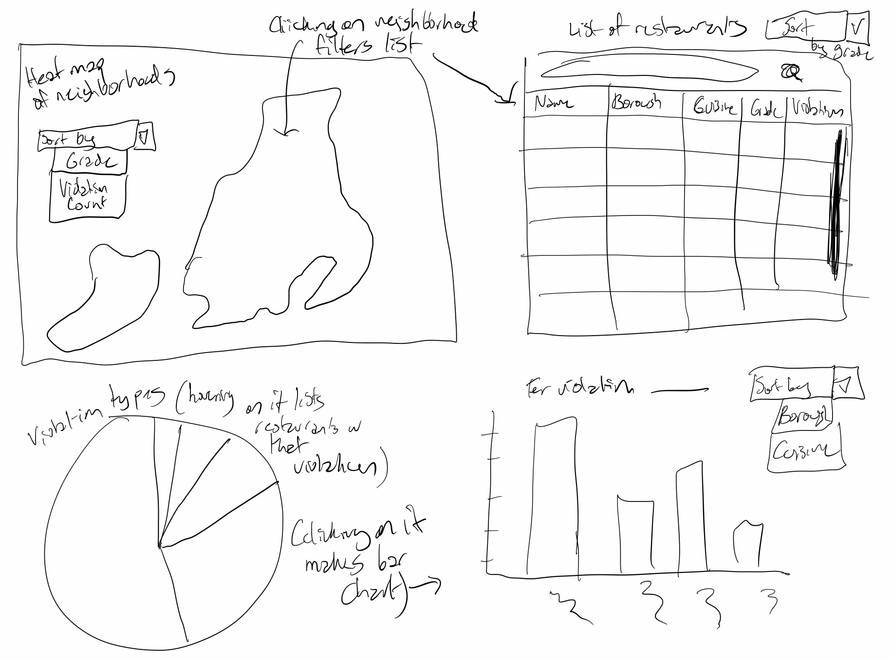
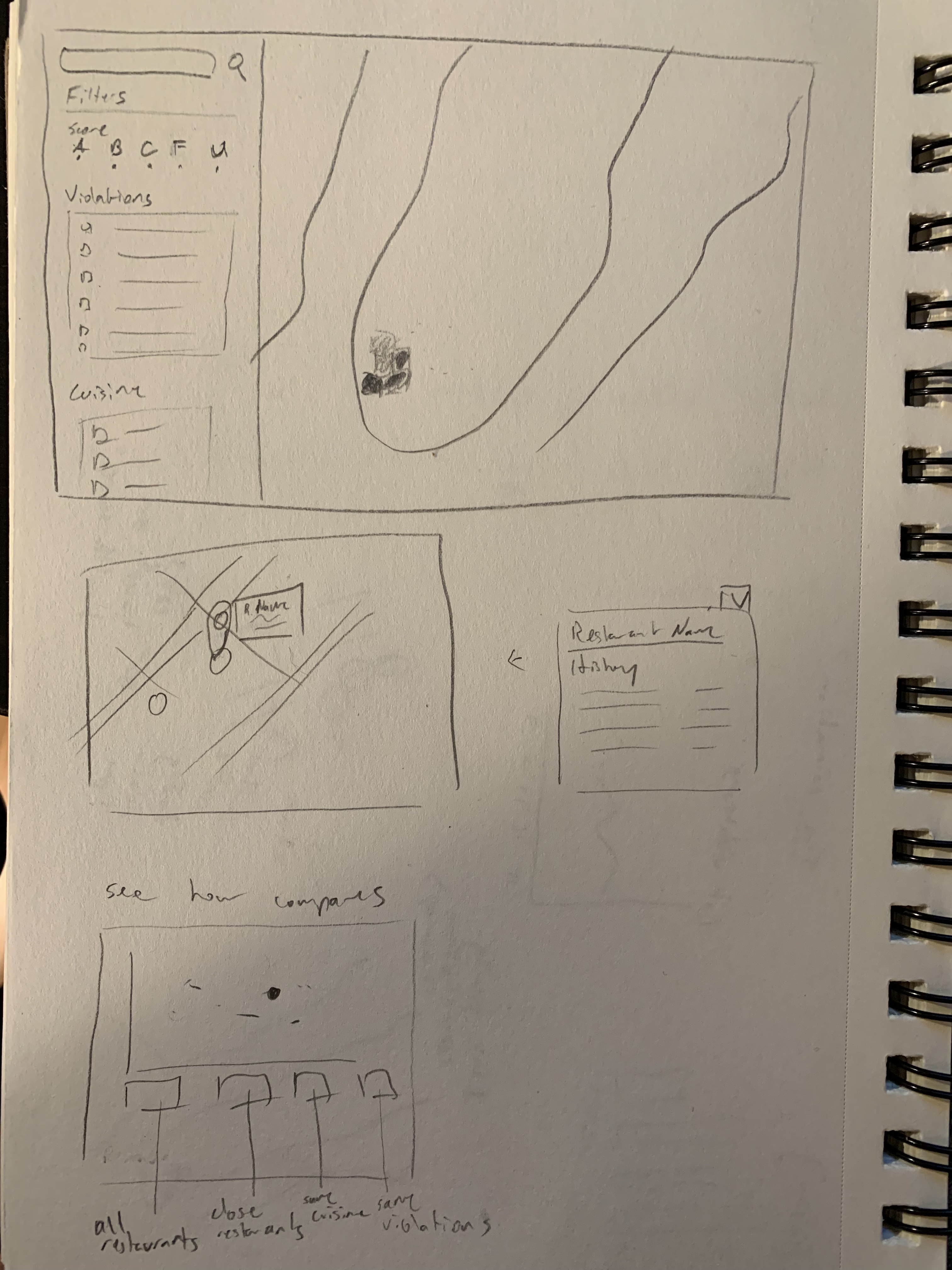
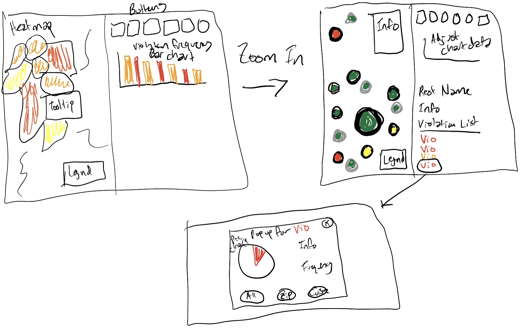
Initial Sketches
Revised Sketches
"Final" Design
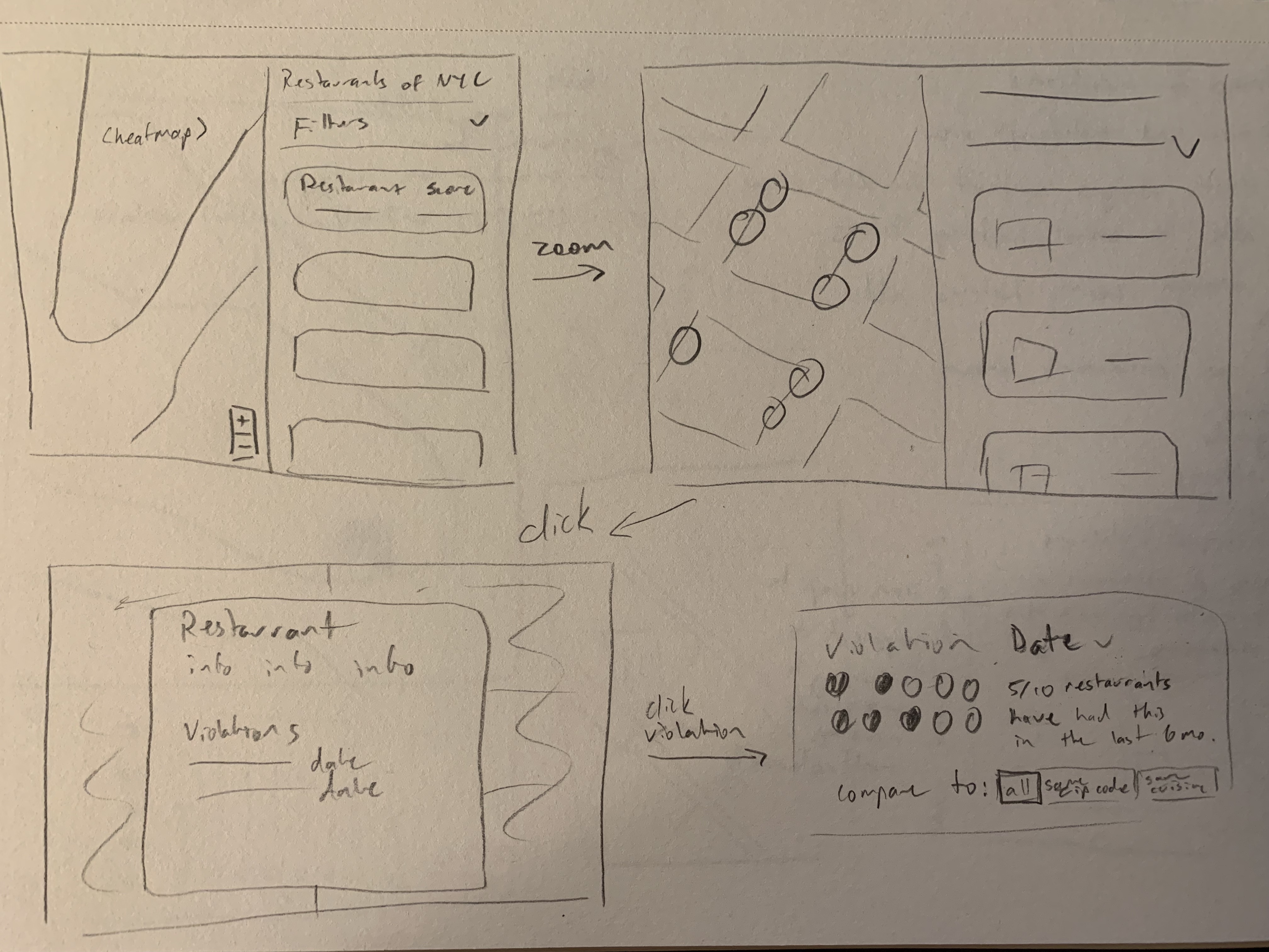
We primarily want this site to make restaurant-goers more informed about restaurant cleanliness. As such, our primary navigation will be location-based. Drawing inspiration from sites such as AirBnB or Zillow, we want to have a split view with a map on one side and a table view on the other.
When zoomed out, the map will be a heatmap showing concentrations of violations. One can zoom in or use the filters on the table view to see individual restaurant pins. These pins will be color-coded to reflect their individual health scores and signal if serious violations have recently occurred.
Once someone has clicked on a restaurant, they can see more information about it including a history of violations. There, one can also see the context for the individual violation through an isotype graph. We will list the raw data below, stating, for example, "3,400 out of 26,000 restaurants have had this violation in the past 6 months." However, these numbers are somewhat difficult to comprehend. The isotype graph included will give an easier method of understanding "3 out of 10 restaurants." One will also be able to compare this to restaurants in different groupings: all restaurants, restuarants nearby, same cuisine, etc.. Although we have several years of data (back to 2014,) we don't believe serious violations from a long time ago are as important, and we will likely limit these sorts of comparisons to one year.
User Studies
Our "final" design continued to evolve to the exact end product available today through user studies conducted during the course. Our user study period had four stages:
1. Think-Aloud
During this stage, we gave users the opportunity to interact with and make sense of our visualization. We asked them to verbalize what they were doing and why they were doing it as they interacted.
Our main takeaway from the users during this section is that they wanted to be able to see more information/trends about the zipcodes while interacting with the heatmap layer. There was the assumption that hovering or clicking on a zipcode would produce some kind of response.
Users also seemed frustrated with how many clicks/zooms it took to get to the detailed circle layer.
We observed as well that even though we provide a modal of how to use the visualization and what everything means, users clicked out of it very quickly and instead just wanted to play with the visualization.
2. Task Completion
Next, we asked users to answer a series of questions using the visualization to see how well it accomplished our goals. Here is what we asked them:
- Choose a random zipcode. Which restaurant would you most likely want to eat at? Why?
- What violations were the most worrying to you from the ones you observed?
The users we worked with were able to easily click around the circle map of restaurants once zoomed in. Whatever zipcode they chose, they gravitated toward looking at different circles that were green (A grades), and then clicking around to examine their cuisine types and violations.
Users were most worried about vermin-related violations or violations related to food sanitation, e.g. the critical violations.
3. Feedback/Critique
Users were then given the opportunitiy to share ideas they had to improve our design.
- One user suggested we change the default heatmap focus to show all of the boroughs initially instead of focusing in on a specific area of the heatmap already, to give users a broader overview when they first load the page.
- Users critiqued how many clicks it took to zoom to the detailed map view, which was helpful because we assumed people would pan (which is much easier). One user suggested adding a button that zooms into the circle view.
- One user suggested that we add a tooltip with the restaurant name or label the circles in some way to make restaurants easier to identify on the map.
- Since there are so many green "Grade A" restaurants, users mentioned wanting them to be encoded differently by some other feature, like number of violations, to give more perspective.
- Users also wanted us to make it more obvious on both the table and the map when a restaurant is selected.
- Users said it was unclear that our table and violation sections could scroll.
- One user was confused that some restaurants only had data from 2019, even though restaurant inspections happen annually.(We originally thought much of that would be due to the pandemic, but we think it's also due to some of the data cleaning we did with missing values.)
- Users said the violation part was kind of small and didn't capture attention well.
4. Debrief
After the studies, we implemented the following changes...
- We plan to add more legends to the map, because even though we provide a useful "About" modal, many people click through it quickly and would like to be reminded.
- We plan to provide more summary data about each zipcode upon hovering/clicking instead of just whitespace, though we haven't decided how to visualize that yet. Additionally, upon clicking on the zipcode we also plan to zoom the user into the circle view.
- We plan to alter the circle layer to make the green less overwhelming by potentially adding other differentiating features.
- Based on instructor feedback, we have decided to get rid of the table since it doesn't do a great job of complementing the map. Instead we will probably use that space to display zipcode trends.
- We plan to highlight the violations more by providing them with their own visualization of trends and giving more space to them.
Final Design
Much of our final design is similar to our "final" design, but we did our best to take user and instructor feedback into account. The changes we made were aimed at making our visualization prettier and easier to understand.
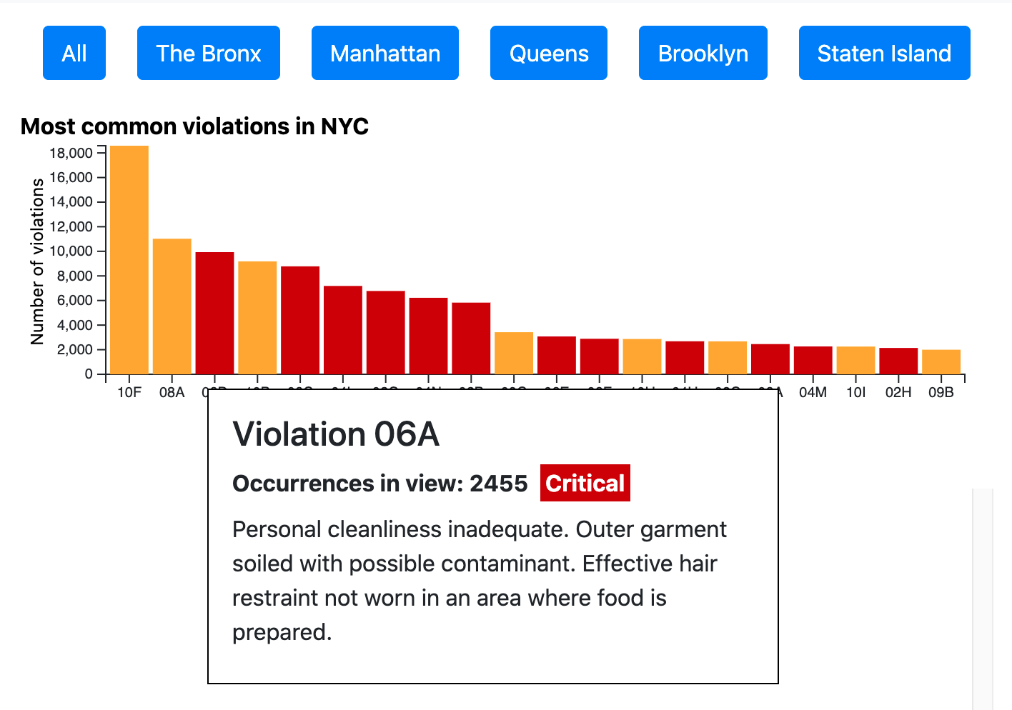
The biggest change we made was the deletion of the table. As noted above, our instructor didn't think it was the best way to visualize information/trends, and we agreed. In place of the table, we want to implement a bar chart of violation frequencies that responds to borough selections and map refocusing. The bar chart will show the top 20 violation codes in a given area, and these codes will be colored depending on their critical flag.
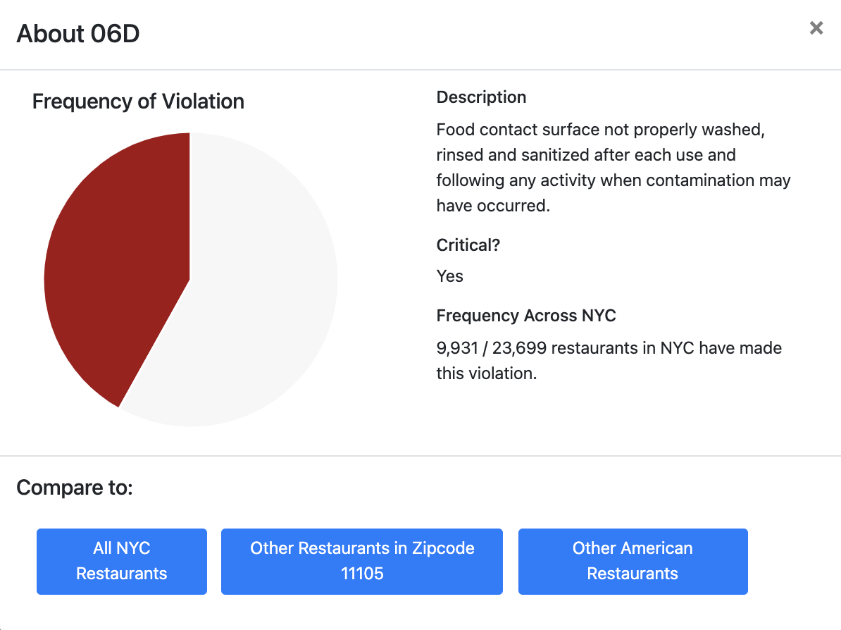
Another big change we want to make to the design is the addition of a violation visualization, which shows up when one of a restaurant's violations (in bottom right of the main webpage) is clicked. This visualization is a simple pie chart where users can see the frequency of a given violation in the context of all of NYC, the restaurant's zipcode, and the restaurant's cuisine type.
We also reimagined our map designs to have legends and tooltips/hover information. For the circle view, we want to add an outline to the circles to distinguish their critical status. For the heatmap view, we want to change the colors so that it's more clear what they mean. We also plan to implement functionality that allows users to click on a zipcode and immediately zoom into the circle view.
We are confident that these changes address the concerns/feedback from our users as noted above.
Justification
We believe that our visualization design is a successful exploration of NYC health inspection data because it encodes information at a macro level - of big trends across the city, its boroughs, and different zipcodes with our heatmap and bar chart - and a micro level - of small trends within each zipcode and neighborhood with our circle map, modified bar chart, and individual restaurant view. Our addition of the bar chart allowed us to target the frequency of violations in a way that's more suitable to identifying trends, and our addition of the restaurant violation pop-up and pie chart allows users to contextualize violations of each restaurant that they select among other restaurants in the same zipcode, of the same cuisine type, and across NYC. Though we ultimately didn't address widespread cuisine type trends in a formal way, we think that was for the best because during our exploratory data analysis, it appeared that certain cuisines had more violations simply because there were more restaurants of those cuisine types.
Implementation
Milestone 1
We foresaw that implementing the map would be the most challenging part of the assignment as it was unfamiliar to us. We thus decided to tackle its implementation first, starting with a heatmap for each zip code. As discussed above, there is too much data to load in all at once, so we had to segment the data by zip code. Individual restaurant data will be loaded in once the user has zoomed in enough.
Starting with a geojson dataset of each individual county in the five New York City boroughs, we calculated and assigned an average restaurant grade for the area. A score of A is a 1, B a 2, and C a 3, so zip codes with a higher average score will have more violations per restaurant on average.
We used leaflet.js as our mapping library, and adapted code from the leaflet docs, Mike Bostock, and the observable forum to initialize and project the geojson.
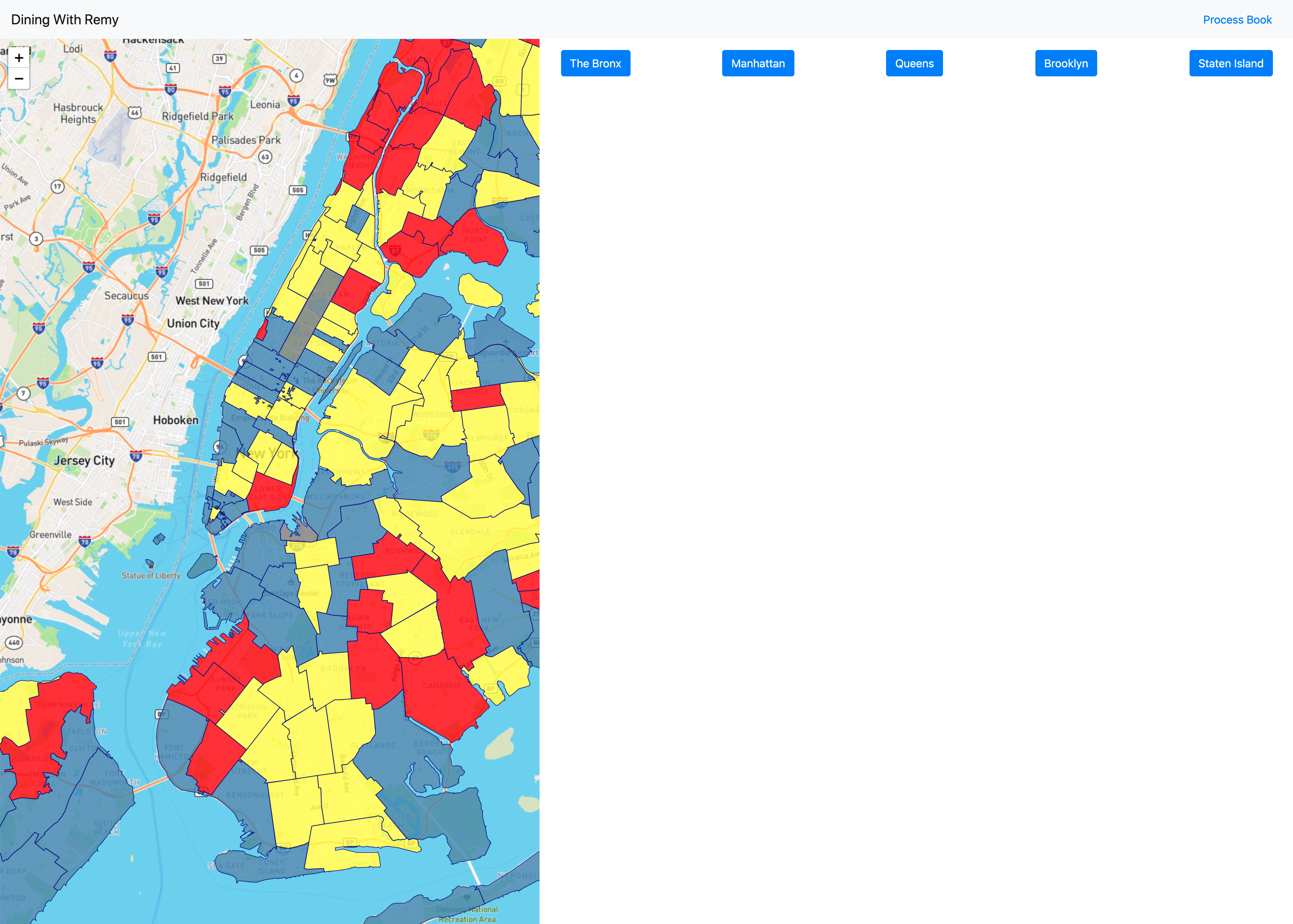
At left is the initial page load. Blue represents zip codes with the lowest (best) scores, with yellow and red being incrementally higher (worse). Currently, users can zoom and pan around the map to explore the different zip codes. For the next milestone, we will implement the loading of individual zip code data when a user has zoomed in sufficiently.
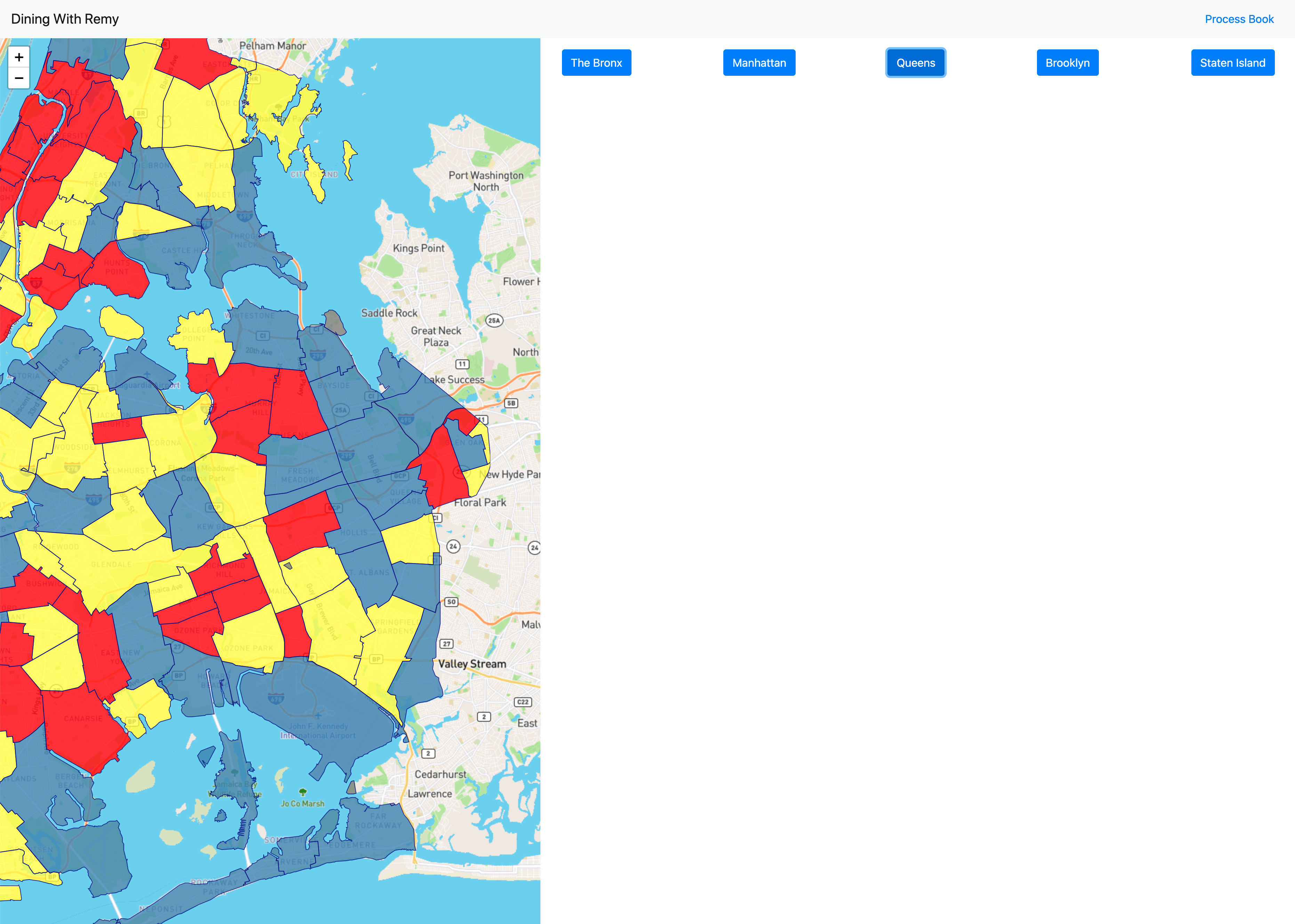
We also implemented positioning buttons, shown in the upper right corner. This screenshot shows the map after a user clicks on "Queens," moving and zooming the map to that borough on the map. This method is passed in coordinates and a zoom level, so it can be extended to focus on restaurants, zip codes, or any other features in the future.
Milestone 2
Implementing more of the map was again our first priority. We broke up the data by zip code, so once you have zoomed in a certain amount, the data for the areas in view will load. This data includes information about each restaurant like its name, address, and cuisine type in addition to data about its health grade and inspection results.
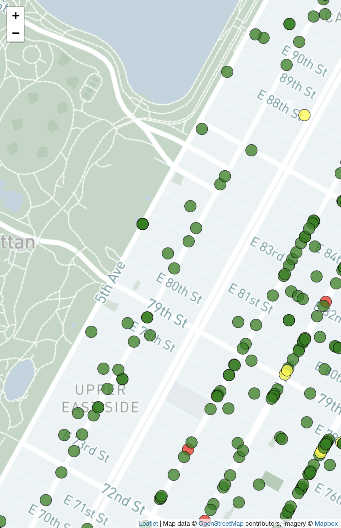
Plotting circles and new map background
At left shows the circles plotted on the map. These locations are pulled from the latitude and longitude present in the dataset, and they are projected onto the leaflet map using d3. We color coded each restaurant to reflect its score—green for "A," yellow for "B," and red for "C."
We also received feedback from Milestone 1 that there was distracting and extraneous information on the base map. Instead of using the default MapBox template, we switched to a custom template with more limited information. This new, reduced template generally only displays street names and neighborhood names instead of including points of interest, restaurants, and other items.
The circles themselves can be interacted with. They are enlarged on hover/click, and these interactions trigger reactions from the table and specific restaurant info view as decribed below.
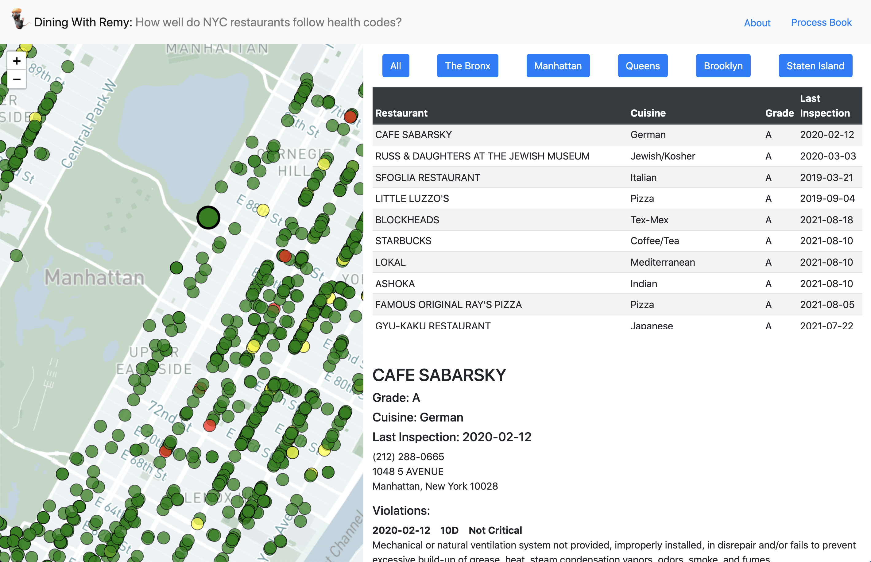
Table view and individual restaurant information
Our next task was to implement the more informational half of the screen. This included adding two new views, created in table.js and restaurantInfo.js. The table view, once a user has zoomed in enough to show individual data, displays a list-based overview of all of the restaurants in view. This table serves two purposes—to show general information about a restaurant and to serve as a navigational element. As users hover on different restaurants on the map, those restaurants are brought up to the first row of the table. A user can click on an element in the table to make that restaurant come into view and be enlarged on the map, and it will also display more specific information below te table as described below.
More specific information about a restaurant is displayed in the bottom right corner of the screen. This view is created in restaurantInfo.js. All information available about a restaurant, other than latitude and longitude used for positioning, is visible in this view. This includes the restaurant name, its grade, the date of last inspection, and a list of past inspection violations. A restaurant can be focused either by clicking its circle on the map or by selecting it in the table view. If a restaurant is selected from the map, it swaps places in the table to become the first element.
Map colors and information on launch
We also changed the colors of the zip code on the map to better reflect the grade information. Instead of blue being associated with "A," we switched it to green. We also created a modal when the page loads to explain the purpose of the visualization and how to use it.
Milestone 2 Resubmission
Based on feedback from submission two in addition to feedback from user studies, we implemented the following changes.
Updated zip code map
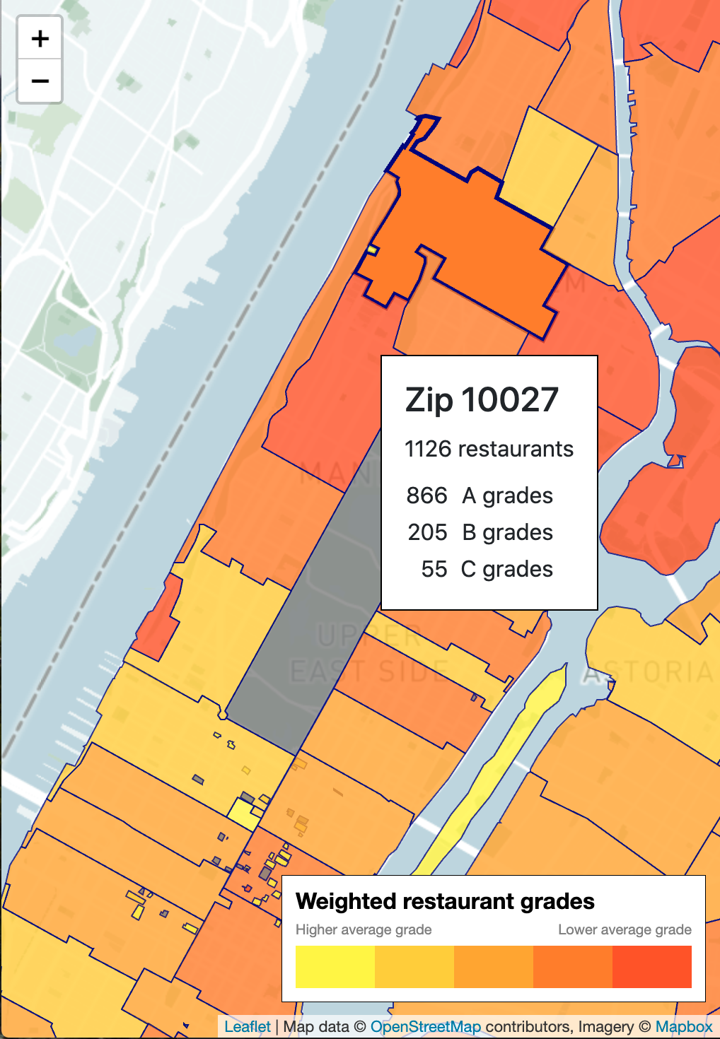
Clearer color scheme
One of our first changes was to update the color scheme for each zip code. The green, yellow, and red colors were too similar (the same, in fact) as the green, yellow, and red used to denote restaurant grades when zoomed in. This created an association that the yellow or red zones had predominantly B or C grades, respectively, but this is not the case. Across the board, most restaurants have grades of A, but some zip codes have more clusters of lower grades. We chose to divide scores into 5 groups of equal size of the orange to yellow scale. While this doesn't show a true distribution and comparison of scores, it more clearly shows where there are zones with restaurants restaurants of lower grades.
We also added a legend to clarify what these colors mean.
Tooltips and zoom
We also implemented a tooltip, as shown in the picture to the left, that displays general information about the area including the total number of restaurants and a breakdown of restaurant grades. Additionally, when a user clicks on a zip code, the map will zoom in to that specific area. This makes navigation easier, as repeatedly zooming can be cumbersome.
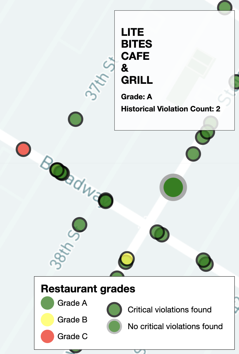
Updated circle map
Instead of the responsive table, restaurant information is now displayed in the top right corner of the map when users hover over the map circles. (This includes name, grade, and their total violation count for the available inspections in the dataset.)
To differentiate restaurants more (since there are a lot of green Grade A restaurants), we added distinct outlines to help users know if the restaurant had critical violations (black outline) or not (gray outline).
We also added a legend to clarify what the colors and outlines mean.
Violation frequency chart
We replaced the table view from the previous submission with a bar chart showing the frequency of different violations. This gives a clearer picture of trends within an area. When the page loads, the chart displays violation frequency across all of New York. When the blue buttons above are clicked, the map refocuses on that borough, and the data updates to that borough as well. Once a user has zoomed in to the restaurant level, the chart also updates to show frequencies of violations in that zip code and close surrounding zip codes.
We also implemented a tooltip that shows more information about a violation. The code itself is not helpful on its own, so when a user hovers over a bar, more information about the violation is displayed.
Restaurant violation information
Once a user clicks on a restaurant, we added color-coding to the listed violations so that it's easier to distinguish critical (red) vs. non-critical (orange) violations. (Same color-coding as the bar chart.) We also added a "More Info" button to each violation, which displays a pop-up (pictured left) when clicked.
The pop-up once again shows the violation code's description and critical flag. However, it also contextualizes how common the violation is within the zipcode that the current restaurant is in, across all restaurants in the city with the same cuisine type as the current restaurant, and across all of NYC. Users can click on the different buttons at the bottom to switch between these levels, and the text/pie chart respond accordingly. The pie chart will also display percentages when it is hovered on.
Evaluation
We learned several things about our data. Most notably, we noticed in what way restaurants with lower or higher scores are clustered and how violations that seem serious don't always result in a poor grade.
Clusters of data
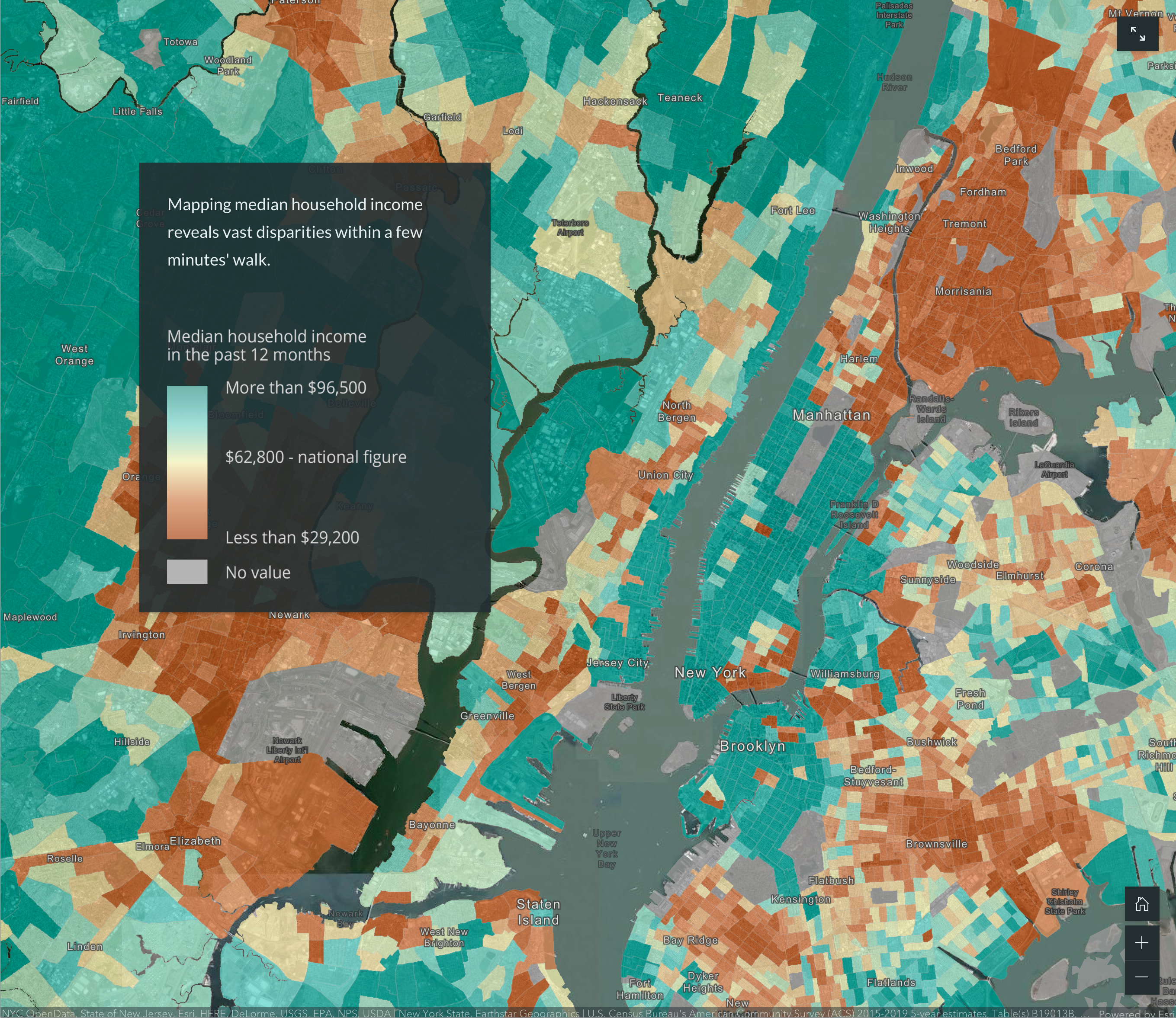
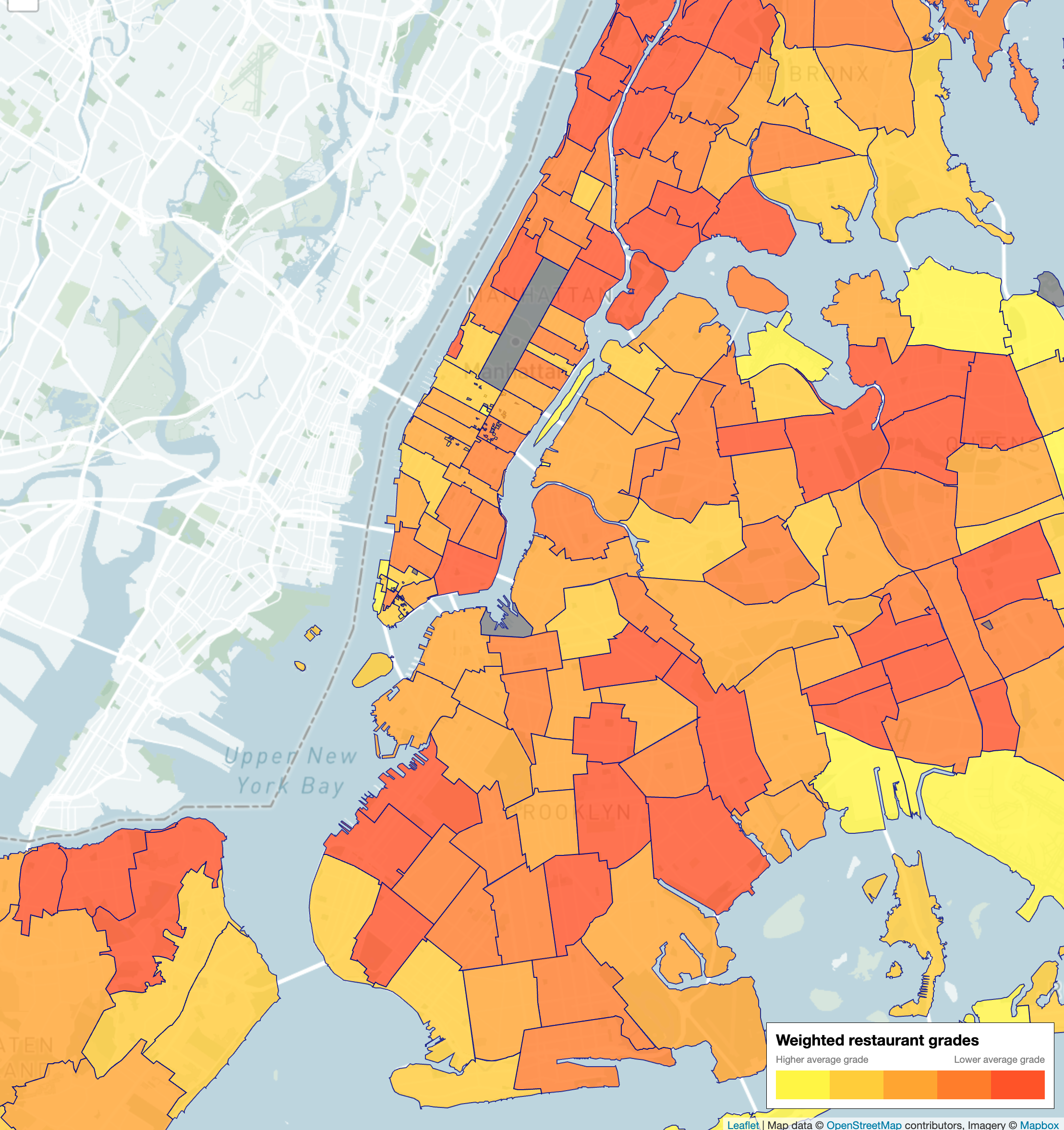
One of the most interesting discoveries was that restaurant grades are clustered on the macro/neightboorhood level, but not necessarily on the street level. For instance, zip codes in the Bronx tend to have more grades of B and C compared to that of lower Manhattan. On our map, one can see how the Bronx has zones colored more orange, and lower Manhattan has zones colored more yellow.
Above, the map on the left shows income inequality throughout New York City. Our map on the right, showing health code data, is colored similarly, implying there might be some relationship between neighborhood wealth and cleanliness of restaurants.
We had initially hypothesized that restaurants on the street level would share similar scores or violations. For example, we thought several restaurants next to one another would all have rats or not have rats at all. This, however, turned out not to be the case. This could imply that while there is potentially a more macro level answer to health data, preventing violations still lies with the individual restaurant.
Critical violations
The most concerning discovery was with how scores are calculated. A restaurant can have critical violations, such as evidence of rats or roaches, and still have a grade of A. This is the most important takeaway from our data. Restaurant grades must be considered in tandem with the actual violations that contributed to that grade in order to fully understand the safety of a restaurant. Yelp or Google Reviews can provide one perspective, but those don’t give you the full picture of how safe it is to eat there.
Reflection
Overall, we think our visualization works well to answer the main questions we asked. To further improve our design, we think adding the ability to search for a restaurant by name would be helpful for someone who wants to find information quickly about a specific place. Similarly, adding filters on the restaurant level such as by cuisine or by violation could also help someone have more control over the navigation.