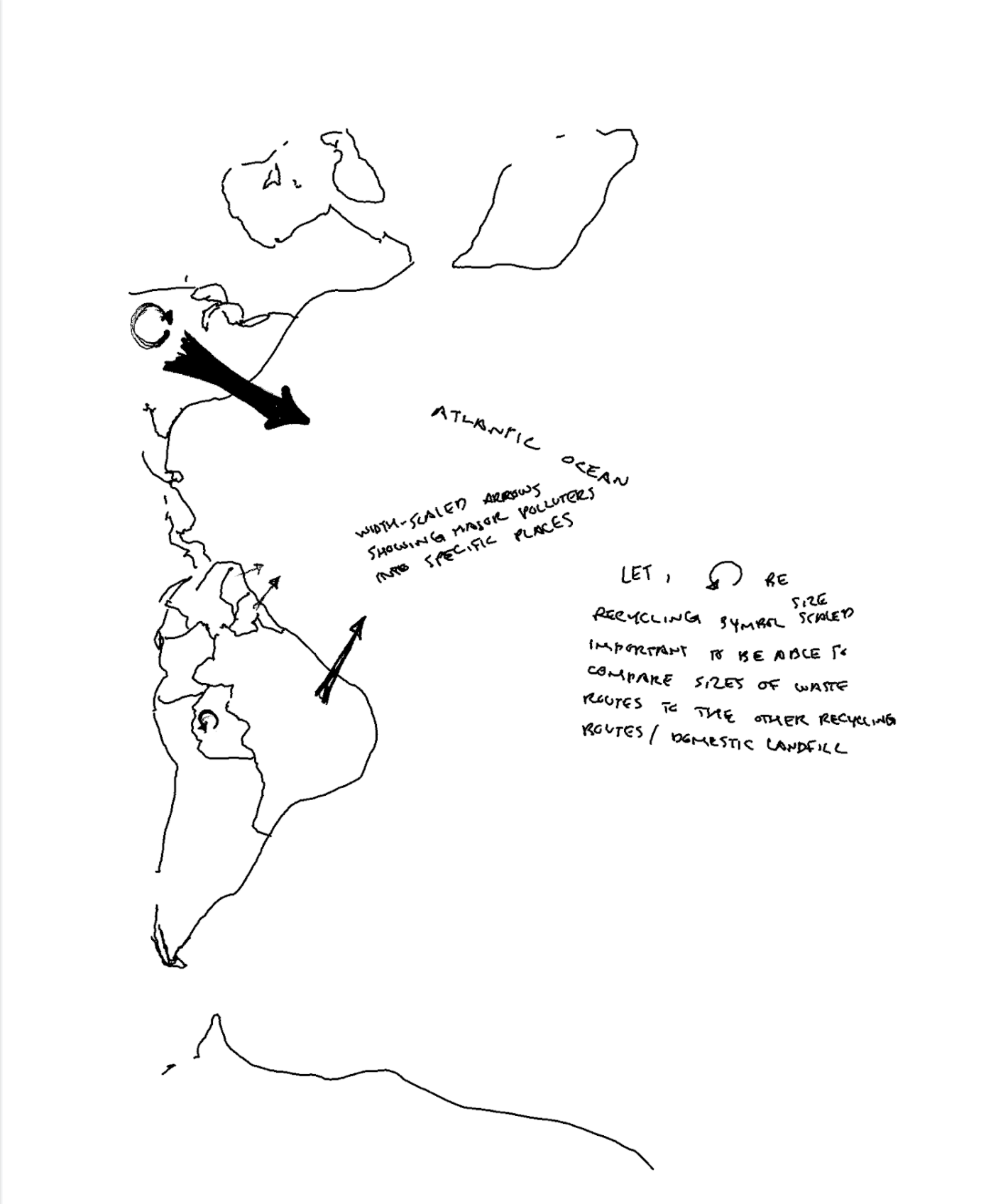
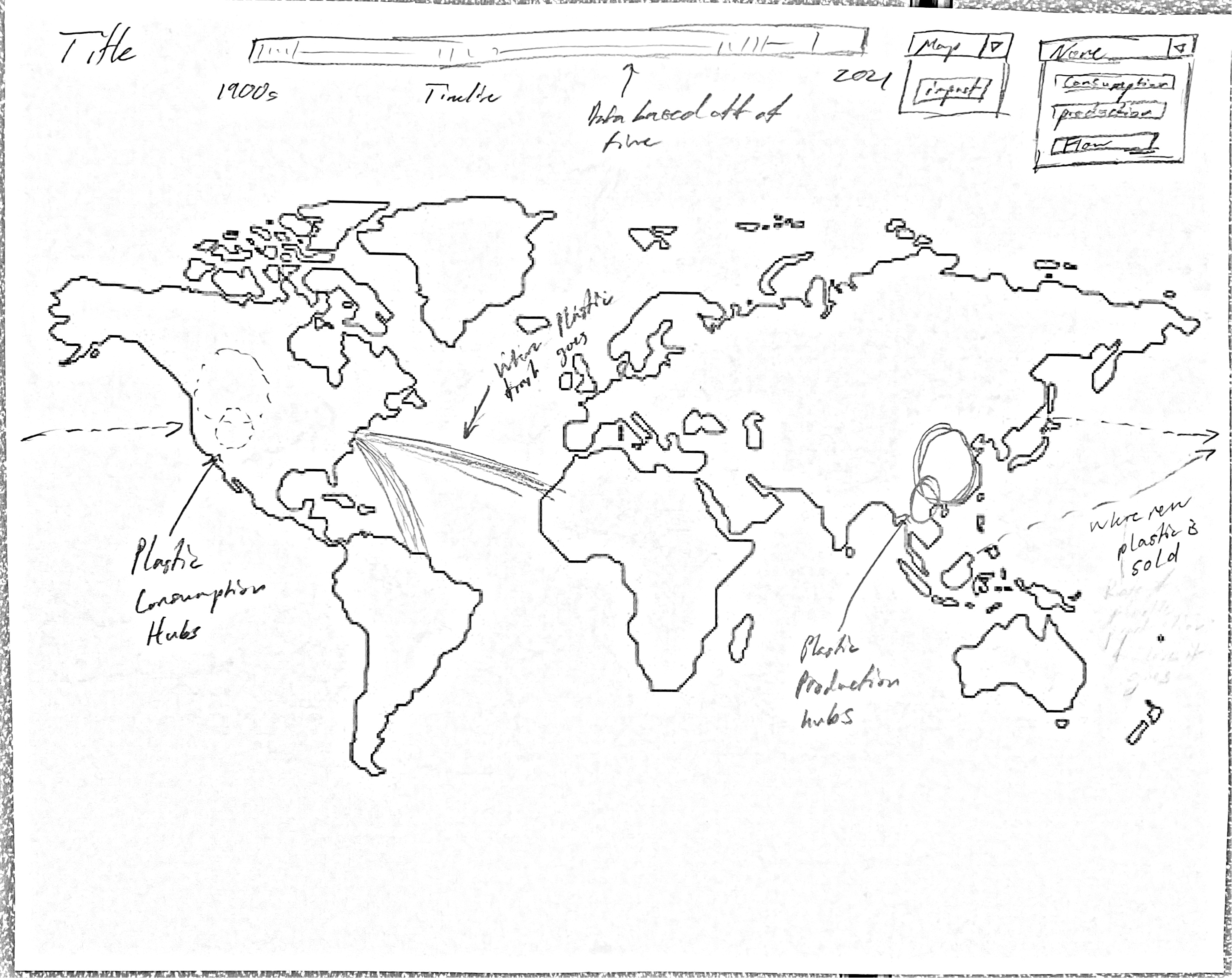
From the beginning, we seeked to bring awareness to the variety of impacts caused by plastic pollution and trace down the main polluters. We proposed our geospatial visualization to look as follows:
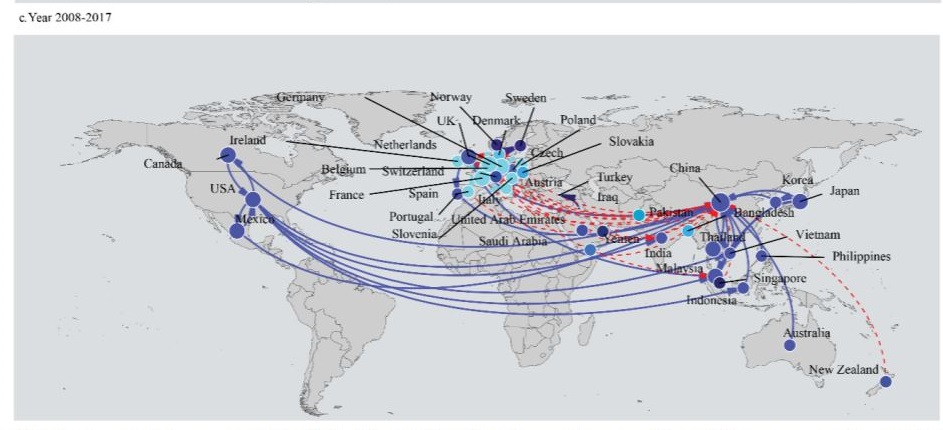
Upon beginning to source our datasets, we came across research projects such as Structure of the Global Plastic Waste Trade Network and the Impact of China's Import Ban which presented similar data visualizations to our proposal.
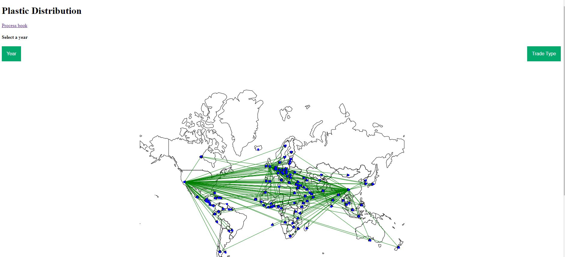
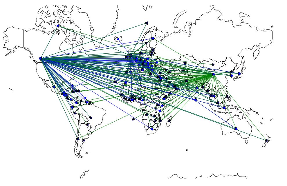
We found that the extensive international plastic trade network were perfectly mapped by the datasets provided by UN Comtrade, which compiles country reported trade information.
Indicating the direction of trades between countries with arrows as well as colors allows the audience to easier read the major contributors for importing separate from exporting. This is indicated by blue and green respectively in our visualization (Milestone 1).
For the second checkup, we created filtering mechanisms to create interactivity in the the geospatial data. Filtering by year, the user is able to see the changes over time. Also, filtering on imports vs exports highlights the main providers/consumers of plastic. For example the visualization filtered to include only exports is shown below.