CSE457 - Final Project Proposal
Back To VisualizationScroll to the bottom for updates
Basic Info
Project title: California Fires and Resulting Burned Areas
Sophia Rosset | srosset@wustl.edu | 464319
Katie Steinmeyer | ksteinmeyer@wustl.edu | 464398
Link to project repo:
https://github.com/srosset13/cse457finalprojectBackground and Motivation
We chose to focus on California forest fires and the resulting burned areas because one of us took a class on natural disasters last semester, and became interested in the ways these disasters spread and affect surrounding land. Particularly in the state of California, wildfires are extremely prominent. We wanted to use this project as an opportunity to display how these fires have affected land in the state throughout the past century. We both also made it a priority to incorporate a map into our final visualization. We enjoy the way geospatial data conveys information into an absorbable format that might otherwise be hard to understand. Additionally, natural disaster data translates particularly well to a map-style visualization.
Project Objectives
Through our visualization we would like to show the progression of fires in California over time. There are two main aspects of the fires we want to show: the changing wildfires over time and the relationship between prescribed burns and wildfires. Showing how the fires have changed both in size, location, and intensity would educate viewers on the severity of the California fire problem. Additionally we would like to show the causes of the fires so that could be linked to the fire (the causes are included in our dataset). Lastly if possible we would like to show the relationship between prescribed burns (fires set on purpose) and wildfires that end up out of control. Do prescribed burns reduce wildfires or do they run out of control and cause wildfires?
Data
California fire data sets:
https://gis.data.ca.gov/datasets/CALFIRE-Forestry::california-fire-perimeters-all/about https://gis.data.ca.gov/datasets/CALFIRE-Forestry::prescribed-burns/aboutBoth datasets are available in geojson formats.
Data Processing
We will need an enum for the fire causes from the fire-perimeters dataset to map the causes onto in order to display them. We will need to create a geopath.
Visualization Design
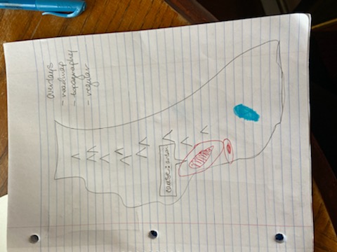
Idea #1: Map will show the wildfires and prescribed fires. We will use heat mapping to display each fire; red will correspond to wildfires, blue will correspond to prescribed fires. We chose red and blue so that a purple color can be shown to represent the prescribed fires that transition into wildfires, as is often the case. This visualization will also include the topographic information by overlaying the topography of the state of California onto the map. This may be useful in identifying the correlation between higher and lower elevations and mountainous areas with fires in California. We chose to include the heatmap because it shows the prevalence of wild and prescribed fires in a digestible format. It will also make the transition from prescribed to wildfires easier if we use a blue-to-red color scale.
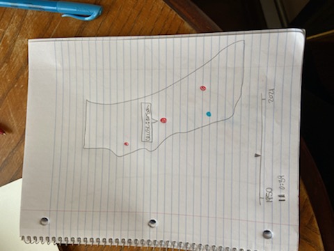
Idea #2: Map will show circles based on the geographical location of the fires (both wild and prescribed). Larger circles will represent fires with a greater magnitude. There are several possible causes for wildfires-- upon hovering over a circle, a tooltip will appear, displaying the cause of the wildfire. This design will also include a selection bar in which the user can filter which wildfires are displayed on the map based on their causes. There will be a default “all” option here so that all wildfires are displayed initially. We chose to include the hovering and selection bar features for causes of fires because it is important to understand which fires are triggered by which causes. Users will be able to see which causes are the most prevalent in wildfire spread.
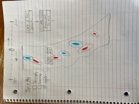
Idea #3: Map will show the wildfires and prescribed fires using the heatmap and color system described above (red for wildfires, blue for prescribed fires, purple for prescribed fires that become wild). This visualization will also include a timeline in which the viewer can drag a selector back and forth to see how the fires have moved throughout the state. Based on our data, the timeline will go from 1915 to 2021. We chose to include the timeline and selector becaue it allows users to visualize how fires have moved thoughout the state of California throughout time as opposed to seeing them all at once in a vide-like visualization.
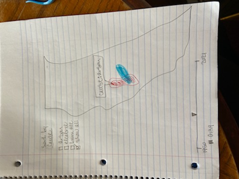
Final Design: We have decided our final design will use a heat map if possible to represent the fires so that we can effectively transition from prescribed burns to wildfires if needed. We will use red to illustrate wildfires and blue to show prescribed burns. Ideally in cases where prescribed burns turn into wildfires we will show a transition from blue to red. We will play a video of the fires showing how they have changed over time (starting with the beginning of our dataset and ending at present day). We will also allow users to revisit moments in time by manually moving the slider. We will have a tooltip that allows users to hover over a wildfire center to see the cause of the fire. Additionally, users can sort by the types of wildfires they want to see by checking boxes representing each cause of fires or only clicking see all. Lastly, we will have different types of maps a user can view in order to see other relationships between fires and city centers (shown using a roadmap projection) or between fires and topography (shown using a topographic projection). We chose this as our final design because it extracts the most meaning from all three of the previous designs by allowing the user to see the data in different ways through various mediums and formats.
Some of the features described above are reaches (the final design will likely not be as robust as the description). Our final design will include the must-have features below and ideally a few optional features.
Must-have Features
Way to show wildfires Way to show prescribed burns Tooltip for hovering over wildfires to see the cause and additional information about the fire Way to show change over time (either video timeline or allowing users to select a certain year)
Optional Features
Transition from prescribed fires to wildfires Sorting by wildfire cause Different types of map projections (roadmaps and topographic maps) Additional method of viewing time (either video or selecting year depending on how we decide to do our primary time display)
Project Schedule
Proposal: 11/1
Milestone 1: 11/8
- Display wildfires on map
- Show tooltip
- Show timeline and play data over time
Milestone 2: 11/22
- Display prescribed burns
- Cause sorting for wildfires
- Transition from burns to wildfires
Final project: 12/10
- User tested and adjusted
- Bug free
- Transition from burns to wildfires
Update 1
For Milestone 1 we:
- Processed the data
- Drew the map of California
- Drew fires on map
- Drew the slider which allowed users to change the year
Processing the Wildfires Data
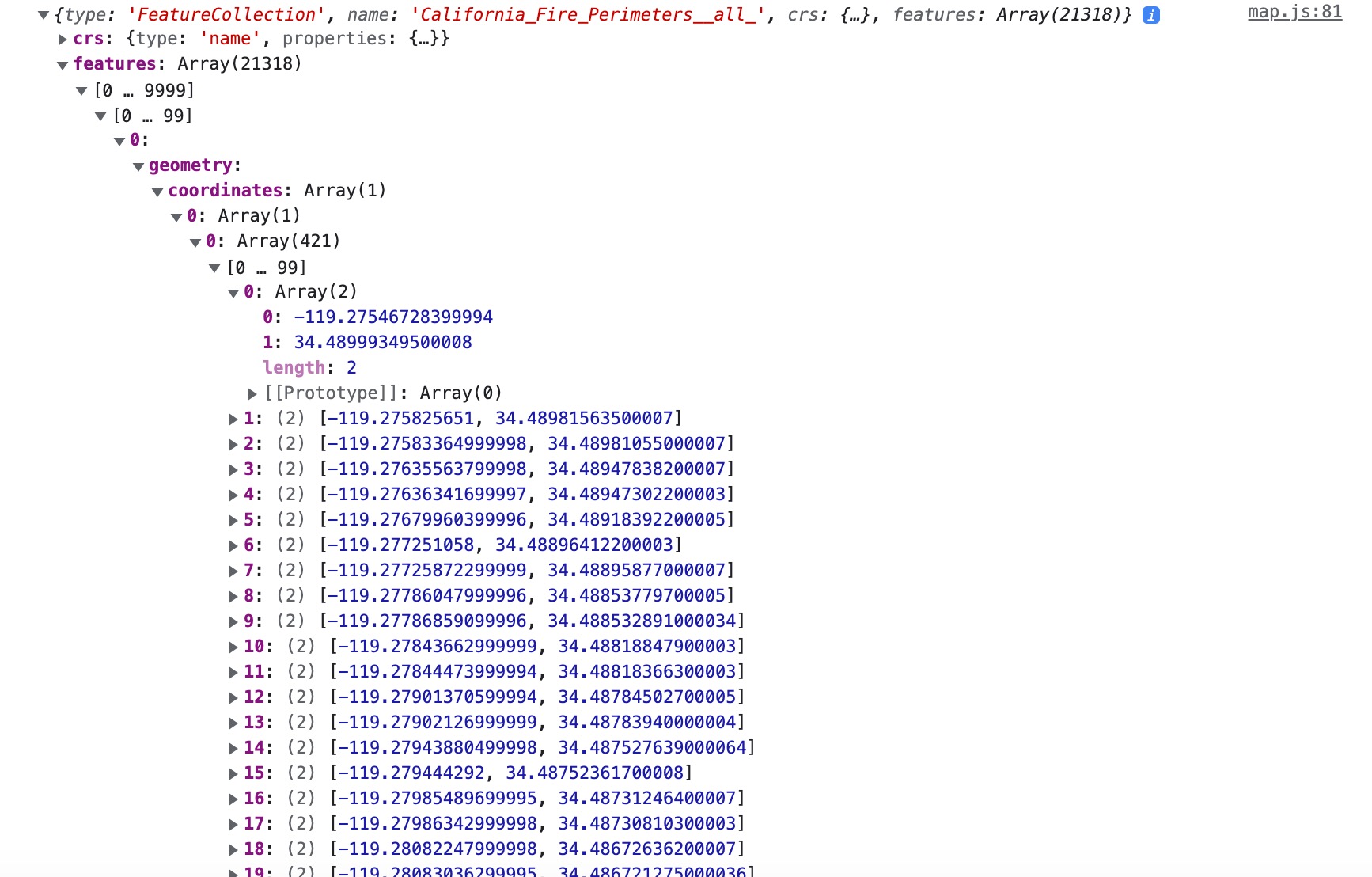
In order to process the data Sophia and I first iterated through the data and printed it out. Initially we used a past studio and the code we found to draw the California counties in order to draw the data. We ran into several roadblocks because of how large and complex our data set was. We had to research and learn how to deal with geojson differently than the topojson we were used to working with. Additionally the process of redrawing the data for each year was very slow and we have trouble deleting the old fires off the page efficiently. Below is a screenshot of the data we were working with.
Pictured below is a screenshot of the full wildfires dataset
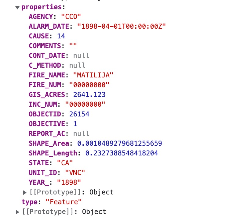
Pictured below is the properties list of one fire from the wildfires dataset
Update 2
- Filtered and drew the prescribed burns data in addition to regular fires
- Added filter by cause
- Added a legend
- Improved the speed of the site
- Added styling
- Added a description on the top of the page to contextualize all of our work
Speeding up the Loading Pace
To speed up the loading of the data we organized the data for the fires we started by collecting all the fires of the selected year by starting either at the beginning or the end of our sorted (by year) fires list based on whether the selected year was below the midpoint or above. So if I was a user and wanted to look at 2017 our code would start searching as the end of our array and stop when we hit 2016 that was the later years would load faster and would not have to iterated through the earlier years in our dataset. Additionally our fires were sliced by cause. So if you only select on cause only the array of all fires by that cause will be filtered by year so that the dataset that needs to be parsed is much smaller. If a user selects all the causes then the full dataset will be filtered by year. This significantly improved the runtime of the site when moving between years and causes for the fires. The initial load time of the site is still long because the fires dataset is not organized in a discernable way that allows us to load a portion of the data at once (it does not appear to be sorted by location, time, or cause before we load it) so the whole dataset must be initially loaded and sorted before the user can interact with it.
Update 3
- Added tooltip to show additional specific data about individal fires and prescribed burns when hovering over a burn or fire
- Added check and uncheck buttons for cause filtering
- Adjusts svg styling to better fit the map on the page
- Added addtional labels and links for further learning about fires
- Added the total count of fires and burns per year
- Alphabetized the list of causes
- Added link to process book on main page