CSE 457 Final Project Proposal
Back to Visualization
Basic Information
Project title: Visualizing Airplane Crashes Over Time
Collaborators
- Alex Appel (464919) (aappel@wustl.edu)
- Ryan Larm (465954) (l.ryan@wustl.edu)
- Annie Zhao (455316) (annie.zhao@wustl.edu)
Link to final project repo
Link to screencast demo video
Background and Motivation
We discussed a few different ideas for visualization topics, including weather, covid, and mental health. However, with weather and mental health, it was challenging to find data sets adequate for visualization that were open and free for download, as many were stuck behind paywalls or weren’t quite the type of data that would make for a good visualization. As for the covid data sets, we figured that it was an extremely overplayed idea that would require a significantly new or creative contribution in order to stand out from previous visualization projects.
After performing some more research on available datasets, we came across one that caught our interest – airplane crash data. This is a topic that is visualized less commonly than some of the others we were considering, and it has the potential for an interesting project as visualizations can be made in the shape of an airplane to tell a story. Additionally, we were just interested in the dataset out of our own personal curiosity.
Project Objectives
-
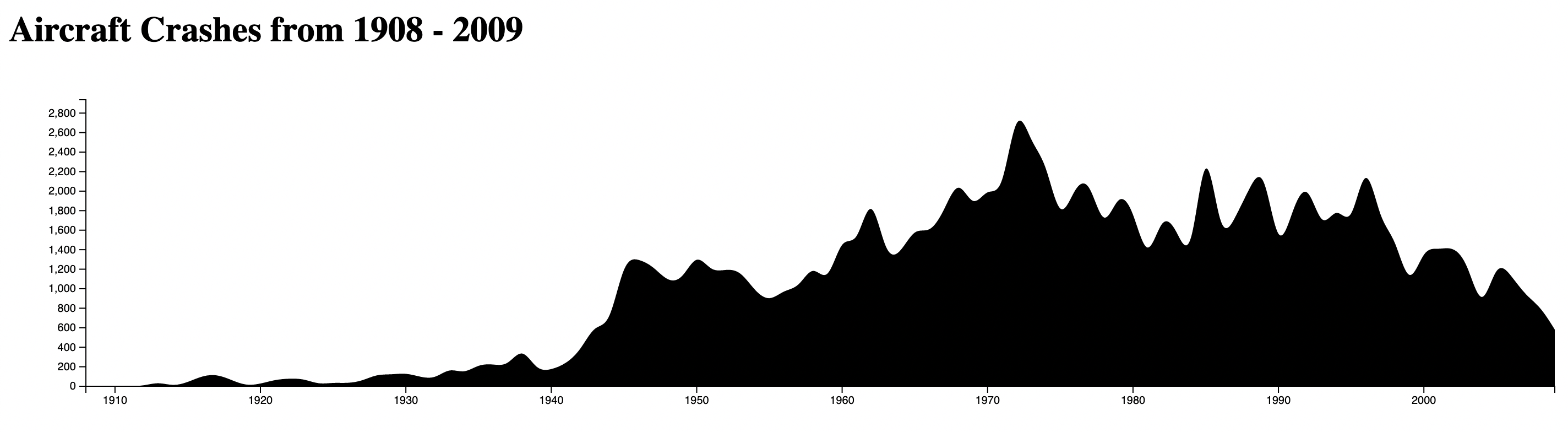
What is the trend in airplane safety over the past century of data? We would like to learn if there is a significant downward trend in crashes from the early years of commercial aviation to the modern day. We expect to see a decline in these accidents, but it will be interesting to see if the line is gradual, or if it is steeper up to a certain decade and gradual after that, etc. With this data, we will be able to learn more about the history of aviation safety, and propose future safety trends based on the past.
-
What kinds of aircraft are the most safe or the most dangerous? We would like to learn if there are types of aircrafts that stand out in the safety data, as this will be interesting data for the public to consider. Most people do not care much for the type of aircraft they are flying on, as all are considered basically equivalent in terms of safety in the modern day. With this visualization, people would be able to see if this is really the case, or perhaps realize how far aircraft safety has come, which would be of comfort.
-
Are there any flight paths/routes that stand out as being particularly dangerous or prone to crashes? We think it would be interesting to have a visualization of particular routes in the world that have caused, or still cause, a disproportionate amount of danger, compared to the rest of the world. We expect these flight paths to go through difficult terrain during take-off or landing, such as high elevation, alpine peaks, short runways, etc. This data would be useful for people to gain a better understanding of the risks involved in air travel around the world, and how it differs from location to location.
Due to the inconsistencies in the way that the dataset presented location data, we were not able to achieve this objective in the time allotted. We instead implemented an additional objective (answering whether there are clusters of times that crashes are more prone to occur) and additional visualizations to give greater context to the other listed objectives.
The Data
We’re collecting our data from an open source website (kaggle) where a dataset, "Airplane Crashes and Fatalities Since 1908 (Full history of airplane crashes throughout the world, from 1908-present)”, has been available for public use. Each plane crash entry contains the following potential characteristics: Date, Time, Location, Operator, Flight #, Route, Type, Registration, Construction or serial number, Total aboard, Fatalities, Total killed on ground, and Summary.
Link to data souce
Data Processing
For the plane crash entries in the dataset, the number of available characteristics varies depending on the year. For certain visualizations, we plan to extract and only use specific characteristics - we will filter the data as needed, as there is a substantial amount of entries available for each visualization in mind. The quantities we plan to derive include: Plan Type, Route, Total aboard, Fatalities, Date, Time, Location. We may feel inclined to utilize more if we decide it is useful for the visualizations.
The numerical data (Total aboard, Fatalities, Date) will not need to be processed, as we can use it as is (in integer form). The categorical data (of string type) will need to be processed in a way that strips unnecessary text in order to successfully group together similar information/entries. For example, two planes of the same type may have a slightly different description under the “Plane Type” characteristic - we hope to standardize the text to account for these insignificant variations. Similarly for the qualitative data (Location, Route), we hope to get rid of unnecessary descriptive terms (for ex. “near”, “above”, “off”, etc.) in order to standardize the data.
Must-Have Features
For our project to be considered a success, we expect it to at the very least provide an insight into historical numbers on crashes throughout time. This lies at the core of the dataset, and is the primary purpose of our project.
Additionally, we would like to visualize danger based on different aircraft models/types, and flight paths/routes.
One other feature that we believe is absolutely necessary is a brushing feature over the line chart that would change the timeline for the other charts. This can help to reduce the messiness of the other charts and isolate crashes within a particular time period.
Optional Features
An intersting optional feature that would help to shed more light on the reasoning behind the crashes and the overall timeline would be add some sort of link or summary of various world events. For instance labelling the creation of the Zeppelin or even linking to the wikipedia article, as those crashes are included in the data. We believe that it would help to shed some light on why these crashes occur and give some much needed context.
Project Schedule
-
Nov 1 - Nov 8: Finish first prototype for milestone 1
-
Nov 9 - Nov 15: Start working on milestone 2 prototype
-
Nov 16 - Nov 21: Finalize layout and classes for visualization
-
Nov 22 - Dec 13: Finish visualization
-
Dec 14 - Dec 20: Clean up visualization and any final details, finish turn in requirements (Process book, write-up, etc)
Milestone 1 Designs
First Brainstorm Idea
Second Brainstorm Idea
Third Brainstorm Idea
Fourth Brainstorm Idea
Final Design
Milestone 1 Update
We've made some good progress for milestone 1, by implementing the outline for our visualizations. We each worked on a visualization and then combined them into a single page.
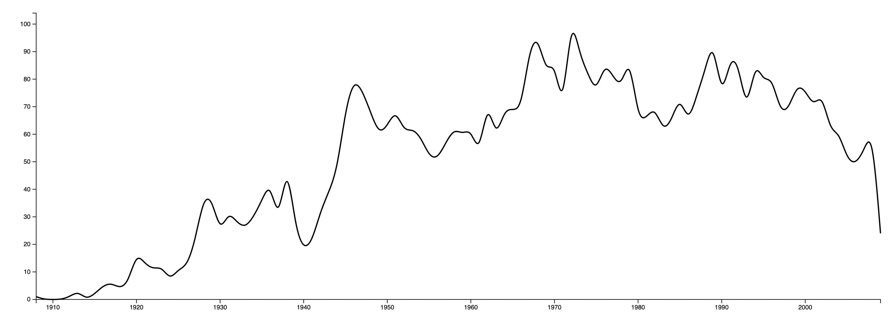
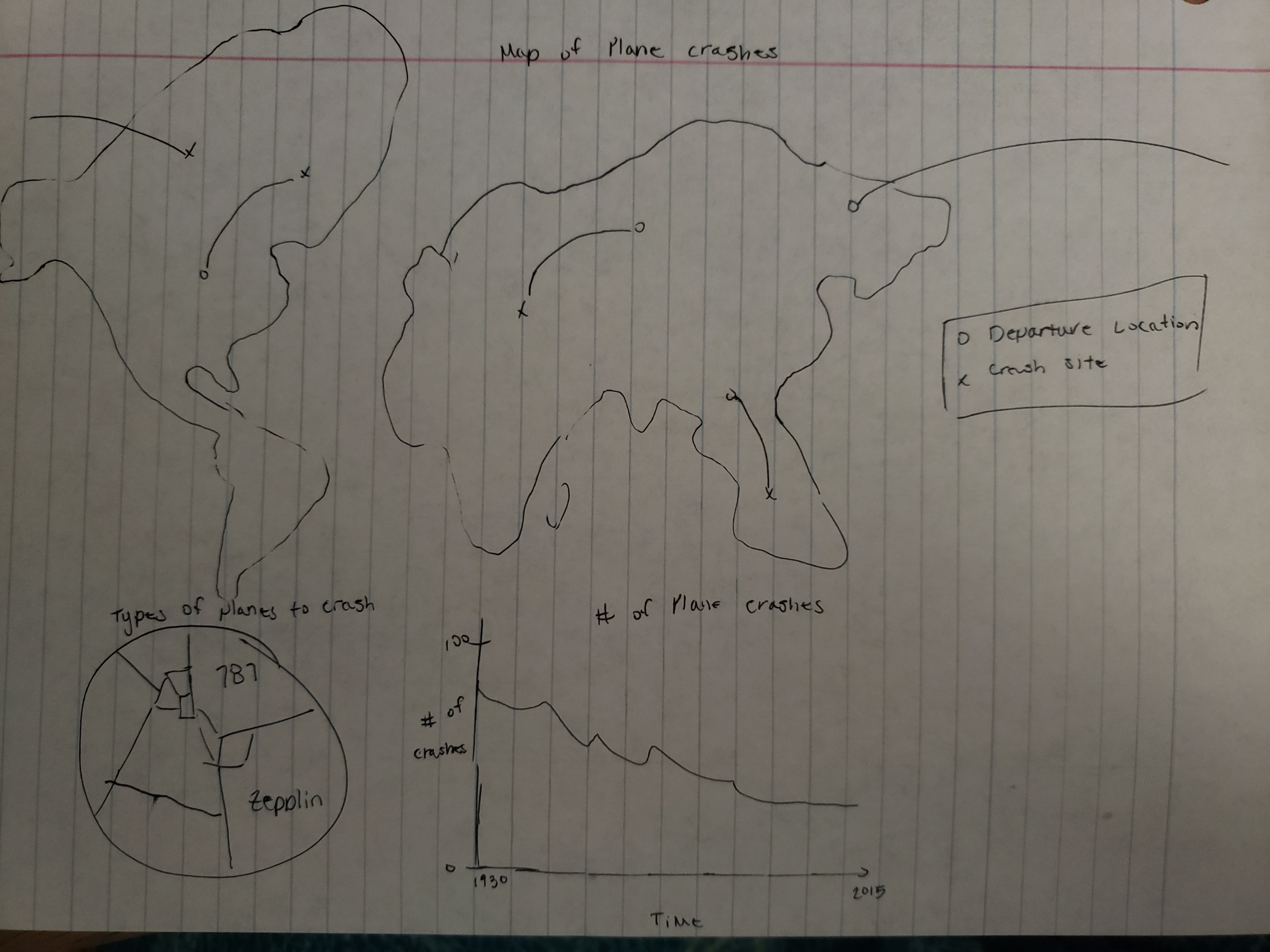
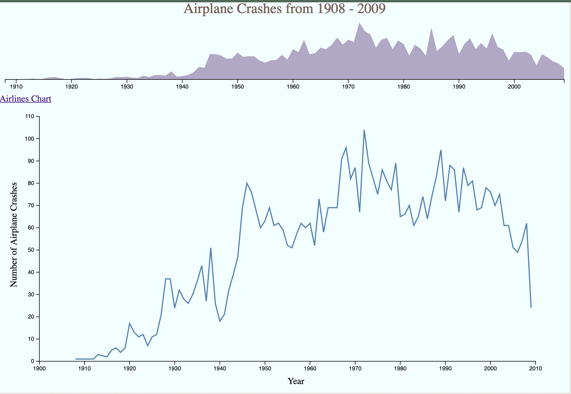
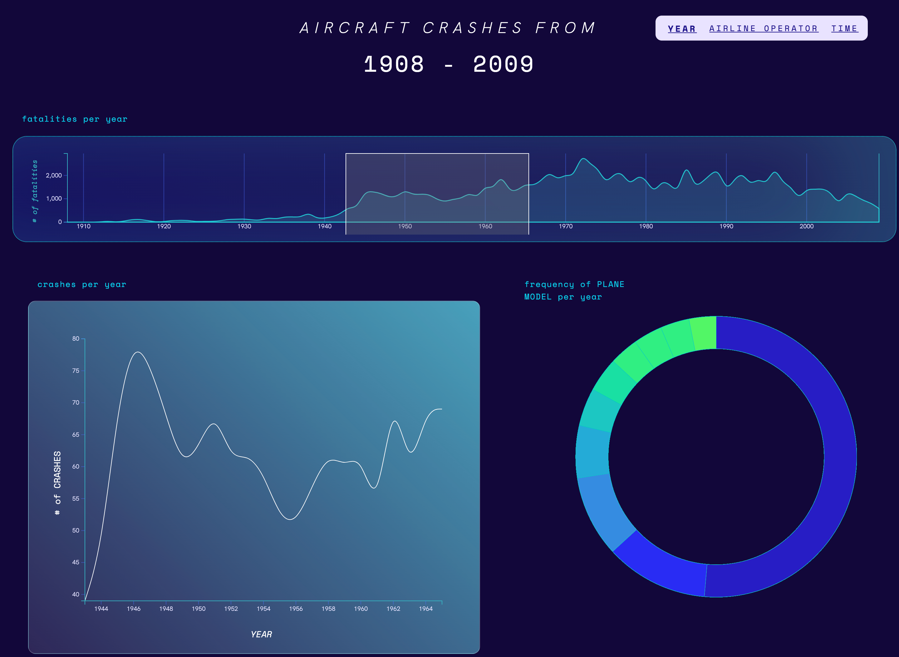
Currently, we have three visualizations, one of which was not the one we originally intended to implement which is discussed in more detail below. However, we have the core idea laid out. The goal is to implement a timeline similar to the one from Studio 6, where we can brush over the timeline and update the other visualizations in real time.
There are two line charts that currently look identical, however the shorter one is meant to be a timeline that has brushing, while the other is a line chart that is meant to reflect number of fatalities within the selected year, and naturally the other visualizations would reflect the updates time frame as well.
Project Schedule
We're still on track with our original schedule with the only set back being the Mercator projection. The layout is rough and each visualization is haphazardly placed, however which is something we plan on working on over the next week.
Since the Mercator projection didn't work out as expected, we will work on implementing a replacement visualization over the next week. We've implemented everything using the conventions used in class and so we should only need to fix the layout next week, so there will be plenty of time to add another visualization to supplement our current design.
Problems leading up to Milestone 1
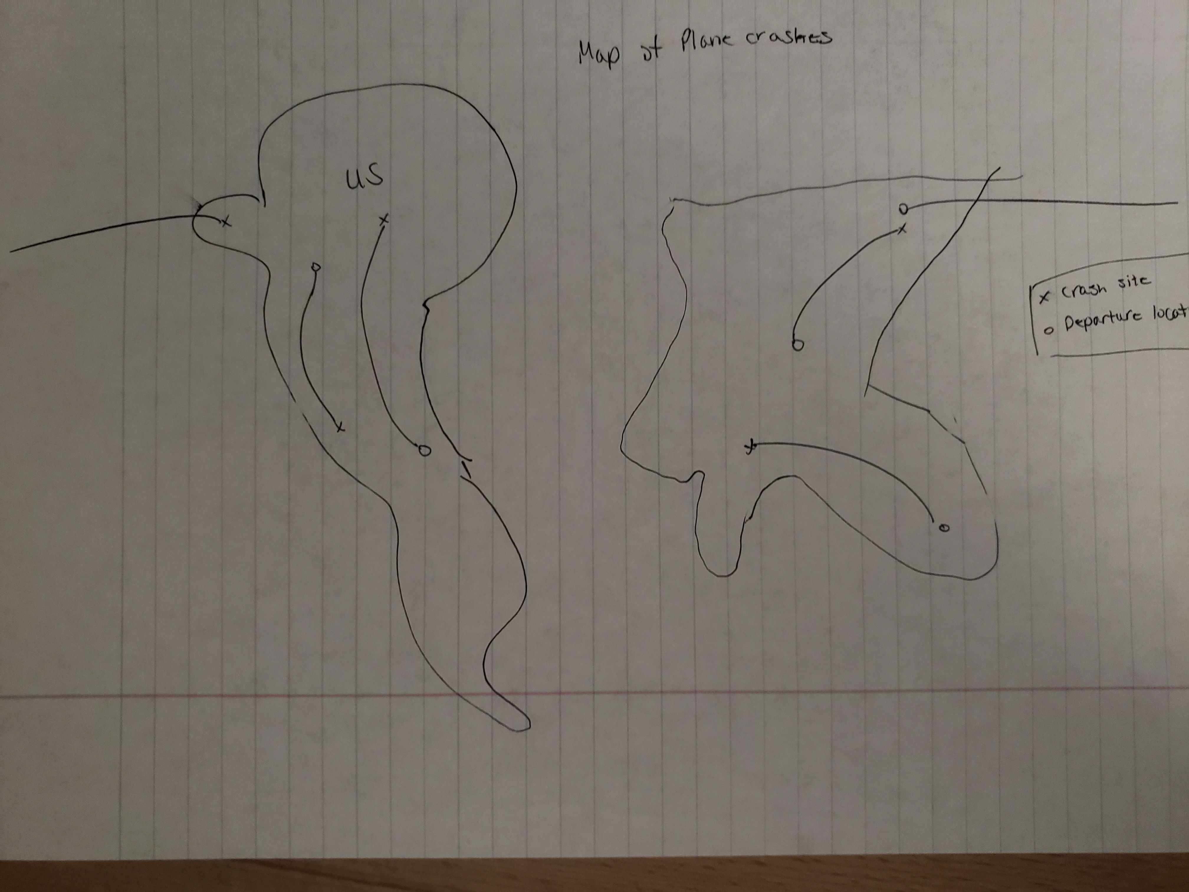
We had some issues leading up to milestone 1 that mainly revolved around our original idea to implement a map. We had yet to actually process the data so we had only take cursory glances at the data set. We initially thought to implement a Mercator Projection that had plane crashes overlayed with their flight paths and potential tooltip giving a summary and more detailed information.
After reviewing the data set and the available tools and frameworks available we figured that we would need to use GeoJSON in order to create the Mercator projection. This isn't an issue, however the data set we've chosen doesn't include any absolute coordinates, only relative or vague information. In order to turn this into proper longitude and latitudes for the projection overlay, we would need to process the location with some NLP libraries to remove the unnecessary descriptors from the locations, then use a mapping API to get coordinates from the given location.
We discussed together and figured that the amount of work in order to implement the Mercator project could be better spent on implementing other visualizations and then fine tuning their appearances. There were some other logistical problems that would also make it harder like spelliing errors. It's a simple issue, but depending on the frequency, then it could be problematic and required manually fixing the data for the mapping API to properly process.
The other idea we've considered is changing the information encoded by our map to something more manageable. Alex suggested to still use a Mercator projection, but as a heat map showing which countries have the most crashes. This would be easier and could be done with a csv/json file containing country names and country codes that we could use to map to the Mercator Projection.
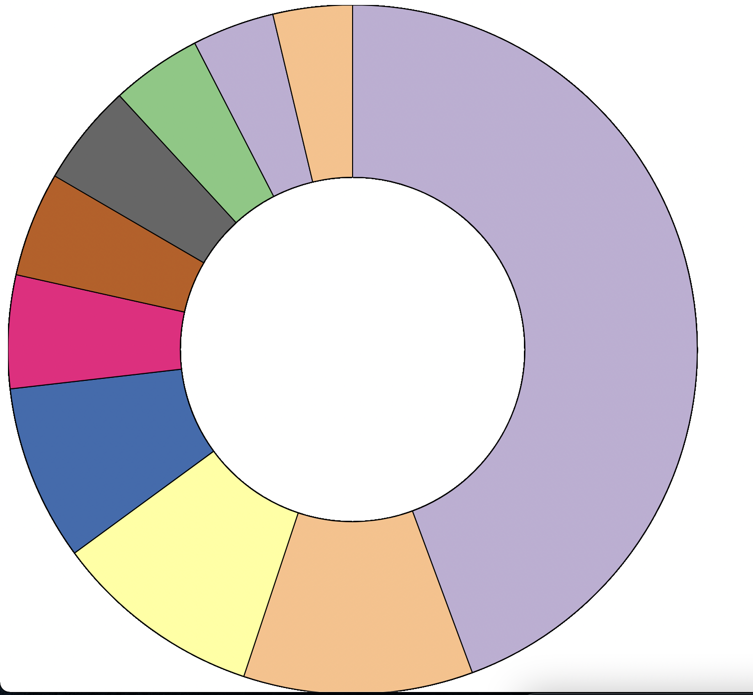
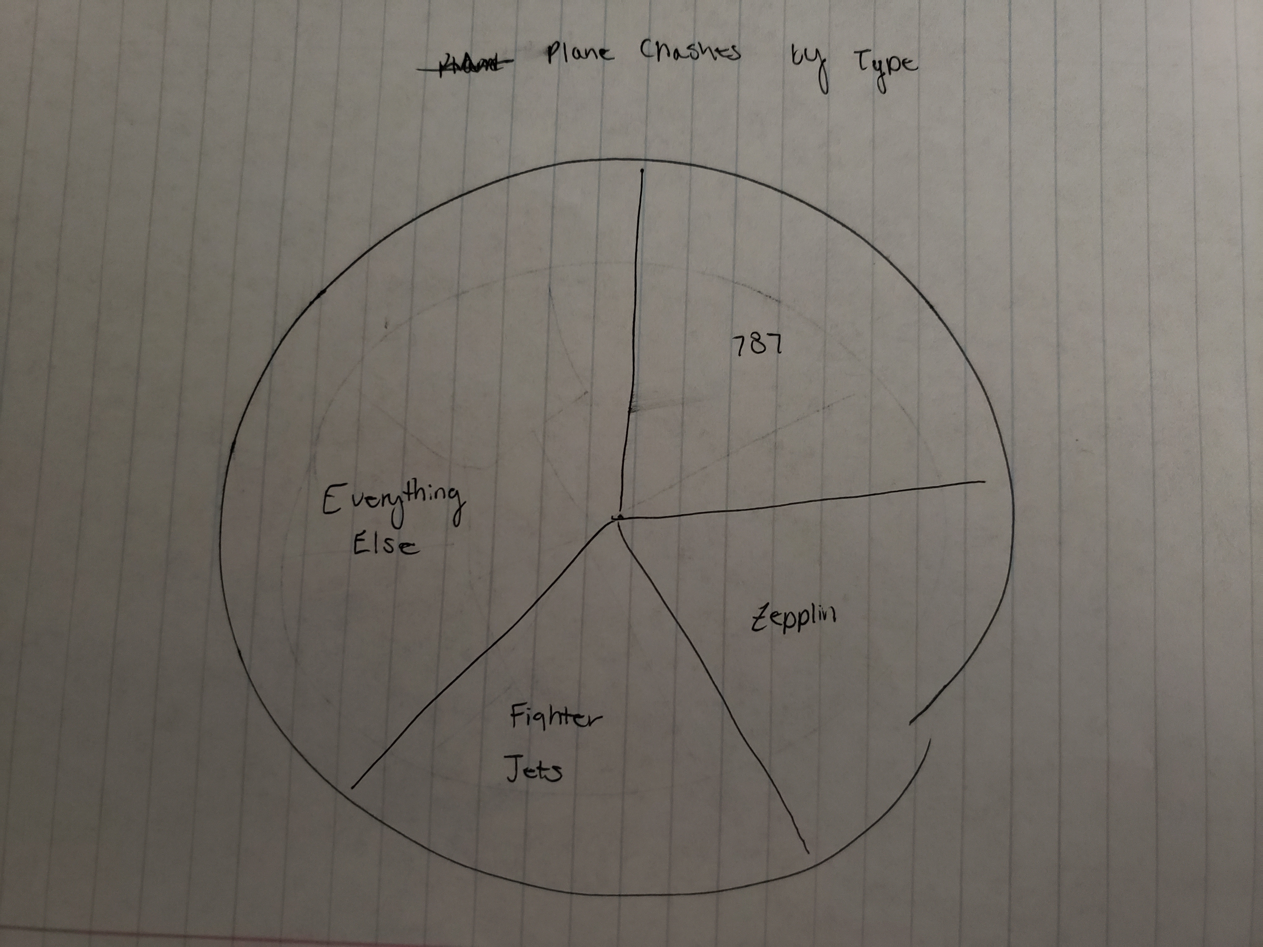
Also, we had problems with different version of D3, one of the charts used d3 version 4, while the others use version 6. The code is there for a pie chart, but there are some version issues that need to be fixed. The pi chart can be shown by swapping the orderings of the D3 scripts declarations in index.html.
Milestone 2 Update
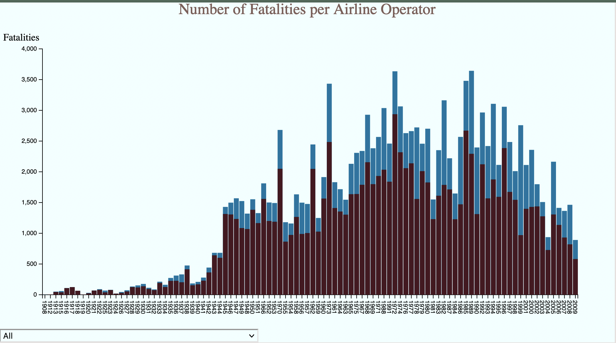
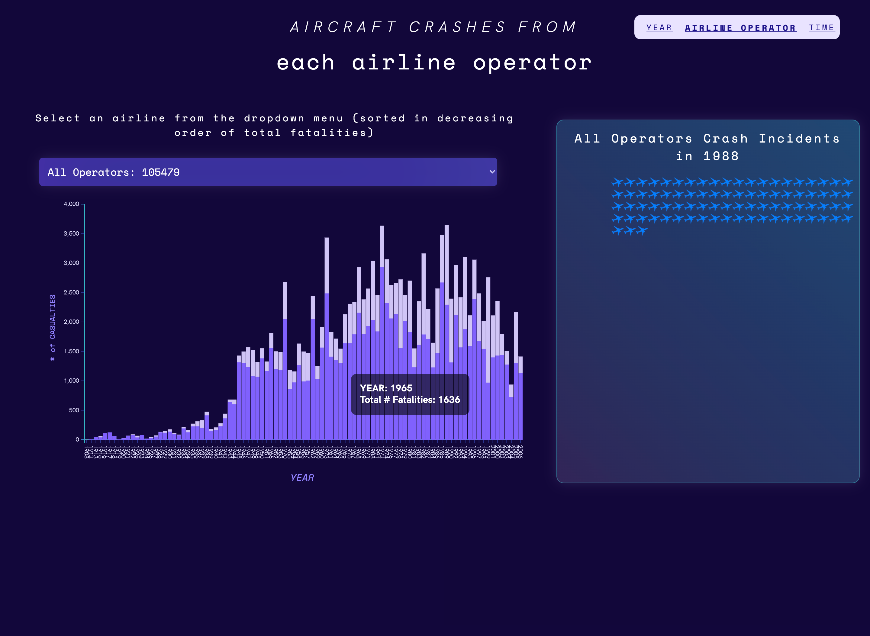
We created a new visualization for fatalities per airline operator. This visualization is an interactive bar chart, where the user can select to view all the airlines, or a specific airline from a dropdown menu, and view crash data for a given year. The bars represent the proportion of fatalities vs total people on board for the year. Hovering of the bars gives the user a tip with the exact numbers of fatalities and total people on board. To view more information, the user can click on the bar and it will spawn small graphics of airplanes which represent each individual crash. Hovering over an airplane graphic gives the user a tip with information on the specific crash (airline, date, # fatalities, # aboard, and location). We believe we made fairly good progress on this visualization for this milestone, but for the final product we would like to adjust the styling and fix some bugs, such as the airplanes overlapping with the bars in certain situations.
Also, we continued working on the timeline and implementing the brushing functionality. As discussed with the professor, since our visualizaiton lacks complexity, we opted to add some interesting interactive features that should hopefully provide a better user experience for the user. Our plan was to use the mouse scroll wheel to control the movement of the brushed selection on the timeline. This would in turn update the other visualizations. Currently the feature is not working, however the brushed selection should work regardless of that fact. We've written code to read the mouse scroll wheel events and determine the direction of the action, scrolling up or down. Also we can keep track of the current position of the brushed selection, the last thing that needs to be done is figure out how to move the brushed selection to the new coordinates.
We’ve now implemented the pie chart (now a donut chart) using the actual plane crash data, specifically the Type attribute. This csv data was processed so that it could be integrated with the chart. The pie chart would ideally depict the frequency of the plane types which is connected to a brushing tool on the timeline visualization. When the timeline is brushed, the pie chart will update the type frequencies with whichever years are selected at that point in time. The years applicable will be shown in the middle of the donut chart.
Future Plans
After this, we will explore the GeoJSON idea originally proposed to try and visualize some of the crashes on a map. This would require some mild data processing (fixing spelling errors and relative coordinates) then querying an API for latitude and longitudes for placement on a map.
Finally, we still need clean up our process book as well as our visualization. Everything is still pretty rough in appearance and we're still having some errors when trying to include everyone's work into a single file. Therefore, we're going to need to get together after the break to fix every bug we're seeing and clean our code base.
Final Update
This is pretty much the final appearance for our visualizations. The main changes here are the styling and layout. In the previous update, most changes were functionality related and the last things that needed to be done were the styling and layout changes. We've added a better colorscheme as well as a more optimal layout for the main page of the visualization.
Previously we threw out the idea to work with GeoJSON and creating a mercator projection for visualizing plane crash locations. That would be an interesting additon, however we've chosen to not do that. Besides our data's lack of real location data, the other reason we made that decision is because we believe that it's not necessary when the other visualizations are taken into consideration. We believe that our other visualizations provide enough information to answer our original questions and goals.