Water: Everyone Needs It, but Who Has It?
Names: Jack Horan, Dominic Bottom
E-mails: hjack@wustl.edu, dbottom@wustl.edu
Student ID Numbers: 465858, 463836
Project Repo: https://github.com/washuvis/water
Overview and Motivation
Water is a fundamental human resource, yet a significant portion of the world today lacks regular access to clean drinking water.
Many factors - wealth, rainfall, geographic location, to name a few - could be contributing to this disparity, but how and how much?
With our visualization, we intend to illustrate the correlation and magnitude of that correlation between these factors and clean drinking water access.
Related Work
Here is a list of works we referenced while researching our topic, and some thoughts on them.
- Although not incredibly informative, this visualization is easy to digest and highlights
the main issues with water access.
- This graphic is closer to what we are going for. There is a bit of information-overload, but
it's quite informative and aesthetic!
- This site is rich with drinking water visualzations. At this point we are beginning to get a firmer idea of what
we want to do, but it's really interesting to poke around and see the different factors this author thought to highlight in terms of drinking water. Really interesting!
Questions
Our fundamental question is: why don't all countries have equal access to water?
To explore this, we've chosen a number of factors to compare with water access, asking the question:
Does X feature affect a country's access to water?
These features include:
- Economic Indicators (like GDP)
- Latitude
- Tempurature
- Population Density / Population
- Conflicts / War
- Rainfall
We question what is and is not actually important of these factors. They all seem like they could affect water access, but do they?
By asking these questions, we hope to show (and learn ourselves) how some people can still be without water today.
Sketches
We began by sketching out potential visualizations for what would help us (and others) understand where people lack drinking water around the world.
The above image shows the initial idea for the latitude chart. We threw as many dimensions of informations as possible into this idea to use data ink to the best of our abilities. Later we decided that
this was overwhelming to the user and cut back, but the fundamental design of the chart remains the same in the final design.
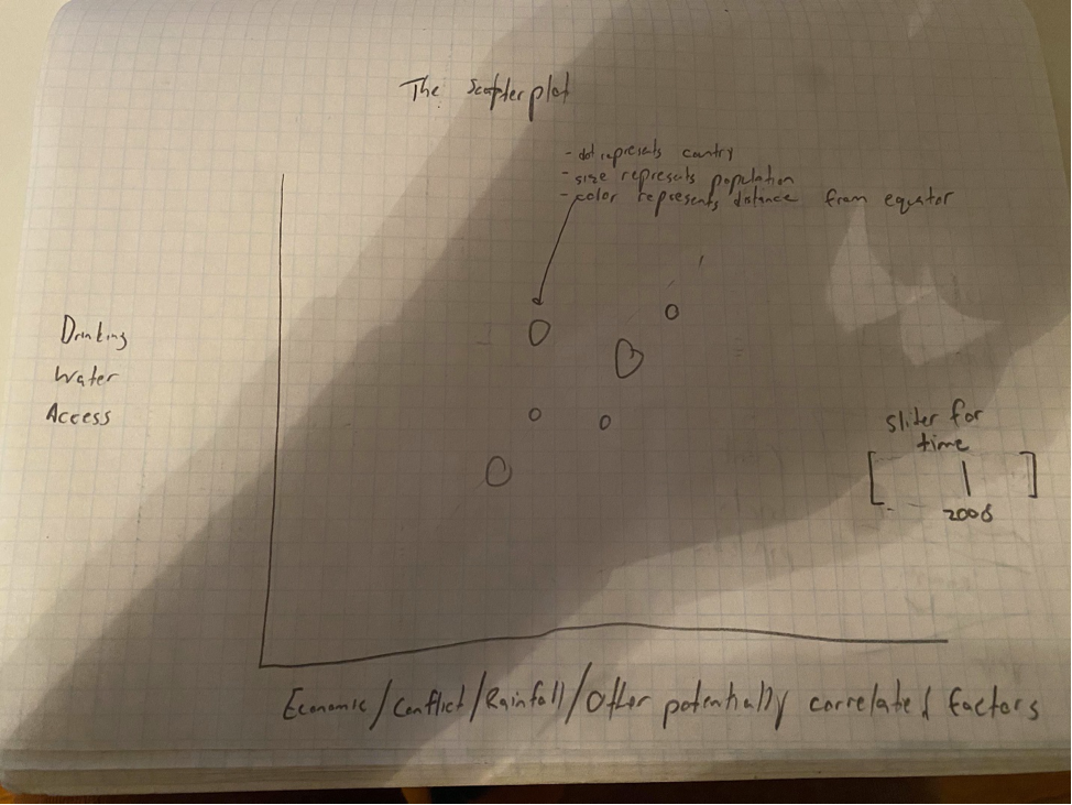
The above image shows our plan for the scatterplot. This was the first thing we implemented in our visualization and serves as the foundation for which all other graphics extend from. The ability to toggle between
so many different dimensions along with our tooltips allow the user to really dig deep and understand the problem for themselves.
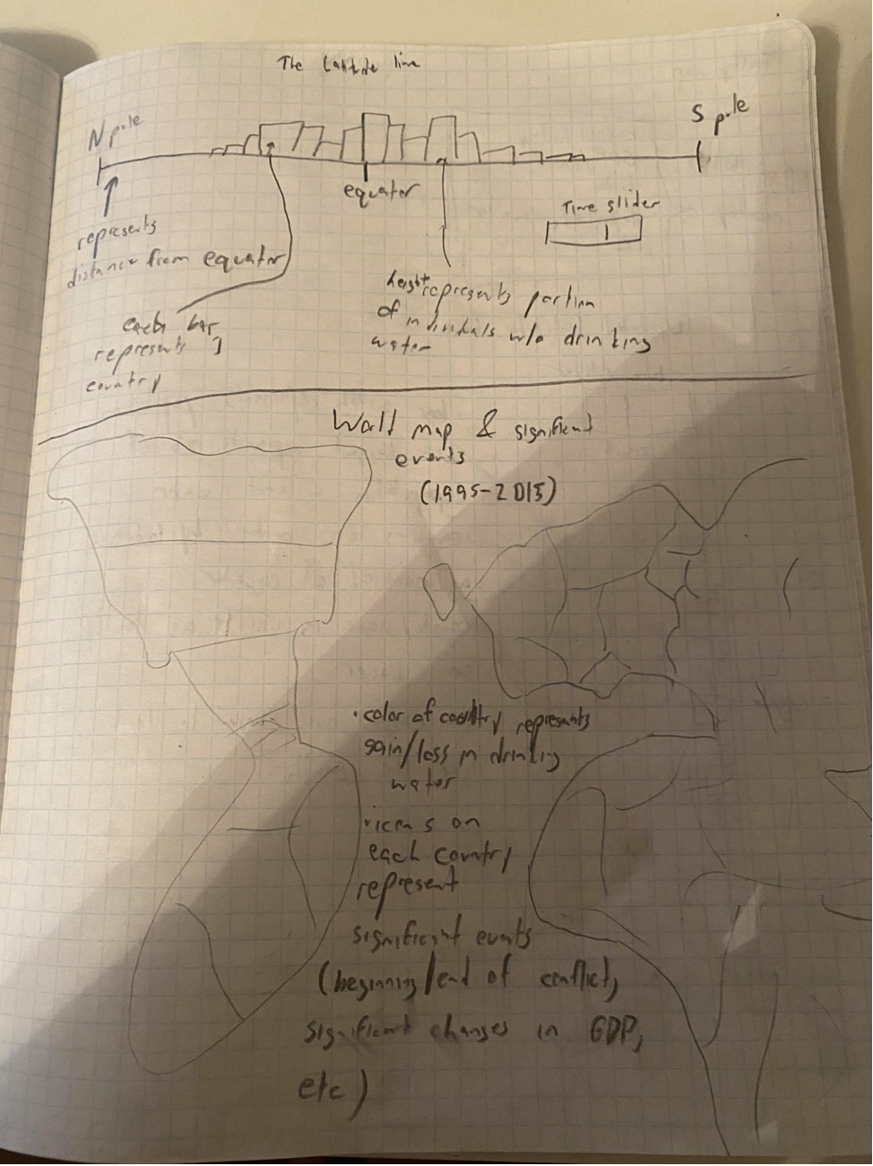
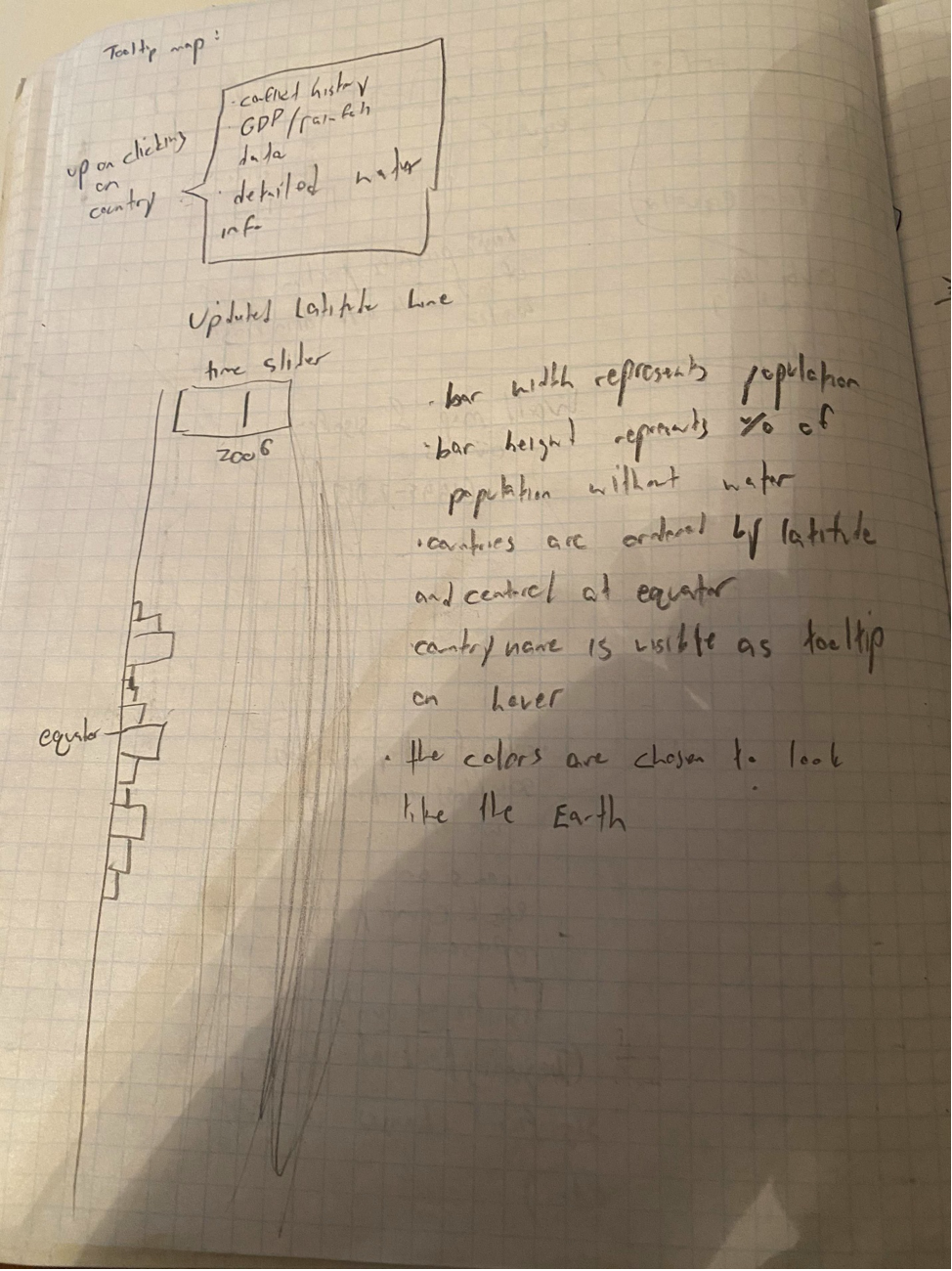
This (admittedly sloppy) sketch shows the basis for our map. Unfortunately we weren't able to implement this map until after milestone 2, but we're so glad we added it! It really ties the visualization together
in an easy-to-understand format, and the tooltips provide a lot of depth to the map's breadth. Also pictured was a rejected earlier sketch for the latitude chart. (We decided that showing North and South horizontally
would be quite confusing!)
Data
Our inspiration
Water and sanitation
Supplementary data by country
Exploratory Data Analysis
We have a number of distinct datasets, so our plan is to go through them one-by-one and compile them into a single data structure
that we can easily perform analysis on. Roughly, this will be organized as a multi-dimensional map, where the first dimension represents
the year the data is from, the second dimension represents the country the data is from, the third dimension represents the category of data,
the fourth dimension represents the data label, and finally the last dimension represents the underlying value of the data point. For example,
structured_data[2000][China][drinking_water][at_least_basic_water_access] == 80, representing 80% of China's population.
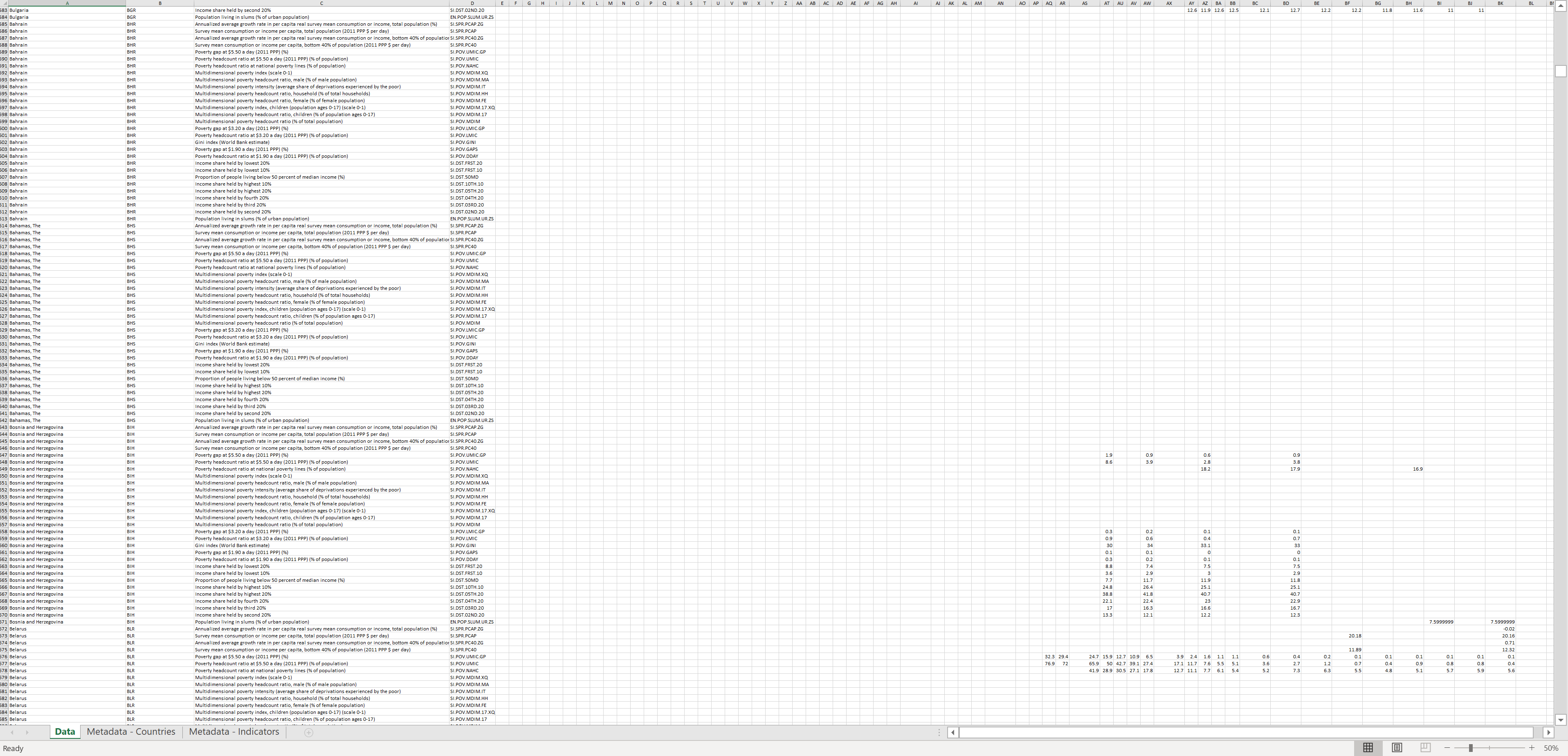
Unfortunately, our poverty dataset is abysmally sparse & we can't find decent alternatives online. We will rely on GDP for the time being to represent
a country's economic success. Here's an image of the poverty dataset (note: each column should be full!):
Another concession: our precipitation data is missing a few years we are considering otherwise. We will use linear interpolation to fill in the gaps -
we aren't expecting large changes in precipitation over just a couple of years.
Wrangling the data was a far more intensive process than expected. The general process was to begin by either loading each CSV into JavaScript and logging
the data, or opening the CSV/spreadsheet in Excel to clean first. One of the websites, WorldBank, had a bug where one could only download Excel files, not CSVs,
which contributed to the time it took to get the data ready. However, while we did end up replacing some of the datasets for an inability to download them or simply
not having enough data, we were able to accomplish our goal of fiting the data into a shape that's easy to manipulate. This will make prototyping our visualization
and improving upon it much easier. We've found & refined datasets for GDP, population density, regional conflicts, latitude, precipitation, average tempurature,
and water access, which we would say is more than enough for some meaningful analysis and visualization.
Design Evolution
After the Tuesday, 12/1 lecture, we got the impression that maps are a generic and overdone method of visualization. Thus, we've cut the map
portion of our visualization and will instead be focusing on improving our existing views.
Implementation
After cleaning the data, we focused on making a working prototype for the scatterplot and latitude bar chart. We ran into some trouble at first passing functions asynchronously,
but it was solved by returning a Promise object from cleanData and chaining .then()s afterward. With that small hiccup out of the was a simple matter to pack the cleaned data into
the appropriate format for the visualization we required.
Evaluation
The user studies gave us some good insight on the strengths of our project. Things commonly given props include our layout and the customizability of our data.
It also exposed flaws and bugs. Notably, users wanted more labels on axes so you don't have to comb through the paragraph explanations to make sense of the graphs.
Users noted a text overlap issue on the water percentage bar when changing the year to 2017. They requested wider bars, bigger dots and more responsive tooltips to
make exploring the visualization easier. They suggested trimming outliers that made no sense, like countries with 0 GDP. They suggested keyword highlighting to make
the paragraphs easier to follow. They also suggested a legend for the color scale.
Design Re-Evolution
After our feedback from milestone 2 and peer evaluation, we ultimately decided that a map would be a beneficial addition to the visualization after all. When discussing
data from each country around the world, users just expect a map. A map doesn't convey as much real information as some of our other graphics, but it makes sense that
it can be a helpful supplement to the graphs and allows for a new way to explore the data. Thus, we are adding the map back ahead of the presentation.
Milestone 1
Most of our work before milestone 1 was behind the scenes. We spent a lot of time, thinking, planning/sketching, investigating & collecting data, and cleaning data! However,
we did mannage to have some of our visualization up-and-running for this milestone. Our basic scatterplot and latitude chart are up, though they aren't pretty! We have a lot of work to do.
Milestone 2
We made a lot of visual progress since milestone 1! We now have basic tooltips, three graphics, and a layout that looks more like a dashboard than an html page. We discussed for a while whether
a map would be beneficial or simply detract from the rest of the visualization and decided to let the data presentation speak for itself without the map.
Presentation
We spent a lot of time thinking about how to best explain our visualization - we didn't just want to make a tech demo or a day-by-day re-visiting of creating the visualization.
Instead, we decided that the most interesting & valuable presentation would discuss the fundamental questions we had about our problem, and therefore how our visualization could be
used to answer these questions. We knew we only had a few minutes to present, so we'd have to be efficient with all of the time we're given, which is why we are recording the presentation
in advance.
Project Journal
Throughout our project, we reserved this process book for major updates, and kept a more detailed journal which we entered into (almost) every time we worked on the project.
Listed below are the entries from this journal.
Thursday, 11/19
Today was an in-class work day. The instructors pushed off Studio 10 till next week so that they could provide feedback on our project proposals.
We had some time to kill until Professor Ottley got around to us, so we got started.
Jack downloaded the drinking water dataset and worked on cleaning it.
The drinking water dataset had some generic string values of "less than 1" or "greater than 99". We've changed those values to 0 and 100 respectively where numerals are necessary for visualization.
Dom set up boilerplate code, downloaded the supplementary datasets, and started writing the process book.
Monday, 11/23
Milestone I is due tonight at midnight. Jack has gone ahead and cleaned most of the data and inserted it into waterdata.csv. Dom is responsible
for making the data structure skeletons for the scatterplot and bar charts. Let's get into it.
Thursday, 12/3
Milestone II is due Dec 7th. We spent the day outlining our goals for the milestone, and dividing up our work. Here's what we need to get done:
Must-haves
* Year toggling on scatter plot
* Add axes to scatter plot
* Bar/pie chart representing global water access
Desired
* Color toggle on lat/lon chart where colors represents rainfall or temperature
* Tooltips on lat chart/scatter plot
* Styling/beautification
Jack will be focusing on adding the bar/pie chart and styling. Dom will be focusing on adding the year toggle, axes, and tooltips to the scatter plot, and the color toggle and tooltips on the lat chart.
Saturday, 12/5
Style day! Jack converted the document from Milestone I into a dashboard. He also cleaned data, added datasets to the scatterplot, added coloring and a slider to the latitude bar chart, added year toggling for the document,
and created the global water access bar chart. We are in great shape, and just need to add axes, tooltips, and a few other misc. stylized items.
Monday, 12/7
Today, Dom added the last few features necessary for Milestone II, specifically:
* Axes on scatter plot
* Tooltips on lat chart/scatter plot.
Tuesday, 12/8
It's user study day! Here are some general ideas we had while waiting:
* Bar should scale to the size of the window.
* Make the top section fixed so you can toggle the year and see what changes
Gameplan
Session 1: Think-aloud method
* "Please verbalize your thoughts and feelings about the viz."
Session 2: Specific tasks
* Which country's population has the least basic water access?
* ~~Is it fun to slide the slider up and down?~~
* Which factors seem to affect water access the most? The least?
* Which country has the highest GDP in 2000? 2017?
Session 3: Feedback/Critique
* Thoughts on the design?
* What made sense? What didn't?
* What did you like? Dislike?
* What would you change?
Session 4: Debrief
* Clarify the goals of the viz
Notes
Group 1 (12/08)
Session 1
* Likes the title. Title is clear
* Likes how each section is broken up. Draws the eye to a specific piece of information.
* Paragraph explanations are good. If I'm confused, I can read.
* Not immediately clear that each bar is a country. Include Y-Axis on lat bar chart.
* Slider is good.
* Tooltips are good.
* Axes labels would be informative.
* Legend for the color scale
* Could round the percentage. Fix the text overlap
* Trimming outliers. Maybe set the max.
Session 2
* 1st one good. Chad
* GDP/GDP per capita most. Not so easy to tell though.
Session 3
* Axes labels would go a long way towards making things more clear
* Outlier trimming, data points that don't make sense.
* Units. What is 500 rain?
Group 2 (12/08)
Session 1
* Fix the text overlap on percentage bar
* Label on the equator bar rather than explanation in paragraph
* Use custom tooltips instead of title
* Very informative visualization, like a research paper
* Axes labels, even on the scatter-plot y, would help
* Widen bars so that tooltips show up easier
Session 2
* First task is pretty easy if you're familiar with the viz.
* Second task would be aided by a best fit line
* Move the GDP button to be in line with the text
Session 3
* Layout is good
* Keyword highlighting in paragraphs. What do you want the reader to read first?
* Percentage with water access is good
* Make the bars and circles largers
Group 3 (12/10)
Session 1
* Can't read 90% on graph (known bug)
* Lots of reading :(
* Labels and axes on sliding bar chart (including equator label and color legend)
* Add data to tooltips
* Add LABELS to axes (scatter plot and sliding bar chart)
* Use logarithmic axis for GDP
* Add STORY to header (background on project)
Session 2
* had a hard time finding correlation
Session 3
* align outer bars
* make mobile compatable
* format process book
* filter / search bar
Group 4 (12/10)
Session 1
* Likes design
* We should explain what latitude is
* Add color key on bar chart
* Show everything is changing when toggling years
Session 2
* Struggled to find correlation in scatterplot
* Finding GDP, struggling country was very easy though
* We left the raw data on scatterplot to avoid bias but it might make sense to highlight correlations with trendlines or something
Session 3
* Likes layout (but header is not exactly aligned with top bar chart!! :( )
* Feels like a Google Form (for better or for worse)
* Use better tooltips (include data along with titles)
* Didn't realize toggling year changed everything
Saturday, 12/12
We received great feedback from both our grader and user studies. Jack got to work fixing glaring bugs, like a lack of responsive design and mis-aligned axes and styling.
Sunday, 12/13
Jack continued to address feedback from user studies & the grader. He added additional text at the top, explaining the motivation behind the visualization and how it can be used. He fixed overlapping text. He added axes, axis labels, and a color-key to the bar chart. He also re-aligned axes, added labels, and cleaned data on the scatter-plot. Furthermore, he improved readability by changing the font on the page, replacing the radio buttons with a select input, and changing scales in the scatter-plot from linear to logarithmic where necessary. It's come a long way. He is leaving tooltips for Dom!
Monday, 12/14
Jack created a map! We realized the scope of our solution was rather narrow, so we decided to make a map to supplement the more standard visualizations. The map simply shows the proportion of water access in each country at each time. Tooltips will display additional data from the country.
Dom redid the scatter plot and bar chart tooltips in a more D3-way. He also added tooltips to the map.
Monday, 12/14
Presentation time! We spent a lot of time thinking about how to best explain our visualization - we didn't just want to make a tech demo or a day-by-day re-visiting of creating the visualization. Instead, we decided that the most interesting & valuable presentation would discuss the fundamental questions we had about our problem, and therefore how our visualization could be used to answer these questions. We know we only had a few minutes to present, so we had to be efficient with all of the time we're given, which is why we are recording the presentation in advance.