UFOs. Are they real? Are they from space? Some people believe they are. Some even say they've seen them. Is there any correlation or causation for the rates of UFO sightings throughout the world? Does the frequency of UFOs in select locations change over time? Do certain UFO types appear more in certain locations? This visualization aims to organize the many UFO sightings throughout US history into a more accessible and visually appealing form.
There wasn't any specific inciting work that inspired this project. Given the state of current events and the effect it has had on our mental health, we simply wanted to pursue a subject that was neither political nor urgently topical. Aside from a general shared interest in the UFO aesthetic, we also chose this project because we wanted to try using the new map visualizations we learned recently before the beginning of this project.
Our project began more so with just the aim of presenting copious amounts of data (around 80000 points) in a more parse-able form. We then wanted to use this data to see if there were any trends across the US relating to the frequency of UFO appearances and the types of UFOs (in shape) that appear, or even to just confirm that there were no trends at all.
Given the sheer amount of UFO sightings logged, we eventually decided to divide the data by decade as well, allowing the user to examine individual years within the decade while also tracking the rates of UFO appearances in each US State over said decade. This decision also enabled us to better compare data over time, not just location.
All of our data was sourced from century's worth of geolocated and standardized ufo reports by NUFORC (National UFO Reporting Center). The data itself was already scrubbed by Sigmond Axel (user planetsig), so all that was needed to be done on our end was organize and label the columns of the .csv files provided.
Aside from the main UFO data, we also downloaded GeoJSON data to create the geometry of the individual US states so we could display them as selectable areas on our map. This data itself was found on a Leaflet tutorial for creating an interactive choropleth map. This tutorial is also where we referenced a lot of our code for creating selectable state areas.
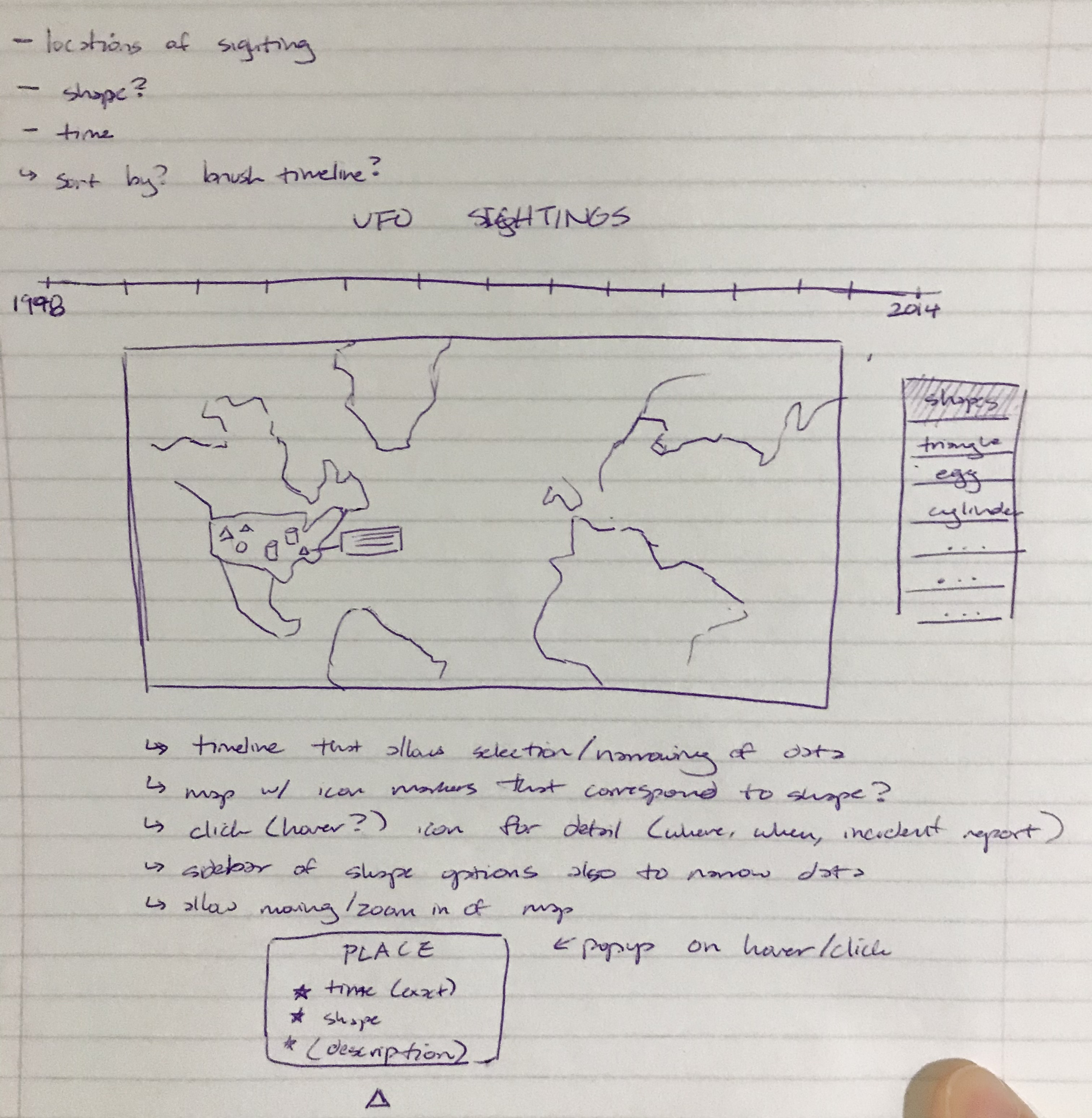
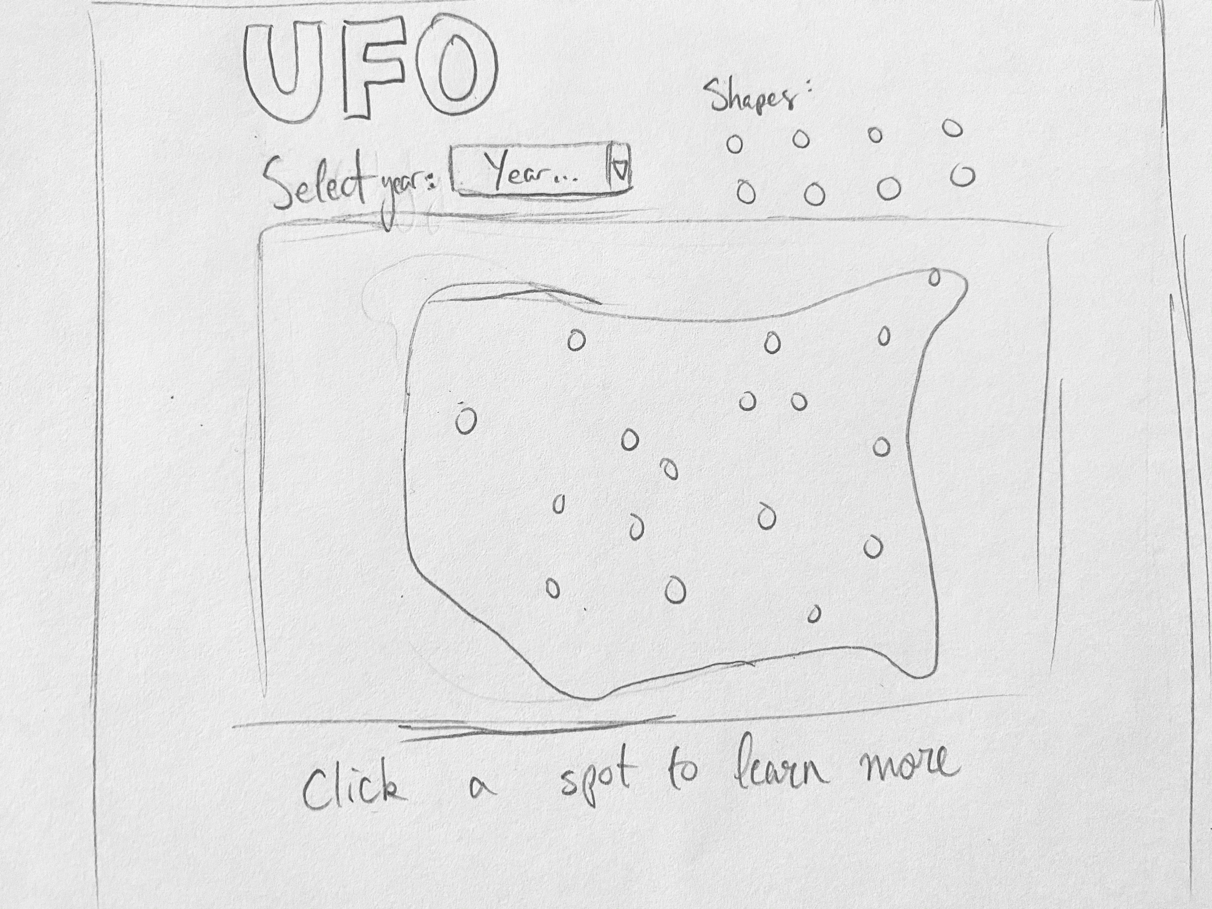
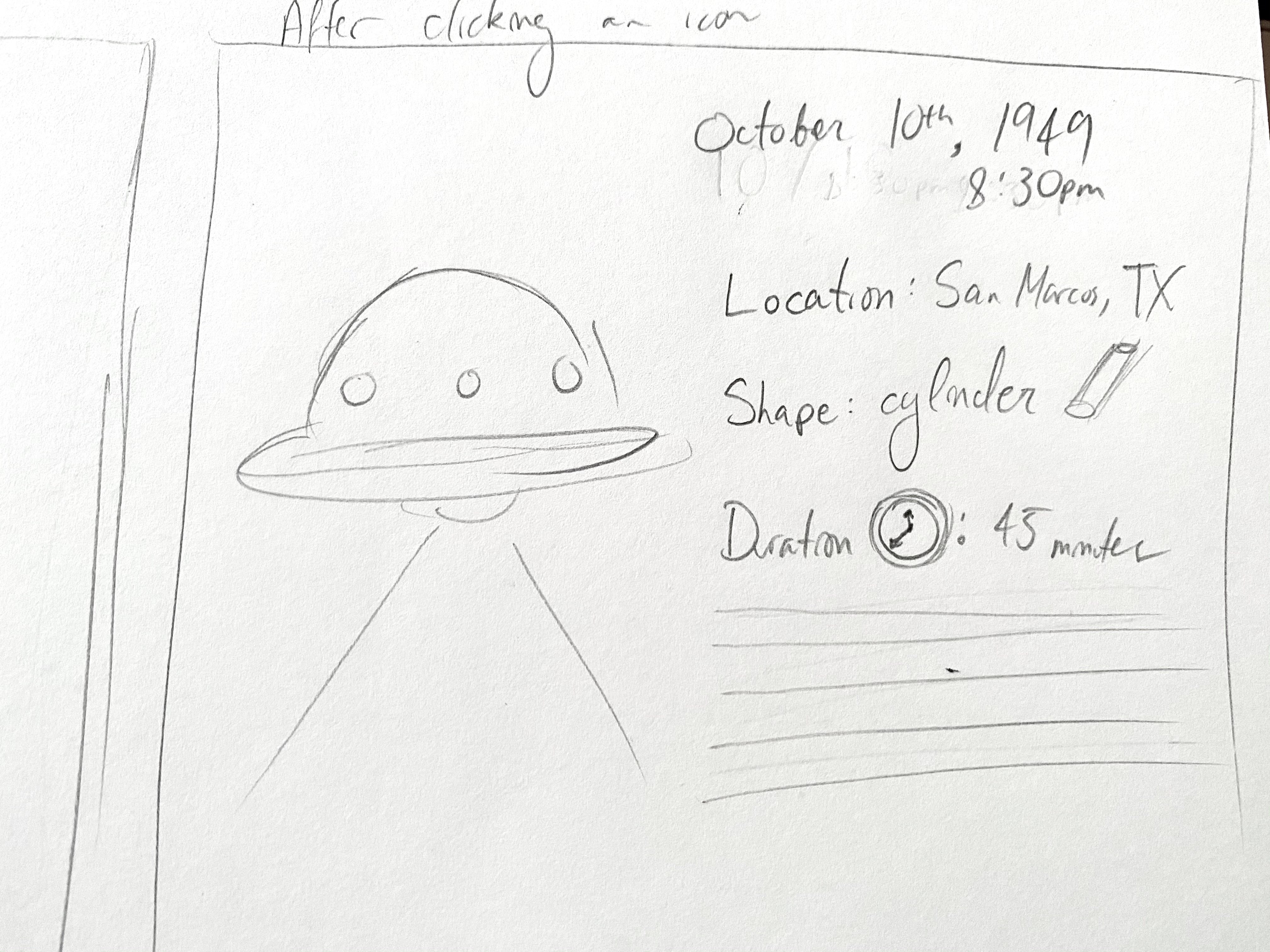
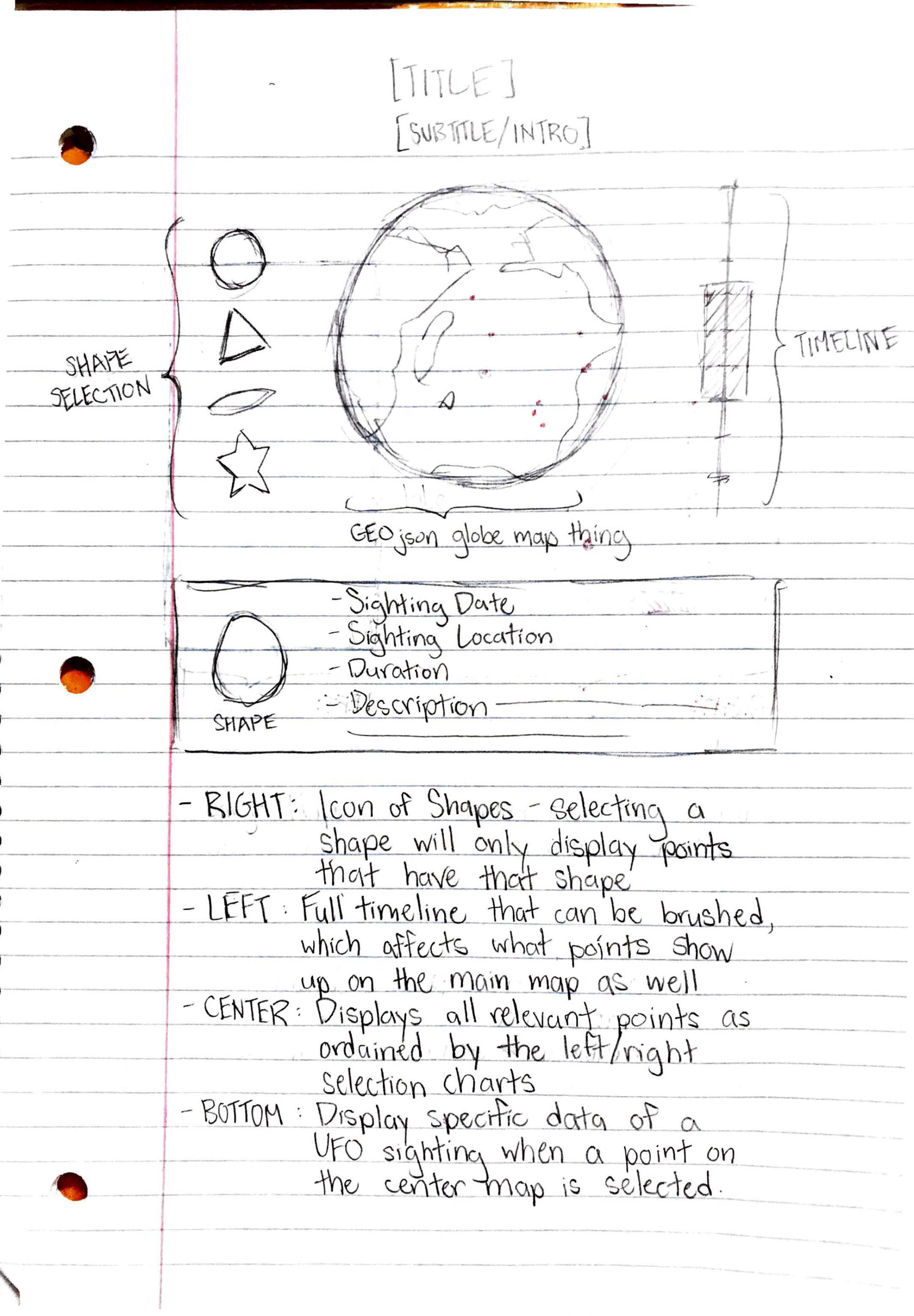
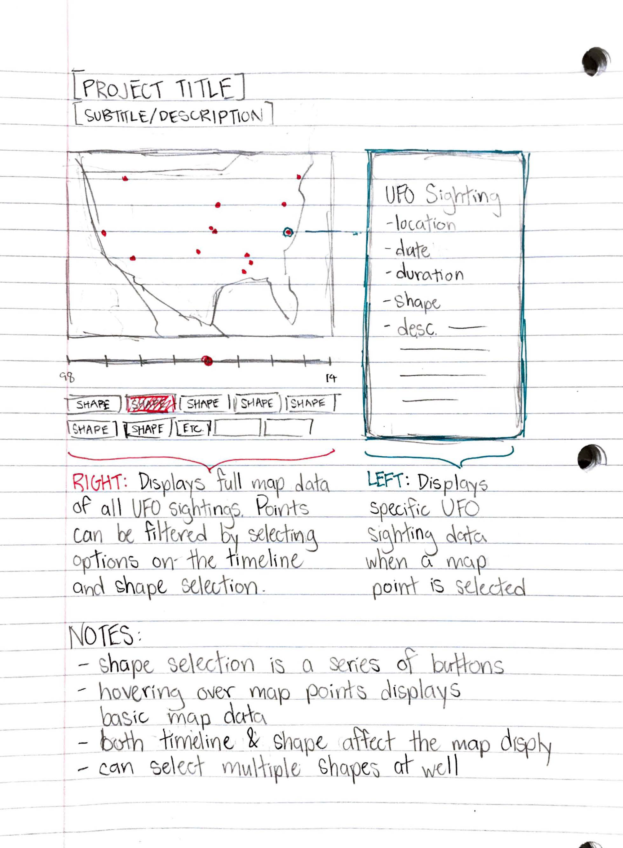
As reflected by what was said in our motivations, all our initial designs are centered around the map visualization, with various other smaller visualizations, like a timeline and a shape selection bank, that would allow users to pick specific features for filtering the data on the main map. Eventually we also decided to narrow down our data to only the United States and to to keep the data manageable and more focused. Alongside that, there would be a tooltip available to allow more detailed information on specificed points or instances that the user can click or hover on.
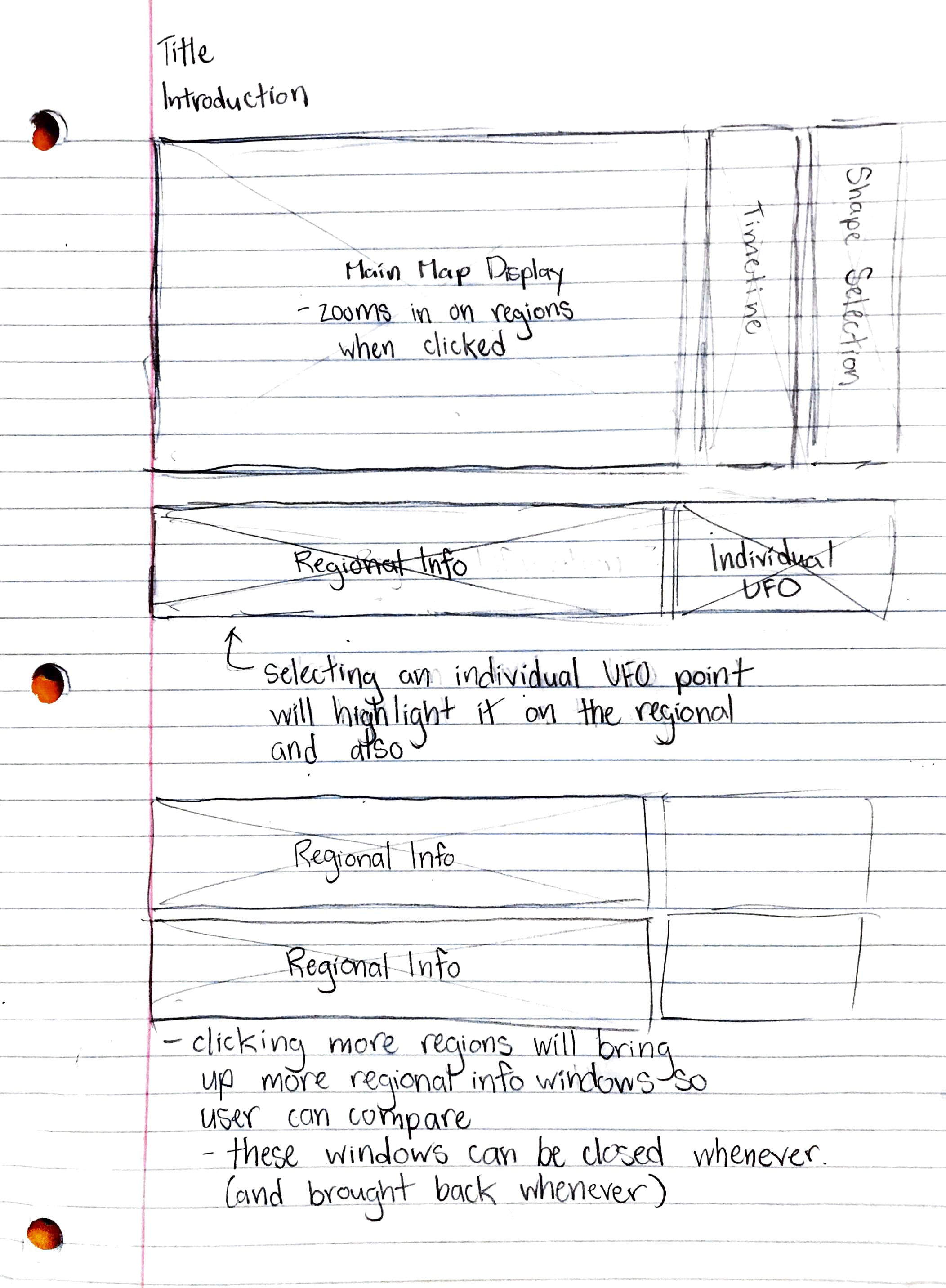
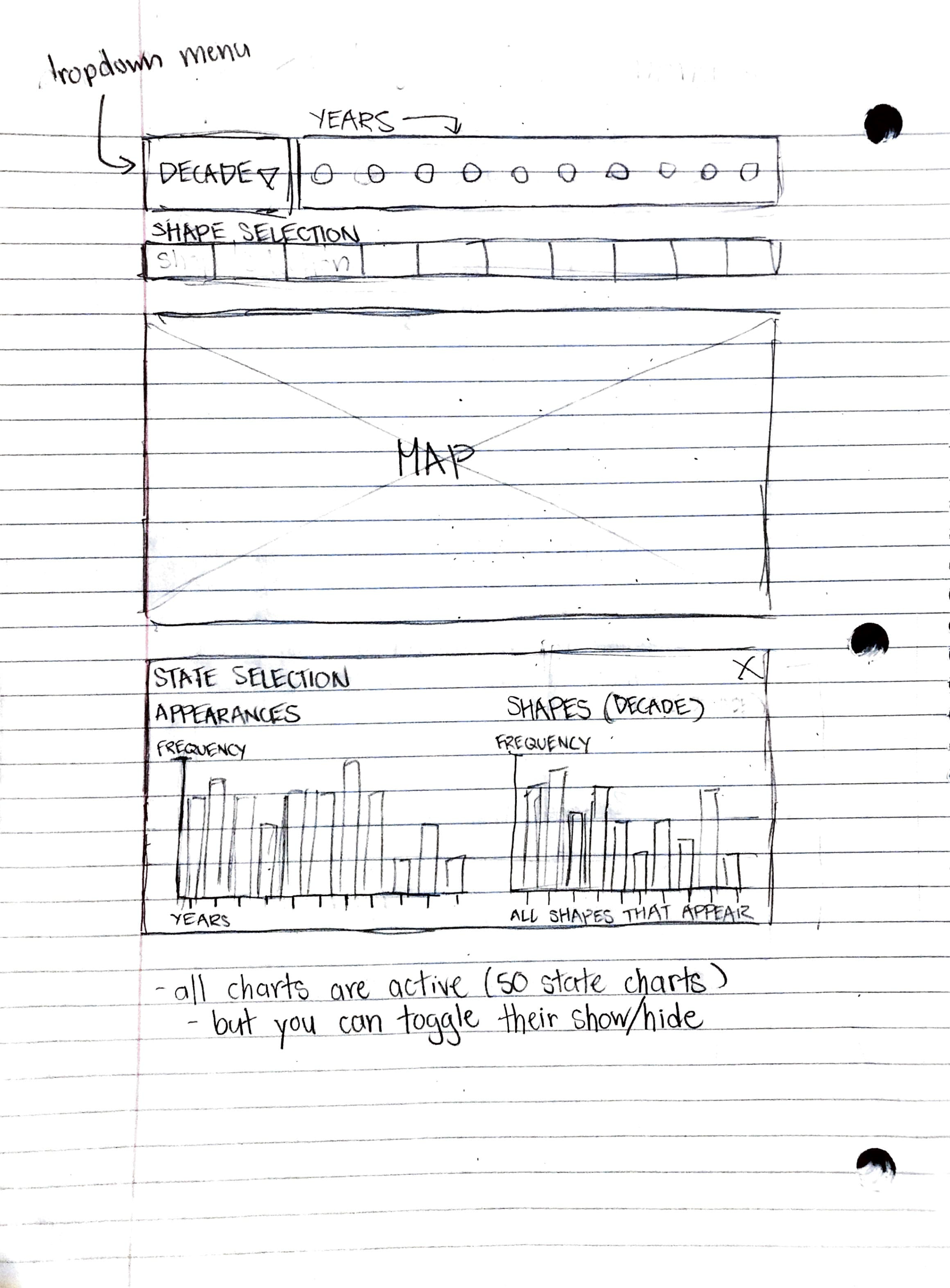
When we received feedback on our initial proposal, it became apparent that there was no real way to compare the data in our visualization; only to filter it. Taking this into consideration, we decided a good feature to have would be the ability to save selections by US state and display more detailed information (like rate of UFO appearances and the frequency of certain UFO shape types across the current decade, both of which will be represented with bar charts) for said state selection, appending the info as a div to the bottom of the page. The page will allow for multiple divs that can be appended so the user can view multiple states at once for direct comparison between various points without requiring users to simply remember previous tooltips' information, as well as more easily draw comparisons between different instances to see ifthere truly is a correlation between different events, days, shapes, or other variables. To avoid the clutter of too many divs, the user will also have the ability to remove the divs with the click of a button (like an 'X' in the top right corner of the div, similar to that of a browser window).
We've decided to forgo displaying individual UFO information for now, and instead have chosen to focus on this more comparison/trend-oriented approach.
As of Milestone 1, we've managed to set up the general look and template of the website (save for certain styling elements like color and spacing, which will likely be reminiscent of this process book page). All the major visualization elements are present on the page: the timeline, the shape selection, and the map are all present, although choosing options on both the timeline and shape selection will not affect the map visually at this moment. Clicking on a state will append a div under the map displaying more detailed information regarding UFO appearances and UFO shape types (the bar charts themselves have the data implemented, but they do not have proper labelling/formatting yet). The user should be able to add as many divs for as many states as they so please, and can remove the divs by clicking the X in each top right corner.
For the next milestone we intend to hook up the timeline and shape selection charts as planned to properly filter the visual data on the map, as well as formatting the individual state bar charts for better readability. Some much needed styling will be made as well, and if time allows it we will try to reimplement a way to display individual UFO sighting data.
For Milestone 2, we hooked up the data so that the markers on the maps filter properly as promised, and we implemented some changes based on the feedback received for Milestone 1. For starters, we've replaced the multiple state bar charts with one singular line chart that adds lines depending on the states selected (as it was noted that having to scroll through many bar charts was not ideal). In addition, the new line chart allowed us to track UFO sightings across the entire timeline, as opposed to separating things by decade for the sake of saving space. This in return negated the need for a dropdown menu next to the timeline, and we insteand changed the timeline to display all the selectable years in one long horizontal scroll.
Other changes include small quality of life improvements like making the markers smaller and being able to hover over the lines on the line chart to see which state they represent.
After a few rounds of user testing and feedback, this final implementation adds a few quaity of life features, including a more condensed timeline that takes less time to scroll through, the ability to delete lines from the line chart, tooltips that display relevant information (like the number of UFO sightings in a given year, so that the user is not confused when that number is zero), and a beginning tutorial modal that gives a basic rundown of the website's features.
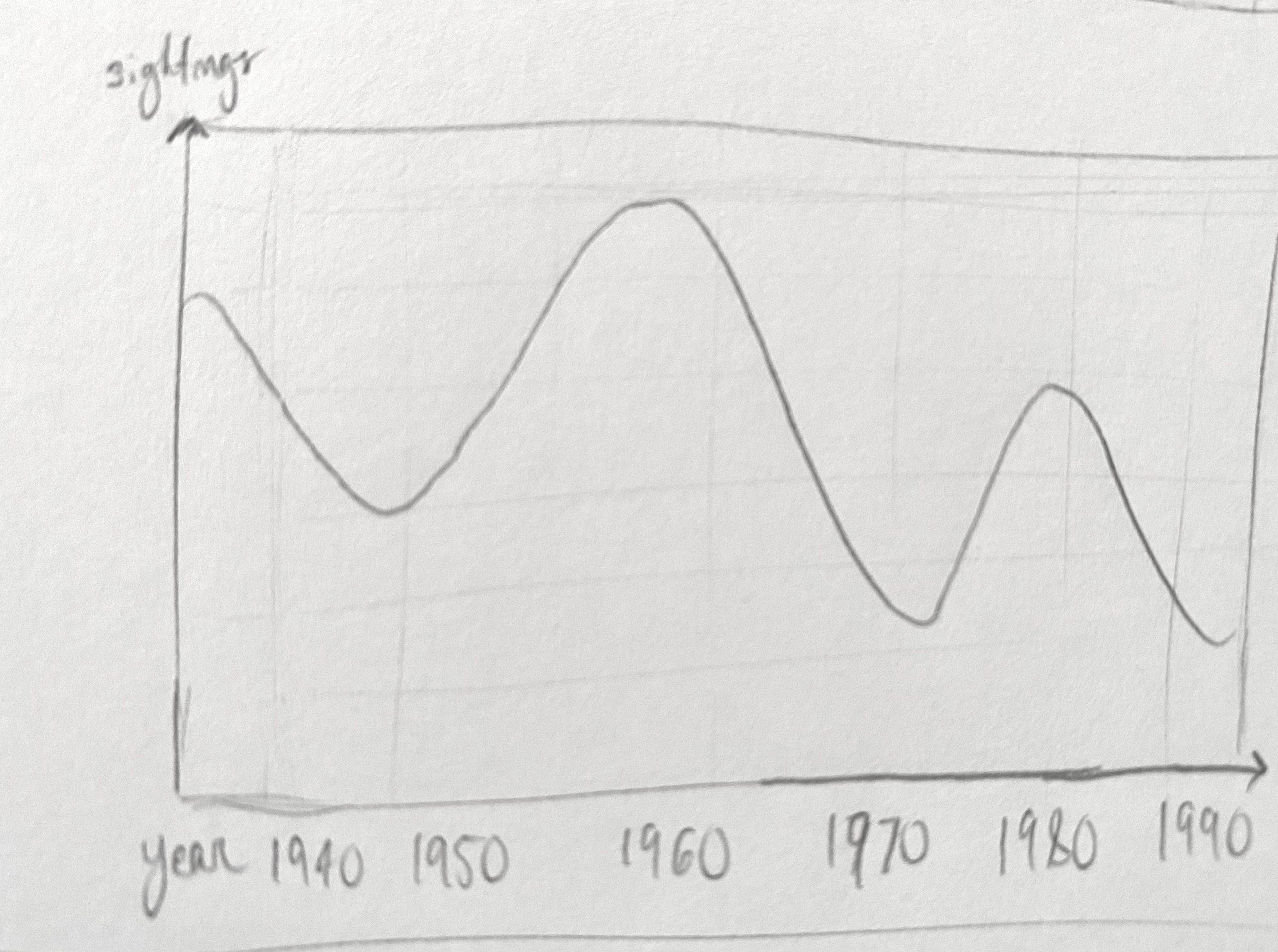
While our visualization acts mostly as an exploratory tool users can play with, it does draw one conclusion from the data. There are no correlations in UFO appearances with regards to shape and location. The only trend that does seem consistent is in that the number of UFO sightings drastically increases around the turn of the century. This makes sense, as that is around the time people become more connected with the advent of important technological advances--namely the internet.