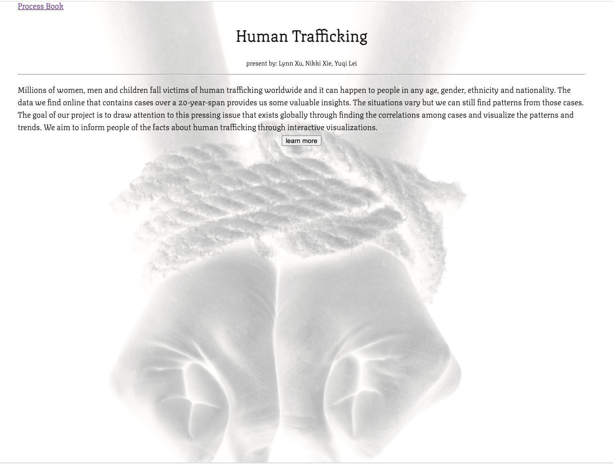
A Closer Look into Global Human Trafficking
Basic Info
Team:
- Yuqi Lei leiy@wustl.edu 475441
- Nikki Xie n.xie@wustl.edu 448385
- Huilin Xu huilinlynn@wustl.edu 466551
Repository:
Background and Motivation
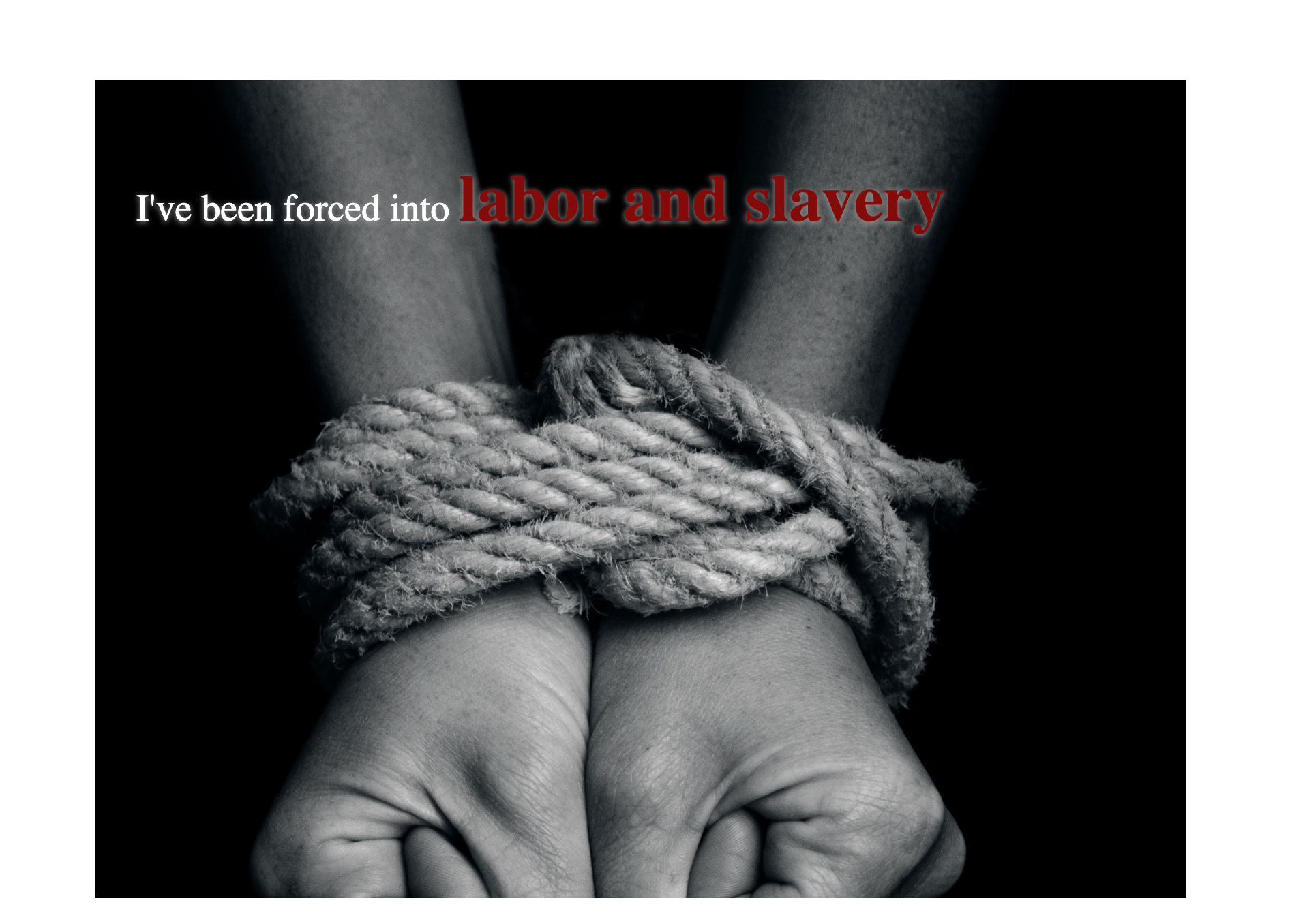
Human trafficking is a dynamic, widespread and complex issue. Millions of women, men and children fall victims of human trafficking worldwide and it can happen to people in any age, gender, ethnicity and nationality. The data we find online that contains cases over a 20-year-span provides us some valuable insights. The situations vary but we can still find patterns from those cases. The goal of our project is to draw attention to this pressing issue that exists globally through finding the correlations among cases and visualize the patterns and trends. We aim to inform people of the facts about human trafficking through interactive visualizations.
Project Objectives
Our project aims to present the facts about human trafficking we found from the raw data and draw people's attention to this. With our goal, we list several objectives of this project that we will accomplish.
- Present general info such as the gender and age of victims, recruitment types and recruitment reasons with an interactive map.
- Victim composition(gender, recruitment types, age, etc) will be presented around the map as bar charts. Users can sort those bar charts by one of the following: total number of victims, gender and age ratio
- Users can select a specific country on the map and selected country's victim composition will be presented on a separate graph. Multiple countries' data can be presented on the same graph for comparison.
Data
We used a dataset from Kaggle. It contains about 50k records of victims of global human trafficking over the past 20 years.
Data Processing
The original data is stored in csv format. We will use python and Pandas to pre-process the data and use them as input for the visualizations. We will first filter out the invalid data which are represented by -99 in the dataset. We will use year and country abbreviation to group the dataset. We will keep the columns such as means of control, recruiter relationships, gender, type, etc for visualization. We will save the processed dataset in csv files.Visualization Design
Design 1:
These stacked bar graphs will contain the total victims of human trafficking in each country, and victims are distinguished by the colors
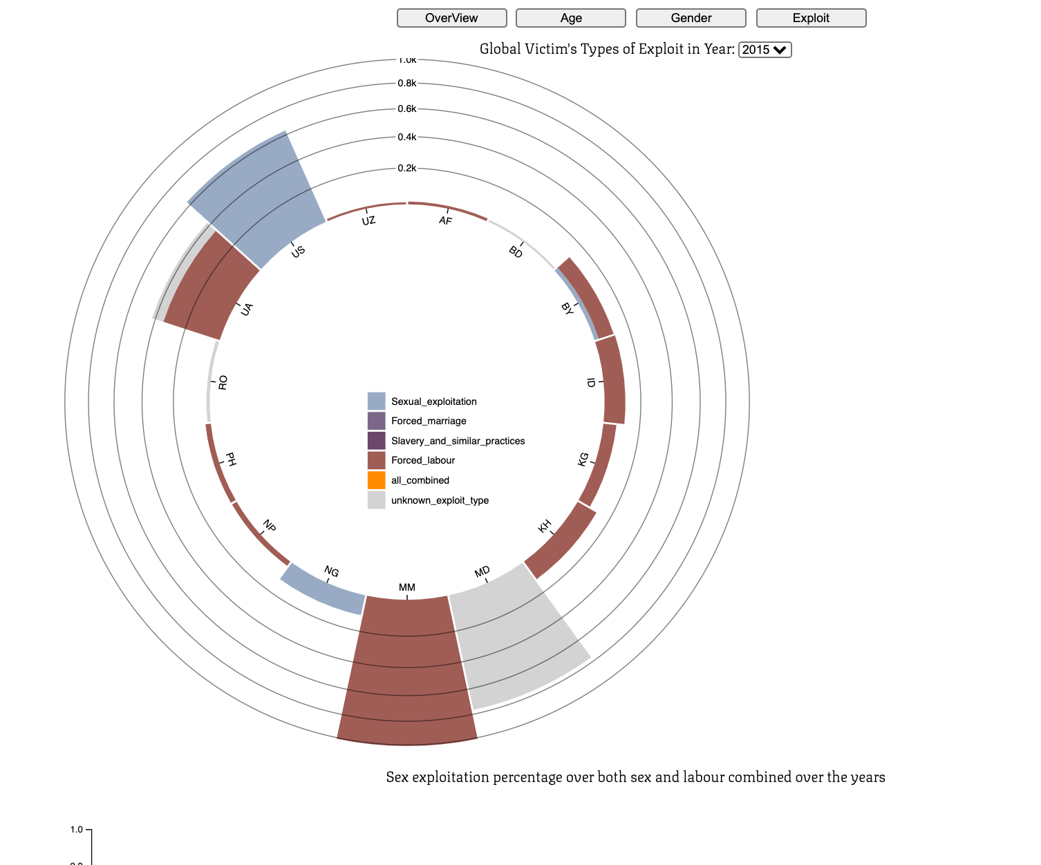
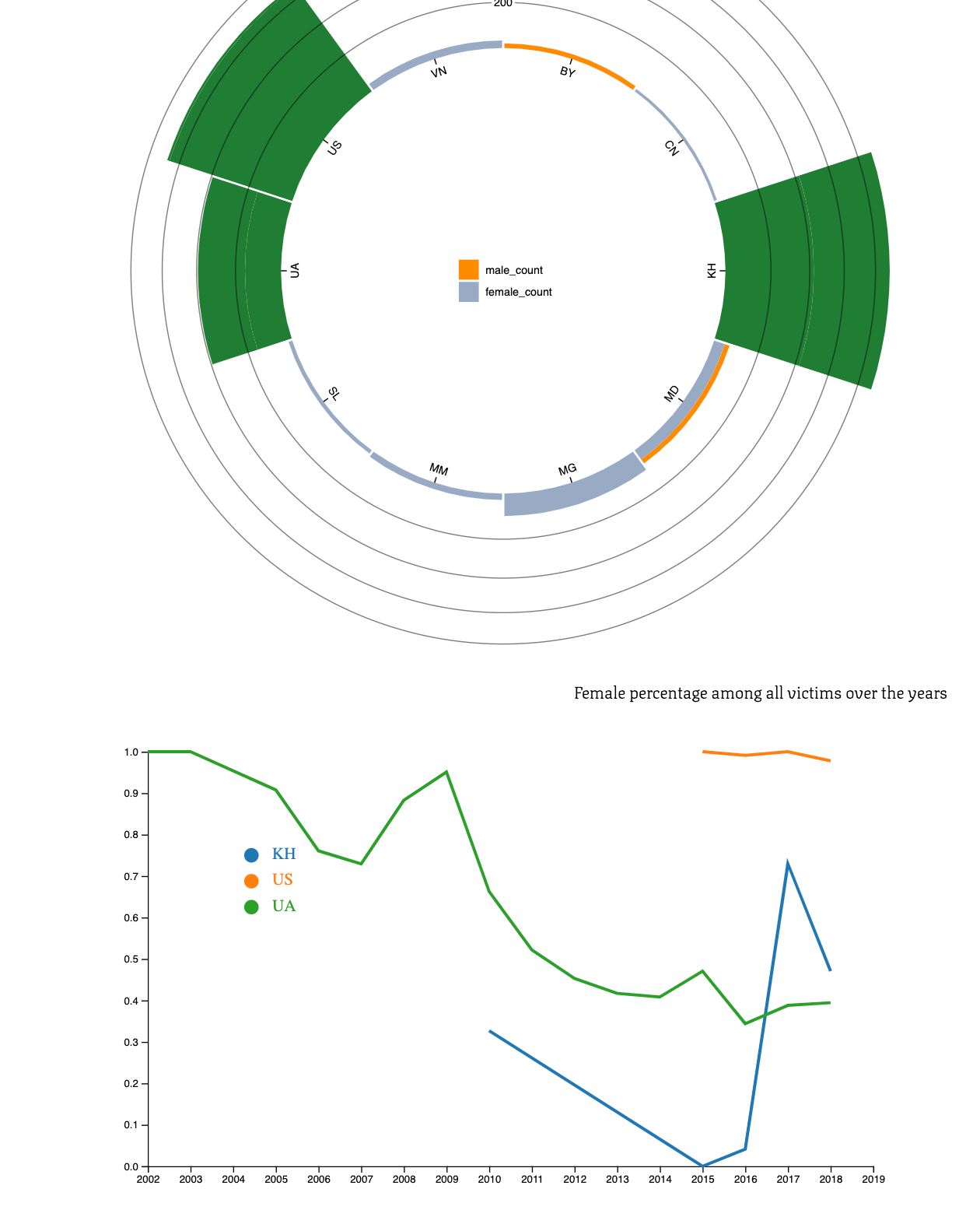
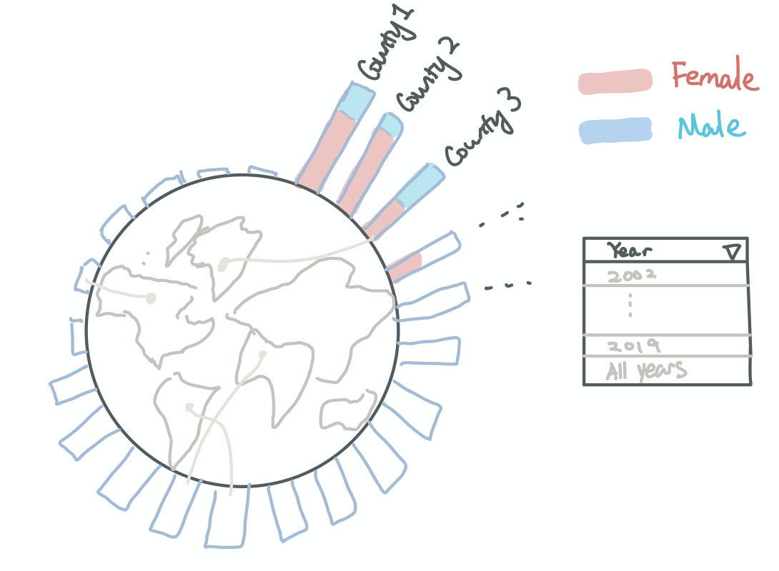
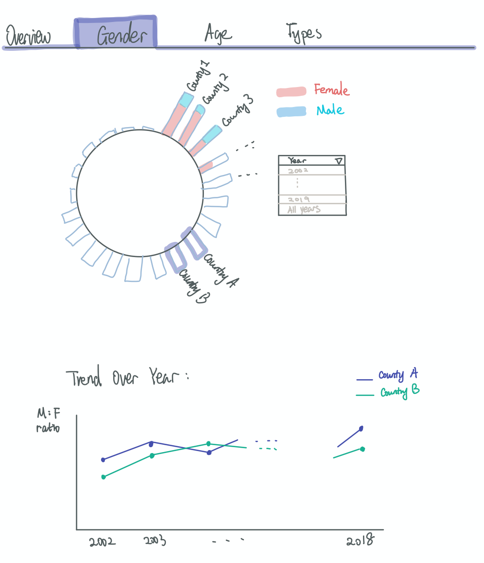
A radial stacked bar chart for global victims:
We can use this graph to compare the human trafficking situation across all countries. We will put a world map in the middle, and use lines to connect each country to their bar on the outer circle. In the example below, we are presenting the gender difference of victims in the bars. We can add selections next to the graph to let users to choose what information they want to see in the bars. For example, the number of victims in different types of human trafficking (sex, labour), number of victims in different sex or labour subtypes, or number of victims coming from different recruitment methods, etc. We can also allow user to choose to view all available data or data from a specific year.
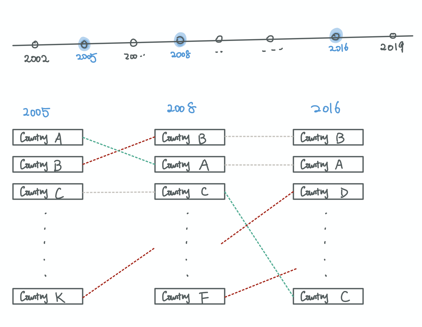
Situation over selected years:
This graph can present the overview of global human trafficking over time. Users can select specific years for comparison. There will be lines connecting the same country across the years. The green line means that country's victims is decreasing. The red line means the situation for that country is getting worse.
Design 2:
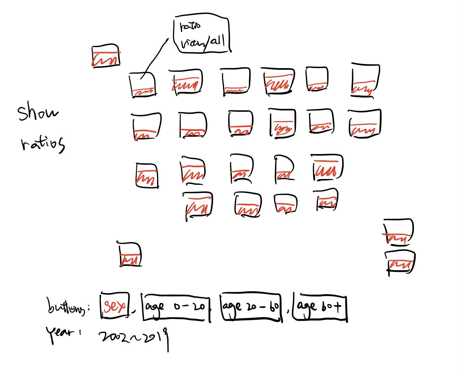
Given some buttons representing many types of victims, we can get the ratios of of selected types / all victims in US/world. The color of the filled part will changed as the ratios goes higher/lower. When we clicked/hover any states, the detailed info like population / victims will pop up(maybe with some icons).
Ratio among states/countries:
Design 3:
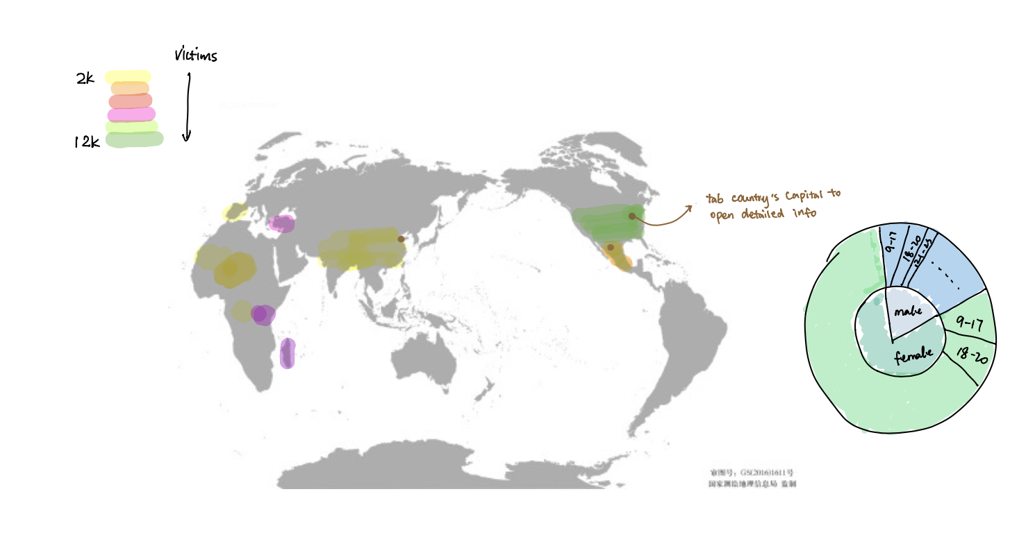
This design is a map that shows the overall number of victims categorized by country. The shades of the country will change according to the number of victims. The region that has more victims will have darker shades. Also, one interactive feature is that user can click the capital of the country and see the detailed demographic information of the victims including their gender and age.
Interactive Map:
Final Design:
We will have a combination of design 1 and design 3. We will use the radial stacked bar graph to show the difference of certain aspect of human trafficking across different countries. When hover on certain country on that map, we will also present a pie chart on the side, presenting all details about human trafficking in that country, as shown in design 3.
Final Design:
Must-Have Features
- A map with all victims info(shown by interactions) including: gender, citizenship, type of human trafficking, means of control, and relation to recruiters.
- Some charts to show the ratios of all kinds of victims
- A timeline for users to select multiple years
Optional Features
- Add animation for chart changing process
- Tooltips for charts
- Brush for selecting the timeline
- Present number of years for victims to escape.
Project Schedule
| Week | Tasks | Deadlines |
|---|---|---|
| 1 (Nov 16 - Nov 21) | Process data; Design and set up structure | |
| 2 (Nov 23 - Nov 29) | Implement interactions and basic visuals | Nov 23 Prototype 1 |
| 3 (Nov 30 - Dec 6) | Finish all visuals details | |
| 4 (Dec 7- Dec 13) | Improve based on feedbacks | Prototype 2 |
| 5 (Dec 14 - Dec 20) | ppt | Presentation |
Milestone 1
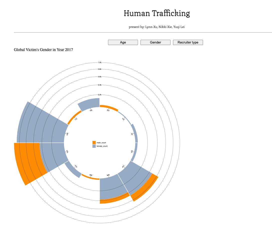
We updated our objectives and final design. We have a csv file for all victims' record. We have some Python scripts to generate json files specific to our graphs. We selected gender information for now. We can select more preferred attributes by rerunning the script with minor changes. We've set up the basic structure of our website. By clicking "learn more" and then "gender", you can see year 2017's global victim's gender info. All years' data are available in our dataset. But we haven't implemented the interaction for users to choose year yet. And the dataset for drawing trend for each selected country is also available.
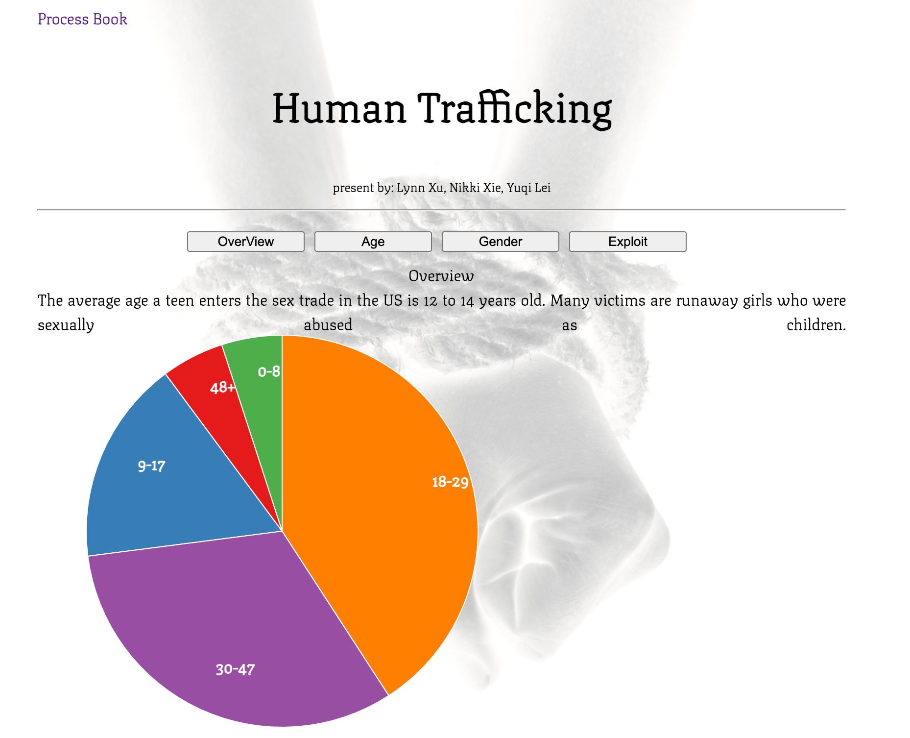
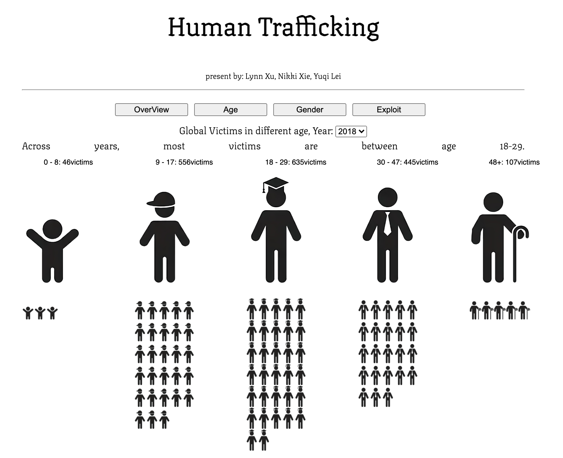
Milestone 2
We created a new animated narrative for front page. We created all visualizations and functionalities. We decided not to show recruiter type information in details as a separate page since we noticed that there isn't enough valid data to make the visualization reasonable. We decide to put that information is overview. And we added exploitation type as a new page that we can explore in depth. We also came up with a new visualization design for age information. It is more eye-catching than the previously planned visuals as in gender and exploit type pages. But it also loses information about countries. We will discuss more about these choices during user studies.