Project Proposal -- AJJAX
Basic Info
Project Title: (SMILE)
AJJAX'S Group Members
Andy Wu
wu.tianqi@wustl.edu
464490
Julia Smith
julia.smith@wustl.edu
457271
Jordan Stone
jordans2299@gmail.com
465595
Background and Motivation
Our project will be centered around answering the questions of what
happiness is, and more importantly how can we bring more of it to the world. While these may seem like simple and
trivial questions, we think that there is a level of complexity when trying to
maximize human happiness and this complexity is only magnified when
trying to maximize happiness for large diverse groups. Furthermore, we are also interested in seeing what we should
prioritize in our own life to reach maximum happiness. To examine happiness,
we will be using the World Happiness report published annually by the United Nations since 2012.
This report ranks all the countries by their happiness score which is based on numerous factors,
such as GDP, life expectancy, freedom, and trust in government.
To provide more context for this data, we will include additional data
sets providing more details about each country for that specific year.
From here you should be able to get a sense of what factors have the most significant
impact on a particular country's happiness rank, and factors should we deem most important
when evaluating a country’s well being.
- What makes human happiness?
- Question is important more now that we are getting into an uncertain world
- What lessons can we take from other countries, since the U.S.'s' happiness index lags behind other countries?
Project Objectives
With this visualization there are numerous questions we are trying to answer regarding the happiness in the world.
- What are the common markers for the most happy countries?
- Is there a way to quantify variables for human happiness such as health, finance, etc.?
- How important is economic progress to happiness? How important are other factors?
- What lessons can we take from the most happy countries?
- What lessons can we take from the least happy countries?
From asking answer these questions, we hope to get a better idea of what
makes people happy, as well as how we can make society better overall.
Discovering this is important because the U.S. has lost a lot of smiles over the years,
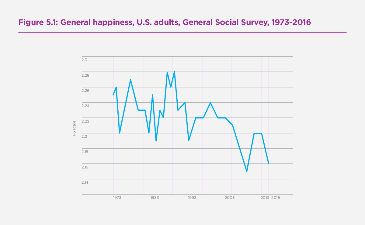
and most people haven't even realized it. As we can see from the graph below from the official World Happiness Report, U.S. happiness
has declined from 2.26 to 2.16 from 1973 to 2013.
From a policy perspective, there is often a lot of focus on indicators like the GDP, stock market, and the overall unemployment rate.policy
doesn't seem to always focus on overall human happiness because it may be seen as something "unquantifiable." With this project, we fundamentally set
out to show that happiness is quantifiable and associated metrics can be used to make policy changes that ensure a more productive, happy, and healthy society. We hope to discover
not just how well common economic indicators are correlated with happiness, but how other factors influence life as well.
Data
Auxiliary economic data that is not included in the original dataset,
e.g. GDP, government debt, and homelessness will have to come from outside our original datsets.
Our data includes data about health, including overall physical health, access to healthcare, and healthcare outcomes. We also include environmental
health and government corruption datasets in case we find interesting correlation in those datasets. These datasets
are collected from reputable sources, such as the Gallup Poll, the World Health Organization, United Nations and the World Values Survey.
Data Processing
Data Gathering
Most of our data is already available somewhere on the Internet in a table or JSON format, so we don't expect to do much data gathering in this regard. The only
data we will have to process is the home size statistics from the UN and the world homeless statistics, as both don't make their tables public.
Data Processing
Most datasets already exist in a helpful table format with clear documentation and methodology, meaning that we may not need to do a lot of processing; however,
we will have to clean some of the date range data to remove sections we don't need. This can be done through Python or even through manual deletion. We may not even have to combine data very much, as it even seems that most datasets we would like to use have already been combined with other datasets (at least in the case of the Our World in Data datasets).
However, in order to make our vision work, we will definitely need to employ multiple sorting and filtering functions to create full functionality. This will
be employed through Javascript.
Derived Quantities
With the vast amount of data we have to work with, it is difficult to say what quantities will be derived.
In general, we will stick to raw quantities--e.g. quantities not adjusted by any sort of statistical normalization
or manipulation. Our later original design features the following data quantities by country and continent: happiness, longevity, GDP per country, GDP per person,
burden of disease, child mortality, mother mortality, homelessness, average home size, and feeling of freedom.
Visualization Designs
Design 1
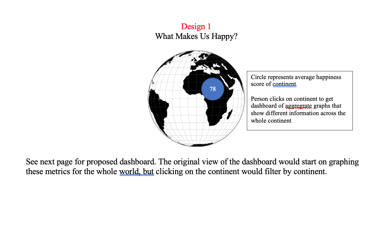
Dashboard graph designs will be spiced up by using color scales. For example, each continent will have its own color associated with it
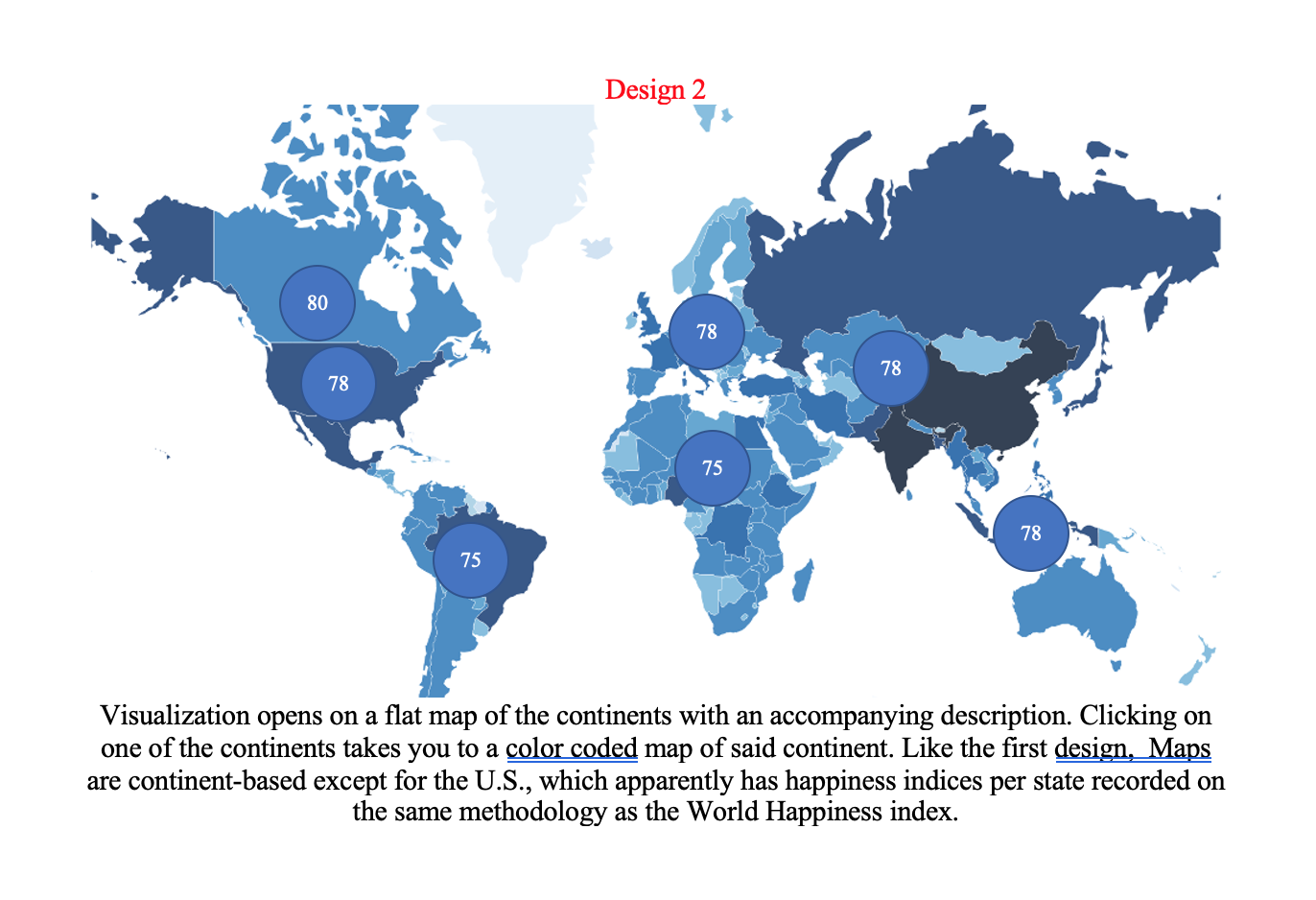
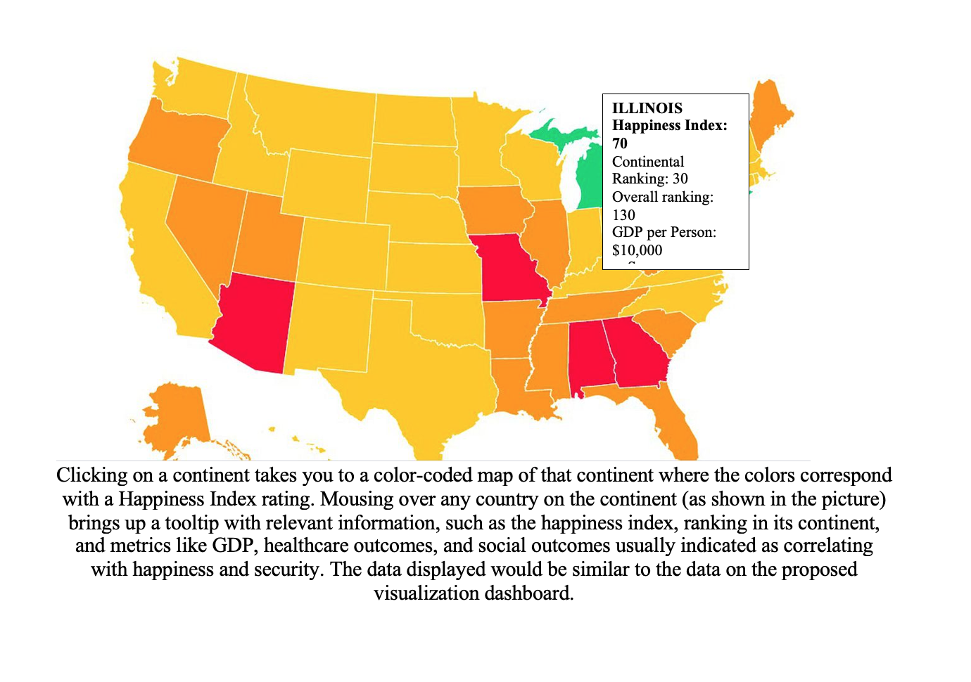
Design 2
Design 3
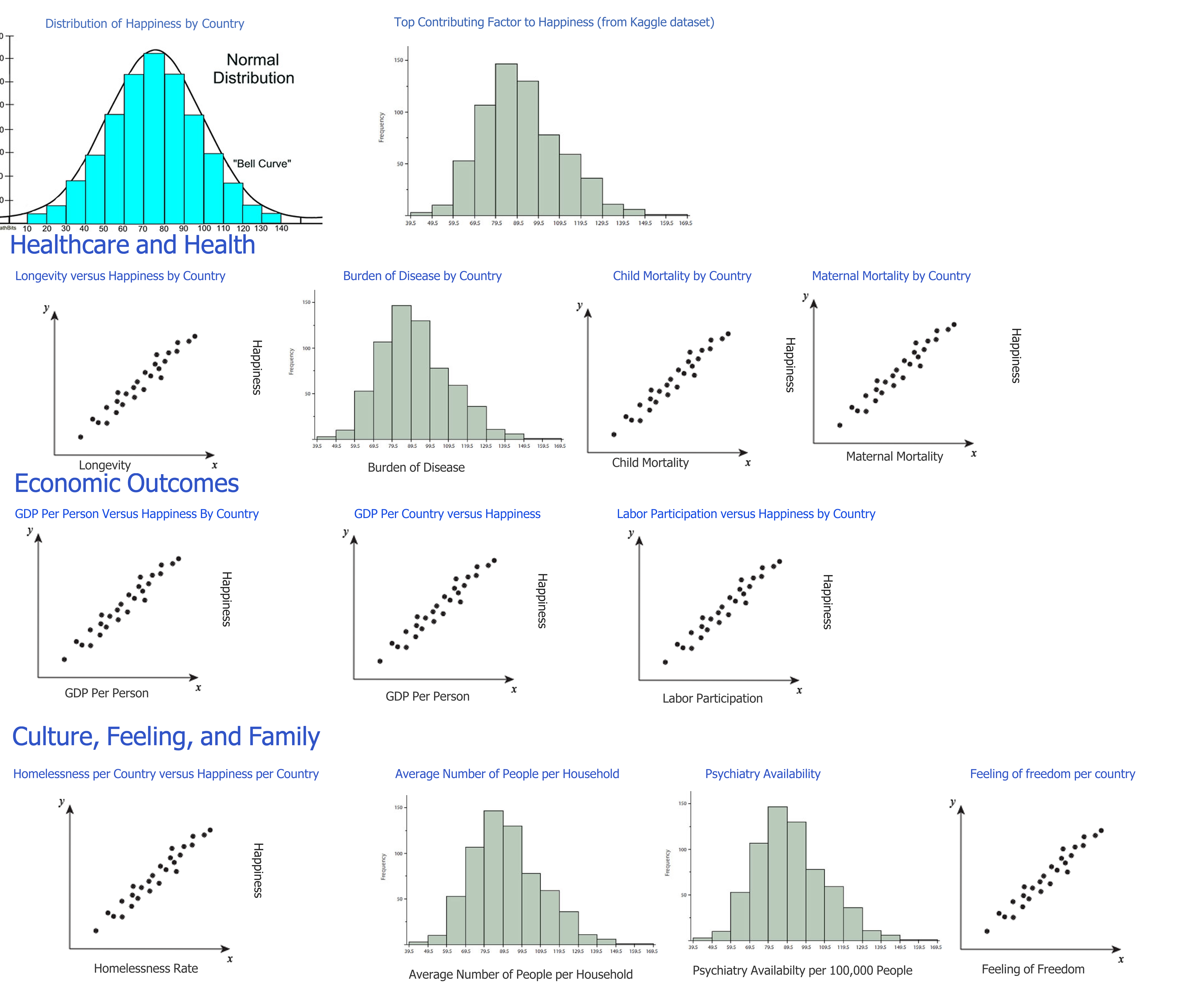
Underneath this world map would be multiple sections that provide a graph on the right side of the web page and a brief explanation or analysis on the left side to provide more context or point out interesting things, making it far more reliant on text than
Design 1, making the page more like a news article than a dashboard. Below is an example.

Sections of this design would include the following:
-
Color coded map of happiness index for the world
-
Scatterplot of happiness over time per continent
-
Distribution of happiness over world and per continent—histogram?
-
Scatterplot of overall country GDP versus happiness with option to filter by continent
-
Scatterplot of average wealth per person versus happiness with option to filter by continent
-
Longevity versus happiness with option to filter by continent
-
Child mortality rate versus happiness with option to filter by continent
-
Healthcare access versus happiness with option to filter by continent
-
Mental healthcare access with option to filter by continent
-
Burden of disease map color-coded by happiness with option to filter by continent
-
Homelessness rates with option to filter by continent
-
Average home size rate with option to filter by continent
-
Sense of freedom versus satisfaction with option to filter by continent
Final Visualization Design Justification
We chose Design 1 for our final visualization design for the following reasons:
-
Design 2 shows data per country, but doesn't adequately address trends across whole continents or countries.
Without correlation graphs, it is much more difficult to answer the question "what makes human happiness," making
it a vastly inferior choice to the others.
-
Design 3 shows much of the similar data in a similar format to Design 1, but features additional context in the form of
paragraphs. While this can be nice to point out interesting things on the graph, it requires the user to take attention away
from the visualization itself. A long wall of text may cause some level of disinterest.
Based on this assessment, Design 1 better answers the questions we posed in our original objective and prevents
distraction from the visualization itself.
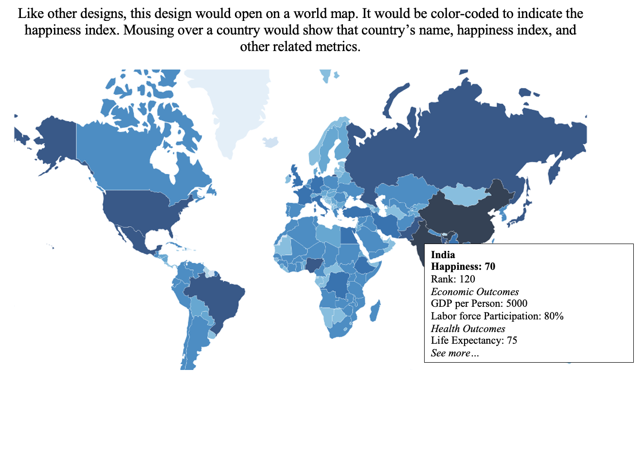
Must-Have Features
- In order to present happy index for any individual country, a map or globe of the world is required with color coding based on the level of happiness..
- Also, we need a way to specify or select any individual country in the map.
- To measure/show the changes of happiness, we need to respond to selection of dates, continents, or countries for the visualization
- Brushing needs to be employed for most charts to allow zooming in on a certain section.
- Scatterplots and line plots should have tooltips that show the country and data associated with each point.
- Frequency and bar charts should have tooltips that also display what countries are associated with each metric.
- All charts should have a color change associated with hovering over a data point.
Optional Features
- Map could have interactive zoom features to highlight the continents in more detail.
- Ability to build visualizations based on country selections--e.g. custom adding and removal of countries
- Transitions for adding, removing data, creating a smoother user experience
Project Schedule
We hope to have this project done by mid- to late- December. However, this
final deadline may change.
| Monday of that Week |
Julia's Assignment |
Andy's Assignment |
Jordan's Assignment |
| Nov. 16 |
Proposal |
Proposal |
Proposal |
| Nov. 23--Iteration 1 |
Prototype for Distribution of Happiness, Top Contributing Factor to Happiness, Longevity, Burden of Disease, Child Mortality, Updates |
Prototype for Economic Outcomes, Maternal Mortality |
Culture, Feeling, and Family |
| Nov.30 |
Clickable map and attach click event to filtering, scrubbing graphs |
Tooltips for data points or data bars, scrubbing for graphs |
Filtering data by continent |
| Dec. 7--Iteration 2 |
Color scale for happiness on map, clickable map, scrub other datasets, finish implementation, start overview |
Color changing when clicking on data points/bars/whatever in chart, scrubbing |
Color legend for graphs, statistical methods for overview, start on overview |
| Dec. 14 |
Implementing country by-country filtering--extend to one country |
Implement country-by-country filtering--extend to multiple countries |
Implementing a search function/dropdown to select countries |
| Dec. 21 |
Zoom on map, implement whatever charts found interesting |
Transitions, whatever he's interested in |
Tweaks user experience for flow and clarity, whatever he's interested in |
Possible Complications
Complications with Data
Though we've tried to gather as many datasets as we can and vetted the
legitimacy of each one, we understand that we may need to include other datasets if we
find that some dataset does not fully design our purposes. In this case, we will verify with other group members
and class staff before doing so.
Complications with Design
Over the duration of this project, we expect to find interesting correlations in the data that we may not have
included in our original design--hence the extra datasets. If we think that adding a new chart or section will help with the understanding of human happiness,
we will discuss with each other and with the course staff.
Milestone 1 Process Book
Design Changes
We received feedback from our professors that our original dashboard design didn't really answer our questions
about common markers of happiness, what we could learn from the most happy countries, least happy countries, etc.
We altered our design into a paginated one as the sketch below indicates. Instead of having a single dashboard,
we have an overview, which will now include a statistical analysis of self-reported happiness contributors and the real
correlation between different data metrics and happiness (overall). Under each statistical graph
will be a text analysis explaining our methods and the correlation between our chosen factors
and happiness--i.e. positive, negative, etc. We are hoping this statistical analysis page
will reveal the most pertinent trends in happiness across the world. The "Explore" page has essentially
unaltered functionality from the basic design, but graphs are now chosen from a drop-down--
they are not displayed at once. I haven't made a sketch for this, because I feel it doesn't deviate that much
from the original.
Finally, we have a page specially built for the 15 happiest and 15 least happiest countries that focuses
special attention on the happiest and least happiest among us.
Data Changes
All data for our visualizations is ready to go inside CSV files. These particular CSV files are listed
on the "Explore Our World" page that talks about what we are going to graph. The datasets will require
some JS-side filtering, as they often include more data than we are graphing, but they are otherwise
complete to the best data-gathering ability.
Initial Data Exploration
Something interesting to note in our initial data analysis was that
suicide rates do not have a strong correlation with happiness. Is this due to a lack of mental-health
data in less-developed countries, or are depressed people outliers from the happiness metric of the original population?
An interesting analysis point that could be added to our overview in the future.
Implementation
Implementation for now has been done using very simple methods. Like most other assignments,
we have a main.js file as a controller, with object files as the inputs to the main.js implementation.
Upon selecting a visualization from the breakdown, the createVis re-updates the given parent element
with the new visualization object that has been selected. It all essentially follows the bog-standard pipeline
well-known to studios.
Unfortunately, this means that a large amount of code is being reused, and certain data cleaning aspects
may tank performance in the long run. This necessitates the creation of a new abstract scatterplot object by next
iteration that can handle any dataset, destroying the need for multiple objects. If we can implement this, we can also explore
the possibilities of other types of charts and additional data from our dataset, as we'll have to spend much less time
implementing different scatterplots.
Proposal Calendar Changes and Code Refactoring Ahead
Proposal calendar changes to be adjusted on Tuesday, November 24, 2020, in light of difficulties
with original design and implementation. Major code refactoring will become part of the proposal so that we may convert data
ahead of time and create a "generic" and highly abstract scatterplot class that can be applied to both the
base happiness data and any auxiliary data. This will help us to create more high-performing, reusable code. The team will also more greatly scrutinize design choices.
Milestone 2 Process Book
Implementation--Data Processing
The overarching goal of an abstracted-out visualization class necessitated
some serious consideration of our data-loading and filtering methods. In Milestone 1,
we loaded multiple datasets and used JS array filtering methods to concatenate series
of interest together within the individual visualization class. However, with so many
planned data series in the visualization, this method of loading in different datasets and considering
relevant series based on the individual visualization object was both computationally expensive and
really coding-intensive.
To resolve this issue, we created one dataset using a combination of built-in Excel tools and the
Python pandas library. Built-in Excel functions were used in initial data processing to filter for indicators of interest, rename columns if necessary,
and get rid of extraneous columns. Python and the "Pandas" library was then used to merge data to the world-happiness-report-2015 dataset, which served
as the overall project base (see exportHelper.py); it was also used to clean the dataset from extraneous countries or other other
extraneous fields.
The results of this data cleaning and merging can now be found in new-data-cleaned.csv, which is the final result. Our
Python cleaner is pretty extensible and can be used on other potential series.
Implementation--Abstracting Out Visualization
As noted before, one of the major goals that was added at the end of Milestone 1 was
abstracting out our visualizations such that one visualization class could be used to
create any graph of a scatterplot nature. We managed to refactor our lifeExpectancy.js file into
lineTemplate.js. Now, any future data series we try to add can simply be added onto the "mega" dataset
and shipped into the template's "data" property.
The refactoring began with adding more object properties. In order to potentially graph many
different things against happiness, we added an x-axis property that could be used to get the
series of interest out of the mega-dataset. We also added an x-label property, because data series names
are not always exactly the same as pertinent axis names. With refactoring to wrangleData(), these new object properties allowed us
to a) graph different series at will, b) scale our axes and data plotting to different series at will,
and c) change our axis names at will. This makes our plotting very flexible.
One thing we also realized when creating this abstracted-out line graph class was that changing our
data points from strings to doubles could be somewhat resource intensive when being done multiple times. However,
as noted above, the creation of a single dataset allowed us to implement our string-to-double
filtering such that it only has to be done once.
We also added a region property, which has a purpose that will be expanded upon in the "Filtering by
Continent and Value" section.
Implementation--Filtering by Continent and Value
Filtering by continent and series of interest was completely refactored when lineTemplate.js was created.
Before, when a selection change was registered, code in main.js took in the selection as a parameter and
created the corresponding graph object. Obviously, this was pretty cumbersome, as if we had kept going
with individual objects for each of our series, we would have had to create a pretty long switch case. With lineTemplate.js,
any selection change is passed to the chart object, which then internally filters its display data. This structure
allows us to implement changing region of interest and series of interest with very little code.
Data Exploration Notes and Design Changes--Explore/Compare
Some design changes were made in the implementation of explore/compare, especially in the datasets we used.
For example, as noted before, there were no clear correlation between suicides and overall national happiness;
we can assume that not only is suicide data often poorly kept or gathered due to stigma, police botching, etc., but
also that people who commit suicide are happiness "outliers" when compared to the general population
and their happiness level. Because of this issue, we removed suicide data from our visualization options. We are still
thinking about what kind of data we would replace it with.
One other thing we changed is adjustments to our environmental plots. It turns out that a combined mortality rate for
safe water and hygiene problems exists; this series captured the wider impact of poor municipal facilities,
so it replaced the safe water alone metric. We also added electricity access to our considerations, as we believe
electricity access will also inform other hygiene and disease metrics by reducing indoor smoke and air pollution,
allowing more advanced medical facilities, and allowing greater public safety (to some extent).
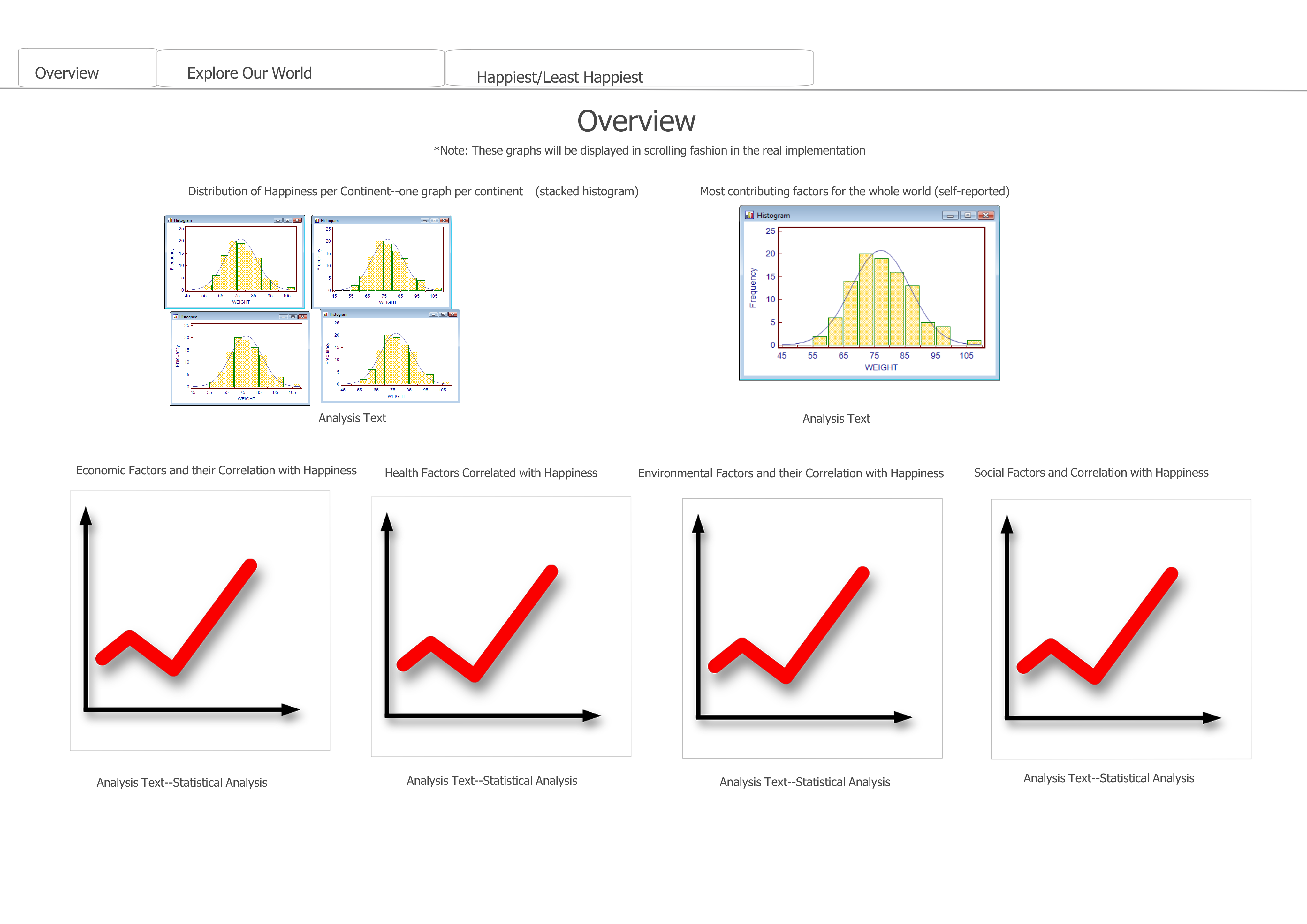
Implementation--Overview
For the overview section there are 5 different visualizations. The first one is a basic histogram that
that shows the distribution of happiness scores for every country. The x-axis is the range of happiness scores and the
y-axis is the frequency of the particular score. The histogram was made using the d3.histogram method to determine the
appropriate bins for the visualization based on the happiness scores and the number of I put (which was 50). The next four visualizations are linear
regression graphs for the four main factors we are comparing with happiness scores, these four are economic factors,
Health, Environment, and Social Factors. These four graphs along with their discriptions underneath give insight into
which factors have the greatest impact on a countries happiness. The visualizations are a simple scatter plot with a
trend line attached. Using the least squares method the slope, y-intercept, and r-squared value were calcuated and the
trend line was drawn using the slop and y-intercept to calcuate the appropriate x1,x2,y1, and y2 value.
Design Choice--Scrubbing v. Tooltips?
In the first sketch aforementioned, we decide to implement tooltips and scrubbing at the same time.
However, since both functionalities are trying to capture the movements of mouse(specifically, the event passed as function parameters), it's impossible to do both.
Therefore, we have to consider tradeoffs while making the decision:
(1) What features are mandatory for the design?
(2) What actions would yield details more effectively, without messing the pages up?
After weighing the strengths of both design, we decide to move forward with tooltips, since data classification with regions are already done with color scales.
Moreover, tooltips are more flexible; instead of choosing an arbitary region, we can look at disconnected dots immediately with mouse movement.
Evaluation
When we evaluate the work for how we could have done the visualization better, we find it difficult to see how we could have used another graph
to show the relationship between different aspects of this data. However, we have waffled back on forth on whether
or not to have made the visualization more of an "article" with some limited interaction and more abstract plots.
Doing this would have allowed us a more pedantic approach, that is, we could have dictated more interesting
features or incidental correlations to our audience; our current implementation is far more open-ended
in what the audience will notice. The audience in our current implementation will likely notice the
general trend of happiness and our data; however, they may or may not notice clustering or other correlatory features of our data. Whether or not
the audience would be interested in a more pedantic approach (rather than open-ended exploration) is something we will re-evaluate after peer feedback. This
evaluation section will likely get a sequel in the future.
Takeaways from Peer Review
The peer review was helpful because it not only exposed the weaknesses of the visualization, but also confirmed
some of the things we were thinking about our visualization. Obvious fixes--including adding legends,
fixing some styling, and adding trendlines--were all things that we ended up implementing
as part of our peer feedback. We also received less concrete feedback about the nature of the visualization.
Some testers felt that the visualization lacked adequate "context" for its exploration; others felt that
a more "storytelling" approach would be more helpful for such a deep and complex subject.
Goals for Further Project Iters
Our refinement of this visualization will likely not end at Iteration 2. We plan to add more obvious legends, more options for data filtering
to allow users to explore the world to their heart's content, and text analysis on our overview/exploration to further explain what trends we see. We also think
it would be fantastic if our data points had transitions that either caused them to move or fade in/fade out with changes to the series of interest.
Milestone 3 Process Book
Design Mockups for Happiest/Least Happiest
We received a lot of feedback that suggested that we should take a more "storytelling" approach
to this project. With this in mind, we decided to redesign happiest/least happiest
a bit to provide more structure and insight to the data. With the amount of data we wanted to explore,
we opted to go for a more didactic "article" or "analysis" approach that we had putted around
as a potential idea with a more storytelling approach. Taking one of our original ideas--Design 3--for a more 'article-based' style of analysis,
we began putting together a design that would deliver more directed analysis and would allow
people to scroll (something they love to do)!
However, upon creating a quick mock-up,
we quickly realized that the repetitive structure and lack of depth
would necessitate more designs. One thing we wanted to do was to use more of our data
from our original dataset--the World Happiness Index Poll itself. This dataset included
several factors that contributed to happiness, but unfortunately, we struggled to figure out how
to compare these variables on a visualization in a visually interesting and informative way.
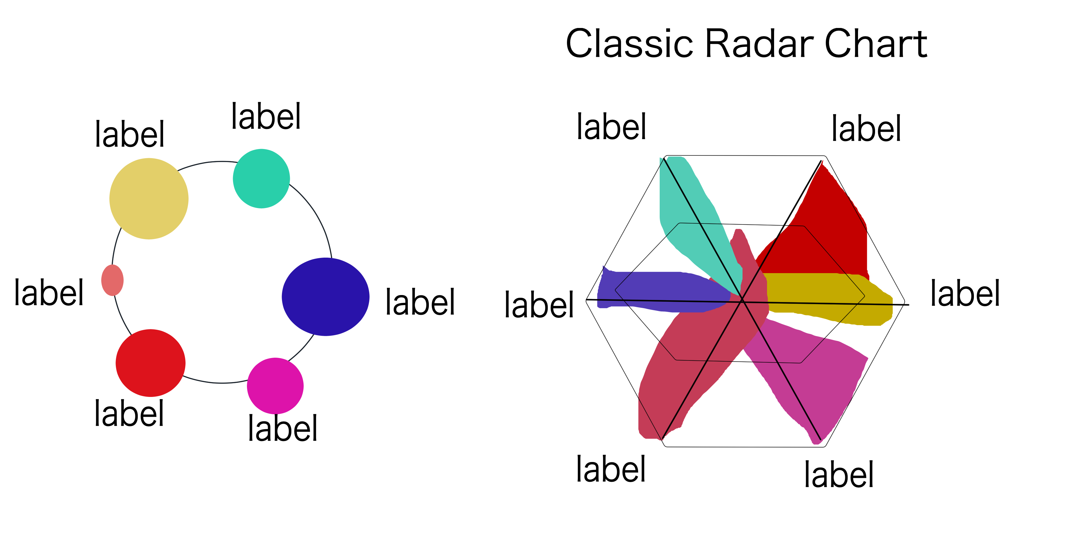
We eventually decided to go for a simplification of the radar chart in order
to prevent a confusing color overlap. Our first idea for displaying this simplified radar chart
with its respective country was to initialize it on a map:
Unfortunately, this design quickly broke down due to its complexity and
detail in a small space. Our major problem was that since the happiest and least happiest
countries were in the same areas, our map would have to be exceedingly large
for the design to be visually parsable. We decided to not scrap the map entirely--instead,
we decided to place the variable comparison in a neighbor visualization. The map could be
used to reiterate points of interest and allow user exploration of each country.
After implementing this, we realized that we could use a similar format to
provide some more economic analysis, which we thought was focused on somewhat inconclusive factors
in Milestone 2. Thus, we implemented a simple pie chart--a classic breakdown for things with sectors--
to describe the economic makeup of each country. Overall, we were happy that implementing
new visualizations in our happiest/least happiest really helped to offer more avenues for analysis.
Implementation--Donut
To show the breakdown of economic sectors, we decided to incorporate the design with interactive map
with a donut-like structure that would allow us to do an analysis we thought might yield some
interesting results with respect to happiness. The donut itself was implemented with
a basic d3 pie chart, accompanied by some minor tooltip functionality. The more interesting
part of the functionality was passing data from the map to a new visualization donut. In order to do this,
we had the economic breakdown map pass certain variables
to an instance of the donut in their mouseover event. The donut would then be dynamically construct
based on the factors passed.
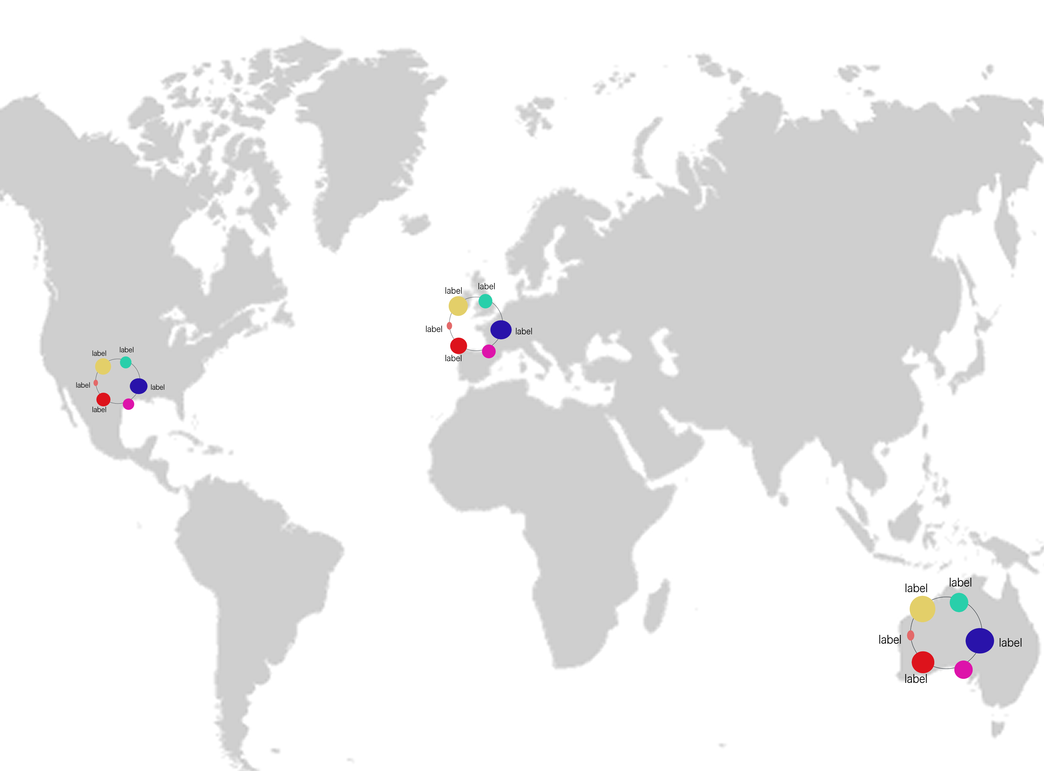
Implementation--Compare Happiness Variables Septagon
The implementation of this--while seemingly simple--went through a few different iterations to be fully
workable. We first tried implementing the Happiness Comparison with a force chart. Unforunately,
the force chart output was very small compared to the visualized svg space. Furthermore, while the force chart
maintained its shape at small link distances, attempts to make the links and nodes larger to fill said
space resulted in the force-graph spaghettifying. After this, we looked into a d3 septagon shape, but no
such thing exists. After a while, we had to go for a good ol' hard-coded septagon, unfortunately. Using
an online coordinator, we created lines and node locations. The radius of each node was calculated
as a fraction of the total variable sum (or total happiness score). As with the donut,
we used an onMouseOver function on the map to pass certain country variables to
a new instance of the StatsWheel object.
Evaluation
When we evaluate the work for how we could have done the visualization better, we wonder if we
maybe should have focused on fewer happiness variables. Because we tried to answer some really, really big questions,
the design both grew in complexity and repetitiveness over its implementation. If we were to do it again,
we would (as the peer feedback suggested) immediately focus on a storytelling approach. We would have also
limited our analysis factors much more--possibly down to only the data from the original survey itself, of which
we would have made many more different visualizations. Doing this
would have possibly allowed for a more directed and concise approach to the major questions of human happiness.