CSE457: Final Project Process Book
Basic Info
Project title:
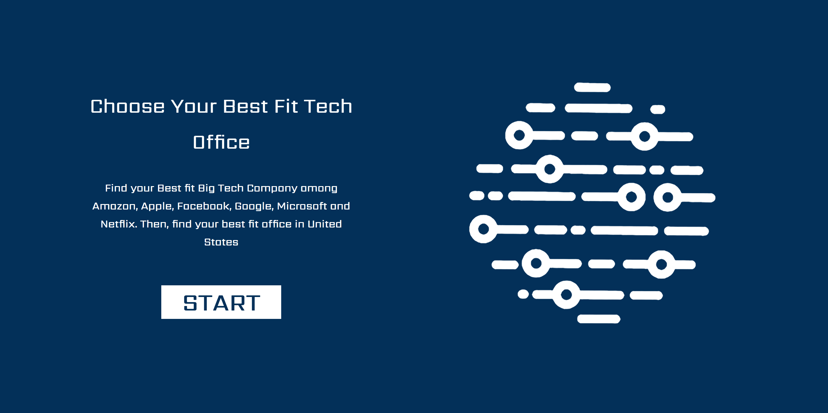
Find your best fit office
Members:
Name: Bessie Ji;
Email: yaqi.ji@wustl.edu;
ID: 448284
Name: Sylvia Sheng;
Email: sheng.sylvia@wustl.edu;
ID: 443552
Name: Zinan Chi;
Email: chizinan@wustl.edu;
ID: 450109
Project Repo:
https://github.com/ji-yaqi/Cube
Project Video Demo:
https://youtu.be/jhegAtoBGH4
Background and Motivation
As juniors and seniors close to graduation and new to the industry, we are curious about the big name companies - Google, Amazon, Facebook, Apple and Microsoft. What differences are there for all those companies? We have found a dataset gathered
from Glassdoor reviews with ratings in terms of work balance, culture values, career opportunities, company benefit and senior management.
We decide to create several visualization to display the differences in those ratings and help users discover the company that they best fit. Moreover, within each company, different locations/offices have different cultures too. Our
visualization will also help users discover their best fit location.
Project Objectives
We would like to answer the following questions through our visualization:
What are the differences in terms of work balance, culture values, career opportunities, company benefit and senior management for those companies?
Within the same company, what are the differences in terms of work balance, culture values, career opportunities, company benefit and senior management for different location/offices?
Data
Dataset from Kaggle:
https://www.kaggle.com/petersunga/google-amazon-facebook-employee-reviews
Data Processing
There are 67.5k reviews inside this dataset. Some data are not completely filled up, with value “none”. We need to remove those data, expecting 30k of valuable reviews.
Next, we will create an array of objects with rating data from work balance, culture values, career opportunities, company benefit, senior management and locations columns and change them to proper data types.
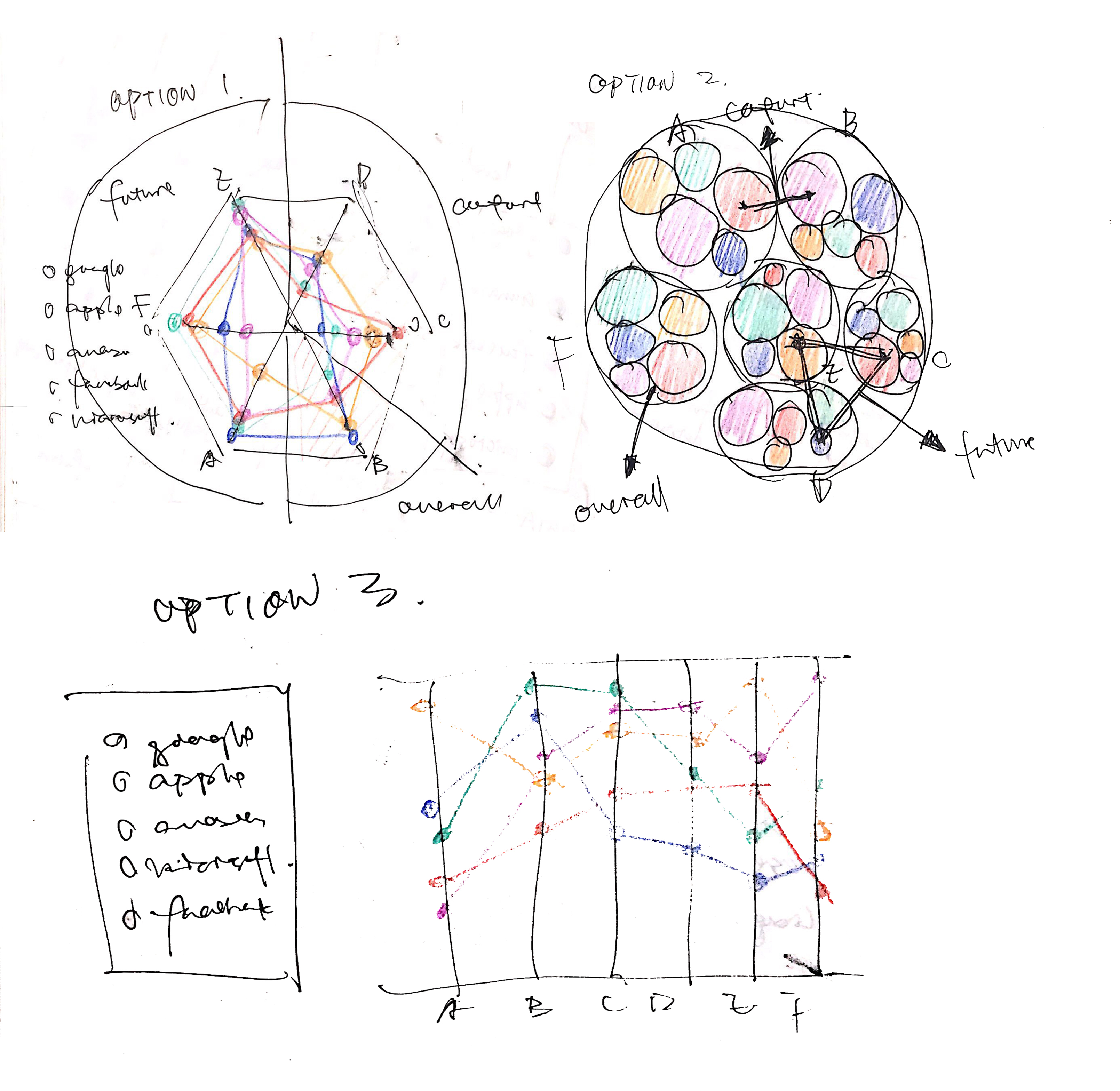
Visualization Design
Must-Have Features
- View the company’s ranking according to overall rating.
- For each individual company, there will be at least one visualization indicating the differences among different office locations.
Optional Features
-
Ability to sort the company with criteria that users rank as important.
Project Schedule
|
Due Date
|
Internal deadline
|
Submission Deadline
|
|
3/18 (Monday)
|
Project proposal text
(Bessie Ji)
Project proposal
sketches (Zinan Chi)
|
Project proposal
|
|
3/25 (Monday)
|
Data Wrangling
(Sylvia Sheng)
Design for 1-2
visualizations (Zinan Chi)
|
|
|
4/1 (Monday)
|
Implementation for
1-2 visualizations
|
Milestone I - a
functional project prototype
|
|
4/8 (Monday)
|
More data wrangling
if needed (Sylvia Sheng)
Complete design
(Zinan Chi)
|
|
|
4/15 (Monday)
|
Implementation for
the rest of visualizations (Bessie Ji)
|
Milestone II - a
fully functional prototype
|
|
4/22 (Monday)
|
Modifications to the
design, implementation and others (ALL)
Final presentation
Prep (ALL)
|
|
|
4/25 (Thursday)
|
|
Final project
presentation
|
|
4/29 (Monday)
|
Modifications (ALL)
|
|
Milestone 1 updates
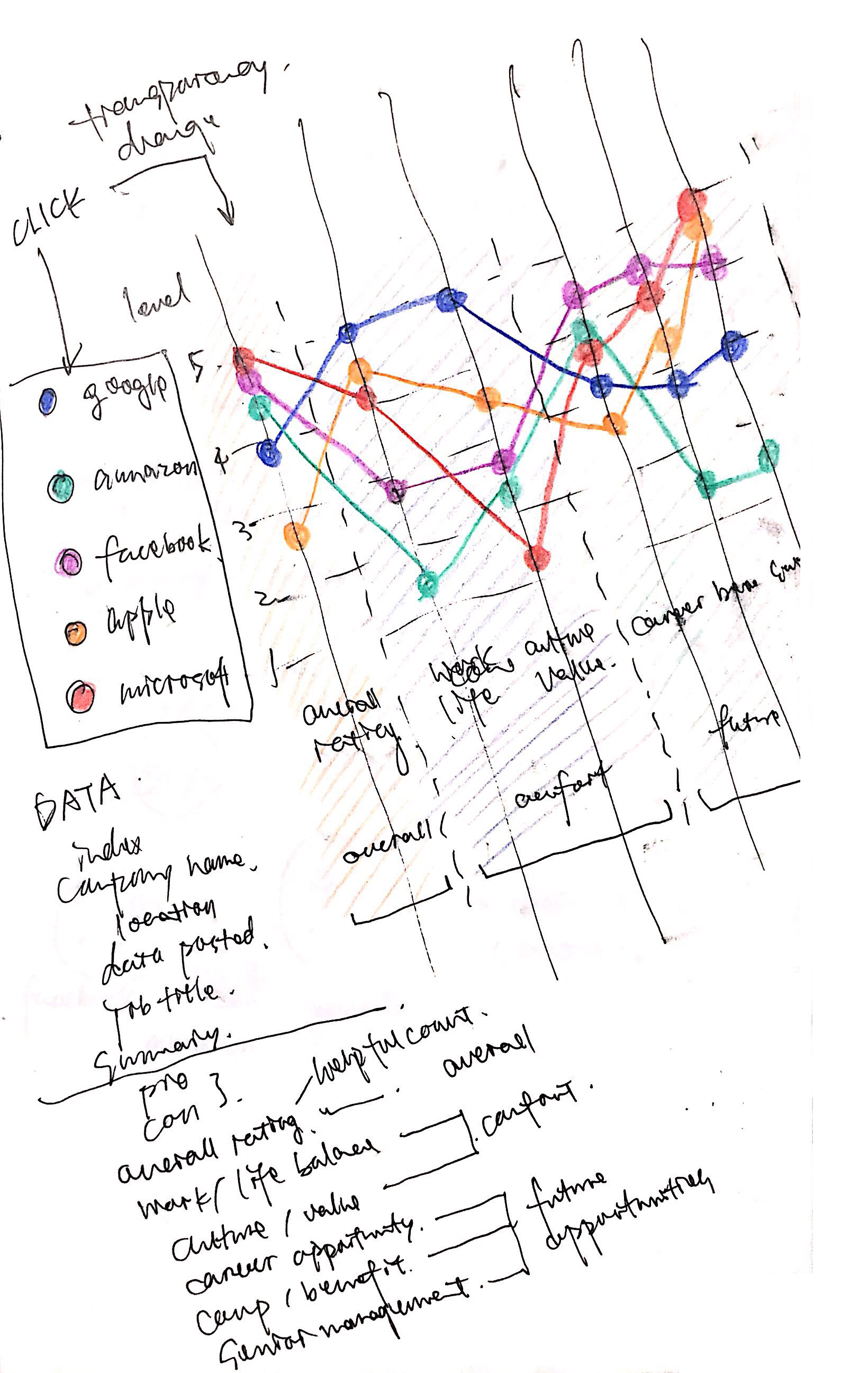
Data wrangling
We processed all 67.5k reviews inside this dataset.
We removed all records with "none" value ratings, and removed all records for foreign country locations.
There are 24.2k relevant records remain in our dataset, and we will build the visualizations based on them.
We then filtered out the unnecessary features (including date, links etc.) and passed the csv.
The general data structure is shown below. This includes all the information for various visualization purposes.
var data = [
{
company: d.company,
city: getCity(d.location),
state: getState(d.location),
summary: d.summary,
pros: d.pros,
cons: d.cons,
overall_r: +d.overall_ratings,
balance_r: +d.work_balance_stars,
culture_r: +d.culture_values_stars,
career_r: +d.carrer_opportunities_stars,
benefit_r: +d.comp_benefit_stars,
senior_r: +d.senior_mangemnet_stars
},
...];
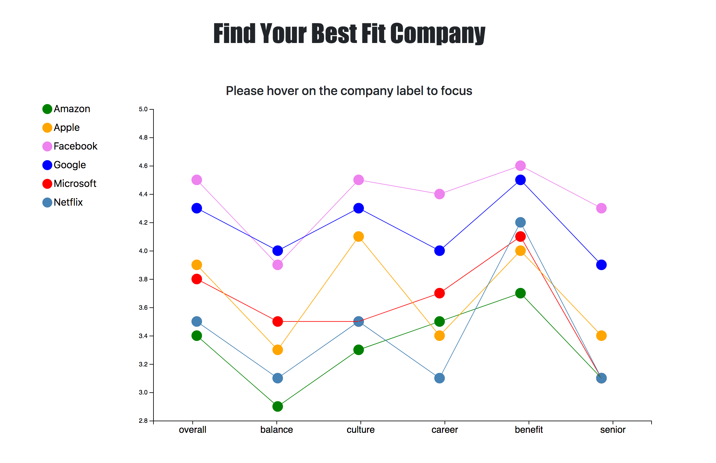
For the company average ratings visualization on the main page, we grouped the data and averaged the ratings for each category.
The average ratings data structure is shwon below.
var averageData = [[
{
company: "amazon",
overall_r: 4,
balance_r: 4,
culture_r: 4,
career_r: 4,
benefit_r: 4,
senior_r: 4
}
...];
Visualization implementation
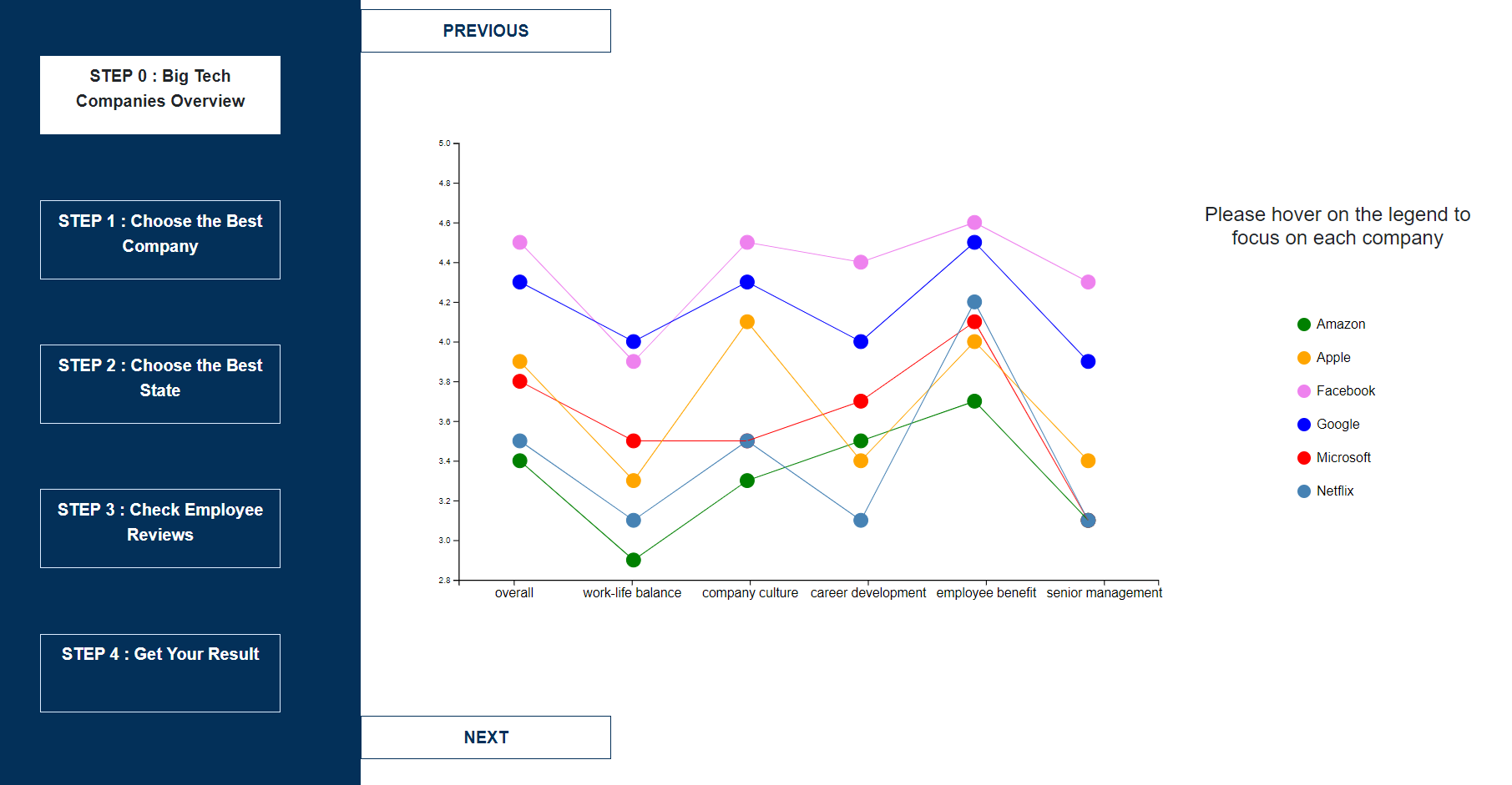
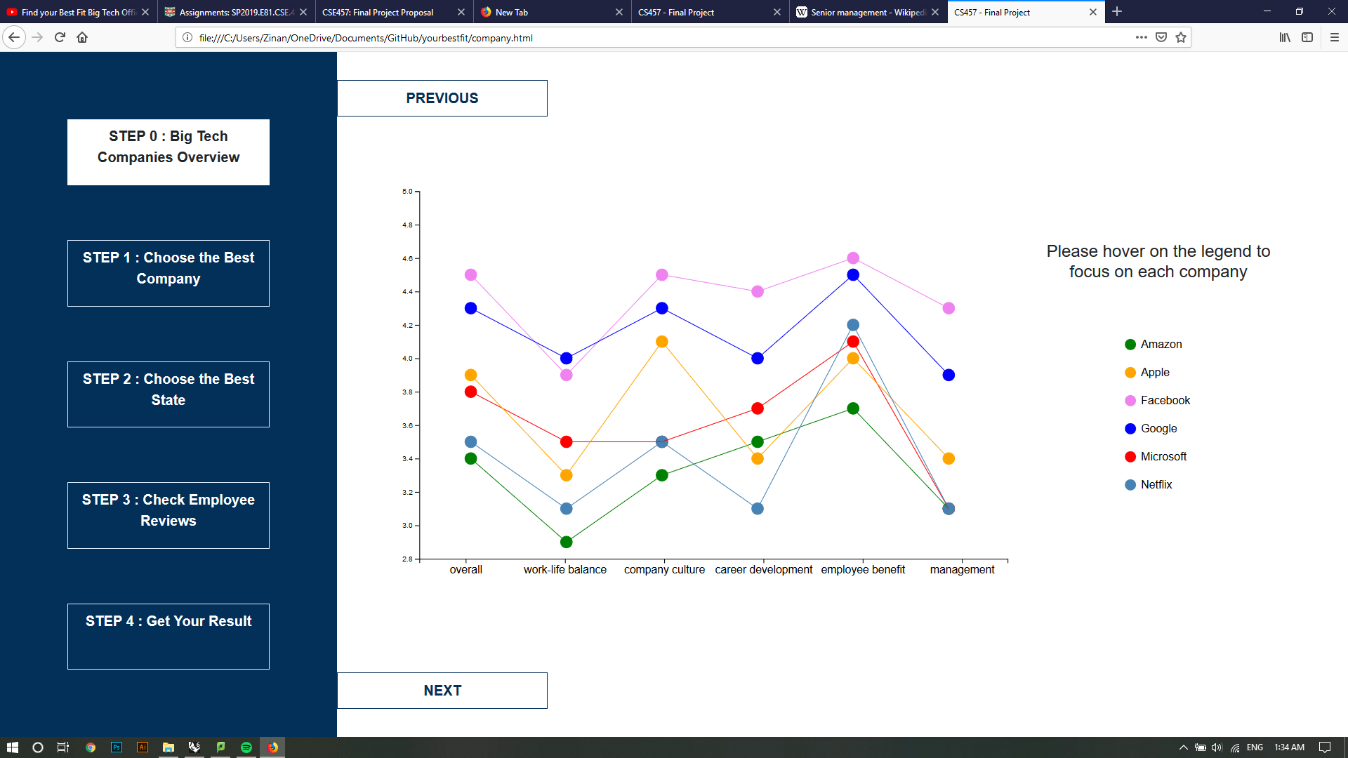
We implemented the average ratings for companies on the main page. We used line charts to realize the visualization.
We also implemented one interative feature triggered by hovering over the legends.
We will modify the color scheme for this visualization and add more visualizations in the next 2 weeks.
The final product will be a multi-page website which enables extensive user interactions.
Here is the screenshot of the current visualization.
Milestone 2 updates
Data wrangling
In addition to the data wrangled during Milestone 1, we added the data for state map, one example is:
var states = {
"California":{
fillKey = "yes";
count = 3000;
overall_r =3.4;
balance_r =2.1;
culture_r =4.6;
career_r = 4.7;
benefit_r = 4.6;
senior_r = 2.5;
},
......
}
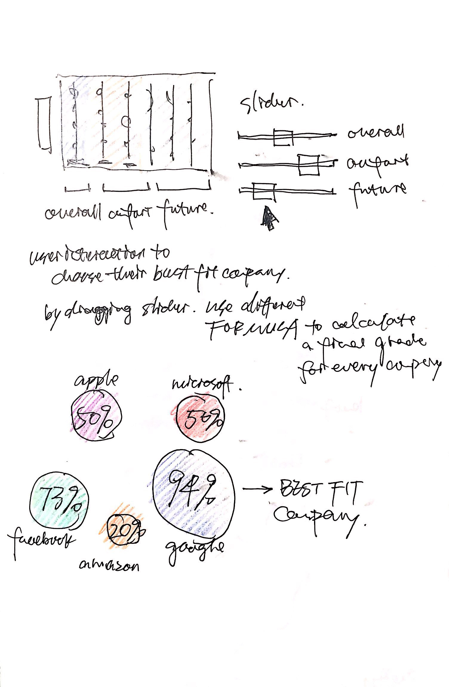
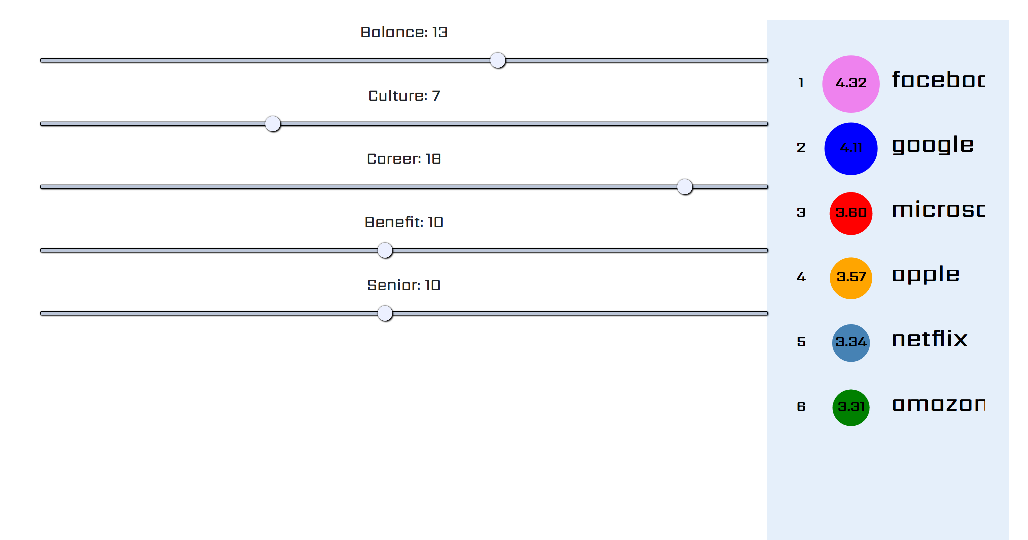
The data used for drawing circles with slide bar selection is:
var companyWithRankingNumber = [
{
name: "Google",
index: 4.33
},
{
name: "Facebook",
index: 4.56
},
......
]
Implementation - storyline creation
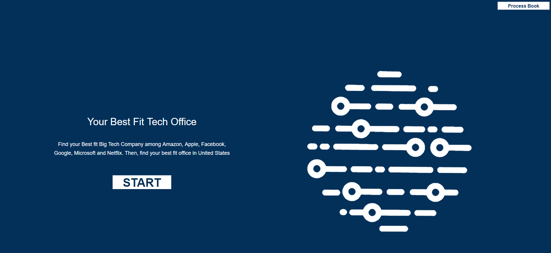
We designed our web page to tell a story for the user. On the first screen, there's instruction for user to choose their best office and explained our main function of our website.
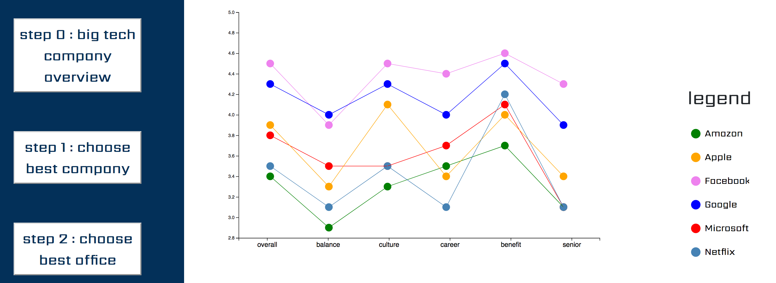
Next, after clicking on start, we can see average ratings for companies and their legends. By hovering over the legends, we can see highlighted color for that company.
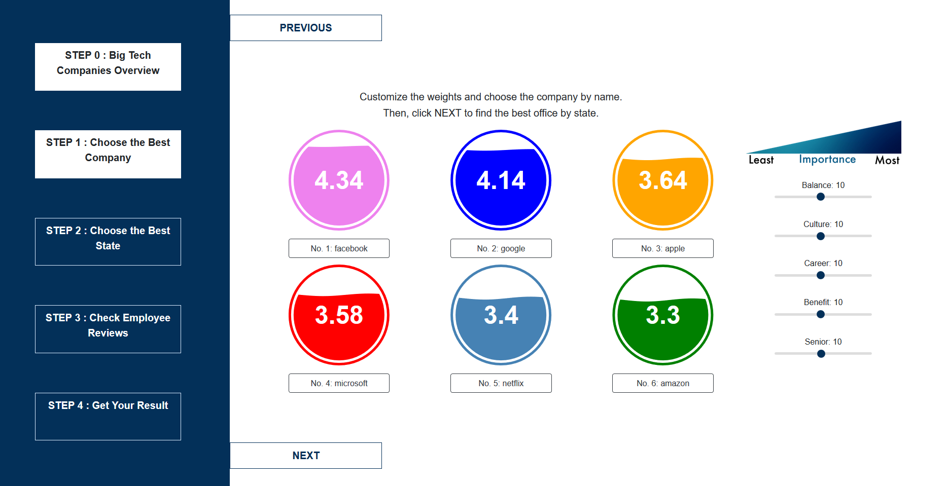
After that, user can adjust their own preference over certain criteria and we will compute the new overall rating and represent by circles of varying size and varying color.
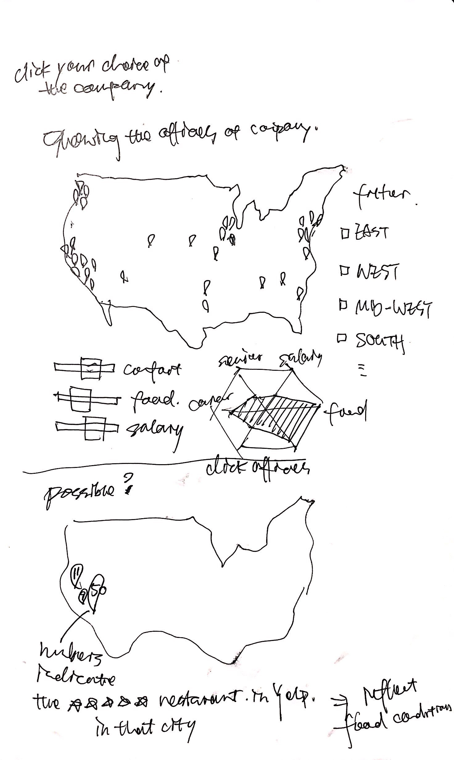
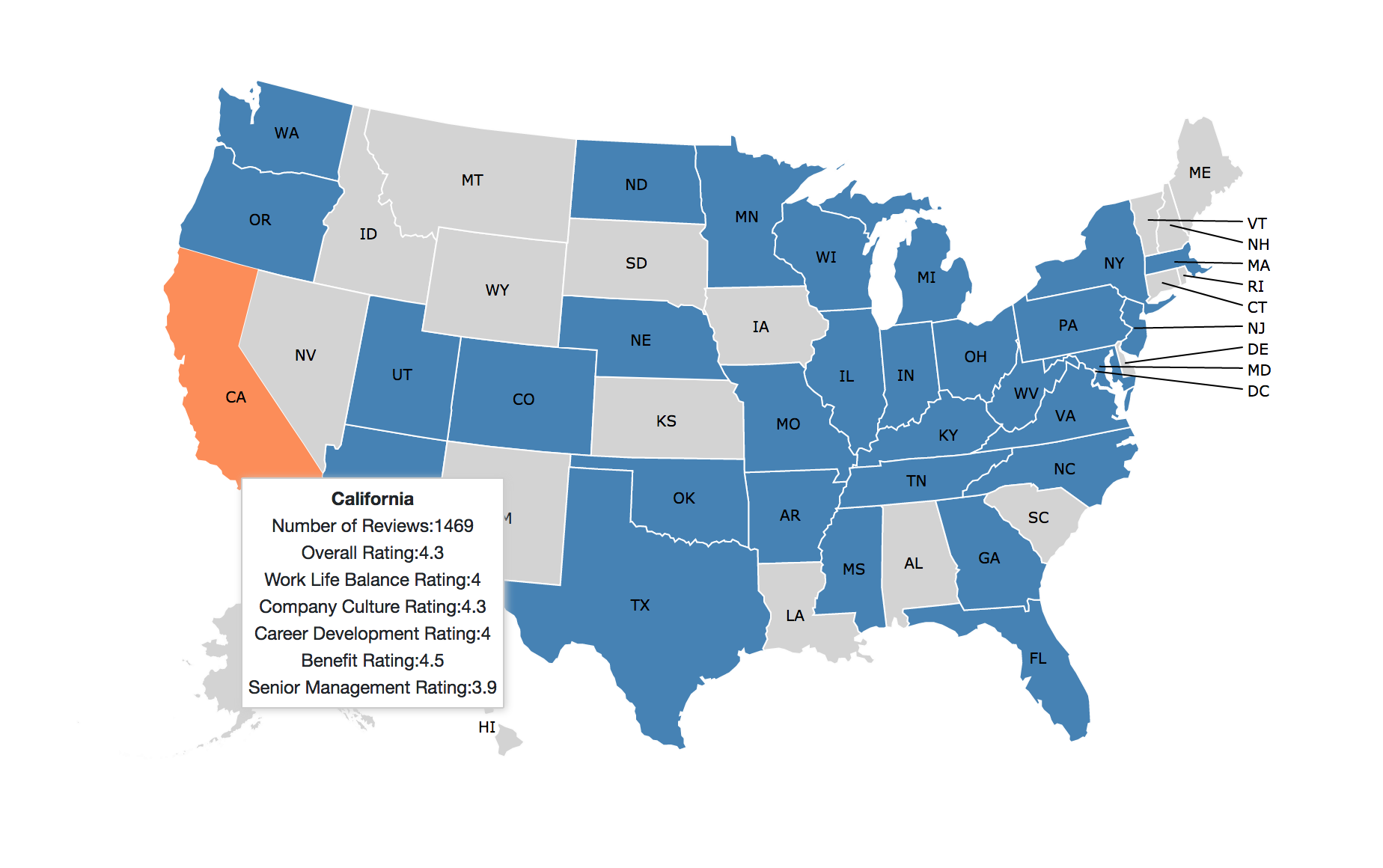
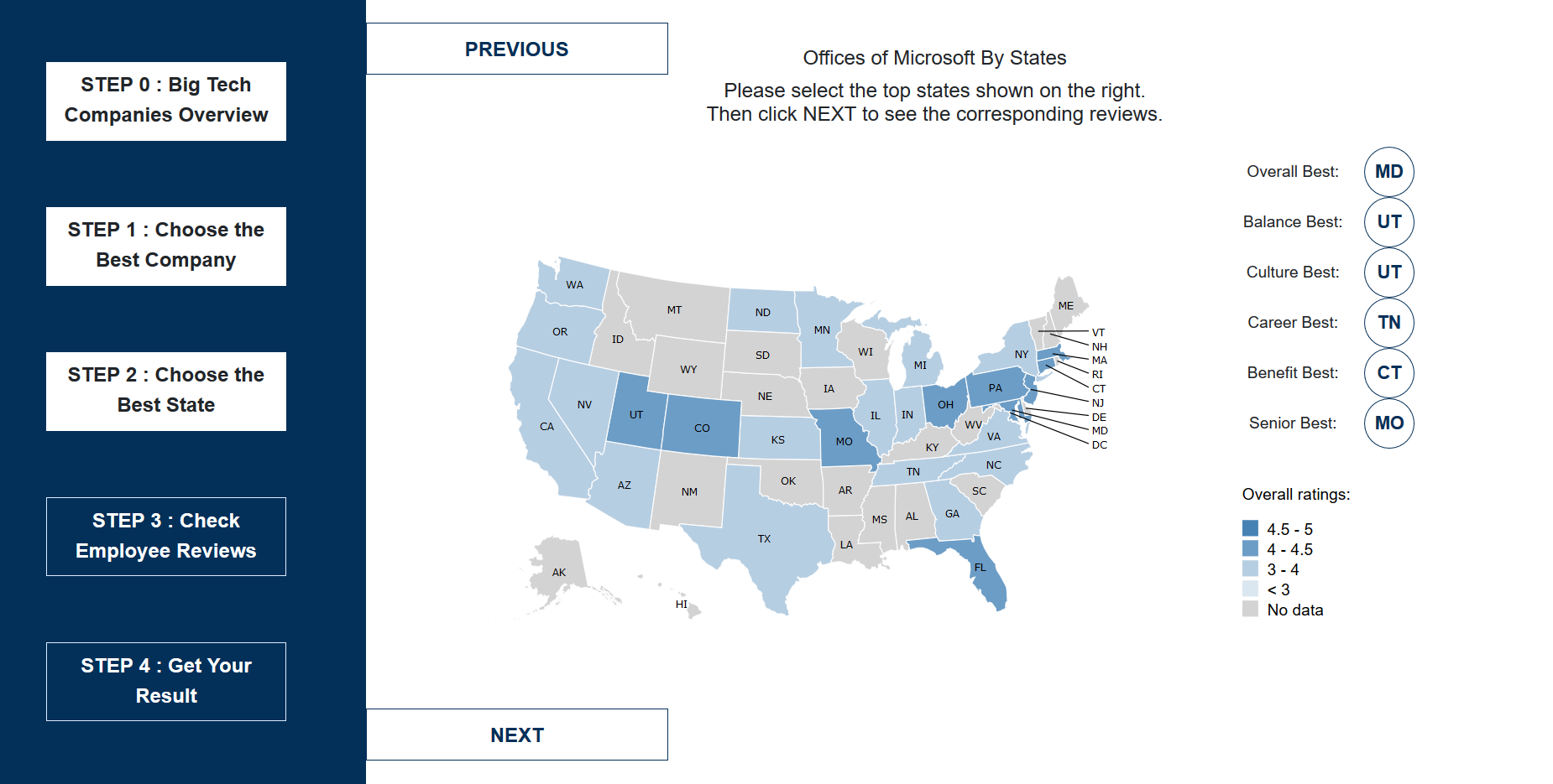
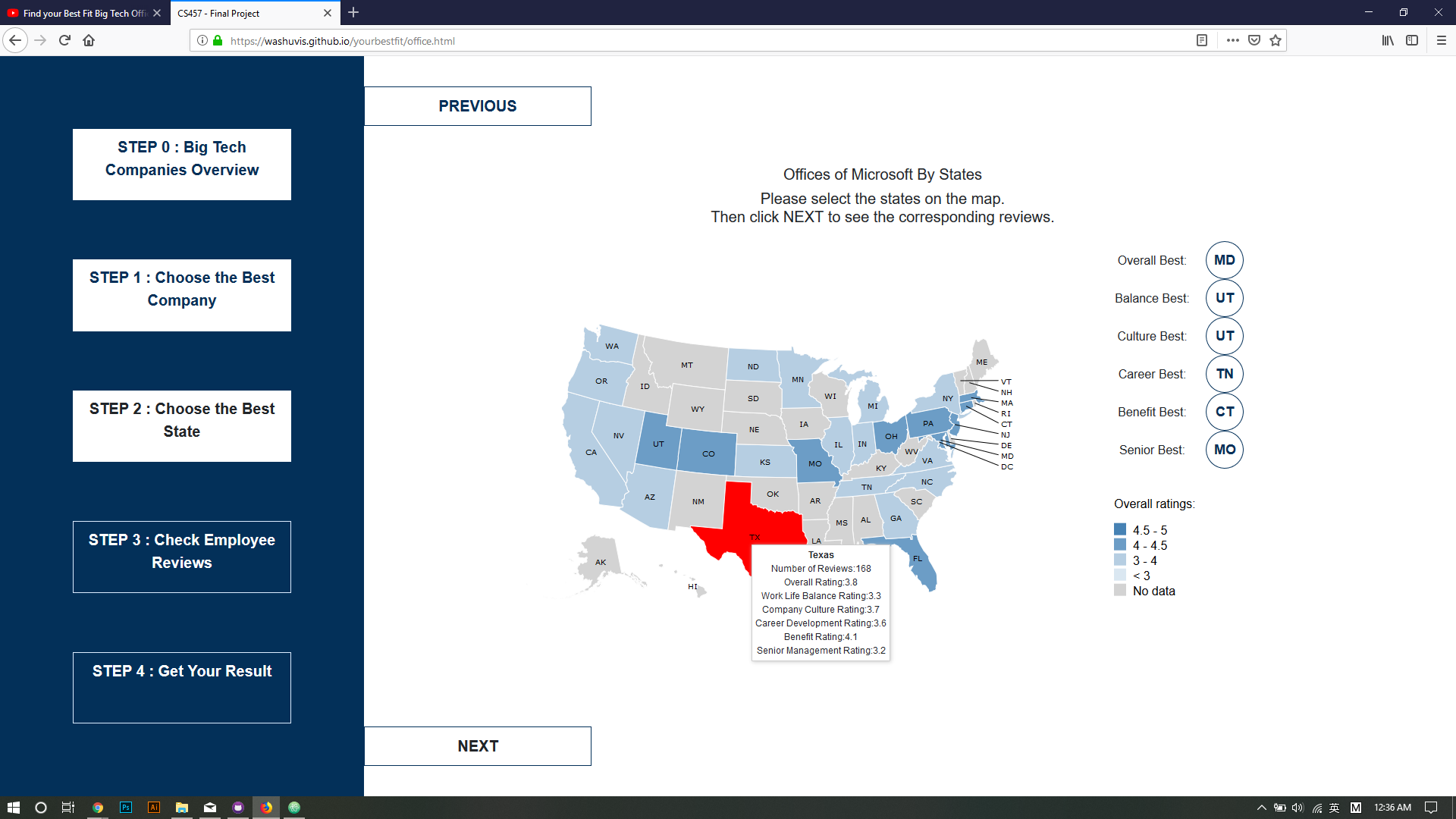
Next, by clicking on the circle for the company that user is interested in, the user can have a US map with all the offices. Grey indicates that there are no office within that state and blue indicates that there are office in that state. By
hovering over states, the state will change the color and we can see a tooltip with calculated data including overall rating and each criteria for that specific state.
Evaluation -- User Feedback 1
We randomly pick three volunteers from wustl CSE457 class as the test user for our website. Though the test members should contain more variety, The participant we choose is the main target user for our website.
These are some useful feedback we've got.
Participant 1:
Session 1:
Clean start page. Stay long on the overall company diagram. Hover on any of the companies to see the detailed rating. Try to click on the label. Go to Next. See the introduction of the slider page - “choose by clicking the name of the company”;
then directly click the company name without using the slider to customize. Like Apple a lot. Even though he adjusted the rating for each category, he chose Apple as his best fit company. Get the result of the best fit company.
Session 2:
Task: Before I got any offer, I just want to know more about these big firms. I weight benefit, life balance and career the most. I think culture is important but not so much. I don’t care about senior. Which company is best for me?
User: User dragged the slider: benefit, balance and career to the very end of right and senior to the very end of left. Facebook is the first, so Facebook is his best fit company.
Session 3: Suggestions
- It is clearer to use the space on the right of the map to display the information instead of the tooltip.
- Could change the font to be more readable.
-
- The color of text in the bubble can be changed. It blurs into the background.
- Check the firm location. The data and function of the map should be clearer. (Or by the title)
Session 4: Feedback
- Change the introduction to the sliding page to show the interaction feature.
- Could have elaboration on the scale.
- When he changed the slider the second time and directly go to next, the webpage will remember his last choice and go with that one.
Participant 2:
Session 1:
Clean start page. Hover on any of the companies to see the detailed rating. Try to click on the circle but that doesn’t work. Go back to click the label. Go to Next. Try to click the left step sidebar, but it doesn’t work. See the introduction
of the “choose by clicking the name of the company. Then directly click the company name without using the slider to customize. Like Apple a lot. Even though he adjusted the rating for each category, he chose Apple as his best fit company. Get
the result of the best fit company.
Session 2:
Task: I weight the life culture the most, don’t care the others. I got the offer from apple and Microsoft. I want to choose which one to accept and which office I want to go.
User: From the overview session, he hovered on the apple and Microsoft label to see each of their rate in culture. The result is that the offer from Apple is more attracting. The user then turned to the slider page to use the slider to
confirm his decision.
Session 3: Suggestions
- Could show the ranking of rating like overall rating and balance rating on the right side of the map.
- The overall view, the circle should also be interactive with the hover.
-
- Think more about the action when clicking the map.
Session 4: Feedback
- The function of map is confusing. Whether that is where people come from or where the offices are.
Participant 3:
Session 1:
Look through the overall rating of 5 companies together. Go to Next. Choose different weight of different aspects and click next. (Always default highest company). Then see the offices rating by hovering the map. Get the result.
Session 2:
Task: I weight the life balance the most, don’t care the others. I got the offer from apple and google. I want to choose which one to accept and which office I want to go.
User: Drag the slider of balance to the right. Didn’t move the others. Click google to show its offices on the map.
Session 3: Suggestions
- Show the legend for the slider. 0 represents doesn’t care so much. 20 represents care the most.
- Possible features: show the office location in a state by using city location data in csv.
-
- The text on the map clickable. On east coast, the states are dense. The interaction on the text out can help hover and click the right states users want.
Session 4: Feedback
- Change the introduction to the sliding page to show the interaction feature.
Summary of user feedback:
- Add more information about the map, for example, the top rating for each category
- company overview hover area can be expand to the dots in the legend area
- instruction of the slider page can be more specific
- think about how to choose the best office
Final submission updates
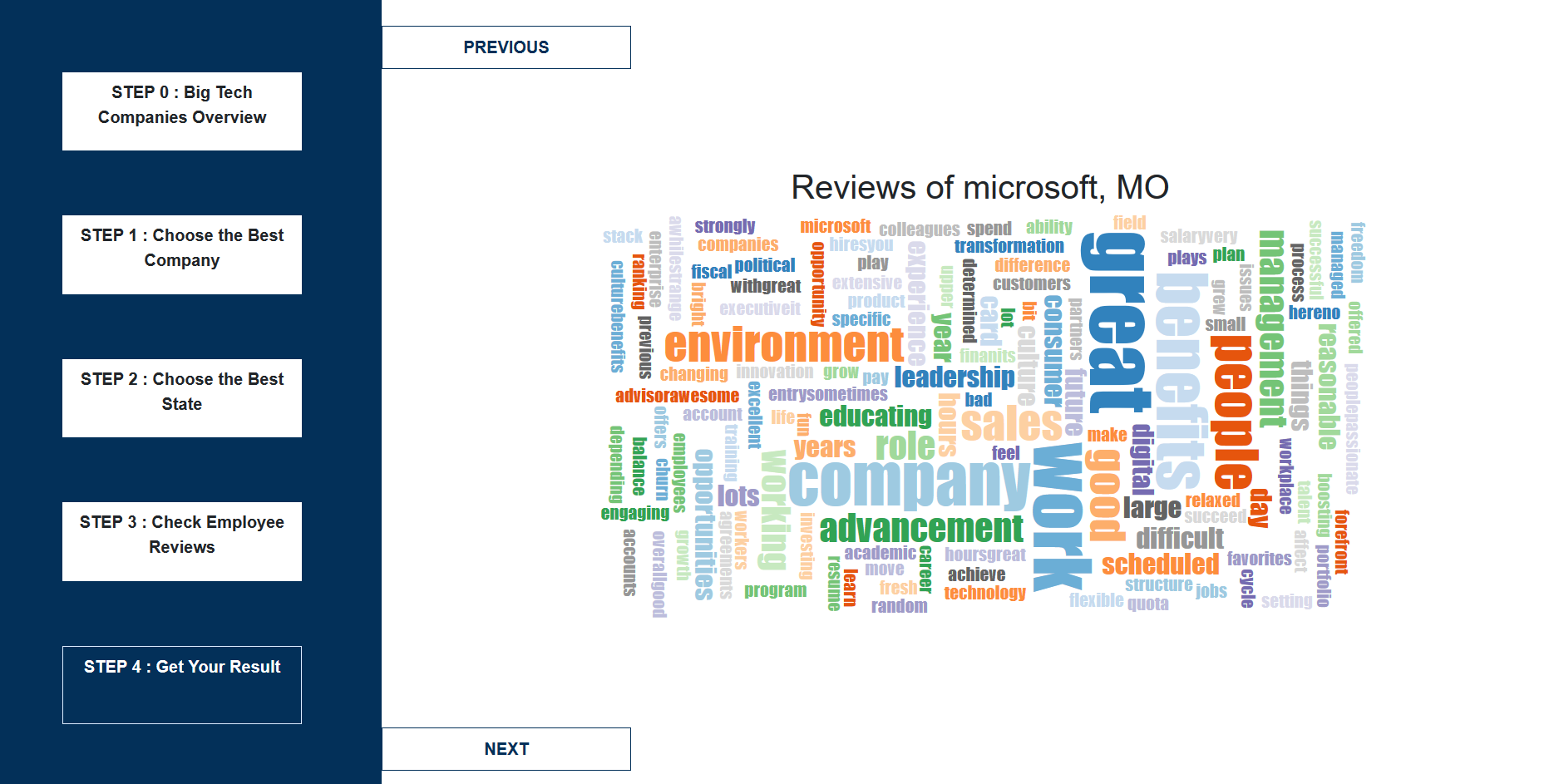
We add another word cloud visualization according to the reviews in the dataset to analyze the highest appearance words in the review for the offices in the state of this company.
Try to avoid the bias in the review, we filtered the states with less than 10 reviews to make the judgement more objective.
We add the user interaction design and try to reach our goal by taking the form of a survey that the users can intuitively test out their best fit office based on their best fit compnay.
Our design combines five steps.
They survey starts with a clean introduction page.
- STEP 0 : Big Tech Companies Overview -- showing general situation among 6 big tech companies.
- STEP 1 : Choose the Best Company -- interactively choosing the best fit company by inplementing personal weights for balance, culture, career, senior and benefit.
- STEP 2 : Choose the Best State -- interactively choosing the best office by state based on the top rating of the same category as before
- STEP 3 : Check Employee Reviews -- when the user choose their best fit company and office state, they can see a word-cloud review, which will help them to decide whether this is what they want or not.
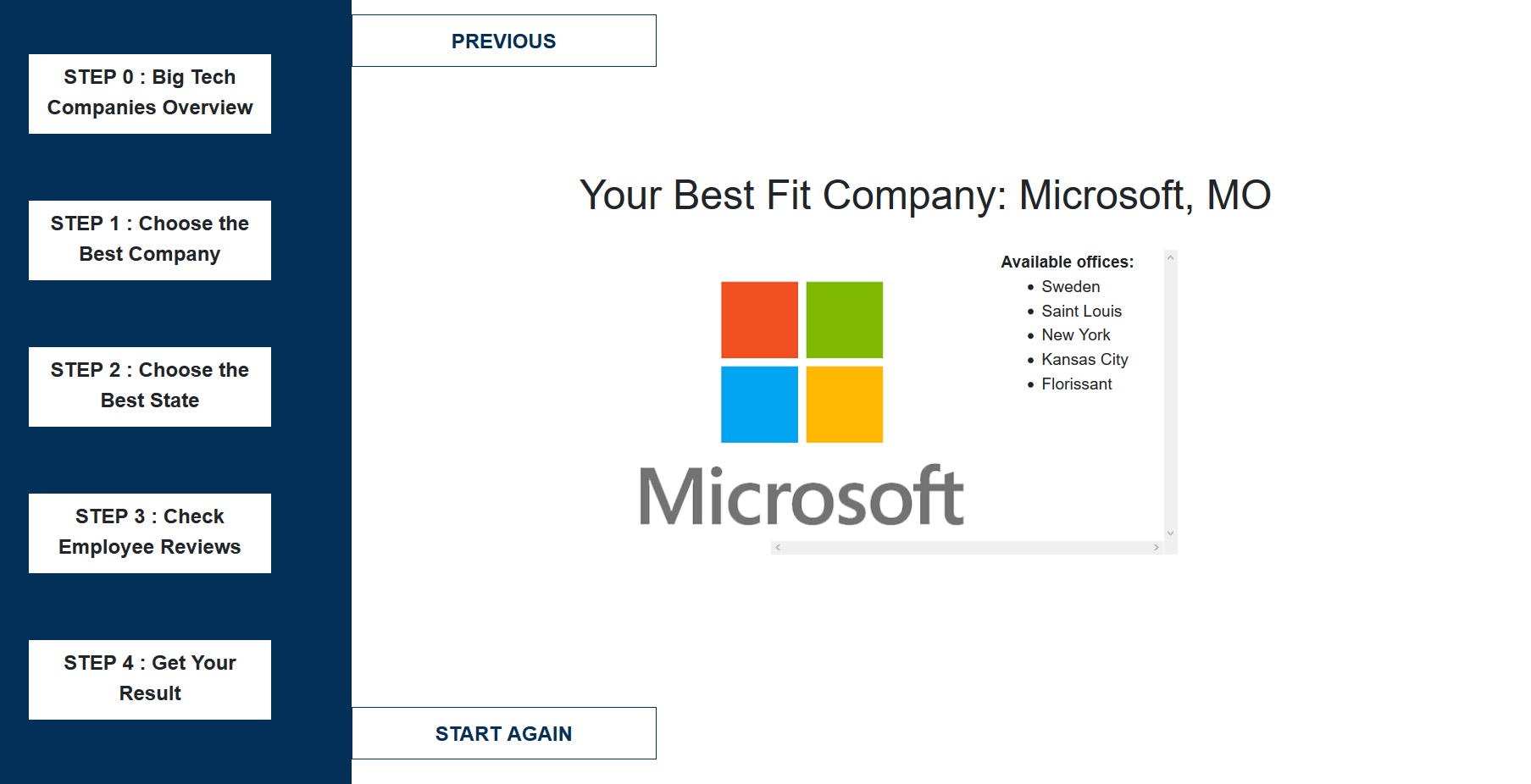
- STEP 4 : Get Your Result -- after they finalize their choice rather than go back to make other choices, they will get the result about their best fit company and best fit offices.
The details of these steps are shown below.
Evaluation -- User Feedback 2
Here are some suggestions we take from the second user interaction feedback
- I was a bit confused navigating and what each page wanted me to do. Also, the previous button overlays some text which blocks out information
- Also, you may want to elaborate on what some of the variables mean (ex: "balance").
- Sidebar interactive
Here we do the editing for each of them.
This graph shows the editted version of company.html about the description.
This graph shows the editted version of office.html about the map interaction.
Evaluation
There are different ways to display the same data. For different emphases, we use different visualization to emphasize that point. For example, the company visualization we grouped the data by 6 categories, while for choosing interaction, we group the data by 6 companies.
The different usage of visualization will provide different information for the user. However, the data itself has limitation that it only contains 6 companies. We wish we could expand this to more companies for people taking considertation.
The form of the survey is leading the user from choose their best fit company to choose their best fit office by state and then provide them the list of offices in a state by that company. Our implementation and visualization help the user make the choice.
The visualization works well and with strong user interaction. If we have more time, we may explore a good way to help user to locate these offices according to their preference.