How easy was it to understand the purpose of this site: 4.5/5
How would you rate the ease of understanding the interactive tasks that the site allows: 3.5/5
• Wondered if they were shades at first, representing concentrations
• No clue what country she's on when hovering (visibility/usability issue)
• Confusion over units of numbers in country hover - Found it really cool
• Pretty
• Mouseover shows "energy values" says she is confused by lack of units
• Noticed colour of country is the one that has the highest "energy value"
• Hard to navigate with mouse over, cant allow zoom either
• "How would you zoom- oh okay!" noticed bc of reset zoom button
• More countries incorporated over different years, wondering why others were missing
• Found pie chart organically - Colours make sense with energy
• Rename None to No Data for grey countries
• Pie Chart same chart inclusion
• Zoom in hover is easier, but normal mode is very difficult
• Fix Hover
• Make zoom more obvious
• Add Units
• Update Pi-chart with more data
• Such a cool and sleek project; loved the UI and concept!
• Hover over pie chart should show energy name + percentage/value.
• Visualization is cool — maybe include more mini-charts.
• Showing percentages on pie chart would help.
• A line graph showing electricity production trends over years per country could add insight.
• Global Energy Breakdown Bar Chart - controled with slider
• Country Energy Breakdown Bar Chart - control with user click and slider
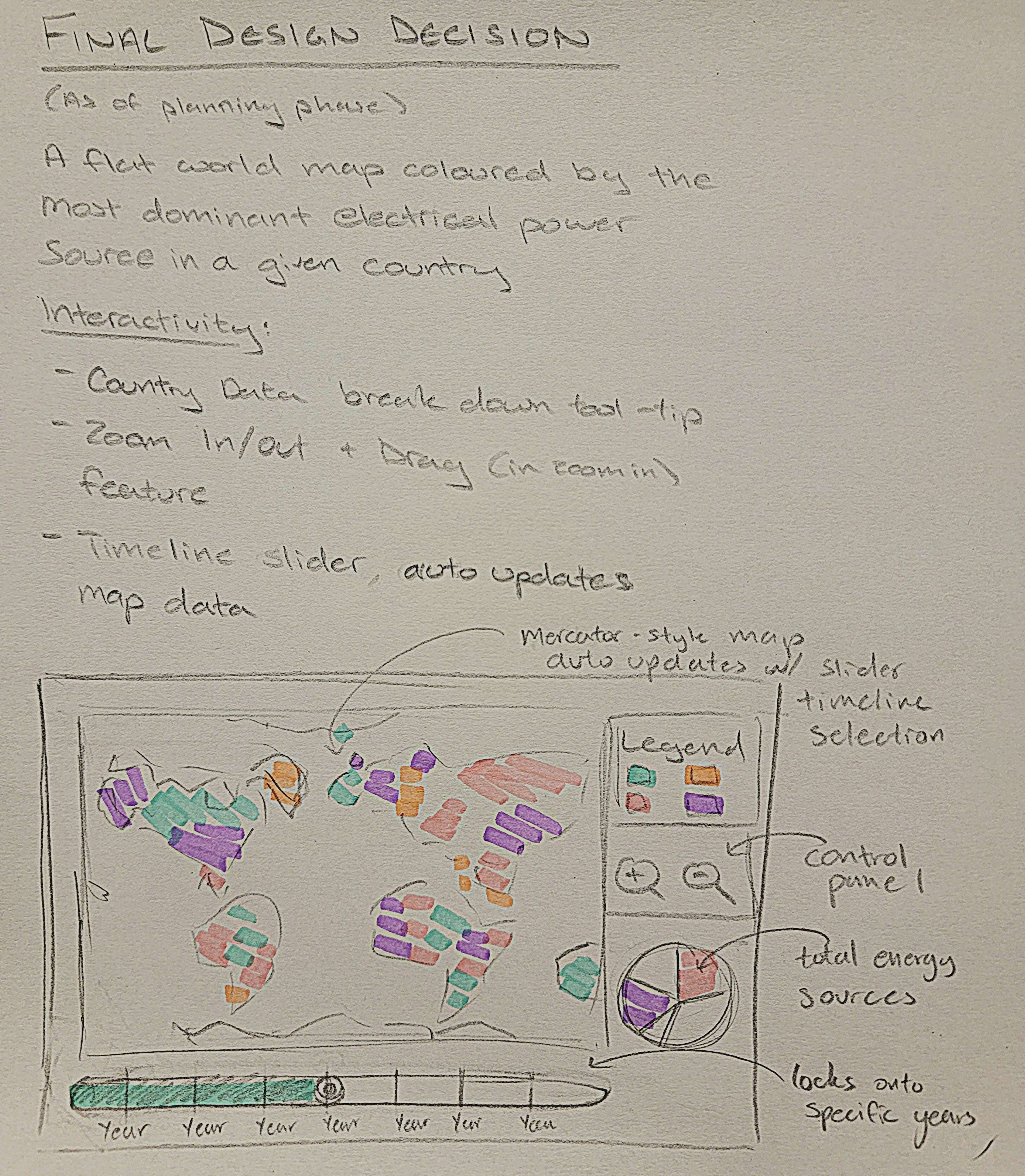
• The data on energy consumption by type per country has been mapped onto the Mercator map
• The slider allows the map's coloration to change for each country according to which energy source is the most
dominant at a certain point in time for each country
• When hovering over a country, the breakdown of its energy consumption and the types appear in a popup that
corresponds to the year that the user set the slider to
• This popup feature does change the information alongside the sliding of the bar
• Essentially both main features of this project and its interactivity are complete
As of now the priority is reformatting the page such that the pie chart for total energy consumption worldwide by energy type is to the right of the Mercator map. Additionally, because the popup does obstruct the ability to see the breakdown for smaller countries on the map/requires extreme zooming in to hover over smaller countries, the pop-up breakdown will likely become a pie chart above the total energy breakdown pie chart to the right of the Mercator map. It will initially be gray and change into a breakdown according to the country that is hovered over. This allows for direct comparison between worldwide consumption and individual country energy consumption.
Session 1: Simple Exploratory (Long answer, single question) Let user look around app and figure out what it’s about, stating any questions and confusions they have out loud
Session 2: Tasks (Correct or Other + fill in incorrect answer) Name a country whose primary source of energy production was hydro-power. What color represents nuclear power? Name one country that had it as their dominant source in 2023. What year did the U.S. phase out coal as their dominant energy source? What was Kenya’s second most used energy source in 2020? What was the dominant energy source worldwide in 2014?
Session 3: Feedback Questions (long answer, question per bullet) Thoughts on our country hover feature? What information had you expected on hover? Was it granted? Would you prefer the pie chart to be its own separate chart or controlled by the same slider tool as the Mercator map? Is it immediately obvious without the legend that gray means there’s no data available or would you like clarification in the legend?
Session 4: Debrief (long answer, single question) [We explain full project and intent then answer any questions user had, listing questions asked]
Project Name: SURGE
(scroll through pages horizontally below)
Next Step: Make the zoom in and out button features instead for clarity + add instruction saying the user can drag the map around + add light nodes associated with energy sources used per country per year
Next Step: Make this pie chart and extension of the Mercator map (place it next to the map) and have the slider play automaticallythrough the years + change styling on slider
{
    YearAsString: {
    CountryName: {
    "dominant_source": "sourcename",
    "sources": {
    "other_renewables": 0.0,
    "bioenergy": 0.0,
    "solar": 0.0,
    "wind": 0.0,
    "hydro": 0.0,
    "nuclear": 0.0,
    "oil": 0.0,
    "gas": 0.0,
    "coal": 0.0
    }
    }, ...
    }
    }
A similar, simpler approach was used to clean the world data for the auxiliary chart, without country-level nesting:
{
    YearAsString: {
    "other_renewables": 0.0,
    "bioenergy": 0.0,
    "solar": 0.011747475,
    "wind": 0.064220205,
    "hydro": 1979.2437,
    "nuclear": 1488.9216,
    "oil": 1110.7574,
    "gas": 1426.3318,
    "coal": 3748.3848
    }, ...
    }
• Remaining features to fix/add
• Tackle the map
• Adding gradual changes to the colors of the countries as the user scrolls through the timeline
• The hovering table/information for each country
• Initially numbers breakdown
• For final, change that to bar charts
• Add numbers of the bars next to the bars (no hovering to see them)
• Fix the slider so that the changes happen as the user is sliding rather than waiting for the user to stop at a
certain date
• Maybe styling the slider / making an svg component that matches the sketches
• Set up the Mercator tomorrow at 6pm
• Abby - data cleaning
• Shaza - mercator map set up, pie chart with data of total energy consumption per year included
• Implement the slider so that the user is the one who pulls it between years and transition between energy
consumption on the pie chart; obviously implement the legend
• (maybe) play around with light nodes
Project Proposal Link