Carbon Emissions in the USA
Eva Markowitz, e.markowitz@wustl.edu, 486153
Mythri Sekar, m.l.sekar@wustl.edu, 510373
Petra Caldwell, c.petra@wustl.edu, 498314
Our general group motivation stems from the broader implications of climate change. Our project focuses on visualizing carbon emissions by state to provide a clearer picture of how different regions contribute to overall carbon footprints. We feel there is a gap in accessible visualized data that can highlight regional patterns and inform both public and policy-driven responses to climate change. By breaking down emissions at a state level, we want to show factors influencing emissions across the country like industrial activity, population density, and local regulations. Our team chose this topic to bridge the gap between raw environmental data and insights that can help inform local and national actions on climate change. By visualizing these trends, we hope to make the data more engaging and actionable and help people understand and address the impact of carbon emissions on a more personal and community-focused level.
Our primary objective is to explore carbon emissions on a state-by-state level in the USA. We aim to answer questions such as:
By answering these questions, we hope to inform both the general public and policymakers about which areas need the most attention. The key benefits of our project include providing a clear picture of where emissions are concentrated and offering insights that can guide targeted policy changes.
this data set shows historical emissions in the US broken down by different emitters and has a breakdown by state and ranges from 1990 to 2020. https://www.climatewatchdata.org/ghg-emissions?end_year=2020&source=US&start_year=1990
This website contains a collection of Energy-Related CO2 Emission Data Tables, stratified by state. It has emissions by year, emissions by fuel, by sector, etc.: https://www.eia.gov/environment/emissions/state/
Handling missing or incomplete data for certain states or sectors.
Converting units to ensure consistency across datasets (e.g., metric tons of CO₂ equivalent).
Normalizing data for comparisons between states with different population sizes or industrial outputs.

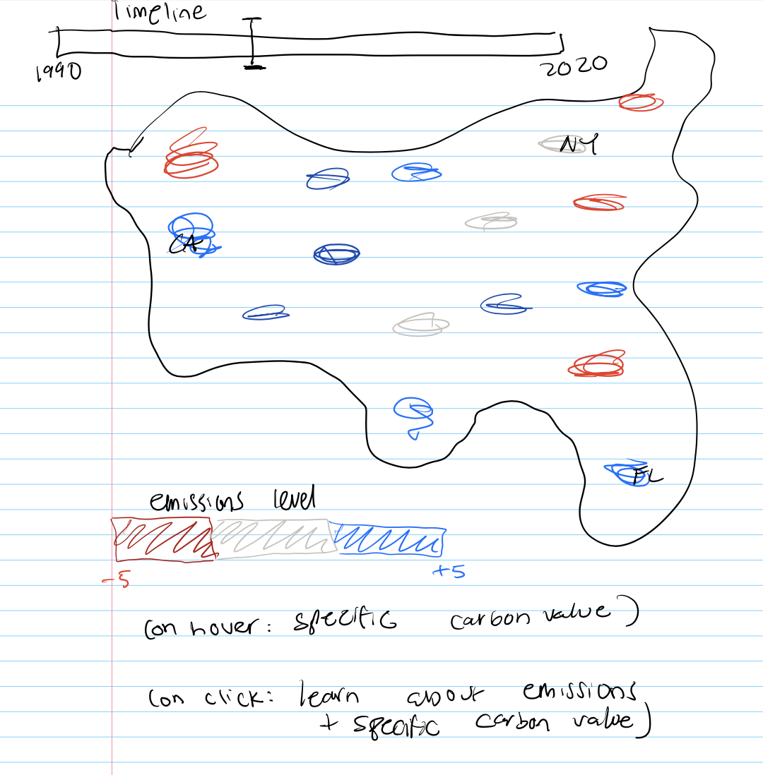
In this design, we have a first drafted idea about how the layout of our page will look, and how a user will be able to draw a connection from the level of emissions to the actual state that they are observing, and an idea for what may show up when a user clicks on a state to view more details about it.
This design fleshes out our first design a little more, aiming to connect the moving parts.
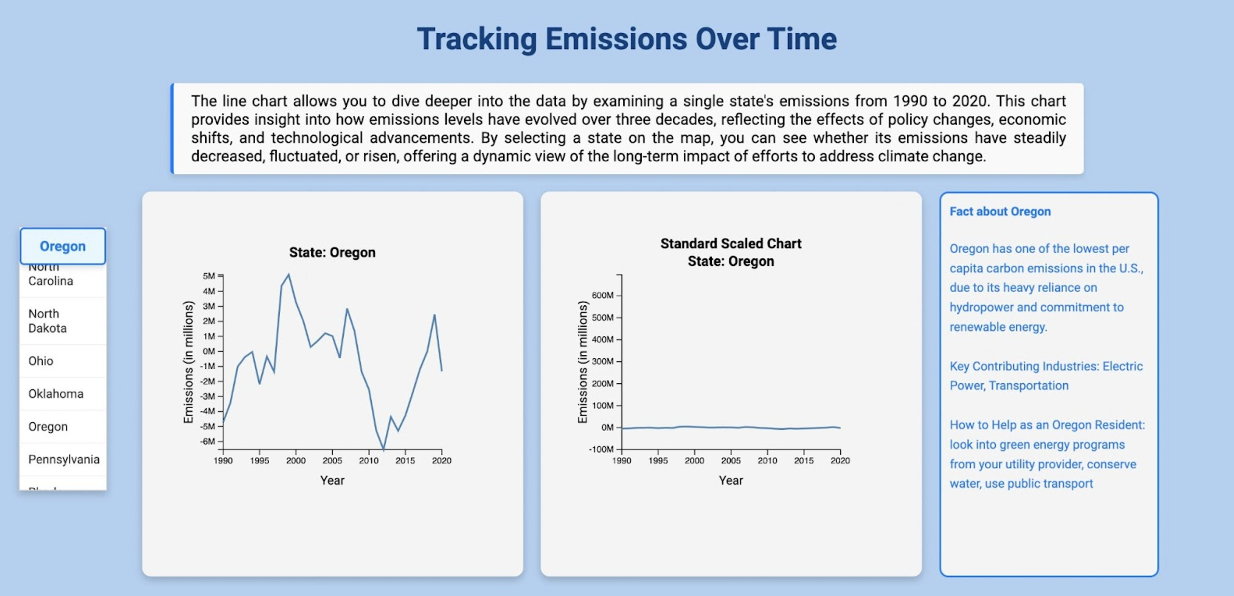
In this image, we created a scrollable dropdown menu on the left that contains all the 50 states on America. When a state is selected the CSS in the dropdown will change and this will trigger a graph to by shown on the right. This graph represents the specific state's carbon emission history from 1990 to 2020 visualized in a line graph.
In this image, we have a bit more insight into a couple of the tools we want to leverage for this project, like the mapbox api and the geojson file that allows for state selection. We hope to display the emissions that are scaled correctly across the states and have a state be visually recognized when hovering over it. we want to align the timeline with the size of the scaled emission so that a user can see the sizes of the emissions changing over time, allowing for a better and more comparative analysis.
Our final design, in which we tried to cohesively combine all of the elements from our brainstorming designs.
Geomap with emission level displayed
Toggle for specific year
On hover and click features
Separate area where you can select a certain states and see a graph of their CO2 emissions over time
Display different states industry information
Oct 28- Nov 3
Nov 4- Nov 10
Nov 11- Nov 17
Nov 18- Nov 24
Thanksgiving
Dec 2- Dec 6
Milestone 1:
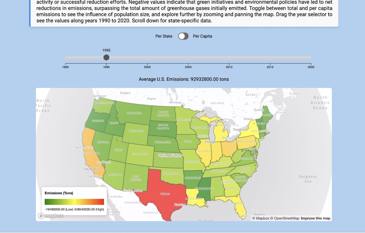
In this milestone, we have acquired all of the data successfully from our planned sources and have included more interactivity. We acquired the data from the World Resources Organization’s climate watch of historical GHG emissions from 1990 to 2020, and have successfully used it to implement per-state emissions. This is a preliminary design of what the final product would look like with a few changes. We have added a toggle at the top to switch between state emissions and per capita emissions by including a population csv source to see a more representative picture of the amount of emissions that can be attributed to a single individual from each state. We have ingested our population data reading to the console correctly, but have not yet implemented the per capita coloring of the states. We have also aligned the number of metric tons of emissions each state produced to correctly match the actual state itself using a geo JSON representation and attributing a fill color to a specific emissions value. We have changed the color scale to include different colors from red to blue to include green, yellow, and red so that more differentiation is seen when comparing each state's emissions. Our slider at the top works in terms of moving the pointer from 1990 to 2020 having the color of the states update in the per-state emissions view.
Milestone 2:
In this milestone, we have changed the color scale to increase variability and visibility while comparing state emissions. We have also expanded the size and d3 dragging of the time scale so it is easier to use. Additionally, we have included a current year tracker at the top of the dragger so that a user knows which specific year it is. The biggest aspect of this milestone is the introduction of a second visualization, where a user clicks on a state on the map. Then the page automatically responds to that click and goes down to a scrollable list of states where that specific state is selected and a corresponding line chart with that particular state’s historical emissions appears so that the trend can be viewed over time. Additionally, a fact about each state’s emissions is populated and pops up right next to the line chart. This fact will allow users to contextualize emission trends by learning about factors that may have played a role in the emission history of a particular state.
Final Milestone:
Before we submit the project, we have made some important changes. Firstly, in our previous version, the number of average U.S. emissions needed to be made clear, and we have introduced the value below the year slider to display average US emissions for that particular year which dynamically updates. Additionally, we have made the legend blend better by removing the single colors of plain red, green, and yellow. We updated the legend so that the colors blend better which allows for a more fluid and connected understanding of the changing relationships between states.

Next, during our presentation, we discussed how the scale for the states was not standardized and that they had different values on the x and y axes as they all progressed at their own rates; having the scales be different for each state allowed for a more magnified view of comparing that specific state’s statistics throughout a set of years. However, we realized that it would be a better idea to introduce another chart next to the current one, as it could be misleading to a user to view a similar pattern of growth/setback but have that be displayed on a completely different scale. One example was Oregon where the net emissions are extremely low and even in the negative. As a result, we introduced another chart that uses a standard scale for every state allowing for a standardized comparison of each state’s emissions.
