Group Members
Eric Wei, eric.wei@wustl.edu, 498209
Edward Wu, edward.w@wustl.edu, 498050
Questions
What are the prevalence levels of different health problems across the USA?
What are the health dimensions that positively correlate with insufficient sleep?
What are the top sleep-associated health problems in each state?
For a specific sleep-associated health problem, which states have high prevalence?
Design Evolution
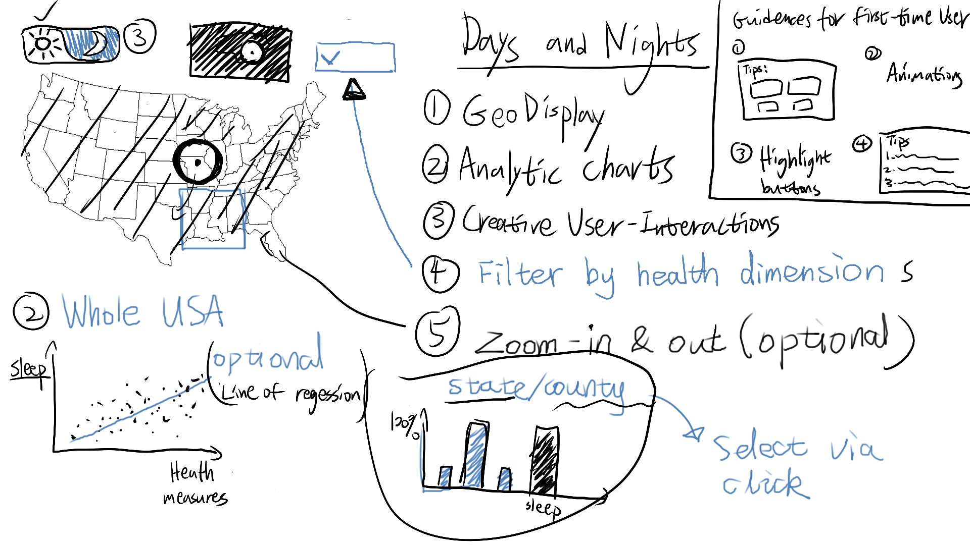
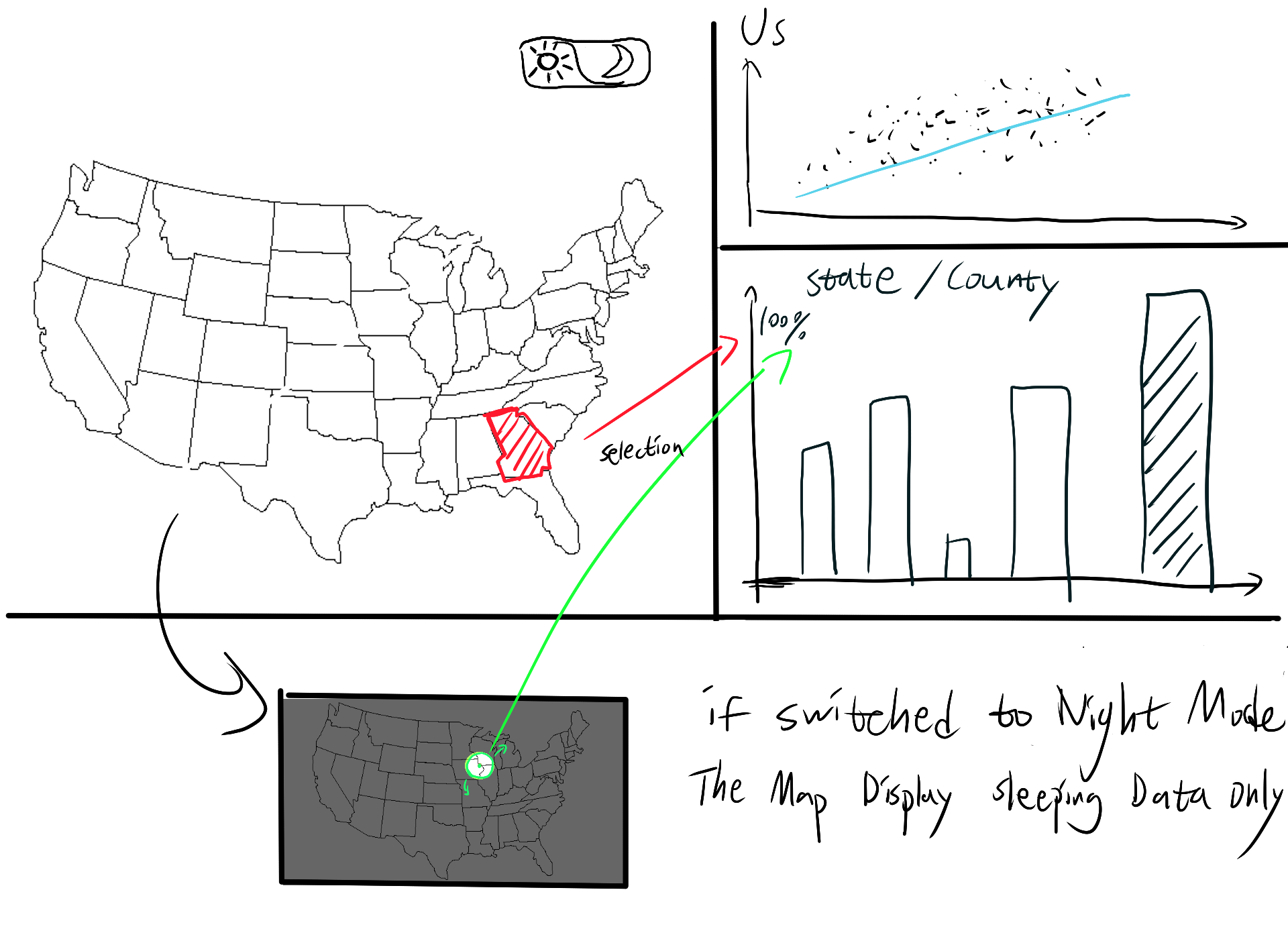
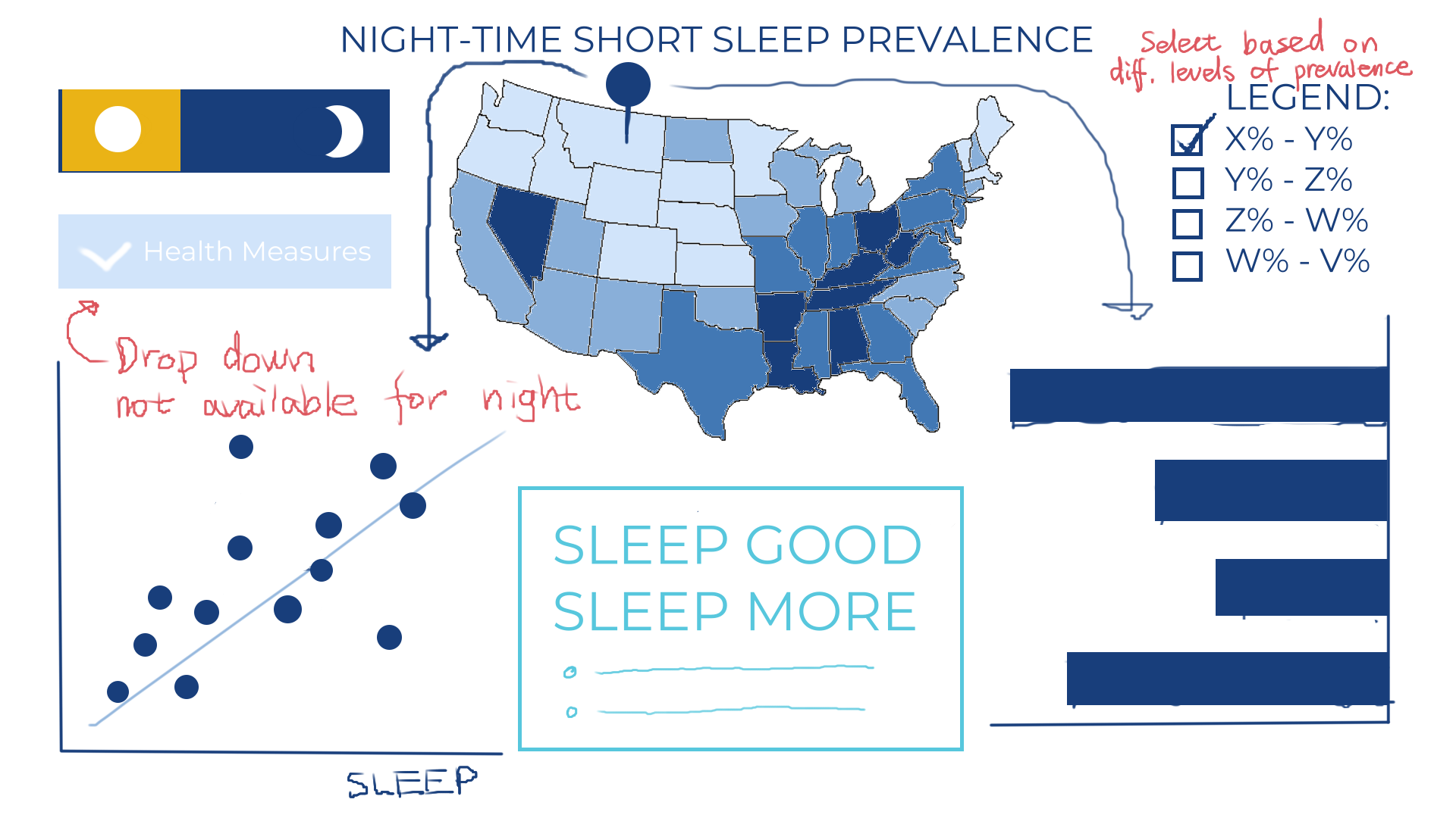
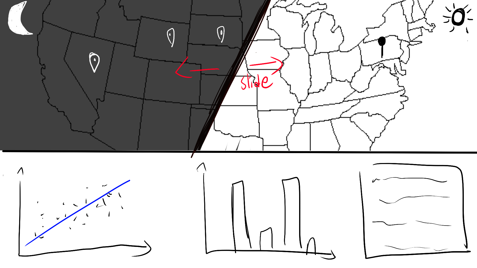
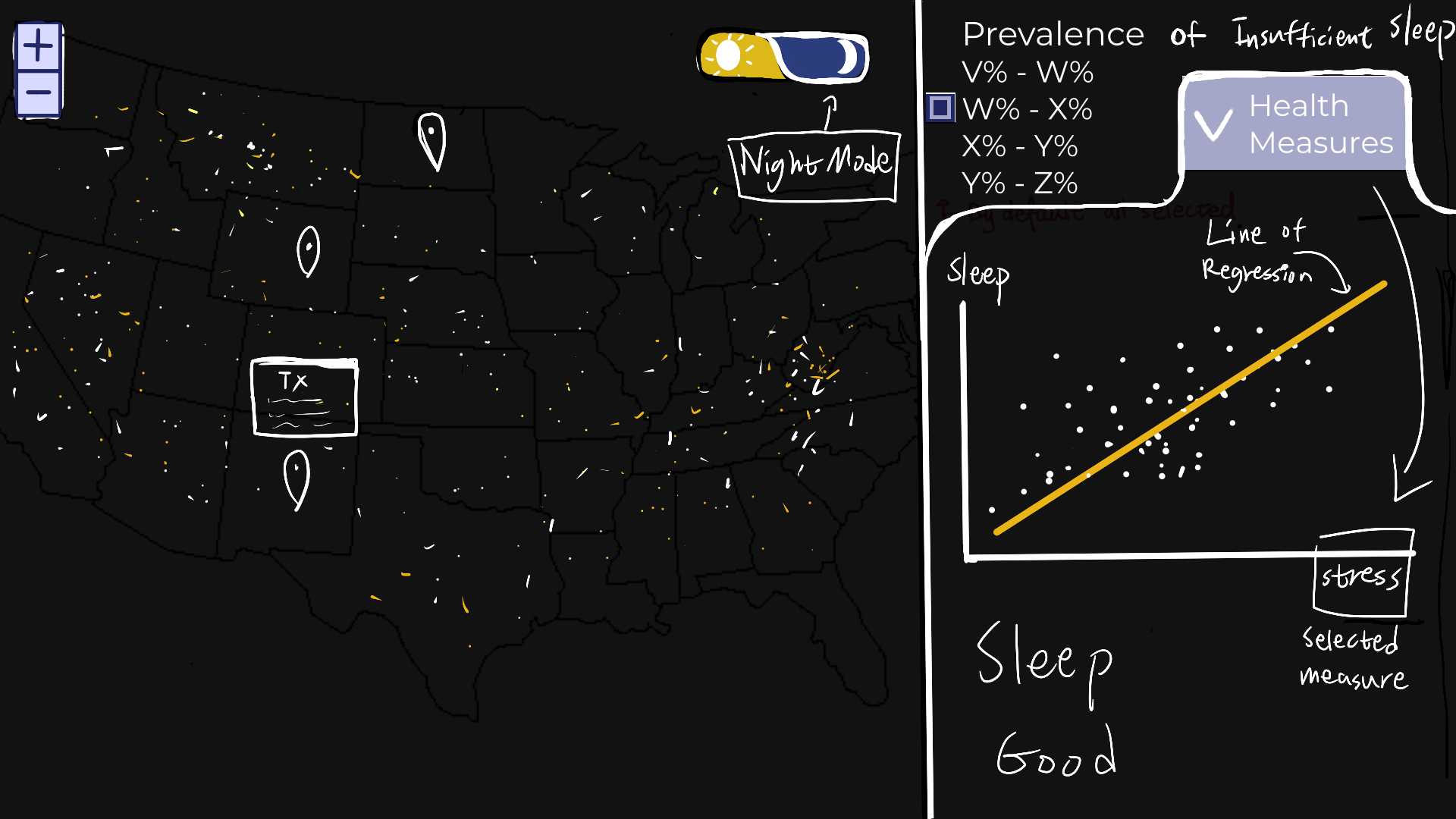
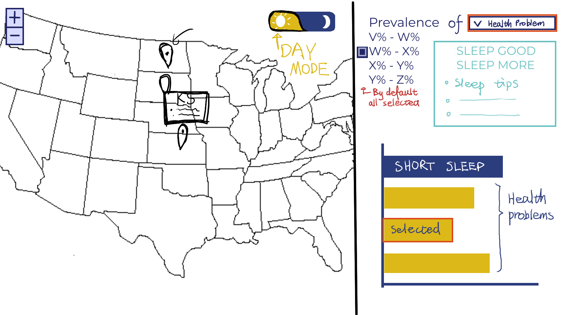
Brainstorm:

Our final preliminary design (showing both Night Mode & Day Mode):


The final design combines elements from Designs 1 and 2, with Design 3 set aside for practicality. The page
layout from Design 1 is used, emphasizing a larger map display to highlight the Day/Night Mode feature.
Design 2’s approach of showing markers based on prevalence levels is also incorporated. Different chart
types are used for each mode: Night Mode features a scatterplot comparing health and sleep measures, while
Day Mode uses a bar chart to show prevalence levels clearly. For added social benefit, health tips for
better sleep are included, providing users with insights and practical advice.
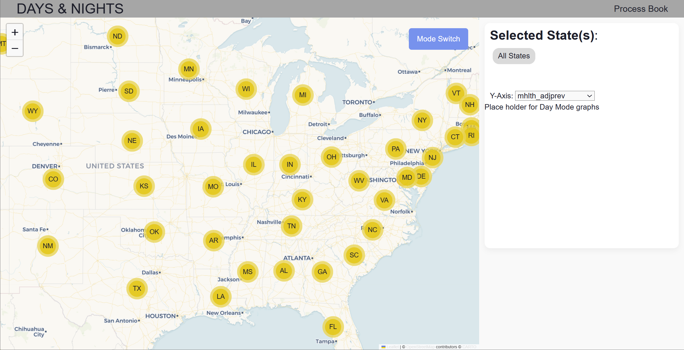
Our Milestone 1 design (showing both Night Mode & Day Mode):


We tried many different color palettes to better fit our theme. We also spent time tweaking the layout of our
elements to enhance aesthetics. Although we haven't made the graphs for Day Mode yet, we plan to have two
graphs: allow the user to select a health problem that show the top states (high prevalence) and allow the
user to click into a state to see the top health problems within that state.
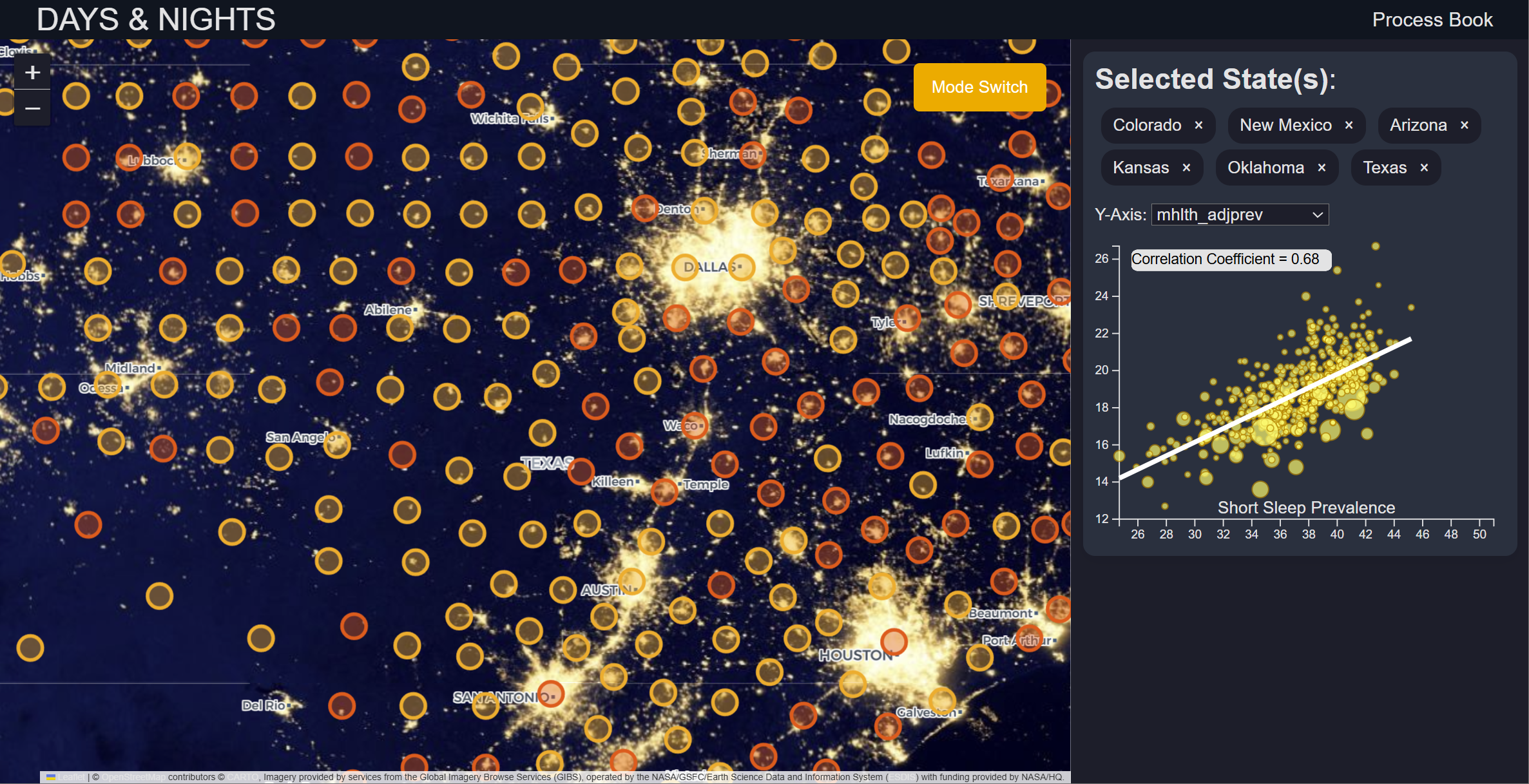
Our Milestone 2 design (showing both Night Mode & Day Mode):


Based on our Milestone 1 feedback, we changed the marker display of locations to actual geological borders.
This change enhanced ascetics, simplicity and made our map more informative. Another crucial quality of life
change was the search bar where the user could search for a county they are interested in and the map's view
would automatically jump to that county. To present meaningful data on state-level, we calculated the state
average of the metrics and color-coded the states. This way, the user can quickly gain insight of the
prevalence levels across the USA when they initially load our website. We also created the Day Mode
visualizations as we planned.
Implementation

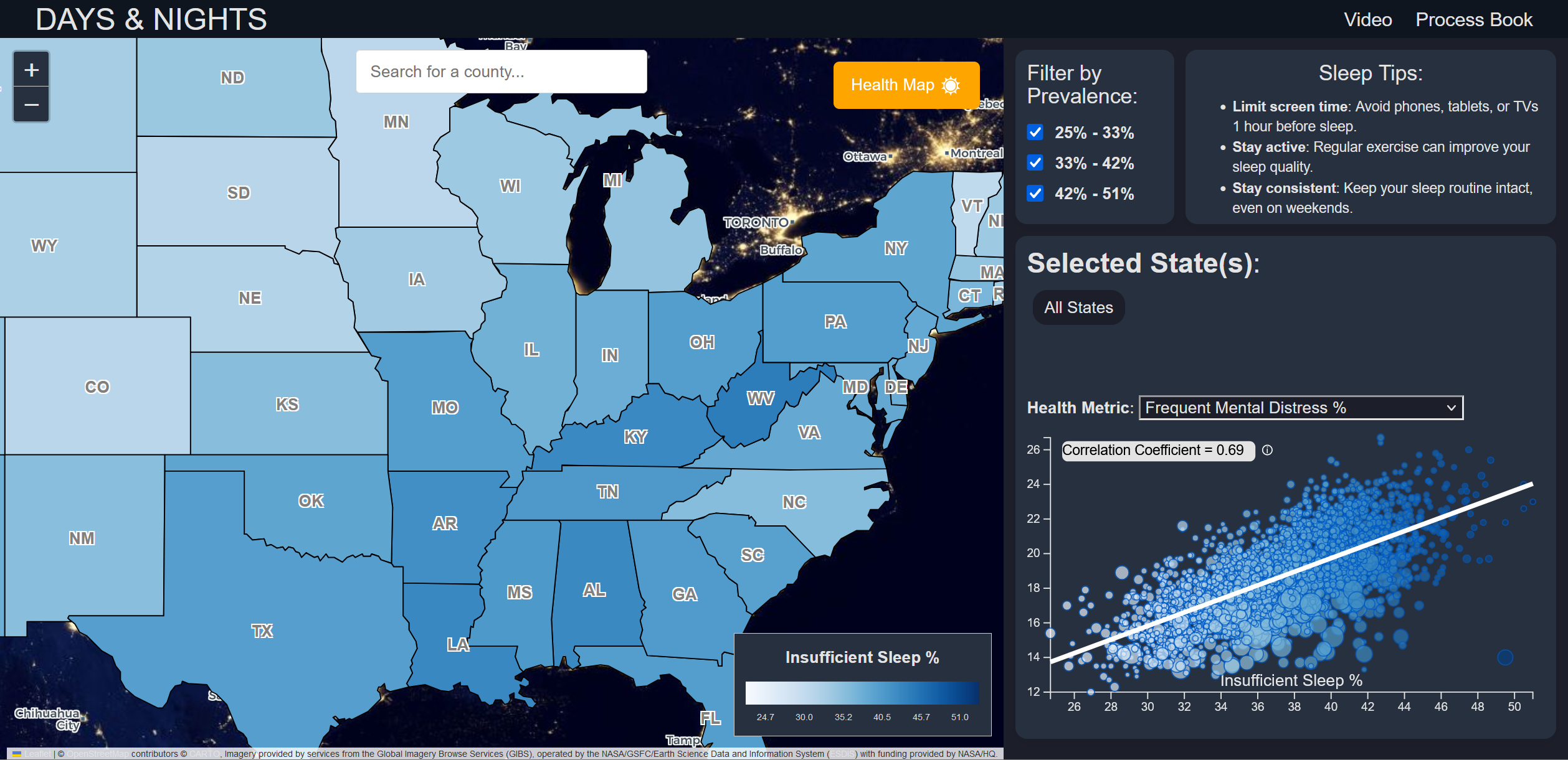
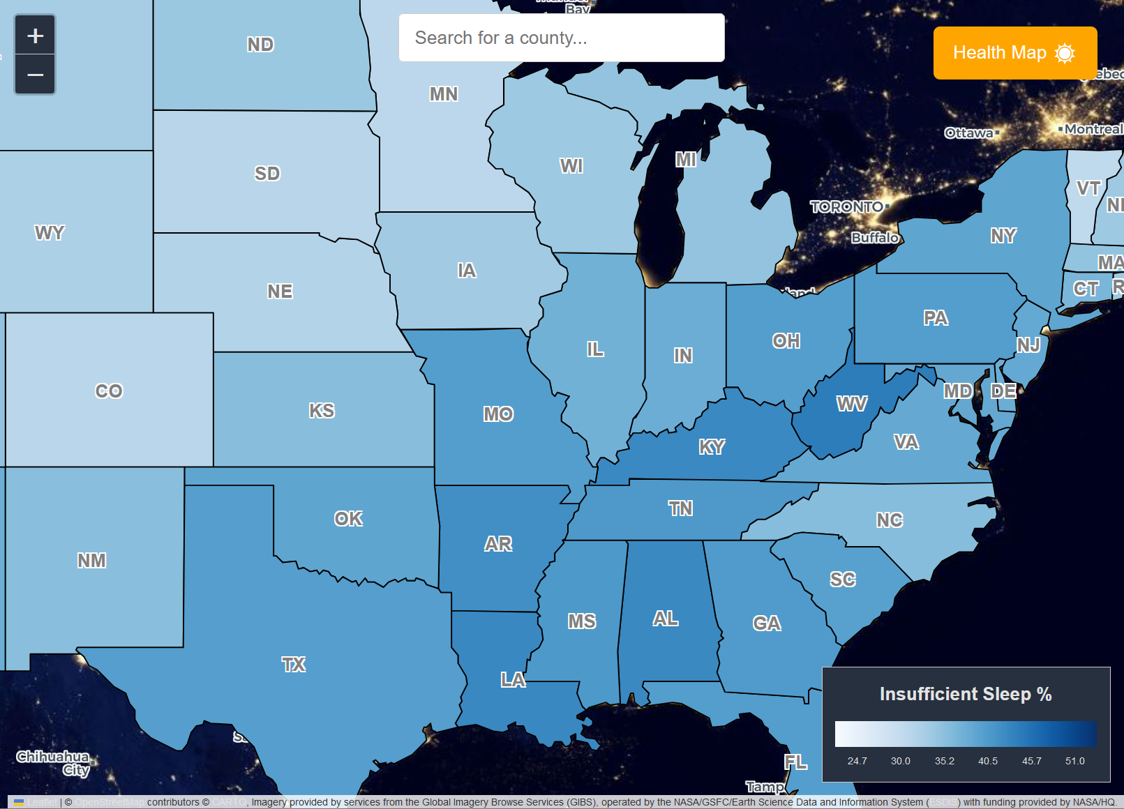
The US map with each state being clickable, color-coded by the prevalence.

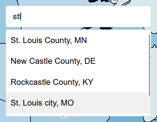
Search bar for searching and jumping to a specified county.

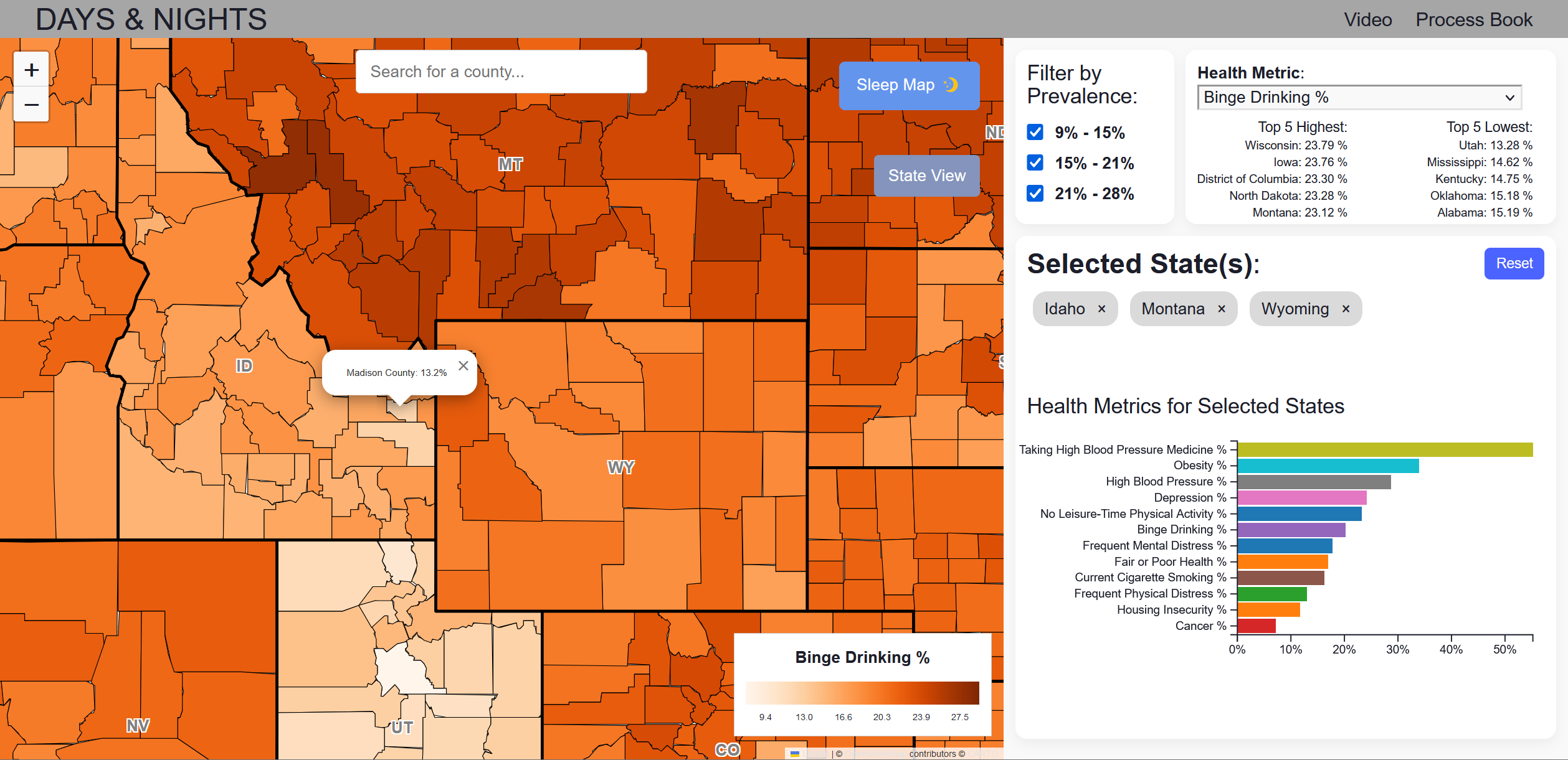
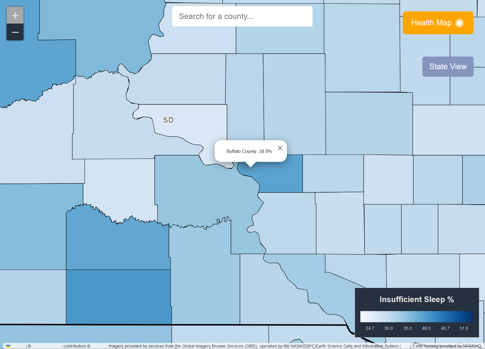
Once clicked into a state, the map automatically zooms and shows each county as circles on the close-up map.
The color of the county means different prevalence levels (the darker the color, the more prevalent). The
color scale is explained in the legend. Clicking on a county shows details about the county (name and
prevalence). Note that at max zoom level, the zoom button is greyed out to hint the user that they cannot
zoom in more.

A button on the map to switch between the Night Mode (Sleep Map) and the Day Mode (Health Map). The Night
Mode focuses on insufficient sleep, while the Day Mode allows exploring other metrics.

A button on the map only rendered if user enters county-level view (after either zooming in or clicking on a
state). It allows user to return back to state-level view of the map.

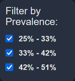
A filter that can multi-select the options to filter out states that does not match the chosen ranges. Only
the matched states are displayed on the map, others get grayed out.

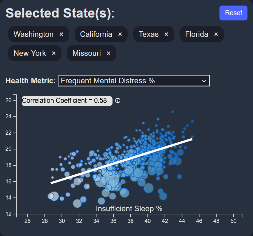
(Night Mode only) By default, the scatter plot shows the correlation of insufficient sleep prevalence and
prevalence of frequent mental distress across the USA. The radius of the circles represents county
population. A line and numerical coefficient help the user better understand the correlation. User can click
on the info icon to see an explanation of "correlation coefficient". Users can choose different Y-axis
metrics (such as depression prevalence or housing insecurity prevalence). Once selected states, the scatter
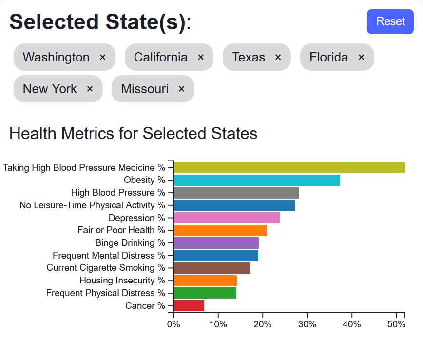
plot also filters on showing the selected state(s). User can select at most 6 states. Deselect a state by
clicking the X next to state name. Reset button (only rendered if any selection is made) clears all
selections.

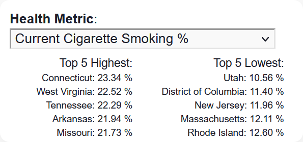
(Day Mode only) This section has filter based on the selected Health Metric, only the matched metric dataset
will be displayed on the map. Along with the filter, it also shows the top5 highest and lowest % states,
which changes according to the selected metric

(Day Mode only) Displays the prevalence levels of the metrics in horizontal bar graph, sorted based on high
to low prevalence. The selection usage is similar to the scatter plot. Also displays the data for the USA by
default.
