The Simpsons represent an icon of American culture. The show’s satirical depiction of working-class America parodies American culture, society, television, and the human condition. The show has been around for almost thirty year, and there must be something special about it. We want to have an overview of show by showing the ratings and number of views for each episode. The family is also interesting, and we want to see how they interact with one another and what each of them is thinking overtime.
There are many visual analyses of shows such as The Simpsons online but one particular one was http://toddwschneider.com/posts/the-simpsons-by-the-data/ which also talked a little about The Simpsons in American culture. We wanted our own approach to looking into this show.
Data comes courtesy of kaggle.com. For several of our visualizations including the map and family network, python scripts needed to be written in order to parse the data into information that we needed. For the map and the family network, only script lines were provided, therefore the python scripts needed to parse those and match them to the location and find their frequencies as in the case of the Map, or map them to the person being addressed as is the case of the family network.
As mentioned above, we looked at the website linked through Kaggle, “The Simpsons by the Data”; Looking at their scatterplot, we thought it was a great idea and decided to include one in our visualization. However, we felt that we could go beyond just external factors and look more into the content of the show. From many of the presentations in class, we decided that a map visualization would be a good choice, and therefore we settled upon that. We also wanted to look at relationships which was another common theme we saw during final project presentation introduction presentations, so we settled on the Family Network.
Originally, we wanted to do something similar to “The Simpsons by the Dat”; and show all character frequencies over time, but we decided that looking at the main characters, the nuclear family, would provide more insight. Most of the peripheral characters had too sparse appearances, and therefore a conversation web would provide little in respect to those characters. For the scatterplot, our original design included a plot against the y-axis of IMDB rating, but we noticed that the trend was flat. Thinking that those who continually watched the show would score it high on the IMDB scale, we changed it to US viewership as a more representative statistic to show popularity trends.
In addition to providing more basic statistics on one of the most popular and long-running shows in American television history, we would also like to see how the Simpsons is a reflection upon American society and culture. We would like to see its political leanings and commentary upon both liberal and conservative policies and values. For example, the nuclear family has been a pillar of since the 1950's and earlier. An analysis of the interactions between each of the members of the Simpsons would provide a portrayal of the way the writers of the show view and influence this aspect of American life. By looking at our visualization, the readers may gain some insights on why the show is so long-lasting and holds such influence over American viewers and helping to shape American culture.
The data we have:
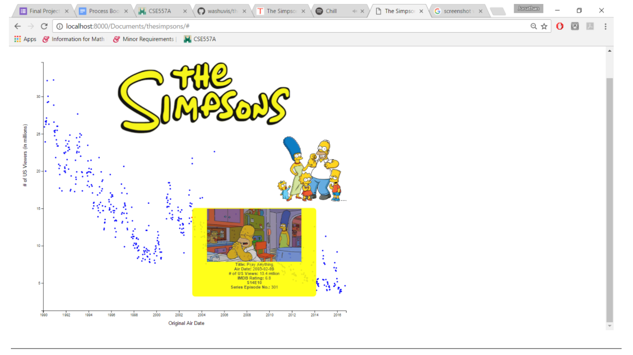
The intent of the scatterplot was to provide the initial overview of the show. The episodes are all plotted according to their original air date against the US viewership of the original viewing. This shows the popularity trends of the show, and a clear downward trend can be spotted along with sharp spikes that correspond to the season premiers. Upon hover, more detailed information about each episode gets displayed along with a visual that corresponds to that particular episode.
The story happens in Springfield, and we want to get some insights as to where most conversations are taking place, and what are the characters talking about.
The data we have:
Data processing:
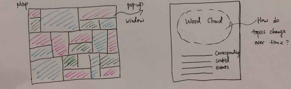
Design evolution of the map:
In the original design, we want to have a word cloud for every location, and see if we can find any connections between the lines in the show and world events at that time. However, after we get the frequency statistics, we find that although some places are among the top 25, the actual lines spoken are not many. Besides, the users of the visualization may not necessary click every location, and it would be a waste of computing capacity if we do the on-click of every square on the map. Therefore, we choose to make a word cloud for each season based on the frequency of the word said.
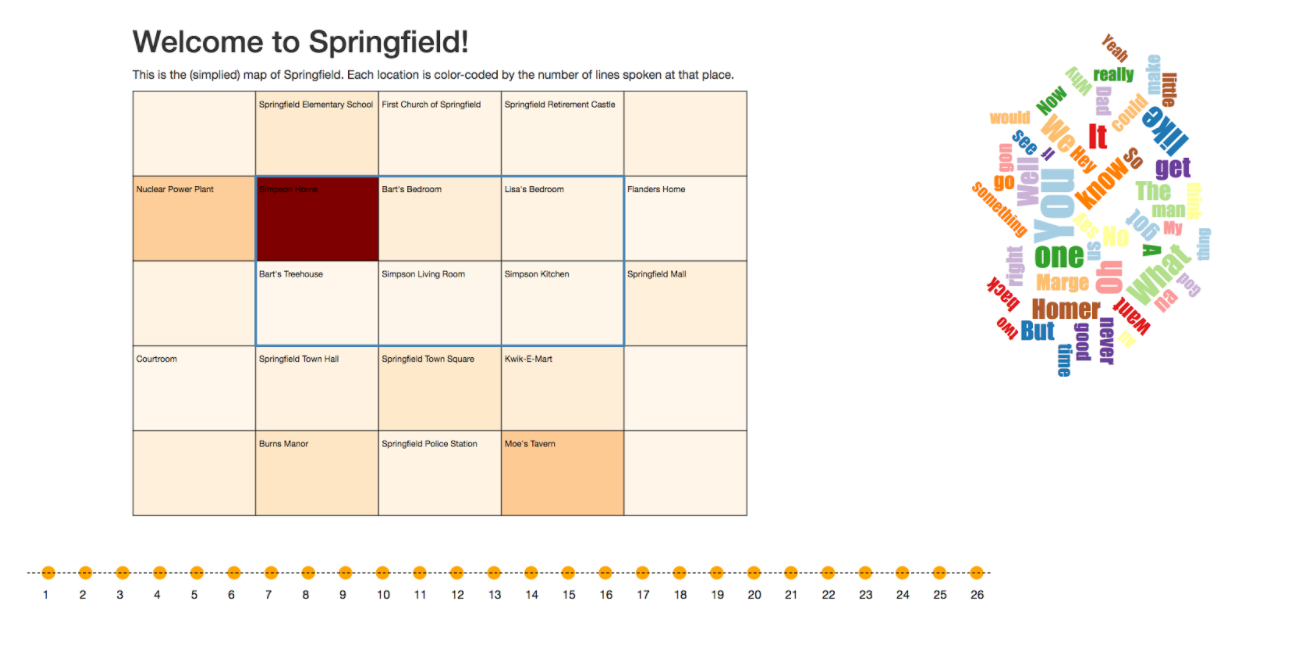
In the final design, we use a grid to represent Springfield. We choose to put most frequently visited places on the map, because they are most relevant to our visualization. Their relative positions are based on the actual map of Springfield in the show created by fans. What's more, since the locations consider different rooms at home seperating, we have a 2-by-3 grid to represent the house. We than have a word cloud for each season that shows the most frequently used words.
What do we find from the visualization:
It is not surprising that most of the conversations happen at the Simpsons' house. Other popular spots are places such as the elementary school, the nuclear power plant where Homer works, and Moe's Tavern. In terms of the word cloud, since we only count word frequencies, there are few informative words. In future work, we may want to analyze the topics in each episode, and combine them season-wise. Then we would have a more informative word cloud.
The data we have:
What we need:
The nuclear family:
The Simpsons
Who are they talking to?
The data set doesn't include this information. We need to analyze the data and find out using Natural Language Processing.
We used a python script to do the processing above. Then we get the following data:
| speaker | marge | homer | bart | lisa | maggie | others |
|---|---|---|---|---|---|---|
| marge | 0 | 4983 | 1293 | 1311 | 26 | 5297 |
| homer | 5393 | 0 | 2637 | 2431 | 25 | 13981 |
| bart | 1288 | 2413 | 0 | 2045 | 9 | 6609 |
| lisa | 1258 | 2242 | 2010 | 0 | 11 | 4859 |
| maggie | 25 | 29 | 11 | 19 | 0 | 38 |
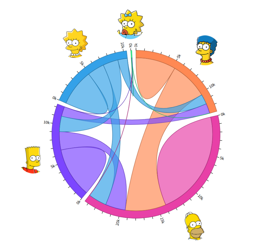
To do the visualization of the relationship of the family and how they communicate, we choose the Chord Diagram. Which could show the relationship between the elements in a group.
Each family member is an arc which length is the total conversation number, and each arc is divided into several segments which connect other family member. The length of each segment indicates the amount of conversation between the connected family members. The segment that only connects itself is the amount of conversations between that family member and someone else who is not in the family.
In the diagram, we can read the following information: