The goal of our project is to allow people to explore demographic information in the St. Louis area. People should be able to use the website to easily navigate all the dimensions of the data, those being the demographic category (for example race), the subcategories (white), year (2010), and location (a specific census tract). By using a dot map, users should be able to visualize the slice of the data they are interested in, and see the distribution of the data over space including the density of different areas. While the dot map is meant to give an overview of the data, users can also hover over census tracts to get the exact data of many locations over time, or click on a census tract to get detailed information of the history of one location over time. This tool is meant to allow people to explore the data provided on their own, and not to provide a narrative by highlighting specific trends.
Inspirations:
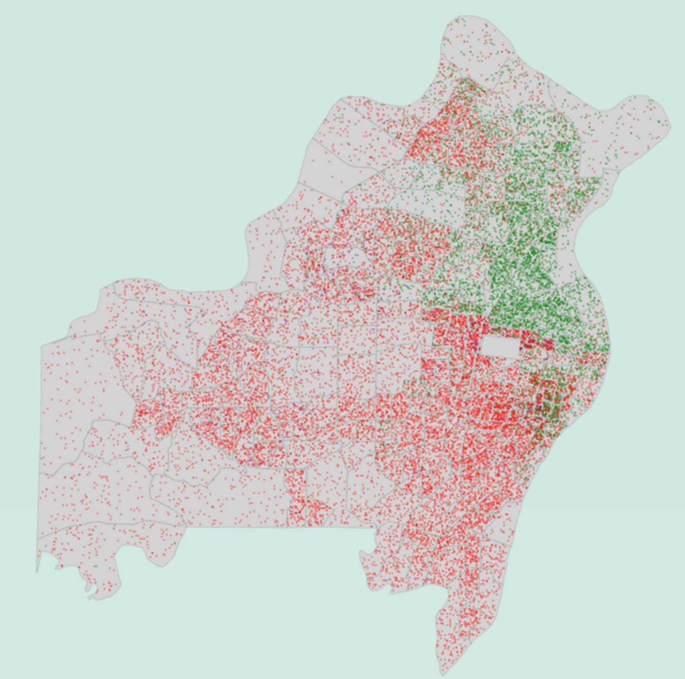
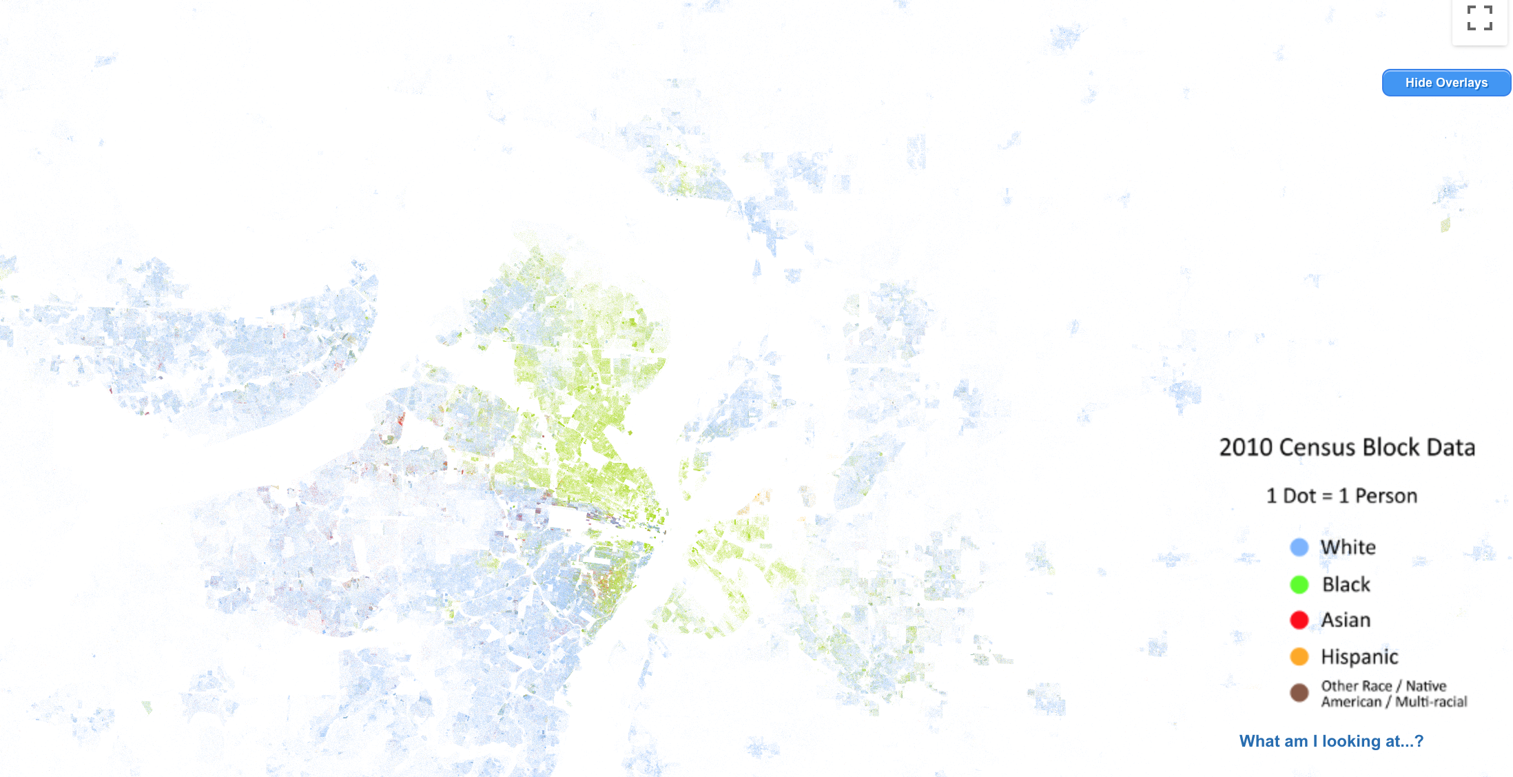
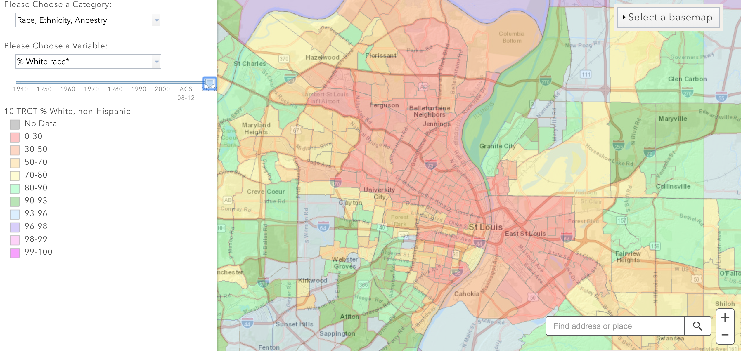
We were inspired by the dots in the image on the top and the by the map on the bottom
Data
All of the data shown was initially gathered by the US Census Bureau. We downloaded the data from socialexplorer.com using a subscription from Washington University. The data is in the form of counts for race, age, and income categories for all census tracts in St. Louis City and St. Louis County for the years 1970, 1980, 1990, 2000, and 2010. The exact locations of census tracts change, but Social Explorer provides the data mapped to the most recent census tracts using the best available estimations, so a specific area can be analyzed over time.
The Missouri census tract shape file, used for the map, was downloaded from census.gov.
Implementation and Design Decisions
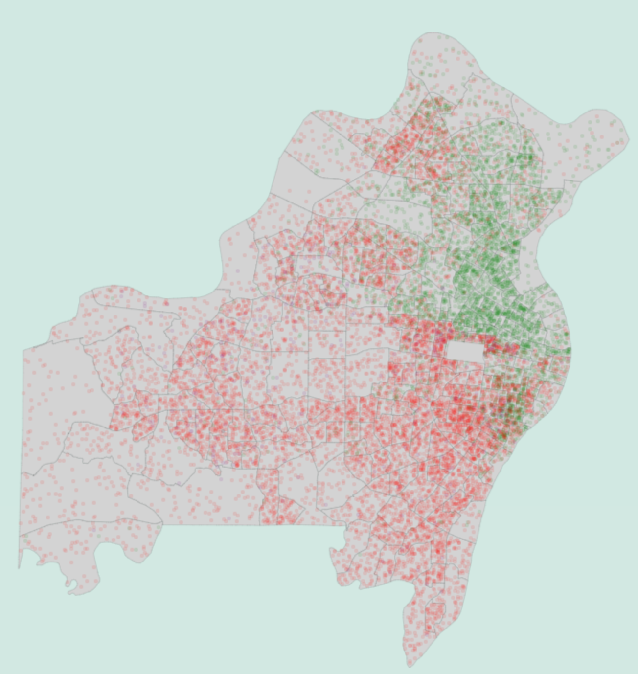
Dot Map
The background map is initially drawn once when the page loads. The gray background includes light gray lines that seperate census tracts, prominent enough to be seen when being searched for, but not distracting. Then for each census tract and for each subcategory, a dot of the appropriate color is placed randomly within the census tract for every 50 people.
Canvas is used instead of SVG because the map and dots can be drawn so much faster, going from an initial speed of 4 seconds to draw with SVG to .2 seconds with canvas. This also means that the dots can't be individually changed or removed, but that every time the category, hidden subcategories, or year is changed, all dots have to be redrawn, with new random locations.
We chose to not add a zooming feature because getting a more close up look would give the false impression that the dots within a census tract are accurately placed. At the current level of zoom, the dots give a good overview and we believe the random distribution within census tracts is not misleading.
Forest Park was manually removed from a census tract because it is a large area where no people lived, and is used as a landmark. There are other areas like parks, rivers, and highways where there are dots even though no one actually lives, but Forest Park was chosen as a special case because it is a large, recognized landmark.
There were three main parameters for the dots: Radius is the size of the dots, opacity is how transparent the dots are (0 is transparent, 1 is full), and people per dot is how many people in a census tract one dot represents. The final chosen parameters were radius=1, opacity=.3, and people_per_dot = 50. Other options would have worked, but we felt this choice presented the data as clearly as possible. Below, are two other parameter combinations that were considered:
radius = .5, opacity = .5, people_per_dot = 20radius = 2, opacity = .1, people_per_dot = 80
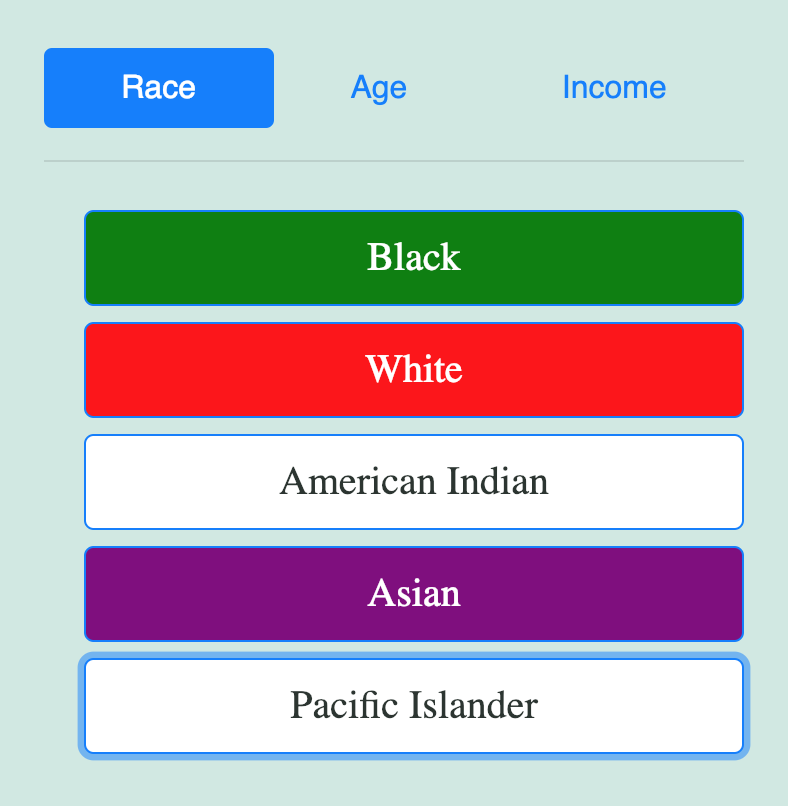
Demographic Selector
The above image shows the buttons used to select a category (race) and a subcategory (white). The category race is selected along with the subcategories "Black", "White", and "Asian", while "American Indian" and "Pacific Islander" are deselected. By default, all subcategories are selected, and the user can deselect certain ones if they want the map to only display dots of certain type. For each category, the subcategories were consolidated to have a maximum of five categories displayed. For example the 35-64 subcategory in age combines many age categories in our data, so that there aren't too many different colored dots on the map.
Year Selector
The above image shows the year selector with 2010 being the current selected year. By clicking on a circle, the user can change the year of the map. The circle corresponding to the selected year grows and turns green.
Evaluation
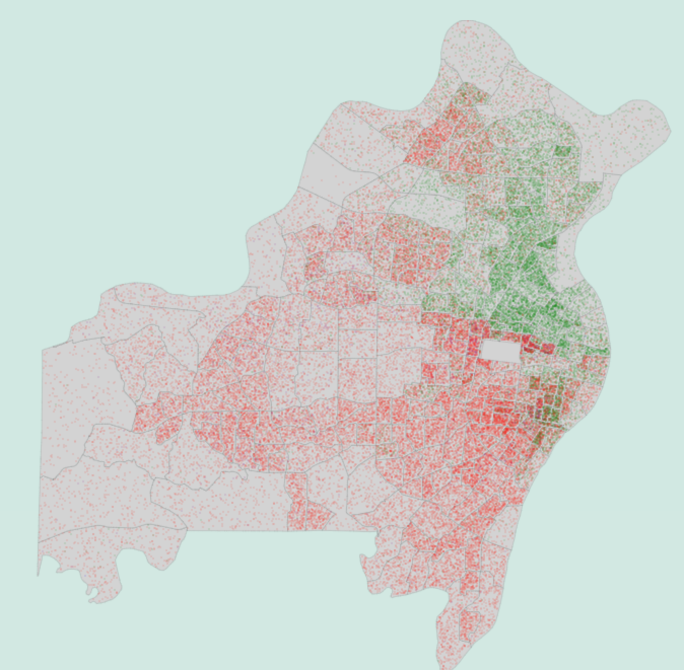
Overall, we are very happy with the way the visualization turned out. People we have showed this to love the way they can look at so much data easily and find their own trends. The way you can see how the black population moved from being completely confined to North City to being much more spread out in 2010 is a very interesting finding that is easy to see from our visualization. Also, you can see well how the city has become less dense over time and the suburbs more dense.
The dot maps of age and income were less interesting than that of race because there is so much more mixing of age and income than race. We think that hovering provides a solution to this because hovering over specific census tracts in different parts of the city can quickly give an overview of trends that the dot map is too jumbled to show. For age, the clearest trend is the large number of college age students at WashU and Saint Louis University. The income divide becomes clear if one selects only the lowest and highest income amounts in 2010. The brown dots are concentrated in North City, South City, and North County, while the gold dots are in the rest of the county. Hovering with just those two values on shows the deep divide.
One big problem that we couldn't resolve is that the income data is not adjusted for inflation, and have different categories each year. That means that the five income categories have to change each year, and it is impossible for them to correspond correctly. The increase of dots in certain income categories between years is largely due to the changing inflation adjusted ranges. Another problem with the map is that it is hard to know what census tracts correspond to exactly what areas, even if you know St. Louis well.
Further Improvements
There are a number of new features that could improve the functionality of the site, but that we did not implement due to time or feasability constraints.
Census tracts being highlighted when hovering over them
The ability to change the colors of different subcategories, including making some the same color
The census tract that a person is currently being highlighted
The ability to search for an address and the appropriate census tract to be highlighted
A map in the background that gives place names to make it easier to find locations