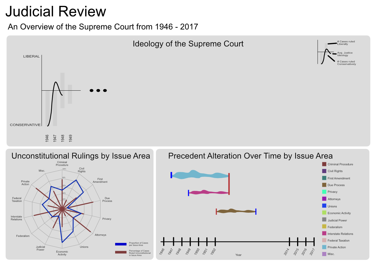
Figure 1: Initial Design Mockup
The Supreme Court of the United States is one of the most powerful institutions in America; its role in arbitrating disagreements at the highest level allows it to influence policy and daily American life in incredibly concrete ways. Famous cases such as Brown v. Board of Education and Roe v. Wade decide which children can go to which schools [3], and a woman’s right to an abortion [10]. Gideon v Wainwright gave Americans their right to legal representation [9], and Citizens United v. Federal Election Committee gave corporations the right to give unlimited amounts of money to political elections [4]. These are just a few of the hundreds of cases the Supreme Court has decided on over the years, shaping America with every ruling.
Despite this, the Supreme Court remains an unknown part of the American political system. According to a 2015 Pew Research Center survey, only 34% of respondents knew who the Chief Justice of the Supreme Court was [5]. Even optimistic research shows that, in 2005, only 60.5% of respondents knew that Supreme Court members serve a life term, and only 56.8% knew that Supreme Court justices serve a life term [8]. In short, the American people are woefully uneducated and misinformed about the role and function of the Supreme Court.
With our visualization, we hope to provide a medium through which everyday people — that may or may not keep up with or understand the Supreme Court — can gain insight into how the Supreme Court has evolved over the years as well as how it has influenced (and has been influenced by) the American people. The source code of the visualization can be found here.
This project should support our main objective: provide insight into the evolution of the Supreme Court and its influence on American society. In order to do that, we proposed the following sub-objectives:
The main source of information comes from the Supreme Court Database which provides both modern and legacy data in two versions: (1) Case Centered Data and (2) Justice Centered Data. We used the Case Centered Data for most of the visualizations, and used the Justice Centered Data for the final design for the Ideology section.
Additionally, we used the datasets used in [7] and [6] to create precedent intervals for the Precedent section of the visualization. The Unconstitutional and Precedent sections of the visualization also make use of case summaries from Justia[1], Oyez[2], and Wikipedia[11] to clearly explain complex cases.
As I began to investigate the structuring of the data at hand, I realized that the initial idea of having a sort of double-sided bar chart overlain with a line chart did not really fit because there were three options for decision rulings: conservative, liberal, and unspecified, the latter of which I neglected to think of. Because of this change, I decided to use a stream graph with the amplitude of each section being proportional to the number of cases of that ruling with respect to the max number of cases taken within a given year. This way, our data is also dual-encoded such that the combined amplitudes can show trends of the number of overall cases over time. The line chart overlain on top of the stream graph will still be present as of right now. For now, I have chosen to color the two initial streams for liberal and conservative the same color tone while coloring the third stream for unspecified to be the same as the visualization background. This was a design choice to show that the unspecified stream is sort of an empty area that doesn’t really give us significant data. The idea of blending the two colors to create the color for the unspecified stream was also toyed around with as an option and may end up being considered at a later date.
At first, I didn’t quite know how to create a stream graph in d3-v4 and hoped that there were someone that already did it. I found a few implementations, but didn’t see any that served the basic purpose of what I wanted; however, with special thanks to the link below, I was able to discover that d3 has what is called a stack layout that, after some initialization, can simply be passed the data to create a series and magically spit out arrays of values that contain lower- and upper-bound pairings for each section of the stack associated with the data.
This made dealing with the stream graph much easier although still a challenge to understand how it is used.
The x-axis proved to be more difficult than I originally thought it would be. For some reason, I got a weird range of decimal numbers that started around 0.94, slowly decreased, then jumped up to a final larger number. This ended up being due to the fact that I was not parsing the year values into JavaScript’s data type.
Moving forward after Milestone 1, I need to add capabilities for brushing over the x-axis to update the below visualizations as well as hovering functionality to show data for each particular year. A legend will also be added to clarify which stream belongs to which ruling direction.
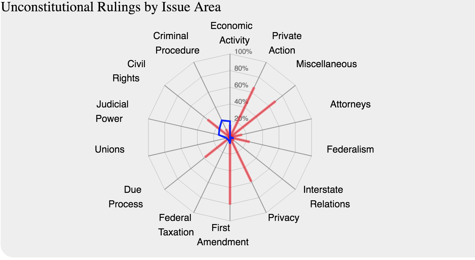
For this visualization we started by implementing the chosen design, however, the proportion of cases per issue area (blue area) is very small compared with the area of the chart, so a first attempt to fix it will be to use a logarithmic scale, since we need the domain to go from 0 to 100% to represent the red rays (Percentage of cases ruled unconstitutional).
We will evaluate if the new design works or if a more radical change in the visualization is required.
The data has been processed and formatted to be used in the visualization. Currently we are using data corresponding to 1946-2017 and we will evaluate the inclusion of information from 1791 to 1945, however, this inclusion will not affect our current implementation.
The first major hurdle for creating this visualization was correctly formatting the data. This required rangling two different data sources (the Spaeth database and a collection of citation data from Fowler and Jeon). The goal was to create a data structure which was light enough to load quickly, but robust enough to support the layout operations needed to create the visualization.
As a result, I decided to use Python’s Pandas library to merge the datasets and create a third, more lightweight dataset, with each entry representing the history of one precedent. The resultant dataset had a column for the indices of the original case and the case that overruled it in the Spaeth database, allowing for further information extraction for tooltips and the like. Additionally, the dataset had columns for the dates of the precedent-setting and precedent-altering cases; this way, large amounts of data wouldn’t have to be pulled from the Spaeth database to do layout. Finally, the data also included the in-degree of the original case from the Fowler and Jeon dataset, which was meant to be used as a proxy for importance.
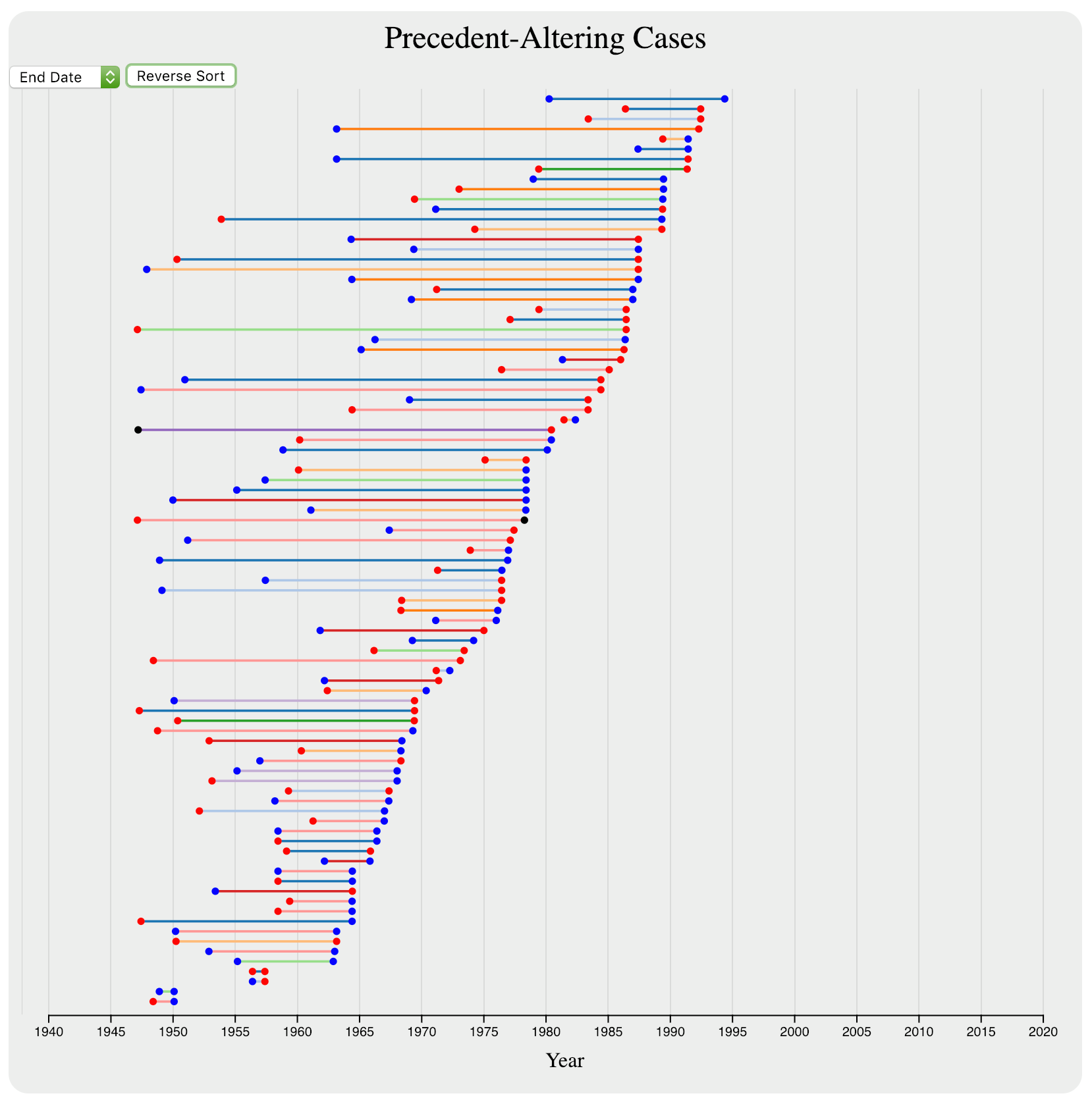
With this data rangling completed, I used a greedy algorithm learned in CSE 347T (thanks Professor Agrawal!) to lay out the intervals in the most compact way possible. I then color-coded each end of each interval according to whether the case represented by that end was decided in a liberal or a conservative manner. Finally, I used another set of colors (specifically schemeCategorical20) to color code each bar, representing the issue area in which the precedent was set. This left me with the following visualization:
This, I felt, was sufficient for a first Milestone, but it left a number of questions to be answered. The first was regarding the large gap on the left (caused by the fact that the Fowler and Jeon dataset only goes through 2002): what would we do about that? It looked a little awkward, but we wanted to have the timeline of all of the graphs linked, meaning we couldn’t cut the graph short. Furthermore, brushing the upper graph and creating an area starting in 2000 or later would cause the lower right graph to be blank. As a result, we realized that it might be necessary to show a message akin to ”No data for this time period” if the precedent graph ever went blank. However, I’m still not married to this solution; we could also link some of the missing data by hand, or we could come up with a more clever utilization of space if the precedent graph was ever blank.
Furthermore, the graph is exceedingly vertically challenged. Unfortunately there is not much to be done about this without a major rethink of the overall design. We considered switching the axes, but felt that a vertical time axis might be misleading, especially since the primary ideology visualization used an horizontal time axis. A solution to this problem may present itself in the future, but for now I feel that I can live with the current state of the visualization.
The next question to arise was how the intervals should be laid out; the current layout puts denser lines at the bottom, and sparser lines (often with longer precedents) at the top. This might be a handy organizational tool, as it reduces the area a user might need to search when looking for long-standing or short-lived precedents. However, it also lends the graph to a slightly “tilted” or top-heavy look. This could be remedied by flipping the horizontal ordering of the lines, thereby creating a more solid “base;” alternatively, I considered making the densest line start in the middle, with sparser lines alternating outwards. These configurations should be explored not only for their aesthetics but also for their ability to convey information and allow users to interact in the best way possible.
The question of brushing arose again when considering a brush area that included the time during which a precedent stood, but excluded either of the cases that set or overruled that precedent. After some discussion with my group members, we decided it would be best if the precedent interval were excluded in this scenario, and only intervals which had a court case in the current brushed time range would be included in the visualization; this way, the precedent-altering visualization really shows how cases affect precedent, not simply that precedent exists.
Finally, a few ideas that were in the original design proved troublesome. The first was the “wave” design of the intervals, which was meant to represent the importance of a precedent-setting case over the years. Unfortunately, the citation data included in the Fowler and Jeon dataset does not include a year-by-year breakdown, making the distribution of citations unknown. Furthermore, the vertical height challenge means that even if the data were available, it might be hard to see when looking at the whole time range. That being said, I have not given up on the idea. Additionally, the idea of linking a single case across lines may also prove difficult: the easy and quick algorithm used for initial layout may not allow fixing the location of a given interval, and so the algorithm may have to be altered slightly or completely rewritten to allow cases to be linked vertically as shown in the initial proposal. However, similar to the wave-shape of the intervals, this is an idea on which I have not given up.
These challenges and questions will be addressed moving forward towards Milestone II and the user tests.
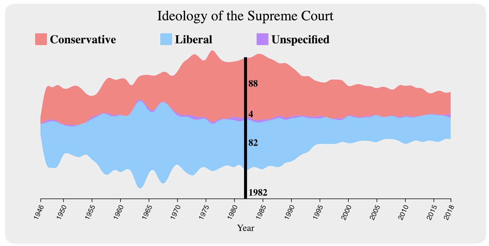
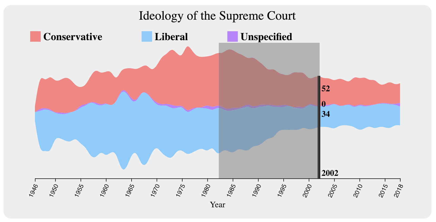
For interaction with the Ideology section, we added the ability to hover over a particular year to view data for each ideology as seen in Figure 5.
In order to tie this visualization to the others, we implemented brushing over the stream. We figured that in order to make it easier on the user when brushing, we would persist the hover line and its data (Figure 6).
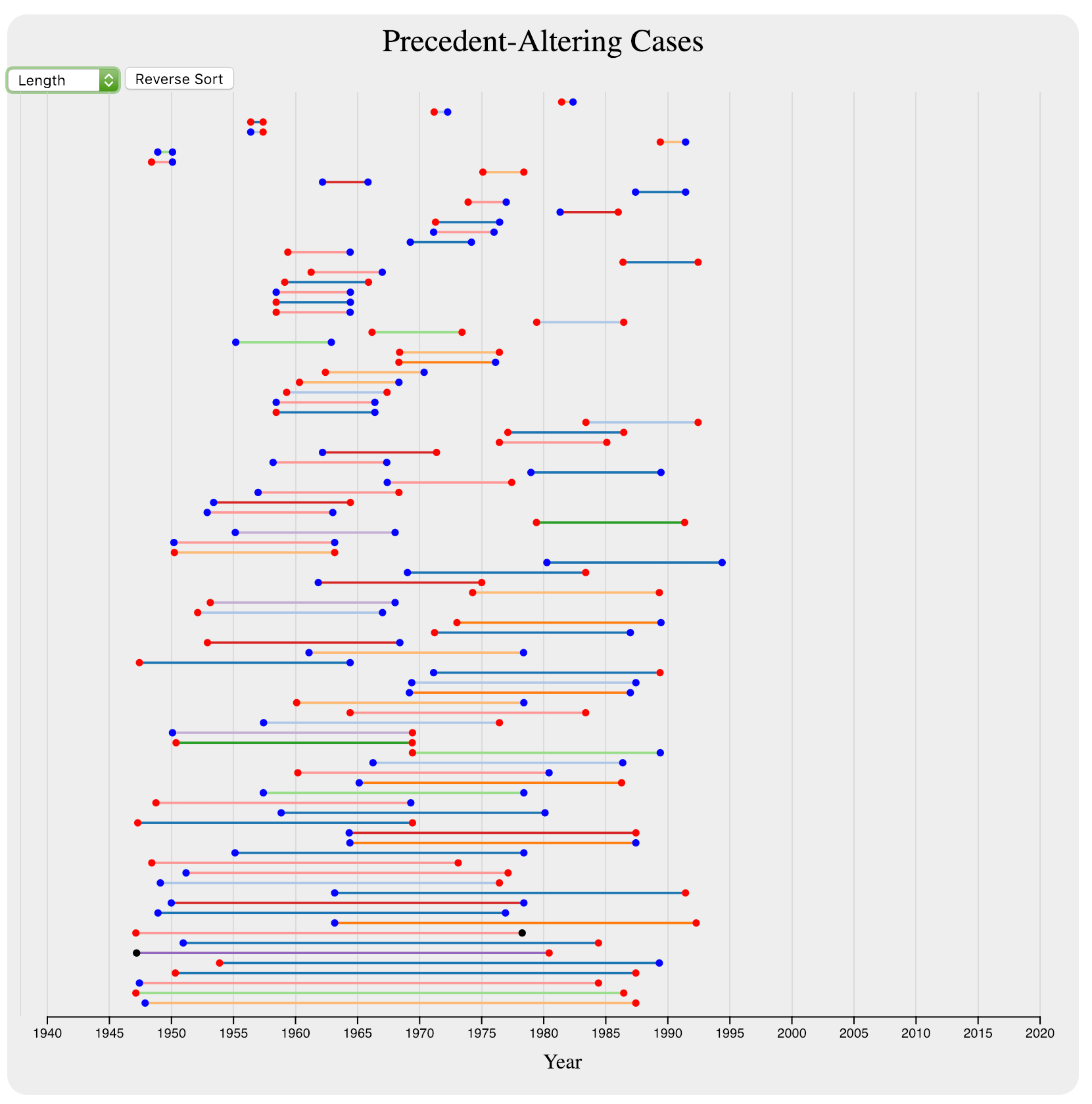
For the interaction with the precedent section, we made two major interactions: sorting and hovering. The sorting allowed the intervals to be sorted by the date of the overruling case (as seen in Figure 7), the date of the overruled case, or the duration of the precedent (as seen in Figure 8).
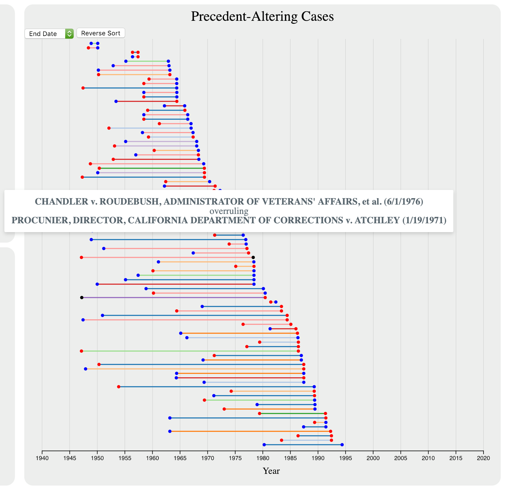
The hovering that we added allowed users to see the names and dates of the cases that set and overruled precedent, as seen in Figure 9.
We tested our first prototype with four users. The questions were divided into four areas, three of them corresponding to each visualization, and the last one with more general questions regarding the user interactivity with the system. All questions regarding the number of cases grouped by ideology were correctly answered; however, it was observed that the brushing was difficult to use in cases where only one year needed to be selected. There was one case where the user did not understand the time range as a range, but instead he tried to find values using brushing to select one year individually.
Questions regarding the grouping by issue area and concerning unconstitutional cases have one question answered by only one user: they were not able to understand the meaning of the information in the bar or in two cases they did not even find that clicking was an option.
Questions for the precedent altering cases had less correct answers. One user reported that he did not understand that visualization at all, others who tried did not find the correct answer or gave comments instead.
In general, people reported that they liked the visual design (two of them assigned the maximum value and the other two assigned 4 out of 5 points). Regarding the intuitiveness of interaction, three of them gave 4 out of 5 points and one assigned 3.5 points. When asked about how intuitive it was to obtain information, the values dropped to 3, 3.5, 4, and 4 respectively, in general they tried to balance the points between the easiest and the hardest visualizations.
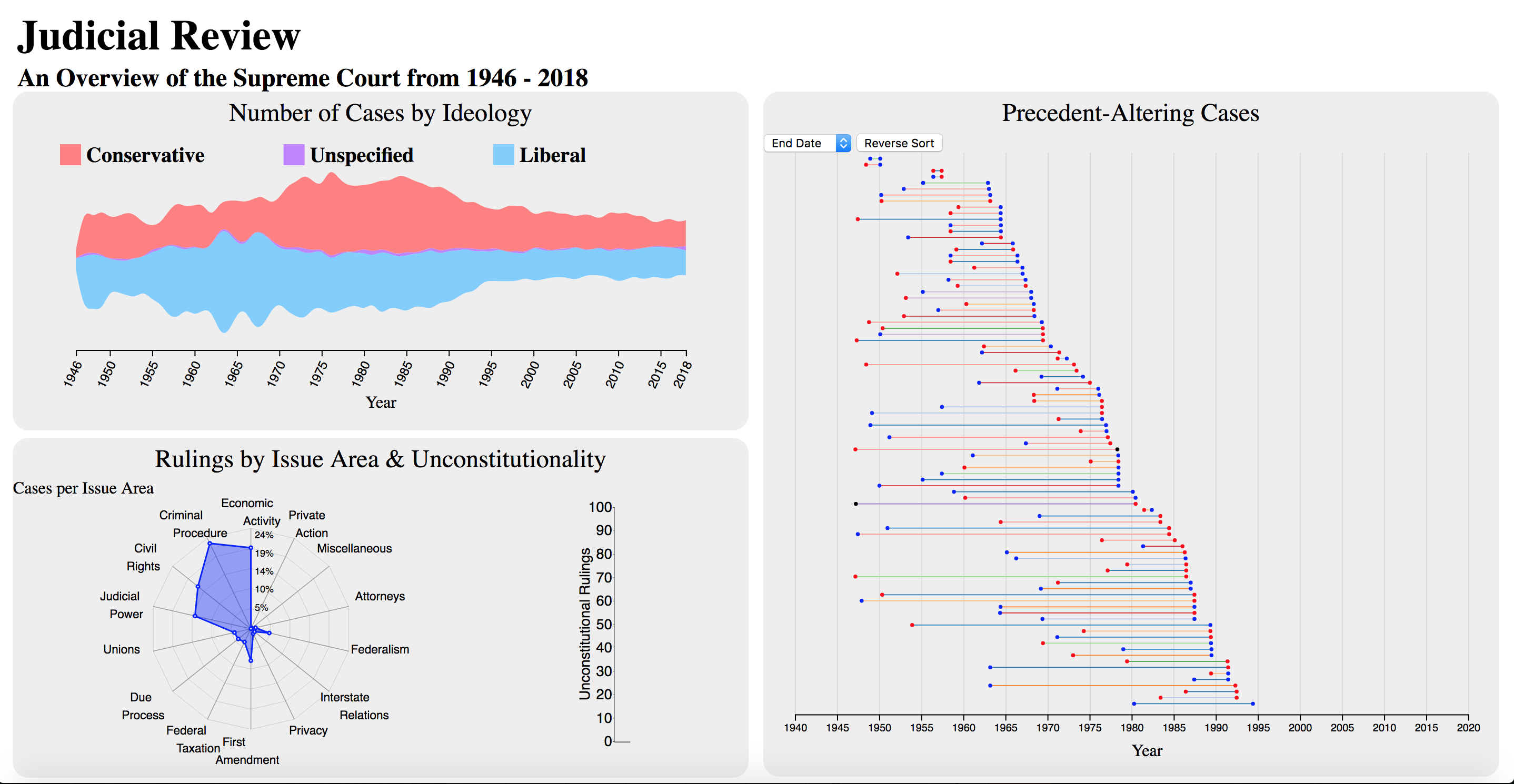
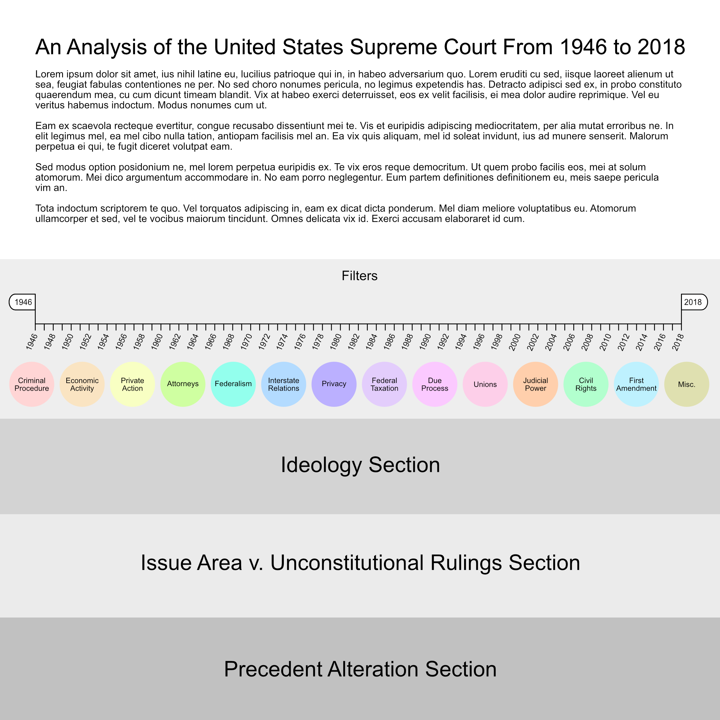
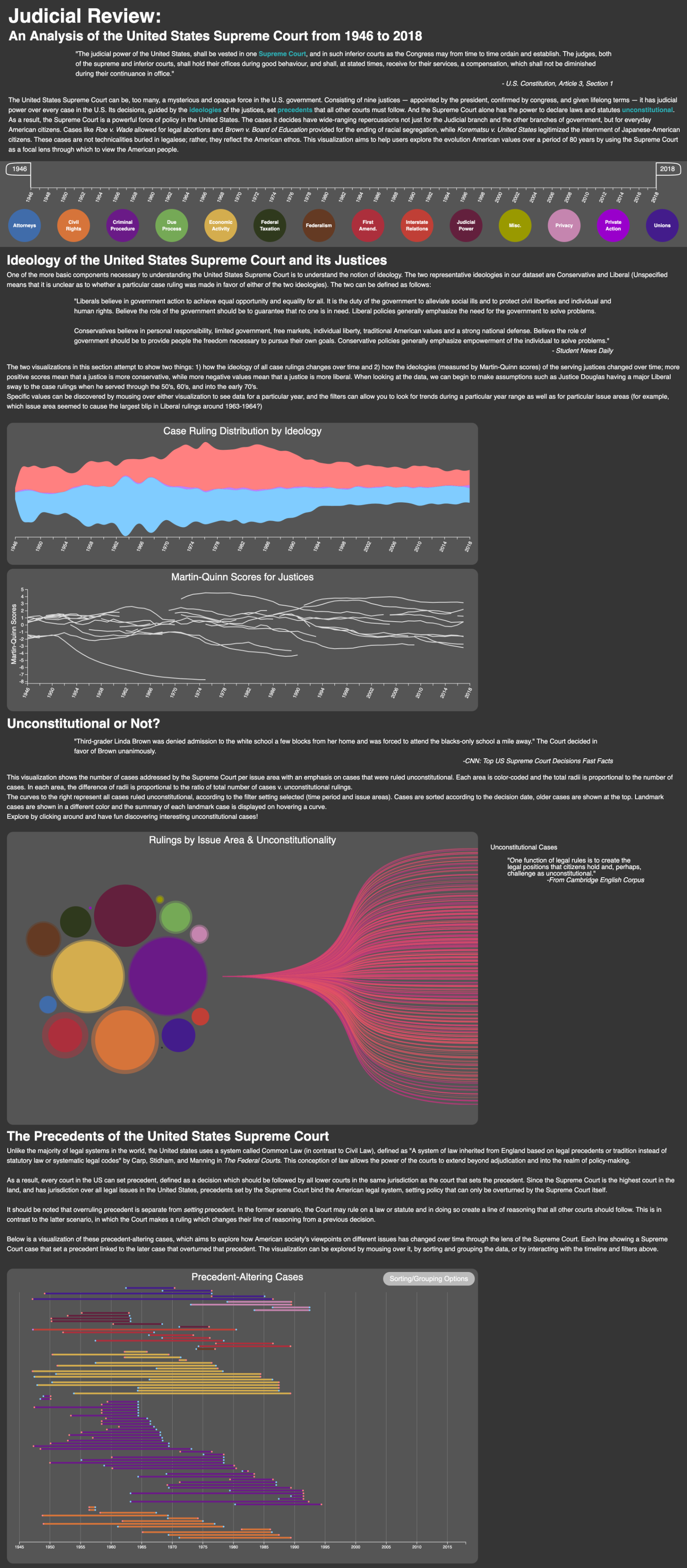
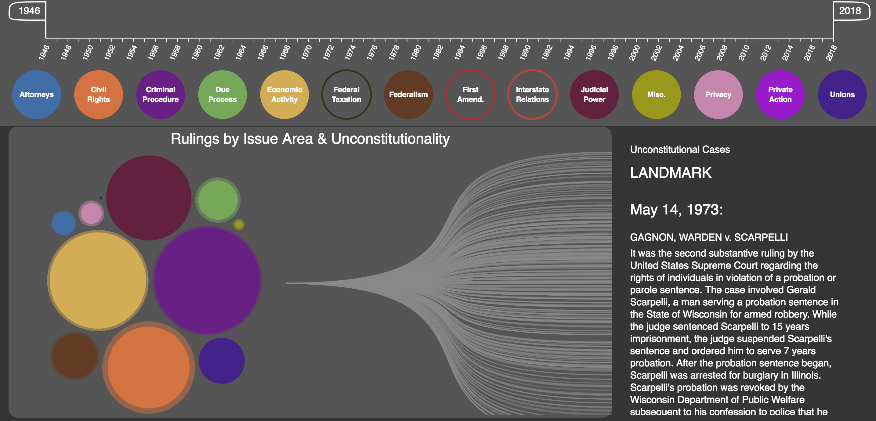
For the redesign, we knew that the most important next step was to ensure that we were answering all of our proposed questions. In order to do this, we definitely couldn’t fit it on one non-scrollable page in a easy-to-use fashion. We brainstormed for a bit, considering creating detail pages for each of our three sections and keeping the first design as the summary page. After picking at this for a bit, we decided that we liked the idea of having all of our data on one scroll-able page better and implemented it as in Figure 10. Having a scrollable page would also give us some room to include textual information that could help a user better understand the context since the U.S. Supreme Court can be a confusing topic.
With our new design, we also thought it would be more intuitive to make the time filter explicit with handles controlling the time range instead of assuming the user would know to brush over the first ideology visualization. When adding this idea of an overarching filter, we also came up with the idea to filter each visualization by issue area since the original design required the Issue Area v. Unconstitutional visualization to control the Precedent Alteration visualization depending on what issue area had been selected. This helps us delve a bit deeper into each section by giving that extra layer of filtration.
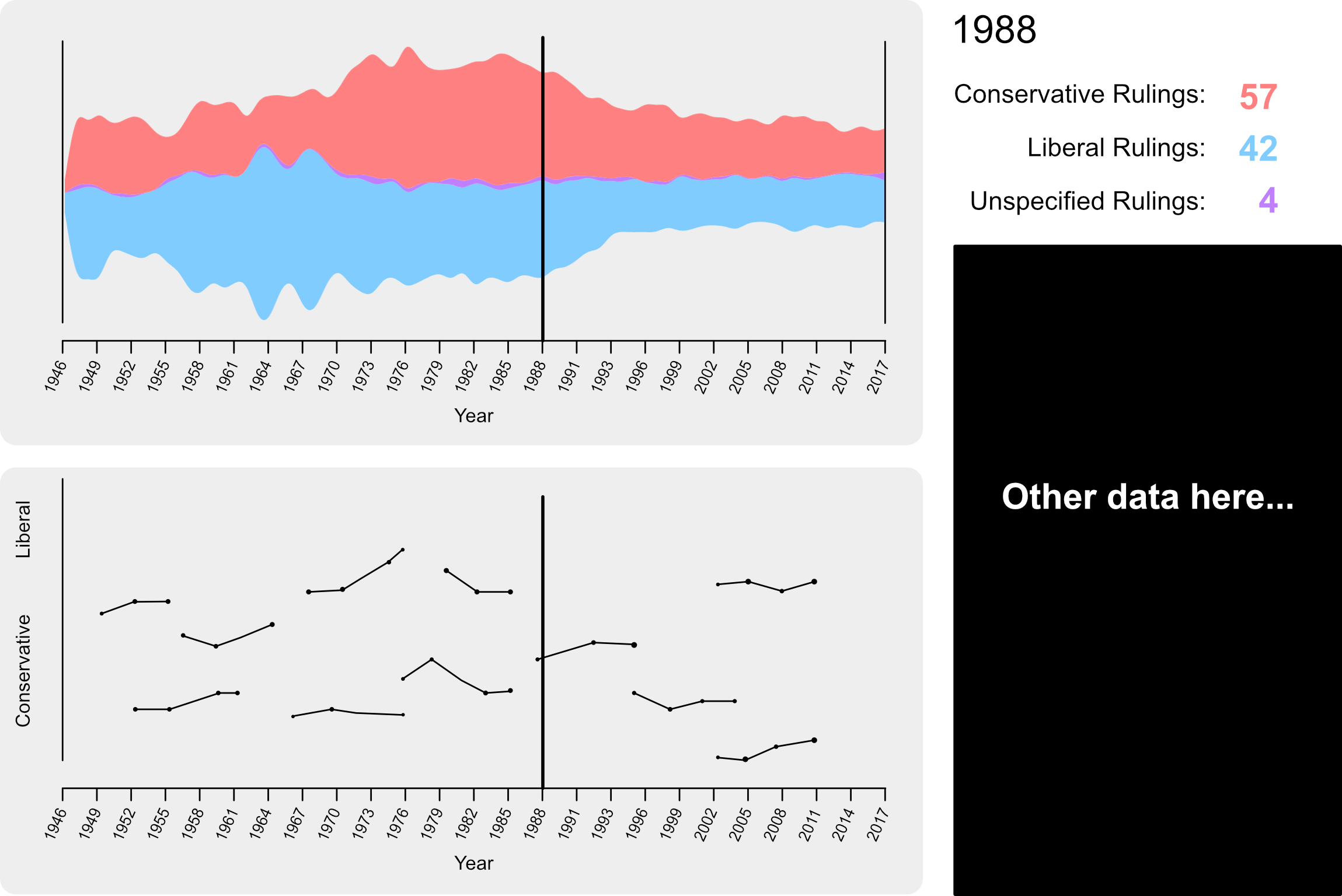
Although people seemed to enjoy the stream graph, it was easy to use, and it was intuitive to discover information, the biggest problem with it was that it did not show how the individual justices affected the Court’s decisions over time. To solve this, we needed to gather more data. It turned out that someone (a student from the University of Michigan) had taken our original datasource and analyzed it to determine Martin-Quinn scores for the justices. Using that data in combination with ours, we created a second visualization for this section in the form of a line chart with each line representing a justice. Since we then had more of the screen to play with, I dedicated the rightmost side of the page to display detailed data of the case ruling counts as well as the Martin-Quinn scores of the justices serving at the particular year a user looks at (see Figure 11).
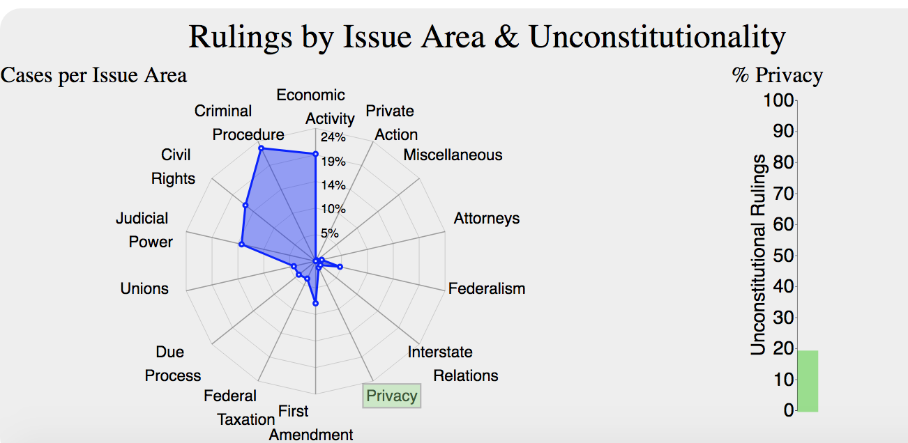
Among the three visualizations, the Issue Area v. Unconstitutional Rulings visualization is the one that suffered most changes. First, because it had scale issues, we decided to have two different visualizations to represent both, the cases per issue area and the unconstitutional rulings per issue area in two different charts; However, the users had hard time understanding the charts and their meaning, even less the interaction among them, the second design is shown in Figure 12.
Where the percentage of cases per issue area was shown in a radar chart and percentage of cases that were ruled unconstitutional within a specific area was represented in the graph bar. The user studies and the feedback we got made us realize that those measurements were not clear and in fact, did not help to answer any of our original questions.
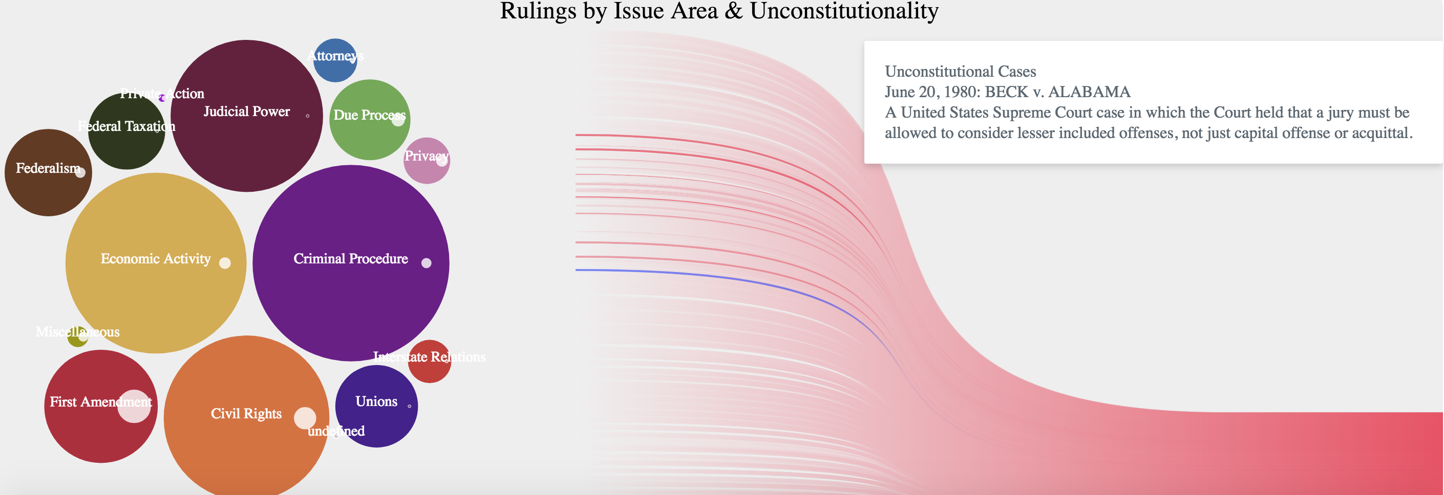
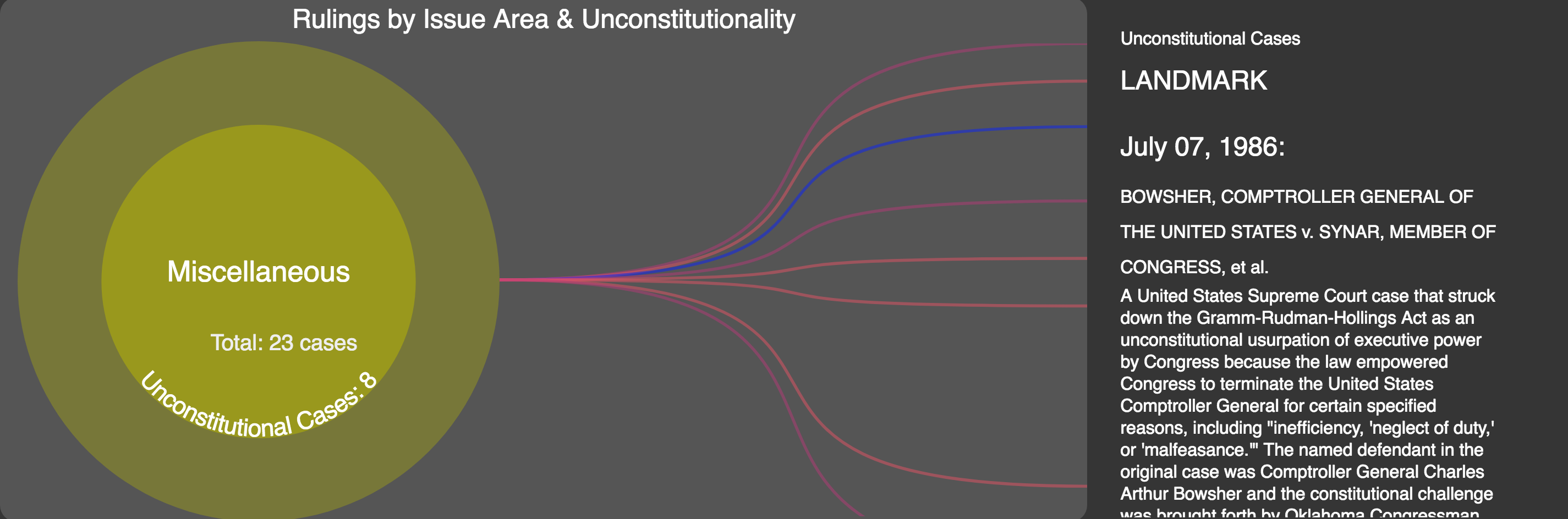
Therefore, we opted for a set representation, using the structure of a circle packing, the intention was to represent one set per issue area and to show all unconstitutional cases within that area as a subset in a Venn Diagram style. One of our objectives was to “Show the Court’s focus and the change and evolution of American society over time by visualizing information about unconstitutional rulings by issue area.” And many of the unconstitutional rulings are landmark cases, which are the most frequently cited cases in the Supreme Court history, those cases have also often influenced the meaning of the Constitution [1]. Hence, we focused on the best way to show cases ruled unconstitutional that were also landmarks.
Our main dataset does not provide the information of whether a case is considered a landmark or not, therefore, we looked into additional sources. One objective I had in mind was to find the clearest explanation of those cases with the minimum amount of technical language. We found some pretty decent information in Wikipedia [2] and some web scraping was done to find descriptions of all cases ruled unconstitutional whether or not they were landmarks.
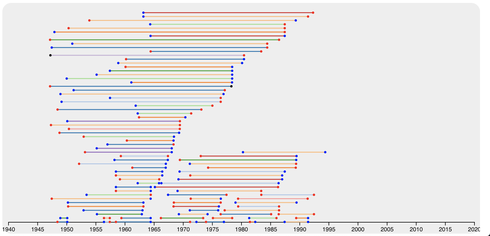
The first attempt to show this information was to use a structure of circle packing with the root hidden and the first level representing each issue area; the idea was to represent each individual case as a leaf in the structure, and modify it so that unconstitutional cases are grouped. Two problems arose with this solution: 1) the computation of the structure using the D3 library was very slow due to the large amount of cases, and 2) the chart needed to be displayed in a rectangular area and therefore a large amount of horizontal space would be left unused (as shown in Figure 13).
The next possible design was to show all unconstitutional rulings to the right with a tooltip showing a brief description of each case (if a description was available), landmark cases were also supposed to be marked with a different color, and the set of displayed cases would be filtered when an area is selected. Figure 14 shows this design; one problem was that the colors used to identify each area required white or light-colored letters and some circles were so small that the name did not fit into them. Another problem was that there was no visual connection between the areas (circles) and the unconstitutional cases (pink curves). Additionally, the tooltip was a very uncomfortable way to access the information. To address all these problems, we came up with the final design.
The precedent alteration section of the visualization was, for most users during the studies, the hardest to use. Unfortunately, this was partly a result of precedent being a uniquely American construct that, while incredibly important, is also highly specific in its importance to the courts. This is what prompted us to move to short writeups to introduce each section, allowing users who did not know the terminology used to become familiar before exploring the visualization.
The second biggest issue was that people were confused as to the encodings used – specifically the color encodings used in the precedent section. This was helped by separating the issue areas into a filters section that allowed the colors for each issue area to be visible at all times, and the precedent colors were coordinated to these issue area colors. The endpoint colors, meant to indicate the leaning of the ruling at each end of the precedent interval, were changed to the same color as the rulings in the stream graph. Unlike the other two sections, the redesign of the precedent alteration was not truly implemented and refined until the final design as a result of time constraints, and so the design is shown later on in the Process Book.
Transitioning from our redesign into a final design, we really just decided to change up the font to Helvetica and adjusted our color scheme to be more appealing and easy on the eyes. This color scheme took the form of the more modern idea of Dark Mode (Figure 15).
The filters initially did not seem to take much thought. The handles are essentially each a grouping of a path and text. The values for this path were created specifically by us (Taylor had prior experience with svg paths when creating Android VectorDrawables). That part aside, dragging them side-to-side is really no different than brushing (functionally). The issue area filters react similarly to buttons, and throwing that collection of objects around is fairly straightforward.
Further implementation of the Ideology section required the creation of the line chart and the addition of the text on the right. The text on the right was not difficult to implement as it was no different than the initial interactive design (which threw the values next to the hover line).
The line chart took a bit of thought as far as the data structure was concerned. Initially, the data was a collection of objects each containing a value for who the justice was/is, their Martin-Quinn scores, and the year that score was recorded for. In order to achieve the desired output for each justice having his or her own line, it made sense to preprocess this data into a collection organized by justice name (although looking back, it would make much more sense to organize the collection by justice id to avoid situations in which two or more justices share the same last name; in our dataset, this did not occur). For each justice object, a collection of Martin-Quinn scores matching to years was created to complete the data preprocessing.
At this point, everything functioned properly. However, once the filters were working, I realized that the way I was modifying the stream was very slow to update (it took seconds from dragging a time handle for the filter to actually move the handle). This was due to the fact that I initially was nesting loops inside one another to rewrite what an initial data file gave me (I had ran a Python script to retrieve the initial values for the stream, so I never realized how slow it was). I spent a decent amount of time trying to figure out how to get around this issue and finally settled on what I felt was the best idea. I trashed my data that my Python script gave me and instead constructed a collection with the following format:
This format in conjunction with my collection tracking which Issue Areas were active allowed me to very easily hide any Issue Area data that was deselected in the Filters section and update my visualization much more quickly.
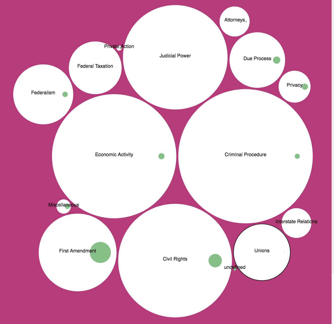
For the final design we decided to get rid of the names of each bubble since the filters already contain that information and the color scheme is the same. We also decided to represent the ratio between total number of cases v. unconstitutional cases per issue area using the radii difference of two circumscribed circles. The larger the radii difference, the larger number of unconstitutional rulings in a respective issue area. The final design using the filter settings by default is shown in Figure 16.
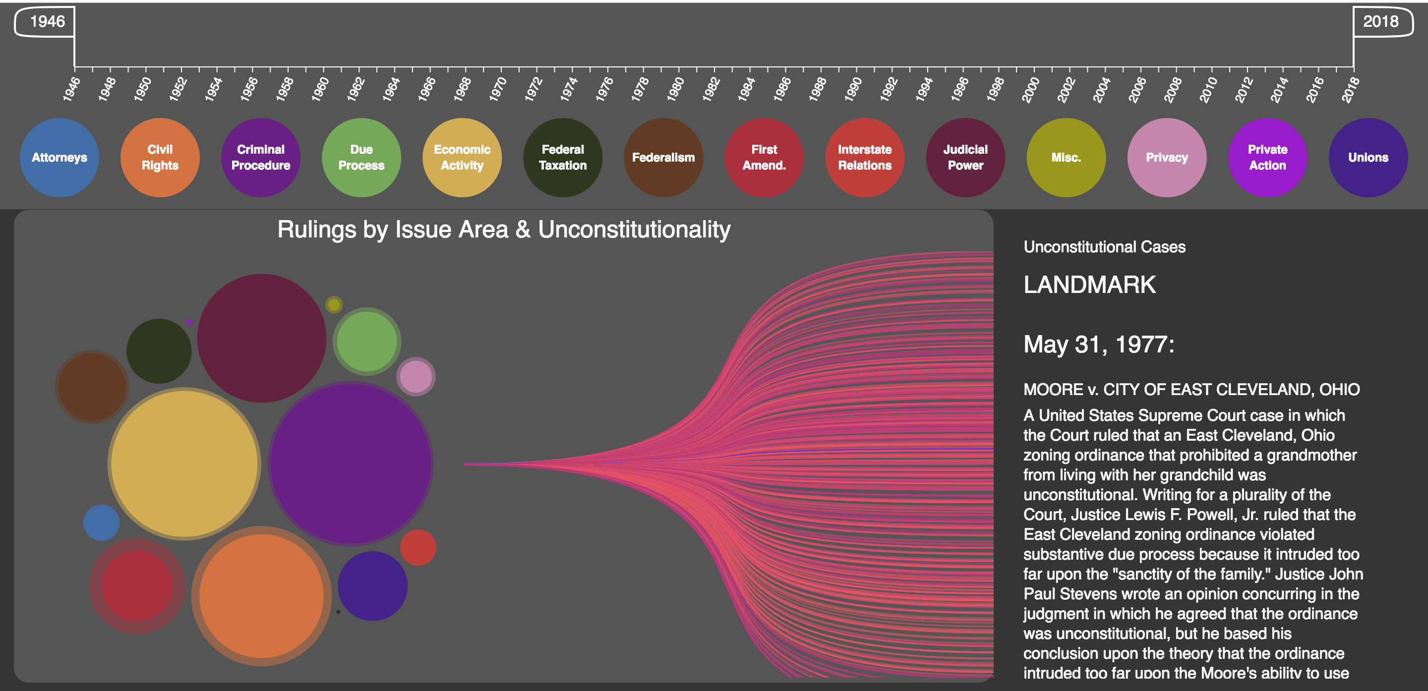
By clicking on any of the issue areas (bubbles to the left) a zooming effect will show the total number of cases as well as the number of unconstitutional rulings for that specific area given the settings of the filters (time period and selected issue areas), it will also show one line per unconstitutional case; on hovering the lines a summary of the case is shown if it happens to be a landmark (Figure 17).
Since reading the information can be problematic in case it is long and there are many cases nearby, disabling the ”mouseover” event was implemented when the user selects a case and clicks. The interface will change to notify the user about the change; going back to normal is implemented by a second click or by performing any other action with the filters or other bubbles. Figure 18
The final design of precedent altering cases shows pairs of cases that set and overruled precedent. Hovering over any of them allows the user to view deeper information about the cases, including citations, names, dates, and in some cases summaries. The implementation of the grouping and sorting was not terribly difficult – the most challenging implementation issue was getting the intervals to go “off screen” when one endpoint was in the selected range but the other endpoint was not. Additionally, making the visualization work when only one year was selected required some debugging to realize that the x-axis scale was off by a year in that case, and had to be shifted manually.
We feel that the filters are very intuitive to use, given that the mouse changes on hover for the elements and the issue area filters even visually change themselves on hover. They may not necessarily be the best option to go with (i.e. there may have been more ways to accomplish the same goal), but we believe that they are implemented in an easy-to-use and intuitive way.
We believe that the Ideology section answers our original goal, in that it is able to show how the justices’ ideologies (i.e. Martin-Quinn scores) seemed to sway the Court’s opinion. We think that this has been executed particularly well given that we are not in any way trying to show that particular justices have affected the Court during particular time periods, but rather we give the user the ability to explore the information such that he or she can make his or her own judgments about what justice(s) they believed had an impact; moreover, the user is also able to look particularly at issue areas or groupings of issue areas to see if a particular justice seemed to have more of a pull with some types of cases and less of a pull with others.
Analyzing unconstitutional rulings, specially landmark cases was an important information obtained not only after the visualization was built, but also in the process of retrieving and compiling the information. Having a sense of the amount of cases that arrive to the Supreme Court and how a small percentage of them are important enough to change the course of history was eye opening.
Being able to observe changes of a specific area during time also gives insight about the American history. Further analysis depends on personal interest, but we think this tool helps to digest the information by providing a high level view and also allows the user to dig deeper, maybe not to the level of details per case, but good enough to grab the attention and look for additional sources of information.
We believe the Precedent section answers the original goals stated, allowing users to see how different areas of American policy and politics changed over the decades by viewing when and on what subjects the Court overturned itself. Unfortunately there was simply not enough time to manually construct the citation pairs for the time period after the mid-90’s, which would have been a huge boon to younger generations who may only be familiar with recent cases. Additionally, having summaries for more cases would also be ideal, but boiling down complex and sometimes mind-numbingly specific cases to short summaries by hand was simply not the focus of the class. All of that being said, we believe the visualization still allows users to explore the Court’s shifting views on different subjects.
Unsurprisingly, this visualization does not encompass all of the vast possibilities the dataset provides. There are a number of features that could be added to advance the visualization’s potential. From a overview standpoint, we believe our visualization does an effective job, and allows mid-level analysis as well. However, we acknowledge that our visualization could go into more detail in many ways. One way to achieve this would be to allow for searching a certain case across all of the visualizations. Another possible expansion would be to implement an idea discussed earlier in the Process Book, in which each visualization also has its own page which goes into much deeper detail. Additionally, case summaries could be obtained for all of the cases.
There are also high-level improvements or advancements that could be made. One such possible advancement would be incorporating some sort of network analysis more fully using the power gotten by crossing the main case data with the citation data. We could also incorporate some new statistical and machine learning models which have used the same data as us to predict future rulings on upcoming Supreme Court cases.
Justia. url: https://supreme.justia.com/.
Oyez. url: https://www.oyez.org/.
Brown v. Board of Education of Topeka (1). Oyez. url: https://www.oyez.org/cases/1940-1955/347us483 (visited on 12/19/2018).
Citizens United v. Federal Election Commission. Oyez. url: https://www.oyez.org/cases/2008/08-205 (visited on 12/19/2018).
Meredith Dost. Dim public awareness of Supreme Court as major rulings loom. Pew Research Center. May 14, 2015. url: http://www.pewresearch.org/fact-tank/2015/05/14/dim-public-awareness-of-supreme-court-as-major-rulings-loom/ (visited on 12/19/2018).
James H Fowler and Sangick Jeon. “The authority of Supreme Court precedent”. In: Social networks 30.1 (2008), pp. 16–30.
James H Fowler et al. “Network analysis and the law: Measuring the legal importance of precedents at the US Supreme Court”. In: Political Analysis 15.3 (2007), pp. 324–346.
James L. Gibson and Gregory A. Caldeira. “Knowing the Supreme Court? A Reconsideration of Public Ignorance of the High Court”. In: The Journal of Politics 71.2 (2009), pp. 429–441. issn: 00223816, 14682508. url: http://www.jstor.org/stable/10.1017/s0022381609090379.
Gideon v. Wainwright. Oyez. url: https://www.oyez.org/cases/1962/155 (visited on 12/19/2018).
Roe v. Wade. Oyez. url: https://www.oyez.org/cases/1971/70-18 (visited on 12/19/2018).
Wikipedia contributors. Wikipedia, The Free Encyclopedia. url: https://www.wikipedia.org/.