Riders of New York
Process Book | VisualizationSections
Project Description Overview and Motivation Related Work Questions Data Exploratory Data Analysis Design Evolution Implementation EvaluationProject By
Lucas Drummond Amelia Santrach Robin LinzmayerRepository
githubRiders of New York
This project is an exploration of NYC's Citi Bike program,
the largest and most used bike sharing program in the United States.
- -
Overview and Motivation
Motivation
The bike share model is a relatively new form of transportation in the US, but based on its growing prevalence in larger cities, it appears to be strongly supported by city planning and local government. Bike sharing programs are complicated systems meant to provide social, environmental, and economic benefits to both the cities and the program users. However, due to the relatively recent boom in usage, there remain many uncertainties to investigate. We are motivated to create a visualization that providess a conduit for researchers, bike share users, and interested parties alike to examine the characterized usage of NYC's Cit Bike program.
Objectives
The objective of our visualization is to elucidate the most common use cases for the Citi bike sharing program. This will be done by visualizing the paths of the bikers over time and visualizing each path by attributes associated with the rider. Both rider attributes and contextualization of the ride will add dimensions that will allow us to examine different use cases of the bike sharing program. Additionally, this will be done by quanitifying rider statistics (such as gender and type of pass holder) for all rides in a sselcted time period. This categorical data, alongside the spatiotemporal data visualized on the map, will help the visualization user reach the objective of understanding usage trends of the Citi Bike program.
Questions and Goals
Original Questions
- What paths do CitiBike users take?
- How many users are their per unit area?
- Are there areas that appear underserved?
- How do the "goals" of the city bike program compare to how it is used?
- Is the a notable difference between different user demographics?
Refined Questions
- What paths do CitiBike users take?
- Are there areas that appear underserved?
- Is there a notable difference in user demographics?
- Is CitiBike in place for NY Natives or Tourists?
Goals
- A map visualization that allows users to select specific dates and times
- A time control element
- An overview of the typical citibike use
Extras
- Comparison to uber maps for current commute traffic
- Comparison to other cities
- Way to visualize common bike accident locations
- Inclusion of Gender and Age attributes
Data
Primary Data Source
Secondary Data Sources
Exploratory Data Analysis
The data explored below is the Citi bike sharing data from October 2018.
October 2018:
- 1,874,487 bike trips were taken
- Bikers used 778 stations across NYC
- 1,106,212.22 kg of CO2 was saved
- 519 Pershing Square North Station saw 32,486 rides in October
- E 30 St & Park Ave S only saw 1 ride in October
Design Evolution
Inspiration
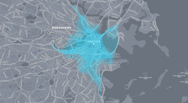
Path Inspiration
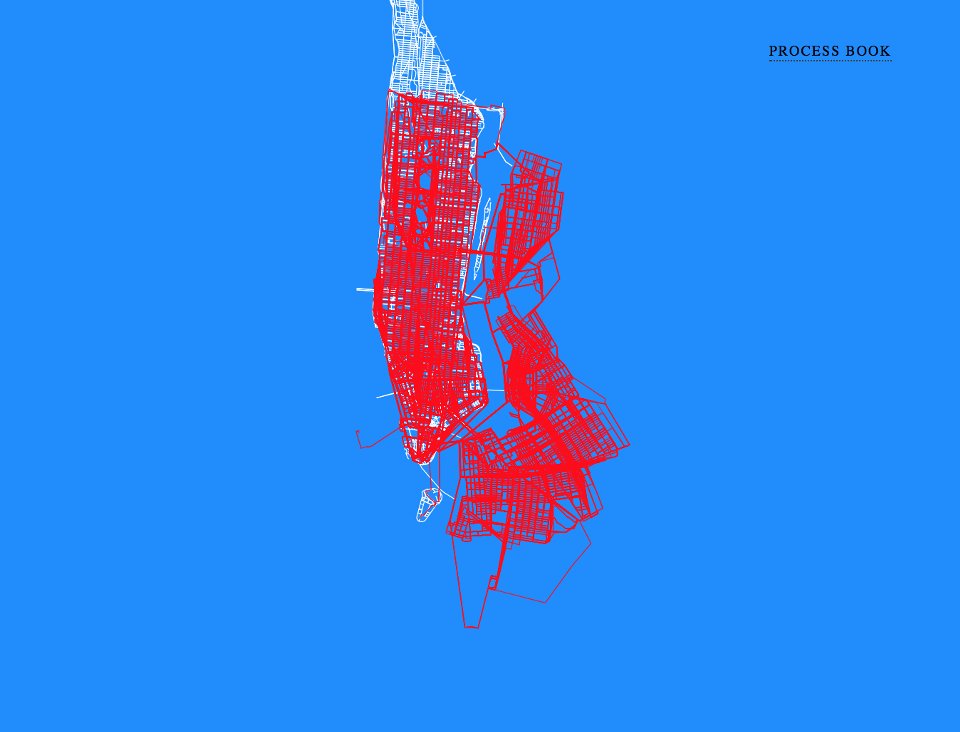
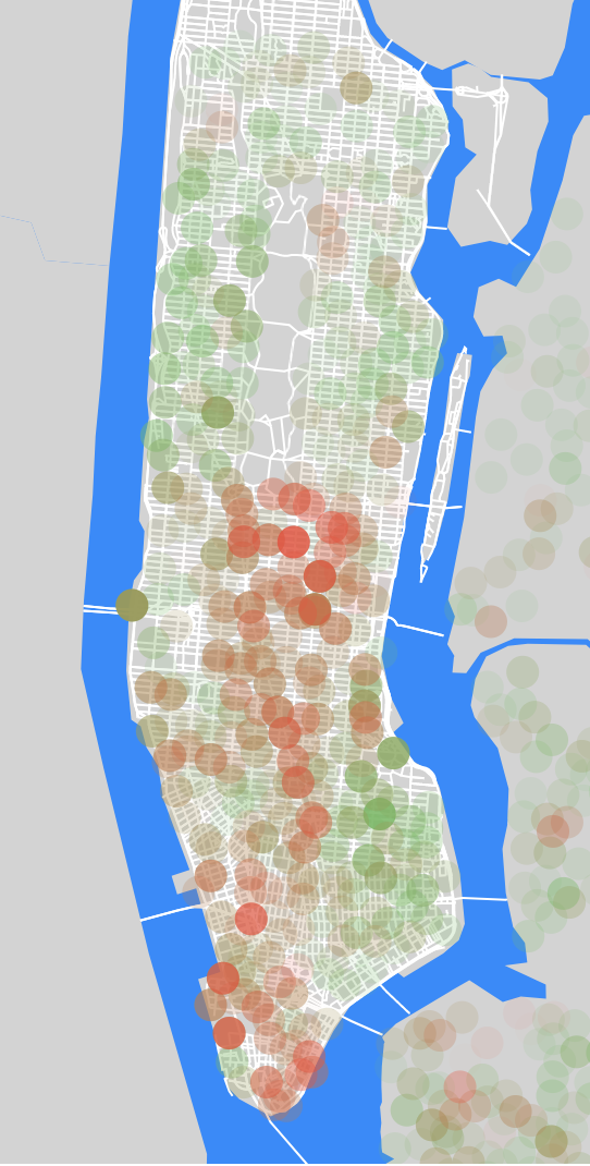
When we were looking for inspiration for drawing paths we found the above example. Originally we didn't want to do just a map with paths and location markers so we tried to explore other ways of showing a network or bikes. We found this map to be both beautiful and understandable. We really liked most how you can see the full grasp of a system. We did find that this visualization maps what we really wanted to know; where are the most commonly used stations/paths.
Map Design from proposal
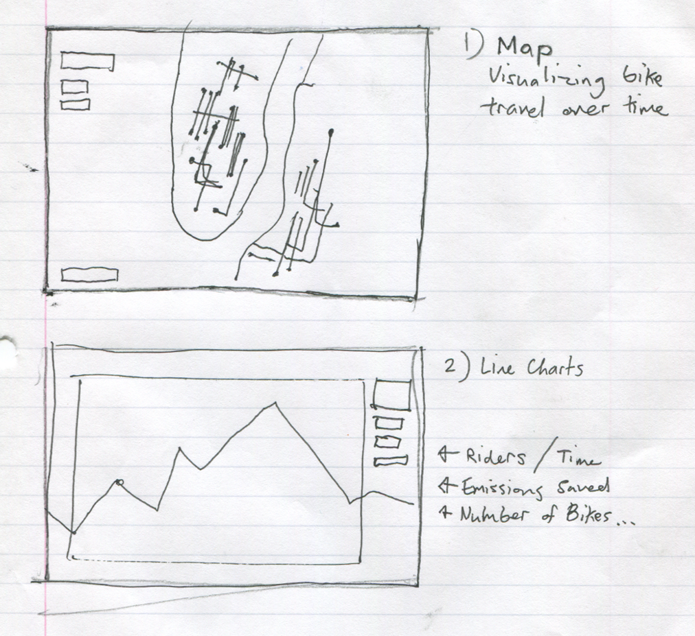
Starting out we wanted to really focus on where users were traveling. We decided putting the focus of our visualization on the map component was one way of really showing how CitiBike is used. Another thing that we really wanted to focus on was the time component. We wanted to show when riders were traveling and what that could mean to NYC. We thought that adding a simple line chart for riders over time might allow the users of our visualization to see trends in who was riding.
Original Dashboard Design
This was our first idea of how we might do more than just a map. We thought a creative way of doing this might be using some type of dashboard similar to a car's dash. We also tried to show that maybe the where CitiBike users are going isn't the most interesting part by putting more of an emphasis on metrics like distance traveled, emissions reduced, etc. We also thought that if we wanted to apply this to other cities we could easily substitute a new dataset in.
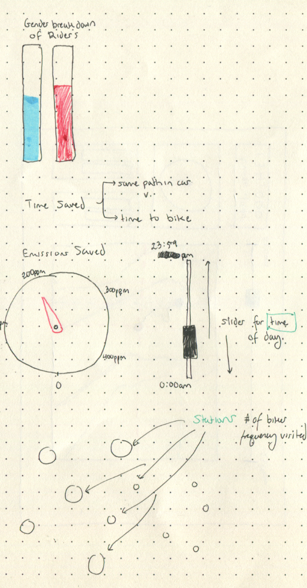
Alternative Dashboard Design
This was another design similar to the dashboard design that we came up with, however this focused more on the design of the elements rather than the feel of the dashboard.
Final Design
Implementation
Map using GoogleMaps API
Paths using Here API
Implementation
The visualization was implemented using JS's D3. Data processing was done in python. To see the visualization select 'visualization' in the top right corner of the process book.
Evaluation
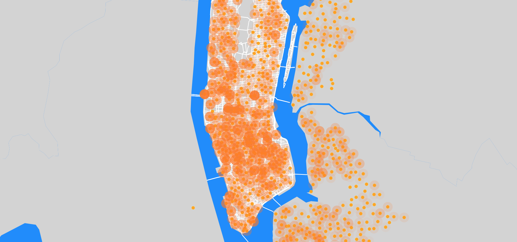
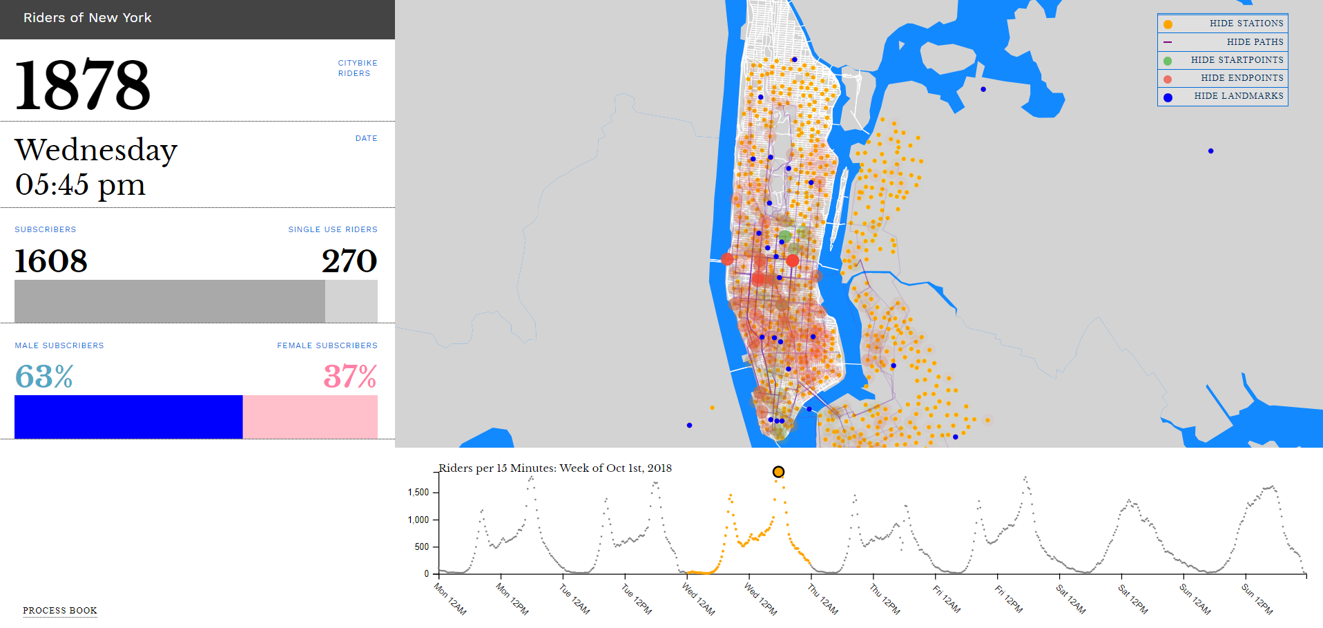
We think that our final implementation of the visualization accomplishes all of the goals we have identified throughout the processs. Though we had to play aroudn with the ways in which movement was visualized on the map, our final vis includes start points, end points, and paths for each ride. The darker the dot or path, it follows intuitively that this indicates a higher volume of riders. Additionally, this information is supplemented by NYC landmarks and Citi Bike Stations all marked on the map. To really allow users to explore this data, you are able to show and hide every feature that is visualized on the map. For example, if you want a better 'topographic' understanding of if Citi Bike users are using this as a form of transportation for work commute, you can just visualize start and stop points. You can see this in the photo below labeled 'Morning Commute'. Here you see riders are ending many of their rides in the dense business districts. They are leaving for work from all over the city, but mostly further uptown and east.
The landmarks layered onto the map provide non-New York residents a way to better understand the geography of the city and rider movements. Furthermore, the visualized map data alongside the rider demographic data help users understand if the usage at that time is mostly residential or touristic in nature. All in all, the multiple layers on the map in conjunciton with the rider demographics on the side allow the visualization to facilitate answering diverse questions, both broad and specific, about how the Citi Bike program is used.
Morning Commute Wednesday at 8:00am
As far as spatiotemporal trends we saw a lot a commuter using CitiBike. This was both due to the consistency in the usage at peak work hours and the increase in subscribers that rode during the week. We also noted that it appears like NY residents are using CitiBike to fill in public transit access. This is both due to the shorter rides that are taken, and the overall trend in subscriber use. We also saw the inverse in commuter usage on the weekends and concluded that the weekends must be for more recreational users or tourists. One key contribution to this idea was that on the peak times during the weekend days we see that the number of single use riders is at a maximum.
The side bar of our visualization shows us that the average rider is male. We also found that the average age of the rider is around 36. However, we decided to leave the age of riders out of our visualization because we felt that keeping the identity of rider private was an important part of our visualization.
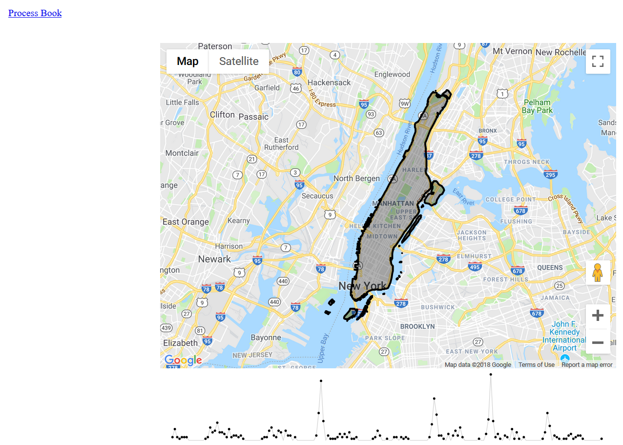
We also noted some important regional trends in the CitiBike data. First that this system is centered in Manhattan, however it reaches into Brooklyn, Queens, and the Bronx. We had originally thought that the CitiBike system was for all of New York City, but once the stations were plotted, we saw that only Manhattan was really being served. After a little research we did find that Queens has one CitiBike station and like many other cities a popular dockless bike program.
Further improvements on our visualization would be to add more meaning to the data. Sure we know the paths and rider demographics but what is missing is more information about New York City. If we added relational data like common car traffic trends/paths, common bike accident locations, or bike shares in similar sized cities we could find more meaning in the data and possibly learn more effective ways to use and expand CitiBike.