Consumer Price Index (CPI) Across Urban Areas in the United States
Team
Riva Kranz · c.kranz@wustl.edu · ID 508687
Yijie Yang · yang.yijie@wustl.edu · ID 528629
Audience
Students, movers, budget planners, and journalists who want quick comparisons from official data.
Motivation
Prices for housing, food, energy, and transportation vary by place and change over time. The CPI is reliable and updated often, but it is hard to navigate and compare across areas. Our goal is a clear interactive view that lets users see how their city compares with the U.S. average and how categories move over time.
Questions
- How do prices change over time across U.S. metro/region/division areas
- Which metros are most expensive in a given year and is it consistent
- What is the gap between each metro and the U.S. average by category and year
Benefits
- One view to compare a chosen metro with the U.S. average
- Spot spikes by category and time window
- Export visuals or CSV for reports and budgeting
Data
Source: U.S. Bureau of Labor Statistics (BLS), CPI-U.
Docs:
BLS Data ·
BLS Public Data API
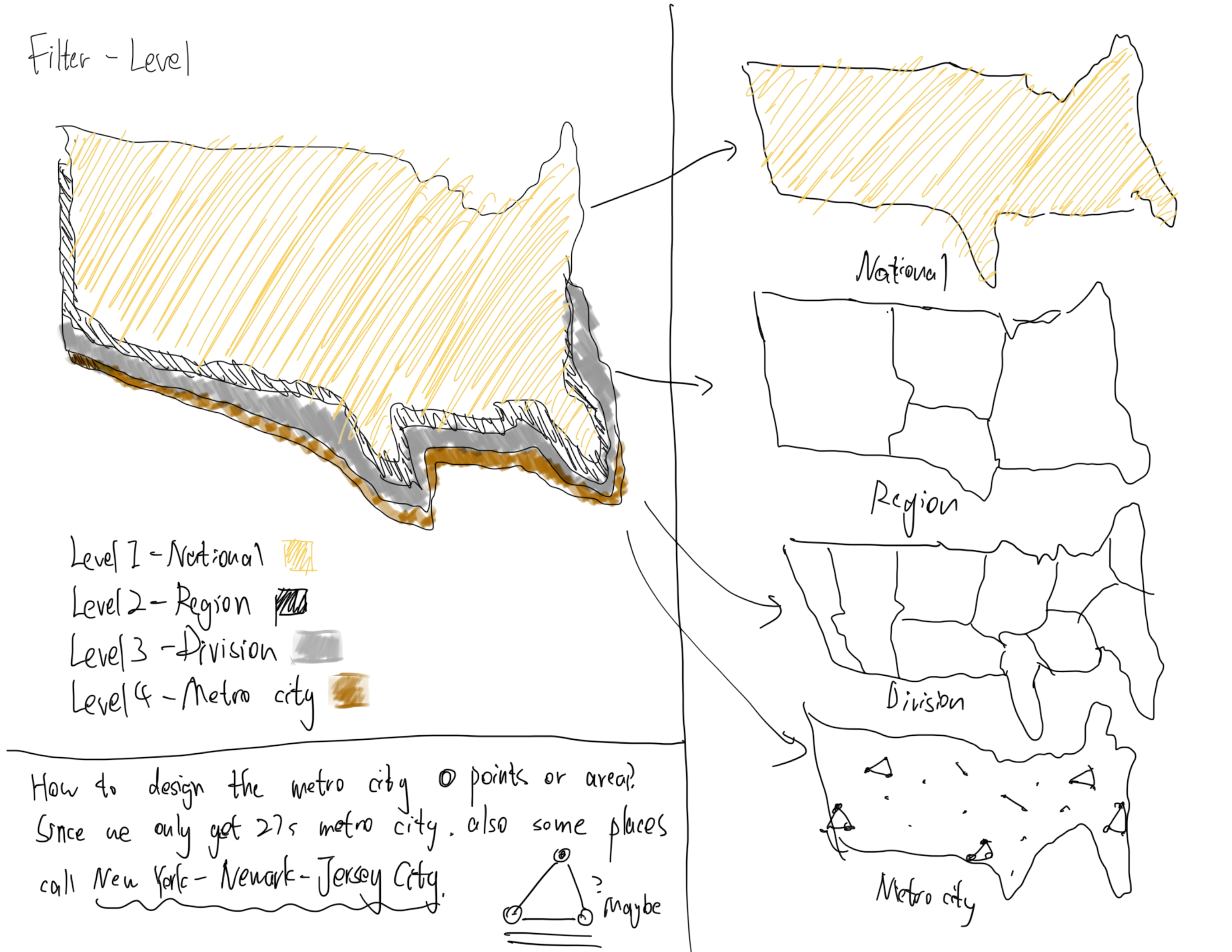
- Geography: U.S. city average, Census Regions, Census Divisions, and 23 major CPI metro areas
- Frequency: Monthly and semiannual (converted to quarterly averages)
- Seasonal adjustment: Not seasonally adjusted
- Items: All Items plus Food, Housing, Energy, Transportation, Medical Care, Education and Communication
- Identifiers: BLS
series_id(for example,CUUR0000SA0)
Data Processing
- Call the BLS Public Data API v2 with an authenticated
api_keyto fetch all relevantseries_idin parallel batches - Cache intermediate results and support resuming from checkpoints to prevent data loss during long requests
- Run a second pass to re-fetch missing or incomplete areas, ensuring full geographic and category coverage
- Normalize raw JSON into tidy tables with
year,month,value, and metadata columns - Aggregate monthly and semiannual values into quarterly means (
Q1-Q4) - Classify all series into four levels — National, Region, Division, and Metro — and merge into one hierarchical dataset
- Export compact JSON (
cpi_time_series.json) containing all layers and categories for client-side visualization
# simplified normalization snippet
records = []
for s in data["Results"]["series"]:
    for item in s["data"]:
        if item["period"] not in ["M13", "S03"]:
            records.append([
                s["seriesID"],
                item["year"],
                item["periodName"],
                float(item["value"])
            ])
df = pd.DataFrame(records, columns=["SeriesID", "Year", "Month", "CPI"])
Visualization Design
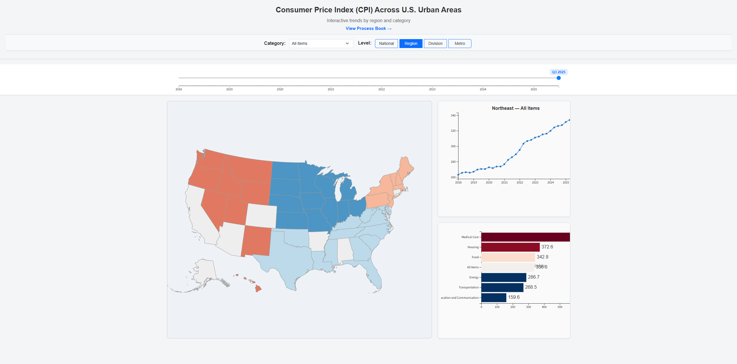
The app combines a choropleth map with time series. Users can move from national to region, division, and metro, pick a category, and set the period with a single timeline handle. The map colors show the gap relative to the selected group mean. The right side stacks a line chart and a category bar chart that update with selections.
Must-Have Features
- Load CPI for at least thirty metros plus U.S. average and four or more categories
- Linked map and charts with clear legends and tooltips
- Quarter selector with live updates across views
- Responsive layout
- On-open guidance dialog
Optional Features
- Export the current view as PNG
- Side by side compare for two metros or two years
- Pin multiple metros on the line chart
- Spike annotations for unusual changes
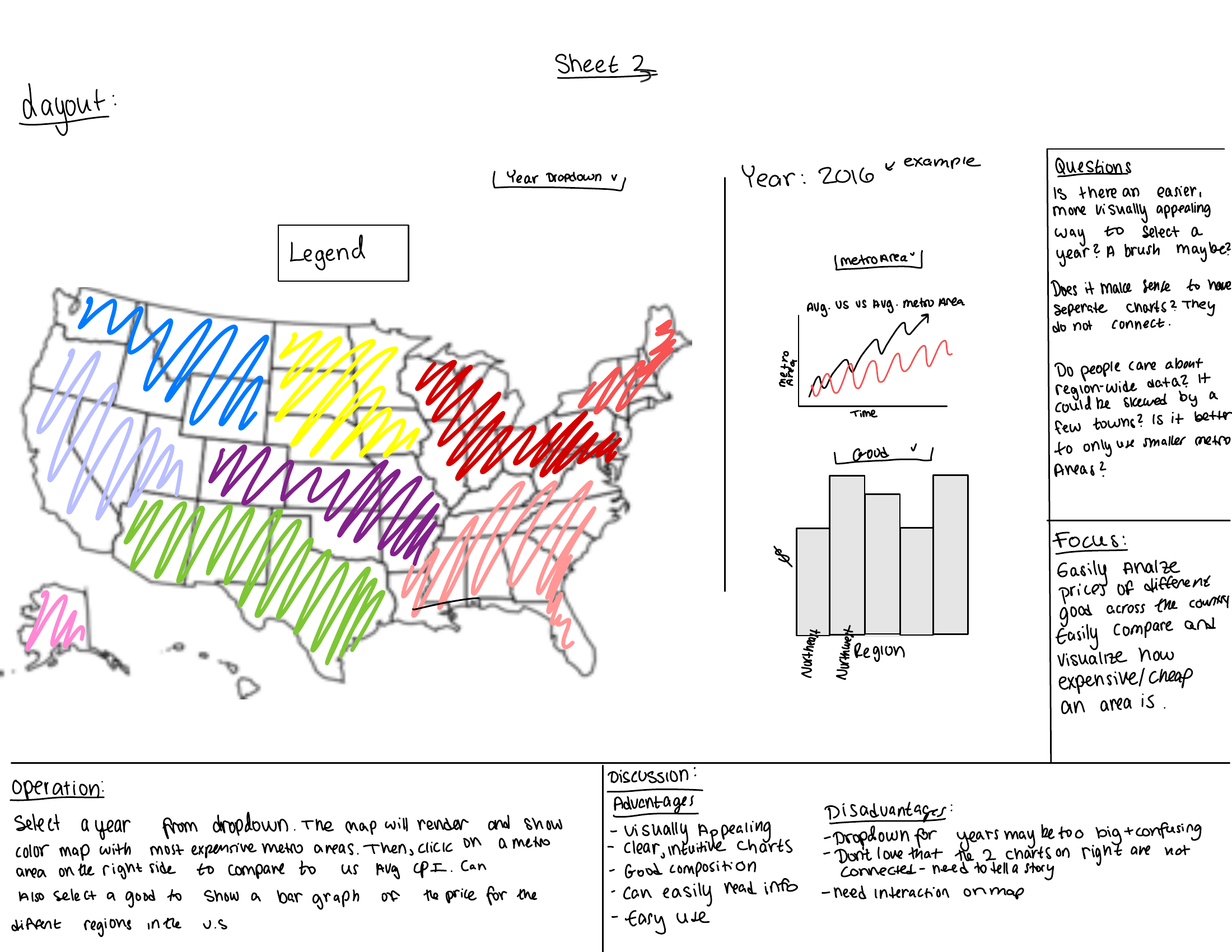
Five Design Sheets
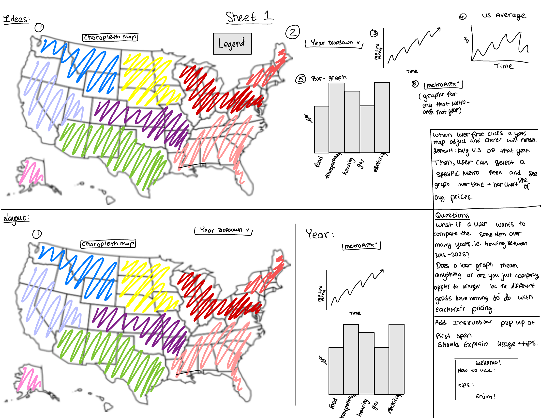
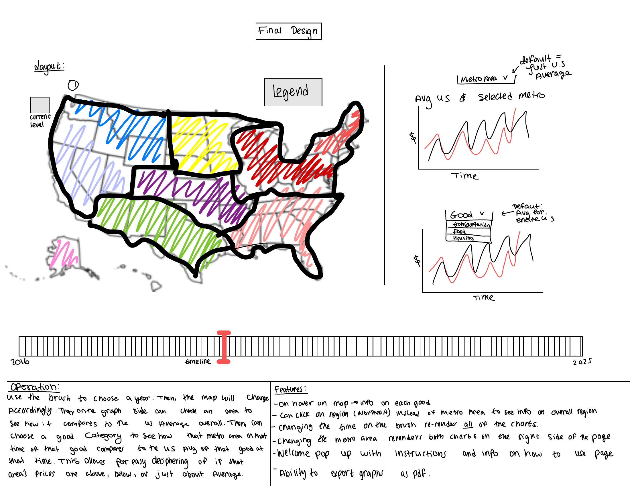
Milestone 1
- Cleaned data
- Built the timeline
- Built the timeline chart
- Built the map
- Built the bar charts
- Built the CSS grid so the map and both charts align at the bottom
- Added category and level filters
Milestone 2
- Added popup instructions on page load and “View Instructions” button
- Added legend on the map
- Made the timeline brush draggable with two blue dots, and able to switch between Point and Range
- Improved CSS responsiveness for small charts
- Integrated metro-level data visualization using geographic coordinates (BLS reference)
- Fixed handling for “Select All Categories” to correctly toggle and untoggle all items
- Added hover-based help tooltip for “Select All Categories” to explain its behavior
- Updated CSS for a more sleek theme
- Cleaned and processed additional data so that the bar chart could be clickable
- Modified the bar charts to be clickable, allowing users to drill down or go back up


Final
- Moved the Alaska inset on the map so it does not overlap other states.
- Animated and enlarged the Filters button and moved it down the page so it is more noticable
- Tightened the header and top spacing so the full dashboard fits on a single screen instead of requiring an extra scroll.
- Cleaned up line chart hover behavior so tooltips use consistent dark text on a light background
- Added a color blind friendly toggle in the filter panel. When it is on, the line chart switches to a color blind safe palette and uses redundant encodings (marker shapes). When it is off, the chart keeps the original solid lines and simple colored circles.
- Made the line chart legend more compact with a translucent background and hover fade so it does not block interaction with the lines underneath.
- Made Filter pannel scrollable.
- Added explanation of what CPI is.

Interaction Design
- On load, an instructions overlay appears to introduce the dashboard and basic interactions. The user can dismiss it or reopen it later with the “View instructions” button in the header.
- In the filter panel, the user selects one or more CPI categories and chooses a geographic level (Region, Division, Metro). A “Select All Categories” option with a hover help box explains that “All Items” behaves like any other category.
- The user can toggle the national comparison checkbox to overlay the U.S. average in the line chart and bar chart for context.
- The user can also toggle a color blind friendly mode in the filter panel. This switches the line chart to a color blind safe palette and adds redundant encodings (dash patterns and marker shapes). Turning it off returns the original simple color treatment.
- On the timeline, the user drags the two handles of the brush to select a range of quarters, or drags the middle of the brush to move the selected window. All linked views update together.
- On the map, the user hovers to see a tooltip for each area and clicks a region, division, or metro to focus it. The “Reset Highlight” pill clears the current selection.
- The line chart shows CPI trends over time for the selected area and categories, with optional national comparison and division average lines. If you click on a legend catagory, it will become less visable.
- The bar chart shows a category breakdown for the selected time or time range, with sorted bars and tooltips showing exact values and comparisons. Clicking on the bars allows users to drill down for more details or go back to a higher level.
Implementation
The dashboard is implemented in JavaScript with D3 for data binding and SVG rendering. We precompute a compact JSON file that contains all national, regional, divisional, and metro series and load it once on page initialization.
The choropleth map uses TopoJSON and a composite U.S. projection Clicking an area updates the shared state, which triggers re-rendering of the linked line chart and bar chart.
The timeline is a brushed D3 chart that supports both range and point modes. The brush selection is stored centrally and used to filter the time domain for both the line chart and the bar chart. The filter panel is implemented as a fixed overlay with scrollable content, and its settings feed into the same state store, so that category, level, and colorblind mode changes all propagate consistently to the views.
Evaluation and Findings
What we learned from the data
- The Russia-Ukraine war caused a massive spike to Transportation and Energy.
- Energy and Transportation categories show the sharpest spikes around key events, and the gap to the U.S. average can be much larger for certain regions.
- Covid caused a massive low for all catagoried.
How well the visualization works
Linking the map and the line chart made it easier to connect “where” and “when” price differences occur. The on-load instructions and the Filters panel helped new users understand which controls affected which views.
Future improvements
- Allow side-by-side comparison of two metros or two time periods.
- Add download options for CSV or PNG exports directly from the dashboard.