Jimin Lee — jimin.l@wustl.edu - 508714
Yiqi Chen — c.yiqi@wustl.edu - 520373
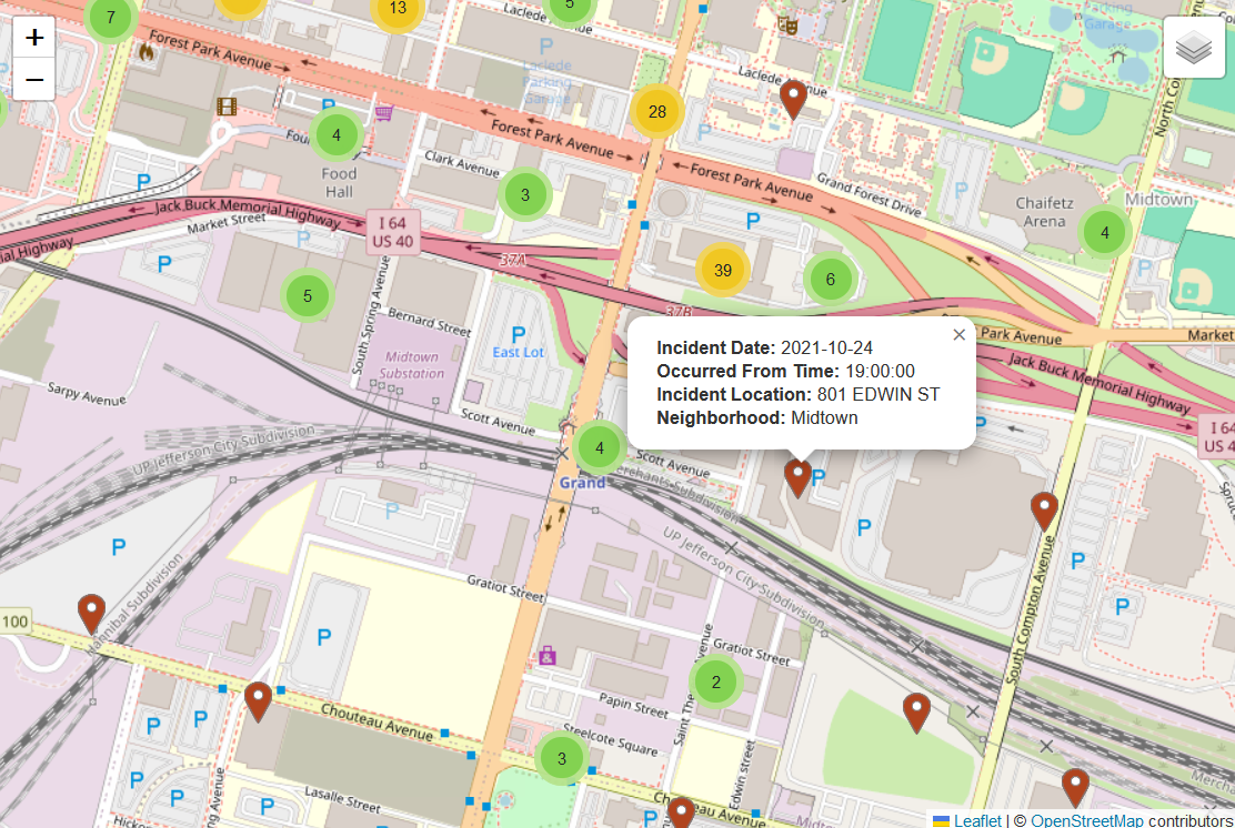
Markers at each location of car crime records are visible when zoomed in. The detail of each car crime record are presented in a pop-up. Markers that are close by are clustered and represented as a circle with the number of clustered markers.
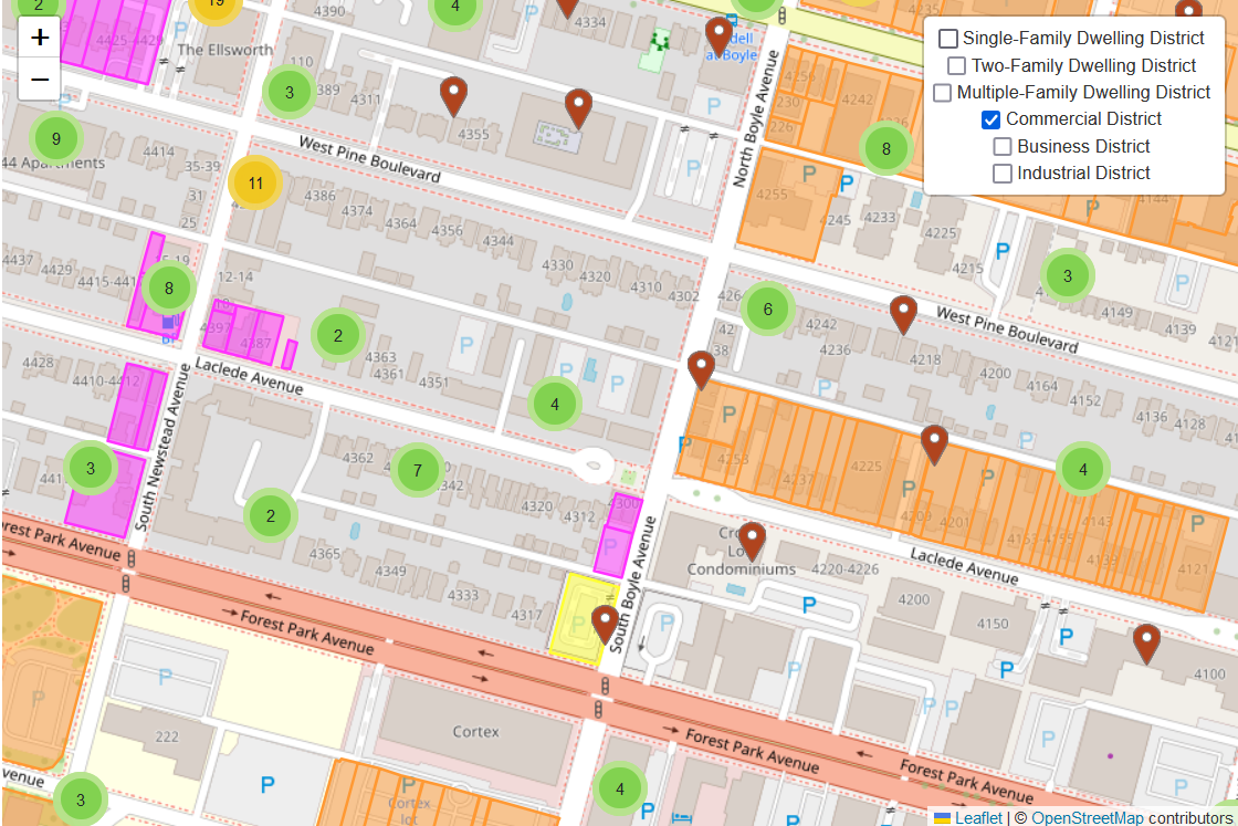
The map has multiple layers of different land use, including various residential districts and commerical districts. The legend and description of each layer will be included in milestone 2 submission
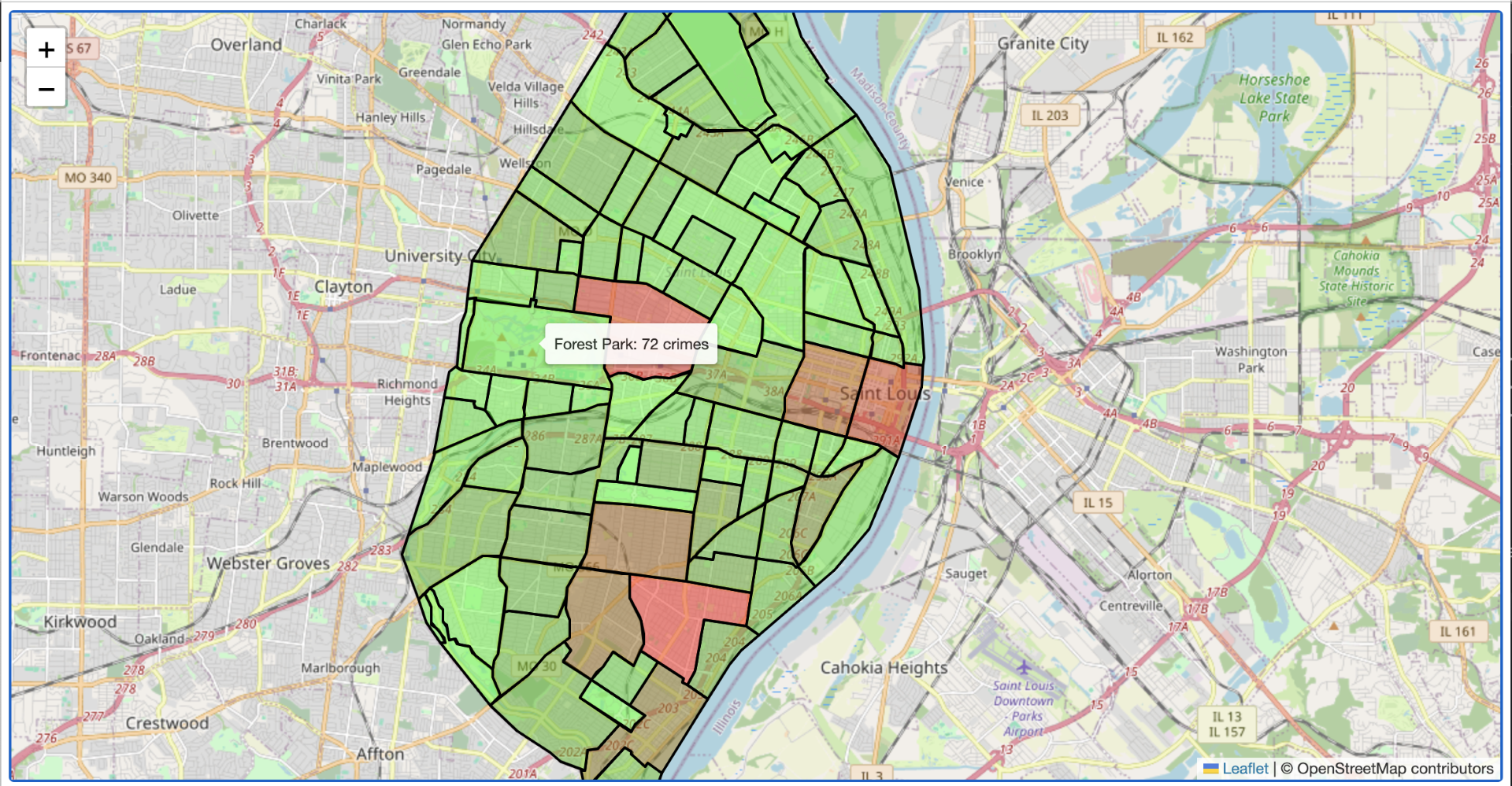
The choropleth map will only be visible when zoomed out to show the overall crime counts with red indicating higher car crime counts.
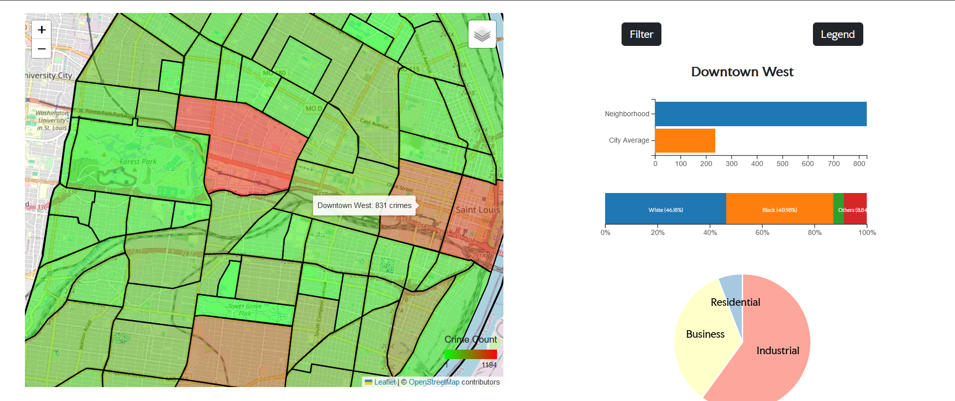
By click selection on the neighborhood polygon, the information panel provide a quick overview of the neighborhood. This includes a bar chart comparing the neighborhood car crime count to the St. Louis city average, a percentage bar chart showing the demographics information and how diverse the neighborhood is, and a pie chart showing the land use in terms of area. We can see obviously, the car crime frequency is higher when a neighborhood has a greater percentage of business district.
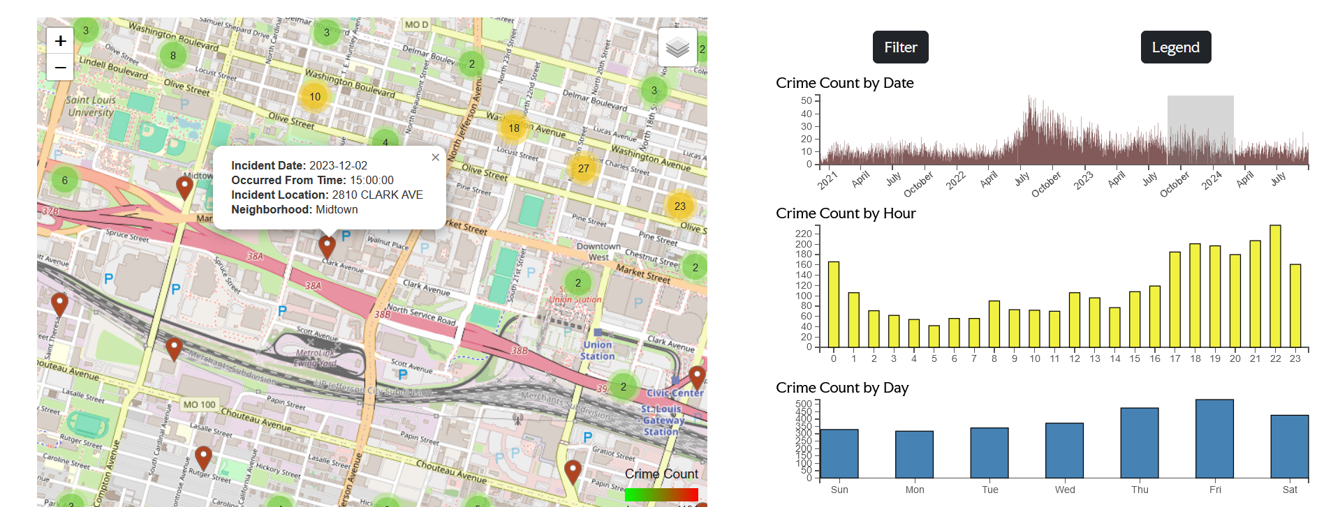
The brush filter allows user to interaction with the map and filter the date relevant to the user's interest. The bar charts of time in the day and weekday provide additional insight into when the car crimes have occurred in the past. For example, the user may be interested in the car crime that took place on monday mornings in Downtown from the most recent 3 months. The functionality of our map will perfectly achieve such objective and facilitate informed parking.
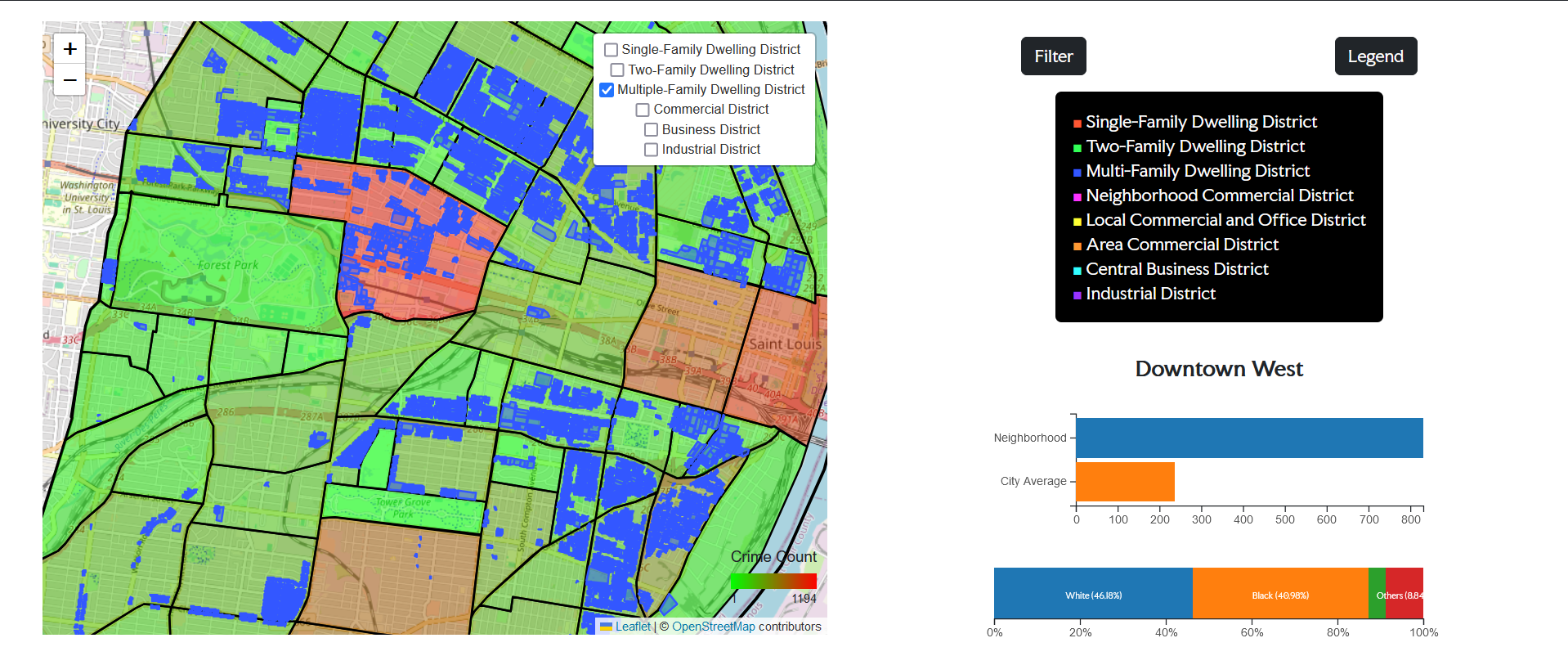
The legend provides additional information to the land use layer. It shows the corresponding category of each color in the selected layer.
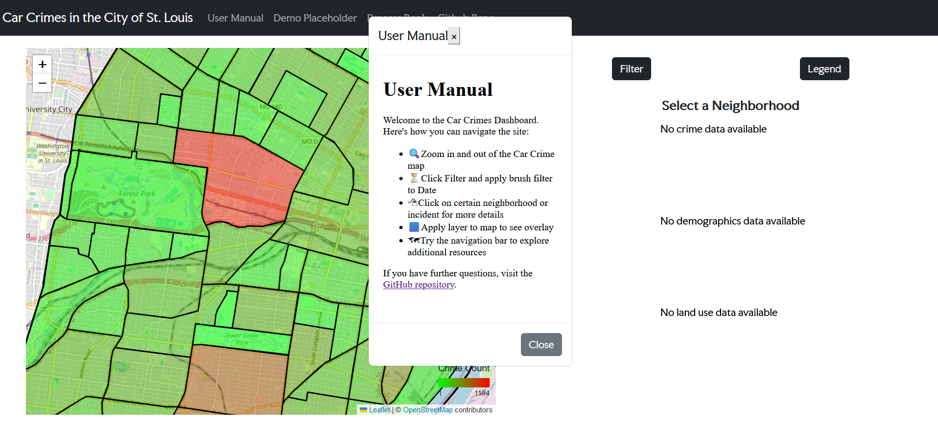
The user manual gives user an instance and short guide of the St. Louis car crime visualization. It provides an overlook of our major website functionality, reducing friction in learning how to use the tools.
From the Milestone 2 submission and in-class user studio, we collected valuable feedback and polished our webpage design accordingly. The final design is included the third and fourth pages of the above PDF.
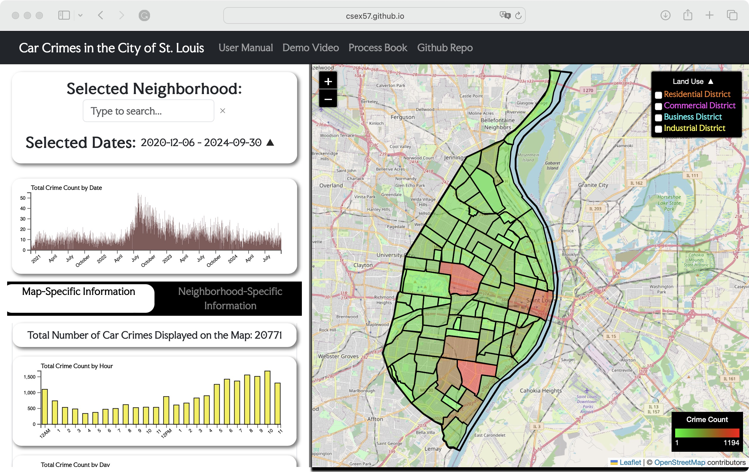
Here is an overview of our webpage after implementing the final design. Next, we'll explore the details of all updated and new design elements.
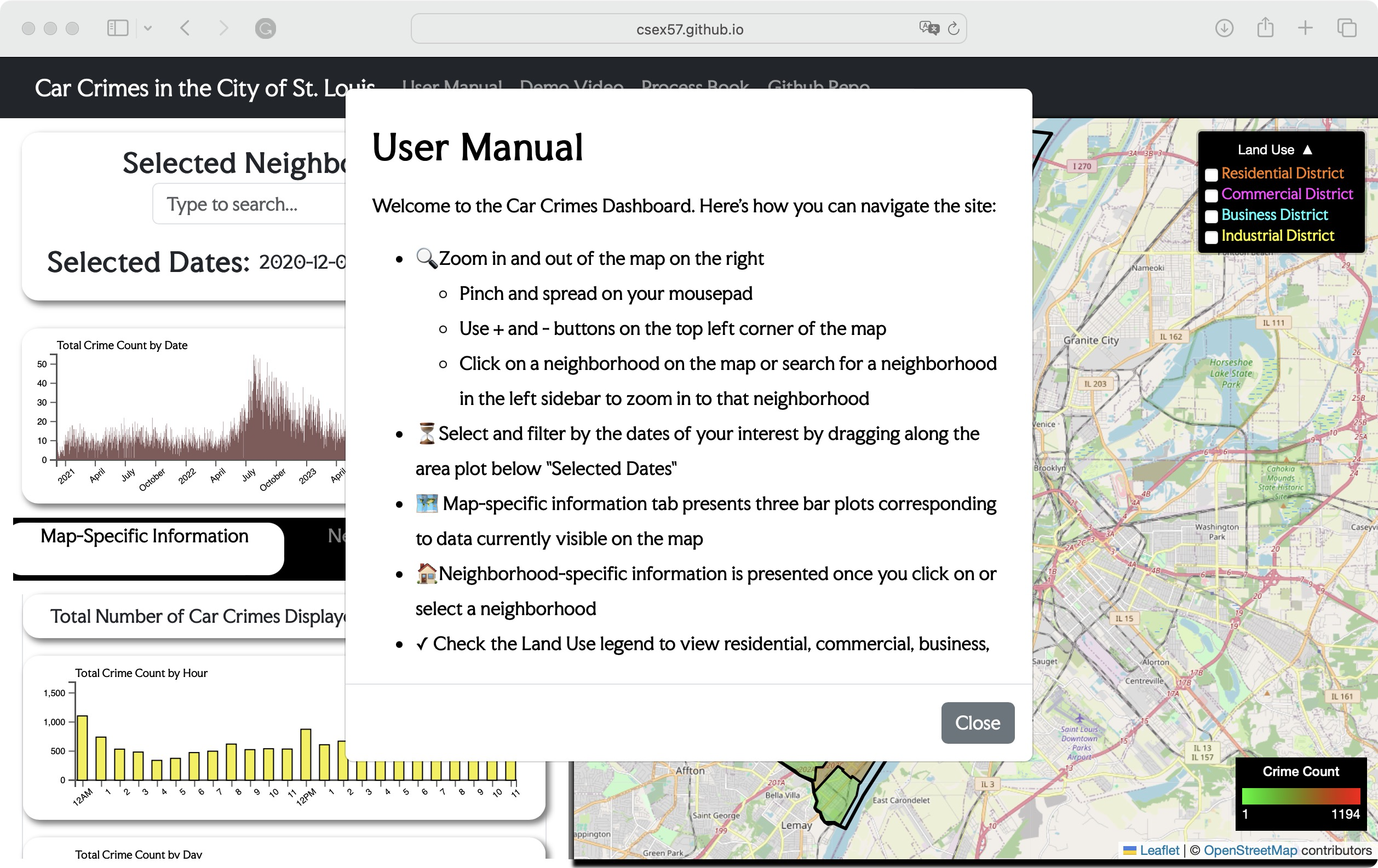
First of all, upon loading the webpage, the user's manual appears, providing a quick introduction to the functionality. The content has been updated based on our new design, and the popup width has been expanded for a better reading experience.
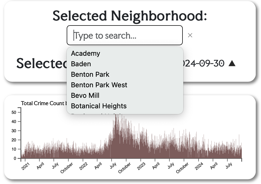
Then, in the top-left corner, we implemented a search bar. Often, users are primarily concerned with their own neighborhood or the one they plan to visit. The search bar allows them to quickly locate the desired neighborhood, saving those who are less familiar with navigating St. Louis neighborhood the effort and time of dragging and clicking.
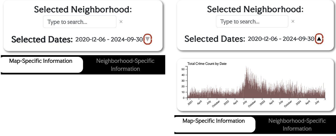
Below the search bar, we have updated the look of our filter. The filter can be hidden by clicking the small triangle circled in red. If users do not need the brush function, they can click on the triangle to hide the filter and better view the information panel below it. Clicking the triangle again will bring the filter back. In addition, the 'Selected Date' at the top displays the date range selected by the brushes.
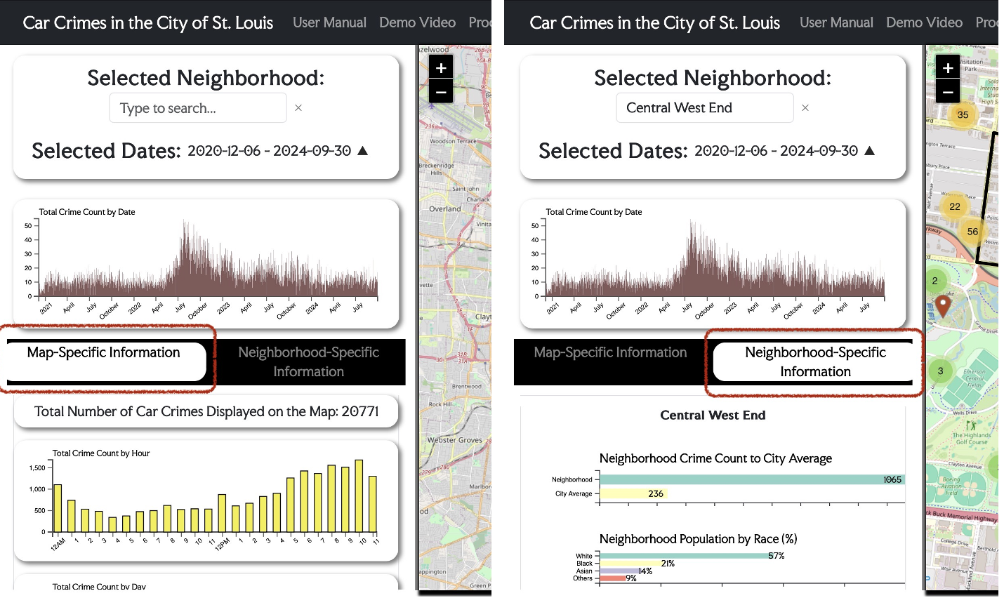
Further down the sidebar, as circled in red, a toggle function has been added. It separated the map-specific information from neighborhood-specific information. Previously, users had to scroll extensively to determine the relevance of specific charts. Now, the information is more clearly organized into separate sections, reducing the need for excessive scrolling.

In the map-specific side of information panel, boxes with rounded corners and shades have been added around each chart, making them more distinctive and aesthetically appealing. Based on the feedback we received during the presentation, a bar chart showing types of car crimes -- stealing, tampering, and damaging properties -- is implemented, with stealing being the most prevalent category.
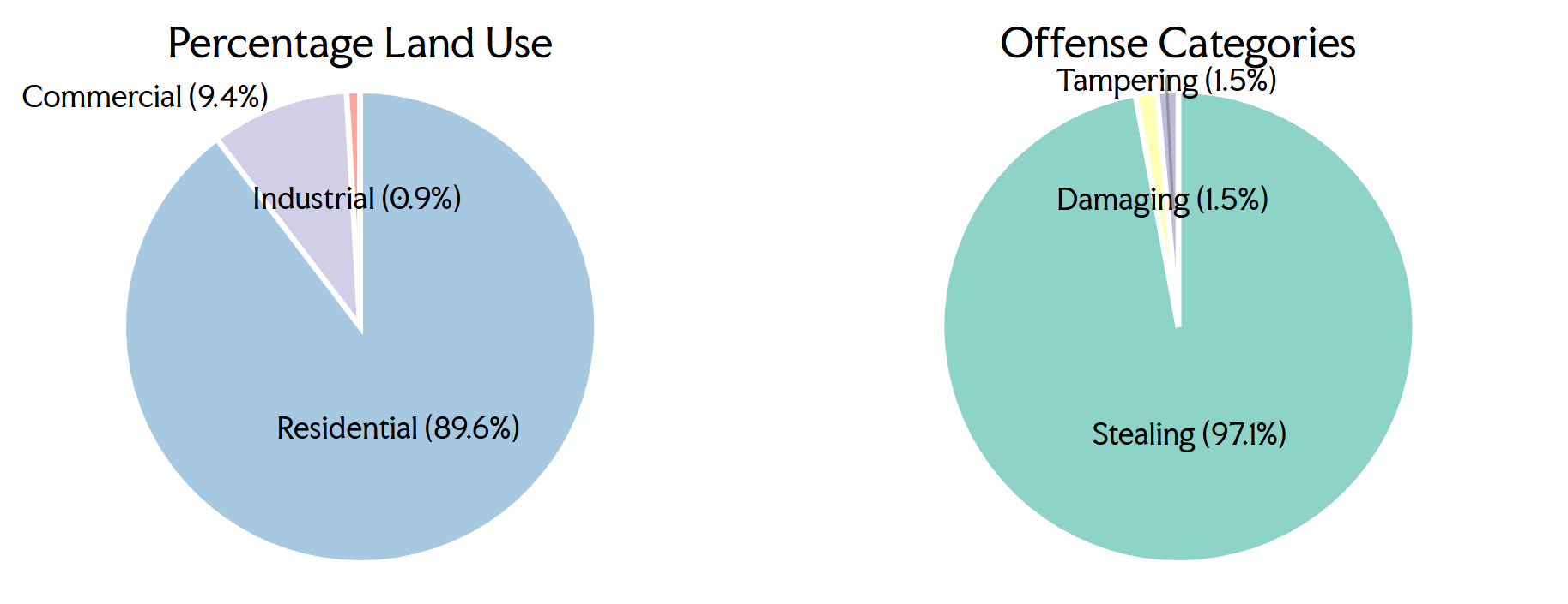
In the neighborhood-specific information panel, titles have been added to improve the clarity of the chart contents. They are responsive to the neighborhood selected on the crime map. The pie chart Offence Categories presents the car crime category by neighborhood. Hovering over it displays the actual counts of each category below the pie chart.
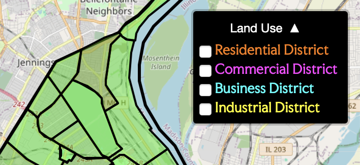
During the user studio, we surprisingly found out many of our classmateswere unaware of the map layers or confused by the variety of colors coming along with the original data. Therefore, the layer legend is now shown by default, and can be hidden by clicking on the small triangle. In addition, the data has been further processed to merge similar categories, such as combining Single-Family Dwelling District and Two-Family Dwelling District to just Residential District. The color scheme is also unified, and category names are colored corresponding to what will appear on the map once the box is checked.
The car crime data exhibit distinct spatial and temporal patterns. The interactive visualizations facilitate user engagement by allowing the toggling of various layers, such as residential, commercial, and business districts. This functionality has revealed a pronounced frequency of car crimes within business districts, thus emphasizing the relationship between district type and the incidence of crime. Moreover, the choropleth map effectively differentiates neighborhoods by crime intensity, pinpointing areas like Downtown and Downtown West as zones with elevated crime rates.
The visualizations also uncovered a significant escalation in car crimes during the evening hours, peaking around 10 PM. This pattern suggests a robust correlation with evening activities and potentially with commuter behavior. Both Question 1 and Question 2 of our study are answered through these findings. Furthermore, the neighborhood-specific information panels further delineate that the majority of car crimes pertain to vehicle thefts. To address Question 3, the implementation of filtering tools in time-based charts permits users to examine how car crime frequencies fluctuate by time of day and date, thereby augmenting the comprehension of temporal patterns.
Our visualizations effectively meet the project's objectives by fostering dynamic data interaction and exploration. The strategic use of color coding, detailed pop-ups, and filtering options significantly enhances user engagement and understanding. Following the user-study, Milestone 2, and presentation feedback, we have refined the usability and responsiveness of our visualizations to improve user experience. While most conceivable enhancements have been implemented, additional features could include an embedded search bar to facilitate specific street searches and diverse icons to represent different categories of car crimes. However, due to time constraints, these enhancements were not realized within the project's timeframe.