Many factors influecne people's decisions when booking flights, including cost, travel time, and number of stops. This info is usually readily available when booking flights. However, another concern that many people like us have and that is not usually readily available is the quality of the airline, more specifically how often an airline’s flights are delayed or not. That’s why for our project, we want to create visualizations that allow the user to see how often flights are delayed based on the airline.
The primary questions we are trying to answer are which airlines tend to have the most delays and most on time. The benefits of finding the answer to these questions through our visualizations are that people could make more informed decisions when booking their flights and understand the chances that their flight may be delayed for their airport.
We are using the U.S. flights dataset - 25M flights from 2022-2025 dataset
from Row Zero. This dataset contains 25 million flights with data on each
one’s date, carrier, airline, flight number, origin, destination, scheduled
and actual departure times, amount of time delayed, and if it was cancelled
or not.
Link to dataset
We are also using Open Data from ourairports.com (airports.csv). This data contains all of
the airports across the globe with their latitude and longitude values,
as well as a variety of other features. We utilized this dataset to map the
airports in the above dataset to their corresponding coordinates for our map visual.
Link to dataset
We do not expect to do substantial cleanup. Glancing at the dataset, we can see that we will have to remove data points with null values. We will implement data processing using Python. Since the dataset is so large, we broke our data down into seperate JSON files by year that contain information on the top seven airlines and top 50 ariports.
We plan to design our data into a dashboard of three different visuals that all interact with each other to best display the delays by airlines over time. In general, we hope to have some sort of airport distribution to showcase the locations of the different airports, and play with how we represent them, whether it be size based on number of flights, color based on most prominent airline, and some sort of indication based on number of delays. Below, we propose three different designs:
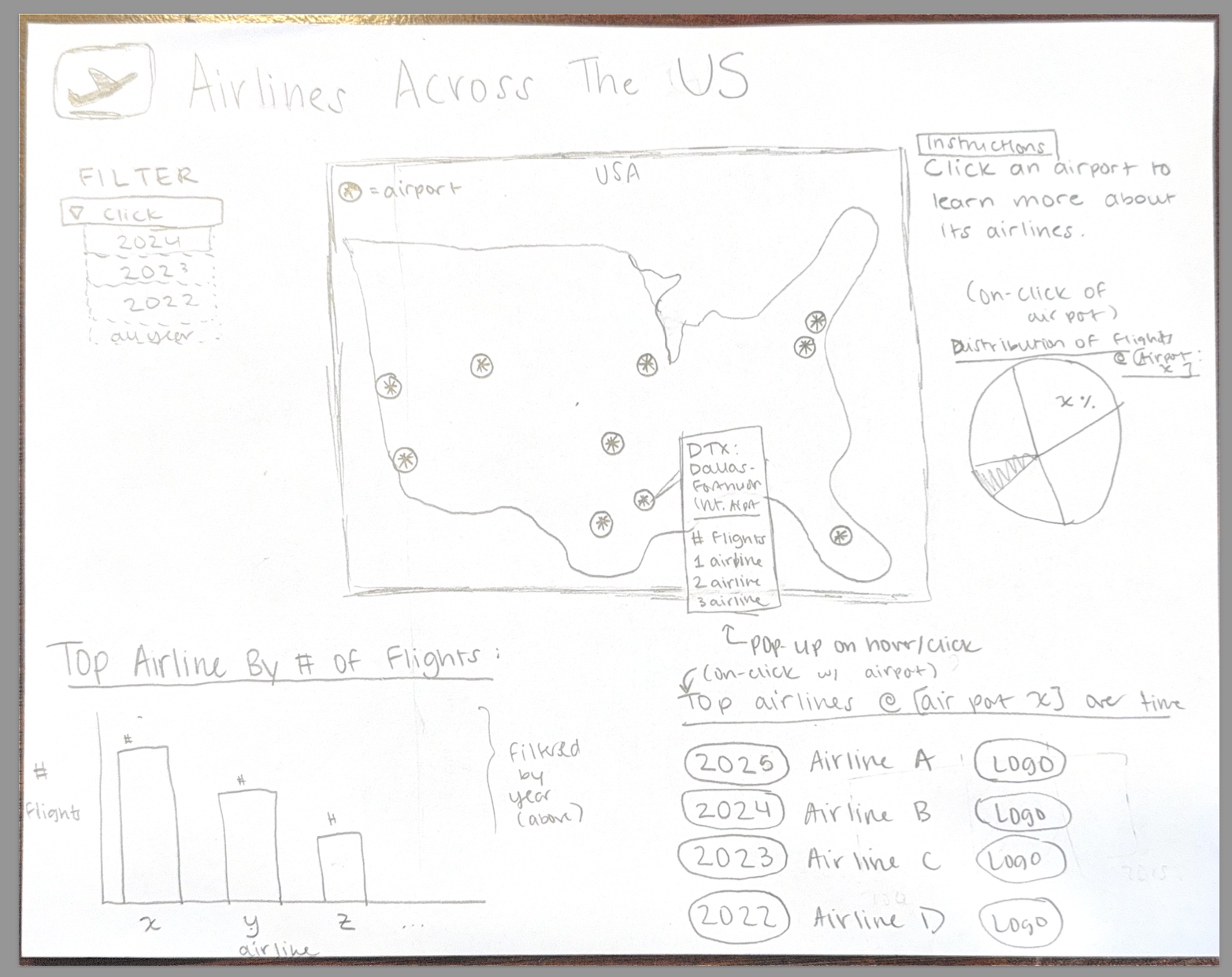
Design 1 incorporates a variety of different visuals that revolve around a map. The map is a US map with airports noted, and a pop-up that discloses the airport name, number of flights, and top airlines. When an airline is selected, you can see a pie chart that shows the airline distribution at that airport, and also the top airlines at that airport over time (e.g., was the top airline the same at airport X in 2022 vs 2025) based on number of flights. In the bottom, we have the overall top airline across the US in a bar chart. This design focuses primarily on the number of flights in each location, and how that varies by airline and over time. This design focuses more on total number of flights rather than delay or on-time data.
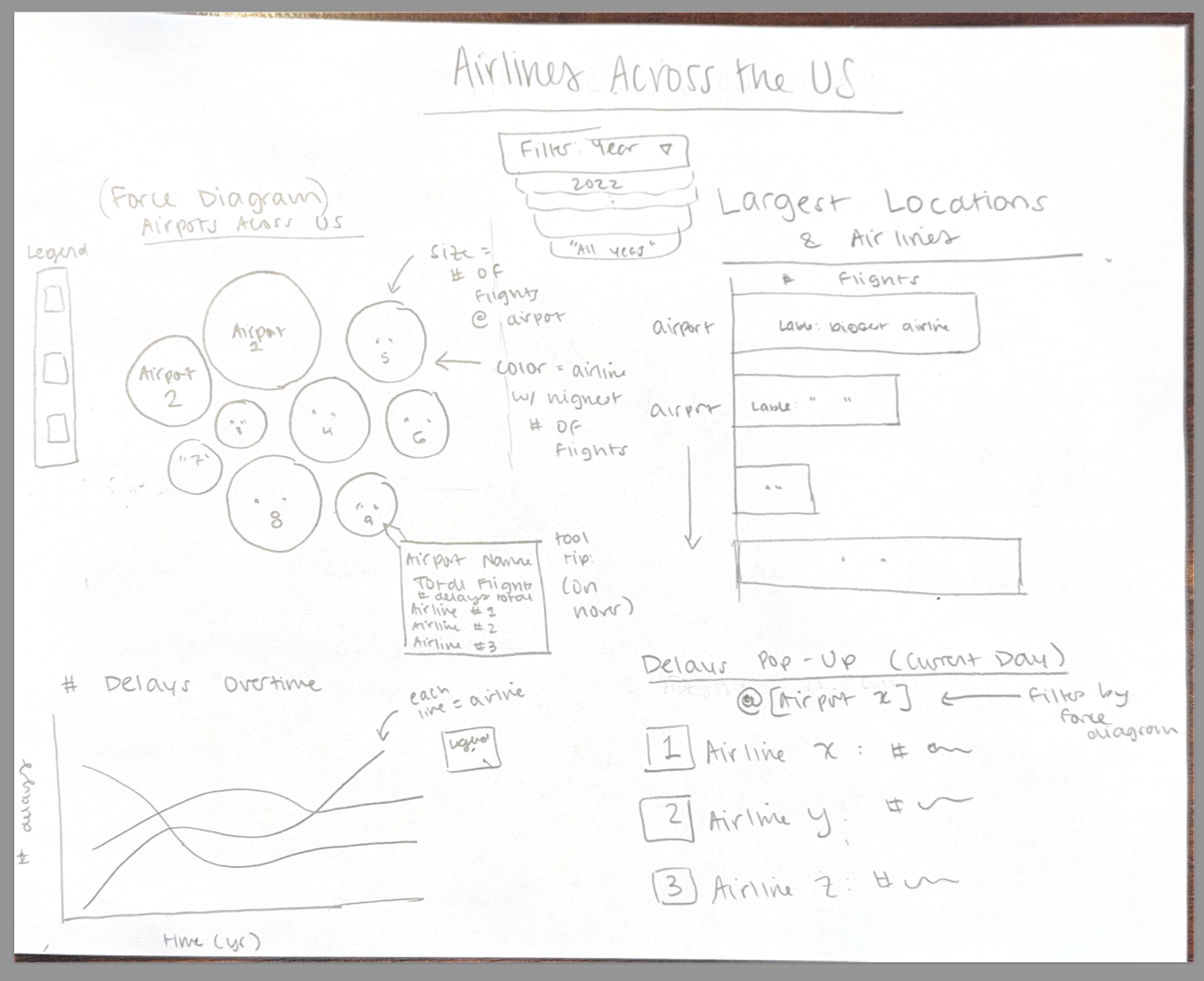
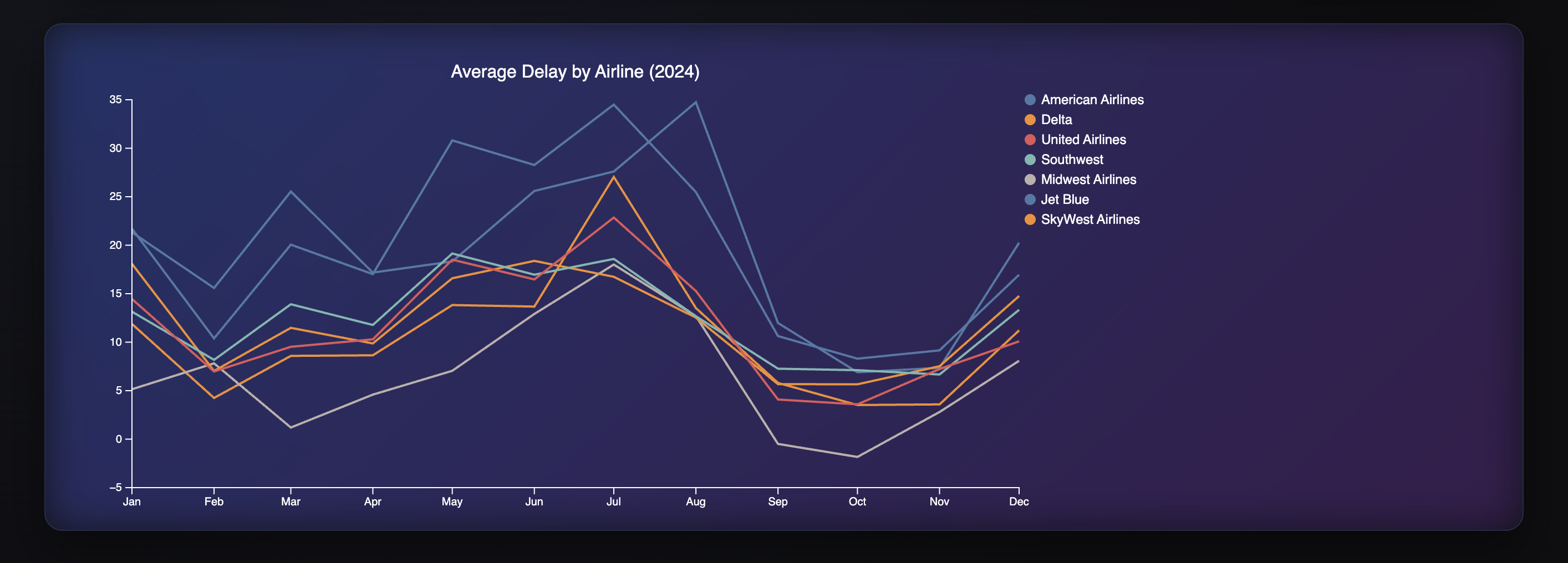
Design 2 is similarly a combination of different visuals that look more specifically at the airlines across the US and over time. We have a force diagram that represents each airport, with size corresponding to the number of flights, and color corresponding to the largest airline at that airport. You can filter based off of each year. There is a horizontal bar graph that showcases the largest locations and airlines across the US, sensitive to year selected. The bottom focuses on delay data, with a line chart that shows how the number of delays changes by airline over time, with each airline being a different colored line. Lastly, we have a large text pop-up that just showcases the number of delays in a current day at a selected airport (selected via clicking a bubble on the force diagram), with the airline and number of delays, appealing to more real-time, critical data.
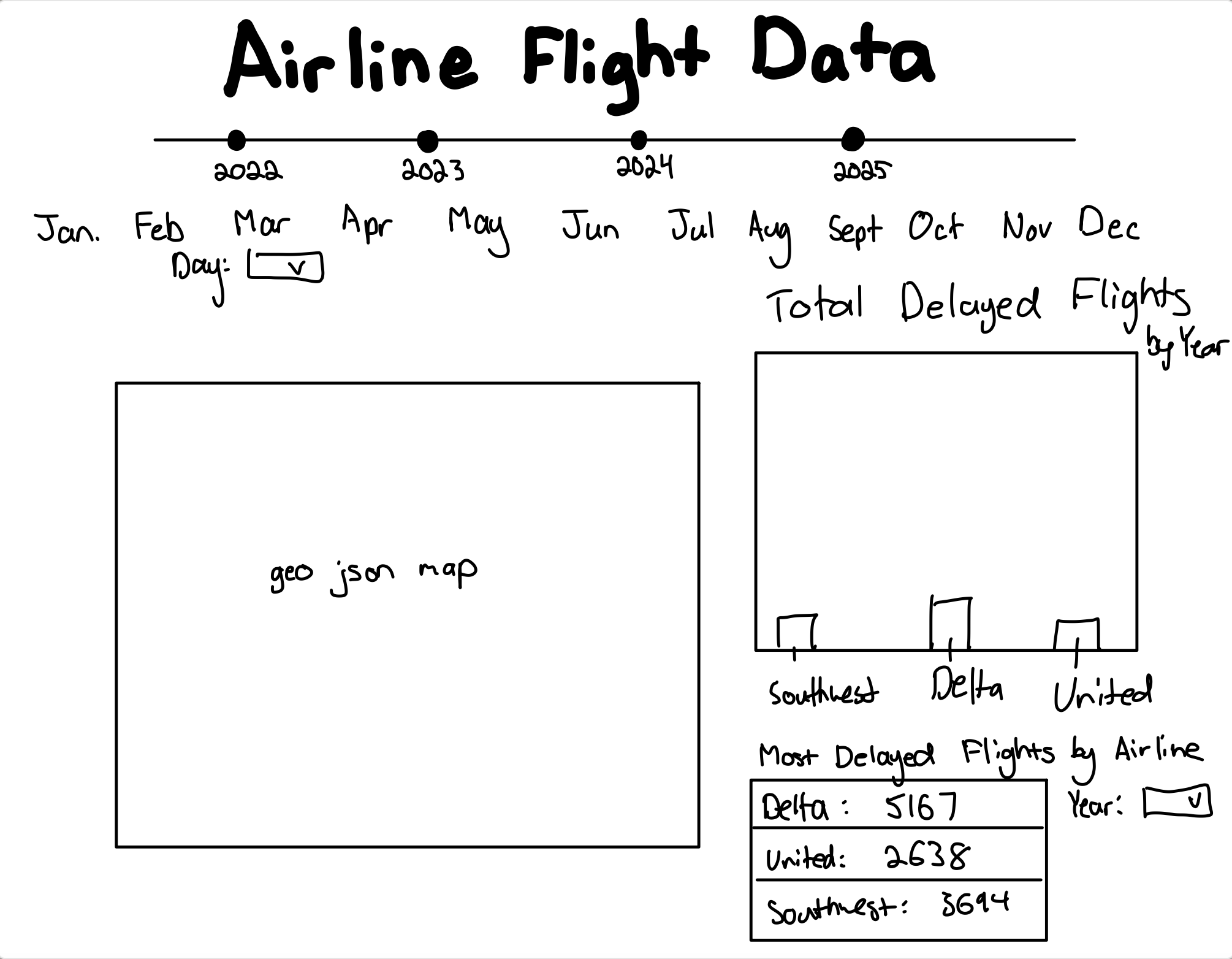
Design 3 includes the same map as design 1, with a different filtering mechanism. We have a timeline to filter based on year, and then widgets to filter based off of month as well. On the right, we have a bar graph that showcases the number of delayed flights relative to on-time flights for each airline, filtered by the year or month selected above and airport selected on the map. Lastly, the bottom right has a table with shoutouts of the number of delayed flights by airline overall (also filtered by year or month from above) to best showcase which airlines have the most delays.
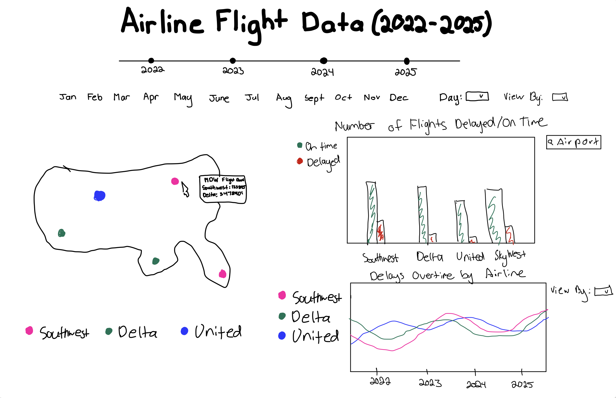
Our final design is a combination of all three designs. We included a map, like in designs 1 and 3, that has each airport designated by a dot on the map. The color of the dot corresponds to the airline, and the potentially aesthetics-permitting size of the dot corresponds to the number of flights at that airport, similar to the force diagram in design 2. When you hover over an airport, you can see a tooltip with the name, number of flights, and top airlines. On the right-hand side, we have a bar graph that is sensitive to the airport selected on the map, that showcases the number of on-time versus delayed flights at that airport for each airline, like in design 3. Looking below, we incorporated the graph from design 2 that showcases the number of delays by airline at that particular airport over time, with each airline as a different line. Altogether, we hope that these visuals and their interactions together help portray which airlines have the biggest presence across the country and at each airport. Further, we hope that we are able to illustrate how the number of delays is sensitive to the airline and location, and whether or not there is a pattern between number of delays, airline, and location. Overall, hopefully the user can gather which airlines and airports are best to minimize delays.
Our must-have features in this project are a map with the airport locations, as we feel strongly that is a crucial element to showcasing each airline's data by airports. Another must-have feature is also an airline comparison visual; whether it be comparing number of delays against each other, or presence at an individual airport, we want a visual to illustrate how airlines compare against each other, especially depending on location. Our last must-have feature is having some sort of interaction between the visuals. We hope that when an element is clicked on in one visual (i.e., an airport location on a map), it filters the other graphs or charts to be specific to that airport, which would overall increase the usability and expand the horizons for conclusions to be pulled from our visualization.
Optional features in this project would be perhaps different pop-ups or tooltips. While helpful, we think the main focus of the project is to have different visuals that interact with each other. We also talked about designing the page to mimic the style of an airport departure board, but as aesthetics are not the biggest focus, that would be an optional element.
Our first milestone mainly involved cleaning and manipulating data, and then beginning our visuals. Due to the large file size of the 25 million U.S. Flights dataset, we decided to upload the dataset as a zip file into Box. We created a python file to read the dataset into a csv file and then cleaned the data by removing entries with null values, removing cancelled flights, and converting dates that were String types into date objects. We then shrunk the dataset to be more manageable by keeping only the top seven airlines and top 50 airports, which were calculated based on the number of flights each airline/airport had in the entire dataset. We also removed smaller airports due to their insignificance in the overall data and our objectives.
After cleaning the data, we made new json files for each year from 2022 to 2025 and utilized an additional dataset (airports.csv, see README.md) that maps airports to coordinates for the map. We merged this data to make a new dataframe based off of matching airports in the original dataset to the new one, including latitude and longitude values to create a new dataset that has the airline and its location. Then we included in that dataset the number of flights at each airport and then the top airline at that airport. We made JSON files for each year for the map, and then for the line graph. The line graph JSON files make a new column that aggregates the delayed data by month and by airline.
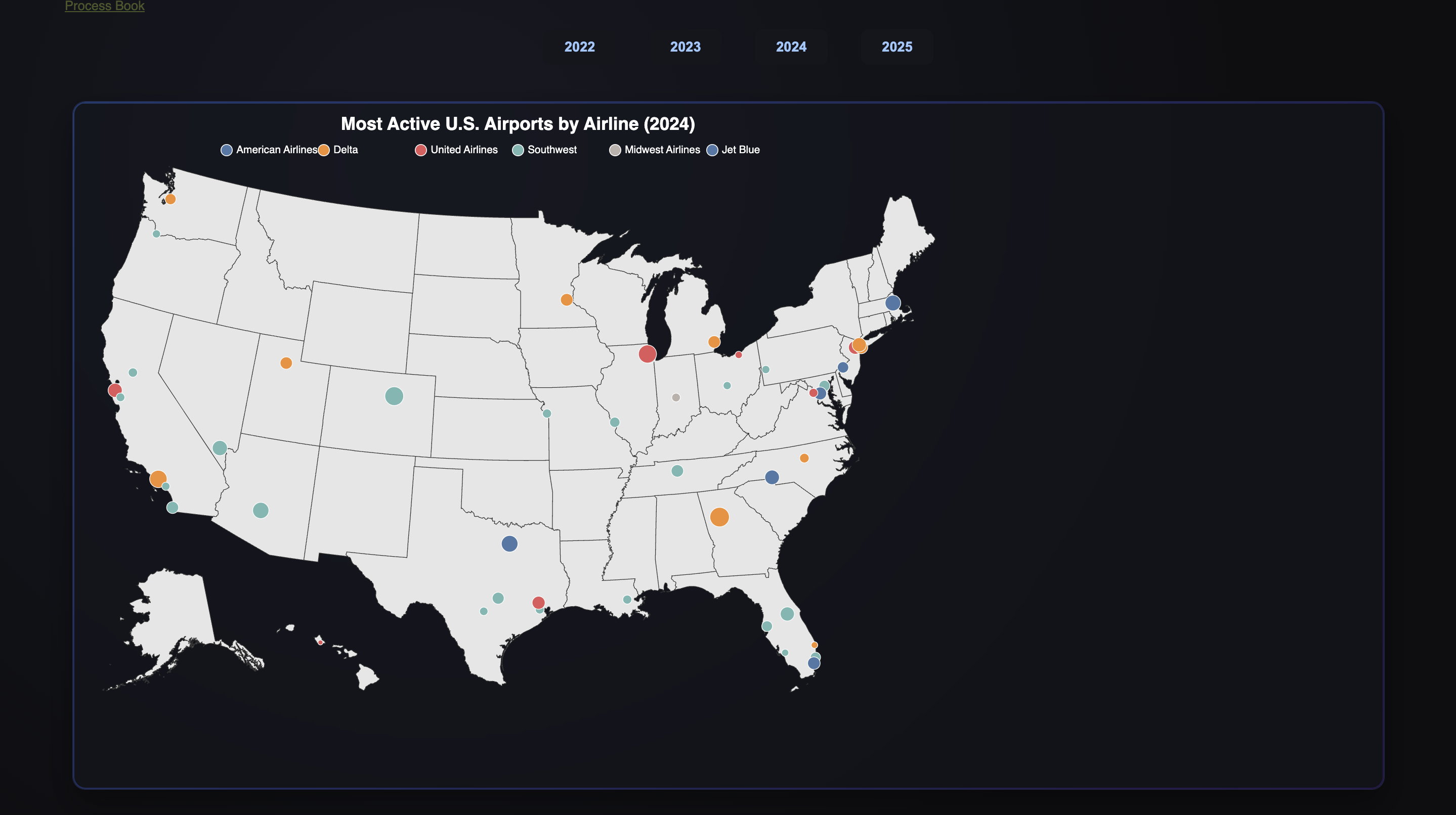
Our current prototype is interactive, allowing the user to view flight data from 2022 to 2025 based on airport and airline in the form of a map and a line graph. The user can select the year buttons at the top to filter their graphs with the corresponding year data. The map consists of dots at the location of the top 50 airports with the most flights. Hovering over a dot allows the user to see which airline has the most flights at that airport, as well as the overall number of flights at that airport. Additionally, the size of the dots correlates with the number of flights the airport has.
Our second milestone involved adding our third visualization, additional info about our dashboard, and styling. We implemented a bar chart that visualizes how many on-time and delayed flights there were for each airline, filterable by year and airport. When creating this, we had to choose two colors that would be easy to look at and also take into account color-blind individuals. When hovering over the bars, a tooltip pops up indicating the exact number of flights that were on time or delayed.
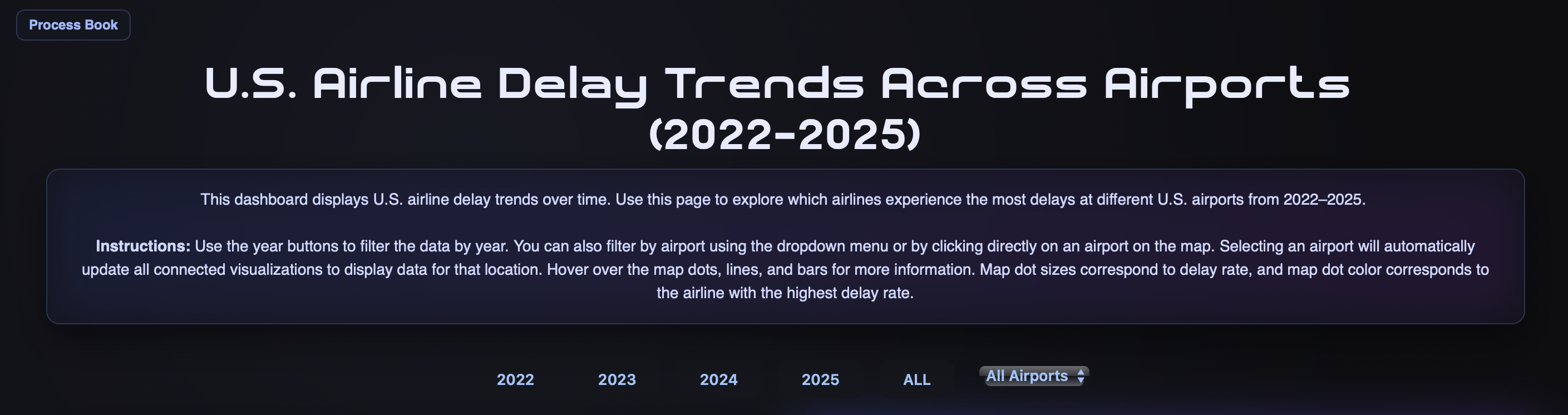
We wanted the page to default to total data, or a sum of all years 2022-2025, on load, so we added an all button to our year filters. When the page is opened, the dashboard displays visualizations for all of the data, summing the data across the years and graphing that, throughout the bar chart, line chart, and airport circles on the map. The all data also defaults to all airport data, and then can be filtered when an airport is selected. Additionally, we added a drop-down selection for users to use to select a specific airport code to investigate. Before, users could select an airport by clicking its circle on the map; now, users can still do that, but they can use the drop-down to filter quicker, or if they don’t know where that airport lies geographically.
We played around with the spacing and positioning of our visualizations in order to find the layout that is most intuitive for the user. This involved moving around our visualizations and changing the sizing so that they would reasonably fit on the webpage. As we did this, we found that the legends in the line and bar charts were overlapping with the data, so we decided to change it from a bulleted list, as seen in the line chart in Milestone 2, to listing them in a straight line. We also made it so that the dashboard would resize based on the size of the window. Additionally, we added an overall data summary box filterable based on year that lists the airline and airport with the most delays.
We overall tried to enhance our visuals, and take them to the next level. We added animations to the graphs, with the lines growing from left to right upon filter for the line graph, and the bars rising from bottom to top upon the filter. This makes our dashboard more dynamic, and caters to the interactiveness as it allows the user to notice that their interaction triggered a change. We further tried to re-develop the map to better suit the data and better help tell the story about delays across airlines, rather than just airport size. The radius of each airport is determined based on the percentage of total flights that are delayed; so, large circles have a larger proportion of delayed flights, and smaller circles have a small proportion of delayed flights. Our tooltip also includes metrics about the delay data, so that the user can see the specific delay rate, number of delayed and total flights, the airline with the most flights at that airport, and the airline with the most delays. Upon selection, the opacity of the non-selected circles decreases to help the user note that they have selected a particular airport. The map further zooms in on the selected airport, and zooms out upon de-selection. The dropdown selection and the clicking functionality to select an airport work interchangeably, and correspond with all the other graphs. We also developed instructions to help the user understand how to use the dashboard, and used custom fonts from dafont.
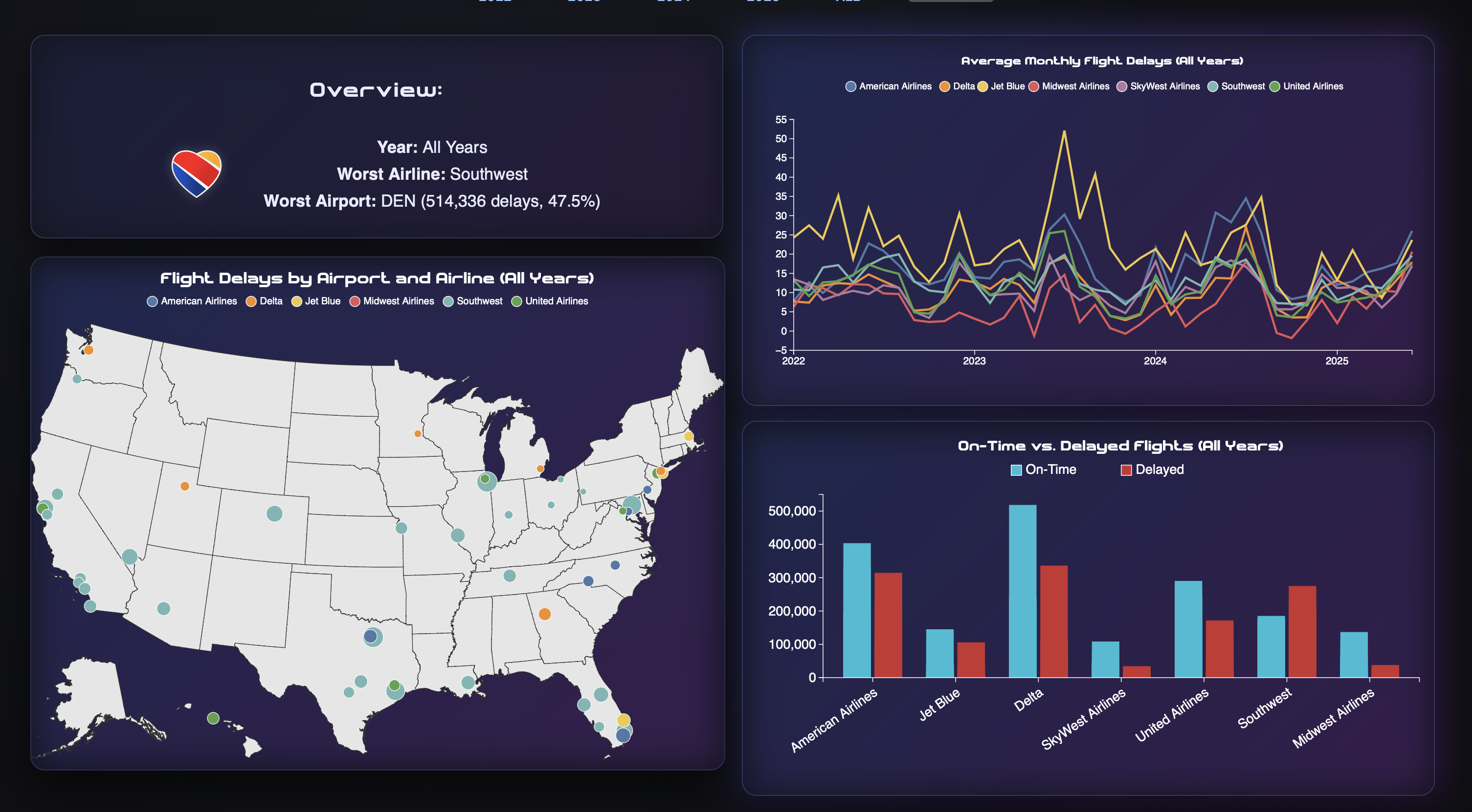
We conducted a user study on Lauren's highschool siblings and parents over the break. Overall, we recieved good feedback. The dashboard was intuitive, easy to use, and they were able to pull key insights. Lauren's father was able to quickly gather that overall, Southwest had the most frequent delays out of all flights, and that out of our two home airports (Ohare and Midway), Ohare had a significantly less delay rate than Midway; looking ahead, Lauren's father gathered that it may be more adventagous to fly out of Ohare to minimize chance of delay. One critique from Lauren's brother was that it would be nice if the airport code was concatenated with the airport name. As a highschooler, he was not as familiar with the airport codes as to airport names (like knowing ORD was Ohare). As our dashboard is targeted towards adults who frequently fly, we did not make this change. Overall, the user study was helpful to confirm that our dashboard was easy to use and understand.