Implementation:
Milestone 1:

For Milestone 1, we focued on collecting and cleaning all the data we retrieved from the Spotify API. We
started
by importing all the "daily top 50", "viral top 50", and "weekly top 50" data, separated by country, into
our
project's data folder. Then we
merged all the data from each country into three large data sets: "daily_top50_merged_json",
"viral_top50_merged_json", "weekly_top50_merged_json". This will make it so we can display general trends
across
the globe.
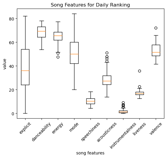
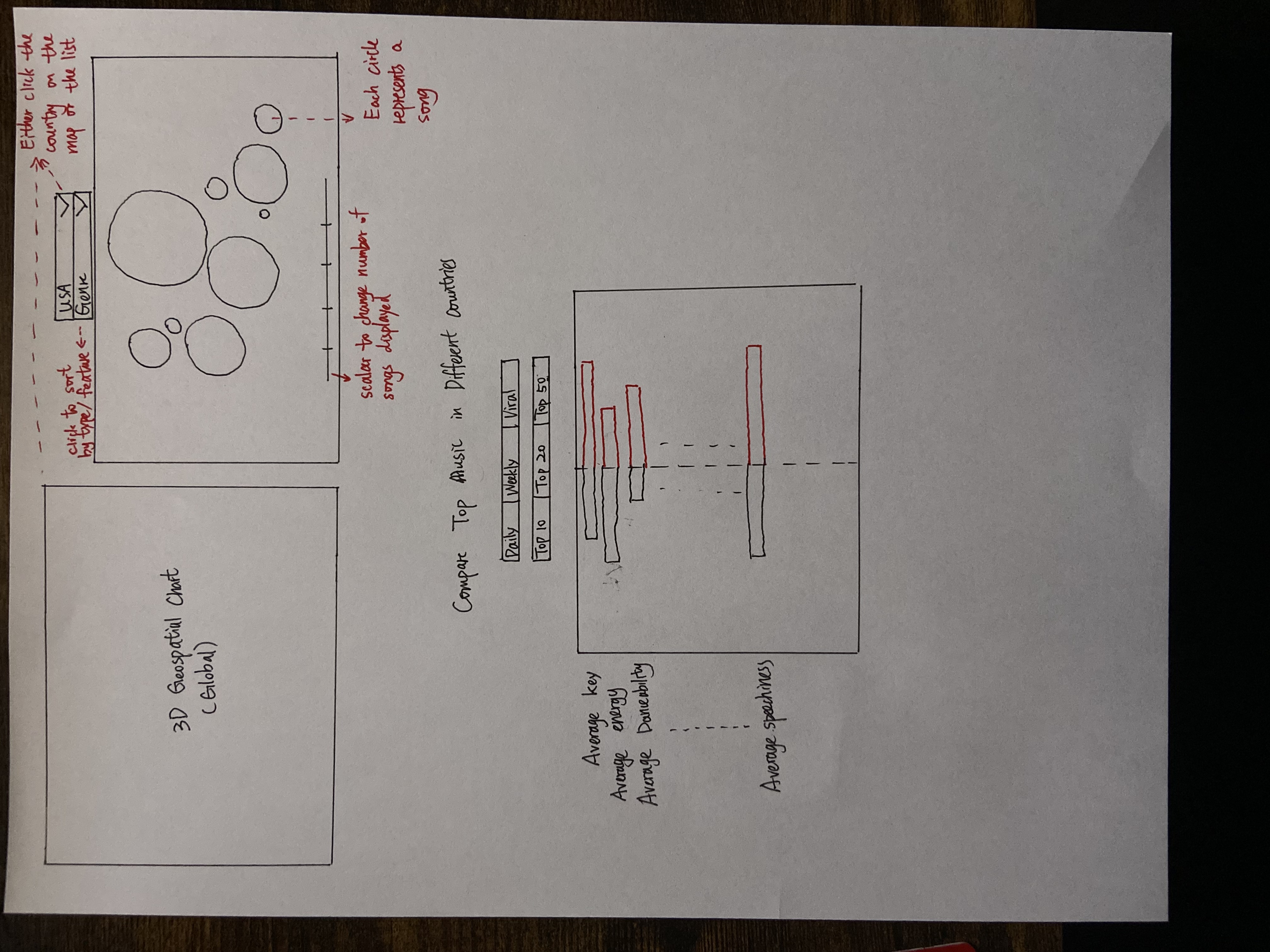
We also added one of the 3 visualizations we wanted to have. With the comparison chart, we added
interactivity
so that users can selected which 2 countries
they wanted to compare. Based on their input an svg bar graph would update to represent the musical trends
from
both countries. We also added 2 additional divs that will eventually hold the geospatial map and the bubble
map.
Milestone 2:
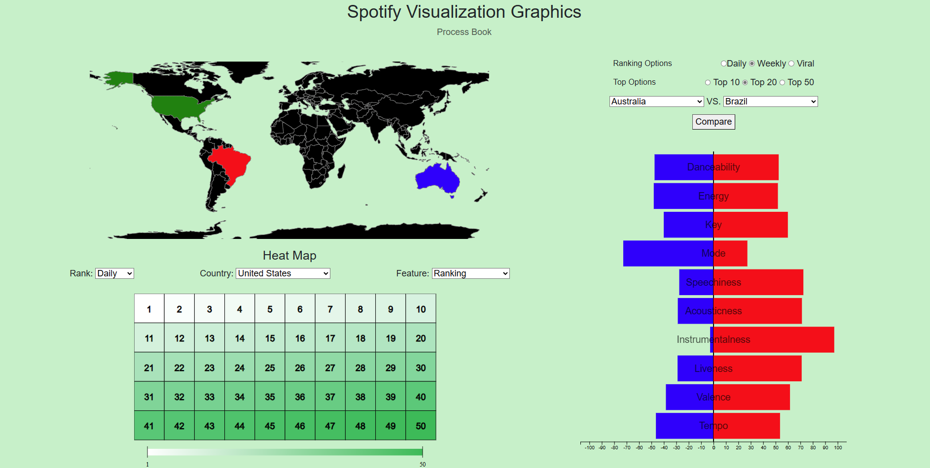
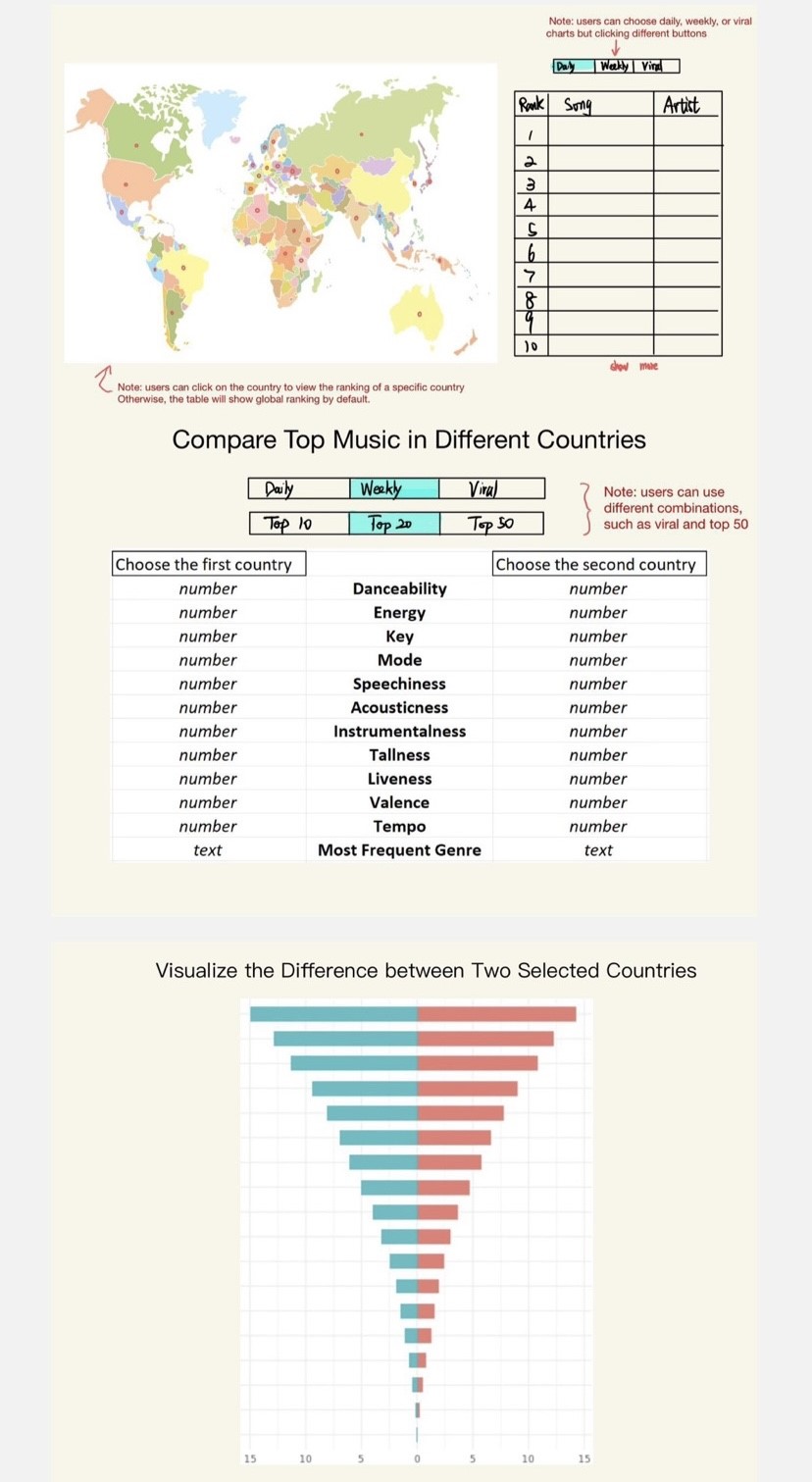
The figure above is an overview of our visualization. Compared to the visualization in Milestone 1, we now have
geospatial map implemented. For the bubble chart in Milestone 1, we decided to convert it to a heat map. For the
third visualization, the comparison table is deleted, and we only keep the funnel chart to compare music features
of two countries selected.
The geospatial map is updated simultaneously with the country-selection in comparison chart on the right. Two countries
that are selected on the comparison chart will be highlighted with blue and red in the world map. If the user then click
on any of these two highlighted countries, a tooltip will show up with top songs in that specific country. List and number of songs will
vary based on users' choice of Ranking Options and Top Options.
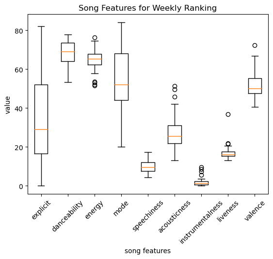
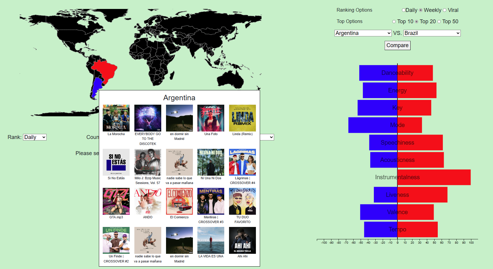
The image above is an example of how these two visualizations work together. A user selected Weekly Top 20 ranking option and
then selected Argentina and Brazil for comparison. The bar chart is updated with average song features for weekly top 20 songs
in two countries. Two countries is highlighted in geospatial map. If the user click on Argentina (blue space),
weekly top 20 songs in Argentina will appear in the tooltip.
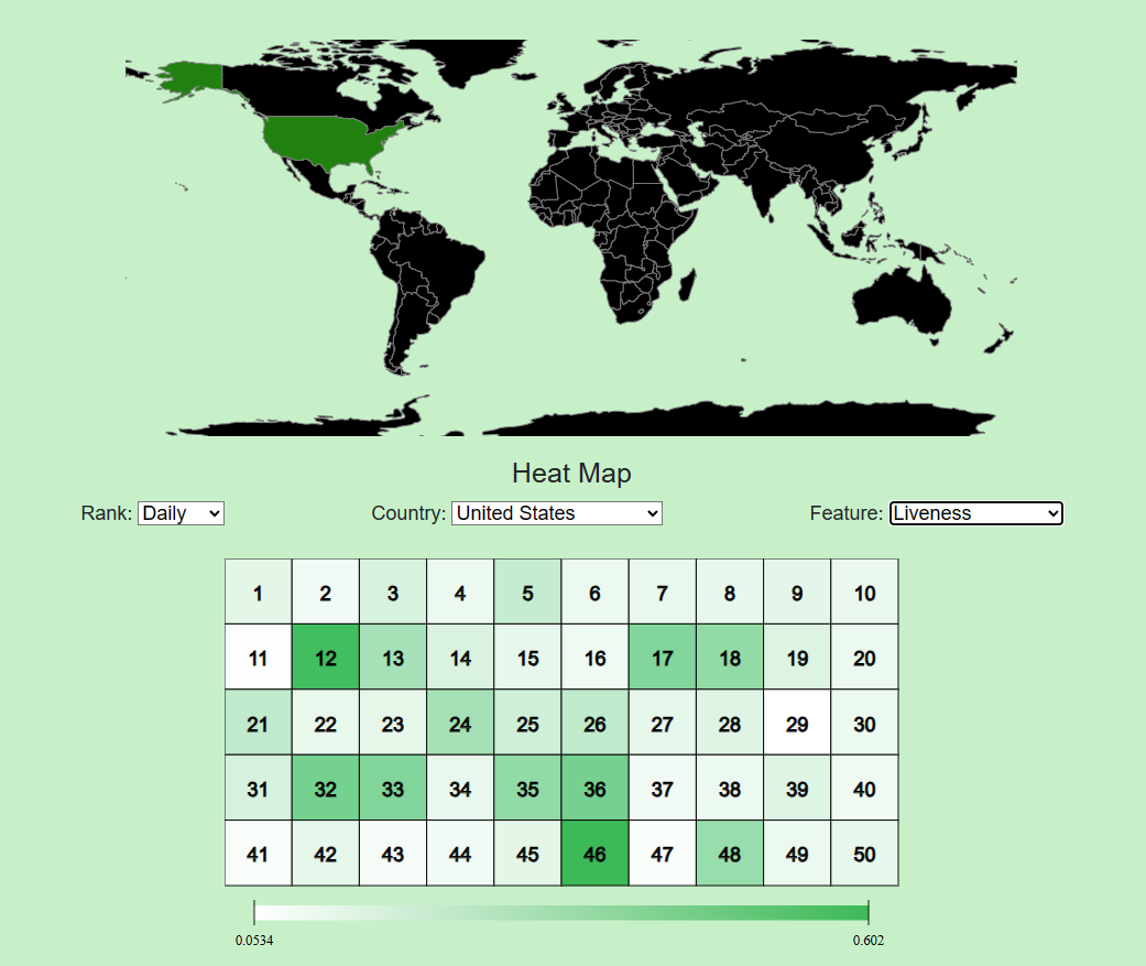
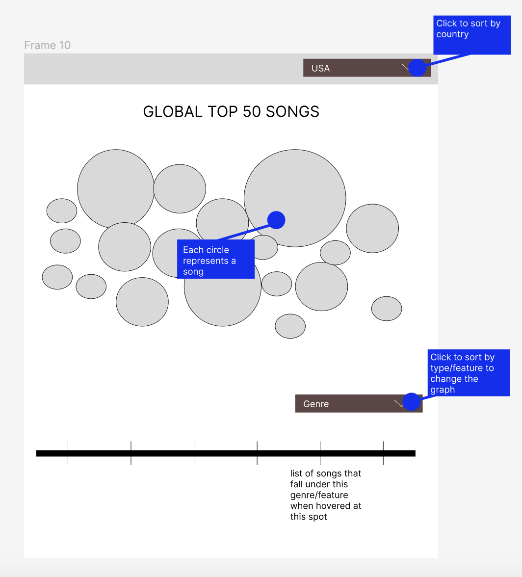
The heat map is used in milestone 2 to replace the bubble chart in milestone 1. After we finished implementing
the bubble chart, we discovered that bubbles might overlap with each other, which makes it difficult to acquire
useful information. We thus decided to implement heat map. In the heat map, we can
layout all 50 songs in a more concise way than bubble chart. Users can easily hover over a specific ranking number
to see detailed information. The color scale of heat map also help users to study whether there exists a trend for
selected features.
Users can select countries in two different ways. The first way is to select their interested country from the
dropdown list. The second way is to interact with the geospatial map above by clicking on a specific
country, which will then highlighted in green. After selecting a country, users can choose a specific music feature,
including popularity, ranking, danceability, energy, key, mode, speechiness, acousticness, instrumentalness,
liveness, valence, and tempo. The heat map will then be updated based on users' selections. In the figure above,
United States is selected, and the map is highlighted in green. The chosen feature is liveness, then the heat map will
be updated with liveness value of daily top 50 songs in the United States with a color scale.
Final Design:
Based on the comments of Milestone 2, we made several modifications to our design. We first add borders to each
of our visualizations to make some distinctions. We also made several updates to each of our visualizations,
and the update will be demonstrated below.
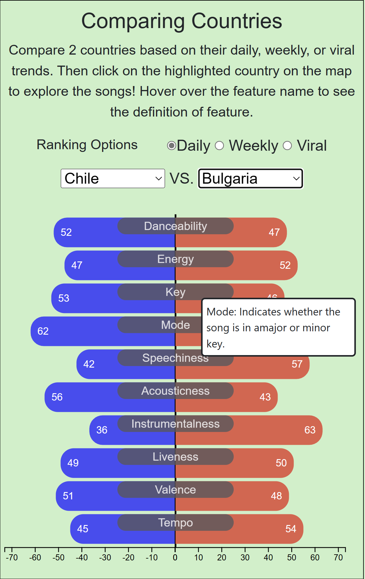
For the comparison chart, the first change is that the users can see a live update when they change the countries they selected so that
they don't have to click the compare button every time they change country selection. The second modification
is to add detailed explanation of each song feature when users hover over so that they can have a better understanding
of each feature. The third update is to add scores on each bar, which provides an additional choice to understand
the value other than the scale bar below.
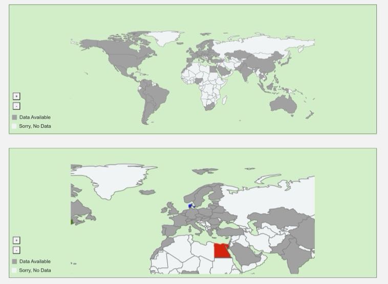
For the global map, the first change we add different colors for country available and unavailable so that there is a
contrast. The second change is that the new map does not cut off at the top so that all countries can
be shown on the map. The third change is that we add zoom in and zoom out feature. The zoom in feature works
typically well when users select European countries, which sometimes can be hard to find on map with original size.
With zoom in feature, countries like Denmark, Dominican Republic, Belarus, and etc., can now be easily found on the map.
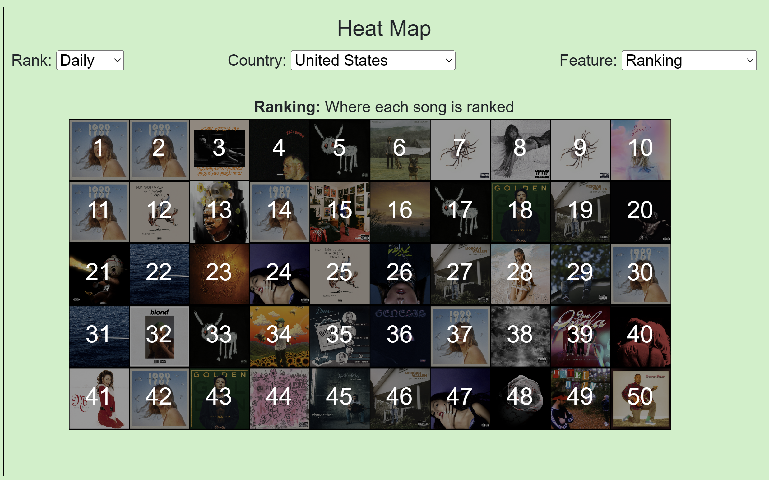
For the heat map, we diminished the opacity and put a black background behind each album image to make the numbers
more visible while still being able to see the images. We also made the numbers white only for the ranking setting.
By using our visualizations, we can view comparison chart and heat map to understand the
music preference in different countries. We can use comparison chart to compare the top music in one country
with another country. We can also use heat map to understand the detailed ranking information of top songs in the
selected country. Using Denmark as our example, from comparison chart, we discovered that the instrumentalness of
top songs in Denmark is relatively low compared to other countries. From ranking of heat map, we can discover that, unlike
many other countries, songs of Taylor Swift only ranks at 35th place in Denmark. For future development, we aim to
update the website on a daily basis by using the latest data from Spotify. We also aim to update the comparison
chart so that users can select more countries for comparison. Another possible development is to create a visualization
to compare song preferences in different continents or regions.