Alec Anderson 511333 a.t.anderson@wustl.edu
Hailey Montgomery 508840 h.e.montgomery@wustl.edu
As AI becomes increasingly mainstream, it seems to touch nearly every corner of life. From sports to architecture, stock trading to animation, AI has enveloped society’s attention at a whirlwind pace. In particular, large language models are now rivalling one of mankind’s greatest technological inventions, the internet. And all this for good reason, AI, and in particular LLMs, have mind-bending potential to revolutionize almost any industry. LLM’s such as chatGPT capture the very essence of humankind’s greatest and longest held fantasies of technology with its ability to communicate genuinely and present a consciousness to their human users. As far as the uninitiated user is concerned, and even to some who are, chatGPT might as well be magic. But every trick has its toll…
Behind every AI summary, suggestion, or response there is a hidden cost. With each prompt, the Earth is slowly drained of its most precious natural resource, water, and polluted with emissions due to its taxing energy requirements, all without the slightest indication to the user. A steadfast charge into all things AI may seem like the best course of action for any individual, institution, or nation right now, but catastrophic consequences lurk beyond the entrancing growth which AI promises.
Our objective in creating this project is to highlight the dual impact of using artificial intelligence. While, as most people know, AI has great potential to drive growth in countless industries in any corner of the globe, at the same time it imposes hidden costs on the environment. We want to show how increased AI usage contributes to increased resource consumption, specifically focusing on water usage as a sustainability concern. Our primary goal is to paint a story of two sides: limitless benefit and crippling consequences. We want to present data to the user in a way which makes them think more critically and allow them to come to their own conclusions about how even seemingly perfect technologies with untold benefits come at a price, that being the unspoken tax on the natural world.
For our visualization we were particularly inspired by the life and death visualization, a previous work in this class. The two defining features of it were its simplicity and abstraction. The visualization did not have an overwhelming number of elements or interactivity. It included bouncing balls dropped from the top of the frame with two different warm tones to signify either life or death. This design choice let data speak for itself and left room for the user to devise their own thoughts and feelings on the data.
While aesthetically our visualization is different, we seek to draw on the successful traits of abstraction through the use of flowers. Abstraction encourages the user to engage with the medium more actively to reason about what they are seeing and how it connects to the underlying story. Additionally, as a “nice to have” feature, we are considering implementing dynamic scrolling as a way to build immersion across views. Inspiration for this is taken from multiple places including Apple’s product pages (as seen here: Apple MacBook Pro).
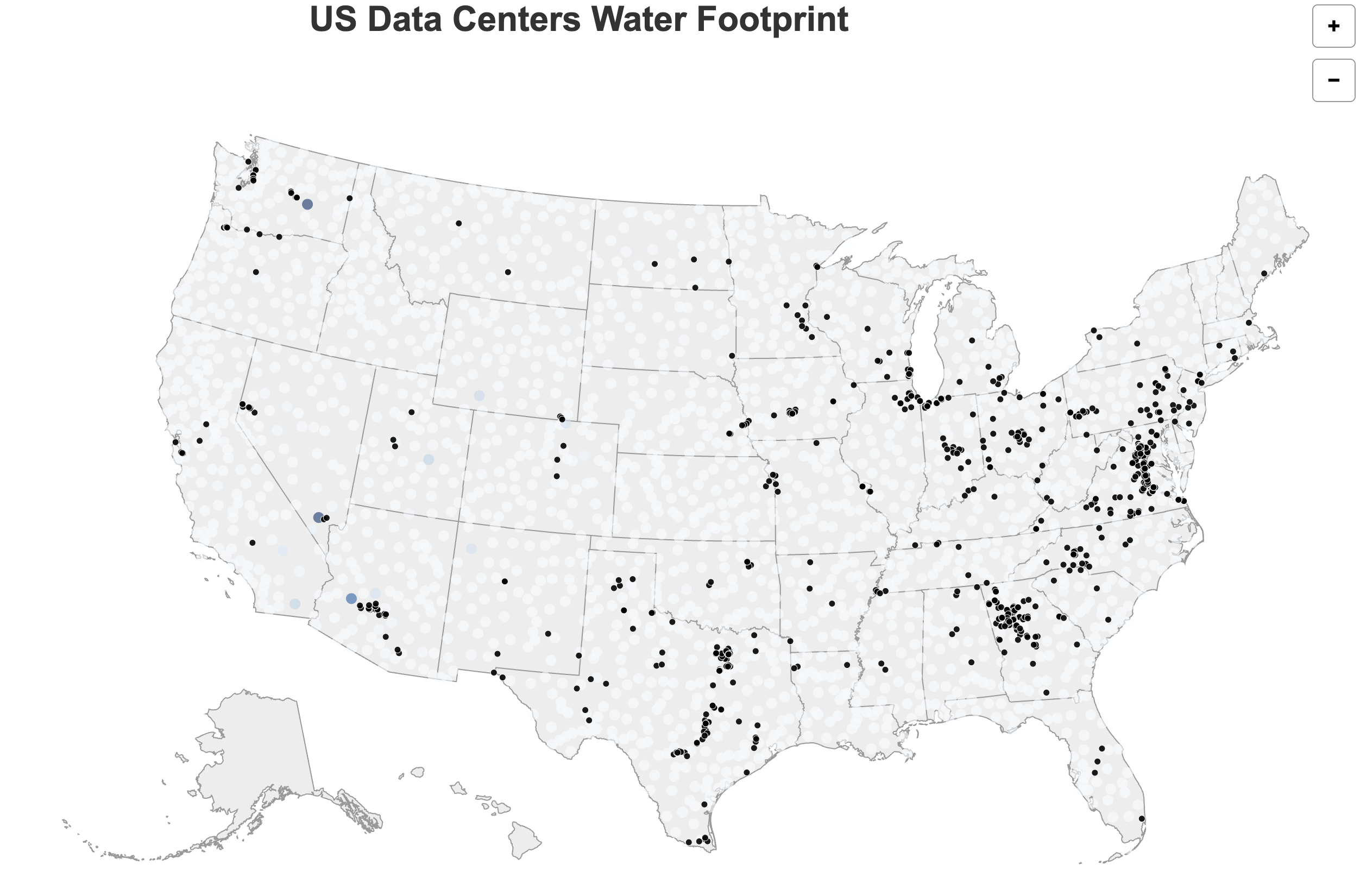
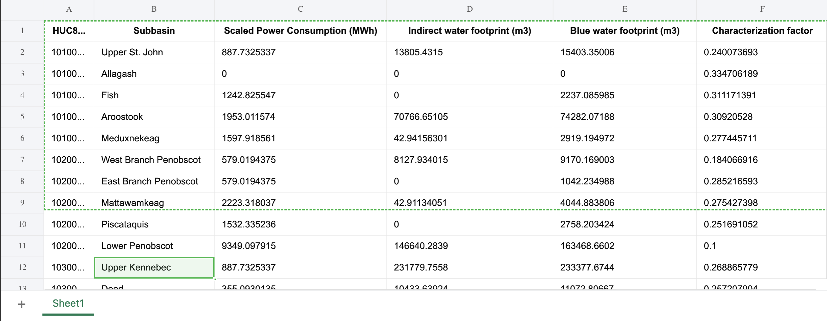
Our main goal for this milestone was to get all of our data cleaned and prepped to be used in our visualization. Because we chose to explore both sustainability and productivity in regards to AI, there are massive datasets that we have chosen to use. After much discussion we decided that our original water consumption dataset was not quite suited to the driving motivations behind our project. The data was slightly too general and did not get at the heart of the issue of the cost of AI on the natural world. After more searching we found a much better suited dataset from a study conducted by Virginia Tech which included detailed location data and power usage for thousands of data centers in the US, allowing us to back out the implied water usage based on their power consumption. Included in this dataset were scripts that we could run to calculate the water consumption and water scarcity of data center locations.
VT Dataset
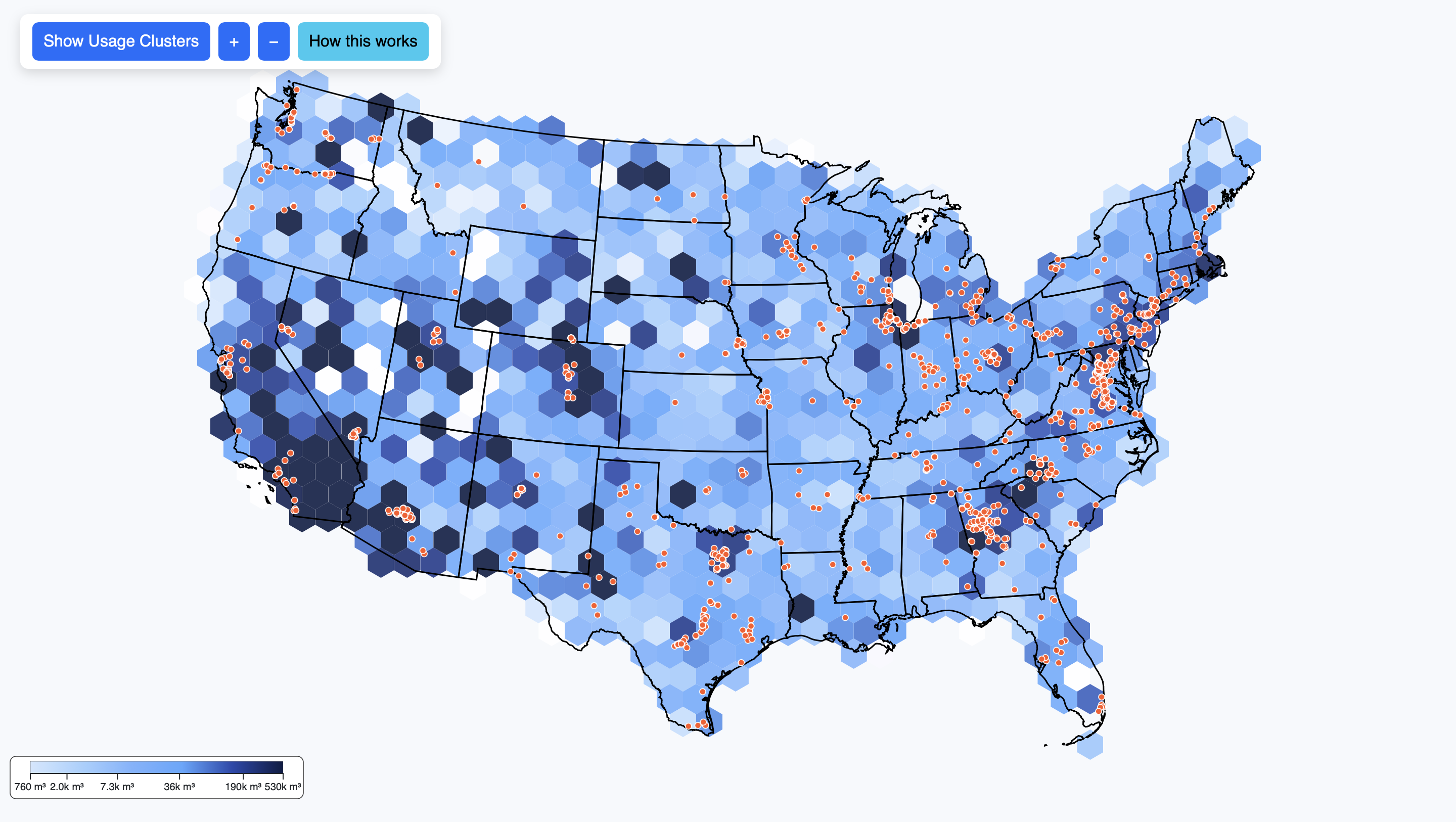
To prepare the sustainability dataset for visualization, we first explored the open-source supplemental data from “The Environmental Footprint of Data Centers in the United States.” This dataset included detailed estimates for direct and indirect water footprints, carbon footprints, and water scarcity footprints of U.S. data centers. Using the provided scripts and input tables, we extracted the relevant metrics for each subbasin (HUC8 region).
We specifically focused on three key measures:
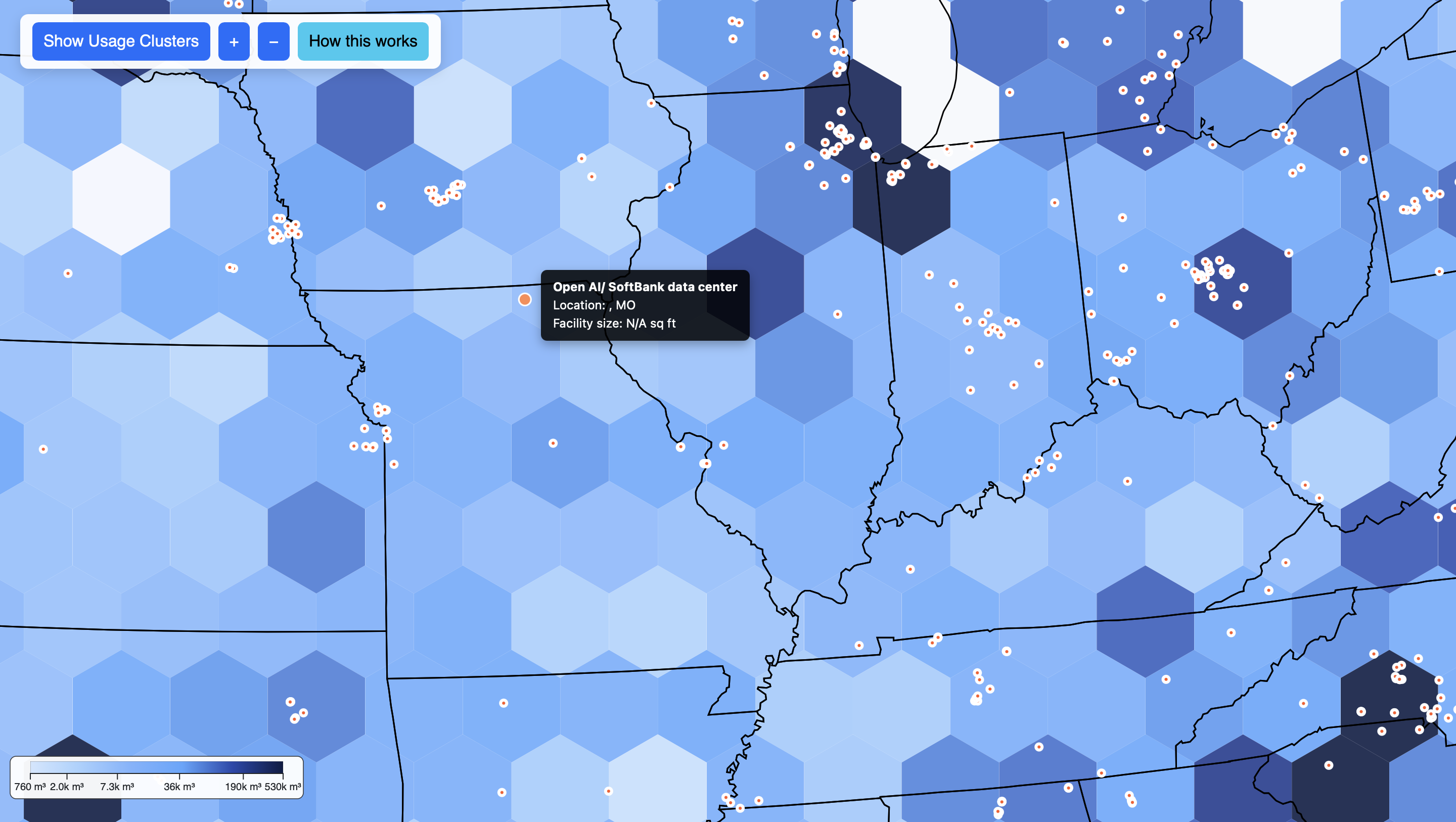
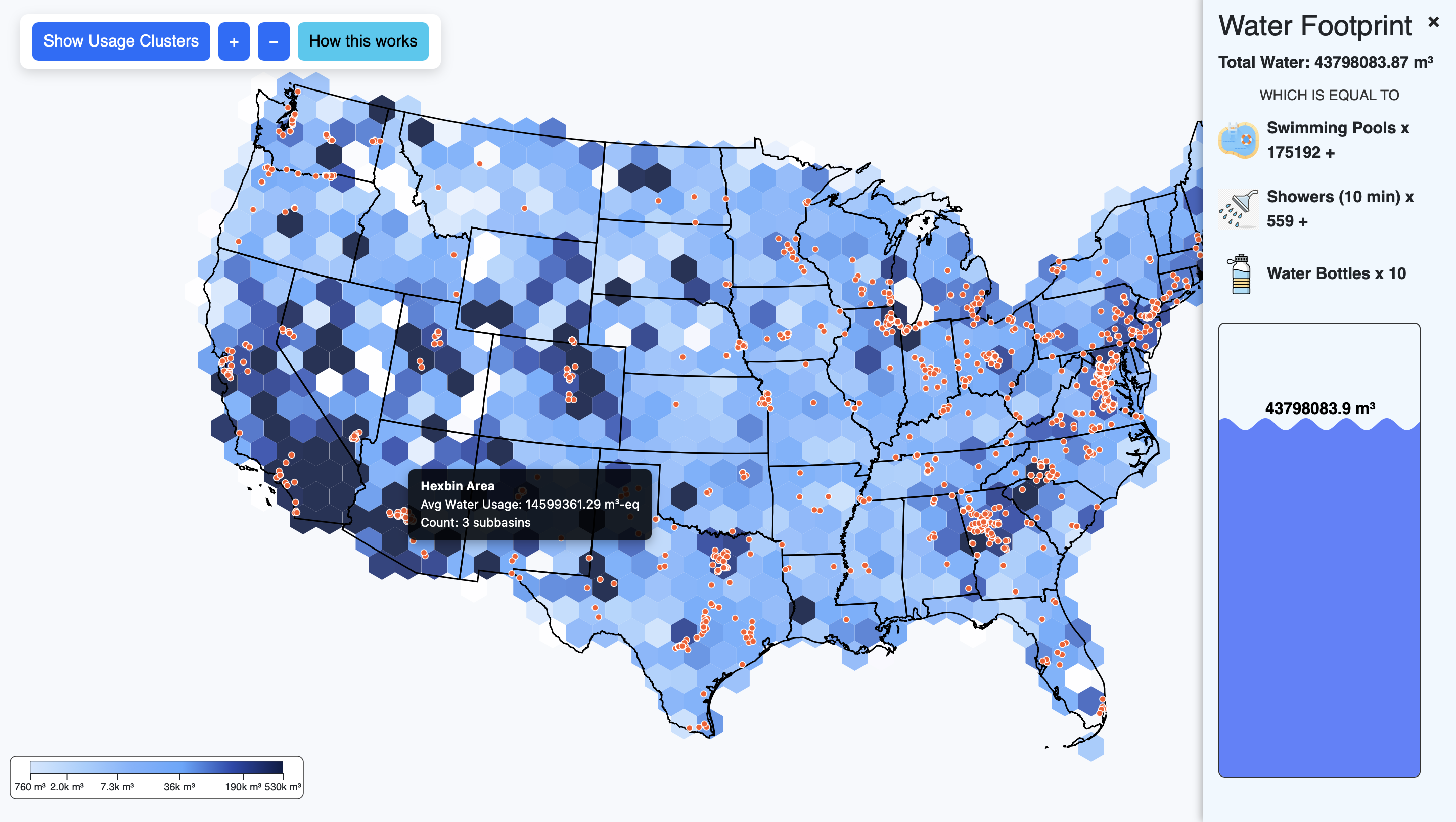
We cleaned and condensed these results into a single structured dataset containing latitude/longitude data (based on the subbasin centroids), state, subbasin name, and water footprint values. This enabled us to integrate the results with geographic map data for visualization. Each data point on the map corresponds to an approximate subbasin containing one or more data centers. The plan for the color of the visualization is to encode the magnitude of water consumption (darker = more usage), while interactivity will allow users to explore specific regions and view contextual data such as total power consumption and estimated emissions. Right now we have all of the data centers on the map, along with tooltips. We also have started experimenting with a heat map for areas of high water consumption/water scarcity, but we have not got this functionality to work fully yet.
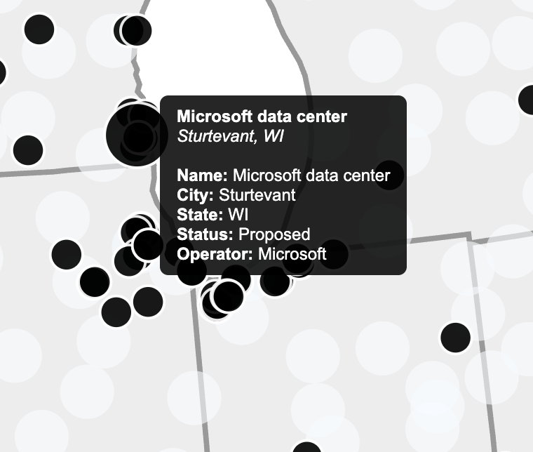
For Milestone 2, we added another dataset that provides the locations of additional data centers across the US. This allows us to better estimate the total number of data centers, giving a more accurate picture of water consumption patterns nationwide. Integrating this new data improved our spatial coverage and will enhance the visualizations in both the sustainability and productivity views.
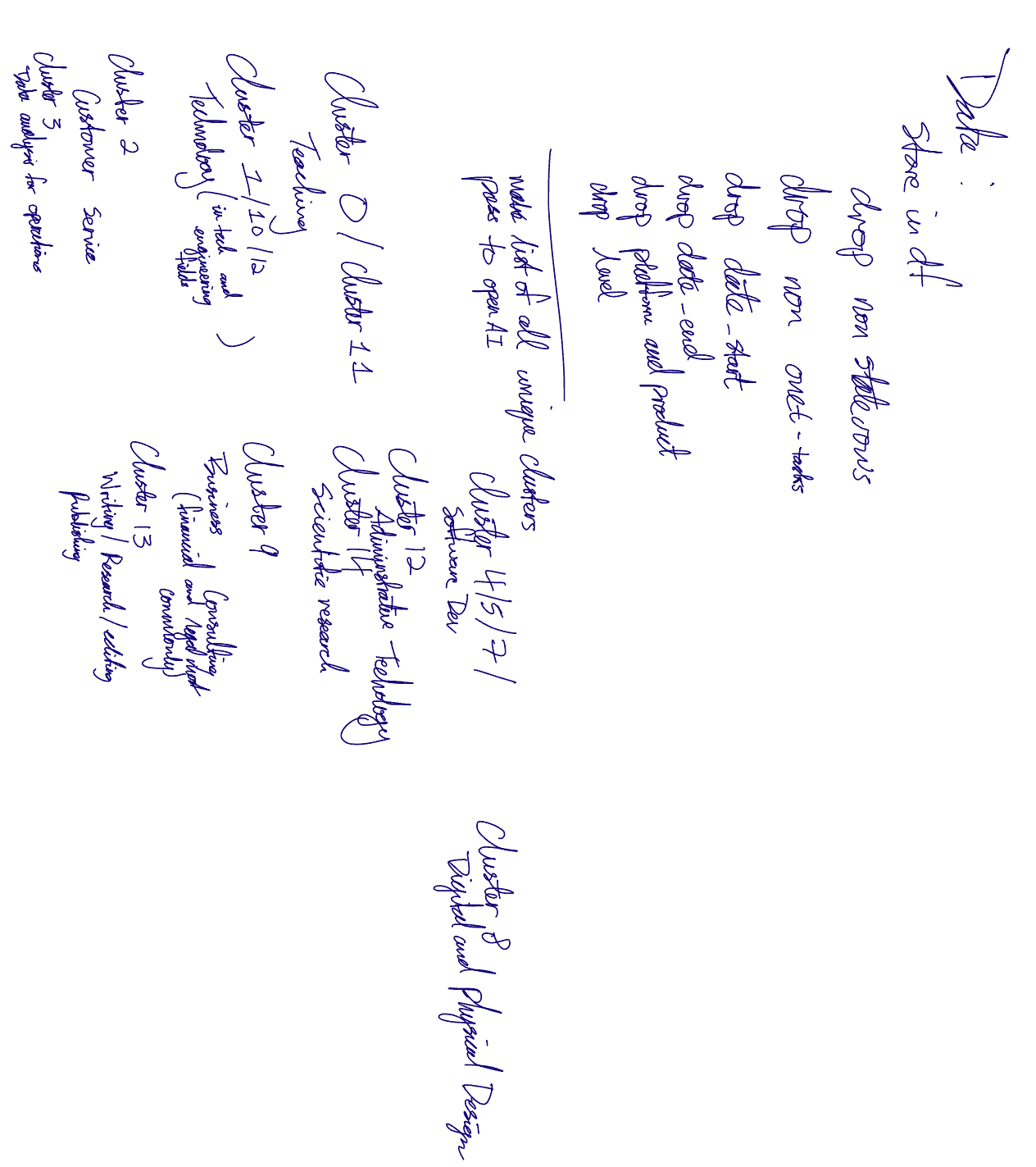
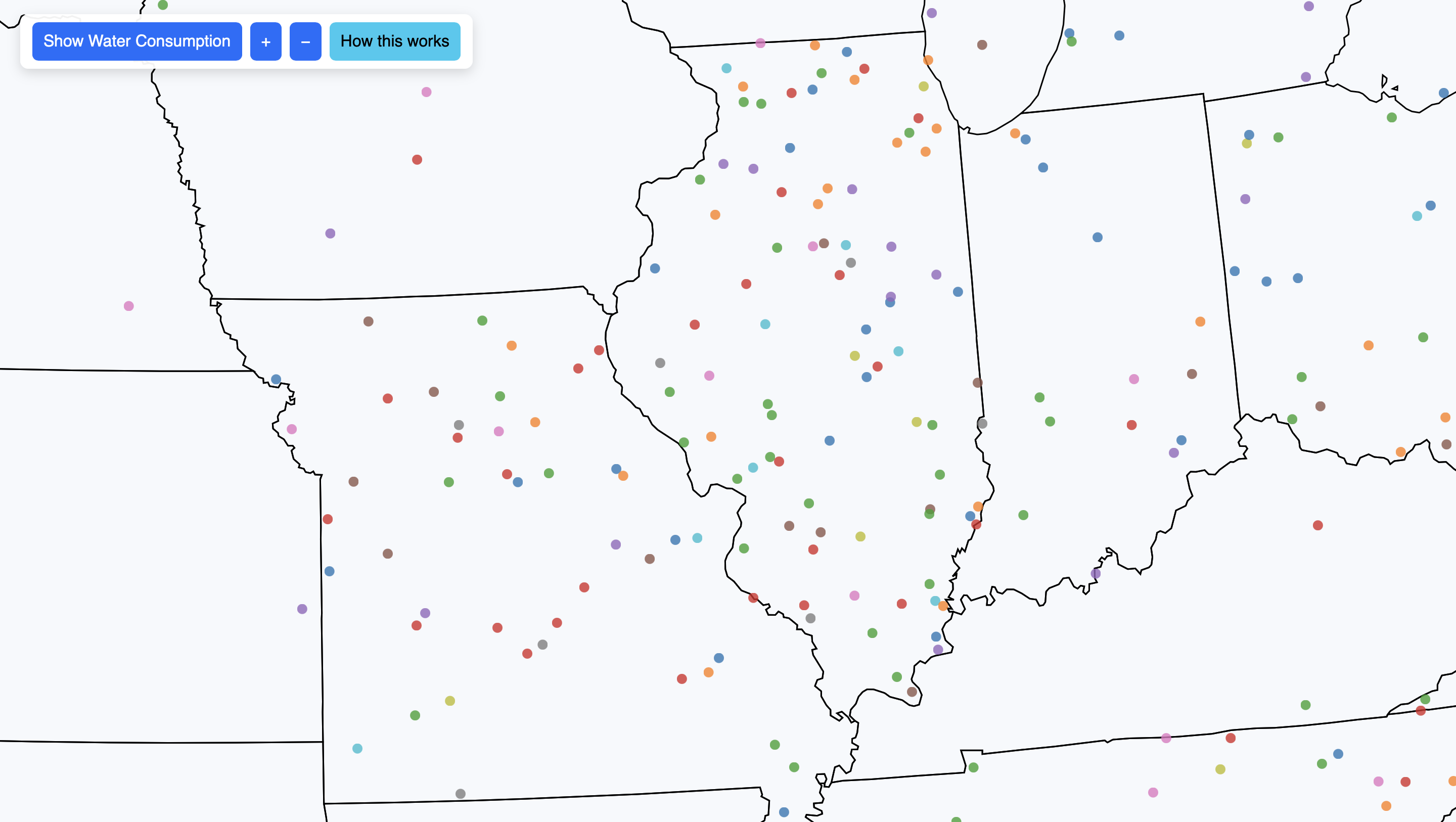
We processed the Claude AI usage dataset in a few different ways. Firstly by cleaning, reorganizing, and filtering the original CSV. We decided that many of the fields were not going to be of use to us, retaining the core information from the data set (location, usage type (cluster_name), usage count, and percentage). We combined the duplicate rows for every usage entry (one for usage count and one for percentage) into one row and added two new columns for count and percent. Realizing that the provided usage descriptions were too wordy and too variable (over 400 unique descriptions), we utilized a machine learning sentence embedding model to embed the usage descriptions as vectors. After this, we used K Means Clustering to form new groups from which we could derive more clear categorizations for the usages. We manually assigned meaning to each of these clusters. These new cluster categorizations will be the basis for the data point coloring (colors of the flowers). Finally, since each usage only has a state name for its location, we generated a set of random coordinate points within the state boundaries to allow us to map each usage (flower) onto the map.
Originally (as seen in our preliminary sketches) we envisioned our sustainability data using an interpretive area chart to show water usage levels across different industries over time. This approach emphasized temporal trends, allowing users to see how water use evolved and how patterns shifted across sectors. However, as we explored our updated dataset and considered cohesion with the AI productivity visualization, we realized that a temporal chart would not fully capture the spatial impact of AI on the environment. Consequently, we pivoted to a map-based approach, focusing on the geographic distribution of water consumption by U.S. data centers. This shift makes the transition from productivity (AI usage) to sustainability (water consumption) more intuitive and allows users to directly contrast these two aspects of AI in a clear and meaningful way.
With this pivot, we adapted our design goals to highlight both the magnitude and the spatial distribution of environmental cost. The Virginia Tech dataset, which provides spatially explicit data on water consumption and data center locations, naturally guided this shift. To improve clarity and visual impact, we implemented several key design updates for Milestone 2:
Key design changes and updates for Milestone 2:
Overall, these updates result in a more immersive and contemplative experience. The combination of hexagonal heat maps, data center markers, dynamic water metaphors, and AI productivity visuals encourages users to explore and reason about the datasets themselves. Users are able to see the magnitude of environmental cost alongside the benefits of AI in an intuitive, interactive, and visually compelling way. By carefully designing color contrasts, interactivity, and spatial representation, the visualization now tells a cohesive story of AI’s dual impact, combining aesthetic appeal with informative clarity.
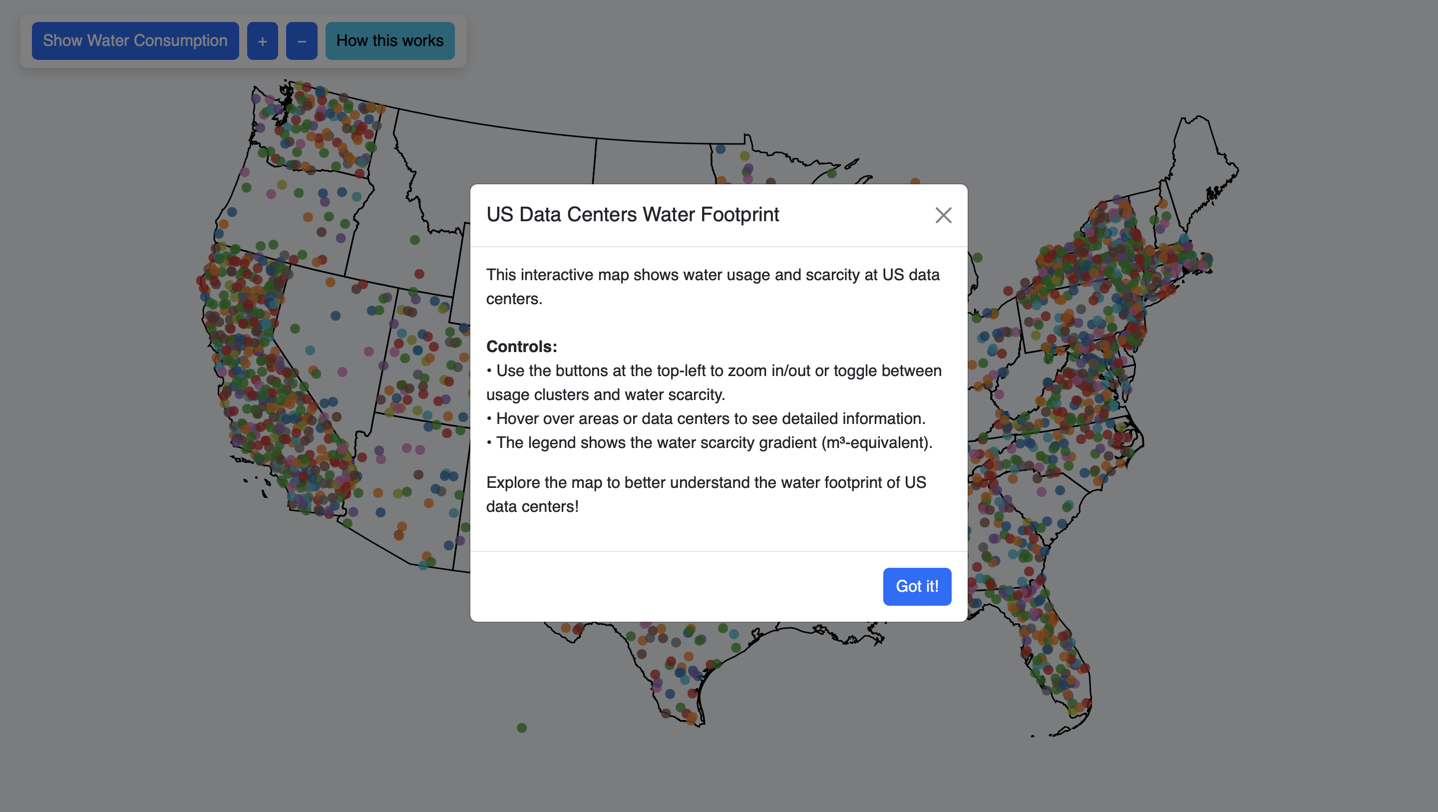
Our primary implementation framework continues to be D3.js combined with TopoJSON data. This allows us to accurately map U.S. data centers and power plants while visually representing their water usage. In the initial implementation, we focused on making data centers distinct and readable through the use of color coding and scalable circle sizes. Tooltips provide contextual information for each data center, such as location, facility name, and operational status. Users can interact with the map by zooming and panning, enabling them to explore data at multiple scales — from individual states to the entire country.
Our mapping employs a geoAlbersUsa projection to accurately position data centers relative to subbasins. Each water footprint data point is rendered as an SVG circle with its radius and color intensity reflecting total water usage. Initially, we used a color scale with d3.scaleSequential and d3.interpolateBlues to convey intensity. Although the color scale is still being refined for smoother gradients, the current setup successfully encodes magnitude and allows users to differentiate regions with low versus high water consumption.
Usability improvements:
Since Milestone 1, we have significantly enhanced both our productivity (AI usage) and sustainability (water footprint) visualizations. These updates include new interactive elements, improved visual encoding, and additional datasets to provide a more complete and engaging user experience.
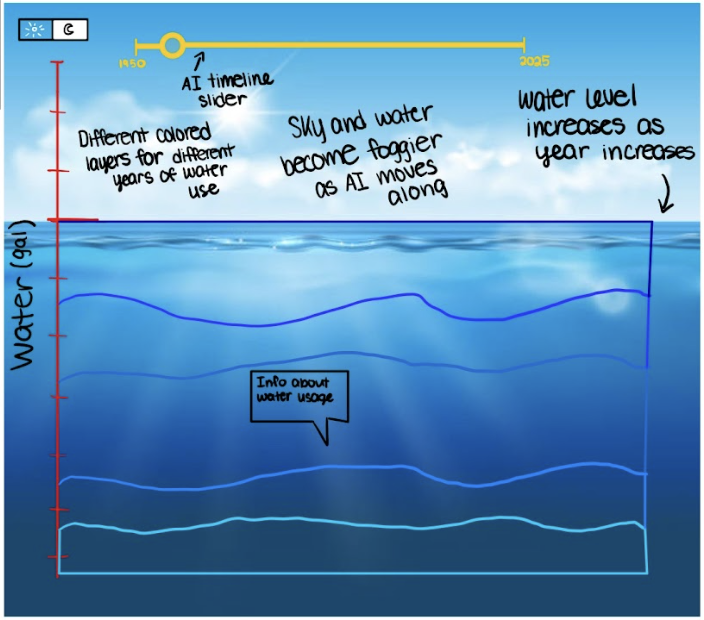
To make water usage more tangible, we implemented a dynamic water pool at the bottom of the visualization. This element provides a visual metaphor for the total water footprint within a given hexagonal area and helps users intuitively grasp the magnitude of consumption.
Our water footprint map has been further refined to provide greater clarity and interactivity. Key updates include:
For Milestone 2, significant effort was devoted to cleaning, structuring, and enriching both datasets to ensure accurate and meaningful visualizations:
Overall, these Milestone 2 updates significantly enhance both interactivity and storytelling in our visualizations. The integration of dynamic water pools, hexagonal heat maps, AI clusters, and tooltips allows users to explore complex datasets intuitively. By combining visual appeal with meaningful interactivity, the project now communicates the dual narrative of AI productivity and environmental cost more effectively than before.
In this session, participants will explore the visualization freely while verbalizing their thoughts. This allows us to observe how users naturally interpret the two sides of our project: AI productivity and sustainability (water consumption). Sample prompts include:
This session will help identify confusing elements, unclear labels, or unexpected interpretations of the visual encoding.
Participants will be asked to perform specific tasks to assess usability and comprehension. Tasks are designed to test the clarity and effectiveness of both visualizations. Example tasks include:
Task-based exploration will allow us to measure how easily users can locate, interpret, and compare data across the two visualizations.
After completing the tasks, participants will provide open-ended feedback to help identify strengths and areas for improvement. Example prompts include:
This session captures qualitative insights that will guide refinements in color scales, interactivity, and overall emotional impact.
The debrief provides an opportunity to summarize findings, clarify participant interpretations, and gather final impressions. Sample prompts include:
Debriefing ensures that participant reactions are accurately understood and allows us to identify any unexpected insights or emotional responses that may inform further design iterations.
Overall, this user study is designed to assess both usability and emotional impact, helping us refine visual encoding, interactivity, and narrative cohesion between the AI productivity and sustainability views. The results will inform improvements in color schemes, animation, labeling, and interface design for the final submission.
Looking ahead, our main focus for the next phase is to enhance the overall impact and cohesion of the visualizations, making them both informative and emotionally engaging. While the core functionality is in place, we are exploring ways to make the experience more intuitive, immersive, and thought-provoking for users.
Key goals for the next phase include:
Overall, the next steps are about balancing clarity, usability, and emotional resonance. While we have a strong foundation, we are still exploring creative ideas to make the visualizations not just informative but compelling, leaving users with a deeper understanding of the tradeoffs between AI productivity and environmental impact.
From Milestone 2 to 3 we included usability as well as storytelling upgrades. On the usability side we worked to ensure that the visualization could be dynamic with the screen size. By ensuring that the aspect ratio of our map and legends is maintained on different screen sizes we improved usability. On the AI usage side of the map we also adjusted the pie charts and bar charts on the sidebar so that the colors would be consistent with the map (and the legend). We also included tooltip information on hover so that users could more easily see what slice of the pie (or layer of the bar chart) corresponds to what type of usage. The sidebars for each of the AI usage and water usage now do not interfere with each other anymore. We also sought to evoke more emotion from our visualization by adding a fog layer which fades in when the user switched to the water usage map. Finally we included more detail in our introductory popup to better explain our data and visualization functionality.