Process Book: How AI is Reshaping the Job Market
Names: Jonas Schwab; Matt Grossman; Sophia Raudez
Emails: j.g.schwab@wustl.edu; grossman.m@wustl.edu; raudez@wustl.edu
UIDs: 509002; 508495; 508944
Repo Link: here
Project site: here
Final Design Demo Video
Background and Motivation
AI is reshaping the global economy around itself at breakneck speed. As soon-to-be new grads, we are acutely aware of how AI has the possibility to upend the economy and job market, replacing entry-level jobs faster than we are able to adapt to this new reality.
Project Objectives
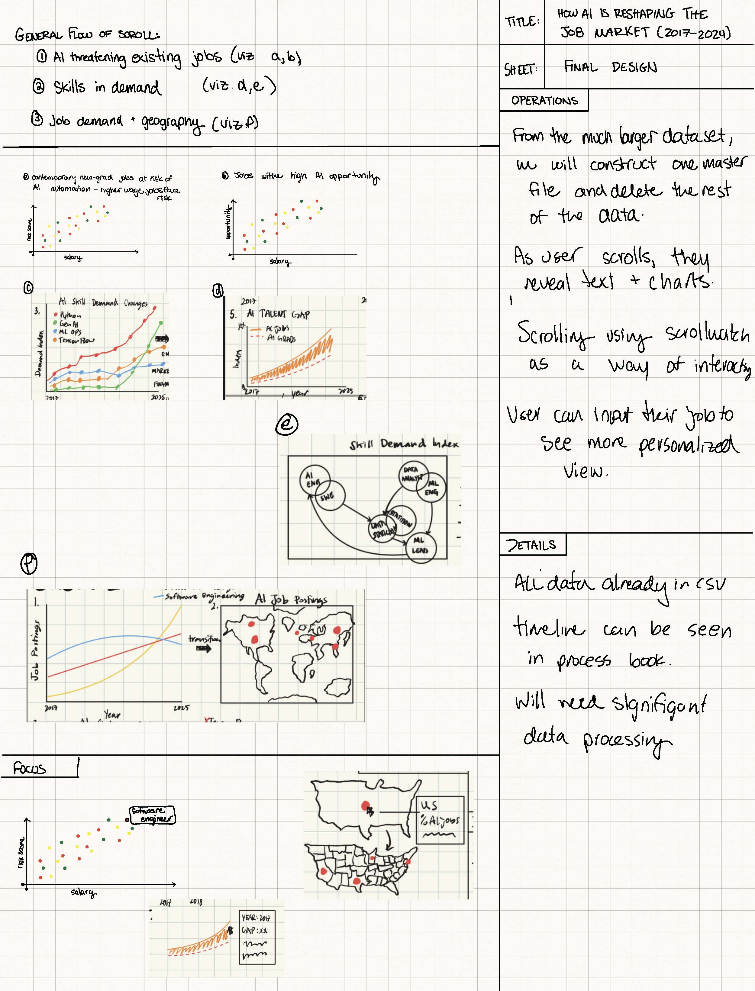
We want to paint a story of this snapshot in time - before AI is generally useful in the workforce but just as it is staring to impact the job market.
We want to tell this story in three parts: the risks, the opportunities, and the geographic distribution.
- The risks section will focus on the jobs that are at highest risk of being replaced by AI. It will show how many jobs that were traditionally 'safe' like white-collar jobs are now at risk of being replaced by AI.
- The opportunities section will focus on the skills that are becoming an expectation in the workforce, in order to help individuals understand what active learning they should be doing to make themselves more attractive candidates. It will also focus on what jobs and industries have the most AI upside.
- The geographic distribution section will focus on the geographic distribution of AI jobs to show how it is not evenly distributed across the globe or even the US.
Dataset
We will be using the Stanford AI Index Dataset. Each year since 2017, the Stanford Human-Centered AI Institute releases the AI Index.
The dataset contains data in many categories, but we will focus on the economic AI data. This section of the AI Index is focused on the economic impact of AI on the job market and economy. For this project, the most important datasubsets are the jov risk scores, skills demand, and geographic distribution.
Data Processing
The dataset is released each year from 2017-2025 and the amount of data collected has grown each year.
The jobs data that we want to focus on is mostly collected between 2023-2025. As AI evolves so quickly, we will be able to show the beginning of trends with these 3 years of data rather than showing a complete picture over many, many years.
Much of the data is already relatively clean so there will be minimal work on that end.
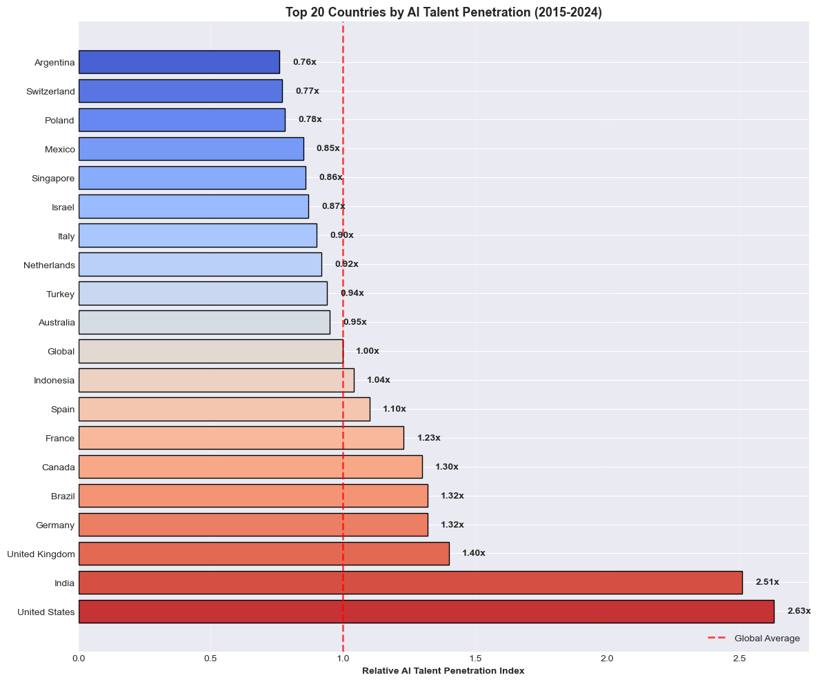
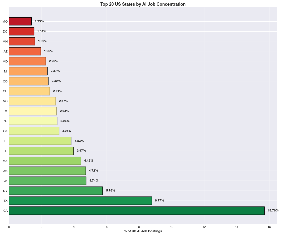
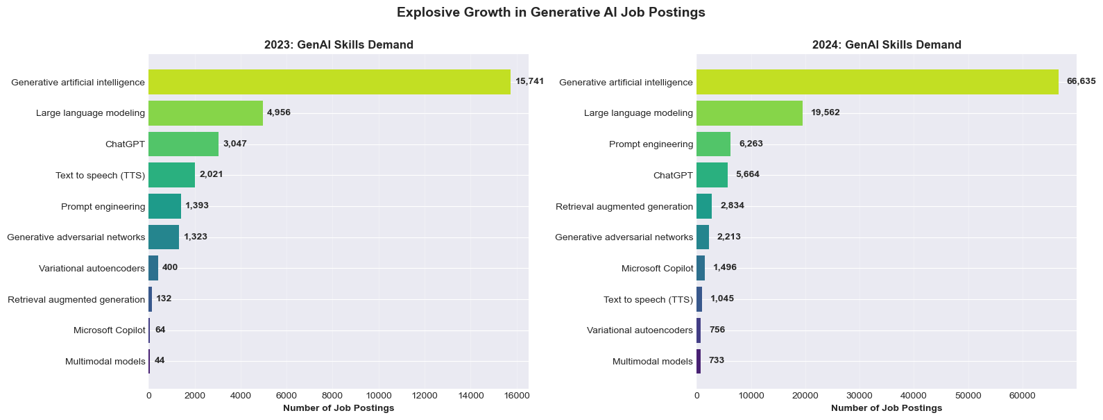
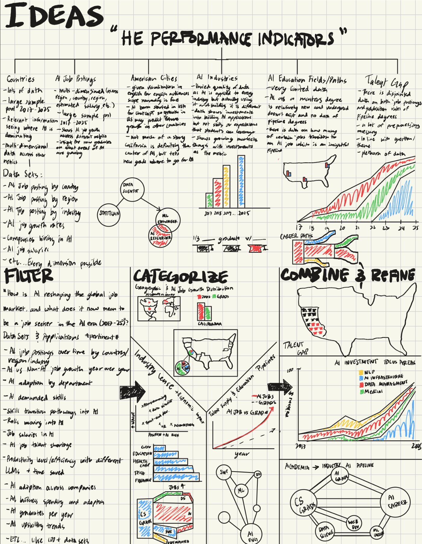
Exploratory Data Analysis
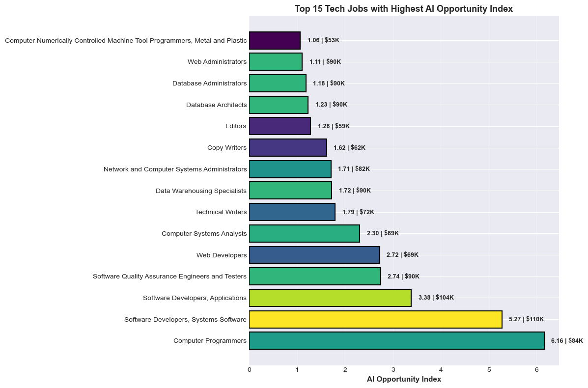
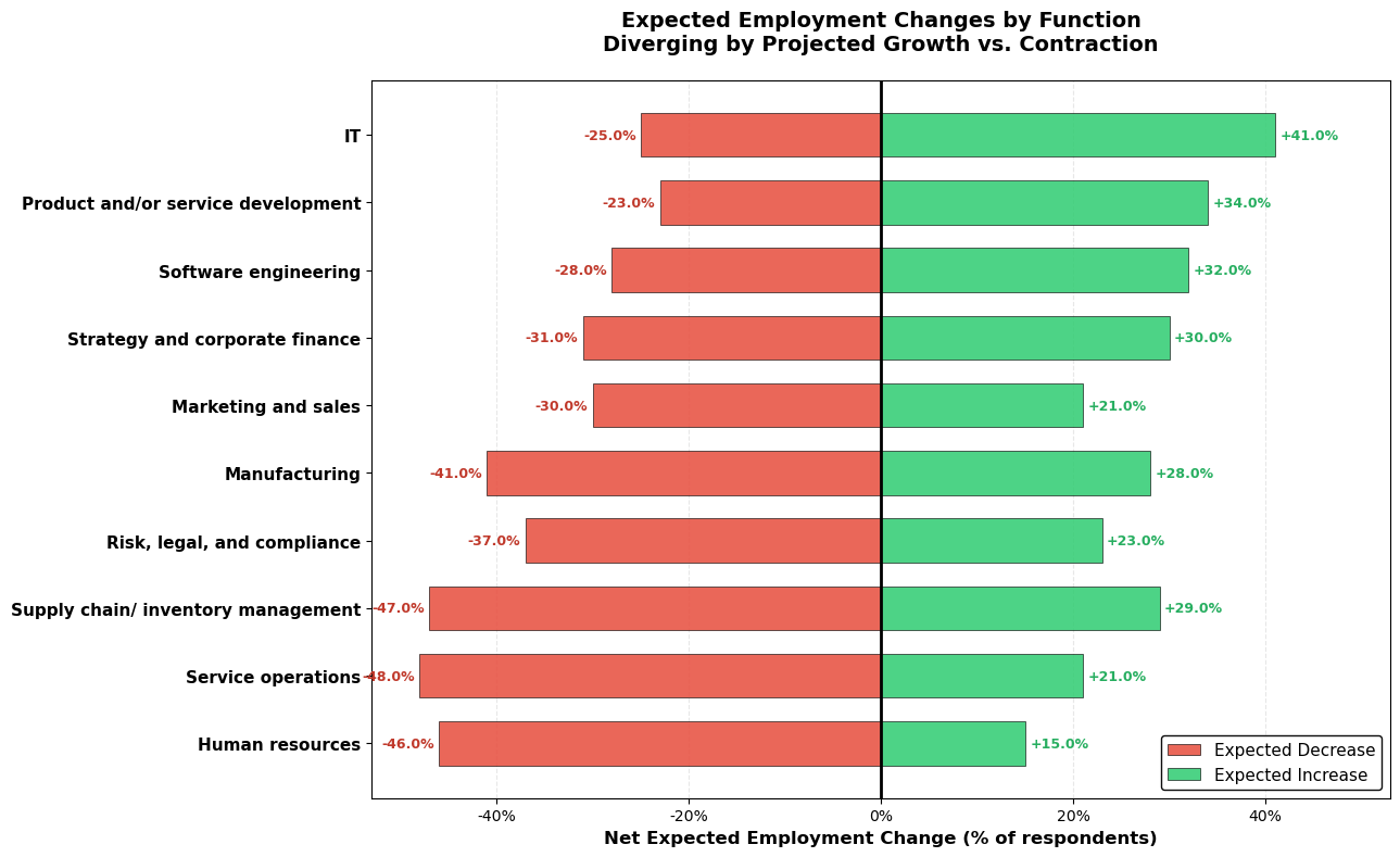
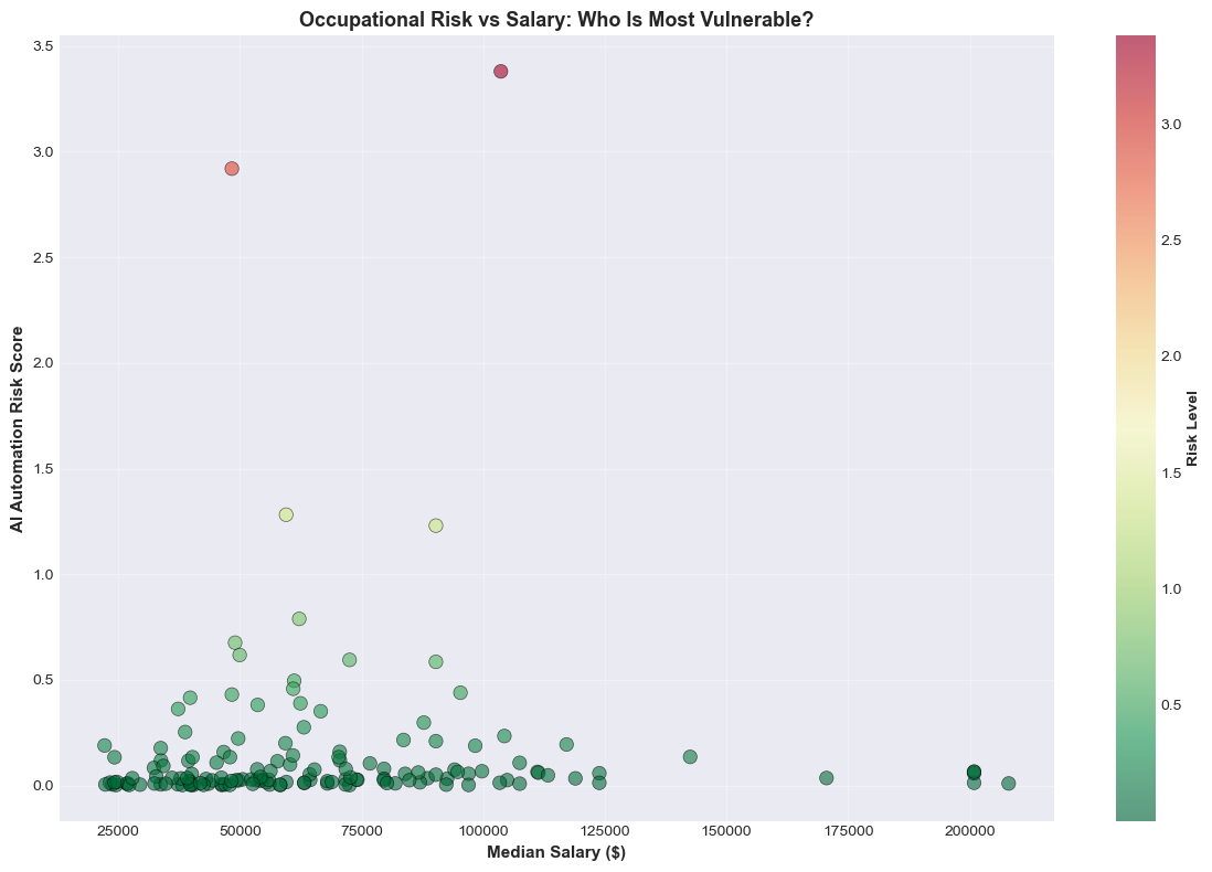
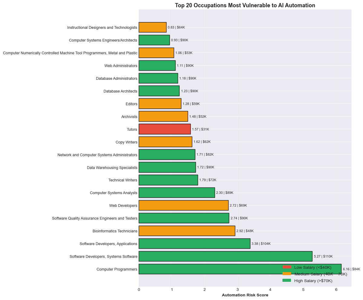
To start the project, we did extensive EDA on the data. All of the python notebooks are in the data-exploration folder. The following were our most interesting visualizations/insights based on the data:
Design Concepts
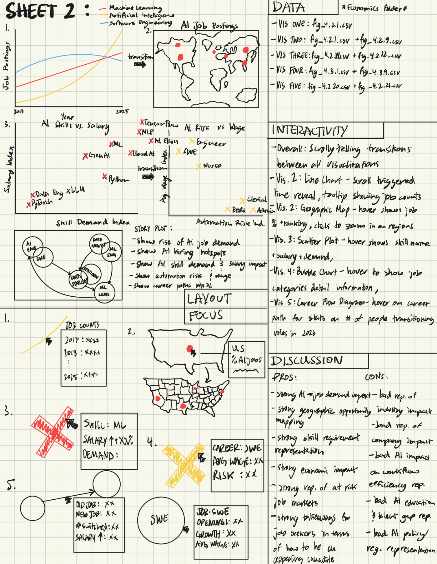
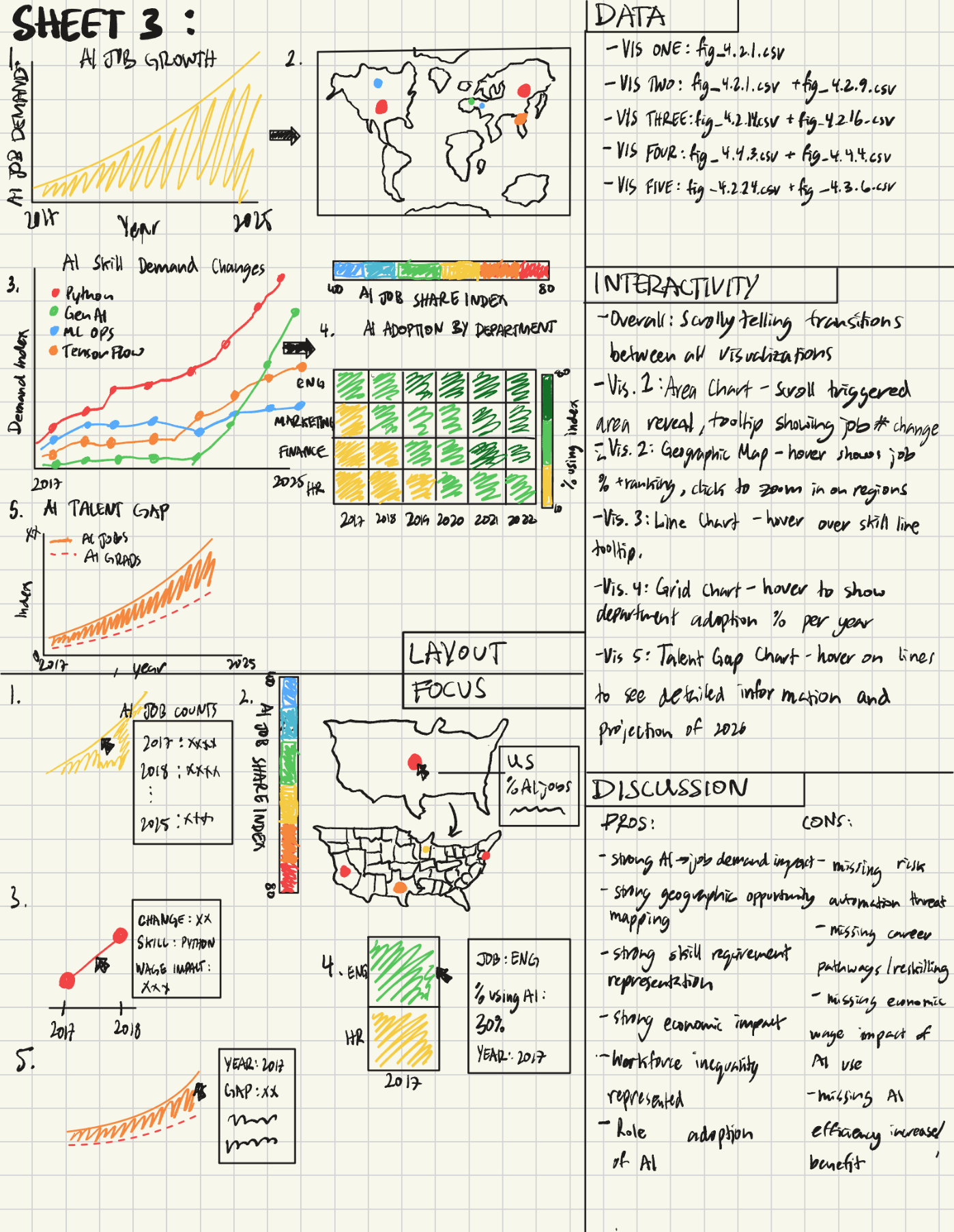
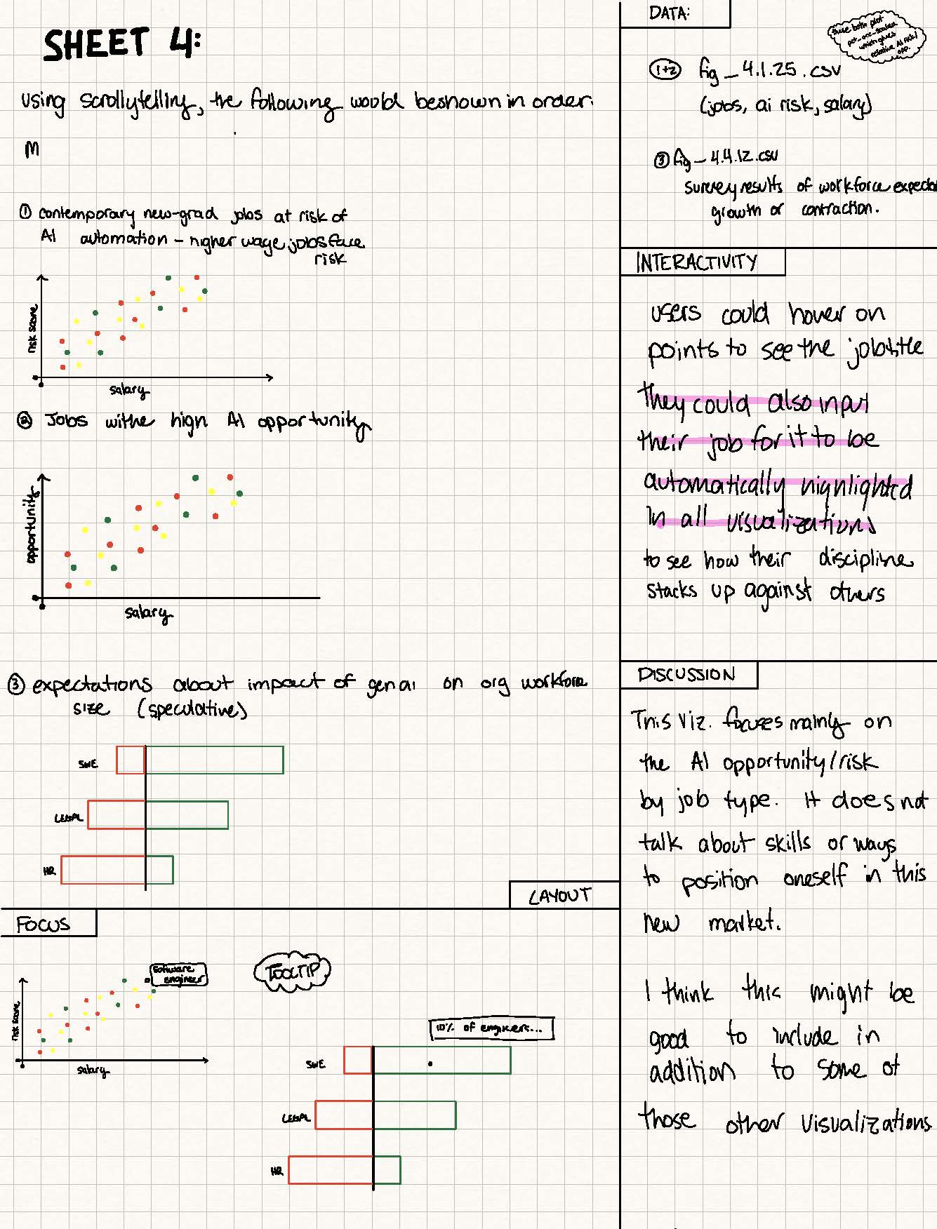
Must Have Features
- Scrolly-telling layout (see examples for reference). We will be using the Wall Street Journal's ScrollWatch Repo to handle the interaction. When possible, scrolling will be the means by which users interact with data.
- When data will permit, we will show timebound trends of how AI has evolved the skills and types of jobs being hired for.
- Map visualization
Nice to Have Features
- Map Zoom is going from a global view to zoom into countries or continents, then to zoom into cities, showing AI jobs and AI economic growth with a key visual (maybe as the person scrolls through the storytelling).
- Ghost traces to show past years' data on the current trends with hover features that allow the examination of older data to contrast the 2025 report.
- Some sort of predictive feature that shows calculations based on current trajectories.
- Users will be able to input their career title to see have that highlighted automatically in relevant secitons of the visualizations.
Design Evolution
Checkpoint 1: So far, we have an article with visualizations that are not interactive on scroll. All of our content and visualizations are worked out, but they are just in a continuous HTML file. Some have some hover features, but no scrollability. In class, we've discussed how motion is a key principle of storytelling for data, and we have a plan for how to implmeent that motion into our porject. While the design of the visualizations might not change much from here, implementing the scrollability will be a major change to the project and the layout of the site. We're excited to see where this goes!
Checkpoint 2: We had a lot of design changes in this round! First, we implemented the sticky scrolling so that text and visualizations would appear in a 2-column layout. From there, we each took our try at making our visualizations change with the scrolling. This was pretty hard but we're happy with where it landed. The biggest noticeable change was the design system. We changed the primary background color to dark mode with contrasting white text, updated the fonts, and the text hierarchy. Each of us individually added animations and transitions between our visualizations that connect inherently. We also populated our visualizations with additional data from our processed data sets. Finally, we changed the colors for the visualizations, we originally had green and red but changed to blue and red as to be more accessible for red-green color blindness. We also refined the spacing and scroll distances to create a more compact, focused reading experience so each section is not too long.
User Testing Plan:
Pre-Survey Questions:
1. How familiar are you with AI job market topics?
2. How often do you interact with data visualizations online?
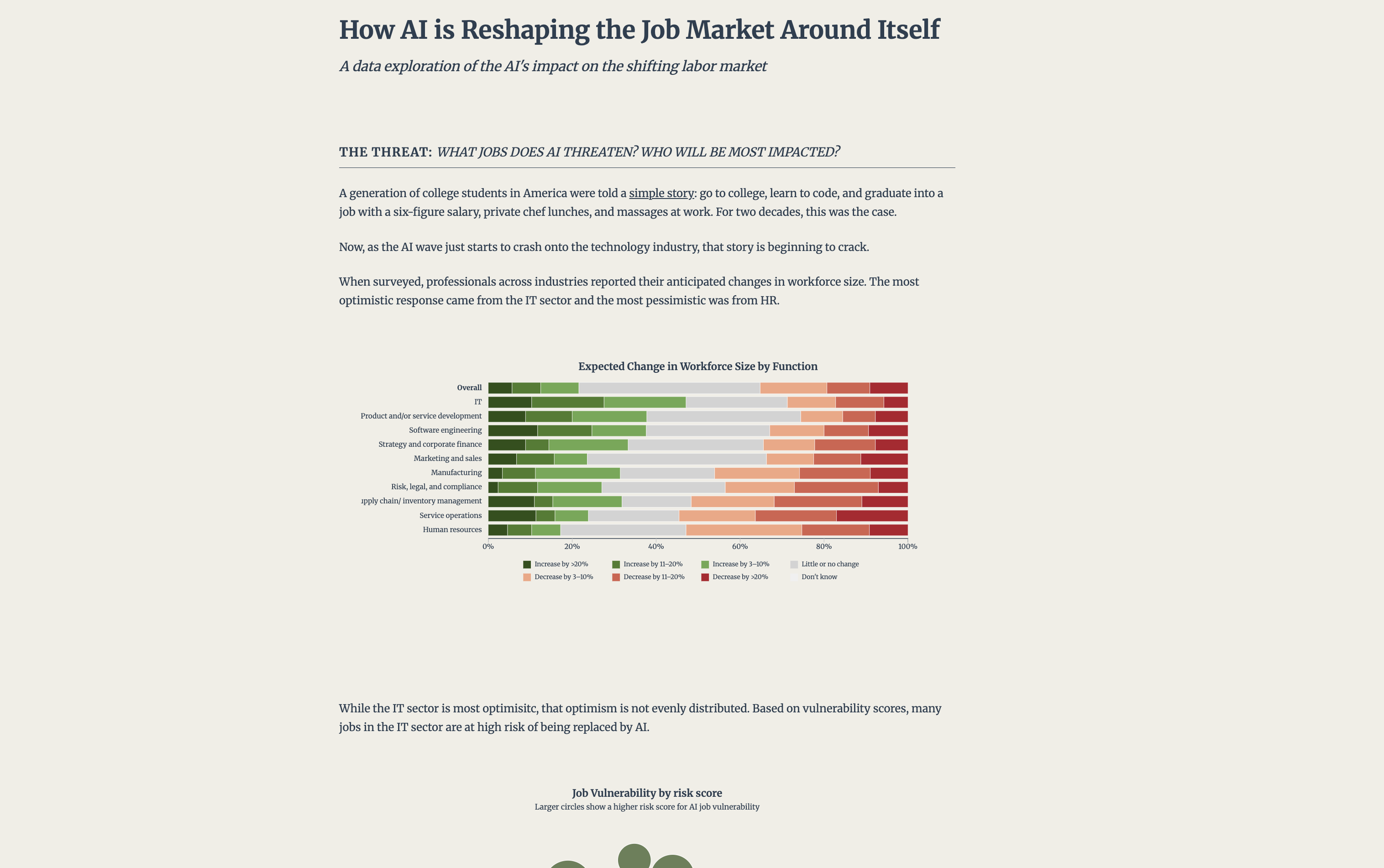
Task 1 [Understanding Job's at Risk]:
1. Tell me which job functions appear most at risk. How can you tell?
2. What story do these risk visualizations tell you?
3. Which jobs does AI threaten?
Task 2 [Interpreting Opportune Skills]:
1. Identify one skill that is rapidly increasing in demand. What tells you that?
2. What does the demand index axis represent in the given context?
3. Where do new AI-driven roles appear?
Task 3 [Geographic Layout of AI Jobs]:
1. Which global regions are hubs for AI jobs?
2. What does the bubble size and color represent?
3. What is the difference bewtween what the two US map visualizations capture?
Task 4 [ScrollyTelling Mechanics]:
1. Describe where the scrolling helps the narrative or hinders it.
2. Describe how you would re-organize the visualizations to improve the story told.
Task 5 [Cognitive Overload]:
1. Did you ever feel lost while scrolling?
2. Were there moments where too much was happening at once?
3. Find something hard to read or understand.
Post-Task Comprehension Test:
1. What is the overall story that the visualizations tell?
2. What did you learn about AI's impact on the job market?
3. Which sections felt confusing?
4. Did the findings feel credible and interpretable?
5. What did you like the most about the visual experience?
6. What frustrated you or slowed you down?
7. If you were seeking a job would this be helpful to you?
User Testing Results:
Matt: Users that I tested with were able to understand the main points of the project. Their three usability pain points: text didn't line up with visualziations at points; there was no visual indicator to scroll from the landing page; confusion about the values for the risk scores and how they were calculated.
Jonas: The user that I tested gad some positive feeback complimenting the color scheme was aesthetic and readable. He also mentioned that the bubble visualization was his favorite and clearest cut. In terms of constructive critisicm he mainly had gripes with minute readibility issues. First, he found the distance between the text on the right and the visualizations was too large and it harder to make connections between the two, unfortunately we do not plan to change that as the maps require that much space, to fit the screen nicely. The nect complaint was about misalignment between scrolling on the visualizations and text which caused some text to finish early. The user also gave specific feedback about the scatterplot, in that the dividing across top 30, middle 30, and bottom 40% were strange segmentations and the change in the y-axis was disorienting to compare information. Additional feedback was that the map scrolling takes too long and could be shortened. Overall, the only changes I plan to implement are the scroll timing on the map visualization and fixing some of the descriptions for what risk and opportunity scores are.
Sophia: My user testing showed that the scrollytelling format was engaging and encouraged continued interaction. The participant responded positively to the overall visual aesthetic and identified the first graph as the most effective due to its smooth transitions and interactive feel. However, they noted that the timing of the “jobs by AI opportunity” section disrupted the narrative flow. Based on this feedback, I removed the middle and bottom percentage graphs and focused solely on the top 30%, aligning the visuals more clearly with my goal of emphasizing opportunity rather than scarcity.
Timeline
| Date | Matt Goals | Jonas Goals | Sophia Raudez | Overall Goals |
|---|---|---|---|---|
| October 27 | EDA Brainstorm sheet and 2 visualization proposal sheets. Decide what nice-to-have features we need. |
EDA Brainstorm sheet and 2 visualization proposal sheets. |
N/A (Sophia is joining the project later) | HTML Project Proposal Complete: - Convert documents and designs into HTML - Complete Schedule with personal goals - Complete half of the 5-sheet design methodology and pick a favorite as the final design. |
| October 27th - Final Project Proposal | ||||
| November 3 | EDA continued Come up with 5 interesting insights/visualizations from the data |
Clean up data and figure out how to compile multiple datasets for chronological visualizations across
multiple years. EDA continued Come up with 5 interesting insights/visualizations from the data [python]. |
EDA continued Come up with 5 interesting insights/visualizations from the data Validate dataset accuracy |
Data processed and cleaned. Exploratory data analysis to begin to put together a data story. |
| November 10 | Organize insights into a clear narrative story Section 1 (risks) writing and 3 interactive visualizations in d3. |
Put narrative story with static visualizations into a scrollable page Section 3 (maps) writing and 3 interactive visualizations in d3. |
Section 2 (opportunities and skills) writing and 2 interactive visualizations in d3. | Storytelling and visualizations (static) with writing/framing |
| November 10th - Milestone 1 | ||||
| November 17 | Explore the ScrollWatcher library and implement it into our project. Figure out layout and mechanics for how scrolling will work. | Make map plots more robust with mroe data and implement scroll transitions on the maps. | TBD | Implemented scrollable, interactive visualizations. |
| November 24 | Redesign the CSS elements of the project to improve readibility, color contrast, aesthetics (focusing on color and typography); implement scrolling interactivity for first set of 3 visusalizations. | Implement scrolling interactivity for map visualization(zoom), explore different data to plot onto the maps, draft questions for usertesting | Implement scrolling interactivity and transitionsfor second set of 2 visualizations. | Implemented animations and interactivity |
| November 24th - Milestone 2 | ||||
| December 4 | Leading the user testing and iterating on the project based on feedback. | Consider adding the feature of the user inputting their career title to see how it is affected by AI. Finsih design tweaks. | Adding more text for the narrative. | Implemented feedback from milestone 2; clean up visual design; nitpicking. Add anything missing from the project to the process book. |
| December 4th - Final Presentation | ||||
| December 9 | TBD | TBD | TBD | Our goal is to have the project done by December 4 but if we need to make edits that can be done in this week. |
| December 9th - Final Submission | ||||